

Getting fit for the post COVID world


Rebuilding a
fitness app after COVID

Possible is a nutrition-based healthcare company that is on a mission to make the world healthier and lighter. Its three-pronged approach helps people lose weight through consultations with personal nutritionists, customised meal plans based on superfoods, and app-based mentoring.
Possible had a thriving business based on in-person consultations and sales, but COVID hurt their sales and forced them to rethink their products. They asked us to help them find a new path forward by overhauling their app and moving to a digital-first model.
We undertook a three-month collaboration, starting with in-depth research and ending with a highly polished, complete design for a new app that would help them acquire new customers and build a sustainable, digital business.
The impact of COVID😷 on Possible's business
Since Possible was founded in 2013, it has successfully opened offices across 12 cities and enrolled over 40,000 people into its nutrition programs.
New customers start their journey with free, in-person consultations with Possible's network of over 100 nutritionists and doctors. But this model crashed when COVID hit the world. Suddenly, Possible couldn't conduct in-person consultations, and the business took a serious hit.
Possible's founding team knew that this was an opportunity to reinvent themselves and create a digital-first business, based around their existing app. However, with its low conversion rate, the app wouldn't be able to replace in-person consultations without a facelift.
Laying a solid foundation with user research
We started with three weeks of research on user behavior for the customer segment that Possible was targeting. This was critical since we weren't just doing usability improvements. Our problem was to fundamentally rethink how Possible could use their app to convert users without in-person consultations.
Investigating the competitor landscape
We started with three weeks of research on user behavior for the customer segment that Possible was targeting. This was critical since we weren't just doing usability improvements. Our problem was to fundamentally rethink how Possible could use their app to convert users without in-person consultations.
Analysing the existing app's UI/UX
Our design team dove deep into the current Possible app to assess what was working and what wasn't. They found a wide range of issues that needed to be fixed:
- Inconsistencies in the app's colours, fonts, layout, images, navigation and information hierarchy
- Onboarding that overwhelmed users, rather than guiding them through the app
- Text-heavy pages that led to cognitive overload
- Nested hamburger menus that made navigation more difficult
- Inefficient use of screen real-estate with overly frequent pop-ups
.avif)
Learning from current customers
We also turned to Possible's current customers to learn why they had picked the Possible app over other options.
To get a wide range of perspectives, we conducted in-depth interviews with a diverse sample of users. This included people in different stages of the user journey (not signed up, new free user, free user for 3+ months, new paid user, paid user for 6+ months, etc.), age groups, BMIs, locations, etc.
The result was a treasure trove of detailed insights on what people loved and hated about Possible. Most notably, people had trouble remembering basic app capabilities, found core features like the Health Score confusing, and struggled to stay motivated over time.
Building a new app through a Design Sprint
With loads of primary and secondary research under our belts, we were excited to kick off a remote Design Sprint with the Possible team.
Since we were taking on a full app redesign, it was important that everyone was in sync on what we wanted to achieve. Everyone from Possible came in with strong but divergent ideas about how the app should change. A couple rounds of brainstorming and voting helped everyone agree on the problems we wanted to solve.
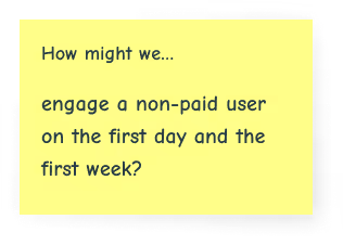
To help us stay on track, we created our How Might We questions, a set of opportunities to tackle during the sprint:
.avif)
.avif)
.png)
.png)
We also created a two-year goal for the app:
.avif)
We also created a set of questions to check during user testing, which would validate if our Design Sprint was successful.
.avif)
.png)
.png)
Moving from goals to solutions
With an ambitious goal in our minds, everyone was excited to transform Possible. After several rounds of sketching and voting, we had mapped out every page for the new prototype.
We decided to build the app around the core concept of challenges. Every day, users would face a new challenge designed to help them eat healthier, stay motivated and build better habits. We thought that breaking big health goals into small, daily actions would help people stay engaged and steadily make progress.

Our design team turned the sketches into a digital, interactive prototype in just a day. Since the stakes were high, we did a couple more iterations on the prototype with the Possible team to be certain we had our new concept right.
Checking if we were on the right track
We thought the new Possible app was great, but would it actually achieve what it needed to? Would users even like it?
To get real user data quickly, we tested the prototype with five users from Possible's target audience. Here is what users said about the prototype:
"The challenges are definitely exciting. It's good to track specific outcomes."
"I found the challenge videos interesting and the philosophy useful."
"I would keep doing the challenges. I like the day-to-day approach."
The overall feedback was great and validated the app's new direction. Every user we tested gave a big thumbs up to the new daily challenges and believed they would lead to healthy changes.
Going from a prototype to a complete app design
After the Design Sprint, we spent several weeks building a complete design for the new app. The prototype only included a couple challenges and screens, so we started by thinking through every single screen and flow needed within the app.
Prompting small but powerful changes through challenges

Our biggest challenge with expanding the Possible app was actually creating the challenges.
Most apps use challenges to get users to repeat the same task. But here we wanted to use challenges to introduce seven fundamental concepts, which would introduce users to Possible's philosophy, shift their mindset around diet, and bring small changes to their routine that would quickly lead to big impact. Each day would have a different activity, but they would all have to feel harmonious and unified.
Even though each user would go through these challenges alone, we also wanted to make sure they felt like they were part of a larger community. We focused on integrating social proof, friend activity, and referrals throughout the challenges.

To help users stay motivated, we gamified the challenges by adding a points system. Doing activities helps users gain points and unlock new activities, while the progress bars and indicators help users track how far they've come and get excited about what's ahead. We also added timely nudges to prompt users to take advantage of special offers on Possible's expert consultations, superfoods, and other offers
Building on the Possible brand

As we designed the app, we focused on building upon Possible's branding. We took the existing color palette and incorporated it into backgrounds, icons and images to help unify different screens and help users track their progress through the app. We also used Indian stock images and engaging microcopy (with emojis 😄 ) to differentiate the Possible brand from other fitness apps, which often use illustrations and formal language.
All of these rounds of iteration helped us nail our sprint goals and turn the basic prototype into a pixel-perfect design that was jam-packed with engaging features and visual details.
Book a 60 min Strategy Call with our founders

A laser-focussed call to discuss your product goals/challenges and how can we help.
.webp)
12 yrs of experience in UX Design and helped clients like Meta, Equifax and Delhivery
.webp)
15 years of experience and has data led digital transformations for Unicorn Startups