Design Systems That Scale with Your Team
Create a unified experience across every feature and platform. We help you set up a system of reusable components, patterns and rules so your team can move faster and stay consistent. From your first prototype to enterprise maturity, we make sure design scales with your ambitions.


What Sets Us Apart
Consistency builds trust. We build libraries of components and patterns that work across every touch‑point, reducing friction for users and developers. Each piece is backed by research and tied to clear goals.
A good system saves time. With reusable styles and tokens, your team can prototype in days instead of months. You ship more often because you’re not reinventing basic building blocks.
Your product will change; your system should support that change. We plan for growth, creating foundations that support new features and platforms without throwing away what already works.
How We Approach Design Systems
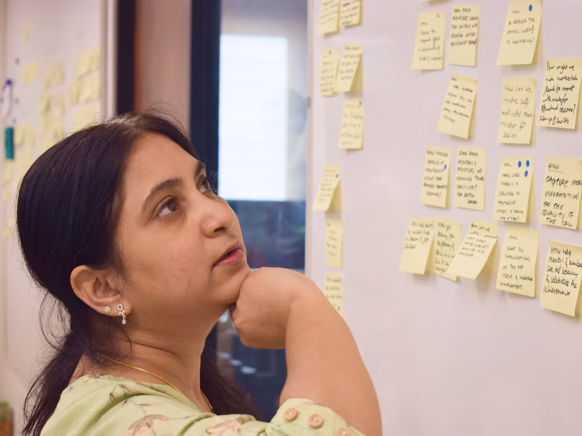
We start by understanding your users and team. We interview stakeholders, study competitors and map pain points to make sure every decision solves a real problem.
- Stakeholder interviews and competitive analysis
- User interviews & behavioural research
- Journey mapping & pain point identification
- Opportunity assessment and prioritisation
We turn insights into clear structures. We define the information architecture, craft modular components and validate them with prototypes so your team knows exactly how each piece fits together.
- Information architecture & system mapping
- Component design & pattern definition
- Prototyping & validation
- Accessibility and inclusion best practices
A system isn’t useful without good documentation. We create visual guidelines, interactive libraries and handover docs so developers can build with confidence. We also run workshops and support your team during rollout.
- Visual guidelines & brand application
- Token management & style libraries
- Developer handoff & training
- Governance & maintenance support
Our Process
- Alignment workshops with your team
- Current design inventory & gap analysis
- Technical constraints assessment
- Success metrics definition
- Information architecture and taxonomy design
- Core component creation (buttons, forms, layouts)
- Interactive prototypes for validation
- Usability testing & iteration
- Final design tokens and component libraries
- High‑fidelity templates and guidelines
- Developer handoff & documentation
- Quality assurance support
Our Case Studies

Building the AI‑native content ops layer for SaaS
Pageloop needed a Help Center that updated automatically without losing trust. Automation had to feel like an assistive layer, not a risk.
We designed a system where teams can feed changelogs and notes directly into the platform. AI suggests draft content while writers stay in control via approval flows and preview modes.
The new experience led to faster onboarding and adoption. Pageloop reports a 40% cut in onboarding time, an 85% adoption rate for advanced features, and a 90% customer satisfaction score.


Powering reliable payments at scale
Payment flows varied across partners, causing drop‑offs and support issues.
We created a modular system of payment components that adapt to different contexts while maintaining trust.
The new design led to a 25% rise in payment completion rates and cut support tickets by half. The system now processes more than 2 billion transactions per year.

Empowering consultancies with powerful tools
Consultants needed access to advanced AI tools without feeling overwhelmed.
We developed progressive disclosure patterns that guide users from simple tasks to advanced workflows. The system scales as teams grow and needs become more complex.
Project completion times dropped by 60%, user retention reached 95%, and feature adoption increased by 35%.

Shaping daily health habits through behaviour‑led design
Lume needed to translate continuous hormone‑tracking data into simple, actionable insights for early adopters.
We crafted an experience that makes scientific data easy to read and act on. We designed habit‑building mechanisms and motivational feedback to improve circadian rhythms.
Early beta users reported better understanding of their light intake and improved routines. The founder praised our fast iterations and user testing: “Parallel was excellent in helping us bring our vision to life. The quick iterations done in parallel with user testing let us try a lot of things in order to get to our beta”.
Our Tools and Methods
 FigmaFor component libraries, tokens and collaborative design.
 FigJamFor workshops and ideation sessions.
 StorybookTo document components in a way developers can use.
 MazeFor user testing and validation.
 NotionFor documenting guidelines and handoff packages.
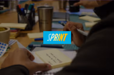
- Design sprintsQuick validation of concepts.
- User interviewsDeep qualitative insights.
- Usability testingRefinement and optimisation.
- Analytics reviewData‑driven decisions.
- A/B testingData‑driven decisions.

“They were as invested as our own team. The ownership was so high that we would debate features – it showed how deeply they cared about our product.”

“Parallel takes true ownership of their projects rather than just being a design partner. They helped us bring our offerings to users as simply as possible.”

“Parallel worked patiently with our in‑house product, design and engineering teams. They understood impact without friction.”

“Parallel was excellent in helping us bring our vision to life. Quick iterations with user testing let us try lots of things before the beta.”
Why Choose Parallel for Design Systems
With over a decade in product design, we’ve built systems for SaaS, fintech, healthtech and AI‑powered platforms. That breadth gives us insight into what works across different sectors.
Our design systems have supported products that serve hundreds of millions of users and facilitated billions of transactions. Clients have raised over $500 million on the strength of products we helped create.
We work as part of your team. Regular check‑ins, transparent communication and shared responsibility mean we’re invested in your success.
We design with scale in mind. Every component comes with rules, states and usage guidelines to ensure a cohesive experience as your product grows.
We’ve been featured around the world


FAQs
