I spend my days looking at early-stage software products and their marketing sites. Most founders treat their website like a digital brochure instead of the first step in product onboarding. When they realize their site is confusing users rather than converting them, they start searching for an external partner. Finding the right B2B website design agency is difficult because most teams prioritize aesthetics over usability. You do not need a pretty website. You need clarity. Your website must explain complex product mechanics simply and drive real activation.
Top 10 B2B Website Design Agencies: TL;DR
The best partner depends on your product stage and specific goals. Here is a direct comparison of the top ten agencies for 2026 to help you make a clear and informed decision.
Why B2B websites fail to activate users
We have seen teams overcomplicate their messaging repeatedly. It usually backfires. Founders know their product deeply and want to explain every feature on the homepage. This creates cognitive overload for the user.
Buyers in 2026 do not want to read an instruction manual before understanding your value proposition. According to a 2025 usability report by the Nielsen Norman Group, B2B buyers abandon websites primarily because of hidden pricing, obscure product capabilities, and heavy industry jargon. Users need to see the product in action immediately.
The website is not separate from the product. It is the beginning of your product experience. When users land on your site, they are already trying to solve a problem. If the navigation is confusing or the copy is vague, they will assume your software is equally difficult to use. Good design removes this friction. It guides the user from their initial problem to your specific solution with zero wasted steps.
The gap between surface design and product strategy
Most design projects fail because teams focus on the wrong problems. They spend weeks debating color palettes and typography while ignoring fundamental flaws in user flow. Visuals do not fix broken messaging.
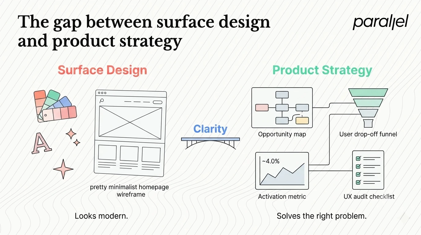
In my experience, this is where most product decisions go wrong. Teams hire external partners to make things look modern. They fail to address the underlying structural issues of how the product is presented. Before hiring any B2B website design agency, you must evaluate their fundamental approach to problem-solving. Do they ask about your activation metrics? Do they want to understand your user retention data? If they only ask about your preferred visual style, you are talking to the wrong team.
We approach this differently at ParallelHQ. We start with opportunity mapping to understand exactly where users drop off. We look at the actual behavior of your target audience. This grounds our design decisions in reality rather than subjective opinion.
How to evaluate an external partner correctly
Evaluating a B2B website design agency requires you to look past their polished portfolio. You need to understand how they think. A beautiful case study tells you they have talented graphic designers. It does not tell you if they can solve your specific business problem.
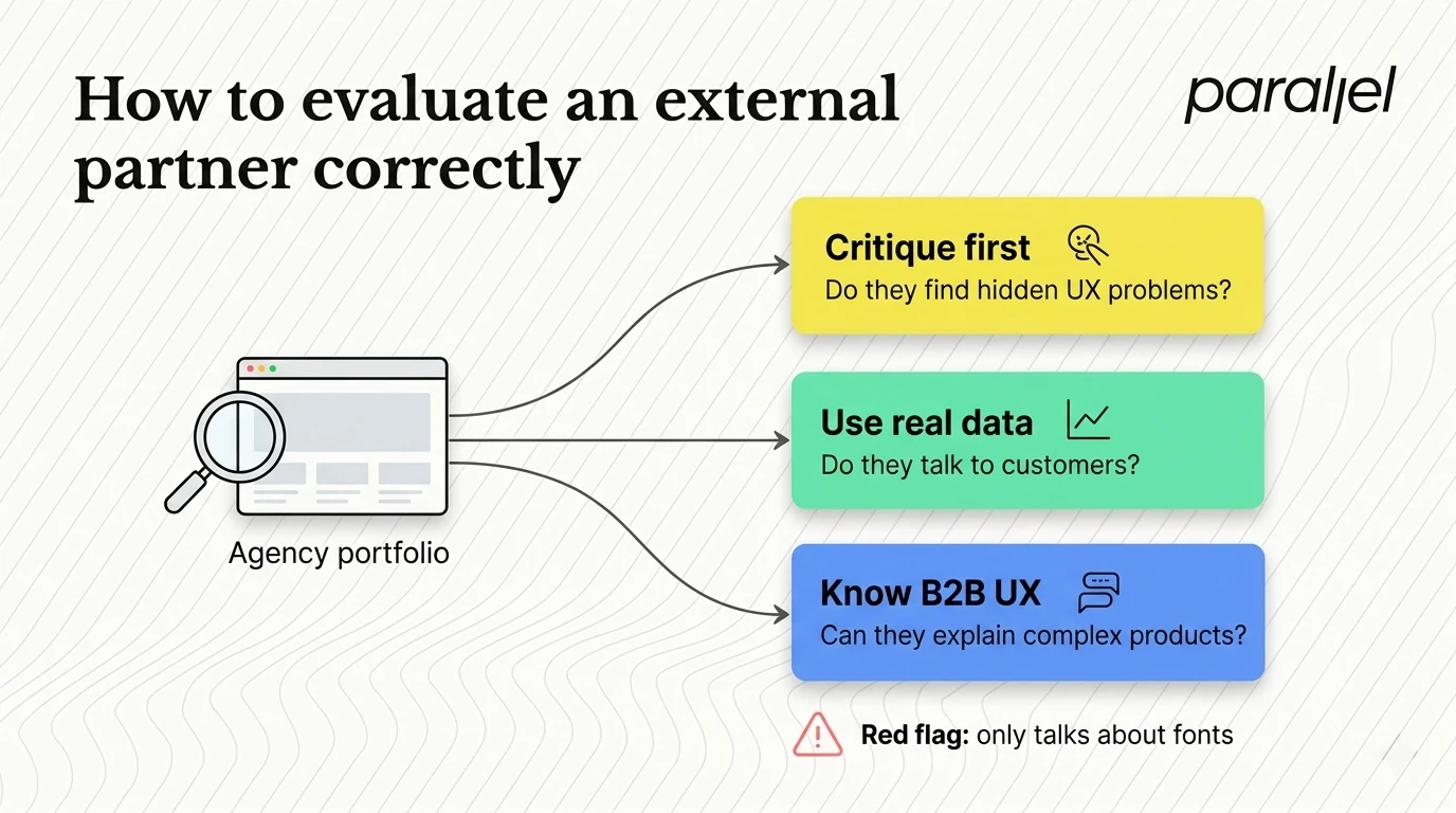
Here is how we advise founders to think about this evaluation. First, ask them to critique your current website. Listen to what they prioritize. If they immediately suggest changing your fonts, be cautious. If they point out that your value proposition is hidden or your call-to-action is confusing, they understand user experience.
Second, look for a methodology based on real user data. Ask them how they handle user research. You want a team that talks to your actual customers. Relying on assumptions is dangerous and expensive.
Finally, consider their focus. Building a consumer e-commerce site is entirely different from explaining a complex API product. You need a team that specializes in the mechanics of B2B UX design.
10 best B2B website design partners for 2026
We have compiled this list based on industry reputation, client outcomes, and our own observations of the market. Each of these firms excels in a specific area.
1) ParallelHQ
We built ParallelHQ because the traditional B2B website design agency model was broken. We saw founders wasting money on beautiful websites that failed to communicate what their product actually did. We focus on clarity in thinking.
We work closely with early-stage and growth startups. Our process is highly collaborative. We use frameworks like design sprints to validate ideas quickly and avoid months of wasted development time. We do not just design web pages. We align your website with your core product strategy. We help teams simplify complex product experiences and ground their decisions in real user behavior.
If you are struggling with weak onboarding or low activation, we help you fix the root cause. We start by analyzing your current state, often through a detailed UX audit, to identify exactly where you are losing potential customers.
2) Clay
Clay has built a massive reputation for producing stunning, premium visual identities. They are highly sought after by well-funded tech companies based in the Bay Area. Their work is characterized by high-end 3D graphics, smooth animations, and a distinct modern aesthetic.
They are an excellent choice if your primary goal is to establish visual dominance in a crowded market. They build sites that win awards and impress investors. However, their services come with a premium price tag. If you are an early-stage founder needing rapid iteration and deep product mechanics work, their approach might feel too heavy. Many teams evaluate a Clay alternative when they need a faster, more product-focused execution.
3) Metalab
Metalab is one of the most famous names in the industry. They have designed interfaces for some of the biggest software companies in the world. They bring a consumer-grade polish to complex B2B applications.
Their strength lies in handling massive scale. If you are a late-stage enterprise company needing to overhaul a massive product ecosystem, they have the resources to handle it. Their process is thorough and established. The downside is that they are built for large corporate engagements. Startups looking for agile problem-solving often seek a Metalab alternative to get closer access to senior designers without the heavy agency overhead.
4) Work & Co
Work & Co operates at the intersection of deep engineering and design execution. They are highly technical. They excel at building digital products and websites that require complex backend integrations.
If you need a B2B website design agency that acts more like a heavy engineering firm, they are a strong choice. They build robust, scalable systems for global brands. They are less focused on pure marketing sites and more focused on functional web applications. If your website is essentially the product interface, they have the technical rigor to deliver. For teams that want more strategic product guidance early on, exploring a Work & Co alternative can provide a better balance of strategy and execution.
5) Instrument
Instrument is a multidisciplinary firm known for building deep brand ecosystems. They do not just design websites. They craft the entire narrative surrounding a digital brand.
They excel at storytelling. If your B2B product relies heavily on selling a vision or a new category, Instrument knows how to package that narrative. They work well with marketing teams that need to launch massive global campaigns alongside their digital platforms. They are less specialized in the granular SaaS design services required for self-serve product activation. Companies prioritizing product-led growth often look for an Instrument alternative to focus strictly on user conversion.
6) Ramotion
Ramotion specializes in brand identity and interface design for growing tech companies. They have a recognizable style that is clean, sharp, and highly professional. They are very effective at taking a disjointed startup brand and unifying it across a new website.
They are a great choice for Series A or Series B companies that have outgrown their initial branding. They deliver comprehensive design systems and polished web assets. Their approach is heavily weighted toward visual identity. If your core problem is a fundamentally confusing product flow rather than outdated branding, you might need a team more focused on product strategy. This is why some teams choose a Ramotion alternative.
7) Frog Design
Frog Design is a legacy player with deep roots in industrial design and human-computer interaction. They handle massive, multi-year digital transformation projects for Fortune 500 companies.
They are the right choice for highly complex organizational challenges. If you need to align thousands of employees across a new digital portal, they have the frameworks to manage it. Their work is heavily research-based and systemic. For early-stage startups, their process is usually far too slow and expensive. Founders moving quickly typically prefer a Frog design alternative that operates with startup agility.
8) Code and Theory
Code and Theory is built around digital transformation and data-driven design. They handle incredibly complex content architectures. They are often hired by media companies and massive B2B publishers to structure vast amounts of information.
Not every B2B website design agency handles massive content architecture well, but they excel here. If your product relies on a huge library of documentation, resources, and technical specifications, they know how to organize it. They are highly analytical in their approach. However, if your need is a simple, highly targeted landing page for a single SaaS product, their process might be over-engineered. Teams looking for simpler software design often consider a Code and theory alternative.
9) Huge
Huge is a global digital agency that provides enterprise-level experience design. They have offices worldwide and handle massive global rollouts for corporate clients.
Working with a massive firm means you get access to a very wide range of services, from advertising to web development. They are suited for enterprise CMOs who need a single vendor to handle a global brand refresh. They are not built to act as an extension of a small startup team. Their engagement models are rigid. Teams that want a true collaborative partnership often prefer a boutique Huge alternative.
10) Neuron
Neuron is a highly specialized firm focused almost exclusively on B2B UX/UI design. They are very pragmatic in their approach. They focus heavily on making workplace software easier to use.
They are a solid choice if you have a highly technical internal tool or a complex dashboard that needs organizing. They understand the specific constraints of business software. They are less focused on high-end brand marketing and more focused on screen-level usability. If you need a partner to rethink your entire market positioning alongside your website, you might need a broader Neuron alternative.
The danger of generic advice
One pattern we have observed repeatedly is the reliance on generic best practices. Many teams copy the websites of successful companies like Stripe or Vercel. They assume that adopting the same visual style will yield the same results.
This is a fundamental mistake. A 2026 Baymard Institute benchmark report highlights that B2B user journeys are highly contextual. What works for a developer-focused API company will fail for a healthcare compliance platform. You cannot copy context. You must design for your specific user's mental model.
When we engage in UI/UX design, we start by understanding the user's current environment. We look at the tools they already use and the workflows they are trying to replace. This is the only way to build an intuitive experience.
Moving toward clarity
Building a successful product is difficult enough. Your website should not make it harder. The goal of your digital presence is not to impress other designers. The goal is to make your product's value instantly obvious to the people who need it.
Stop trying to sound clever. Stop using vague adjectives. Break down your product mechanics so simply that a user can understand exactly what you do within five seconds of landing on your page. If you prioritize clarity over cleverness, you will always make better product decisions. Let the actual utility of your product speak for itself.
Frequently asked questions
1) What does a B2B website design agency actually do?
They handle the strategy, user experience, and visual design of a business-facing website. The best ones go beyond visuals. They structure your information architecture, optimize your conversion funnels, and ensure the site accurately reflects your core product mechanics.
2) How much does a redesign cost in 2026?
Costs vary wildly based on the partner and the scope. A basic marketing site from a mid-tier firm might range from $20,000 to $50,000. Comprehensive redesigns involving deep product strategy from top-tier firms typically range from $80,000 to over $200,000.
3) Should we hire an in-house designer or a B2B website design agency?
It depends on your runway and speed requirements. An in-house designer is great for long-term product maintenance. An external partner is better when you need a sudden, massive shift in quality, or when you need diverse perspectives to solve a complex strategic problem quickly.
4) How long does a standard redesign process take?
A proper strategic redesign usually takes between eight to sixteen weeks. This includes the initial discovery phase, user research, wireframing, high-fidelity design, and final handoff. Rushing this process usually leads to fundamental structural errors.
5) What is the difference between product design and web design?
Web design traditionally focuses on marketing, brand perception, and information delivery. Product design focuses on utility, task completion, and user retention within an application. The best modern websites require strong product design thinking to drive activation.
6) How do we know if our current website needs a redesign?
Look at your metrics. If you have high traffic but low conversion rates, your messaging is likely failing. If users are signing up but immediately churning, your website is setting the wrong expectations for the product. A thorough UX audit can confirm these issues.
7) Is ParallelHQ the right B2B website design agency for my startup?
We are the right fit if you value clarity and strategic thinking over superficial design trends. If your product is complex and you are struggling to communicate its value simply, we can help. We partner closely with founders who want to ground their decisions in real user behavior.
8) How does AI impact the web design process today?
AI is changing how we generate content and concepts rapidly. However, it cannot replace strategic decision-making. We use AI to speed up wireframing and test content variations, but human insight is still required to understand complex B2B buying behaviors and design empathetic user journeys.

check out these related blogs






























.webp)