I have seen too many early-stage teams blow their runway on a visual facelift that completely ignores how their product actually works. A shiny logo will never fix a confusing onboarding flow or a broken user journey. If you are looking for the right partner, evaluating branding agencies for startups requires looking past flashy portfolios. You need a team that understands product strategy, user behavior, and market positioning natively. We built ParallelHQ to bridge that exact gap. Here is a grounded look at the agencies actually moving the needle for founders this year.
Quick answer and TL;DR
The best partners connect visual identity directly to product experience and user activation. We ranked the top branding agencies for startups based on strategic depth, tech expertise, and ability to execute beyond surface-level aesthetics.
Why do most branding agencies for startups fail early-stage teams?
There is a massive difference between designing a logo and designing a brand that scales with a software product. Most traditional agencies focus entirely on the visual layer. They hand over a polished PDF guidelines document, collect their fee, and walk away.
This leaves founders with a beautiful identity that cannot actually be implemented into a complex user interface. In my experience, this is where most product decisions go wrong. Teams try to force a marketing brand into a product environment, resulting in cognitive overload for the end user.
The data backs this up. The Founders Forum Group reported in their 2024 to 2025 statistics that poor messaging and positioning contribute to 14% of all startup failures. You simply cannot separate what you say from how your product works.
Furthermore, a 2025 industry report from Cropink revealed that consistent branding integrated into the core experience increases revenue by an average of 23%. When your brand and your UX are disjointed, users lose trust immediately. They click an ad that promises a premium experience and drop into a dashboard that feels chaotic.
Where do teams usually go wrong with brand identity in software?
Founders often approve brand guidelines that look stunning in a presentation but fail completely in reality. A classic example is typography. An agency might select an elegant, high-contrast serif font because it conveys trust and sophistication to investors.
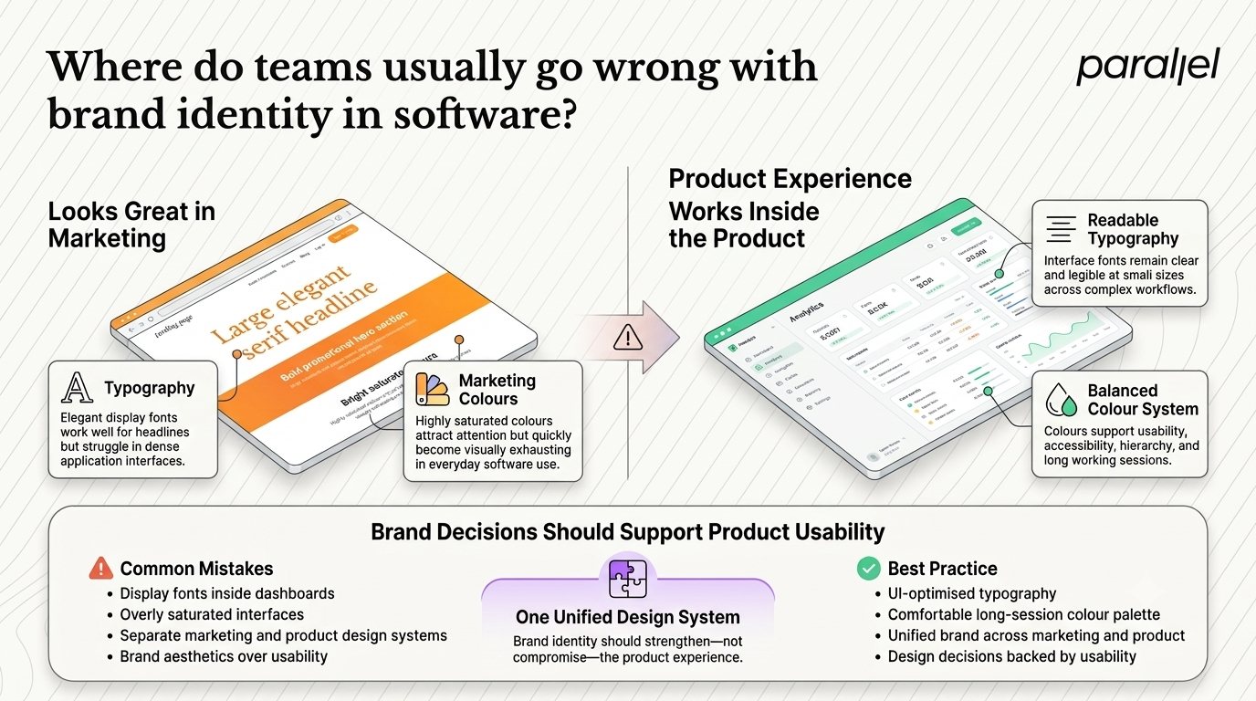
That font looks incredible on a marketing landing page. However, when your engineering team tries to use that same font at 12 pixels inside a data-dense analytics dashboard, it becomes entirely unreadable. The brand identity actively harms the user experience.
Color palettes present another massive trap. Marketing-focused designers love highly saturated, aggressive colors because they grab attention on social media. But if your user needs to stare at your B2B interface for six hours a day, those same neon colors will cause severe eye strain.
We constantly see teams forced to create a completely separate product color palette just to make their app usable. When this happens, the brand becomes fractured. The user feels a jarring disconnect the moment they log in, which spikes churn and lowers activation rates.
Which are the top 10 branding agencies for startups in 2026?
We evaluated these teams based on their ability to merge visual identity with real product thinking, scalability, and startup-friendly execution.
1) ParallelHQ
We built ParallelHQ because we saw a glaring gap in the market. Startups were paying for beautiful brands that completely broke down once applied to a real application. Our approach roots branding services for startups directly in product strategy and user research.
We do not just hand over a logo and a color palette. We map your brand to your onboarding flows, user journeys, and core product loops. If you need clarity in product thinking alongside your visual identity, we are your partner.
- The Good: Deep integration of brand and product design, fast iteration cycles, and a focus on user activation.
- The Catch: We are highly opinionated about usability, which means we will push back if a visual trend harms the user experience.
- Best Suited For: Early-stage and growth startups that need their brand to actively improve their software product.
2) MetaLab
MetaLab is an absolute powerhouse in the tech space. They are known for defining the aesthetic of massive products like Slack, Pitch, and Tinder. They are an excellent choice if you have a massive budget and need a highly polished, trend-setting interface.
Their work is undeniably beautiful. They have a massive team of top-tier designers who can execute complex visual systems at scale.
- The Good: World-class aesthetics and a proven track record with unicorns.
- The Catch: Their engagements are notoriously expensive and slow. If you need a more agile partner, you might want to look into a MetaLab alternative that moves at startup speed.
- Best Suited For: Well-funded Series B or C scale-ups with a clear market position.
3) Focus Lab
Focus Lab practically owns the B2B SaaS branding space. They deeply understand the nuances of selling complex software to other businesses. Their work is typically very clean, highly corporate, and built to drive conversions.
They are a strong choice if you are building an enterprise tool and need to look instantly credible to Fortune 500 buyers.
- The Good: Expert knowledge of the B2B buyer journey and highly professional visual systems.
- The Catch: Their style can sometimes feel a bit safe or overly corporate for disruptive, younger tech products.
- Best Suited For: Enterprise SaaS companies needing serious B2B CRO suggestions woven into their identity.
4) Red Antler
If you are building a physical product or a consumer application, Red Antler is the gold standard. They defined the minimalist consumer aesthetic of the last decade and have since evolved into creating vibrant, culturally relevant brands.
They excel at lifestyle positioning. They understand how to make people fall in love with a product before they even use it.
- The Good: Unmatched consumer psychology insights and brilliant physical packaging.
- The Catch: They are less focused on complex software logic. If your product requires heavy ecommerce UX design, you will need a separate product team.
- Best Suited For: Direct-to-Consumer startups and lifestyle tech apps.
5) Clay
Clay is a fantastic design firm based in San Francisco. They have an incredible grasp of modern web aesthetics, specifically using 3D elements, motion design, and high-fidelity interactions.
They are ideal for Web3 companies or startups that need a highly interactive, award-winning marketing site.
- The Good: Cutting-edge visual design and seamless motion graphics.
- The Catch: Flashy marketing sites do not always translate to usable software. If your core need is deep product strategy, comparing them with a Clay alternative is a smart move.
- Best Suited For: Startups needing high-impact marketing websites and AI software design services.
6) Ramotion
Ramotion blends identity creation with solid web and mobile app design. They are very popular among tech companies looking for a clean, modern aesthetic supported by custom iconography.
They sit comfortably somewhere between a traditional agency and a pure product shop, offering a good balance for early-stage teams.
- The Good: Great iconography and clean, developer-friendly web handoffs.
- The Catch: Their approach can feel slightly templated if you are looking for a highly disruptive or unconventional identity. Checking out a Ramotion alternative could provide good contrast.
- Best Suited For: Seed-stage tech startups needing a quick, professional baseline.
7) DesignStudio
DesignStudio takes on massive, strategic rebrands for companies like Airbnb, Deliveroo, and Evernote. They are highly strategic and focus deeply on company culture and overarching mission.
They are best suited for companies that have already found product-market fit and are ready to reshape their entire industry narrative.
- The Good: Incredibly deep strategic thinking and global market understanding.
- The Catch: Overkill for an MVP. You should only hire them when you have millions to spend and months to wait.
- Best Suited For: Mature companies preparing for an IPO or global expansion.
8) Koto
Koto builds incredibly energetic, slightly rebellious visual systems. They worked on Discord and Back Market, proving they know how to capture community-driven momentum.
They are perfect for startups targeting Gen-Z or trying to disrupt a very boring, legacy industry with a loud voice.
- The Good: High-energy illustration styles and distinct, memorable tones of voice.
- The Catch: Their loud style is not suitable for serious B2B tools or healthcare products.
- Best Suited For: Consumer social apps and disruptive fintech.
9) Pentagram
Pentagram is arguably the most famous design firm in the world. They operate on a unique partner-led model, meaning you work directly with design legends rather than junior staff.
They are brilliant for institutional identities, masterful typography, and timeless design.
- The Good: Unmatched prestige and historically significant design work.
- The Catch: They are rarely the right fit for an iterative, messy, early-stage software startup that needs to pivot quickly.
- Best Suited For: Cultural institutions, hardware companies, and legacy brands.
10) R/GA
R/GA is a massive global network that handles everything from visual identity to complex digital transformation. They have deep resources, technological capabilities, and global reach.
They are built to handle the complexities of Fortune 500 companies.
- The Good: Massive scale and ability to handle international campaigns.
- The Catch: Startups usually get lost in their massive machinery. Founders often seek an R/GA alternative for more personalized attention and speed.
- Best Suited For: Enterprise corporations needing full-scale digital transformation.
How should you choose from the best branding agencies for startups?
Choosing the right partner comes down to understanding your actual bottleneck. If your users are churning immediately after signing up, a new color palette will not save you. You need a team that conducts deep UX audits before they ever start sketching logos.
Ask potential partners how they measure success. If their answer is only about design awards or brand sentiment, walk away. They should be talking about activation rates, reduced time-to-value, and clearer user journeys.
Look for teams that run structured design sprints. This proves they know how to validate ideas with real users before committing to high-fidelity designs. It shows they value function just as much as form.
How do you successfully align brand strategy with product reality?
Before you ever look at a mood board, you need to understand your user's core workflows. This is why we always start with discovery frameworks rather than visual explorations. You must map out the exact moments where your identity needs to communicate with the user.
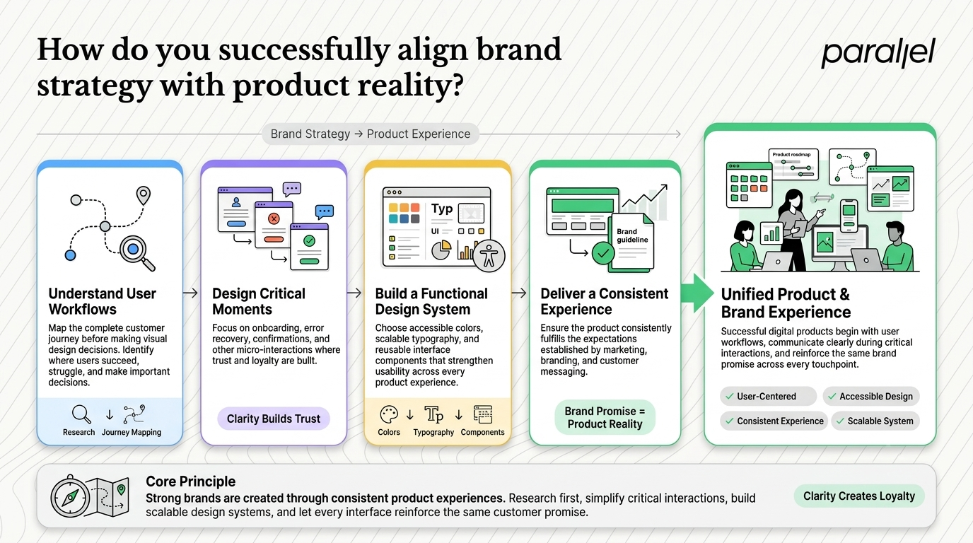
Is it during a complex onboarding flow? Is it when they hit an error state? These micro-interactions are where true loyalty is built. We have seen time and again through our SaaS onboarding teardowns that clarity always beats cleverness.
Once the product logic is sound, you build the visual layer around it. You choose accessible colors that support data visualization. You select variable fonts that scale down beautifully on mobile devices. This ensures that your guidelines become a functional design system, bridging the gap between what marketing promises and what the product delivers.
What is the true ROI of product-led brand design?
Good design decisions compound over time. When your identity perfectly reflects your product capabilities, you attract better users and retain them longer.
According to the Nielsen Norman Group's research on the aesthetic-usability effect, visual appeal directly impacts perceived usability. Users are actually more forgiving of minor friction if the interface feels cohesive, professional, and trustworthy.
Furthermore, a 2026 report on branding ROI indicates that strong identity integration can reduce customer acquisition costs (CAC) by 15 to 30%. You stop paying premium ad rates to convince skeptical users, and you stop arguing internally about button colors so you can ship features faster. This is how you differentiate a mature product organization from a chaotic one.
Conclusion
Finding the right fit takes time and careful evaluation. Do not settle for a team that only knows how to draw nice pictures. The best partners are the ones that fundamentally improve how your product works and how your users feel when they interact with it. Let your product strategy drive your visual decisions, and you will build something that actually lasts.
Frequently Asked Questions
1) What exactly do branding agencies for startups do?
They define your market positioning, visual identity, and messaging. The great ones ensure this identity translates directly into your UI/UX design and core product flows, rather than just delivering a standalone marketing asset that breaks in production.
2) How much should a seed-stage startup spend on brand identity?
It varies wildly, but spending massive amounts purely on visuals at the seed stage is usually a mistake. Focus your budget on foundational product strategy consulting and a lean identity that gets you to market quickly to test assumptions.
3) When is the right time to hire branding agencies for startups?
The optimal time is right after you have early validation but before you scale your marketing spend. You need enough user feedback to know who you are actually building for, so the design is grounded in reality rather than guesswork.
4) What is the difference between a branding agency and a product design firm?
A traditional firm focuses heavily on marketing, perception, and visual assets. A product design firm focuses on user behavior, logic, and functional interfaces. At ParallelHQ, we blend both because modern tech companies require a unified approach.
5) How does ParallelHQ differ from traditional branding agencies for startups?
We do not believe in surface-level aesthetics. We are a product-led team. We start with user research, map out your software flows, and build an identity that naturally enhances your actual product experience and drives activation.
6) Is a rebrand necessary before finding product-market fit?
No. Finding product-market fit should be your only goal. A basic, clean identity is enough for early testing. Only invest heavily in a rebrand once you know exactly what product you are scaling and who is buying it.
7) How do you measure the ROI of hiring branding agencies for startups?
Look at business metrics, not design awards. You should see tangible improvements in customer acquisition costs, higher user activation rates, faster time-to-value, and a decrease in user drop-off during onboarding.
8) Should we use an agency or hire in-house designers first?
Hire a strong, versatile product designer internally first to handle day-to-day execution. Bring in a specialized external team when you need deep expertise, an outside perspective, or a sudden burst of strategic execution that your internal team cannot handle alone.

check out these related blogs





















.avif)












































.webp)