Screen‑based products often start with one designer and an engineer hacking together screens. As the team grows, however, every designer and developer adds their own button sizes, colour codes and input field styles. After a few releases the user interface no longer feels cohesive. Users notice that inconsistency – and it damages trust.
A design system solves that problem. It combines a reusable component library, a style guide and common patterns into a shared language across design and engineering. For a young company scaling quickly, building and maintaining a design system isn’t a luxury; it is a way to ship quality products faster.
In this article I’ll explain why a design system matters now, how to plan and build one, and how to keep it adapting as your startup grows. Throughout this piece I’ll use the phrase building and maintaining a design system deliberately. It captures both the creation and the ongoing care required to make your system successful.
Why build a design system?
At Parallel we work with early‑stage teams across SaaS and machine‑learning products. We see the same pains over and over: duplicated UI elements, slow hand‑offs and mismatched branding. A good system addresses those pains. Supernova’s 2024 design tokens survey found that the launch of Figma variables led to widespread adoption of tokenised design, with 42.5% of respondents using Figma variables as their source of truth.
That standardisation eliminates guesswork and saves time. A SoftKraft study of enterprise design systems reported that organisations with more than 100 employees saw a 46% reduction in design and development costs and a 22% faster time to market after implementing a system. A Medium 2025 business value article reports a SaaS company that accelerated releases by 40% once it adopted a system, and a McKinsey study showing that mature systems save 20–30% of design and development costs each year. These numbers aren’t just for global giants; they reflect the efficiency that reusable components bring to any product team.
In addition to efficiency, a system strengthens brand identity. Consistent colours, typography and interactions create familiarity. Users develop muscle memory when buttons, input fields and navigation behave predictably. Sparkbox’s design system survey found that nearly 40% of systems were deemed successful or very successful and that most teams included colour systems, typography and input field components. Those shared elements reinforce the brand across products and platforms.
Finally, a design system fosters collaboration. Designers think in components, developers work from a shared component library, and product managers stop arguing about colours and start focusing on user problems. It’s also easier to bring new team members on board because there’s a clear “source of truth” for how the product looks and feels.
When you know it’s time
You might be ready for a system if:
- You support multiple products or platforms and notice inconsistent UI patterns.
- Designers or engineers repeatedly solve the same problems instead of reusing solutions.
- There’s no single source of truth, making it hard to onboard new staff.
- You find yourself copying and pasting components across files.
Many companies wait too long and end up with UI drift – a “cluttered mess of mismatched buttons, inconsistent layouts, and forgotten design choices.” An audit often shows dozens of button styles and inconsistent spacing. That’s wasted design and engineering time that could have been avoided.
Foundations before you build
Before building and maintaining a design system, take time to lay a solid foundation.
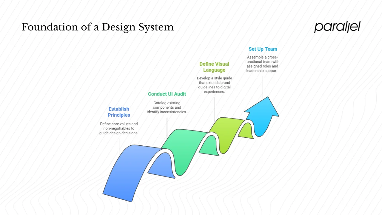
1) Start with principles
Every system needs a north star. Frontify’s guide says the foundation should reflect your company’s values and principles. Work with stakeholders to articulate principles such as accessibility, scalability, brand identity and usability. Agree on non‑negotiables: for example, all components must meet contrast ratios and keyboard accessibility. These principles guide decisions when trade‑offs arise.
2) Audit what you have
Before creating anything new, examine what exists. Conduct a UI audit of your product. Frontify recommends cataloguing every component, style and pattern in use. Record duplicates and inconsistencies: ten shades of blue? five different input field layouts? When we did this for a health‑tech client, we found 60 button variants across three products. The audit became the backlog for our new system.
3) Define your visual language
Your style guide is the set of colours, typography, icons, spacing and motion guidelines that express your brand. This language should draw on existing brand guidelines and extend them to screen‑based experiences. Frontify suggests using your brand’s palette and typography as the starting point for developing a design language. Having this documented makes it easy for designers to assemble screens without reinventing the basics.
4) Set up the team
A system is a cross‑functional project. Involve design, development and product from the start. The Sparkbox survey highlights that design system teams typically include designers (94%), developers (87%) and UX specialists (71%). Even in a startup, assign roles: a designer to curate tokens and components, a developer to build code equivalents and manage the repository, and a product lead to prioritise work. Securing leadership sponsorship ensures the system stays funded.
Building the design system
The heart of building and maintaining a design system lies in turning principles and audits into tangible tokens, components and documentation.
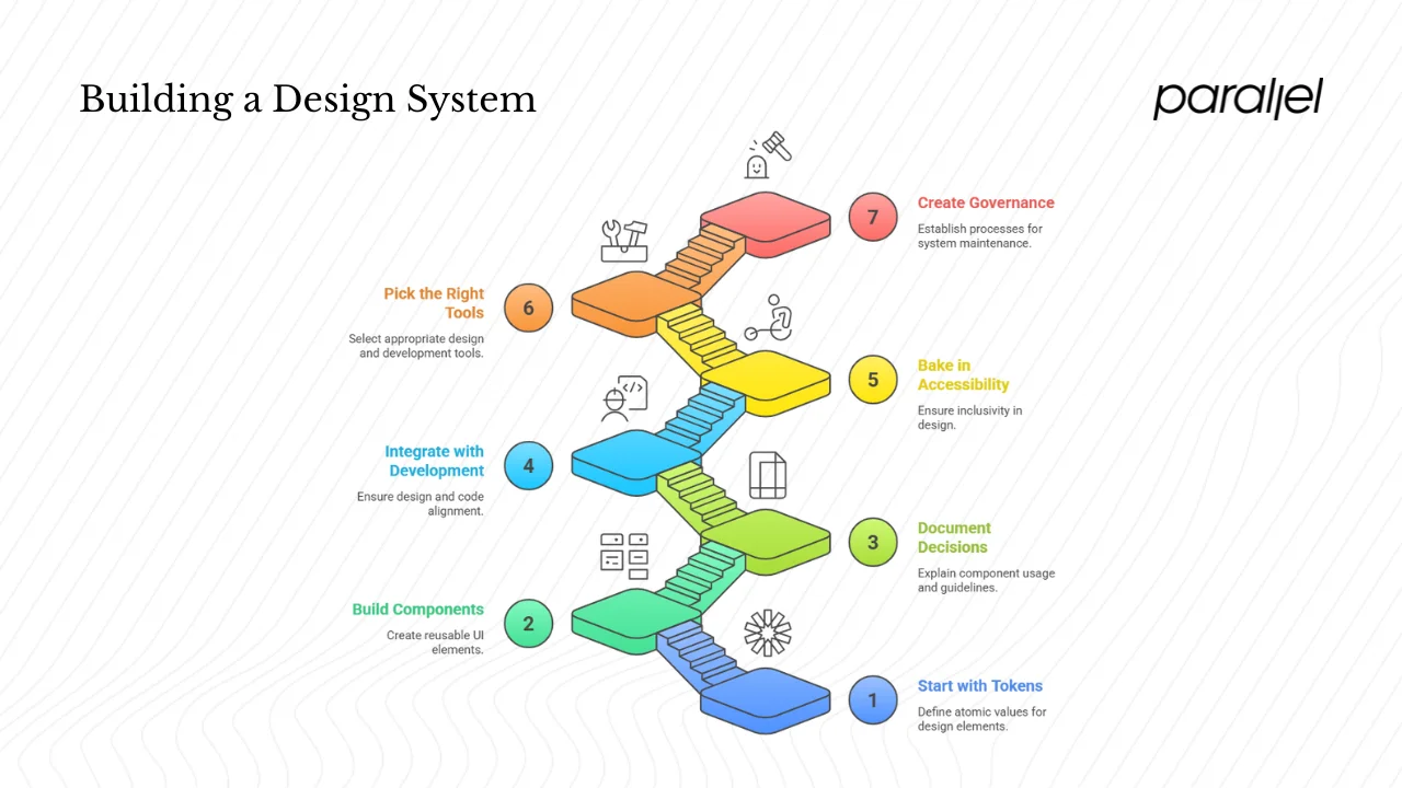
1) Start with tokens
Tokens are the atomic values for colours, typography, spacing and motion that you’ll reuse everywhere. They allow changes at a single point to propagate across platforms. Supernova’s 2024 report shows that Figma variables became the most common source of truth, with 69.8% of respondents using them or planning to. That shift demonstrates how tokens simplify design hand‑off. Keep tokens platform‑agnostic – define them in JSON or use a tool that exports to CSS, iOS and Android formats.
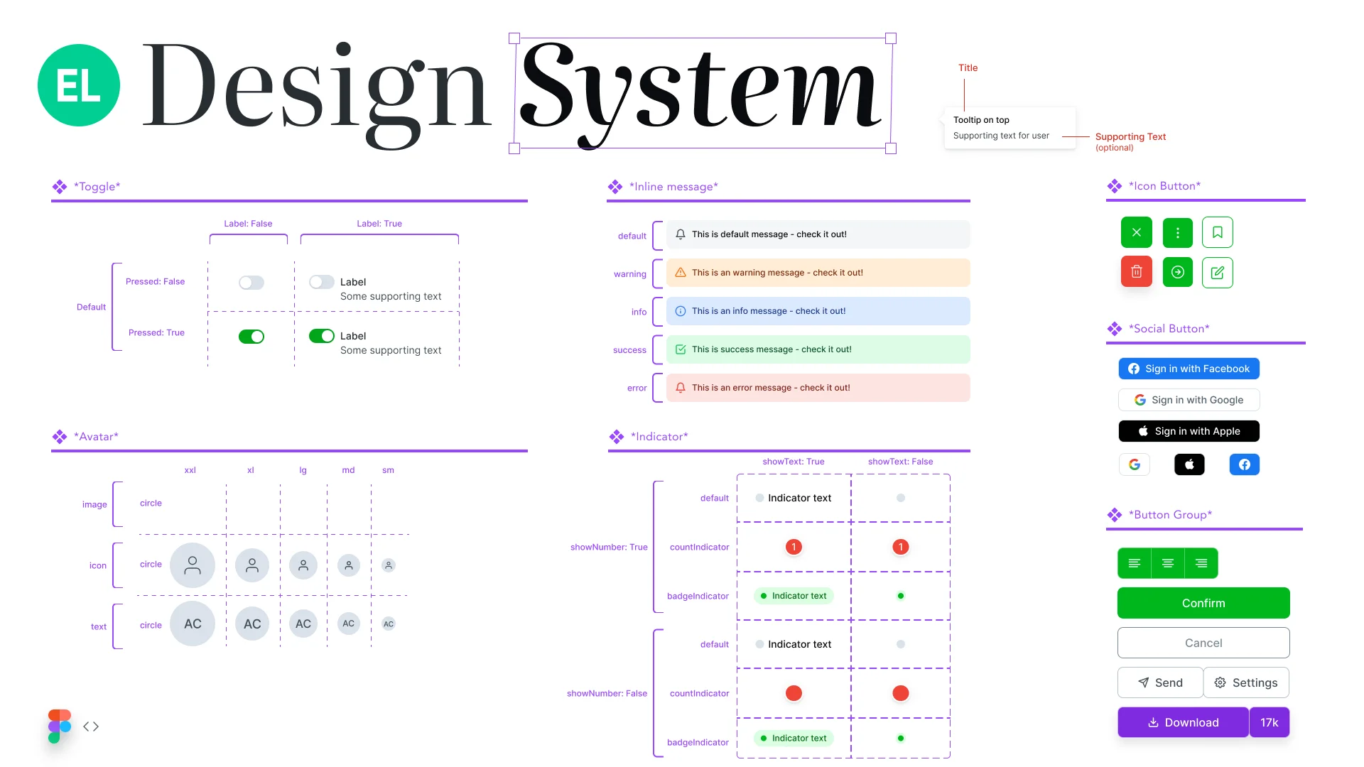
2) Build a modular component library
Once tokens are defined, create reusable UI components: buttons, input fields, cards, modals and navigation patterns. Each component should be modular and composable, following Brad Frost’s atomic design idea of atoms, molecules and organisms. Include states (hover, disabled, error) and variations (primary vs. secondary buttons). SoftKraft reports that component libraries and pattern libraries make up the foundation of any system. The library should be mirrored in code – React, Vue or whatever your stack uses. Aim for a one‑to‑one match between design files and code so designers and developers speak the same language.
3) Document every decision
A system isn’t just components; it’s also the documentation that explains how to use them. Frontify advises including guidance on when to use each component, examples of correct and incorrect usage, accessibility notes and update history. Good documentation reduces misuse and support questions. Use tools like Storybook or Zeroheight to host live code examples next to design guidelines. In our projects, we embed Figma components directly into the documentation so engineers can copy the code snippet.
4) Integrate with development
Handoff is smooth when design and code reflect each other. Link tokens to variables in your codebase and import component definitions into your front‑end framework. Versions control the system in Git so changes are reviewed. Supernova’s report notes that many organisations still manage tokens manually and lack versioning – 44.4% of respondents still use manual processes and 62.5% don’t version their tokens. This creates drift between design and development. Invest in automation early; use tools that sync tokens and components across platforms.
5) Bake in accessibility
Accessibility isn’t an afterthought. It’s part of your design principles. Ensure colour contrast meets WCAG guidelines, interactive elements are keyboard‑navigable, and components support screen readers. SoftKraft lists accessibility as a vital component of modern systems. Document accessible patterns like error messages and focus states. Test with real assistive technology; don’t assume compliance.
6) Pick the right tools
Use design tools (Figma, Sketch), code libraries (React, Vue), version control (Git) and documentation platforms (Storybook, Zeroheight). Choose lightweight tools that fit your budget and scale with you. Startups might adopt open‑source component libraries (Material UI, Chakra UI) and customise them rather than building everything from scratch. This speeds up delivery and allows you to focus on unique parts of your product.
7) Create governance and feedback loops
Define how changes are proposed, reviewed and approved. Frontify emphasises having a clear process: who can suggest changes, who implements them, and who reviews them. Establish a review cadence and maintain a changelog. Encourage feedback from designers, developers and PMs. The system should adapt based on real usage. In some companies the design system team runs office hours to help others use and contribute to the system. This fosters ownership and ensures the system stays relevant.
Maintaining the system
A big part of building and maintaining a design system happens after launch. Keeping it healthy requires constant attention.
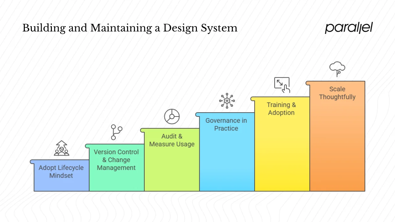
1) Adopt a lifecycle mindset
A design system is a product. It needs continuous care. Teams often assume the work is done once the library is launched, but a Reddit commenter put it well: a design system is “an ongoing, expanding maintenance project.” That means budgeting time for updates and improvements.
2) Version control and change management
Introduce semantic versioning (major, minor, patch). Deprecate old components gradually and provide migration paths. Supernova’s report highlights that most teams don’t version tokens; adopting versioning prevents breaking changes. Publish release notes so all teams know what changed.
3) Audit and measure usage
Schedule periodic audits to see whether components are being reused and whether new components have appeared outside the system. Define metrics: component reuse rate, number of unique components, time saved, and UI consistency scores. Frontify recommends tracking visits to documentation, adoption rates and development time saved. Use these numbers to make the case for continued investment.
4) Governance in practice
Assign clear roles: an owner or small core team to manage the system, contributors who can suggest changes, and a review board for approvals. Encourage open discussion about proposed changes. Resist the urge to accept every request; maintain coherence with your guiding principles.
5) Training, adoption and team environment
Onboard new designers and developers by walking them through the system. Make the design system part of your company’s environment. When teams see the benefits – faster delivery, fewer bugs, consistent UX – they will adopt it. Encourage everyone to report pain points and suggest improvements.
In our projects, we hold quarterly retrospectives to gather feedback.
6) Scale thoughtfully
As your company adds products or goes cross‑platform, resist the temptation to bolt on new patterns ad hoc. Use modular design to adapt components for new contexts. The design tokens survey notes that larger companies tend to have dedicated design system teams, but smaller companies rely on generalist designers. Even in a small team, allocate time to extend the system as you grow. Keep brand identity consistent when launching new features or products.
Avoid common pitfalls
Common mistakes include:
- Building too much too soon. Start with a minimum viable system: a handful of tokens and core components. Expand based on real needs.
- Neglecting documentation. Components without guidelines invite misuse.
- Lack of governance. Without clear ownership, the system becomes outdated or fragmented.
- Poor coordination with engineering. If code doesn’t mirror design, adoption suffers.
Practical considerations for startups
No matter how lean your team, building and maintaining a design system requires balancing scope with speed.
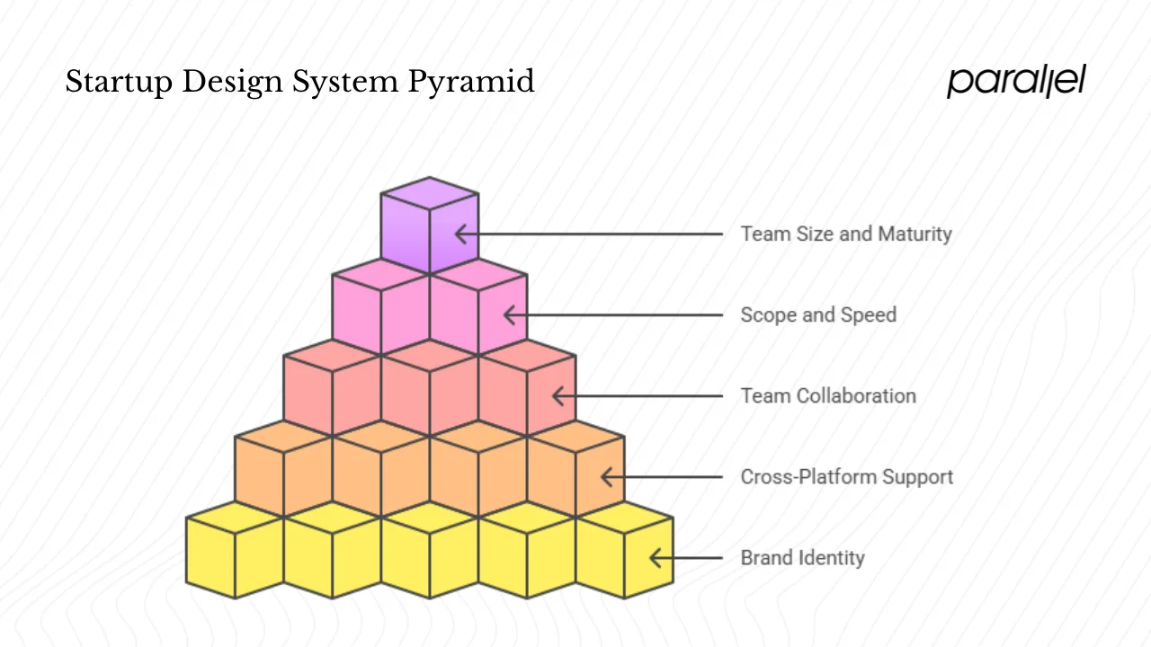
1) Balance scope and speed
Early‑stage teams operate under tight deadlines. Building a full‑scale system can feel daunting. Take a pragmatic approach: adopt a pre‑built component library like Material UI or Chakra UI to get started, then customise and expand it. A Reddit thread advises: “Do not start from scratch – find a pre‑built component library that your engineers can use off the shelf.” Implementing a lightweight system now pays dividends later in reduced rework.
2) Factor in team size and maturity
If you have only one or two designers, avoid over‑engineering the system. Start with a style guide and a handful of reusable components. As you hire more designers and developers, formalise the system and assign responsibilities. The Sparkbox survey shows that design system teams often miss disciplines like product management and research. Even if those roles are absent, involve whoever can provide strategic direction.
3) Support multiple platforms
Plan for cross‑platform components from the start if your product spans web, iOS and Android. Use platform‑agnostic tokens and document platform‑specific differences. Define patterns that work across devices, such as responsive grids and navigation behaviours. This will prevent divergence when you expand to new platforms.
4) Bring design, product and engineering together
A design system serves as the shared language across functions. Schedule regular check‑ins where design, product and engineering leads review the system roadmap. Use the system to inform feature prioritisation: when planning a new feature, check whether the system already supports the required components. When teams collaborate on the system, they agree on user experience goals.
5) Capture brand identity early
Even a two‑person startup benefits from codifying the brand’s visual language. Capture your colours, typography and tone of voice. This early work prevents inconsistent visuals when multiple products appear later. It also communicates professionalism to customers and investors.
Example workflow
Imagine you’ve launched your MVP and are starting to scale. Here’s a possible workflow:
- Audit and plan: Catalogue all UI elements and identify inconsistencies. Define core principles (accessibility, brand identity, scalability).
- Define tokens: Create a JSON or Figma variables file with colours, typography and spacing values.
- Build a component library: Start with buttons, inputs, cards and modals. Use a library like Storybook to document states and variations.
- Onboard and adopt: Share the library with design and engineering teams. Run a workshop to demonstrate usage. Integrate tokens into your codebase.
- Measure: Track reuse rates, time to implement new features and feedback from users.
- Iterate: Review metrics quarterly, update components, add new patterns and retire unused ones.
Assign roles: a product manager approves scope, a designer owns tokens and guidelines, a developer integrates components and manages version control, and the PM monitors reuse metrics to demonstrate ROI. This cycle repeats as the product grows.
Conclusion
Design systems are no longer optional. They provide the structure and shared language needed to build cohesive, scalable products. For startups, the benefits are tangible: faster releases, cost savings, stronger branding and better collaboration. Building a system requires careful planning, cross‑functional coordination and ongoing maintenance. Start small, focus on core components and principles, and let real product needs guide the system’s evolution. A design system is a living product that grows with your organisation. The sooner you invest in building and maintaining a design system, the sooner you’ll see the payoff in consistency, efficiency and user trust.
FAQ
1) What are the five principles of a design system?
- Consistency: Use the same colours, typography and patterns across all products. Consistency strengthens brand identity and improves usability.
- Scalability: Design components and tokens so they can grow with your product. Use modular patterns that adapt to new platforms and features.
- Modularity: Build components from smaller parts (atoms, molecules) so they can be recombined. This matches atomic design and makes maintenance easier.
- Accessibility: Ensure every component meets WCAG guidelines. Build in keyboard support, proper contrast and screen‑reader labels.
- Collaboration: Use the system as a shared language for design, development and product. Establish governance and encourage contributions from all disciplines.
2) What is the 6‑3‑1 rule in UI design?
The 6‑3‑1 rule is a colour‑composition guideline. It suggests choosing a dominant colour for 60% of the interface, a secondary colour for 30%, and a tertiary colour for the remaining 10%. This ratio creates balance and guides the user’s eye. It’s commonly used in branding and interface design to maintain harmony without overwhelming users.
3) What are the seven steps in the design process?
A typical design process includes: (1) Research – understand users and business goals; (2) Define – synthesize insights and clarify the problem; (3) Ideate – generate many possible solutions; (4) Prototype – create mock‑ups or interactive prototypes; (5) Test – gather feedback from users; (6) Implement – build and ship the solution; and (7) Iterate – refine based on feedback and data. A design system supports each step by providing ready‑made components and guidelines, speeding up prototyping and ensuring consistency during implementation.
4) What should a design system include?
A full system contains:
- Style guide: Colours, typography, spacing, iconography and motion guidelines that express the brand.
- Design tokens: Platform‑agnostic variables that represent colours, type sizes, spacing and other visual properties. Supernova’s report shows widespread adoption of Figma variables for tokens.
- Component library: Reusable UI elements and patterns with documented states and behaviours.
- Documentation: Guidelines explaining when and how to use each component, with examples and code snippets.
- Accessibility guidelines: Standards and checklists to ensure components are usable by everyone.
- Governance and version control: Processes for proposing changes, reviewing updates and maintaining versions.
- Metrics: Data on adoption, reuse and performance, which inform improvements and demonstrate value.
Creating and nurturing a design system demands commitment, but the payoff is substantial. For startups looking to grow quickly without sacrificing quality, investing in a system is one of the smartest decisions you can make.

check out these related blogs


.avif)


.webp)