Early‑stage founders and product leaders often ask why shoppers abandon their carts or click away. The answer usually lies in the ecommerce user experience: how people feel and act when they browse, decide and pay on a site. When the buying process is smooth it builds trust and increases sales; when it is clumsy it erodes loyalty. This guide shares practical advice grounded in research, case studies and our own work with SaaS teams. It’s written for founders, product managers and design leads who want clear guidance without marketing fluff.
Quick Answer: What Is Ecommerce User Experience?
Ecommerce user experience (UX) is the complete journey a shopper takes on an online store — from discovering products to browsing, checking out, and post‑purchase support.
A great ecommerce UX makes every step intuitive, fast, and trustworthy, which increases conversions, builds loyalty, and reduces abandonment.
What is user experience in ecommerce?
An ecommerce user experience is the sum of all interactions a shopper has with a web‑based store. It covers first impressions, product discovery, payment, and even post‑purchase support. According to Baymard Institute, 65% of leading sites deliver a mediocre or worse checkout and could boost conversion by about a third simply by fixing common issues. The aim is to move people smoothly from discovery to purchase while building confidence. Clear menus, helpful product descriptions, responsive pages and clear trust signals all contribute. When they line up, customers stay longer and come back.
Fundamentals of ecommerce UX
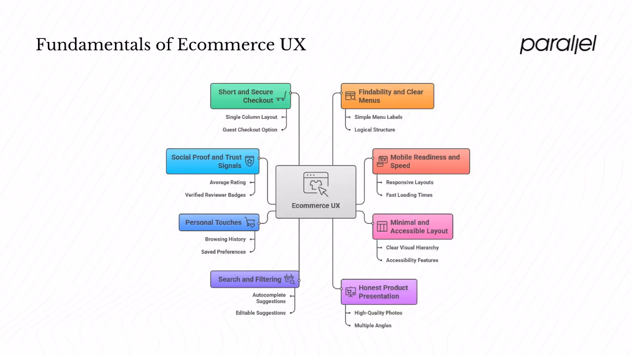
1) Findability and clear menus
Shopping starts with finding the right product. Baymard’s 2024 benchmark shows that 76% of sites have poor home and category structures. Common mistakes include confusing hierarchies and overcategorization. Keep menu labels simple and use a logical structure. Allow people to jump between categories and always provide a search bar. Use filters for attributes like size or brand instead of splitting the catalog into dozens of subgroups.
2) Mobile readiness and speed
Half of web traffic now comes from mobile devices. Users are five times more likely to abandon a task if a site isn’t mobile friendly, and 40% leave if pages take more than three seconds to load. Prioritize responsive layouts, compress images and defer non‑essential scripts. On smaller screens, touch targets should have room; Baymard found that two‑thirds of mobile sites place buttons too close together.
3) Minimal and accessible layout
Clutter distracts. Use a clear visual hierarchy: large fonts for headings, modest body text and adequate spacing. Limit pop‑ups and auto‑playing videos. Provide alt text for images and maintain good contrast. A clean layout not only looks better but also loads faster and supports assistive technologies.
4) Honest product presentation
Users rely on product pages to decide whether to buy. Nielsen Norman Group states that pages should answer questions, enable comparisons, show reviews and ease the transition to purchase. High‑quality photos, multiple angles and short videos set accurate expectations. Show variations like color and size clearly. Poor pages cause buyers to either leave or choose the wrong item.
5) Search and filtering
A good search tool feels like a shortcut. Most retailers offer autocomplete suggestions, yet 27% implement it poorly and more than half fail to let users edit the selected suggestion. Limit the number of suggestions, let the suggested text be editable and support navigation with arrow or Tab keys. Filters should be easy to apply and remove, with visible indicators. Group options logically and avoid forcing people through endless category pages.
6) Personal touches
Customization can increase relevance and satisfaction. A recent survey from an industry news site shows that 39% of consumers expect personalized shopping. Nearly half of merchants are investing in personalization technology. Simple tactics include showing items based on browsing history, offering recently viewed products and allowing customers to save their preferences. Use data responsibly and provide clear controls for users to adjust or opt out.
7) Social proof and trust signals
Reviews and badges calm uncertainty. Shoppers use feedback from other buyers to evaluate quality and fit. Show an average rating, allow filtering by rating and show both positive and negative comments. Verified reviewer badges and context about reviewers (such as age or intended use) add credibility. In addition to reviews, display security icons, clear return policies and contact information.
8) Short and secure checkout
Checkout is often the breaking point. Baymard found that the average U.S. checkout requires 23.48 data fields and that sites could remove up to 60% of them. More fields mean more friction. Keep the layout single column, group related details and ask only for essential information. Provide a guest checkout option and allow account creation after purchase. Difficult checkouts drive 17% of shoppers away, while 24% leave when forced to create an account. A streamlined process raises conversion considerably.
9) Multiple payment options
People want choice when paying. Nine percent of shoppers abandon their cart because their preferred payment isn’t available. Offer major cards and popular wallets like Apple Pay or PayPal. For higher‑priced items, installment plans or “pay later” services can reduce hesitation. Show accepted payment logos early so buyers aren’t surprised at the end.
10) Post‑purchase care
Account and self‑service features affect repeat business. Baymard’s 2025 research shows that 73% of desktop sites and 66% of mobile sites perform poorly on account dashboards and self‑service. Many companies hide order history, make returns hard or scatter information across multiple pages. Provide a clear dashboard with recent orders, tracking links, saved addresses and payment methods. Make returns simple with printable labels or QR codes and pre‑filled details. Let customers edit their information and preferences without hunting through menus.
Evidence‑based best practices

1) Home and categories
Simplify your taxonomy. Limit category depth, use plain names and avoid burying popular items. Keep promotional banners minimal and ensure that search and filters remain visible. Remove unnecessary sign‑up boxes on the homepage; nearly 59% of sites use aggressive pop‑ups that frustrate users.
2) Product pages
Cover the basics: descriptive name, price, availability and clear variations. Provide multiple photos and context shots. Offer comparison tables for technical products. Show reviews prominently and let users sort or filter them. Confirm items added to the cart with a clear message.
3) Search and filters
Keep autocomplete lists concise and allow users to modify suggestions. Show applied filters and make them easy to remove. Use synonyms and handle typos so that searches return relevant results.
4) Checkout design
Reduce the number of fields; ask only for what’s needed. Use a single column and clear labels. Offer guest checkout and encourage account creation after the purchase. Provide helpful error messages and support browser autofill. Display a progress indicator so users know how many steps remain.
5) Accounts and self‑service
Make account areas clear and helpful. Show recent orders, tracking details and saved items in one place. Provide easy options to change personal information, manage subscriptions and start returns. Communicate proactively about shipments or delays.
Strategy and process
Great ecommerce user experience comes from understanding users and iterating over time. Start with research: watch session replays, analyze analytics and talk to customers. Use benchmarks from Baymard and Nielsen Norman Group to compare your site against others. Focus first on issues that block purchases, such as slow pages, confusing categories and long checkouts. Then tackle enhancements like better personalization or advanced filtering.
Work collaboratively across product, design and engineering. Share findings openly and set clear success metrics. Usability testing, both moderated and unmoderated, reveals how people actually use your site. Pair these insights with experiments—A/B tests, prototypes—and measure their impact. Improvements are rarely one‑time; continuous monitoring and iteration keep your ecommerce user experience in line with evolving expectations.
Bridging strategy and design
Guidelines provide a starting point, but real progress happens when product, design and engineering work together. Too often design is seen as decoration or, conversely, blamed for every problem. In practice, strong decisions come from balancing product goals, user needs and technical constraints. Start with a clear idea of the value you want to deliver and prioritise work that helps customers buy. Early wins often come from small changes: grouping items, clarifying calls to action or removing a step from the checkout. We ask: does this change make it easier for someone to find and buy what they need? If yes, it belongs on the roadmap.
Standards from Baymard or Nielsen Norman Group help you avoid common pitfalls and provide a shared language for discussing trade‑offs. Use them to audit major flows such as search or checkout and score them against best practices. This exposes hidden pain points. Break gaps into small experiments and devote resources to the changes that matter. Good design is not about adding features but about making choices that serve both the business and the customer. By combining collaboration, research and feedback, you lay the foundation for a strong ecommerce user experience.
Community insights
Useful advice often comes from practitioners who have faced similar problems. Web communities such as Reddit feature long threads where founders share experiences with Baymard checklists and other tools. Commenters say these lists feel more current than some reports and offer a clear set of steps to follow. In our own work we see this echoed: people value concrete examples over vague directives. A checklist is a starting point rather than a substitute for understanding your customers.
Experience with early SaaS products reminds us to be humble. Sometimes a novel feature seems appealing but confuses users. Paying attention to feedback and observing how people respond helps you avoid repeating mistakes and sparks ideas you may not have considered. Community wisdom reinforces the idea that good design is iterative and grounded in practice.
Practical tips at a glance
Closing thoughts
A well‑designed ecommerce user experience is not about polished visuals alone; it’s about meeting people’s needs quickly and confidently. Research shows that small improvements—faster pages, simpler checkouts, clearer information—can significantly raise conversion and recover billions in lost sales. On the flip side, one bad experience is enough for 32% of shoppers to leave a brand they love. For founders and product leaders, the lesson is clear: invest in understanding your customers, fix the basics and iterate thoughtfully. Over time, your ecommerce user experience becomes a competitive advantage that drives both acquisition and loyalty.
FAQ
1) What does user experience mean for a web store?
It describes how people feel and behave when interacting with a store. It spans visual design, how easy it is to find items, how fast pages respond, how trustworthy the checkout feels and whether personal touches make the process relevant.
2) What is ecommerce UX?
It refers to the specific design of a commercial site built for buying and selling. It covers menus, images, search, performance, checkout, security and personalization. A thoughtful ecommerce user experience removes friction and builds confidence.
3) What are the stages of user experience?
A common model uses five tiers: functionality (it works), usability (it’s easy to use), desirability (it’s enjoyable), findability (content is easy to locate) and credibility (it’s trustworthy).
4) What is an e‑commerce experience?
It’s the broader path a shopper takes when buying over the internet, including discovery, product evaluation, payment and post‑purchase support.

check out these related blogs