How to Build a UX Portfolio: Guide (2026)
Learn how to build a compelling UX portfolio that showcases your skills, projects, and design process.
Not so long ago, I sat in a hiring room watching a product lead scroll through dozens of UX portfolios. Each looked slick at first glance, but most were forgotten within seconds. Then one stood out. It told a genuine story, explained the why behind each decision and, by the end, we knew exactly how that designer could help our company. This guide aims to help you do the same.
A portfolio is often the single strongest signal of a UX designer’s capability. For founders and product managers at young startups, design leads looking for strong hires, and peers in our field, knowing how to build a UX portfolio that communicates real value is a must. You’ll learn how to target your audience, structure your site, tell your story, choose the right platform and avoid common mistakes. Along the way I’ll share insights from recent research, stats from 2024–2025 and patterns from our work with AI/SaaS teams.
Foundations — mindset and targeting
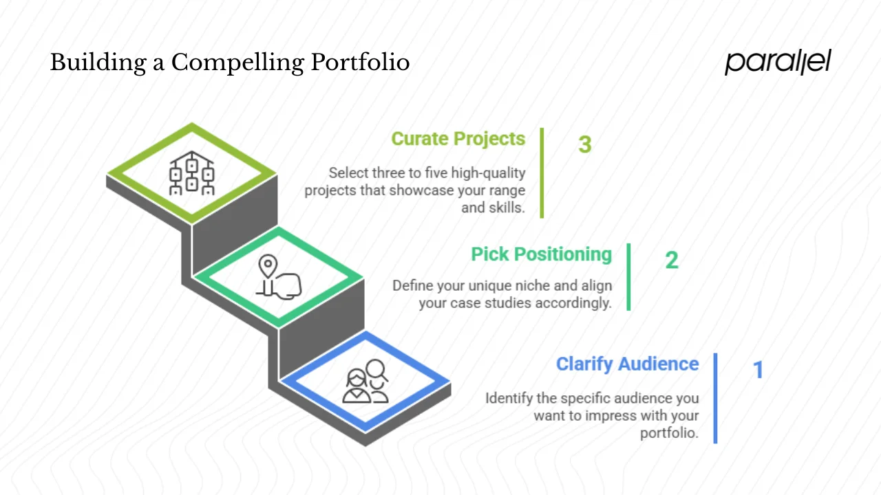
Clarify your audience and goal
Before writing a single line of HTML or signing up for a platform, decide who you want to impress. Are you recruiting designers, evaluating peers, attracting clients, or mentoring newcomers? Your portfolio isn’t for everyone. Picture the person at the other end: a founder who cares about metrics and impact, a design director looking for problem‑solving skills, or a recruiter scanning quickly for teamwork and communication. Recent industry reports note that hiring managers often spend around three minutes reviewing a portfolio, so you need to make every second count.
Pick your positioning / niche
A clear point of view makes you memorable. Decide whether you’re a generalist or a specialist. Maybe you excel at mobile product strategy, service design for complex systems, or deep user research. Align your case studies with the roles you want next. Personal branding isn’t about logos or taglines; it’s the consistent message that threads through your work and bio. If you want to work with AI‑driven SaaS, for example, show projects where you simplified onboarding, reduced time‑to‑value or improved a key metric for such products.
How many projects is enough?
Hiring managers don’t need to see everything you’ve ever touched. Many trusted design educators advise featuring three to five case studies rather than a long list of shallow projects. Curate a small set that shows range: one or two hero projects that cover the full process end‑to‑end, plus perhaps a shorter case showing experimentation or a side project. Quality matters more than quantity. An extra project is only worth adding if it reveals a different skill or context.
Structuring the portfolio and layout
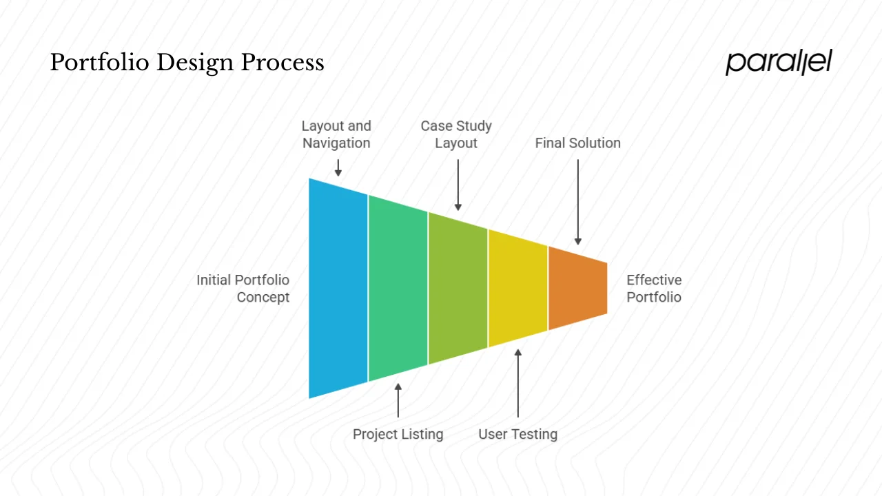
Overall site layout and navigation
Think of your portfolio as a product. Make it intuitive: a landing page, an about page, a project overview, detailed case studies and a way to reach you. Use cards or tiles for your projects so viewers can scan quickly. Recruiters will give you seconds, not minutes, so guide their eyes with a clear hierarchy and generous white space. And make it responsive. With mobile traffic accounting for most site visits, a site that isn’t mobile‑friendly will lose users — 74 % of people are more likely to return to mobile‑friendly sites and mobile users are five times more likely to abandon a task if the site isn’t optimized.
Project listing (overview) page
Your overview page should show thumbnails, titles and one‑line summaries. Each card should link to the full case study. Some designers add a hover state or teaser snippet that hints at the problem solved or the metric improved. Make sure the summary conveys the core problem and outcome rather than just a feature list.
Case study layout
Consistency helps busy viewers. Each case study can follow a simple narrative structure inspired by industry best practices:
- Project snapshot – name, role, timeline, team and tools. Summarize the problem and your solution in one line.
- Context & problem – describe the business or user challenge, constraints, goals and target users.
- Research & insights – share methods (interviews, surveys, competitive benchmarking) and the key findings that shaped your direction.
- Ideation & concepting – show early sketches, information architecture diagrams, design alternatives and your rationale.
- Wireframes & prototypes – illustrate the evolution from low‑fidelity wireframes to high‑fidelity prototypes; include responsive variants and interactive prototypes.
- User testing & iteration – describe your testing methodology, feedback gathered and the iterative changes you made.
- Final solution & impact – showcase polished screens, micro‑interactions, before/after comparisons and the metrics achieved. When relevant, tie results back to broader business outcomes; Forrester research shows that good UX can raise conversion rates by up to 400 % and strong UI can drive up to 200 % conversion improvement.
- Reflection & learnings – share challenges, trade‑offs and what you’d do differently next time.
Readers appreciate honesty about constraints and mistakes. As the LogRocket article notes, highlighting challenges shows resilience and helps recruiters understand how you handle real‑world pressures.
Core content elements — what your portfolio must show
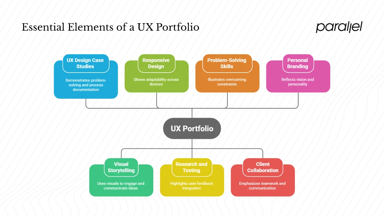
1) UX design case studies & process documentation
A portfolio is not just a gallery of pretty screens. Show how you think. Document the problem, context, constraints, decisions and outcomes. If you overcame limited budgets or tight deadlines, explain the trade‑offs you made and why. Recounting the problem‑solving path is more valuable than showcasing a final interface alone. According to the UX Design Institute, each case study should clearly outline your process, methodologies, findings and impact. This signals to leaders that you can replicate that process on their problems.
2) Visual storytelling and presentation
Humans are drawn to stories. Structure each case with a clear beginning, middle and end. Set up the conflict (the challenge), build tension by sharing research insights and design explorations, and resolve with the final solution and measurable results. Use diagrams, user journeys and annotated screenshots to make complex ideas easy to digest. Keep colors, typography and spacing consistent across case studies to reinforce your personal brand. Provide visual anchors so readers never feel lost.
3) Responsive design examples and prototyping
Given the dominance of mobile, show how your designs work across devices. Include screenshots of mobile, tablet and desktop versions. Embed or link to clickable prototypes so viewers can experience the interactions. Highlight micro‑interactions or transitions that matter. If you worked on animation or motion, explain your rationale and how it improved engagement.
4) Research, user testing and feedback incorporation
Explain your research methods and how insights informed design decisions. If you used interviews, surveys or competitor analysis, show examples and share quotes (anonymized if needed). Describe how you conducted usability tests — moderated or remote — and how findings led to iterations. Many junior portfolios fail because they skip the testing phase entirely; including this signals maturity.
5) Demonstrating problem‑solving skills
Don’t shy away from constraints. Share time, technical or business limitations and how you navigated them. For example, a startup might push for a feature‑rich onboarding, but your research showed that a simpler flow reduced friction and improved activation. Explain the trade‑offs you made and how you resolved ambiguity. Hiring leaders value designers who can work through uncertainty.
6) Client collaboration and stakeholder communication
UX work happens in teams. Explain your role alongside product managers, engineers and clients. Show artifacts such as stakeholder maps, meeting summaries or alignment documents. Describe how you built consensus, handled conflicting feedback or presented findings. If you worked with engineers to refine interactions, say so. Collaboration is a key differentiator for early‑stage startups where communication speed matters.
7) Personal branding and about / narrative
Your about page should give a sense of your vision and personality. Share why you moved into UX and what motivates you. Keep it concise; two or three short paragraphs are enough. Maintain a consistent visual identity across your site — colors, typography and tone. Consider adding a blog to showcase thought leadership. This is optional but can demonstrate your ability to articulate processes and teach others.
Choosing the right platform and technical decisions
Digital portfolio platforms
There are many tools for hosting a portfolio. The best choice depends on your priorities:
- Webflow — gives you full creative control with responsive design tools. It merges design and development, letting you craft layouts and interactions visually without hand‑offs. It offers scalable hosting and fast load times because the code is lean. However, it has a steep learning curve and lacks live chat support.
- Squarespace — prioritizes ease of use. Its drag‑and‑drop interface and beautiful templates let beginners build a site quickly. It’s great for those who want a polished look without much setup. The trade‑off is less flexibility and customization compared to Webflow.
- Wix and Carrd — good for simple sites; Wix offers many templates but can produce bloated code, which may slow load times. Carrd is lightweight but limited to single‑page sites.
- WordPress — highly customizable with plug‑ins and themes, but requires more maintenance and may be overkill for a personal portfolio.
- Designer‑centric tools — platforms like UXfol.io, Behance and Dribbble are popular for hosting case studies and visuals. While they’re good for exposure, owning your domain signals professionalism and gives you full control over design and SEO.
Performance, accessibility and responsiveness
Fast load times and accessible design matter. Research shows that websites loading in one second have three times higher conversion rates than those loading in five seconds. Use optimized images, compress assets and avoid unnecessary scripts. For accessibility, follow WCAG 2.1 guidelines: maintain a contrast ratio of at least 4.5:1 for normal text and 3:1 for large text; use alt text for images; structure content with semantic HTML. Accessibility isn’t just a nice‑to‑have — about 2.2 billion people have visual impairments worldwide, and around 8 % of men and 0.5 % of women are colorblind. In April 2024, the U.S. Department of Justice updated Title II of the ADA, requiring government digital services to comply with WCAG 2.1 standards by 2026–27, and a 2023 audit found that 96.3 % of the top million homepages failed to meet accessibility standards. Making your site accessible improves usability for everyone and reduces legal risk.
SEO and discoverability
A great portfolio is useless if no one finds it. Use clean, descriptive URLs and titles. Add meta descriptions to each page; search engines use them in snippets. Choose an informative meta description for your homepage that includes the phrase how to build a ux portfolio in a natural way. Use meaningful alt text for images, not just file names, to improve search indexing. Consider adding a blog or writing articles on design topics to attract traffic; each post can link back to your case studies.
Maintenance and updates over time
Your portfolio is a living document. Schedule time every three to six months to review and refresh it. Retire older work if it no longer represents your abilities. Add new case studies and update metrics as projects evolve. Use analytics tools to see which pages draw traffic and where visitors drop off. This data helps you refine content and navigation. One of our SaaS clients added analytics to their portfolio and found that visitors rarely scrolled through a long case study; they shortened it and added a quick summary at the top, which improved engagement.
How founders, PMs and design leads should read a portfolio
Many portfolio guides focus on designers, but readers matter too. Here are some tips for non‑designers evaluating a UX portfolio:
- Skim strategically: start with the hero project or whichever case study most closely matches your problem. Look for the summary and the metrics achieved.
- Look for evidence of user‑centered thinking: check whether the designer identifies the real problem, conducts research and shows empathy for users.
- Check collaboration and communication: does the case study mention working with product managers, engineers or clients? Does it show how the designer incorporated feedback and gained buy‑in?
- Demand measurable impact: good design solves business problems. Did the work improve retention, reduce support calls or increase conversion? The Hypersense article cites cases where UX changes increased conversions by 52 % or more; your candidate should connect their work to outcomes.
- Watch for red flags: portfolios that only show polished screens without process, use stock templates, lack any evidence of testing, or omit constraints may signal inexperience. If everything went smoothly in a case study, ask what went wrong — something always does.
Common pitfalls and mistakes to avoid
Even talented designers make errors when assembling a portfolio. Avoid these traps:
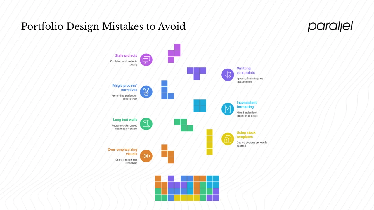
- Over‑emphasizing visuals: beautiful screens alone don’t demonstrate thinking. Always pair visuals with context and reasoning.
- Using stock screenshots or templates: hiring managers can spot copied designs. Show original work and credit collaborators.
- Long text walls: break up your narrative with headings, bullet points and images. Recruiters skim. Provide scannable content and link to deeper details for those who want them.
- Inconsistent formatting: use consistent typography, colors and layout across projects. Mixed styles suggest a lack of attention to detail.
- “Magic process” narratives: pretending everything was perfect erodes trust. Be transparent about challenges, trade‑offs and iterations.
- Omitting constraints: ignoring deadlines, budgets or technical limits implies you’ve never faced them. Show how you worked within real boundaries.
- Stale projects: remove outdated work that no longer reflects your skills. Regularly update your site to reflect your current thinking and capabilities.
Step‑by‑step roadmap to build your UX portfolio
A practical roadmap makes the task manageable. You can adapt this plan to your timeline.
| Phase | Actions | Deliverables |
|---|---|---|
| Phase 1: Audit & planning | Define your positioning and audience. Choose three to five projects to feature. Identify gaps where you need to gather artifacts or metrics. | Project list, audience brief |
| Phase 2: Research & sketching | Conduct or revisit user research. Sketch wireframes and information architecture. Document personas, journey maps and sketches. | Personas, sketch explorations |
| Phase 3: Design & prototyping | Create low- to high-fidelity prototypes. Test interactions and responsive behavior. Iterate based on feedback. | Interactive prototype, high-fidelity mockups |
| Phase 4: Case study write-up | Write the narrative for each case study. Include context, research methods, design decisions, iterations and impact. Use the structure outlined in Section 2.3. | Full case study drafts |
| Phase 5: Build & publish | Choose a platform (Webflow, Squarespace, etc.). Build your site, ensuring performance and accessibility. Optimize SEO. | Live portfolio site |
| Phase 6: Review & iterate | Solicit feedback from peers, mentors and potential viewers. Adjust content, design and navigation. Plan future updates every few months. | Revised versions over time |
A 30‑day challenge example
If you want to move quickly, try this month‑long plan:
- Week 1: Select projects, gather research and artifacts, outline your narrative.
- Week 2: Write your case study drafts and create wireframes for your site.
- Week 3: Build prototypes and test them with friends or colleagues. Collect feedback and refine.
- Week 4: Choose a hosting platform, assemble your pages, optimize for speed and accessibility, and publish. Then share your site for more feedback and prepare to iterate.
Conclusion
A strong portfolio combines thoughtful storytelling, process transparency and measurable impact. Good design isn’t just about pretty pixels; it’s about solving real problems. In summary, you should show your full design process, from context and research through iteration to outcomes; present your work clearly and responsively; keep accessibility, performance and SEO in mind; and update your site regularly.
Don’t overthink your first step: pick one project and start documenting it today. As you refine your how to build a UX portfolio strategy, you’ll gain clarity and momentum. Iteration is part of the process — solicit feedback, revise and improve over time.
If you’re a founder or product lead, share this guide with your design team and use it as a baseline when evaluating portfolios. If you’re a peer looking for inspiration, let it encourage you to raise your own bar. And if you’re just beginning your journey into UX, take heart: many people have transitioned into this field later in life and thrived. What matters most is your dedication to understanding users and creating thoughtful solutions.
Frequently asked questions
1) How should I structure a UX portfolio?
A good structure starts with a concise homepage, a directory of projects and a detailed case study format. Each case study should begin with a snapshot (project name, role, timeline, tools and a one‑sentence summary), followed by context and problem definition, research insights, design concepts, prototypes, testing and iteration, final outcome and reflection. Finish with an about page and a way to reach you.
2) What should a UX design portfolio contain?
Aim for three to five case studies. Include process artifacts such as sketches, wireframes, prototypes and research notes. Show evidence of user research and testing. Provide metrics or outcomes (e.g., increased conversion or reduced support calls). Add a short bio that reveals your vision and personality, and include responsive design examples. A blog or side projects can show thought leadership but are optional.
3) What are the four C’s of UX design?
Different sources outline different sets of C’s. One common variant focuses on Clarity, Consistency, Conversion and Content. Clarity means the interface is easy to understand. Consistency involves uniform use of icons, colors and patterns across a product. Conversion refers to designing experiences that drive users to complete key actions, such as sign‑ups or purchases. Content is about providing relevant and meaningful information and presenting it in a digestible way. Another approach emphasises Consistency, Continuity, Context and Complementary: maintain a familiar brand across platforms, allow users to pick up where they left off, consider the context of each platform and ensure each platform offers something unique. Both frameworks remind us to focus on clarity, coherence and user needs.
4) Is 30 too late to become a UX designer?
No. Many successful designers transitioned into UX in their thirties or later. UX is a field grounded in empathy, problem‑solving and continuous learning. As long as you can demonstrate these skills through thoughtful case studies, age is not a barrier. Our own team at Parallel has welcomed people from product management, engineering and even finance who switched careers in their thirties and forties. The diversity of experience can strengthen your empathy and strategic thinking.




.avif)


