User engagement isn’t a vanity metric. As founders and product leaders quickly find out, traffic by itself does little to create durable companies. What matters is whether visitors care enough to scroll, share, come back, and eventually support your business. If you’re wondering how to increase user engagement on a website, this guide shares what we’ve learned working with early‑stage teams and points to data from 2024–2025 to help ground those lessons in evidence.
According to a conversion rate optimization study, pages that load in one second have a conversion rate three times higher than pages that take five seconds. In other words, engagement goes hand‑in‑hand with technical performance. Likewise, marketing researchers say personalization increases revenue by 40% and 63% of marketers have seen higher conversion rates when they customize experiences. With that context, let’s dig into what user engagement really means, why it matters for startups, and how to improve it.
User Engagement: More Than Clicks
It’s tempting to reduce engagement to click‑through rates. In practice, engagement is any meaningful interaction that signals attention, curiosity or commitment. For example:
- Depth of interaction: Scroll depth, hovering over elements, playing a video, reading multiple articles.
- Feedback and participation: Comments, reviews, star ratings or bug reports.
- Repeat visits: Returning sessions or time between visits.
- Social signals: Shares, mentions or referrals.
- Micro‑conversions: Signing up for a newsletter, saving a favourite product, adding to cart.
These signals give you a sense of whether the user experience and content are resonating. They also predict long‑term outcomes. Engaged visitors convert better, retain longer, and are more likely to tell others about you. For early‑stage teams, measuring engagement is a leading indicator of retention and monetization.
What Startups Stand to Gain
When you focus on engagement, you’re not just chasing numbers. You’re ensuring that every visitor understands and values what you offer. This matters because engaged users are the ones who stick around long enough to discover the core value of your product. Without that, viral loops and revenue models never materialize. We’ve seen scrappy teams double their paid conversions simply by reducing friction in the onboarding flow and introducing personalized onboarding prompts. At a stage when growth budgets are thin, improving engagement is often the most cost‑effective lever.
We’ll unpack actionable ideas across five areas: understanding metrics and setting priorities, building a strong user experience foundation, crafting content and personalization, designing feedback loops and incentives, and iterating through experiments. Feel free to jump to the section that matches your current challenge, but each builds on the previous one.
What to Measure & Prioritize?
Key Engagement Metrics
Before tackling how to increase user engagement on a website, you need to know what to watch. Common metrics include:
- Activity counts: Number of clicks, taps, scrolls or interactions per session. High counts can indicate interest but also frustration if users click around because they’re lost.
- Session consumption: Pages per session, scroll depth and time on page. These show whether visitors explore or bounce quickly.
- Bounce and exit rates: The percentage of sessions where users leave after a single page or exit at specific steps. Benchmarks vary by industry; for instance, a conversion research firm lists average bounce rates ranging from 65.52% for food and drink to 44.50% for real estate. Lower bounce rates typically mean more engaged visitors.
- Micro‑conversions: Newsletter sign‑ups, adding to cart, account creation, or leaving a comment. These small steps often correlate with later revenue.
- Qualitative feedback: Ratings, satisfaction scores or free‑text comments can reveal motivations behind the numbers.
Remember that engagement isn’t a single number. Segment metrics by new vs. returning users, traffic sources (organic search, paid ads, referrals), device type and user cohorts. A table summarizing bounce rates by channel is revealing: display ads have a 56.50% bounce rate while email traffic averages 35.20%. Such segmentation helps you find where people are dropping off and where they’re most engaged.
Setting Expectations and Benchmarks
For early‑stage products, there’s no universal benchmark for what’s “good enough.” Instead, establish a north‑star metric tied to your goal (for example, successful sign‑ups, feature activation or paid conversions) and set incremental targets. Use industry benchmarks as guardrails: service sites might accept bounce rates around 50%, while content sites expect higher rates due to one‑and‑done reading. The key is to improve your own baseline rather than chase arbitrary averages.
Tools and Methods for Tracking Engagement
To capture the signals above, you’ll need both quantitative and qualitative tools:
- Analytics platforms: Google Analytics 4, Mixpanel or Amplitude track sessions, flows and cohorts. They let you slice metrics by segment and create funnels.
- Experience intelligence tools: Heatmaps and scroll maps show where users click and how far they scroll. Session recordings reveal confusion points.
- Feedback widgets: On‑page surveys, NPS pop‑ups and feedback buttons help capture immediate reactions. Use open‑ended questions to understand why something isn’t working.
Establish a cadence for reviewing metrics and discussing them with your team. Encourage designers, marketers and engineers to look at the same dashboards so everyone works from shared data.
UX & Technical Hygiene — The Baseline Musts
You can’t ask how to increase user engagement on a website without first removing friction. The basics — responsive design, performance, navigation, clear calls‑to‑action — may sound unglamorous, but they’re the foundation.
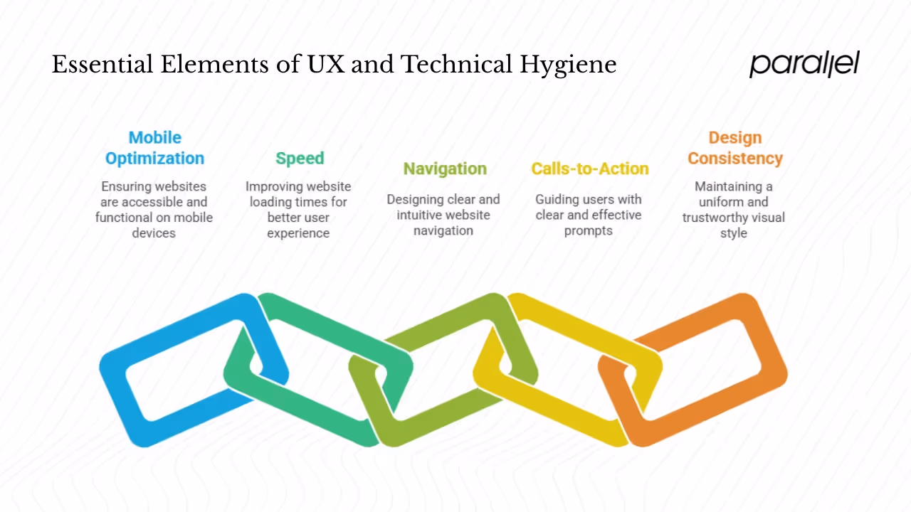
1) Mobile Optimization Matters
More than half of global web traffic now originates from mobile devices (multiple industry reports put this figure above 60%). If your site isn’t mobile‑friendly, you’re blocking a majority of potential users. Responsive design means not just scaling down layouts but rethinking touch targets, typography and interactions. Use breakpoints to adapt your design; avoid long menus that require precise tapping.
Common pitfalls include hidden navigation, overlapping elements and unresponsive buttons. Test on actual devices rather than just browser emulators. Tools like BrowserStack let you see how your site behaves across devices and browsers. A good habit is to build with a mobile‑first mindset and only then adjust for larger screens.
2) Speed Is a Feature
Slow pages drive users away. That earlier study comparing one‑second and five‑second load times showed a 3× conversion difference for B2B sites and 2.5× difference for e‑commerce. Speed influences not just conversions but also search ranking and user satisfaction. Core Web Vitals — Largest Contentful Paint (LCP), First Input Delay (FID) and Cumulative Layout Shift (CLS) — offer a practical framework for assessing performance.
To improve load times:
- Compress images: Serve appropriately sized images and use modern formats like WebP.
- Enable caching: Store static resources locally so returning visitors load pages faster.
- Minify code: Remove unused CSS and JavaScript. Splitting scripts and deferring non‑essential code helps first paint.
- Lazy load media: Load images or video only when they enter the viewport.
Monitor performance using Google’s PageSpeed Insights or builtin tools like web.dev. Even small improvements such as reducing a hero image from 2MB to 200KB can yield noticeable gains.
3) Navigation and Information Architecture
Clear navigation reduces friction and encourages exploration. Keep your primary navigation visible and descriptive — users shouldn’t guess where to find pricing or documentation. Breadcrumbs help users backtrack. For content‑heavy sites, provide a search function and filters to narrow results.
Link related content through “You may also like” suggestions. Internal linking keeps visitors on your site, boosts SEO and surfaces older pieces of value. At the same time, avoid forcing loops; respect the visitor’s ability to choose their next step.
4) Clear Calls‑to‑Action (CTAs)
A call‑to‑action tells users what to do next — start a trial, download an e‑book, subscribe. Good CTAs are specific (“Start your free trial,” “Get the weekly newsletter”) and visible without being pushy. Test different placements: sometimes a button at the top of the page works, while in long articles a mid‑page or end‑of‑page prompt catches more engaged readers.
Contrast matters: choose colors that stand out from your background. Pair the CTA with copy that conveys value (“Create your project in minutes”) rather than generic language. Consider both button CTAs and text links; the latter can feel less intrusive in editorial content. In our projects, a simple text link at the halfway point increased newsletter sign‑ups by 15% because it met readers when they were most invested.
5) Design Consistency and Inclusive Practices
Visual coherence builds trust. Use a consistent typeface, color palette and spacing. Micro‑animations — like subtle button feedback or progress indicators — can guide users without distracting them. Maintain adequate white space so pages feel breathable rather than cluttered.
Inclusive design isn’t optional. Ensure sufficient contrast for text, add alt attributes to images, provide keyboard navigation and avoid color‑only distinctions. Consider screen reader users and those with motion sensitivities. Tools like WAVE or Axe can audit accessibility and highlight issues.
Content & Personalization Strategies
Once the technical foundation is solid, content is your next lever for increasing engagement. A great user experience gets people to the door; content keeps them inside.
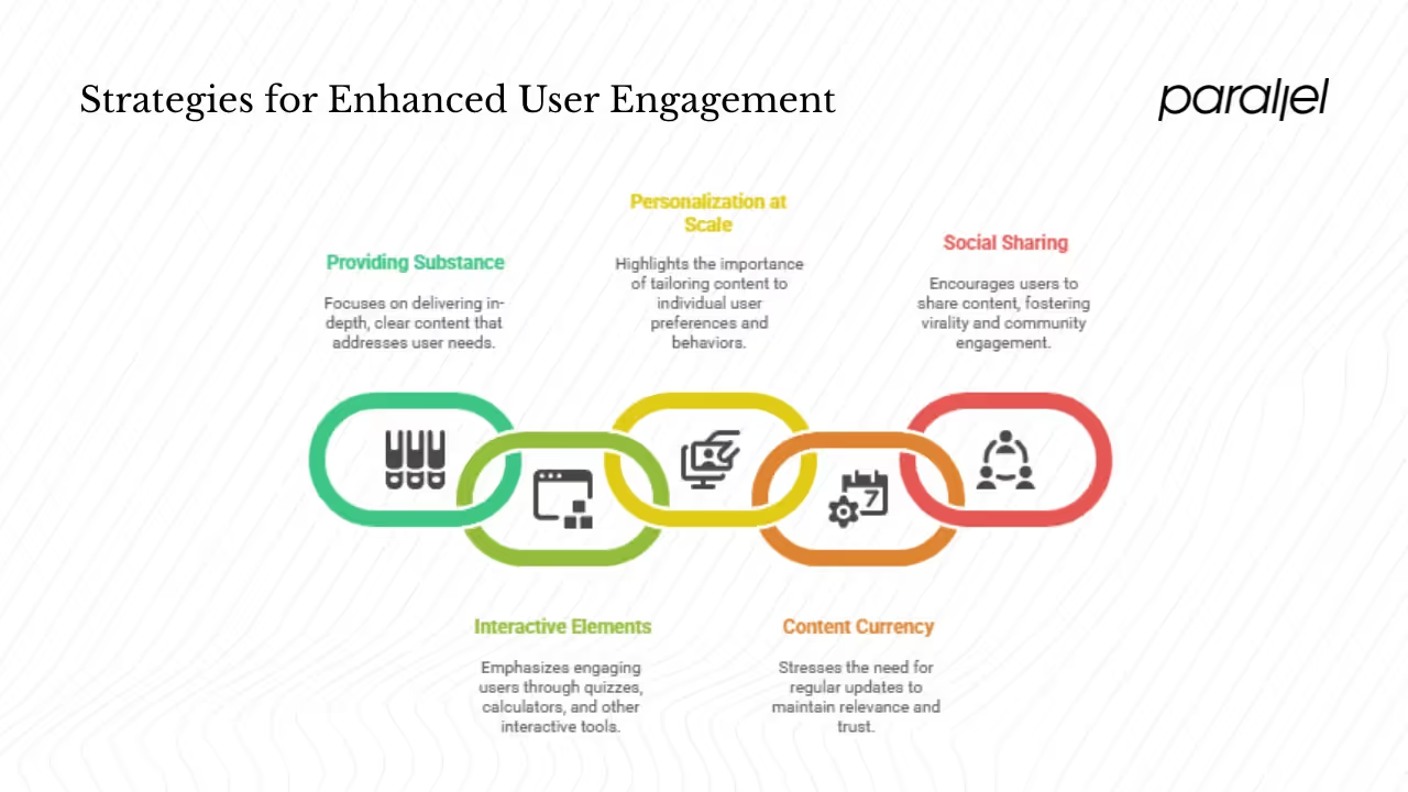
1) Provide Substance, Not Fluff
Visitors arrive with questions or problems. Your content should help them solve those issues. Whether you write blog posts, guides, tutorials or case studies, aim for depth and clarity rather than generic marketing copy. Keep paragraphs short (two to four sentences) and use headings to make scanning easy.
Diversify formats: text, infographics, short videos or podcasts. People absorb information differently, and offering options can increase time on site. If you produce evergreen content, refresh it periodically to keep data current. Stale articles hurt your credibility.
2) Interactive Elements
Interactivity invites participation. Consider quizzes, calculators, polls or mini‑tools that help users apply what they’ve learned. For a SaaS product, an ROI calculator can illustrate value. For a content site, a quiz can help users gauge their knowledge level and point them to appropriate resources. Interactive content tends to be shared more often and encourages repeat visits.
3) Personalization at Scale
Personalization is not just for big companies. Modern tools let you show different messages, features or content based on user attributes or behaviour. The statistics support its power: a report compiled from multiple studies found that personalization increases revenue by 40% and 63% of marketers saw higher conversion rates when customizing experiences. Even simple segmentation — such as highlighting different features for developers versus designers — can make users feel understood.
Implement personalization thoughtfully:
- Start with broad segments (new vs. returning, logged in vs. anonymous).
- Use behavioural triggers (e.g., showing an onboarding checklist after the second visit).
- Avoid the “creepy” line: don’t expose data the user didn’t knowingly share.
Remember to test personalized experiences; what works for one cohort may confuse another. And always offer an escape route, such as a “See all options” link.
4) Keep Content Current and Cadenced
Regular updates tell users your site is alive and cared for. Publish on a predictable cadence — whether weekly or monthly — so readers know when to return. For evergreen articles, add “last updated” dates and refresh statistics or examples. Content stagnation erodes trust and signals that the company isn’t investing in its product.
5) Facilitate Social Sharing and Virality
Make it easy for users to share posts, tools or products. Embed share buttons near headings or interactive elements. Encourage sharing by adding subtle prompts (“Share this with a teammate”) or by running referral programs. User‑generated content — testimonials, reviews, photos — can also increase trust and engagement. Feature real stories to show how others benefit from your product.
Feedback Loops, Incentives & Engagement Mechanisms
Encouraging interaction doesn’t end at the content. Engaged communities thrive on feedback, rewards and structured prompts. Here’s how to bring those elements together.
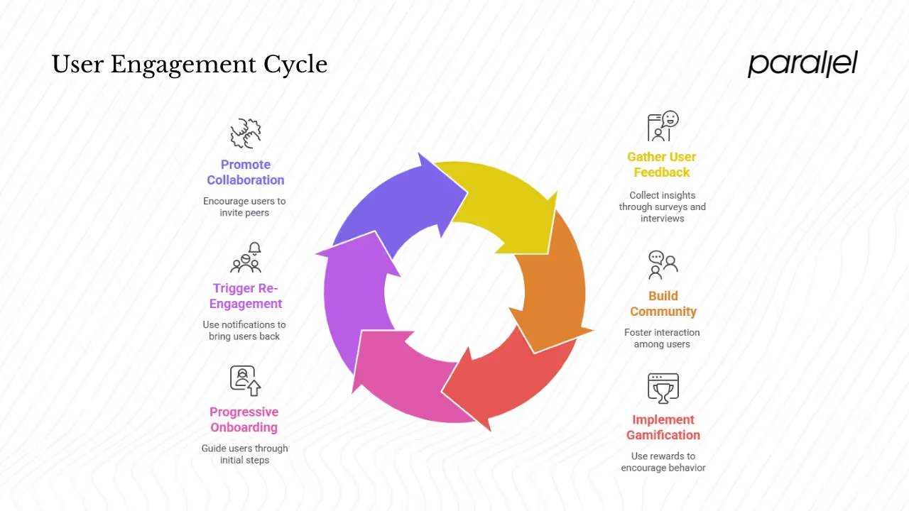
1) Capture the Voice of Your Users
Use feedback widgets within your app or site. Exit surveys can reveal why people leave. Net Promoter Score (NPS) pop‑ups gauge loyalty. Qualitative interviews — even ten minutes with a handful of users — often uncover more than analytics charts. Collate this feedback in a shared doc so your team can spot patterns.
2) Build Community and Social Proof
Foster a sense of belonging by giving users a place to talk to you and each other. Comment sections on articles, forums, Slack or Discord communities, and user groups help people share experiences and tips. Showing community activity signals to newcomers that the product is alive and supported. Leaderboards, badges or public stats can encourage friendly competition if they’re relevant to your product.
3) Gamification and Rewards
Gamification isn’t about gimmicks; it’s about making progress visible. Badges, points or streaks can encourage consistent behaviour. For example, awarding a badge after a user completes their first project encourages them to complete the second. Rewards can be intangible (recognition, levels) or tangible (discounts, access to premium features). Use them sparingly and tie them to genuine milestones so they motivate rather than annoy.
4) Progressive Onboarding and Nudges
Onboarding isn’t a one‑time event. Break it into digestible steps with tooltips, guided tours and checkpoints. Remind users of incomplete tasks with contextual prompts rather than generic emails. When building an automated nudge system, base triggers on user behaviour (e.g., send a reminder if a user hasn’t returned in three days but completed 70% of onboarding). Done right, these nudges help users succeed rather than simply add to their inbox.
5) Trigger‑Based Re‑Engagement
Push notifications, emails and retargeting messages can bring users back — but use them judiciously. Over‑communication leads to fatigue. Personalize messages based on what the user cares about. For example, if a visitor abandoned a cart, remind them about the specific items. If a user frequently reads product‑management articles, send them a weekly digest rather than a generic newsletter.
6) Promote Social Accountability and Collaboration
Encourage users to invite peers. In B2B products, features like shared workspaces or team invites help embed your product into the user’s workflow. Referral incentives — such as a free month of service for both the referrer and invitee — can create network effects. Collaboration features should make sense for your product; forcing them can backfire.
Testing, Iterating & Scaling Engagement Tactics
Getting engagement right is an ongoing process. Treat improvements as experiments rather than one‑off projects. Here’s a structured approach:
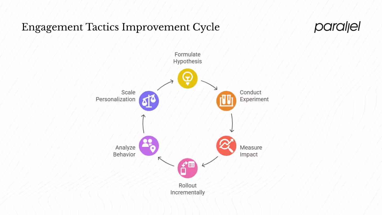
1) Hypothesis‑Driven Experiments
Instead of random tweaks, start with a hypothesis: “We believe that adding in‑line help text will reduce form abandonment by 20%.” Then design an A/B test or multivariate test to compare the change against the current experience. Use tools like Optimizely or VWO to run experiments without code deployments.
Prioritize experiments based on impact vs. effort. Early‑stage teams have limited resources, so focus on changes that promise meaningful gains. For example, rewriting headline copy might be low effort with high potential impact; building a complex recommendation engine is high effort and may not move the needle immediately.
2) Tracking Uplift and Attribution
After launching an engagement feature, measure its effect. Look at micro‑conversions, session duration and user retention before and after. Use cohort analysis to isolate the impact of a change. Attribution is tricky: multiple factors contribute to engagement. However, you can infer impact by analysing controlled experiments, holding other variables constant.
3) Incremental Rollout
Roll out new engagement features gradually. Feature flags and canary releases let you test with a small subset of users before full deployment. This approach reduces risk and allows you to gather feedback early. Pay attention to both quantitative metrics and qualitative responses during the rollout.
4) Learn from Behaviour Patterns
Heatmaps and session recordings reveal where users linger and where they drop off. Funnel analysis shows at which step most users abandon a flow. Path analysis lets you see common routes through your product. Use these insights to generate hypotheses for improvement.
5) Scale Personalization and Gamification Carefully
Personalization and gamification can boost engagement, but overdoing them makes the experience feel manipulated. Avoid trivial reward loops that offer badges for every click. Don’t show dynamic content that’s irrelevant or eerily specific. Keep novelty fresh by rotating interactive elements and removing outdated campaigns.
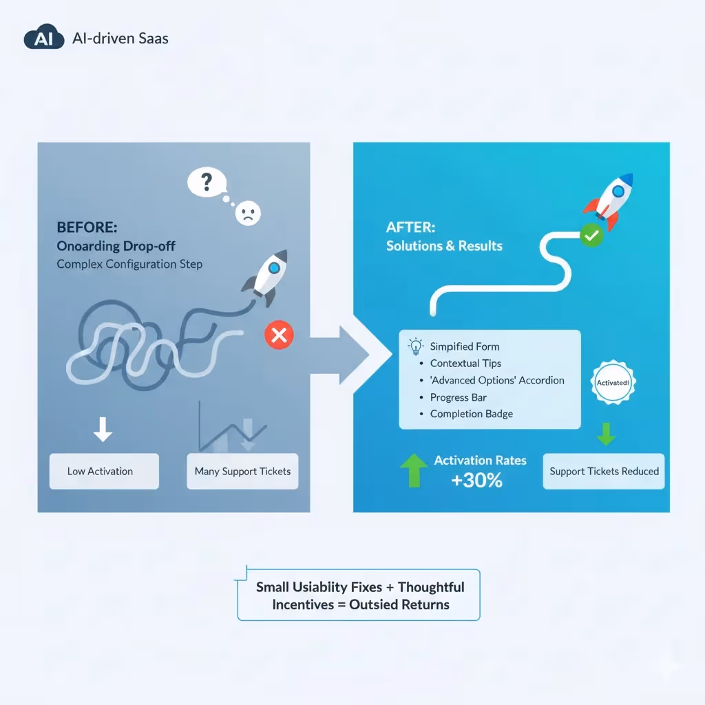
A Quick Example
One AI‑driven SaaS company we advised struggled with onboarding drop‑off. Users signed up but didn’t activate the core feature. By watching session recordings, we learned that many users hesitated at a complex configuration step. We simplified the form, added contextual tips and moved advanced settings under an “advanced options” accordion. We also introduced a progress bar and awarded a small badge when users completed onboarding. The result: activation rates increased by roughly 30% and support tickets decreased because users understood the process. This isn’t unique — small usability fixes combined with thoughtful incentives often yield outsized returns.
Challenges & Pitfalls to Watch Out For
- Over‑gamification: If every action yields a badge, rewards lose meaning. Reserve incentives for milestones that matter.
- Poor personalization: Irrelevant or overly invasive messages can alienate users. Ensure you’re using data responsibly and offering value.
- Performance trade‑offs: Fancy animations and heavy scripts can slow your site, hurting engagement. Always test performance after adding new features.
- Notification fatigue: Too many emails or push notifications lead users to tune out. Use frequency caps and allow opt‑outs.
- Vanity metrics: Time on site or pageviews may look good, but they don’t always reflect value. Focus on signals tied to your north‑star metric.
- Cross‑device consistency: Users switch between devices. Ensure progress saves across sessions and that mobile and desktop experiences are coherent.
Conclusion
Improving engagement isn’t about chasing hacks. It’s about creating experiences that respect users’ time, solve their problems and invite them back. You can increase engagement on your site by focusing on performance, clear navigation, meaningful content, thoughtful personalization, supportive feedback loops and continuous experimentation. The data is compelling: faster pages convert better, personalization drives more revenue, and understanding bounce rates by industry and channel helps set realistic goals.
If you’re wondering how to increase user engagement on a website, start small. Pick one tactic — perhaps improve page speed or add a feedback widget — and measure its effect. Iterate based on what you learn. Engagement is a long‑term play; incremental gains compound into retention, growth and revenue.
FAQ
1) How do you increase user engagement?
Focus on delivering value and reducing friction. Start by improving page speed and mobile responsiveness because faster pages convert better. Offer quality content, personalize experiences (which can increase revenue by 40%), and implement feedback loops. Use gamification sparingly and build community features to encourage repeat visits.
2) How to make a website more engaging?
Design clear navigation and CTAs, optimize for mobile, and ensure your pages load quickly. Provide interactive content like quizzes or calculators and use segmentation to show relevant information. Show social proof through testimonials and create spaces where users can interact with you and each other.
3) What increases engagement rate?
Elements that drive engagement include clear calls‑to‑action, compelling content, personalized recommendations and fast page load times. Benchmarks show bounce rates differ by channel; for example, email traffic has a bounce rate around 35% while display ads average 56.50%. Understanding such differences lets you focus on channels where visitors are more likely to engage.
4) How do you attract people to your website?
Attracting traffic involves content marketing, search engine optimization, social media and partnerships. Once visitors arrive, convert them to engaged users by following the principles in this guide: performance, clear messaging, valuable content and thoughtful incentives. The real question is not just how to bring people in, but how to increase user engagement on a website once they arrive.

check out these related blogs


.avif)


