It takes just 50 milliseconds for users to form an opinion about your site, and 94% of those first impressions are based on design. A visually appealing, fast interface can boost conversion rates dramatically—case studies show that a well‑designed user interface can increase conversions by up to 200%. The stakes are high: with mobile now accounting for over 60% of global web traffic and 73% of 2025 e‑commerce revenue, your digital presence is often your first touch‑point with a customer.
If you’re wondering how to redesign a website that respects your brand and drives growth, this guide walks you through the decisions we make at Parallel. As a founder, PM or design leader, you’ll learn our research‑first approach, the strategic questions to ask, and how to transform your site without losing your soul.
Quick Answer: How to Redesign a Website (2026)
To redesign a website effectively, start by auditing your current site and clarifying business and user goals. Then restructure your content and information architecture, design and test wireframes with a mobile-first mindset, optimise technical performance (speed, SEO, accessibility), and launch iteratively while monitoring KPIs and user feedback.
Explore the full step-by-step guide below to execute a redesign that improves engagement, trust and growth.
When does a website need redesign?
Symptoms of an outdated or misaligned experience
- Visual decay erodes trust. Studies from 2025 show that 94% of users’ first impressions are design‑related and 75% of visitors trust a site more when it looks professional. If your layout feels dated or inconsistent with your brand, you’re leaking credibility.
- Poor performance metrics. Google’s Core Web Vitals recommend keeping Largest Contentful Paint (LCP) under 2.5 seconds, Interaction to Next Paint (INP) under 200 milliseconds, and Cumulative Layout Shift (CLS) below 0.1. Each additional second of load time can reduce conversion rates by 0.3%.
- Declining engagement or conversions. If bounce rates climb and time on page drops, your site may no longer serve user goals. After all, 88% of visitors are unlikely to return when confronted with poor visual design or slow load times.
- Non‑responsive or mobile‑unfriendly pages. With mobile traffic representing 60% of browsing and e‑commerce sales leaning 73% mobile, a desktop‑centric design is no longer tenable. In a survey of web designers, 53.8% cited lack of responsiveness as the top reason for a redesign.
- Content misalignment. Outdated copy, broken links or incoherent information architecture (IA) confuse users. Research shows that 38% of visitors look at navigation links first, and 38% stop engaging when layout or content is unattractive.
- SEO degradation and technical debt. Broken URLs, inefficient code and poor metadata harm search visibility. A redesign is an opportunity to tidy technical foundations and adopt modern standards (structured data, accessibility features, semantic HTML).
As you can see, the question of how to redesign a website often emerges from quantitative signals (metrics) and qualitative feedback (user trust). Instead of a knee‑jerk visual update, we treat redesign as a strategic investment into the future of your product.
Pre‑redesign foundation: research and audit
A strategic redesign begins not with pixels but with clarity of objectives and evidence from real users.
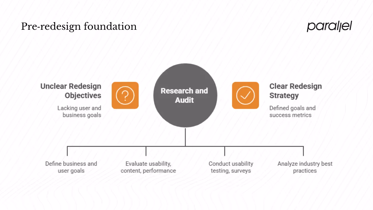
Clarify objectives and KPIs
Before sketching anything, you should define business and user goals. Ask:
- What outcomes are we trying to improve?—user engagement, conversion rate, retention, brand perception, search visibility or all of the above.
- Which metrics will indicate success?—think qualitative (satisfaction scores) and quantitative (task success rates, drop‑off points). For instance, task success rate is an essential UX performance indicator.
- What constraints and trade‑offs exist?—timeline, budget, internal resources, technical debt, regulatory requirements.
Audit the current site
A thorough audit reveals what works and what doesn’t:
- Usability & heuristics: Conduct a heuristic evaluation using established guidelines (Jakob Nielsen’s 10 heuristics, for example). Such evaluations identify design problems but cannot replace user research. In our experience with early‑stage AI/SaaS teams, a simple heuristic audit often surfaces low‑hanging fruit like inconsistent navigation, unclear feedback, or overloaded forms.
- Content & IA: Map your content structure. Identify redundant pages, missing categories, and misaligned messaging. Remember that visitors check navigation early; a confusing IA disrupts user journeys.
- Visual & brand consistency: Review typography, color palettes, imagery and tone of voice. Ensure they align with your brand guidelines and resonate with your target audience.
- Performance & SEO: Evaluate Core Web Vitals and page speed. Use lighthouse audits to assess accessibility, SEO and best practices. An outdated site may have heavy images, blocking scripts, or uncompressed assets.
Gather user insights
Numbers alone can’t tell the full story. Invest in qualitative research:
- Usability testing: Ask real users to complete key tasks while thinking aloud. Identify pain points and friction. Research shows that people prefer simple, easy experiences. At Parallel, we often discover that perceived complexity—not missing features—is the real barrier to adoption.
- Surveys & interviews: Use surveys to capture sentiment at scale. Then conduct one‑on‑one interviews to dig into motivations and mental models. According to CXL, user interviews clarify goals and flows. We’ve seen early‑stage teams overcomplicate onboarding flows because they assumed users needed hand‑holding; interviews revealed that users craved control and simplicity.
- Analytics review: Examine click‑through rates, session recordings and funnel drop‑offs. Look for patterns across devices—mobile vs. desktop, new vs. returning visitors, location segments.
Competitive & industry research
Analyse similar products to identify best practices and differentiation opportunities. A 2025 survey found that 84.6% of users prefer minimalist design. Don’t copy your competitors blindly; instead, look for gaps you can own. For example, if your peers ignore microcopy and onboarding guidance, investing in those areas can differentiate your product.
Armed with these insights, you can now articulate why the redesign is needed and what success looks like.
Strategy, information architecture and content
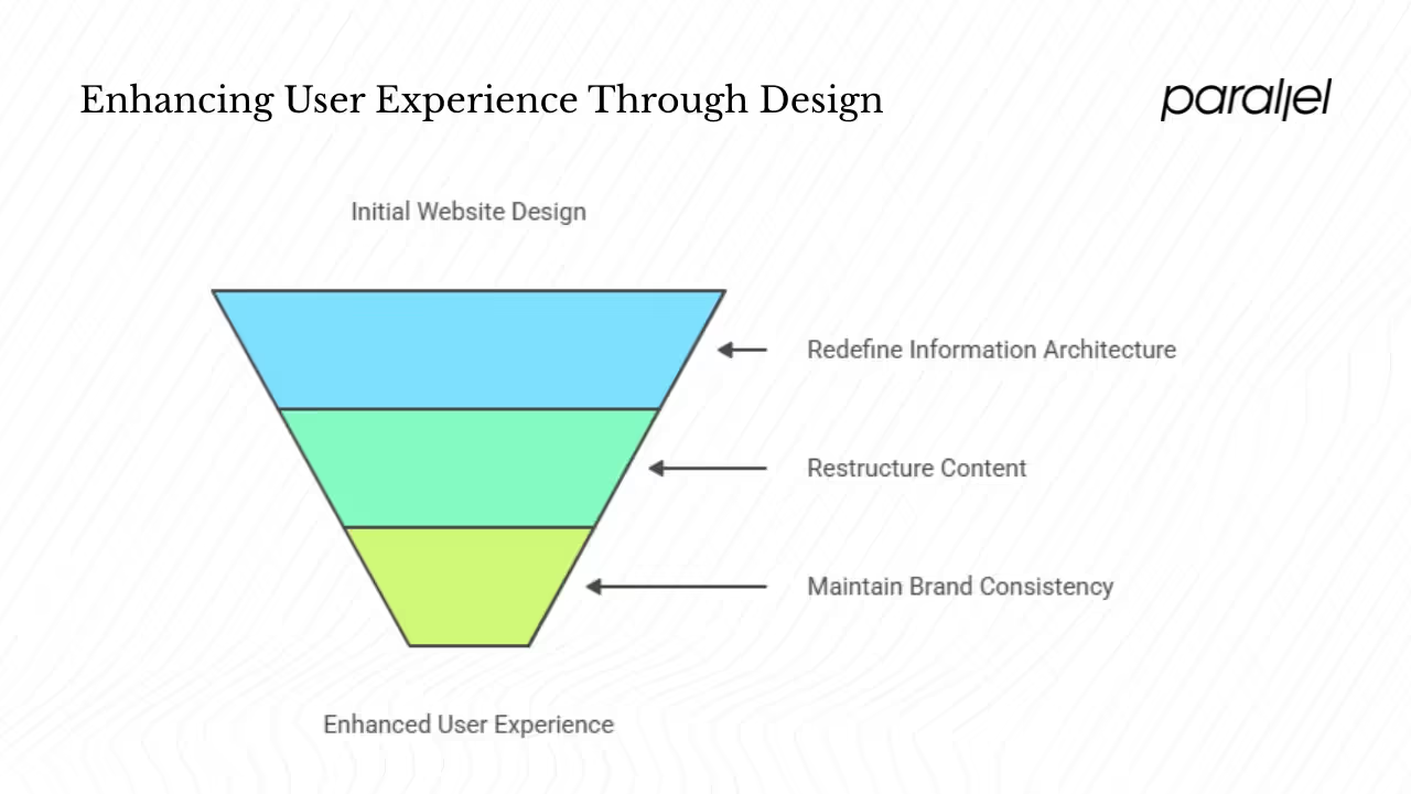
Redefine your information architecture (IA)
A clear IA helps users find information quickly. Start by clustering content into logical categories and designing user‑centric navigation. Tree tests and card sorting can validate whether users understand your proposed structure. Remember that first impressions are largely influenced by design and that messy navigation leads to frustration.
At Parallel, we often prioritise top‑level categories that reflect user jobs, not internal functions. For example, instead of “Resources,” we group by Use Cases, Pricing and About—aligning with how visitors think.
Restructure your content
Content should support user goals and reflect your brand voice. Conduct a content inventory: keep what’s relevant, update outdated copy, and remove duplicates. Organise the remaining content into a coherent hierarchy. Ensure that CTAs appear logically within the flow rather than at arbitrary positions. Remember that 40% of visitors prioritise images—use visuals purposefully, not decoratively.
Maintain brand consistency & visual hierarchy
Your redesign must reinforce brand recognition. Define a visual hierarchy that guides users through each page, using clear headings, typographic contrast and whitespace. Keep the number of font families to one or two for harmony and readability. Designers on Reddit remind us to “don’t cram everything together” and “don’t use more than two fonts”—advice we’ve seen validated by our own projects. Use color intentionally: accessible, high‑contrast palettes support readability, and avoid red/green combinations that hinder color‑blind users.
By refining IA, content and visual hierarchy, you create a foundation that supports user goals and amplifies your message.
Design phase: wireframing, prototyping and responsive thinking
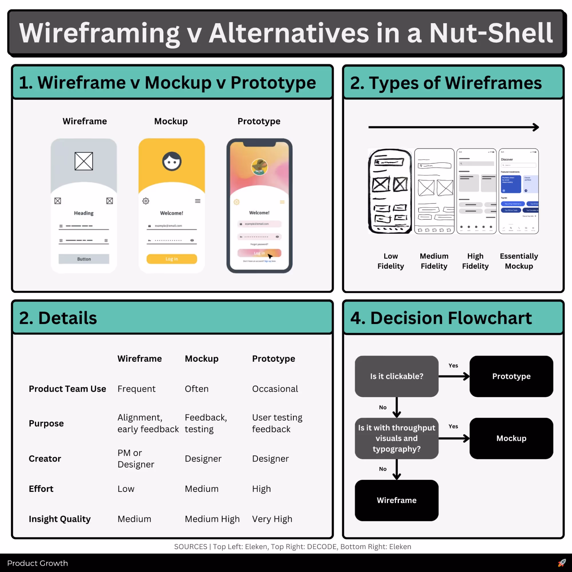
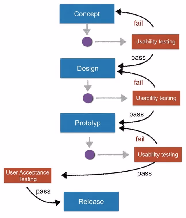
Start with wireframes
Wireframes are low‑fidelity sketches that emphasise structure over decoration. They help you align stakeholders on layout, navigation and content blocks without being distracted by color or typography. We often iterate quickly on paper or in digital tools (Figma, Sketch) to test ideas cheaply. Remember: the purpose is to validate flows, not to perfect visuals.
Build prototypes and test early
Once the structure feels right, move to clickable prototypes. Mid‑fidelity prototypes incorporate typography, spacing and interaction states, while high‑fidelity prototypes approximate the final product. Usability tests should be conducted across devices to ensure consistency. Good mobile UX can entice 74% of visitors to return, so mobile flows must be tested thoroughly.
Adopt a responsive and mobile‑first mindset
Mobile usage now dominates web traffic, and 90% of websites have adopted responsive design. A responsive layout adapts fluidly to different screen sizes; a mobile‑first approach designs for small screens first and scales up. Avoid designing desktop screens first and “shrinking” them—complex columns and heavy media often break down on mobile. Keep in mind that mobile e‑commerce drives 73% of sales, so friction in mobile checkout directly impacts revenue. Testing with real devices—not just emulators—will uncover edge cases like slow networks or one‑handed use.
Embrace minimalism and clarity
Research shows that 84.6% of users prefer clean, minimalist interfaces. A clutter‑free layout improves comprehension and reduces cognitive load. Use generous spacing, consistent paddings and margins; avoid overcrowding CTAs or forms. Our rule of thumb: if every element competes for attention, nothing wins. White space is not wasted space—it’s clarity.
By iterating on wireframes and prototypes, you mitigate risks before committing engineering resources.
UI elements: color, layout, typography and CTAs
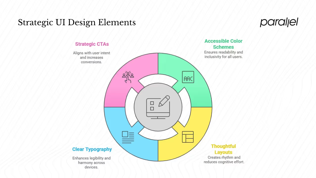
1) Choose accessible color schemes
Color influences mood and usability. High‑contrast palettes aid readability and meet accessibility standards (WCAG). Avoid color combinations like red/green that are indistinguishable to color‑blind users. Use color to highlight key actions (primary CTAs) and states (errors, success messages). Tools like Figma’s built‑in contrast checker can help you meet guidelines.
2) Design thoughtful layouts and spacing
Maintain consistent grid systems, paddings and margins to create rhythm. Remember that 38% of people stop engaging with a site because the layout is unattractive. A well‑structured layout supports scanning; grouping related content reduces cognitive effort. Our design system at Parallel defines a base spacing unit (e.g., 8 px) to keep spacing predictable.
3) Limit typography for clarity
Use one or two typefaces that complement each other. Define a clear hierarchy of headings, subheadings and body text. Avoid decorative fonts for body copy; legibility is key. Keep line lengths comfortable (45–75 characters) and line height generous. A consistent type scale ensures harmony across pages and devices.
4) Place call‑to‑action buttons strategically
CTAs should align with user intent. Position them after value propositions or at points where users are ready to act. Use clear, action‑oriented language (“Get started,” “Book a demo”) and differentiate primary CTAs from secondary actions using color or weight. Personalized CTAs convert 42% more users, so consider dynamic messaging based on user segments.
These UI decisions cumulatively drive clarity and conversion. As one Reddit practitioner put it, “be gentle with rounded corners” and avoid decorative flourish that distracts from the message.
Technical development and performance optimisation
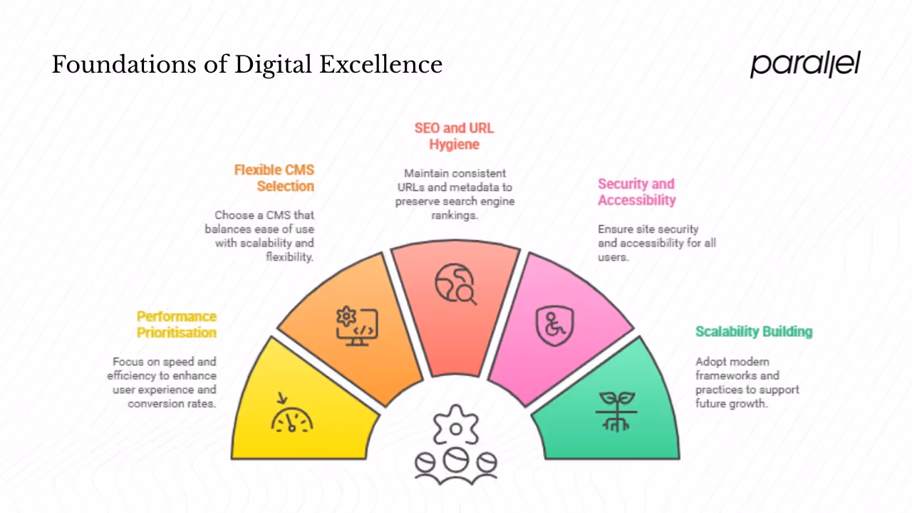
1) Prioritise performance
Speed is non‑negotiable. Google’s Core Web Vitals set the baseline: LCP < 2.5 seconds, INP < 200 ms, CLS < 0.1. Use CDNs, image compression, lazy loading, minification, and caching to reduce load times. Every additional second decreases conversion rate by 0.3%. In our experience, moving assets to a CDN and compressing hero images often yields the biggest gains. Remember to audit third‑party scripts; remove unused libraries and embed fonts efficiently.
2) Choose a flexible CMS
For many start‑ups, WordPress offers a balance between flexibility and ease of non‑technical edits. Headless CMS solutions (Contentful, Sanity) allow you to decouple content from presentation. Select a CMS that aligns with your team’s skills and scalability needs. Ensure that editors can manage content without developer intervention, reducing bottlenecks.
3) Enhance SEO and maintain URL hygiene
During a redesign, avoid breaking URLs. Keep slugs consistent; if you must change them, implement 301 redirects to preserve search equity. Retain metadata (titles, descriptions, alt tags) and improve where necessary. Use semantic HTML and structured data (Schema .org) to help search engines understand your content. Optimise images with descriptive alt text and use heading tags appropriately.
4) Secure and accessible builds
Implement HTTPS across your site. Follow accessibility guidelines (WCAG 2.1); include keyboard navigation, descriptive labels, and ARIA roles. Use rem units for scalable text and test with screen readers. Chrome’s Lighthouse audits will help you evaluate accessibility, performance and SEO concurrently.
5) Build for scalability
Adopt modern frameworks (Next.js, Remix) that support code splitting and server‑side rendering. Write modular, maintainable code. Use design tokens to store colors, typography and spacing values centrally. Automate deployments with CI/CD pipelines to catch regressions early. In our own practice, migrating to a component‑based architecture reduces development time for new pages and ensures consistency.
Testing and iteration
User testing
Test prototypes and later the staging build across devices and browsers. Use remote moderated sessions for in‑depth feedback and unmoderated sessions for scale. Invite participants from your target segments—founders, PMs, designers and technical peers—to ensure the design speaks to them. Document tasks, success rates and qualitative comments. Aim for at least 78% task completion—the industry average—and iterate until you exceed it.
A/B testing
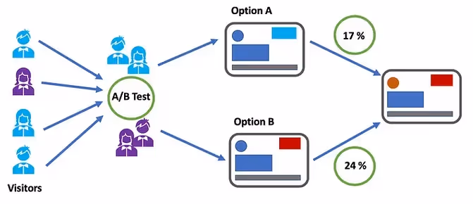
For elements with high impact (hero copy, CTA color, navigation labels), run A/B tests. Compare variations and measure improvements in click‑through rate, sign‑ups or purchases. Avoid testing everything at once; start with hypotheses derived from research. Remember that 38% of website feedback relates to design—small visual tweaks can influence perception significantly.
Accessibility and Lighthouse audits
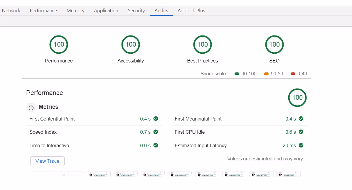
Use Chrome’s Lighthouse tool to measure performance, accessibility and SEO. Check color contrast, font sizes, ARIA labels and keyboard navigation. Ensure that text can be resized without breaking layouts. Audit forms for proper labels, focus states and error messages. Address issues systematically; accessibility is not only a legal requirement in many jurisdictions but also a moral imperative.
Iterate continuously
A redesign is not a one‑shot project. Post‑launch, monitor analytics, user feedback and bug reports. Schedule regular design critiques and backlog refinement sessions. Create a design system to maintain consistency as new pages are added. In our practice, we conduct quarterly UX reviews to align the product with evolving user needs and industry trends.
Launch and post‑launch strategy
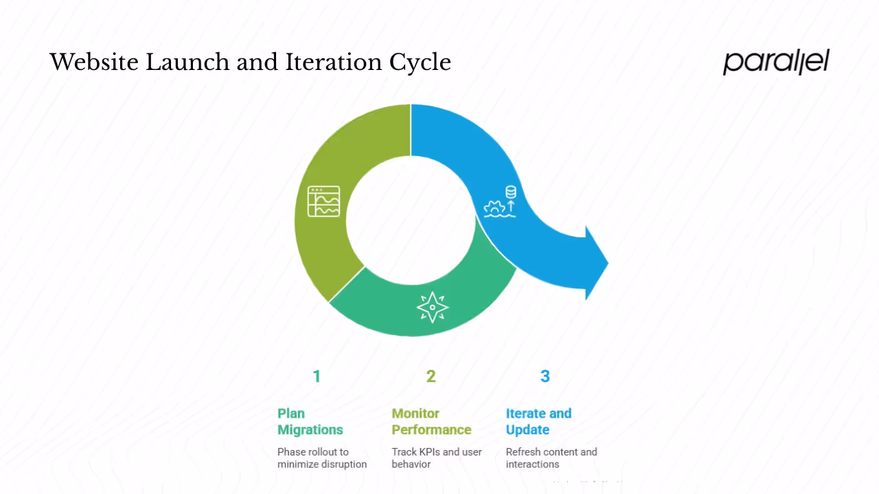
Plan migrations carefully
Avoid big‑bang launches. Instead, phase your rollout to minimize disruption. Use staging environments to test integration points (forms, payment gateways, marketing automation). Map old URLs to new ones and test redirects. Communicate the change to users ahead of time—transparency builds trust.
Monitor analytics and performance
After launch, track key performance indicators (KPIs) such as bounce rate, conversion rate, LCP and INP. Compare them against your pre‑redesign benchmarks. Use heatmaps and session recordings to spot unexpected friction. If numbers decline, don’t panic—investigate and iterate. Remember that user behaviour may fluctuate in the first weeks as people adjust to the new design.
Continue iterating
Modern websites are living systems. Technology, user expectations and your business model evolve. Schedule periodic updates to refresh content, refine interactions and adopt new standards. A full redesign every 2–4 years is common, but incremental improvements should occur continuously. Focus on the core job‑to‑be‑done—make your site the best tool for your users, not just a polished brochure.
Industry insights and voices from practitioners
Beyond statistics, practitioner wisdom matters. On UX design communities like Reddit, seasoned designers advise newcomers to start with a thorough audit, including usability tests and analytics.
- One practitioner wrote: “First do an audit of the site! Ideally, start with a usability test… then you can prioritise your changes.”
- Another emphasised the importance of defining objectives and understanding the target audience: “Start by thoroughly evaluating the current website… define the objectives… Understand your target audience… Ensure the redesign plan accounts for mobile users… consider site speed…”
- A third stressed technical diligence: “Make sure content is like for like… URLs remain EXACTLY the same… 301 any content that has to move… optimise for site speed / CWVs… make sure the site is crawlable.”
- Finally, a practitioner reminded us to respect fundamentals: “Don’t cram everything together… don’t use more than 2 fonts… be very gentle with rounded corners.”
These voices echo what research tells us: redesign is strategic, user‑centred and performance‑driven. They also underscore the value of professional humility—no single team member has all the answers; instead, listen to users and peers.
Key Phases of a Website Redesign
- Audit & Research – Identify usability issues, gather analytics, and interview users to understand pain points and goals.
- Strategy & Information Architecture – Define business objectives, restructure site navigation, and align content to user needs.
- Design & Prototyping – Create wireframes and responsive prototypes, focusing on clarity, accessibility, and conversion flows.
- Development & Performance Optimisation – Build using scalable code, optimise for speed, mobile, and SEO with semantic HTML and schema.
- Testing, Launch & Iteration – Conduct usability testing, A/B experiments, monitor KPIs post-launch, and iterate based on feedback.
Conclusion
Redesigning your website is not about chasing trends; it’s about aligning your digital presence with user needs, business goals, and technical best practices. The journey begins with research: audit your current site, clarify objectives and gather user insights. From there, strategy and IA provide the blueprint; wireframes and prototypes allow you to experiment; thoughtful UI decisions create clarity and trust; technical optimisation delivers speed and accessibility; testing and iteration refine the experience; and a careful launch sets you up for continued success. In essence, how to redesign a website is less about aesthetics and more about solving real problems and creating value.
At Parallel, we’ve seen early‑stage teams transform their customer journeys by treating redesign as a strategic investment, not a cosmetic overhaul. When done well, a redesign improves brand perception, accelerates time‑to‑value and drives sustainable growth. When done poorly, it introduces friction and erodes trust. Our belief is simple: a website should be a living system that evolves alongside your users. Keep listening, keep iterating—and let your work speak for itself.
Frequently asked questions
1) How do I redesign an existing website?
Begin with a comprehensive audit and define clear objectives. Conduct user research to understand pain points, then plan your information architecture and content strategy. Use wireframes and prototypes to test ideas early. Prioritise responsive, performance‑optimised design, choose an appropriate CMS and perform SEO‑conscious development. Test, iterate and launch incrementally. The earlier sections provide a detailed roadmap.
2) What does it cost to redesign a website?
Costs vary widely based on scope, complexity, technology stack and whether you hire an agency or build in‑house. Surveys show redesign projects can range from $3,000 to $75,000. Regardless of budget, view redesign costs as investments—research suggests that every $1 spent on UX can return $100. Prioritise high‑impact improvements rather than superficial changes.
3) What does a website redesign do?
It improves aesthetics, usability, performance and brand perception. A strategic redesign resolves pain points, simplifies navigation, aligns content with user goals, accelerates load times and enhances SEO. The result is improved engagement, higher conversion rates and stronger customer loyalty.
4) How often should a website be redesigned?
Rather than massive overhauls, aim for continuous improvement. Small updates—copy tweaks, UI refinements, performance optimisations—should happen regularly. A complete redesign every 2–4 years is common, or sooner if metrics decline or your brand pivots. Focus on the needs of your users and your market; your site should evolve as they do.

check out these related blogs


.avif)