The way people find their way around your web product isn’t just an academic curiosity; it can make or break a young company. When visitors arrive at your site they start a journey that either ends in delight or in frustration. The phrase how users move through the information or navigate the pages of a website captures this idea. This article shares first‑hand insight and research to help early‑stage founders and product leaders create clear, predictable pathways. Expect practical steps rather than theory.
Why does user navigation matter?
At a high level, navigation refers to how a site is structured and how people move from one page to another. Researchers at the Center Centre analysed 44 users performing 620 tasks and counted more than 8 000 clicks; they found no correlation between the number of clicks and task success. Many participants visited as many as 25 pages and still completed their tasks. Dissatisfaction didn’t increase with more clicks—users kept going as long as they felt they were on the right path. On the flip side, the Baymard Institute’s 2025 benchmark notes that 58% of desktop sites and 67% of mobile sites have mediocre or poor homepage and category movement. For early‑stage start‑ups, the stakes are high: poor information pathways translate to missed conversions, higher support costs and bounces.
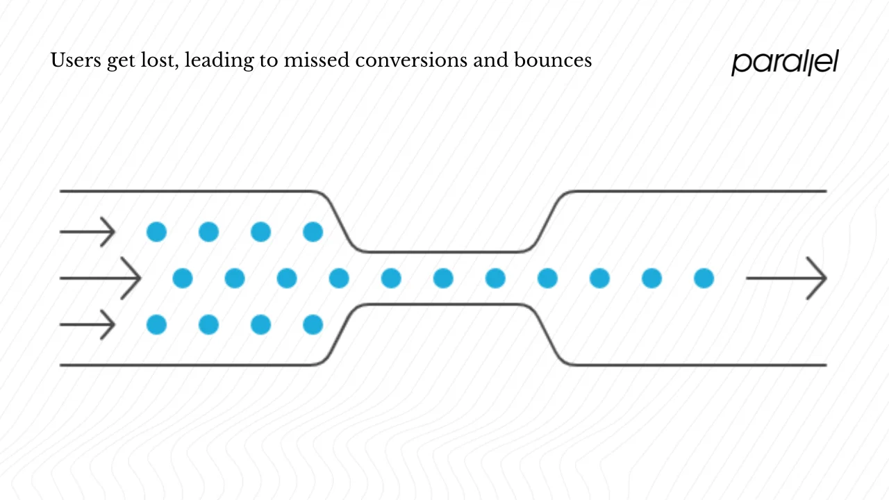
From our client work we’ve seen that many product teams fixate on reducing clicks, but the research shows the real problem is losing users in the structure. Jakob Nielsen’s team discovered that making product pages four clicks away instead of three boosted findability by 600%. Portent’s 2024 speed study found that a one‑second to ten‑second increase in load time results in a 123% higher bounce probability. DesignRush reports that 88% of people will not come back after a poor user experience and that unappealing designs are avoided by 60% of consumers. Getting the structure right isn’t optional.
Mapping your structure: page hierarchy, menus and links
Before diving into specific components, it helps to state that how users move through the information or navigate the pages of a website depends on a coherent skeleton. The following sections break down that skeleton into manageable parts.
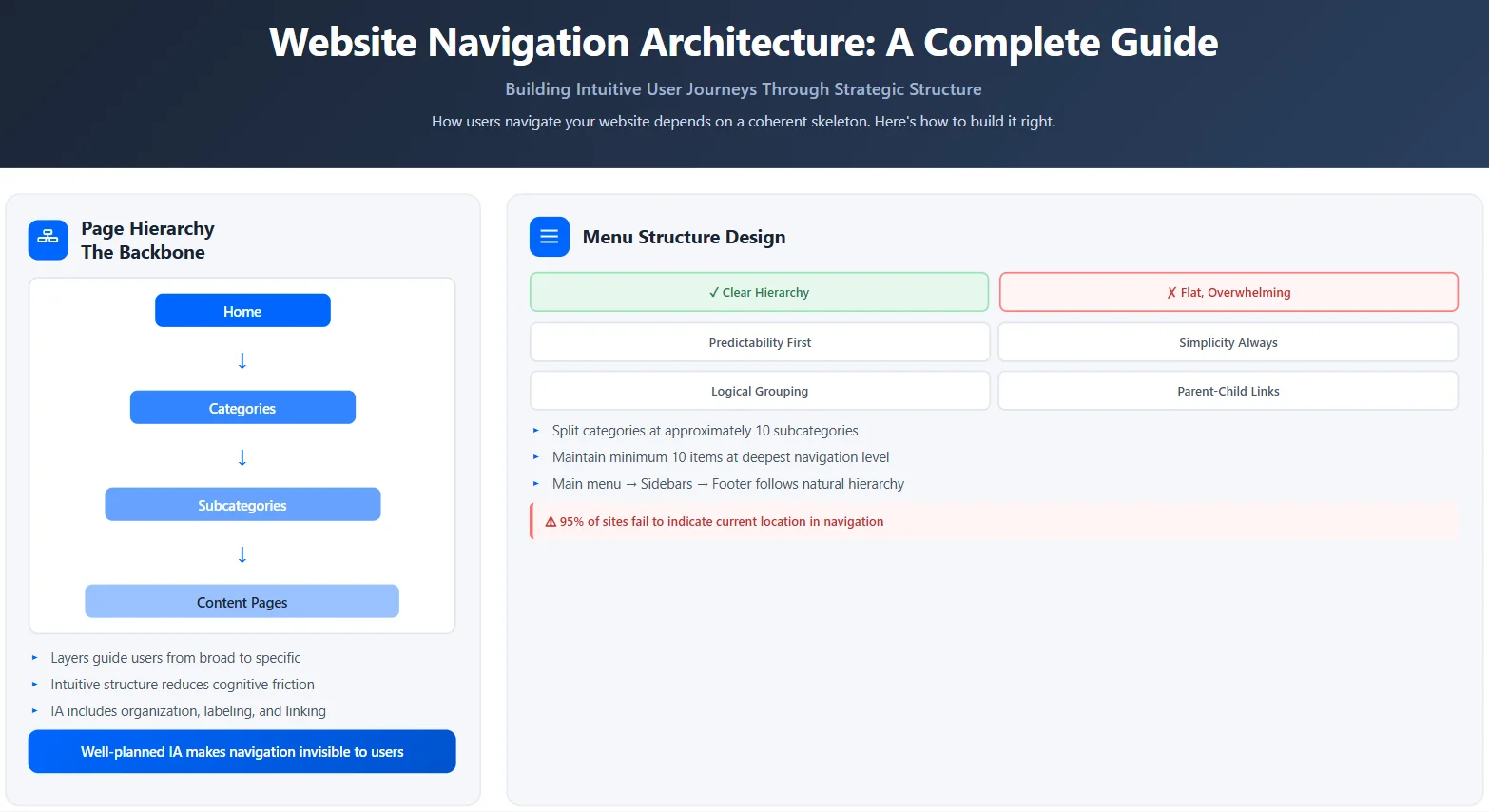
1) Page hierarchy as the backbone
A clear hierarchy helps visitors understand where they are and where they can go next. Think of it as layers: a home page leads to major categories, which lead to sub‑categories and then to detailed content. Sites with well‑planned information architecture support the cognitive model of visitors and reduce friction. Optimal Workshop argues that information architecture is more than finding your way around; it includes how content is organized, labeled and linked. Navigation is just one part of this wider system. When the structure is intuitive, the visible menus do not need to work as hard.
2) Designing the menu structure
The main menu, dropdowns, sidebars and footers are the most visible tools that guide your visitors. Usability Geek emphasises predictability and simplicity; unconventional or cluttered menus confuse users and increase bounce rates. A clear hierarchical structure with grouped parent and child items gives visitors a quick overview of what you offer. The Baymard Institute advises splitting categories into manageable chunks when you reach around ten subcategories and ensuring at least ten products or pages at the deepest level. Too many options are overwhelming, especially on mobile.
Sidebars work well for content‑heavy sites where persistent context is helpful. Footers act as a secondary layer for less frequent links—terms, privacy or support pages. Regardless of layout, ensure that the menu reflects the underlying hierarchy and that the current section is clearly indicated. Baymard researchers found that 95% of sites fail to indicate the current scope in the main navigation. Participants in their study were often unsure where they were when the active section was not marked.
3) Breadcrumb trails and path indicators
Breadcrumbs show visitors the path back to the root. Usability Geek notes that breadcrumbs help people know where they came from and where they are. Keep titles short and consistent, start with the home page, and avoid deep hierarchies that make the trail too long. When people land directly on an inner page from search results, a breadcrumb trail can orient them and reduce reliance on the browser back button.
4) Responsive behaviour across devices
Mobile screens have limited space. Hamburger menus and bottom bars can conserve room, but they hide options. Baymard’s research shows that on mobile homepages, scoped links often mislead because users think they are seeing the entire category when they are actually viewing a narrow selection. Including the full scope (both category and filter names) in link text prevents this confusion. Ensure that your menus adjust gracefully to touch interactions, and that important links are visible without requiring complex gestures. Testing across device types is essential because 67% of mobile sites are rated mediocre or poor.
5) Internal linking for discoverability
Internal links let visitors move laterally through your content. They are particularly important for content‑rich blogs, docs or knowledge bases. Linking related articles and features increases time on site and helps search engines understand your structure. A moderate network of internal links supports how users move through the information or navigate the pages of a website by offering multiple paths to content. Avoid orphan pages with no incoming links and ensure that each page has a clear purpose in the hierarchy.
Understanding user flow and click paths
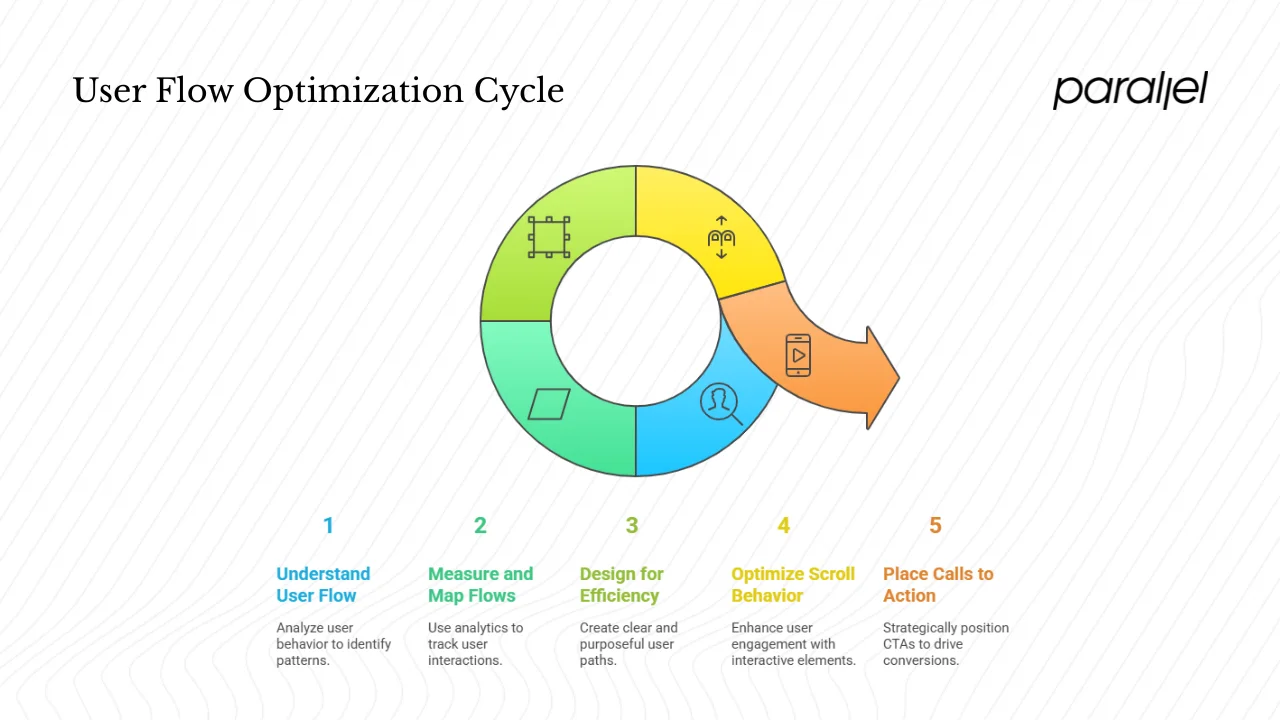
1) What user flow means
User flow refers to the sequence of steps a person takes to achieve a goal: reading an article, signing up for a free trial, or completing a purchase. Click paths are the actual sequence of pages visited. They reveal patterns—home → category → sub‑category → content → action—and they also show where visitors detour or leave. The phrase how users move through the information or navigate the pages of a website is central here. In practice, flows include not only clicks but scrolling, tapping, swiping and using search.
2) Measuring and mapping flows
Analytics tools can map page paths and show entry and exit points. Session recordings and heatmaps reveal where people focus their attention and where they stumble. Databox reported a 44% median bounce rate across industries in late 2024—a reminder that many sessions end quickly. Observing flows helps identify drop‑offs, dead ends and unexpected loops. Startups should track metrics such as time to first value, click‑through from the main menu, and completion rates for sign‑up or checkout flows.
3) Designing for efficient movement
The goal isn’t to reduce clicks at all costs but to make every step purposeful. Joshua Porter’s study found that users didn’t quit after three clicks; they quit when they felt lost. Nielsen’s tests showed that adding an extra click improved findability by 600%, demonstrating that clarity beats minimalism. Use clear labels that visitors understand, group related actions together and position important links where they can be seen without scrolling. On mobile, keep primary actions within thumb reach and avoid burying them in hidden menus.
4) Scroll behaviour and interactive elements
People scan pages and scroll quickly rather than clicking immediately. Splitting long forms or articles into digestible sections reduces cognitive load. Qualaroo cites tests where multi‑step forms outperformed single‑step forms by 12% and 5.51%. Breaking complex tasks into steps can make the experience feel lighter. Providing progress indicators—numbers or bars—gives confidence and keeps visitors moving. Use tabs, accordions and carousels judiciously; they should reveal more without overwhelming the initial view.
5) Call‑to‑action placement
Calls to action are pivotal nodes in a flow. Place them where visitors naturally reach decision points: at the top of a page for obvious tasks, within the body when context matters, and at the bottom for those who read through. Data suggests that clear, specific CTAs can increase conversion rates by 161%. Use contrast to make the button stand out without using the banned word at index 70, and align the action with the page’s goal.
Visual and interactive cues
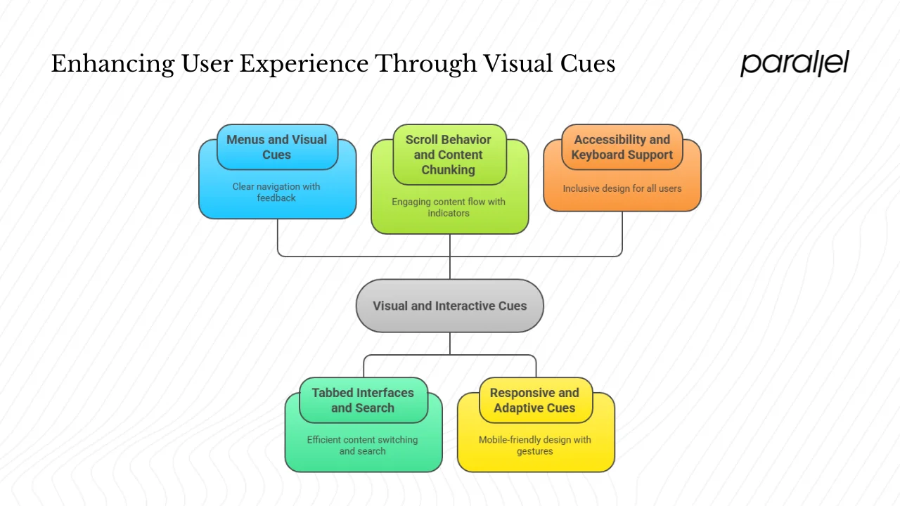
1) Menus and visual cues
Menus are the most overt guide through a site. Make the structure visible: show all top‑level categories on desktop, use grouping and spacing to communicate relationships, and employ simple icons to aid recognition. Provide feedback—hover states, focus indicators, or subtle underlines—to signal that an item is interactive. When visitors open a dropdown, maintain the open state until another choice is made, reducing accidental closure.
2) Tabbed interfaces, sidebars and search
Tabbed layouts work for content that can be segmented, such as pricing tiers or documentation sections. They let users switch without reloading the page. Sidebars are helpful for long articles or docs where quick links to sections provide orientation; they should stay fixed as the user scrolls. A search bar is essential: Usability Geek urges always include one. Search helps when the hierarchy is deep or when the visitor has a specific term in mind. Make sure the search returns relevant results and tolerates typos.
3) Scroll behaviour and content chunking
Breaking content into short sections with descriptive headings helps readers scan. Use internal links inside articles—“see also” or related posts—to invite further reading. Scroll indicators or sticky progress bars can reassure visitors that they are moving through the material. At the end of each section, present a clear next step, such as a CTA or an internal link to related content. This supports how users move through the information or navigate the pages of a website by providing continuous motion.
4) Responsive and adaptive cues
On touch devices, interactions differ. Provide ample spacing between tappable elements to avoid accidental taps. Use familiar icons such as the three‑line menu for hidden menus but ensure the contents are clear. Consider bottom navigation bars for mobile apps and small screens where the thumb naturally rests. Provide gestures like swipe for carousels but don’t rely exclusively on gestures—always provide a visible control as well. Baymard’s research shows that users can misunderstand narrow product lists when the link text doesn’t include the full scope; writing explicit labels helps on small screens.
5) Accessibility and keyboard support
Inclusive design isn’t a luxury. Make sure that people can use your site with a keyboard: logical tab order, skip‑to‑content links and focus outlines. Use semantic HTML so screen readers can understand your hierarchy and menus. Label buttons and links clearly; avoid vague phrases like “click here”. Provide alt text for icons and images. Meeting accessibility standards also improves SEO and broadens your audience.
A practical checklist for product teams
Audit your current site
- Map your page hierarchy. How many levels do you have? Are there dead ends? Are you supporting how users move through the information or navigate the pages of a website or forcing them into loops?
- Review the menu structure. Are labels clear? Are there too many top‑level items? Usability Geek recommends keeping menus simple and predictable. Baymard suggests subdividing categories once you reach around ten subcategories.
- Check breadcrumbs, internal links and sitemaps. Do they provide orientation? Do they reflect the real structure?
- Test on mobile. Does the hamburger menu work? Are important links visible without scrolling? How does the menu adjust to different widths?
- Inspect page load times. Portent’s study shows that longer load times double bounce probability. Optimise images, defer non‑critical scripts and consider static site generation where possible.
Test your flows and paths
- Use analytics to view entry and exit pages. Identify pages with high exit rates and find out why.
- Watch session recordings to see where people hesitate, scroll aimlessly or backtrack.
- Run tree‑testing or card‑sorting studies to validate your information architecture. Optimal Workshop provides tools for this and emphasises the importance of labelling and structure.
- Use A/B tests to compare menu structures or CTA placements. Let real behaviour inform decisions rather than assumptions.
Improve and prioritise
- Simplify the menu. Remove or merge low‑priority items. Aim for five to seven top‑level links.
- Make important actions prominent. Place calls to action where they follow the logical flow of content.
- Add or refine search. Provide auto‑complete and handle typos gracefully.
- Introduce or improve breadcrumbs. Use short labels and ensure they reflect the hierarchy.
- Strengthen internal linking. Link related articles and features to support lateral movement.
- Ensure the site works well on small screens and across browsers. Test with both right‑hand and left‑hand dominance in mind.
Monitor and iterate
- Define metrics: bounce rate, time to first value, conversion rate, time on site and click‑through rate.
- Review these metrics regularly. Design changes are experiments; keep what works and revise what doesn’t.
- Gather qualitative feedback. Ask users what they expected to find and whether they were confused. Use surveys with open‑ended questions.
- Plan periodic audits. As your product grows, the structure will need adjustment.
Work across disciplines
- Designers and product managers should define key user flows early. Keep the flows short but meaningful.
- Content teams must use consistent labels and avoid jargon. Clear language reduces cognitive load.
- Developers should implement semantic markup and ensure responsive behaviour. Keep CSS and JavaScript organised to avoid performance issues.
- Stakeholders should treat navigation as part of the product backlog. It influences feature prioritisation and user satisfaction.
Cases from the field
Our work with early‑stage SaaS teams often reveals similar patterns. One client insisted that users should reach account settings in three clicks. However, users needed to complete identity verification, configure preferences and set up payment details. When we forced all options into a single screen, the form felt overwhelming and drop‑offs increased. Splitting the process into four screens increased completion rates by 12%. Another client redesigned a product catalogue so that the checkout page was four steps from the home page rather than three; the findability of products increased sixfold and sales rose. Both cases reflect the principle that purposeful steps, clear labels and progress feedback trump arbitrary click counts.
On the other hand, we have seen poorly thought‑out menus cause harm. A fintech start‑up placed deposit and withdrawal options deep inside nested menus. Users often ended up on the wrong page and support tickets spiked. By placing those actions directly in a simplified primary menu and adding breadcrumbs, the company reduced support tickets by 30% in the first month. Another case involved an e‑commerce store that grouped 25 subcategories under a single menu item. Users felt lost and the bounce rate on that section exceeded 60%. Breaking the subcategories into three groups of eight and adding internal links cut the bounce rate in half.
Conclusion
For product leaders and founders, understanding how users move through the information or navigate the pages of a website is not optional. It affects acquisition, retention and revenue. Research shows that the number of clicks doesn’t predict success; clarity, feedback and structure do. Most sites still struggle: Baymard’s 2025 benchmark reports mediocre or poor navigation performance on the majority of desktop and mobile sites. Poor experiences drive 88% of visitors away, while thoughtful design can boost conversion rates by 200–400%.
Approach navigation as you would any core product feature. Plan the hierarchy, test your flows, refine your menus and monitor behaviour over time. Empower your users with clear pathways, informative labels and responsive interactions. When visitors can see where they are and where they can go, they build trust and confidence. The result is a product that feels easier to use and a business that grows with satisfied customers. Keep focusing on how users move through the information or navigate the pages of a website—it’s the compass that guides every design decision.
Frequently asked questions
1) What shows how users move through or navigate the pages of a website?
You can observe how users move through the information or navigate the pages of a website by analysing click paths, user flows and session recordings. Analytics tools reveal the sequence of pages (entry → sequence → exit). Heatmaps and scroll maps show where people click and how far they scroll. Search logs indicate when people bypass menus. Together, these methods provide a picture of real behaviour.
2) What is an effective way for marketers to use content?
Place content where people naturally look: in the main menu, sidebar or footer. Use internal links to connect related articles and features. Make calls to action contextually relevant; a sign‑up button at the end of a feature overview will perform better than a generic button floating somewhere else. DesignRush notes that clear CTAs can boost conversions by 161%. Think of content as part of the path—each piece should lead to the next meaningful step.
3) What does “dynamic effect” mean in this context?
In discussions about web flows, a dynamic effect refers to interface elements that respond to user actions. Examples include menus that expand when tapped, tabs that reveal content when selected or progress bars that update as a form is completed. These interactions provide feedback and help visitors understand the cause‑and‑effect relationship between actions and outcomes.
4) When deciding on contextual elements while designing a website, what should you identify?
Identify your visitors’ goals (what they’re trying to accomplish) and the context of use (are they on a phone while commuting or sitting at a desk?). Map your content taxonomy so you know how information is grouped. Decide what navigation affordances—menus, links, search bars—support those goals. Conduct card‑sorting or tree‑testing to validate your taxonomy and ensure that the structure matches users’ mental models.

check out these related blogs


.avif)