Most of the world’s web traffic now comes from phones. In 2025, mobile devices account for roughly 59–63 percent of global website visits and 96 percent of internet users go online with a mobile phone at least sometimes. That level of adoption has changed how people expect to interact with digital products. They tap, swipe and switch between apps while commuting, standing in line or on the couch, and they rarely wait for a slow page to load. For founders, product managers and design leads, this shift raises a question: how do you build something delightful for the smallest screen before thinking about anything else? This article answers that question by exploring the mobile‑first design approach and showing how it can help teams focus on what matters.
Why mobile‑first matters for startups and product teams
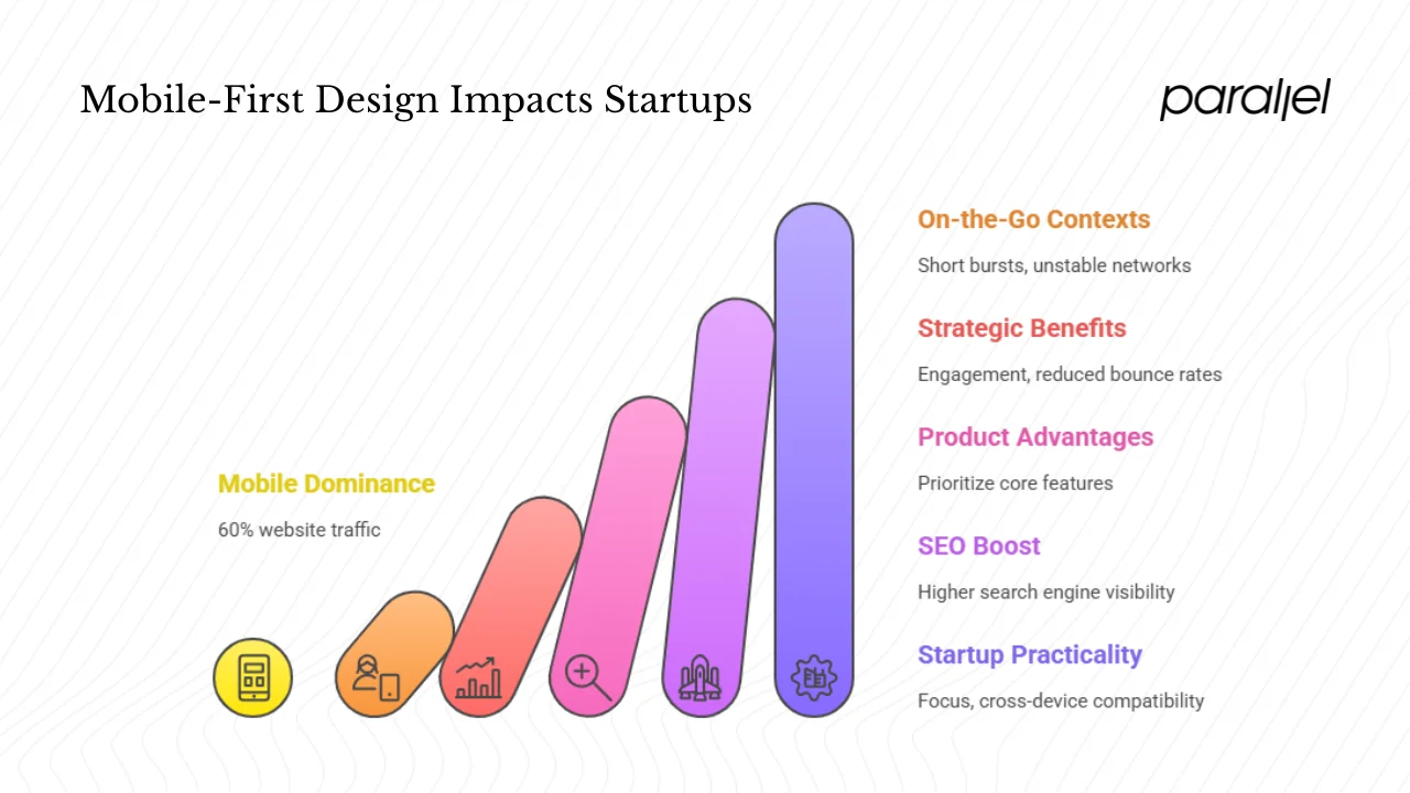
Mobile usage has eclipsed desktop for years, but the scale of the change in 2025 is striking. StatCounter data cited by TekRevol shows mobile driving about 59.7 percent of global website traffic. MobiLoud’s analysis puts the share even higher at 62.45 percent, leaving desktop at 35.71 percent. The DataReportal 2025 digital overview adds that 96 percent of the world’s internet users access the web on their phones and more than 5.78 billion people (70 percent of humanity) now own a mobile phone. This dominance brings business and product implications:
- On‑the‑go contexts: People use apps in short bursts, often on unstable networks. Designs must load quickly and help users accomplish tasks without unnecessary steps.
- Strategic benefits: A fast, reliable mobile experience improves engagement and reduces bounce rates. Google’s mobile‑friendly update even boosts the ranking of pages that are easy to read and tap on phones.
- Product and UX advantages: Starting with the smallest screen forces teams to prioritise core features, simplify flows and create a clear visual hierarchy. The mobile‑first design approach naturally leads to leaner interfaces where the essentials aren’t buried.
- SEO and discoverability: Search engines favour sites that load well on mobile, which can translate into higher visibility. A mobile‑optimised experience is no longer optional for growth.
- Startup practicality: Early-stage teams often have limited resources. Designing for mobile first helps focus on the most important user flows and ensures cross‑device compatibility from the beginning, saving time and rework later on.
What is the mobile‑first design approach (and how it compares)
The mobile‑first design approach means starting the design process with the smallest device and scaling upward. The Interaction Design Foundation describes it as designing for the smallest device first and progressively enhancing the experience for larger layouts. Rather than squeezing a desktop site down, you build the core experience for smartphones—prioritising indispensable content, simplifying navigation and embracing touch. The approach aligns with progressive enhancement, where a basic experience works everywhere and richer features are added for larger screens. This mindset contrasts with graceful degradation, where designers build a feature‑rich desktop version and then strip it down for mobile, often treating small screens as an afterthought.
Desktop‑first vs responsive vs adaptive
Understanding how mobile‑first fits within the broader landscape helps teams choose the right approach:
- Desktop‑first: You design for large screens, then remove or rearrange elements for mobile. This can lead to bloated interfaces and compromises on smaller devices because the core experience was never tailored for the limitations of a phone.
- Responsive design: A technique where layouts and elements fluidly adapt to screen sizes using flexible grids and media queries. Mobile‑first can be part of a responsive strategy; the difference is mindset. In a responsive workflow built around mobile‑first, you create the mobile layout first and then add breakpoints for tablet and desktop.
- Adaptive design: Multiple distinct layouts are served based on device characteristics. Adaptive can work with a mobile‑first mindset by delivering a tailored layout for phones and a richer one for desktops. However, adaptive projects are more complex to maintain because you manage separate templates.
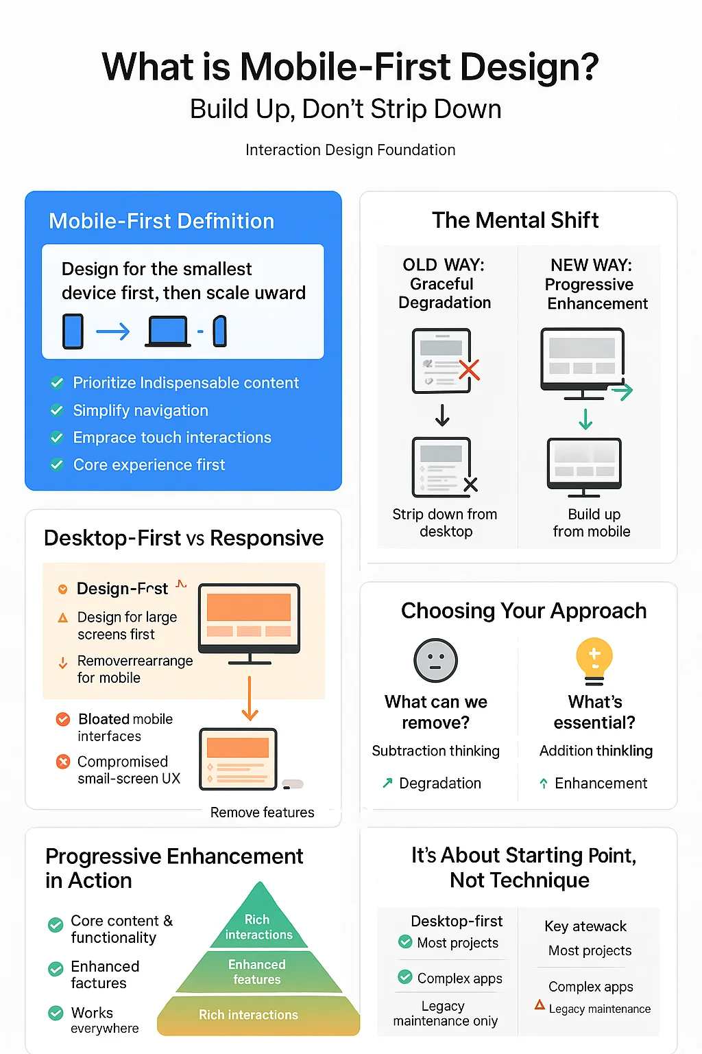
Mobile‑first is not opposed to responsive or adaptive techniques. It’s about starting with the core experience on mobile and progressively enhancing it as screens get bigger.
Core principles of mobile‑first design
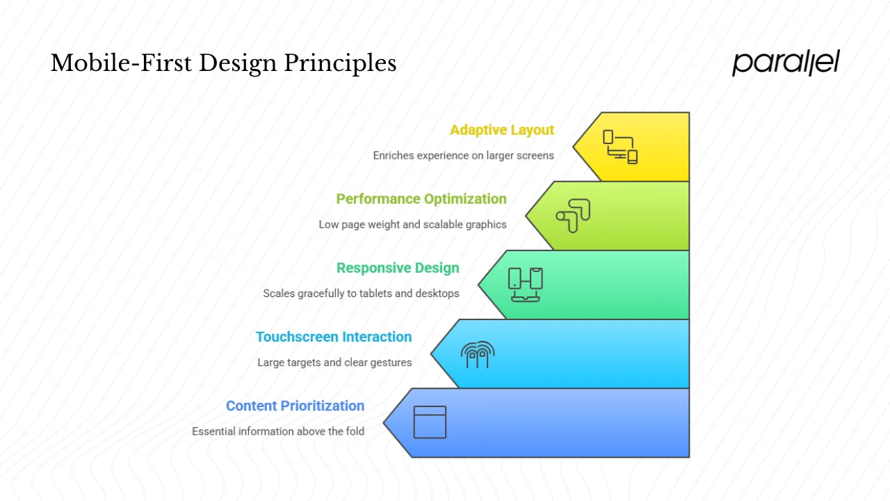
1) Content prioritisation
Limited screen space forces tough decisions. Prioritise the user’s primary task by placing essential information above the fold and structuring content for quick scanning. The Interaction Design Foundation recommends using headings, short paragraphs and visual hierarchy to highlight what matters. Remove unnecessary elements and reduce cognitive load so people can accomplish their goals quickly. As a rule of thumb: if a piece of content isn’t critical on mobile, question why it exists at all.
2) Touchscreen interface and interaction
Designing for touch means making targets large enough (at least 44 px according to Apple guidelines) and placing interactive elements within reachable “thumb zones.” Avoid hover effects; rely on clear touch or swipe gestures. Consider portrait and landscape orientations, and provide feedback when users tap or drag. Affordances—visual clues that an element is interactive—are essential on mobile screens.
3) Responsive design and cross‑device compatibility
Even when you start with mobile, the product must scale gracefully to tablets and desktops. Use fluid grids, flexible images and CSS media queries to adjust layouts. Plan breakpoints based on content rather than arbitrary device widths: for example, add a second column when there is room to display extra information without clutter. Ensure that your design remains consistent across devices so users can move from mobile to desktop without confusion.
4) Performance optimisation and scalable graphics
Phones often operate on slower networks and have less processing power. Optimise performance by keeping page weight low, using compression, and avoiding heavy animations. Scalable graphics (SVGs) and responsive image formats help maintain crisp visuals without bloating downloads. Techniques like lazy loading and code splitting delay non‑critical resources until they’re needed. A lean mobile experience benefits users on all devices.
5) Adaptive layout and progressive enhancement
As screens get larger, you can enrich the experience. Progressive enhancement means adding features and content as space allows. On the desktop, you might show additional navigation options, sidebars or detailed analytics that wouldn’t fit on a phone. In some cases, an adaptive layout with distinct templates for mobile and desktop makes sense—especially for complex dashboard applications. But even when using adaptive design, the mobile‑first mindset helps ensure the core experience remains clear and efficient.
The mobile‑first design workflow (for your team)
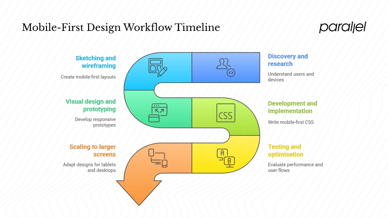
Implementing a mobile‑first design approach requires collaboration between product, design and development. Here’s a workflow we use at Parallel to keep projects focused and adaptable:
- Discovery and research: Understand who will use your product and how. Define personas, tasks and contexts—especially on the go (short sessions, intermittent connectivity). Analyse existing analytics to see what devices people use. Map key user flows separately for mobile and desktop to identify differences.
- Sketching and wireframing: Begin with low‑fidelity wireframes for mobile. Determine what must be visible on the first screen, what can live behind a menu and what can be deferred. Sketch variations to explore layouts before committing to high‑fidelity designs. Once the mobile version is clear, expand to tablet and desktop, adding columns or components as space allows.
- Visual design and prototyping: Establish a mobile style guide with font sizes, spacing and colours. Tools like Figma or UXPin allow you to create prototypes that switch between mobile, tablet and desktop views. Pay attention to scalable graphics, icon fonts and responsive images early on; retrofitting them later is painful.
- Development and implementation: Write CSS with mobile in mind—base styles for phones, then media queries for larger breakpoints. Use flexible units (percentages or rem) rather than fixed pixel values. Implement performance budgets to control page weight and optimize assets.
- Testing and optimisation: Test on real devices and simulated networks. Evaluate metrics such as load time, time to interactive and bounce rate. Use analytics to see where mobile users drop off and refine flows accordingly. Conduct A/B tests to validate design decisions.
- Scaling to larger screens: As you move to tablets and desktops, reveal additional content, offer richer interactions and adjust layouts. Avoid simply stretching the mobile design; think about how extra space can improve the experience. Ensure that the mobile version remains robust and fully functional even as new features are added to the desktop.
Best practices and common pitfalls
Best practices
- Clarify content priorities: Decide what must appear first on a phone—primary actions, key messages and value propositions. Use concise copy and clear headings.
- Keep navigation simple: Use a single, easy‑to‑reach menu, often hidden behind a hamburger or bottom tab bar. Avoid deep nesting that forces users to tap repeatedly.
- Design tap‑friendly controls: Buttons and links should be large, with enough spacing to prevent accidental taps. Apple recommends a minimum target size of 44 px.
- Optimise images and code: Compress assets, use modern formats and lazy load off‑screen content. Set performance budgets during development.
- Use scalable graphics: Employ SVGs or icon fonts to ensure crisp rendering on high‑density screens.
- Maintain cross‑device consistency: While layouts differ, elements like colour, typography and icons should remain consistent so users feel at home on any device.
- Monitor real‑world performance: Track metrics such as load time and bounce rate. Iteratively refine the experience based on data.
- Collaborate early and often: Align product, design and engineering teams on the mobile focus from day one. This prevents last‑minute compromises.
Common pitfalls
- Treating mobile as an afterthought: Designing desktop first and squeezing down leads to compromised mobile experiences. Avoid this by starting with mobile.
- Overloading mobile screens: Cramming too much content or too many interactions onto a small screen causes confusion and frustration.
- Neglecting performance: Heavy images, complex scripts and unnecessary animations slow down pages on mobile networks.
- Skipping real device testing: Emulators can’t replicate all conditions. Test on actual phones and use network throttling.
- Failing to adapt for larger screens: After creating a mobile version, some teams forget to enrich the desktop experience, leaving extra space empty or misaligned.
- Assuming mobile users behave like desktop users: People interact differently on phones; respect their context and design accordingly.
Case examples: mobile‑first in practice
The UXPin guide highlights several organisations that adopted a mobile‑first mindset. Their stories illustrate how starting with mobile reshapes products:
- Google: Early on, Google pushed initiatives like AMP and mobile‑first indexing. By encouraging developers to optimise for mobile, they improved mobile performance and search rankings.
- Dropbox: Transitioning from a desktop‑centric service, Dropbox redesigned its app with a simplified mobile interface, then scaled up for desktop. The shift led to a consistent experience across devices and increased mobile engagement.
- BBC: To reach a global audience that consumes news on the go, the BBC embraced mobile‑first for its website and apps. By optimising content and interactions for small screens, they saw improved mobile traffic and engagement.
- Flipkart: In India, where smartphones are the main internet device, e‑commerce giant Flipkart prioritised fast load times and simple navigation on mobile. This approach contributed to a surge in mobile transactions.
- Airbnb: The company redesigned its platform with mobile at the centre, resulting in higher user satisfaction and more mobile bookings.
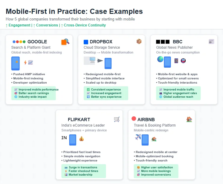
These examples show that investing in the mobile‑first design approach can drive measurable business outcomes—improved engagement, higher conversions and better cross‑device continuity.
When mobile‑first might not be the best fit
Mobile‑first isn’t the answer for every product. Complex enterprise applications with heavy data entry, spreadsheets or multi‑column dashboards may still favour a desktop‑first strategy because their primary tasks require large screens and precise inputs. If your core users spend all day using a desktop interface, it may make sense to design the desktop experience first and then consider how essential features might translate to mobile. Nevertheless, the mobile‑first mindset—prioritising clarity, performance and user focus—still offers benefits even in desktop‑dominant domains.
Metrics and success criteria
To evaluate whether your mobile‑first efforts are working, track a mix of performance, engagement and business metrics:
- Performance: Page load time, time to interactive and First Contentful Paint indicate how quickly users can engage. Aim for sub‑2‑second loads on typical mobile networks.
- Engagement: Monitor bounce rate, conversion rate, time on task and navigation drop‑offs for mobile users. A drop in bounce rate after a redesign can signal improved usability.
- Cross‑device continuity: Assess how many users start on mobile and finish on desktop, or vice versa. A frictionless transition suggests a consistent experience.
- Developer maintainability: A clean codebase with modular components makes it easier to extend to new devices or features.
- Business KPIs: Track mobile traffic share, conversion rates, retention and revenue from mobile channels. Compare these figures before and after adopting the mobile‑first design approach.
Conclusion
Designing for mobile first is not a trend—it reflects how people live today. With 59–63 percent of global web traffic coming from phones and almost every internet user carrying a smartphone, the smallest screen has become the primary screen. For startups and product teams, a mobile‑first design approach enforces discipline: it helps you identify what truly matters, simplify flows and build performance into the foundation. As devices scale up, you can add richness without sacrificing clarity.
I’ve seen early‑stage teams get lost in bells and whistles on desktop prototypes, only to struggle when they compress everything down. When they start with mobile, they cut to the core of the problem and move faster. So ask yourself: if someone opens your product on a phone right now, do they get the best possible experience? If not, the next redesign or iteration is a chance to start small and build up.
FAQ – Frequently asked questions
1) What is a mobile‑first strategy?
A mobile‑first strategy means prioritising mobile devices in your design and product thinking. You start by creating the experience for phones, focusing on the essential content and interactions, and then progressively enhance the design for larger screens.
2) What is the difference between desktop‑first and mobile‑first approaches?
In a desktop‑first approach, you design for large screens and then scale down, often stripping away features. This can make the mobile experience feel secondary. A mobile‑first approach designs for the constraints of a phone first, ensuring that core features are clear and efficient, then scales up to add enhancements for tablets and desktops.
3) Is the mobile‑first design approach still relevant?
Yes. In 2025, mobile devices drive more than half of global web traffic, 96 percent of internet users go online via mobile, and search engines favour mobile‑friendly sites. The discipline of designing for small screens forces teams to prioritise and improve performance, benefiting all users.
4) Why is the mobile‑first approach better for many products?
Because it encourages prioritisation, reduces complexity and aligns with user behaviour. By starting with mobile, you build a lean, fast and focused core experience. You can then add features for larger screens without compromising the essentials. This approach improves user satisfaction, helps with search rankings and sets a strong foundation for future iterations.

check out these related blogs


.avif)