Most web visits now happen on phones. Research from 2025 shows that more than 64% of web traffic comes from mobile devices, and roughly 96% of internet users go online through a mobile phone. In this context, mobile website design services become more than a nice‑to‑have.
This guide is written for founders, product managers and design leaders at early‑stage startups who want to make informed decisions about their mobile web presence. You will gain a strategic overview, learn best practices and receive an action plan for engaging with mobile website design services.
Why do mobile website design services matter for startups?
Early‑stage teams often move quickly and rely on scalable user experiences. With such a high share of traffic coming from phones, neglecting mobile can harm both the brand and the business. More than 73% of designers say that a site which isn’t responsive is a leading reason why visitors leave. Google’s research cited in Shopify’s 2024 data shows that when a mobile page takes longer than three seconds to load, 53% of visitors bounce. At four seconds the bounce rate jumps to 24%, and by five seconds it hits 38%.

Search engines reward mobile‑friendly sites. Mobile optimisation improves user satisfaction, reduces bounce, and increases dwell time, all signals that can improve rankings. Consistency in branding and visual polish also matter. On a small screen there is less margin for error; clear typography, balanced spacing and cohesive colour palettes make a young brand feel trustworthy. Experienced mobile website design services help new companies avoid common pitfalls such as cramped layouts or unreadable copy while aligning the website with the company’s personality.
What are the core offerings of mobile website design services?
Teams offering mobile website design services typically deliver several core capabilities:
- Responsive design. Responsive design is not a separate technology but an approach that uses fluid grids, flexible images and media queries to adapt to any device. Modern responsive layouts rely on flexible grids and relative units instead of fixed pixels. A good service will organise content so it scales gracefully from a narrow phone to a wide desktop.
- Adaptive layout. Some projects employ adaptive techniques, delivering tailored layouts for specific device categories or breakpoints. Adaptive design may include separate templates for portrait versus landscape or for tablets versus phones, improving performance by serving only what is needed.
- Touch‑friendly navigation. On mobile, people tap rather than click. Google’s accessibility guidance suggests that interactive targets be at least 48 dp (around 9 mm) and spaced 8 dp apart. The W3C’s accessibility standard recommends that controls be no smaller than 44 by 44 CSS pixels to help users with limited dexterity. Teams must design large buttons, generous spacing and swipe‑friendly elements.
- Performance optimization. Speed is critical. Research shows that going from one to three seconds of load time increases the probability of bounce by 32%, and more than half of users leave if a mobile page exceeds three seconds. Services should compress images, minimise code, implement lazy loading for off‑screen content and use caching to deliver pages quickly.
- Cross‑platform compatibility. A site must behave consistently across iOS, Android and various browsers. A comprehensive service will test on multiple devices and resolutions. They should ensure that orientation changes, different browsers and OS versions do not break layouts or interactions.
- Accessibility features. Accessibility is not optional. Proper semantic markup, sufficient colour contrast and readable text help everyone. Following W3C’s target size guideline of at least 44 by 44 CSS pixels ensures that people with motor impairments can interact comfortably. Clear labels and alt text help screen readers.

What are the UX and UI foundations of mobile website design?
User interface and user experience
Great mobile experiences feel simple, purposeful and human. A solid mobile website design service will prioritise clarity: concise headings, legible fonts and adequate white space help visitors focus on the task at hand. Navigation should require as few taps as possible. For example, tab bars or bottom navigation provide quick access to core features without forcing users to dig through menus. Visual aesthetics should echo the brand’s character; colours and type choices must remain consistent across marketing materials and products. The goal is not to wow users with novelty but to remove friction so they can achieve their goal with ease.
Loading speed and performance optimisation
Performance underpins user experience. The longer a site takes to load, the more likely visitors will leave. When pages exceed three seconds, more than half of mobile visitors abandon them. To keep pages fast, teams should:
- Optimise images with responsive techniques such as srcset or the picture element, serving appropriately sized files.
- Use lazy loading to defer off‑screen images and reduce initial payload.
- Minify CSS and JavaScript and combine files to reduce requests.
- Implement server caching and CDN support, which store assets closer to users to reduce latency.
By adopting these tactics, mobile website design services not only improve user satisfaction but also support better search rankings and higher conversion rates.
What are the different types and approaches to mobile website design services?
Different mobile website design services have different philosophies. Some use a mobile‑first approach, starting with the smallest screen and progressively enhancing the experience for larger devices. The Webstacks guide emphasises designing for small screens first and scaling up. This method forces clarity and prioritisation. Others offer adaptive or headless approaches that separate content from presentation, giving teams flexibility to use different content management systems or frameworks.
Many providers bundle design and development with search optimisation, copywriting and brand strategy. Large hosting companies provide all‑in‑one packages that include maintenance and security. Design sprint agencies, on the other hand, focus on rapid validation. A remote design sprint is a five‑day process that solves tough challenges by letting users guide decisions. The Marvel blog describes how such sprints follow six phases—understand, define, sketch, decide, prototype and validate—and enable teams to align around a shared goal quickly. Parallel often adapts this framework when working with founders who need to validate an idea without overinvesting.
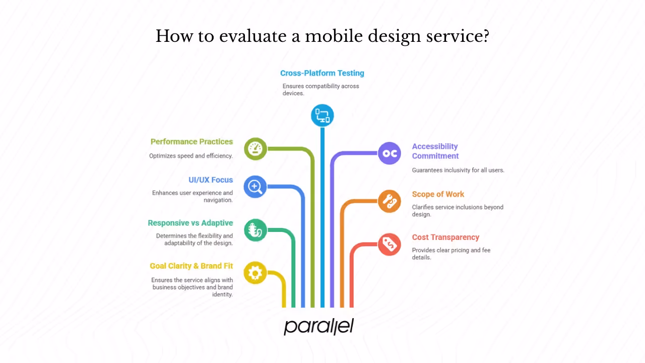
What criteria should you use to evaluate a mobile design service?
Founders and product managers should evaluate providers with a clear checklist:
- Goal clarity and brand fit. Are the agency’s processes set up to understand your business, audience and brand voice? Look for research and strategy sessions at the start.
- Responsive versus adaptive expertise. Does the team favour flexible, responsive layouts or build separate adaptive templates? They should justify their approach for your needs.
- UI/UX focus. Ask how they simplify navigation, handle typography and maintain consistency. Do they test with users?
- Performance practices. Request details on image optimisation, lazy loading, code minification and caching.
- Cross‑platform testing. Check that they test on multiple devices, browsers and orientations.
- Accessibility commitment. Ensure they follow target size guidelines and design for screen readers.
- Scope of work. Clarify if the service includes development, maintenance, copywriting and search optimization or just design.
- Cost transparency. Seek clear pricing, including any recurring fees for hosting or support.
Parallel stands out because we blend research, mobile‑first design and lean development. We emphasise performance, accessibility and iterative testing. Our team has worked with AI and SaaS startups, and we understand the trade‑offs between speed and craft.
What is the typical process and workflow of mobile website design services?
Most mobile website design services follow a similar flow:
- Kickoff. The team clarifies goals, user needs, brand voice and the desired user journey. Founders share context and constraints.
- Research. Designers study device usage patterns, competitor sites and technical requirements. They may run interviews or analytics reviews.
- Wireframes and prototypes. Low‑fidelity sketches outline key screens and flows. Interactive prototypes allow rapid feedback without heavy development.
- Design. Visual designers craft high‑fidelity mock‑ups that align with the brand. Colours, typography and spacing are refined.
- Development. Engineers implement responsive or adaptive layouts using modern CSS techniques like flexible grids, flexbox and media queries. They optimise images, minify code and set up caching.
- Testing. Cross‑device and cross‑browser testing ensures consistent behaviour. Accessibility checks confirm that controls meet recommended sizes.
- Launch and iteration. After deployment, teams monitor metrics such as load time, bounce rate and user flows. Post‑launch sprints refine features based on feedback.
Parallel often condenses this process into design sprints when speed is critical. A rapid cycle can produce a prototype in five days. This helps founders validate concepts without committing to full development.
Should you build a mobile website yourself or hire a service?
Do‑it‑yourself website builders can get a mobile‑friendly site live quickly. Platforms offered by hosting companies provide templates and artificial intelligence suggestions for layout, making it easy to launch without technical skills. This route is fast and inexpensive but limited: you trade customisation and performance tuning for convenience. Professional mobile website design services invest in user research, brand alignment and technical optimisation, resulting in higher quality but requiring more time and budget. The right choice depends on your goals. A founder who needs to validate an idea might start with a DIY tool and later upgrade. A startup aiming to build trust and scale should engage an experienced service.
What is an actionable checklist for founders and PMs?
- Define goals and audience. Identify what your users want from the mobile experience and how it aligns with your business objectives.
- Clarify scope. Decide whether you need design only, full development or ongoing support.
- Evaluate providers. Use the evaluation criteria above to assess agencies. Ask for examples of mobile work and references.
- Gather inspiration. Collect websites you like. Discuss what works and what doesn’t with your team.
- Pilot and iterate. Test a small mobile‑first flow or MVP before committing to a full build. Use metrics and user feedback to guide the next phase.
Conclusion
Mobile design is not optional. With two‑thirds of web traffic coming from phones and more than half of users bouncing when pages load slowly, a well‑crafted mobile experience shapes your brand and your search ranking. Mobile website design services vary widely, from quick builders to full‑service agencies. Your needs—speed, performance, budget and brand fidelity—should drive your choice. As you plan, keep the basics in mind: responsive layouts, generous touch targets, fast loading and accessible design. When you’re ready to build with confidence, book a call with Parallel; we’re here to help you create a mobile presence that supports your vision and scales as you grow.

check out these related blogs


.webp)