The phrase MVP UX design is easy to throw around, but the practice is far more disciplined than many assume. It is not a generic catch‑all for an unfinished prototype; it describes a way to shape an early experience that is both usable and lean. At Parallel we have learned that an MVP UX design mindset delivers core value quickly and helps you learn from real behaviour without burning through funds.
In this article, I break down how to achieve that. You will see why the build–measure–learn loop matters, how to sketch flows and wireframes without over‑building, and when to test and refine. By the end you will have a clear picture of prototyping, testing and iteration with a minimum viable product mindset.
What is an MVP in UX design?
An MVP is the smallest version of a product that still solves a real problem for the user. It offers the core feature set and is deliberately limited so that teams can validate assumptions quickly. In practice this means building a stripped‑down interface that still delivers value and lets you observe how people use it. The point of MVP UX design is to learn with the least effort. As Eric Ries explains, a startup turns ideas into products, measures how people use them and then learns from that evidence; he calls this the build–measure–learn loop. Each version of your early product is an experiment; the learning is the outcome.
The Lean UX approach reframes this loop as think → make → check. You begin by forming hypotheses about what users need; you then create something tangible to test those hypotheses; finally, you check how users respond. This cycle repeats until there is enough evidence to move forward or change course. The MVP UX design mindset aligns perfectly with this loop: you build just enough of the interface to measure behaviour, you collect feedback through observation and metrics, and you decide whether to iterate or pivot.
Key components of MVP UX design
Building a viable yet minimal experience requires discipline. Each component below helps you focus on the essentials without losing sight of quality.
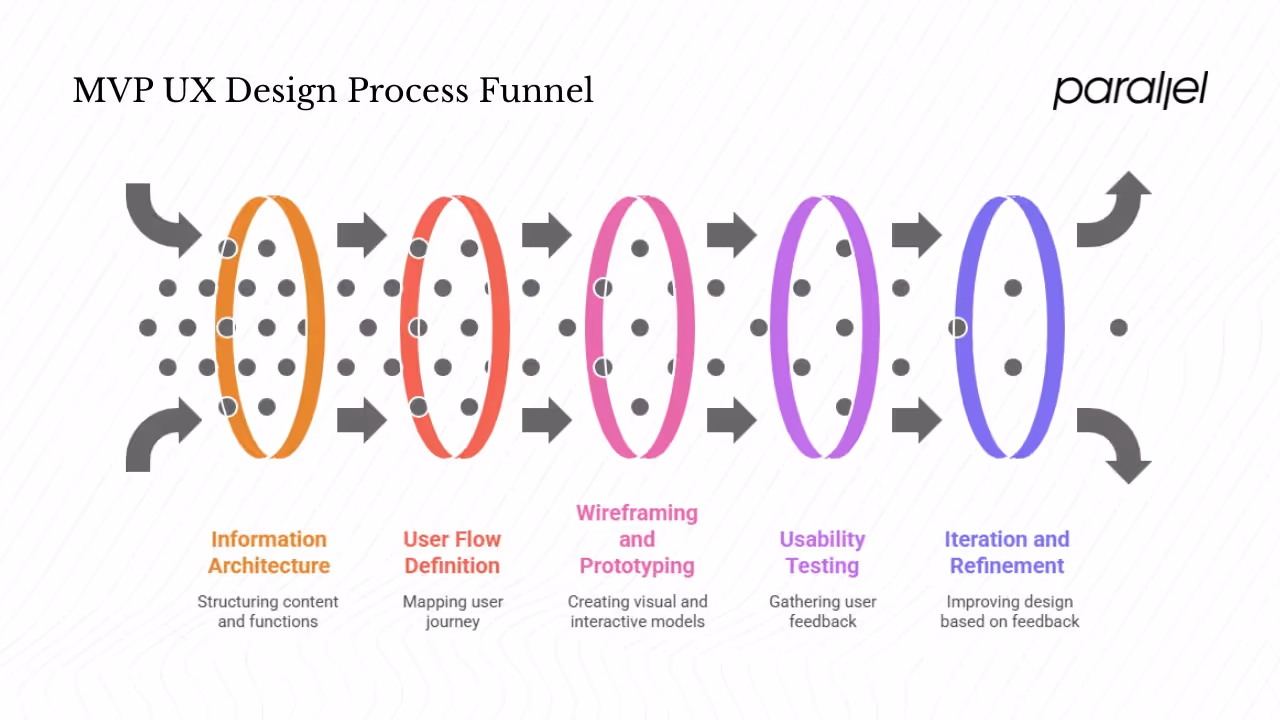
1) Information architecture
Start by mapping content and functions around one core flow. Prioritise clarity over completeness. A lean information architecture should show users where to start and how to reach the main outcome without confusion. People often feel overwhelmed when faced with more than seven options, so keep menus and sections sparse.
2) User flow
Define the shortest path from entry to success, such as signing up or checking out. Draw the steps on paper and test whether each one is necessary. If a step doesn’t move the user towards the core outcome, leave it out. A focused flow not only reduces development time but also prevents decision fatigue for early adopters.
3) Wireframes and low‑fidelity prototypes
Wireframes are sketches of the interface layout; they help you test ideas before investing in visuals or code. When we work with early‑stage teams, we use basic shapes and annotations to show hierarchy and content placement. Low‑fi prototypes add simple interactions like clickable buttons so you can watch how people navigate. These artefacts allow us to uncover issues quickly and cheaply.
4) Interactive elements
Add only the interactions you need to test behaviour. In many early tests, a clickable mock‑up with a handful of links suffices. The goal is to learn whether users can complete the flow, not to impress them with micro‑animations.
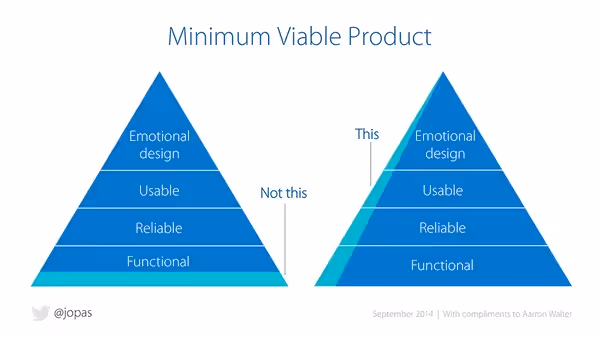
5) Minimal interface
A minimal interface is not a messy one. It emphasises essential elements while avoiding distractions. Research shows that first impressions are formed within 50 milliseconds and nearly 94% are based on design. A clean interface builds trust and keeps people engaged. On the other hand, 88% of consumers will not return after a frustrating experience, so even a minimal MVP must feel usable.
6) Prototyping
Building a prototype means creating something that feels real enough for a user to interact with. Modern tools let you link screens and simulate navigation without writing code. Your MVP UX design prototypes should be quick to assemble and easy to modify. At Parallel we often build clickable Figma prototypes over a day or two. They are imperfect by design, but they let us test assumptions right away.
7) Usability testing and user feedback
Observing people use your prototype is the most valuable part of the process. You should run sessions with at least five participants; ask them to complete the core task while you watch silently. Measure how many succeed, where they hesitate and how long tasks take【298305478474860†L358-L363】. Afterward, gather feedback about what worked and what didn’t. Short surveys or follow‑up interviews help you capture qualitative insights.
8) Iteration
After testing, refine the MVP. Remove or adjust elements that caused confusion. Add small improvements that make the core flow smoother. Then test again. This cycle continues until the core experience works well. Studies show that working iteratively speeds up learning and reduces waste.
9) Feature prioritisation
One of the hardest parts of MVP UX design is deciding what to include. Several frameworks can help. A simple method is the impact–risk matrix: list potential features, rank them by how much they help the user and how difficult they are to build, then pick the ones with high impact and low risk. Saying no to extra features keeps your MVP lean and prevents scope creep.
10) Design sprint and rapid development
Running a focused sprint can compress weeks of work into days. In a typical sprint you map the problem, sketch solutions, decide on one direction, build a prototype and test it with users—all within five days. This approach is ideal for MVP UX design because it forces the team to make decisions quickly and base them on evidence rather than opinion.
Why MVP UX design works for early‑stage teams
In my experience leading product engagements, early teams benefit enormously from a lean UX approach. Here’s why:
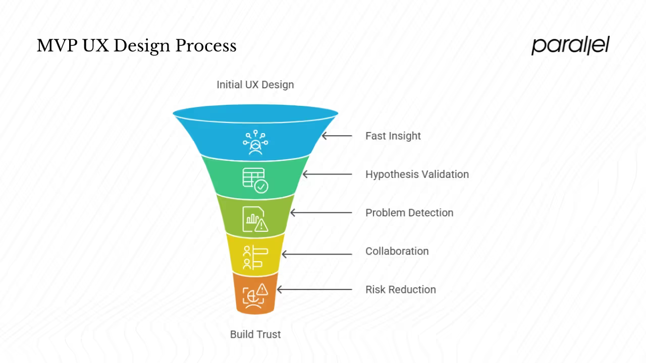
- Fast insight, less waste: Building an MVP helps you learn what users actually need before investing months of development. A well‑designed interface can double conversion rates and an effective UX strategy can boost them even further.
- Validation of hypotheses: Rather than guessing what users want, you let real behaviour confirm or refute your assumptions. The build–measure–learn loop formalises this process.
- Early detection of problems: Usability testing reveals issues in information architecture or flow before they become expensive to fix.
- Collaboration across roles: Designers, founders, product managers and developers can all participate in shaping the MVP. Lean UX emphasises teamwork and shared understanding.
- Lower risk: By focusing on the essential experience first, you reduce the chance of building features that nobody uses. This is crucial for startups facing financial constraints.
- Build trusts: Users judge a website quickly and a poor experience drives them away. A thoughtful MVP can build credibility and attract early adopters.
A step‑by‑step MVP UX design process
You can combine Lean UX principles with practical steps to create a repeatable process. Here’s a framework we use at Parallel.
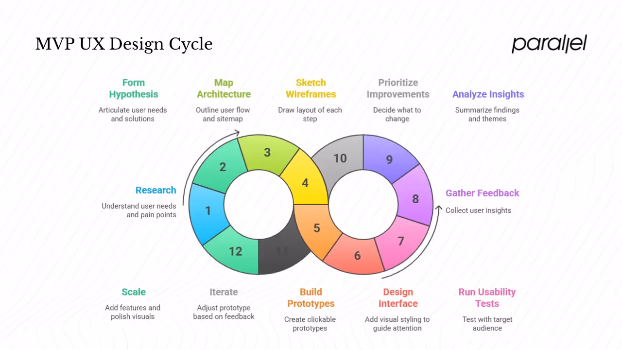
1) Think
- Research. Start by understanding who you are designing for. Conduct interviews, card‑sorting sessions or surveys to uncover mental models and pain points. Ask what problems users face and how they try to solve them. Competitive analysis also highlights unmet needs.
- Form a hypothesis. Based on this research, articulate what you believe users need and how the product will satisfy that need. Phrase it clearly so you can test it later. For example: “We believe that a simplified sign‑up flow will increase completion rates among new users.”
2) Make
- Map information architecture and user flow. Create a simple sitemap and outline the critical path from entry to outcome. Keep the number of steps low to avoid cognitive overload.
- Sketch wireframes. Draw the layout of each step on paper or in a tool. Focus on structure and hierarchy. For early AI/SaaS teams (I avoid the abbreviation intentionally), we often sketch dashboards and onboarding flows in a morning session.
- Build low‑fi prototypes. Turn your wireframes into clickable prototypes. Use basic shapes and dummy data. Resist the urge to polish the visuals; your goal is to test flow and comprehension.
- Create a minimal interface. Add just enough visual styling to guide attention. A clean design encourages trust and helps people focus on the task.
- Add interactive elements. Link screens and buttons so users can complete the core task. Again, limit interactions to those needed for your test.
3) Check
- Run usability tests. Recruit participants who fit your target audience. Ask them to complete the main task while you watch. Measure time on task, success rates and error counts.
- Gather feedback. After the task, ask open‑ended questions about their experience. Listen for patterns. If multiple people hesitate at the same step, that step needs work.
- Use rapid methods. In addition to moderated testing, try A/B tests or remote studies. Short surveys can uncover preferences without heavy research.
- Analyse insights. Summarise findings and look for themes. Did users understand the navigation? Was the language clear? Where did they struggle?
4) Refine
- Prioritise improvements. Use methods like MoSCoW (Must‑have, Should‑have, Could‑have, Won’t‑have) to decide what to change. An impact–risk matrix helps pick features with the greatest benefit for the least effort.
- Iterate. Adjust your prototype based on feedback. Remove unnecessary fields, clarify labels or shorten flows. Then test again.
- Repeat the cycle. Continue building, measuring and learning until the core experience works well and you have evidence to support your hypothesis.
5) Scale
Once the essential experience is validated, you can gradually add features and polish visuals. Avoid the temptation to jump straight into high‑fidelity design until you have enough evidence. Layer enhancements slowly, and test as you go. This approach prevents feature creep and ensures that each addition serves a purpose.
Tips and pitfalls to watch for
- Don’t confuse MVP with a rough prototype. Your MVP should still deliver value. It might be simple, but it must work. An MVP is a probe for feedback, not a throwaway sketch.
- Never skip user testing. The whole point of MVP UX design is to learn. Skipping tests to save time defeats the purpose. Even a couple of quick sessions can reveal critical issues.
- Avoid over‑polishing. Polishing the MVP too much wastes time and makes it harder to change. Use simple visuals until you have validated the concept. As Net Solutions notes, people often mistake a minimal product for sloppy design. You can make an interface elegant without heavy decoration by applying basic principles of unity, balance and contrast.
- Focus on usability. A minimal interface must still be usable. With 94% of first impressions based on design and 88 % of users unwilling to return after a bad experience, you cannot ignore usability even at this stage.
- Stay focused on priorities. Teams often get excited about adding one more “must‑have.” Use your prioritisation framework to keep the scope lean.
When to use MVP UX design
Not every situation calls for a minimal product, but there are clear moments when the approach shines:
- New concepts or markets: When you are uncertain whether a problem exists or how users will respond, MVP UX design lets you test without heavy investment.
- Early planning: Before committing resources to full development, build a lean prototype and gather feedback. If the concept resonates, you can invest more.
- High uncertainty: When knowledge about user needs is low and stakes are high, the build–measure–learn loop helps you avoid building the wrong thing.
- Cross‑functional alignment: Use an MVP to get designers, engineers and founders moving in the same direction. Shared experiments create shared evidence.
- Resource constraints: Startups often have limited money and time. A lean approach helps them learn quickly and conserve resources.
Conclusion
MVP UX design is about delivering essential value first. It combines lean, user‑centric methods with classic UX tools like wireframing, prototyping and testing. By focusing on information architecture, user flows and minimal interfaces, you build experiences that people can use right away. The build–measure–learn loop guides you to ask, build and observe; the cycle continues until you have enough evidence to pursue or pivot. For startups, this mindset reduces risk, speeds up learning and ensures that you build something users actually want. I encourage you to adopt MVP UX design in your next product sprint and see how much more you learn when you start small.
FAQ
1) What is an MVP in UX design?
An MVP is a usable yet minimal version of a product that delivers core value and enables you to learn from real users. It is not a rough sketch; it must still solve the user’s problem.
2) What is MVP in design thinking?
In design thinking, an MVP is a prototype or early product that tests a hypothesis. The objective is to learn quickly, not to build a finished solution. You create something people can use, measure their behaviour and refine based on what you learn.
3) What is MVP in user stories?
In agile planning, an MVP is the smallest set of user stories that delivers the core outcome. It represents the minimum work required to deliver value and gather feedback. Once you have validated this thin slice, you can add more stories as you iterate.
4) What does MVP stand for?
MVP stands for minimum viable product—the smallest version of a product that still delivers core value and allows you to test assumptions.

check out these related blogs


.avif)