Early‑stage startups live on thin margins. You can spend heavily to drive traffic, but if only a fraction of visitors convert into sign‑ups or customers, the runway quickly evaporates. The most efficient way to grow is to convert more of the people you already reach. That means combining disciplined experiments with thoughtful user‑experience design. This article explains how optimizing conversion rates through A/B testing and user experience can unlock sustainable growth. I’ll share definitions, frameworks, case studies and practical advice drawn from research and our work with founders at Parallel.
Fundamentals of conversion optimization and UX
Conversion rate optimization (CRO) is a systematic approach to increasing the percentage of visitors who take a desired action—subscribing, purchasing or requesting a demo. It is inherently cross‑functional; designers, product managers, marketers and engineers collaborate to remove friction and clarify value. A conversion isn’t always monetary; it can be any behaviour that moves the user to the next level of your funnel.
To measure progress, teams track metrics such as:
- Conversion rate – the share of visitors who complete the intended action.
- Click‑through rate (CTR) – how often people click a link relative to how often they see it.
- Bounce rate – the proportion of visitors who leave after viewing only one page.
- Time on page and scroll depth – indicators of engagement.

Improving these numbers isn’t about gimmicks; it’s about user experience. A well‑designed interface can boost conversion rates by 200% and a strong UX strategy can quadruple them. Conversely, slow pages and confusing layouts cause more than half of visitors to abandon a site within three seconds, and 88% of users won’t return after a bad experience. When we frame tests around user needs—clarity, speed, trust—optimizing conversion rates through A/B testing and user experience becomes a way to create value, not just improve numbers.
Setting up A/B tests and UX improvements
Effective experiments start with clear hypotheses. Use analytics to identify high‑traffic pages or steps in the funnel where users drop off. Tools like heatmaps, click‑tracking and session replays highlight friction points: weak CTAs, cluttered forms, confusing navigation. Formulate a hypothesis (“If we simplify the pricing table, more users will sign up”) before designing variants.
Choose metrics carefully. The primary metric is usually conversion rate or CTR; secondary metrics might include bounce rate or time on page. Define what counts as success—a 10% uplift, a 5% reduction in abandonments—and decide on the level of statistical confidence you require. Most experts advocate at least 95 % significance to avoid acting on noise. Run tests long enough to capture weekly patterns; ending prematurely can mislead decisions.
Design variants so that only one element changes at a time. Tweak headlines, button copy, layout or imagery but keep everything else constant. Smaller changes make it easier to attribute outcomes. Pay attention to performance: heavy testing scripts can slow down pages and degrade experience. On the UX side, invest in fundamentals. Compress images, defer non‑critical scripts and implement caching to improve load times—reducing page load from eight seconds to two can increase conversions by 74%. Simplify information architecture; reduce form fields, group related steps and use clear visual hierarchy. Small usability wins often outshine flashy redesigns.
A/B testing types and techniques
A simple A/B test shows half of users the control and half a variant, with one variable changed. This approach is ideal when traffic is limited and you want a clear answer. Multivariate tests change multiple elements—headline, image, button colour—simultaneously; they can reveal interactions but require much more traffic to reach significance. Split or A/B/n tests pit entirely different designs against each other; use them when exploring big directional changes. Whichever method you choose, define success, randomise assignments and avoid mid‑test changes. Beyond generic tests, personalisation tailors experiences based on segment, location or device. Always iterate: test, learn and refine. This iterative mindset is central to optimizing conversion rates through A/B testing and user experience.

UX design elements that drive conversions
The biggest lifts often come from clear copy and frictionless flows. For travel service Going, changing its primary CTA from a generic phrase to “Start my free trial” produced a 104% increase in trial starts. Campaign Monitor personalised landing page headlines with the visitor’s industry and saw a 31.4% uplift. First Midwest Bank swapped stock photos for community images and moved the enquiry form below the fold; conversions rose 195% and then another 52%. These examples show that relevance and context matter more than flashy design.
CTAs deserve special attention. Elements like colour, copy, size and placement influence behaviour. In one test, a red button outperformed a green button by 21%. Clarity and urgency also matter—users are more likely to click when they understand what happens next and why they should act now.
Don’t assume discounts always help. Electronic Arts removed a 20% pre‑order discount for SimCity 5 and saw sales surge by over 40%. The discount signalled low value; removing it increased perceived worth. Similarly, complex checkout flows hurt conversions. TechInsurance built a dedicated landing page and increased conversions by 73%. Grene redesigned its mini‑cart and doubled average purchase quantitiesunbounce.com. The Vancouver Olympic store cut its checkout to a single page and increased completions by 21.8%. The pattern is clear: reduce friction, clarify value and test assumptions. That is the essence of optimizing conversion rates through A/B testing and user experience.

Avoiding common mistakes
Three mistakes derail many experiments. First, testing too many variables at once makes it impossible to know which change caused the outcome. Limit variants to one or a small number of elements. Second, stopping tests too early or running them without enough traffic undermines reliability. Wait until you reach a pre‑defined sample size and statistical significance (often 95 %). Third, ignoring external influences—promo campaigns, seasonality or social sharing—can skew results. Control what you can and document what you cannot.
Other pitfalls are aesthetic. Beautiful pages that hide the CTA or use ambiguous language can underperform. Testimonials and badges aren’t always positive; sometimes they distract. Finally, the testing tool itself can slow down your site and cause flicker if not configured properly. Keep design secondary to usability and speed. In all cases, remember that optimizing conversion rates through A/B testing and user experience is about helping users, not tricking them.
Frameworks and strategies for prioritisation
When faced with a long list of ideas, frameworks such as PIE (Potential, Importance, Ease) help decide where to start. Rate each idea on how much improvement it could deliver, how much traffic or revenue the page sees and how easy it is to implement. Multiply the scores to rank opportunities; high scores indicate tests that could produce the biggest impact for the least effort. This prevents you from chasing minor tweaks on low‑traffic pages.

Mapping the customer journey also reveals friction. Use analytics to identify where people abandon the funnel and assign PIE scores to hypotheses in those zones. Maintain a backlog of experiments and revisit priorities as data changes. As you build testing muscle, mix quick wins with larger, riskier experiments. Scaling tests thoughtfully is a key part of the optimisation journey.
Other prioritisation models and scaling
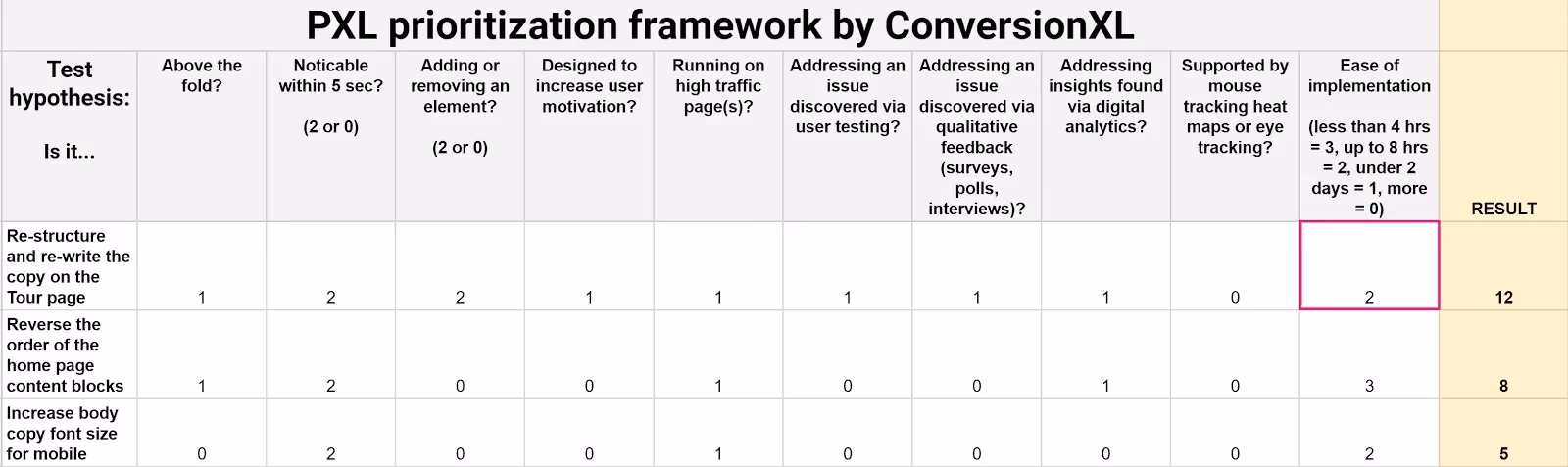
Beyond PIE, other frameworks such as ICE (Impact, Confidence, Effort) and PXL can help structure your backlog. ICE asks you to estimate how much an experiment might move the needle, how confident you are in that prediction and how much effort is involved.

PXL goes a step further by weighting ideas based on the amount of research supporting them and whether they target high‑traffic pages. Whichever framework you use, the goal is the same: allocate scarce resources to experiments that promise the biggest upside relative to cost. We typically give higher scores to ideas backed by usability studies or real‑world case studies because they are more likely to yield a positive result. As your program matures, consider investing in experimentation platforms that automate traffic allocation, calculate statistical significance and support complex segmentation. They free up your team to focus on strategy rather than tooling.
Throughout growth, remember that optimizing conversion rates through A/B testing and user experience isn’t about running more tests; it’s about choosing the right tests.
Case studies
The value of experimentation becomes clear when you look at real examples. A doubled trial starts by adjusting its CTA to speak directly to the user. Campaign Monitor increased conversions by tailoring headline copy to each visitor’s industry. First Midwest Bank boosted leads by replacing generic visuals with local photos and repositioning its form. Electronic Arts increased pre‑order sales by removing a discount. Performable discovered that a red button prompted 21% more clicks than a green one. TechInsurance built a bespoke landing page and saw a 73% conversion lift. Grene’s mini‑cart redesign doubled purchase quantity. A single‑page checkout for the Vancouver Olympic store increased completions by 21.8%. These stories illustrate how small, data‑driven tweaks can produce outsized gains. They also remind us that what works for one product may not work for another; testing is essential. Embrace curiosity and rigour when optimizing conversion rates through A/B testing and user experience.

Measurement and iteration
After a test concludes, analyse more than the primary metric. Did the bounce rate drop? Did users scroll deeper or complete tasks faster? A variant that increases sign‑ups but raises refund requests may hurt the business. Qualitative insights from session recordings and surveys can explain why users behave differently. If results are inconclusive or negative, document the hypothesis and outcome. Learning what doesn’t work is valuable; it prevents repeating mistakes.
When a variant wins, roll it out to all users but keep monitoring. Sometimes gains erode over time as user expectations shift. Continual testing ensures that improvements stick. Optimisation is never finished; as your product evolves and new audiences arrive, revisit assumptions, develop new hypotheses and iterate. The discipline of optimizing conversion rates through A/B testing and user experience turns experimentation into a habit rather than a one‑off project.
Conclusion
Increasing conversions isn’t magic; it’s methodical. By combining rigorous testing with thoughtful UX improvements, early‑stage startups can squeeze more value from existing traffic and build a stronger foundation for growth. The techniques outlined here—clear hypotheses, controlled experiments, prioritisation frameworks, and a focus on speed and clarity—show that even small changes can produce significant returns. Treat this optimisation discipline as an ongoing practice, and let data and empathy guide your decisions.
FAQ
1) What is A/B testing in CRO?
A/B testing compares a control version of a page or element to a variant. Visitors are randomly split, and metrics such as conversion rate or CTR are measured. Because only one element changes, you can attribute performance differences to that change.
2) How do you optimise conversion rates?
Analyse where users drop off using analytics and qualitative feedback. Formulate hypotheses, design simple tests, run them to statistical significance and iterate. Focus on speed, clarity, trust and relevance rather than superficial design.
3) What is a B test for user experience?
A B test is the variant in an A/B test. It could be a new headline, layout or checkout flow. The goal is to see whether the change improves both user experience and the desired metric.
4) Which testing method is most popular?
Simple A/B testing is the most widely used because it provides clear, actionable insights with minimal traffic requirements. Multivariate testing is valuable when you have enough traffic to support many combinations.
5) How long should an A/B test run?
Duration depends on traffic and the expected uplift. Run tests long enough to capture a full business cycle and achieve at least 95% statistical significance. Using calculators helps estimate the required sample size.
6) Which tools or metrics should a startup focus on first?
Start with analytics that show conversion funnels and bounce rates. Use heatmaps and session recordings to uncover friction. Monitor page load times, as speed has a direct impact on conversions. As you scale, adopt feature flags and segmentation tools to run more complex tests.

check out these related blogs


.avif)


