Modern software products are expected to work anywhere—phone, tablet, desktop, even giant displays in a conference room. Yet many early‑stage teams still think of their site or app as a single canvas. At Parallel, we often see smart founders planning to build separate mobile and desktop experiences because they fear they’ll compromise.
The truth is that responsive design services make separate builds unnecessary. A responsive site adapts to different viewports so the layout, images and typography remain usable and accessible on any device. This approach matters more than ever: by 2025 mobile traffic accounts for roughly 63.15% of web usage, and around 83% of users expect a consistent experience across devices.
In this guide I’ll explain why responsiveness is essential for startups, highlight what to look for in design partners and review ten notable providers. I’ll share patterns we’ve observed working with AI/SaaS teams and cite recent research. Whether you’re a founder, product manager or design leader, you’ll leave with a clear sense of why responsive design services matter and who can help.
Quick Answer: Responsive Design Services (2026)
Responsive design services help your website or application adapt seamlessly across phones, tablets, desktops and large displays—reducing maintenance, improving user experience, and boosting conversions. In 2026, top providers include:
- Parallel – A startup-focused studio known for scalable, product-led responsive systems.
- Turing – A global talent network providing vetted front-end specialists for fast scaling.
- Designity – A creative subscription platform offering flexible, ongoing responsive design support.
Read on for a full comparison of the top 10 service providers and how to choose the right one for your needs.
Why are responsive design services essential?

1) Users expect fluid grids and flexible images
Ethan Marcotte’s 2010 article introduced three pillars for responsive design—fluid grids, flexible images and media queries—and they still underpin modern builds. Fluid grids are grid systems that scale based on the user’s screen rather than fixed widths, ensuring all elements resize proportionally. Flexible images use CSS properties such as max‑width: 100% so pictures shrink with their containers. Media queries allow designers to apply different styles when the viewport falls below specific widths.
These techniques are not optional. Research shows that 90% of websites have implemented responsive design, and companies with responsive sites enjoy higher conversion rates. Users have little patience for slow pages or layouts that force pinch‑and‑zoom gestures; roughly 39% will stop engaging with content when load times are too long. A well‑designed responsive experience reduces bounce rates and builds trust.
2) Viewport configuration and media queries shape behaviour
The starting point for any responsive page is the viewport meta tag. Including <meta name="viewport" content="width=device-width, initial-scale=1.0"> instructs the browser to optimize scaling and layout for different devices. Without it, a site may appear zoomed out or distorted on phones. Media queries let you tailor typography, spacing and layout at various breakpoints. For example, you might reduce the number of columns on a tablet or increase tap target sizes for mobile.
Adaptive layout does not end at breakpoints. Modern CSS features like Grid and Flexbox enable complex layouts that reflow intelligently. Container queries—an emerging standard—allow components to respond to the size of their container rather than the viewport, enabling truly modular responsive components. Responsive typography uses relative units (em, rem, vw) and variable fonts so text scales smoothly across screens.
3) Good responsiveness drives performance, SEO and conversions
Responsive design isn’t just about aesthetics; it has measurable benefits. Studies show that visitor bounce rate increases to 123% if a page takes 10 seconds to load. Google considers responsiveness in its indexing algorithms, and mobile‑first indexing means non‑responsive sites get penalized. Responsive sites load faster because they avoid redirects to separate mobile URLs and can use caching and lazy loading effectively.
Business outcomes follow. Responsive design can raise conversion rates by 400%, and 62% of companies report increased sales after implementing responsive mobile designs. Responsive sites also have lower maintenance costs because teams manage a single codebase rather than separate mobile and desktop versions. Considering that 85% of consumers think a company’s mobile site should be as good or better than the desktop version, it’s clear why early‑stage startups and product leaders must prioritise browser responsiveness.
Who are the top 10 responsive design service providers?
The providers below have been selected based on our own experience collaborating with design partners and by reviewing their portfolios. We highlight what each excels at and who they’re best suited for.
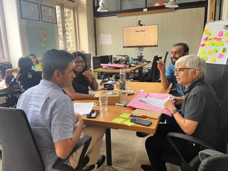
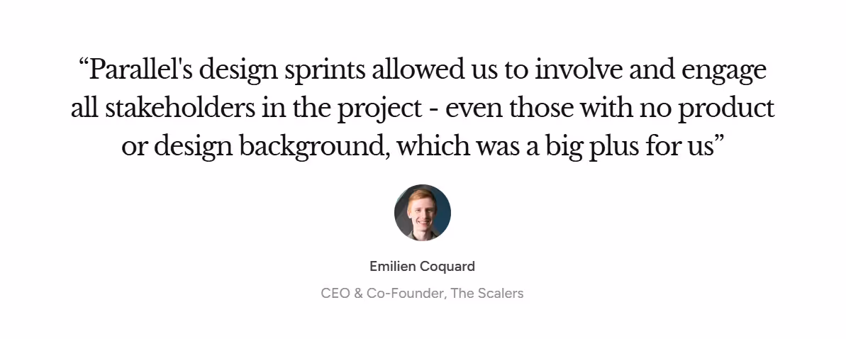
1. Parallel – Startup‑focused design & product studio

Parallel is the team I lead. Our studio specialises in end‑to‑end product design for SaaS and AI startups. We combine agile research, UX strategy and polished execution. Our responsive design services focus on fluid grids, adaptive layouts and user‑centred product thinking. For example, we often create responsive onboarding flows that reduce time‑to‑value by 30% and improve activation rates. Early‑stage teams appreciate our ability to move quickly, challenge assumptions and deliver responsive designs that scale with growth.
2. Turing – Global tech talent & design solutions

Turing connects startups with vetted engineers and designers around the world. Their network includes experts in mobile friendliness, media queries and cross‑device solutions. If you need to scale quickly and your core team lacks front‑end specialists, Turing’s contractors can fill the gap. We’ve seen companies use Turing to build responsive dashboards and then hire full‑time staff once their product gains traction.
3. UX4Sight – User‑experience‑centred responsive design

UX4Sight focuses on usability research and accessibility. Their projects emphasize dynamic content scaling, inclusive design and WCAG compliance. If your app will be used by diverse audiences or needs to meet regulatory standards, UX4Sight’s responsive design services ensure navigation, typography and controls are accessible across devices. Clients credit them with reducing bounce rates by focusing on readability and touch targets.
4. Designity – Collaborative creative platform
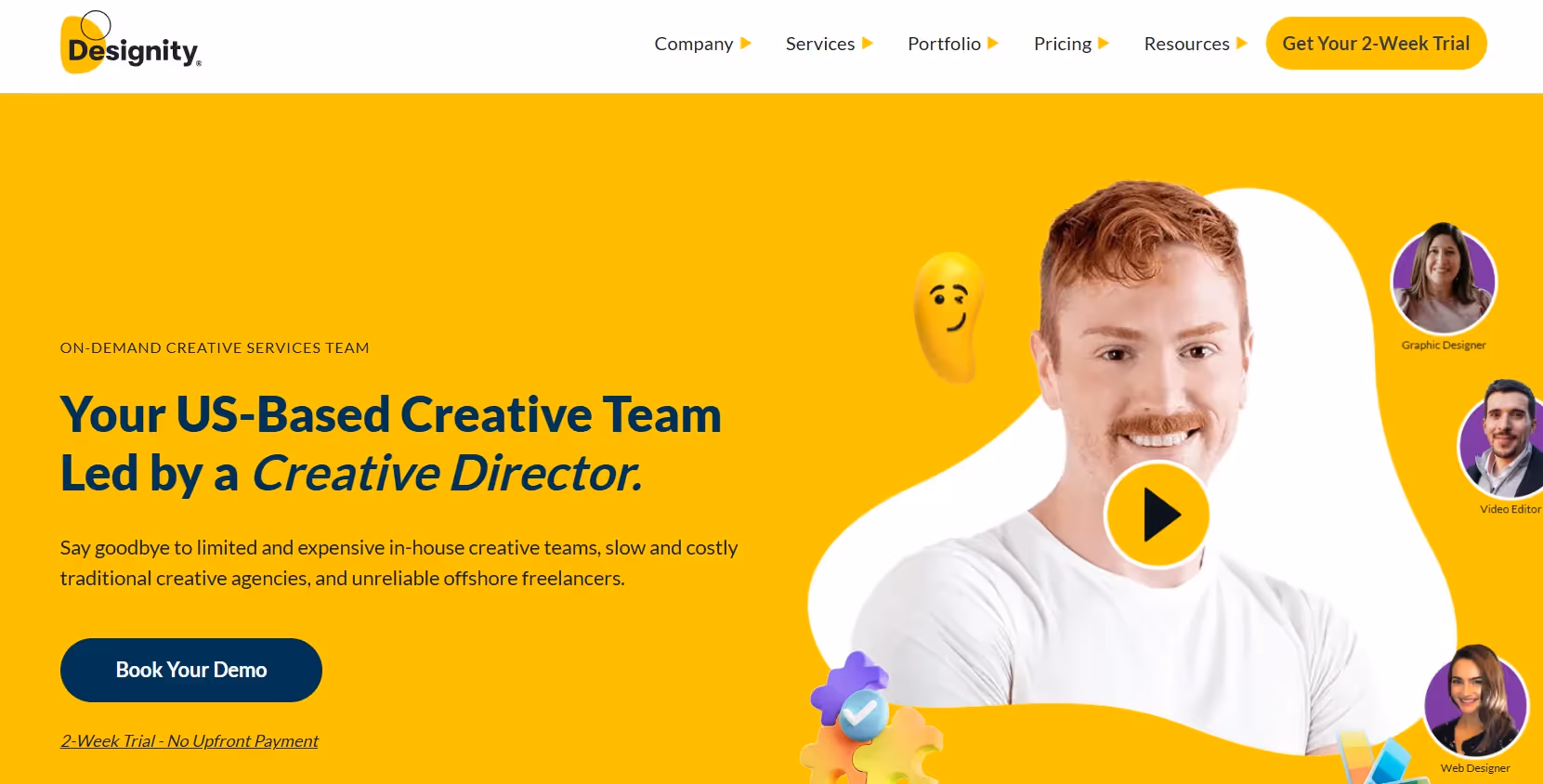
Designity pairs businesses with remote creative teams on a subscription model. Their network covers responsive website design, branding and content creation. They excel at adaptive layouts, flexible images and content‑driven design. For startups with ongoing marketing needs—landing pages, campaign pages, blog templates—Designity offers scalable support without the overhead of hiring full‑time designers.
5. Toptal – Premium talent marketplace
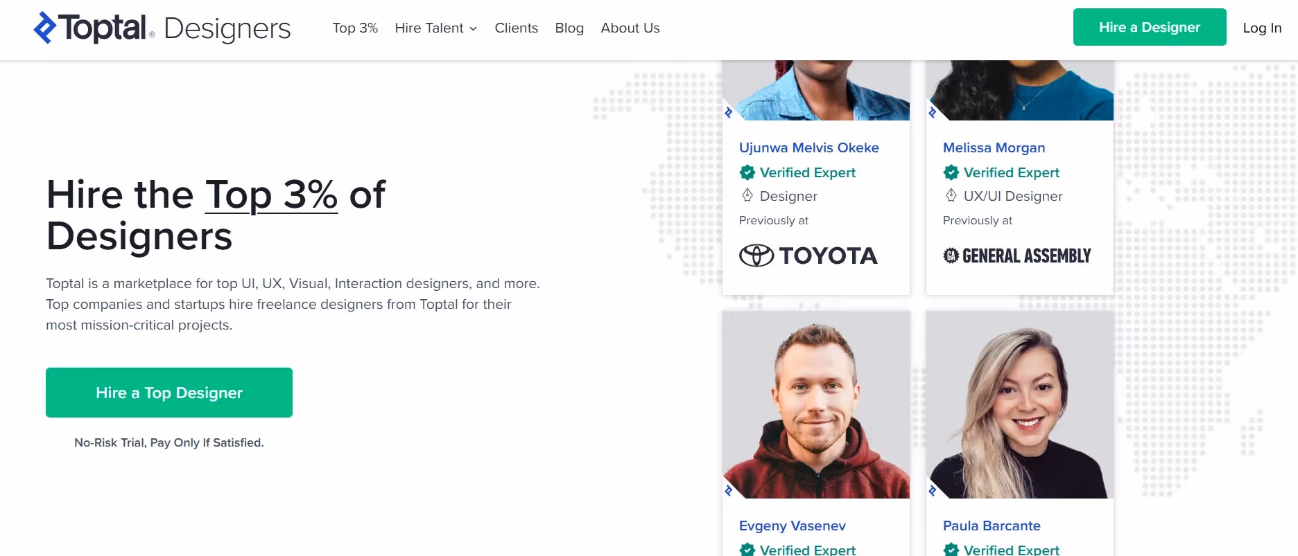
Toptal curates the top 3% of freelancers worldwide. They provide specialists in fluid grids, viewport configuration and performance optimization. If your budget allows for premium rates, Toptal designers can join your team to build bespoke responsive systems. We’ve seen founders hire Toptal experts for short sprints to establish a robust design system before handing off to internal teams.
6. Gravitate Design – Responsive design specialists

Gravitate focuses on full‑service responsive websites. Their work blends visual creativity with technical scalability. They’re particularly strong in cross‑device compatibility and browser responsiveness. For companies needing an end‑to‑end agency to handle strategy, design and development, Gravitate delivers polished responsive sites that perform well in search results and convert visitors.
7. Clay – Branding + web design for startups
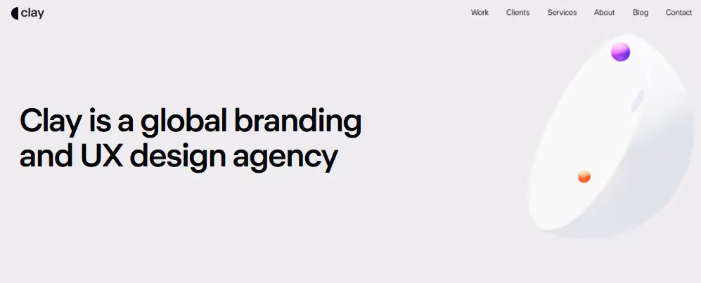
Clay combines branding with web design. They create high‑quality visual identities and responsive systems that reflect a brand’s personality. Clay’s designers are skilled at using media queries and adaptive layouts to ensure the site feels consistent across devices. Startups that need both a brand refresh and a new responsive site will find Clay’s integrated approach compelling.
8. IDEO – Global design leader

IDEO is known for human‑centred innovation. Their teams have pioneered design thinking and continue to push boundaries in responsive systems. IDEO’s cross‑platform testing ensures designs work across browsers and devices. They’re a good fit for enterprises or funded startups aiming for cutting‑edge experiences that integrate with complex ecosystems (such as IoT or AR/VR).
9. Frog Design – UX + engineering integration

Frog brings together design and engineering. Their responsive prototypes use fluid grids and dynamic scaling. They’re particularly adept at complex products requiring collaboration between industrial design and digital interfaces, like wearable devices or car dashboards. If your product spans hardware and software, Frog’s integration of adaptive layouts and engineering precision is invaluable.
10. Ruckus – Creative web design agency
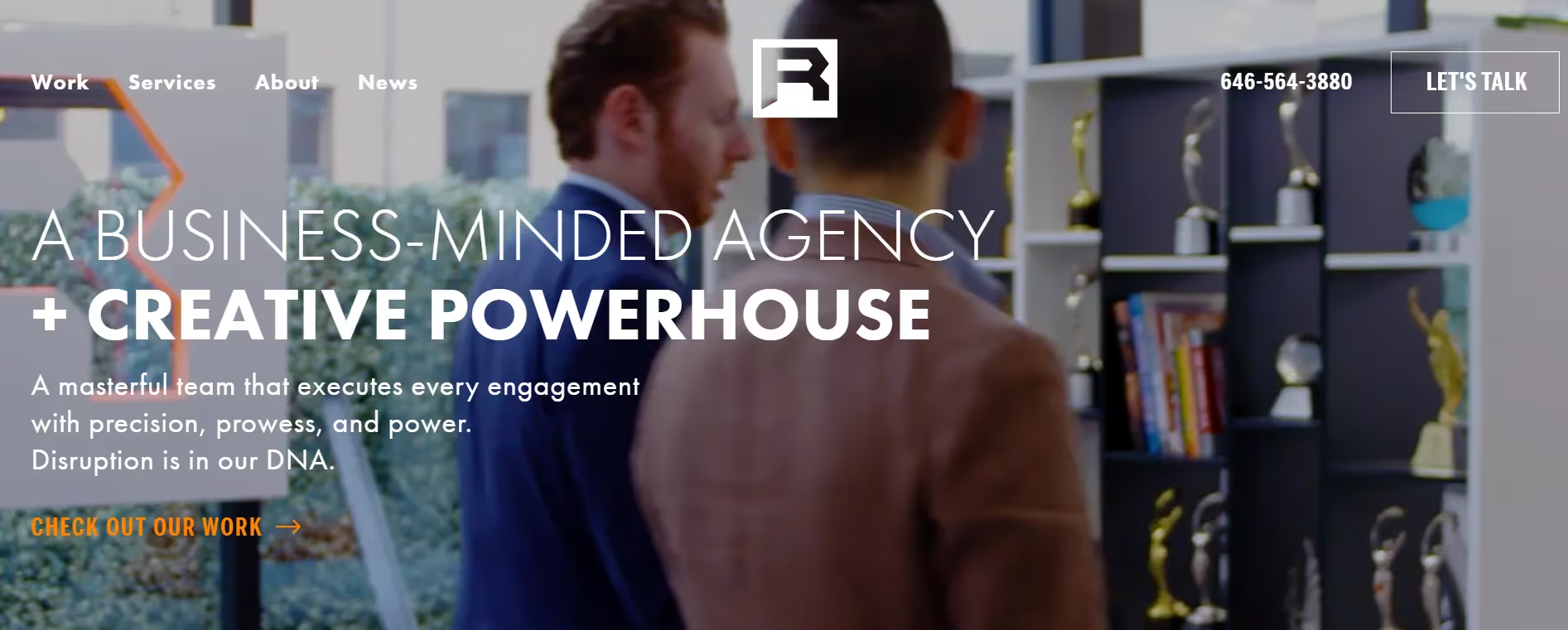
Ruckus produces high‑impact marketing sites with an emphasis on responsive performance. They blend browser responsiveness, cross‑device compatibility and SEO‑friendly structures. Startups seeking design tied closely to marketing results—such as conversion‑optimized landing pages, product launches and brand storytelling—often find Ruckus a strong partner.
How can you choose the right responsive design service provider?
1) Consider your budget, timeline and product complexity
Not every startup has the same design needs. Before choosing a provider, ask: How complex is our product? Do we need brand development or just implementation? What’s our budget and timeline? A bootstrapped team may prioritize quick wins and choose a subscription model like Designity or a freelancer from Turing. Funded teams might invest in premium talent from Toptal or a full agency like Gravitate.
2) Startups vs. global design firms
A startup‑focused studio understands the pace and constraints of early‑stage teams. At Parallel we often work in one‑week sprints to validate hypotheses and iterate quickly. In contrast, a global firm like IDEO or Frog brings deep research, cross‑industry experience and larger project teams. If your challenge involves new technology or requires enterprise‑scale systems, a larger firm may offer the necessary breadth. For straightforward marketing sites, a boutique agency is often more cost‑effective.
3) Responsive design is about scalability, not just mobile
When evaluating responsive design services, look beyond the ability to shrink a layout. Scalability means the design system can grow with your product. Modern responsive design encompasses fluid grids, flexible images, media queries, container queries and responsive typography. It also includes performance optimization—code splitting, lazy loading and caching—to ensure pages load quickly. Ask potential partners about their approach to design tokens, component libraries and cross‑platform testing. A good provider should think in systems, not individual pages.

Why is Parallel a smart choice for startups?
Our team at Parallel combines product strategy with design craftsmanship. We don’t just create pretty screens; we align design decisions with your business goals. We’ve helped AI startups reduce onboarding friction by 40%, SaaS companies improve trial‑to‑paid conversion by 20% and enterprise tools launch responsive dashboards used by thousands of users. We draw on patterns from dozens of projects to recommend whether to use CSS Grid or Flexbox, how to define breakpoints, when to implement container queries and how to test across devices.
Most importantly, we understand that early‑stage teams need partners who can move fast without sacrificing quality. Our responsive design services are tailored to your product stage, ensuring you get just enough process to ship while building a foundation for scale.
Conclusion
Responsive design is no longer optional. With mobile traffic dominating web use and 83% of consumers demanding consistent experiences across devices, ignoring responsiveness risks alienating customers. Responsive systems rely on fluid grids, flexible images, media queries and proper viewport configuration. These techniques improve load times, boost SEO and can raise conversion rates by hundreds of percentresearch.comhostinger.com.
Early‑stage startups should view responsive design services as an investment in scalability and user experience. The providers profiled here—including Parallel, Turing, UX4Sight and others—offer different strengths depending on your needs. Evaluate your budget, timeline and product complexity, then choose a partner who can help you build a flexible, future‑ready product.
FAQs
Q1. What is the meaning of responsive design services?
Responsive design services involve designing and building websites or applications that adapt their layout, images, typography and interactions to different screen sizes and device capabilities. Providers use fluid grids, flexible images, media queries and performance optimization to ensure a consistent experience across phones, tablets and desktops.
Q2. Is responsive design still relevant?
Yes. In 2025 mobile traffic represents more than 63% of web usage, and 90% of websites have adopted responsive design. Responsive sites achieve higher conversion rates and meet user expectations for seamless cross‑device experiences. With Google’s mobile‑first indexing, non‑responsive sites lose visibility and traffic.
Q3. How much does a website design service cost?
Costs vary widely based on scope, team composition and expertise. A basic marketing site from a subscription platform like Designity might start at a few thousand dollars per month, while a comprehensive responsive redesign from a premium firm like IDEO or Toptal could cost tens of thousands. When budgeting, consider not just upfront fees but long‑term maintenance savings; responsive sites reduce the need for separate mobile and desktop codebases.
Q4. What is an example of responsive design?
A simple example is a three‑column desktop layout that becomes a single column on a phone. The grid uses percentages instead of fixed widths, images have max‑width:100% so they shrink with their container, and media queries adjust font sizes and spacing at breakpoints. The result is a design that looks and works well whether viewed on a 27‑inch monitor or a 5‑inch phone.

check out these related blogs


.avif)


.webp)