Usability testing isn't just a checkbox; it's one of the fastest ways to discover what does and doesn’t work for your users. In early‑stage products you often don't have mountains of data, so watching real people use your interface offers priceless insight. Founders and product leaders rely on what actual users say and do to inform product decisions. Structured usability testing questions help you see past assumptions, uncover friction and ship with confidence. In this guide I'll share how to build those questions, link them to core UX principles and answer common questions about testing.
What Are Usability Testing Questions?
Usability testing questions are prompts used during product testing to observe how real users interact with your interface. They help identify friction points, confusing layouts, ineffective features, and areas where users struggle, so you can improve the experience before launch.
What usability testing questions reveal
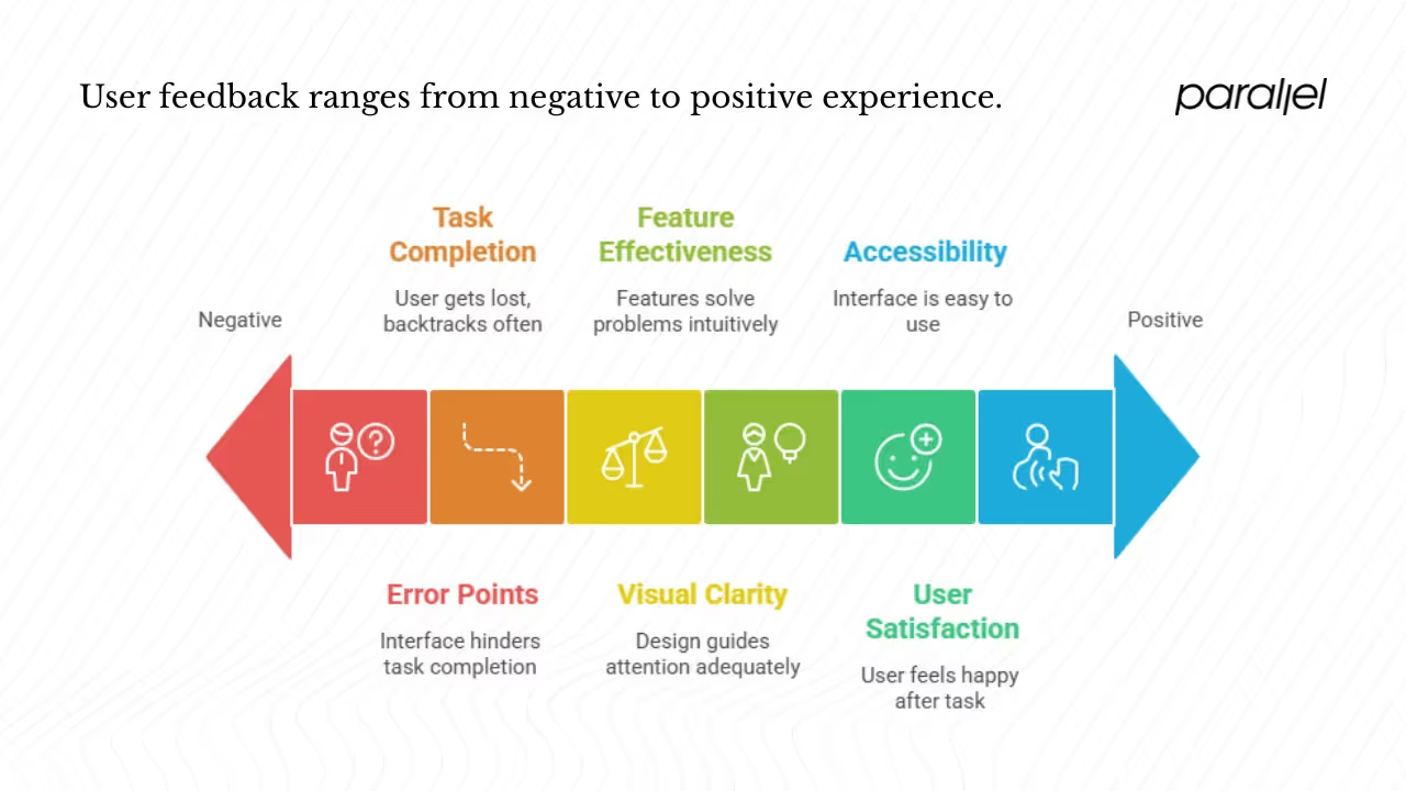
Asking the right usability testing questions lets you see how someone experiences your product in real time. When a participant thinks aloud while signing up, browsing or completing a task, you learn about:
- Task completion and navigation flow: Can the user find what they need without getting lost? Do they take the intended path or backtrack? These insights tie directly to learnability and efficiency.
- Feature effectiveness: Do the features solve the problem they’re meant to solve? Do people find them or ignore them? Simple prompts like “Show me how you’d save this report” expose whether a feature is intuitive.
- Visual clarity and design: First impressions are formed in milliseconds; design influences trust. Asking “What stands out to you on this screen?” reveals whether your hierarchy and typography guide attention.
- Error points and recovery: When something goes wrong, does the interface help? Do users read error messages, or do they get stuck? Questions such as “What did you expect to happen when you clicked that?” surface confusing states.
- User satisfaction and engagement: How do they feel after completing a task? Are they bored, frustrated or delighted? Post‑task prompts like “How did that feel?” add context aside from whether the task was done.
- Accessibility challenges: Everything from font size to contrast and keyboard navigation can block someone’s progress. Asking “Was anything hard to reach or read?” surfaces barriers you might not have considered.
When collected together, these insights show whether your product is easy to use, clear to learn and satisfying. They also flag accessibility problems that might block segments of your audience. In our work with automation‑driven SaaS startups, we've found that unspoken friction in onboarding often correlates with churn; early testing questions can catch those issues before launch.
The principles behind your questions
A good question set is anchored in well‑established usability principles. Two classic frameworks are worth revisiting because they tie directly into the keywords you’re optimizing for.
Jakob Nielsen’s five components: According to Nielsen, usability is defined by learnability, efficiency, memorability, low error rates and satisfaction. Each component maps to the questions you ask:
- Learnability: Can a new user quickly accomplish basic tasks? Observing the path they choose and asking what made sense or felt confusing exposes their initial mental model.
- Efficiency: After learning the system, can users perform tasks quickly? Measuring the time it takes to complete important flows and noting hesitations tells you if your interface supports efficient workflows.
- Memorability: When users return after a break, can they pick up where they left off without relearning everything? Follow‑up sessions reveal whether navigation and terminology stick.
- Errors: Are errors frequent or severe? Do people recover easily? Asking about unexpected outcomes and watching how participants react surfaces common pitfalls.
- Satisfaction: How pleasant is the overall experience? Asking people to rate their experience or compare it to other tools provides qualitative data that influences adoption.
ISO 9241‑11’s definition: The International Organization for Standardization defines usability as “the extent to which a product can be used by specified users to achieve specified goals with effectiveness, efficiency and satisfaction”. Effectiveness asks whether users can complete tasks successfully. Efficiency looks at the resources (time, clicks) needed. Satisfaction captures comfort and positive attitudes. When crafting usability testing questions, linking them back to these three dimensions ensures you cover both performance and perception.
In addition to these frameworks, design practitioners focus on visual clarity, engagement and error prevention. Visual clarity is about reducing noise and guiding attention; asking what a user notices first can tell you if your hierarchy is working. Engagement speaks to whether people want to keep exploring; when someone comments that they enjoyed a flow or found it tedious, you’re learning about engagement. Error prevention is about anticipating missteps—if multiple users misunderstand a label or get stuck on a control, you know where to intervene.
The business case for focusing on these principles is strong. Research compiled in 2024‑2025 shows that return on investment for user‑centred design can range from $2 to $100 for every $1 spent. A survey found that 86 percent of buyers are willing to pay more for better experiences, yet very few believe vendors consistently meet expectations. Moreover, companies that invest in improving experiences see a 42 percent increase in customer retention and a 33 percent boost in satisfaction. Clear, thoughtful questions help you target the factors that influence these outcomes.
Picking the right testing format
Your usability testing questions should match the context in which you’re testing. There are three dimensions to consider:
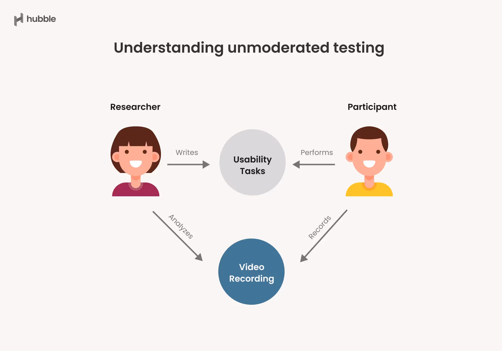
- Moderated versus unmoderated: In moderated sessions, a researcher is present, either in person or via video, to ask questions and observe. Moderated testing works well for exploring new ideas because you can probe in real time. Unmoderated testing involves giving participants a task and set of questions to complete on their own. It’s efficient for quick iterations but limits follow‑up. When designing unmoderated scripts, clarity is critical; tasks must be self‑explanatory.
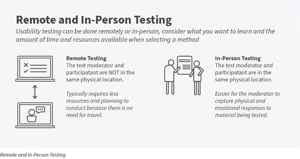
- Remote versus in‑person: Remote sessions are convenient and cost‑effective, enabling you to reach a wider audience. They also let you observe users in their own environment. However, you’ll need to pay attention to technical constraints—lag or screen‑sharing glitches can skew results. In‑person testing allows for richer observation of body language and environment. Choose based on your product stage and the logistics of recruiting your target audience.
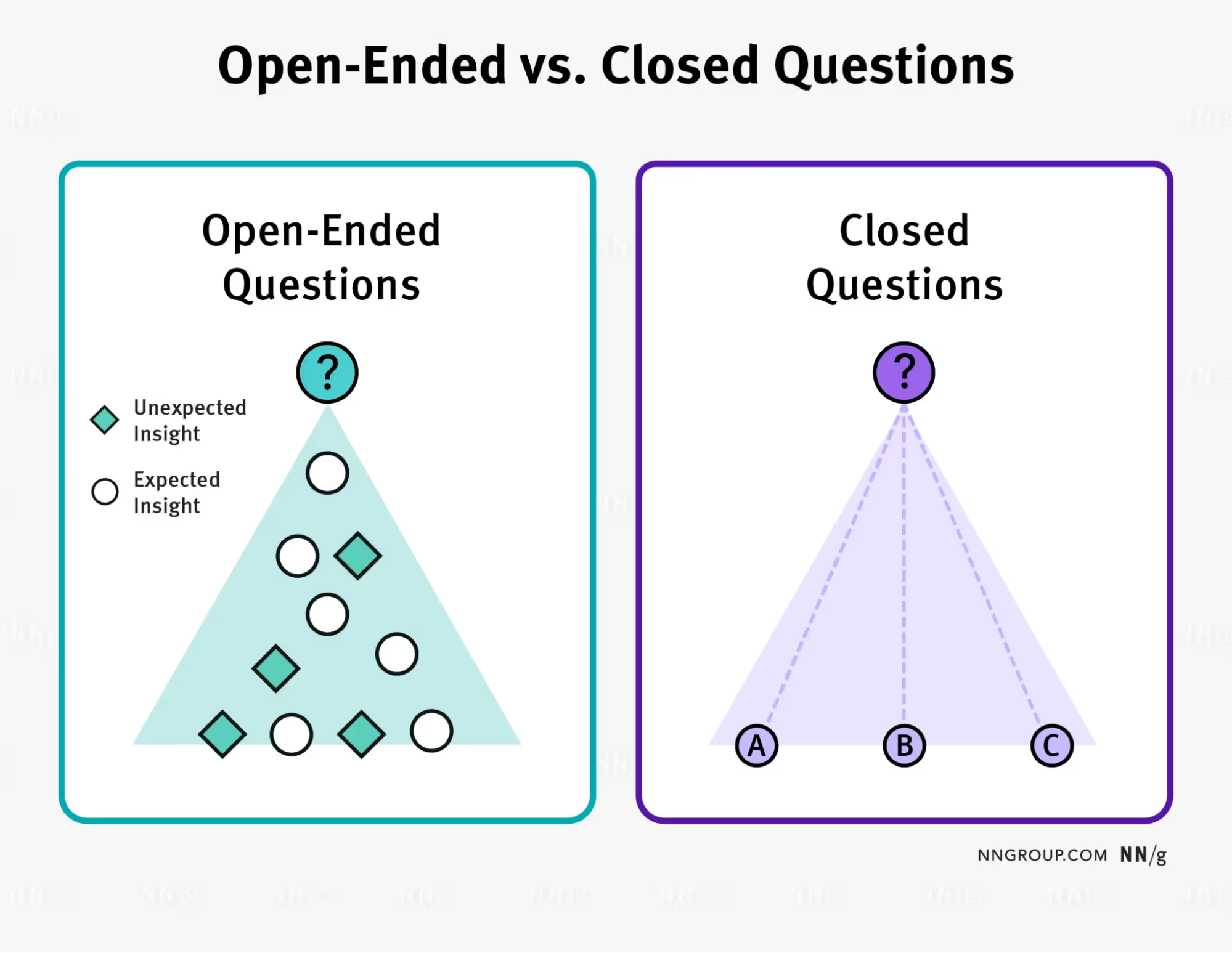
- Open‑ended versus comparative: Open‑ended testing is open‑ended; you’re trying to understand how users approach a concept or task. Questions here should encourage experimentation, like “Show me how you’d solve this problem with our tool.” Comparative testing pits two or more designs against each other. Here your questions focus on preferences and performance: “Which version helped you complete the task faster? Why?”
Selecting the right format ensures that your usability testing questions yield insight rather than confusion. Many early‑stage teams start with moderated remote tests to uncover major issues quickly and then follow up with unmoderated tests once flows stabilize.
Building your question framework
To craft useful usability testing questions, break them down by the aspect of the experience you want to probe. Below is a framework that connects each question type to the main goals outlined earlier.
A. Task‑oriented and navigation flow
Prompt: “Show me how you would…”
This simple invitation lets you observe the natural path a user takes. When you ask participants to complete a scenario—sign up for a plan, create a new document or export a file—you see whether they can find what they need quickly. Pay attention to where they click first, whether they hover or hesitate and how long it takes them to complete the task. Follow up with “Was this what you expected?” to catch mismatched mental models. According to Nielsen’s research, success rate, time taken and error rate are core measures of usability.
B. Ease of use and learnability
Prompt: “How easy or hard was that?”
This question aims at the first of Nielsen’s components—learnability. New users might not have the vocabulary to articulate why something felt hard, so probe gently: “What made that easy?” or “What did you find confusing?” Encourage participants to think aloud, because small comments like “I didn’t realise you could scroll there” reveal pain points. When we redesigned an onboarding flow for a SaaS client, we learned that removing unnecessary fields reduced completion time by 30 percent because the input fields were easier to fill. Without asking people how the process felt, we would have missed that insight.
C. Visual clarity and interface design
Prompt: “At first glance, what do you see here?”
Design is about guiding attention. First impressions are formed in less than 50 milliseconds, and up to 75 percent of users judge a site’s credibility based on appearance. By asking what stands out, you learn if your visual hierarchy is working. Follow with, “If you wanted to do X, where would you click?” to test whether icons and labels communicate meaning. Don’t underestimate the power of whitespace and typography; poor spacing can make even simple layouts feel cluttered.
D. Error identification and recovery
Prompt: “What happened when you clicked that?”
Errors are inevitable. What matters is how your interface helps users recover. When a participant encounters an error, ask what they were trying to do and what they expected. If they miss an error message or misinterpret it, you know your alerts need work. As Nielsen points out, error rates are a basic usability metric. We once observed users repeatedly clicking a disabled button because the micro‑copy didn’t explain why it was greyed out. Fixing the label and adding a tooltip cleared confusion immediately.
E. User satisfaction and performance feedback
Prompt: “How did that go for you?”
After each task, ask participants about their overall feeling. Did it feel smooth or clunky? Would they trust the product for this job? Their subjective satisfaction is part of both Nielsen’s and ISO’s definitions. Because satisfaction is subjective, try to ground responses by asking them to compare the experience with other tools they’ve used or to rate their confidence on a scale. When Macromedia compared two designs, the redesign more than doubled satisfaction scores, showing how performance and sentiment correlate.
F. User engagement and problem areas
Prompt: “If you could change one thing here, what would it be?”
This invitation empowers participants to criticise openly. They might point out confusing labels, wasted space or missing shortcuts. Each suggestion reveals where engagement might drop. For instance, one participant told us they wanted a progress indicator during a long upload. Adding a simple status bar reduced drop‑offs in that flow. Even if you don’t implement every suggestion, patterns across participants show priority fixes.
G. Accessibility issues
Prompt: “Was anything hard to reach or read?”
Accessibility isn’t just about legal compliance; it’s about inclusion. Ask whether the font size was readable, whether controls were reachable with one hand on mobile and whether colour choices made content hard to interpret. When 88 percent of users are less likely to return after a bad experience, ignoring accessibility is costly. If you see participants squinting, zooming or giving up, you know you’re not serving everyone.
Scripts and examples in practice
Turning your framework into a script is about combining tasks with follow‑up prompts. Here’s a simple example for a fictitious task management app aimed at founders.
- Introduction: “Thanks for joining. We’re testing a new way to manage tasks. There are no right or wrong answers—please think aloud.”
- Task 1 – onboarding: “Pretend you just signed up. Show me how you would create your first project.” Follow up with “How did that feel?”
- Task 2 – add a team member: “Invite a colleague to your project.” Ask, “What steps did you take?” and “Was anything unclear?”
- Task 3 – complete a task: “Mark a task as complete.” Then ask, “What feedback did you see?” and “Would you trust this action?”
- General feedback: “If you could improve one thing, what would it be?”
After the session, we map each response to the categories above: Did the participant find the onboarding flow easy (learnability)? Did they move through quickly (efficiency)? Did they encounter errors? Did the interface provide clear feedback? Did they express satisfaction?
A good script also includes small talk to put participants at ease, clear instructions, and time for follow‑up. In unmoderated tests, instructions must be specific: provide screen recordings of expected flows and include simple multiple‑choice questions to check understanding.
The five‑user rule: use wisely
Jakob Nielsen famously suggested testing with five users for qualitative studies. The principle is simple: the first few users will uncover most of the major issues. After five sessions, you start to see diminishing returns. Our experience supports this—in early tests we often discover 80–85 percent of critical problems within the first five participants.
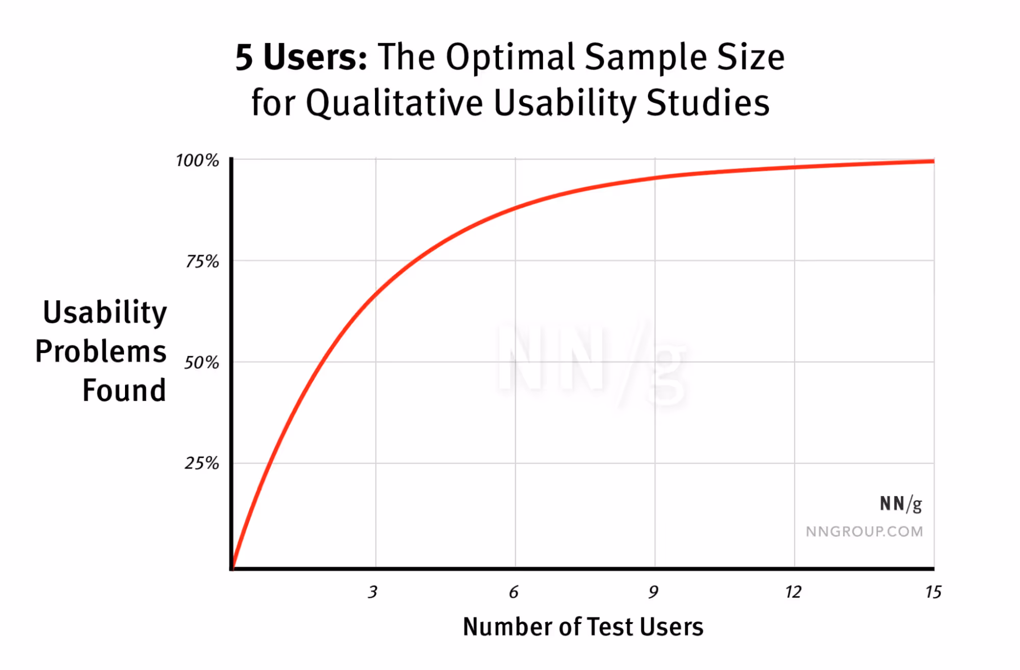
However, context matters. Nielsen himself points out that when you need quantitative metrics—like error rates or time on task—you need more users. He suggests around twenty participants per design to get a tight confidence interval. Small sample sizes can identify common problems but won’t give you statistical certainty. Moreover, if your product serves multiple user groups (for example, both first‑time and expert users), five participants per group may be needed to see patterns.
The 5‑user guideline is meant to promote frequent, low‑cost testing. It’s not an excuse to only test once. Our rule of thumb is to schedule a small round of sessions, fix the problems and then run another round with new participants. Iteration yields better designs than running one large study. In fact, a 2024 survey of 444 UX professionals found that usability testing remains one of the most widely used methods, with 69 percent of respondents reporting that they ran usability tests in 2024. This prevalence reflects industry belief that small, frequent tests deliver value.
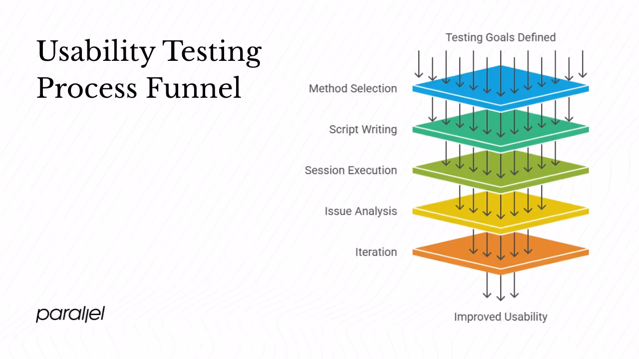
Pulling it all together: your testing process
A structured usability testing process keeps your team focused and efficient. Here’s a sample approach adapted from our own practice:
- Prepare: Define the goals of your study. Are you validating that new users can find a feature? Are you measuring time on task? Link goals to the usability principles: learnability, efficiency, satisfaction, error rates and accessibility. Decide which metrics matter; Nielsen suggests success rate, time, errors and subjective satisfaction.
- Choose your method: Decide if you’ll run moderated or unmoderated sessions, remote or in person, open‑ended or comparative. Consider the resources you have and the stage of your product. Early prototypes often benefit from moderated sessions where you can ask open‑ended questions, while later iterations can be tested unmoderated at scale.
- Write your script: Use the framework above to craft tasks and follow‑ups. Write clear, realistic scenarios that match your product’s use cases. Keep prompts neutral—avoid leading participants. For unmoderated tests, include checkpoints to ensure they’re on track.
- Run the sessions: During moderated sessions, observe silently and record observations on navigation paths, hesitations and body language. Resist the urge to help. For remote sessions, test your tech setup and record screens and audio. In unmoderated tests, collect screen recordings and ask participants to narrate their actions if possible.
- Analyse and map issues: After each session, map observations to the categories in your framework. Identify patterns across participants. Were there repeated navigation errors? Did multiple people mention unclear labels? Tie each issue back to learnability, efficiency, satisfaction, error rates or accessibility. This mapping ensures you don’t fix random things but focus on what matters.
- Iterate: Prioritise fixes based on impact and ease of implementation. Make changes, then run another small round of testing. The five‑user rule suggests you’ll uncover most new problems quickly. Each iteration should reduce friction and improve metrics. Quantify improvements when possible—if a new design reduces task time by 50 percent, that’s evidence you’re moving in the right direction.
In practice, we’ve seen early‑stage startups shorten onboarding flows by 30 percent and increase activation rates after just two rounds of testing. Being disciplined about testing early and often saves you from costly rework later.
Examples of Usability Testing Questions by Category
1. Task Completion and Navigation
- “Show me how you would complete [task].”
- “Where would you click to start this process?”
- “Was that what you expected to happen?”
2. Learnability and Ease of Use
- “How easy or hard was that?”
- “What did you find confusing, if anything?”
- “Was anything unclear the first time you saw it?”
3. Feature Understanding
- “Can you show me how you’d use [feature]?”
- “Did you notice this option? What do you think it does?”
- “Would you use this feature in your real workflow?”
4. Visual Design and Clarity
- “At first glance, what do you notice here?”
- “Is anything visually overwhelming or hard to focus on?”
- “If you wanted to do X, where would you click?”
5. Error Recognition and Recovery
- “What did you expect to happen there?”
- “Did you notice any error messages?”
- “How would you fix this if it happened again?”
6. User Satisfaction and Emotional Response
- “How did that feel?”
- “Would you use this tool again?”
- “How does this compare to other tools you’ve used?”
7. Accessibility and Reachability
- “Was anything hard to reach, click, or read?”
- “Could you complete the task without a mouse?”
- “Did the color contrast or font size get in your way?”
8. Engagement and Suggestions
- “What would you improve or change?”
- “Is there anything missing you expected to find?”
- “What part of this felt most frustrating?”
Conclusion
Usability testing questions are more than diagnostic tools. They shine a light on how real people perceive and interact with your product. By grounding your question set in well‑known principles like learnability, efficiency and satisfaction, tying them to business outcomes and running iterative tests, you can design with confidence. Clear, concise questions reveal whether your navigation works, whether your design communicates the right thing, where errors occur and how people feel about the experience. For founders and product leaders, investing time in thoughtful testing pays off: better retention, happier customers and fewer surprises after launch.
FAQ
1) What are the five components included in usability testing?
Jakob Nielsen outlines learnability, efficiency, memorability, errors and satisfaction as the five components of usability. Learnability measures how quickly a new user can complete basic tasks. Efficiency looks at how quickly users can perform tasks after learning the system. Memorability examines how easily returning users recall how to use the system. Error assessment covers both the frequency and severity of mistakes and how easily users recover. Satisfaction captures how pleasant or frustrating the overall experience is.
2) What is an example of a usability test?
A simple example is watching a participant complete a real task, such as “find and book a ticket on our app.” You ask the user to think aloud as they try to accomplish the goal. You observe their navigation, measure how long it takes, notice where they hesitate and ask follow‑up questions like “What did you expect to happen here?” and “How easy or hard was that?” These prompts reveal whether your design supports the task effectively.
3) What are the five criteria for usability?
ISO 9241‑11 defines usability with three criteria—effectiveness, efficiency and satisfaction. Jakob Nielsen expands this list to five by adding learnability and memorability. Effectiveness asks whether users can complete tasks at all. Efficiency measures the resources needed (time, clicks). Satisfaction assesses comfort and positive feelings. Learnability measures how quickly novices succeed, and memorability looks at how well users recall features after a break.
4) What is the five‑user rule for user testing?
The five‑user rule suggests that you can uncover most usability problems by testing with around five participants. After the fifth user, the rate of discovery diminishes. This rule applies to qualitative studies where the goal is to identify issues, not to gather precise statistics. When you need quantitative metrics or have multiple distinct user groups, you should test with more participants—around twenty per design—to get reliable numbers.

check out these related blogs