How to Improve Website Conversions with UX Design (2026)
Stop losing leads to poor design. Master UX design strategies to improve website conversions and customer retention with our definitive 2026 guide.
When you run a young company, every percent of growth counts. A small increase in the rate of visitors who sign up or buy can mean the difference between steady revenue and a business that struggles. In my work at Parallel I see this all the time. Many founders view design as the finishing touch, but using UX design to improve website conversions is a practical way to drive growth.
This article speaks to founders, product managers and design peers who want to turn their web visitors into paying users. We’ll unpack what conversion really means, describe core design principles, share tactics from early‑stage teams, and close with clear answers to questions we hear often.
What does it mean to improve conversions through UX design?
A conversion is when a visitor takes a desired action — for example buying a product or joining your mailing list. The formula is simple: goal completions divided by the number of visitors, expressed as a percentage. When we talk about UX design to improve website conversions, we’re looking at how subtle changes in layout, flow and content influence that fraction. It’s easy to see why this metric matters.
Shopify’s research on tactics for 2025 reports that the average conversion rate is 2.5%-3%. If an early‑stage company doubles that figure it doesn’t just get more sign‑ups; revenue can more than double because more of your existing traffic is converted into customers.
It’s also important to separate user experience from conversion‑rate optimization. User experience covers all interactions between a person and a company’s products and services. It encompasses emotions, beliefs, preferences and the context of use. Usability — the pragmatic aspect of getting a task done — is a subset of that bigger picture.

Conversion‑rate optimization is a focused discipline of experimentation and analysis aimed at lifting a specific metric. You can have a good user experience without high conversion and vice versa, but the two are intertwined: a better experience reduces friction, builds trust and often leads to a higher percentage of goal completions.
What Are the Core UX Principles That Drive Conversions?
These core principles show how thoughtful UX design lifts conversions by emphasising clarity, trust and speed.
1) Reduce friction and guide people
Visitors should be able to accomplish tasks quickly without confusion. Pages with too many options or unclear labels slow people down. Conversion marketing advice emphasises simplifying navigation and reducing user friction. When we worked with a machine‑learning‑driven SaaS company we removed hidden menus and secondary navigation items, which reduced drop‑offs and increased sign‑up completions.

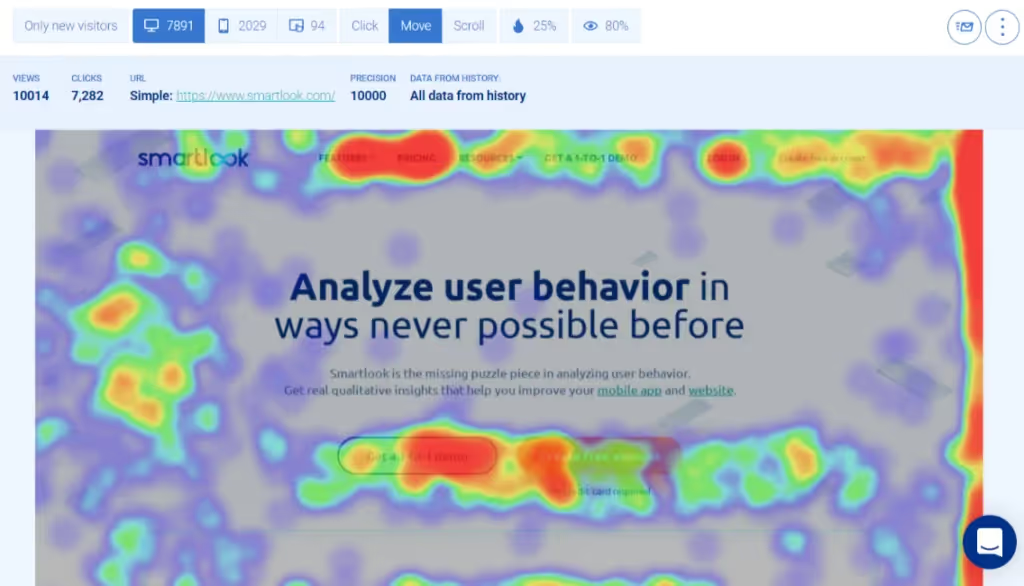
Source: ResearchGate
2) Interface design and visual hierarchy
Clear hierarchy helps the eye move smoothly. Place your call‑to‑action (CTA) buttons where people expect them and make them stand out with contrast. Avoid burying CTAs in long paragraphs. In our projects we often move the main CTA above the fold and use supporting buttons sparingly. Colour and spacing tell a user what to do next; clutter makes them work harder.

2) Simple menus and predictable paths
Predictability builds confidence. Visitors shouldn’t wonder where to click next. Keep primary navigation visible and consistent across pages. Remove unnecessary menu items that distract. When we redesigned a fintech dashboard we grouped related features together, which reduced task completion time.
3) Mobile responsiveness and fast load times
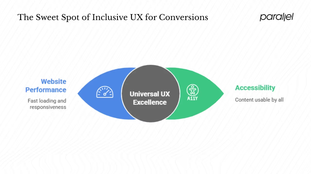
Many visitors arrive via phones, so pages need to adapt smoothly and load quickly. Mozilla’s MDN explains that web performance is both an objective measurement of load time and a subjective perception of how long content takes to appear. The longer a site takes to respond, the more users abandon it. Aim for pages that load within a couple of seconds and respond instantly to taps. Use images that are the right size for smaller screens and defer heavy scripts until necessary. Speed is not an accessory — it’s a foundation for conversion.

4) Clear content and trust signals
Your copy should answer the question: “Why should I care?” Avoid jargon and speak the way your users speak. Testimonials, customer logos and security badges communicate trust. Conversion marketing guidance lists building credibility with trust signals and strong site design as practical methods to lift conversion. In one SaaS onboarding flow we added a short testimonial and an encryption badge near the payment fields and saw fewer abandonments.
5) Thoughtful micro‑interactions and accessibility
Small interactions — a button changing colour on hover, a success tick after a user submits a field — show that the system is responsive and can make the experience feel smoother. Accessibility broadens your audience and improves perception. The Web Content Accessibility Guidelines (WCAG 2.2) outline four principles: content should be perceivable, operable, understandable and resilient. Designing with these principles in mind helps people with disabilities and often benefits everyone. For example, adding alt text to images improves comprehension for screen‑reader users and search engine crawlers alike.

6) Design for real people
Personas are not a fantasy; they are grounded profiles that represent your real users. Designing for them helps you prioritise features and content. When you centre your product around the needs of a job‑seeker, a small business owner or a student, you are more likely to craft flows that make sense for them. This focus is an important difference between designing for yourself and designing for your market.
What Real Methods Work to Improve Conversions Through UX Design?
Real‑world tactics help you turn these ideas into measurable results.

1) Build trust through social proof and security
Visitors are hesitant when they don’t know you. Reviews, testimonials and customer logos act as social proof. Security badges, privacy notices and clear refund policies reduce anxiety. Wikipedia lists ratings and reviews and building credibility with trust signals among effective tactics. We often display a brief quote from a respected client and a data‑protection badge near the checkout button. These simple signals reassure visitors that others have had a good experience and that their payment details are safe.
2) Use experiments and analytics
Testing is not guesswork. A/B testing allows you to compare two versions of a page to see which drives more conversions. Shopify advises segmenting data by pages and traffic channels to understand which ones perform best. Tools like Google Analytics and heat‑mapping software can reveal where visitors drop off, where they click, and how far they scroll. When we replaced a long pricing table with a shorter one and tested both versions, the shorter table improved sign‑ups by 12%. The result was counter‑intuitive; without testing we might have stuck with the longer table.
3) Craft microcopy and behavioural cues
Words matter. Microcopy — the small pieces of text around fields, buttons and notifications — can guide users. Wording such as “Get started — no credit card required” lowers friction. Scarcity cues (“Only 3 seats left”) and social proof (“4,000 teams use this tool”) draw attention without resorting to hype. Reciprocity, such as offering a free trial in exchange for feedback, can encourage users to commit. Use behavioural science thoughtfully, making sure cues are honest and relevant.
4) Remove friction points
Friction hides in unexpected places: an unclear label, an endless list of required fields, a spinner that never ends. Reducing friction means asking for only essential information and giving clear feedback when something goes wrong. In one client project we cut a sign‑up process from ten fields to three by deferring less critical questions until after registration. Completion rates jumped by 20% and our time‑to‑value — the time it took for a user to experience the product’s core benefit — fell by about a third. Fast load times and responsive interactions, as MDN stresses, also reduce abandonment.
These methods are the building blocks of UX design to improve website conversions.
What Is the Step-by-Step Process to Use UX Design to Improve Website Conversions?
Improving conversions isn’t a single action; it’s a discipline. Achieving this through UX requires observation, testing and iteration. Here is a practical process you can follow:
Step #1: Map the customer path and define your goals
Before changing anything, understand how people currently move through your site. Track where they come from, what pages they view and where they drop off. Define a specific goal for each path — such as signing up, requesting a demo or completing a purchase — and write it down. According to Shopify, setting goals such as “Increase conversion rate from 1.5% to 2% by the end of Q4” helps you assess progress. A clear goal turns design work into measurable outcomes. Mapping the customer path is the first step in UX design to improve website conversions.

Step #2: Audit usability and prioritise quick wins
Review your site with a fresh set of eyes — or ask someone outside your team to do so. Identify obvious obstacles: CTAs hidden under images, slow pages, outdated content. Remove or fix them quickly. Addressing basic issues like contrast, button placement and speed can yield immediate gains.
Step #3: Analyse behaviour with analytics and heat maps
Data tells you where to focus. This analysis points to where UX design to improve website conversions should focus. Segment your conversion rate by page and channel. Use heat maps to see where people click, scroll and hesitate. If you see a drop‑off on a pricing page after the fourth section, make that section clearer or shorten the content. If mobile visitors exit more than desktop visitors, your site may not adapt well to smaller screens.

Step #4: Run experiments
A/B test changes to layouts, headlines, button text and colour. Test one variable at a time so you know what caused the change. Use analytics to see which version performs better. Keep in mind that small differences can have big effects; a two‑word change in a CTA once increased sign‑ups by 8% on a start‑up site we worked with.

Step #5: Iterate
Use what you learn to refine visuals, copy, trust signals and navigation. Then test again. Conversion optimization is cyclical. Document what you tried and what happened so you avoid repeating mistakes. Over time, these small improvements compound.
Step #6: Keep mobile, accessibility and clarity front of mind
As MDN explains, visitors abandon sites that respond slowly. Compress images, use responsive layouts and ensure your site works well on various screen sizes. Follow accessibility guidelines to make content perceivable, operable and understandable. Clear messaging and design that works for everyone not only reduces legal risk but widens your audience. Keeping these fundamentals front of mind ensures that UX design to improve website conversions delivers value to all your visitors.

Conclusion
Conversion is not a mysterious craft reserved for growth hackers. It is the result of thoughtful design, careful testing and a deep respect for the people who use your product. A clear, trustworthy and speedy site invites visitors to act. Choosing this focus means you’re centring your work on the people who matter. Working on your site’s user experience is about removing obstacles and making it easier for people to get value from your product.
In my experience, the teams that invest in user‑centred design see compounding returns: lower churn, happier users and steady growth. Begin with small experiments, test often, and you’ll be surprised at how much progress you make. If you invest in UX design to improve website conversions, you’ll see measurable benefits.
FAQ
1) How does UX and UI design impact website conversions?
A friendly user interface lowers the cognitive effort required to complete a task. When your layout is clear, your buttons respond quickly and your copy speaks plainly, visitors move from visiting to acting. User experience design covers everything a person feels when using your product, and that emotional response often influences whether they buy. When you focus on refining the user experience to lift conversions, you reduce friction, clarify value and add trust signals. Good design does not just look nice; it helps people accomplish their goals, and conversions are a natural result.
2) How can I improve my website conversion rate?
Start by exploring UX design to improve website conversions and defining what a conversion means for you, then identify where visitors drop off. Use analytics and heat maps to see how people behave and test changes to pages and CTAs. Simplify your menus, speed up your pages and use social proof. Build credibility with reviews and clear privacy statements. Experiment with microcopy and remove unnecessary fields in sign‑up flows. According to Shopify, average conversion rates are around 2.5%–3%, so even modest improvements can have a big impact.
3) What are the 4 C’s of UX design?
Different practitioners use different models. In some circles the four C’s stand for Clarity, Consistency, Control and Confidence. Clarity means users should immediately understand where they are and what they can do. Consistency keeps patterns familiar across pages. Control gives users the feeling they can make choices and undo actions. Confidence comes from trust signals and helpful feedback. I haven’t found a universal standard for the four C’s, so if you’ve heard a different set, feel free to share it with me.
4) How can good UX design impact the success of a website?
Good design influences everything from first impressions to long‑term loyalty. Clear layouts and fast load times reduce abandonment. Thoughtful information architecture helps people find what they need quickly. Accessible design, as defined by WCAG’s four principles, allows more people to use your product. When visitors trust your site and feel confident using it, they are more likely to buy, come back and tell others about it. In a young company, these gains can make a significant difference. Work on your site’s user experience and you’ll see those benefits reflected in your metrics.


.avif)


