Guessing about user satisfaction is risky. When you make design choices without evidence, you burn time and money. Data helps you see whether your app is easy to use, whether customers finish important tasks, and where they stumble. For young companies, this is even more important because cash and time are scarce. A ux metrics framework gives you a structured way to measure what matters, giving founders and product leaders fast feedback. This guide sets out what UX metrics are, how frameworks help, how to pick and use them, and who should care.
Quick Answer: What Is a UX Metrics Framework?
A UX metrics framework organizes behavioural and attitudinal metrics in alignment with your product goals. For example, Google’s HEART model (Happiness, Engagement, Adoption, Retention, Task success) breaks big goals into measurable signals and metrics, helping teams focus on what truly impacts user experience and business outcomes.
What are UX metrics?
UX metrics quantify how people interact with a product. They fall into two broad categories:
- Behavioural metrics – derived from actions such as clicks, task completion, time spent, or error counts. These reveal how people actually behave.
- Attitudinal metrics – based on surveys or ratings that capture feelings like satisfaction or willingness to recommend. These show how people feel about the experience.
When measuring, we look at concepts like:
- Usability – can people complete tasks? How quickly? Are there errors?
- Engagement – how often do people return? Do they spend time exploring features?
- Satisfaction and loyalty – do users enjoy using the product? Would they advocate for it?
Why use a framework for UX metrics?
Teams often drown in numbers. A framework helps match metrics to business goals, ensures consistency, and stops you from chasing irrelevant measures. The HEART framework from Google is widely adopted. It stands for Happiness, Engagement, Adoption, Retention and Task success, and it uses a goal–signal–metric method to break big ideas into measurable signals. Each dimension starts with a goal (e.g., reduce friction), defines a signal (e.g., number of rage clicks), then tracks a metric (e.g., error rate). Nielsen Norman Group notes that frameworks stop teams from tracking everything and allow them to focus on what moves the needle.
Core Metric Types & Definitions
Below are the main metrics you’ll encounter:
Common UX Measurement Frameworks
What is the HEART framework, and how does it work?
Google’s HEART framework has five dimensions that cover much of the user journey:
- Happiness – measures satisfaction through surveys and feedback, often using NPS.
- Engagement – looks at how frequently and intensively people use the product.
- Adoption – tracks new users, sign‑ups and feature uptake.
- Retention – measures how well you keep existing users.
- Task success – gauges efficiency and effectiveness by examining error rates, completion rates and time.
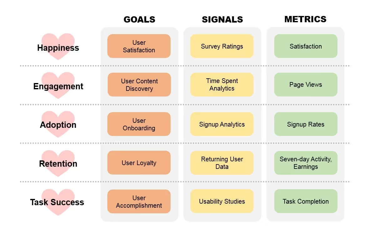
HEART uses the goals–signals–metrics model. Start with a clear goal (e.g., shorten onboarding), identify user actions that indicate progress (signals), and then choose metrics to quantify those signals. Statsig’s 2025 update emphasises adding “True Positive Rate” for contexts where users have no choice (e.g., mandatory workplace tools).
This framework works well for consumer products because it covers adoption and retention, which are meaningful when users can decide whether to use your product. For startups, HEART offers a balanced starting point that keeps things simple and connects UX to growth metrics.
What is the CASTLE framework, and when should you use it?
The HEART framework is less applicable when users have no choice (for example, employees using an internal tool). Nielsen Norman Group introduced the CASTLE framework as a complement for workplace software. CASTLE stands for:
- Cognitive load – the mental effort required to complete tasks. It reflects working‑memory burden and how easy it is to resume interrupted work. It is usually measured with surveys like NASA‑TLX
- Advanced feature usage – how often optional features are used. This helps teams evaluate discoverability and usefulness rather than pushing intrusive tutorials.
- Satisfaction – self‑reported feelings toward the product; it requires surveys and sometimes behavioural signals like rage clicks.
- Task efficiency – speed and steps needed to complete a workflow. NNG cautions that analytics‑based time measurements can be unreliable due to interruptions, so quantitative usability testing is preferred.
- Learnability – the effort and time for new users to become proficient; measured by performance improvements over time and reduced need for help.
- Errors – data‑quality issues or system messages that block progress. This includes repetitive loops that indicate frustration.
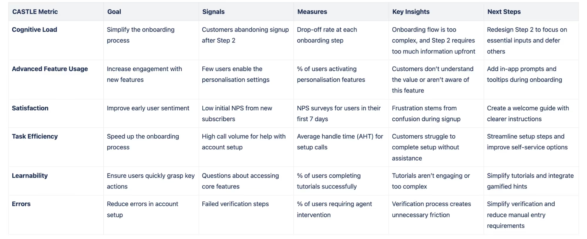
CASTLE uses the same goals–signals–metrics approach but focuses on internal tools where adoption and retention are not meaningful.
What other UX measurement frameworks exist?
- AARRR (Pirate Metrics) – focuses on acquisition, activation, retention, referral and revenue. It is a growth framework used to track the customer funnel, not just UX.
- Customer Experience Index (Forrester) – integrates effectiveness, ease and emotion to assess overall experience across touchpoints. Forrester’s research shows that every dollar invested in user experience yields a return of $100.
- RARRA – a variation that prioritises retention over acquisition, suitable for subscription businesses.
Examples and lessons
Imagine a SaaS startup offering an invoicing tool. The team chooses the HEART framework and tracks task success (time to send an invoice) and adoption (new sign‑ups). By running usability tests, they discover that users struggle with the “Add client” screen. After simplifying the form, task completion rises from 60% to 85%, and time on task drops by 30%. Another example is an internal CRM at a mid‑sized company. Here, retention is irrelevant because staff must use the tool. The team uses CASTLE and finds that cognitive load is high due to many pop‑ups. By reducing notifications and adding contextual help, survey‑based NASA‑TLX scores drop (indicating less mental strain), and new hire onboarding time shortens by 20%.
Building Your Own UX Metrics Framework
Before picking metrics, decide what you want to improve. Are you trying to grow sign‑ups, increase retention, or improve feature adoption? Goals should reflect both business outcomes and user needs. For early‑stage AI or SaaS teams that we work with at Parallel, common priorities include shorter time‑to‑value, smoother onboarding, and higher activation.
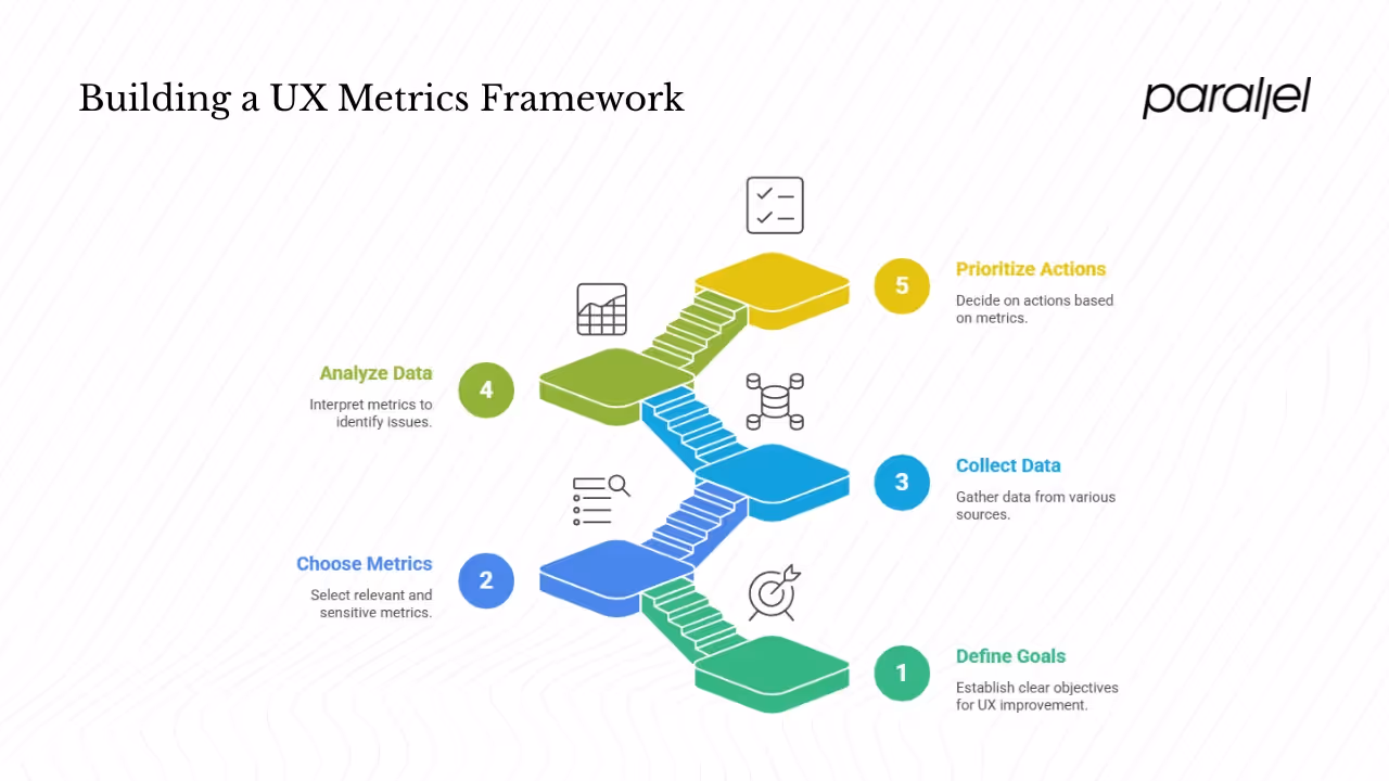
Step #1: Use the goals–signals–metrics model
- Goals – high‑level objectives. Example: “reduce checkout abandonment.”
- Signals – user behaviours or attitudes that indicate progress toward that goal. Signals for the above goal include time spent on checkout pages, number of form errors, and self‑reported frustration.
- Metrics – quantifiable measures of those signals. In this example: error rate, abandonment rate, and CSAT after purchase.
Step #2: Choose metrics that matter
When selecting metrics, consider relevance, sensitivity (will it change when the experience changes?), ease of measurement, cost and frequency. Nielsen Norman Group warns against vanity metrics—numbers that look impressive but don’t reflect user experience. For example, total app downloads always increase and lack context. Instead, measure conversion rates or per‑user actions.
Avoid tracking too many metrics. The Pareto principle states that 80% of results come from 20% of causes. Focus on the critical flows and the small set of metrics that drive results. For startups, this might mean tracking completion rates of onboarding tasks and activation of a core feature.
Step #3: Instrumentation and data collection
A ux metrics framework requires data from multiple sources:
- Analytics tools – track events, funnels, and behaviour patterns. Make sure events are well defined and consistently named.
- Usability testing – run moderated or unmoderated sessions with real or prospective users. Capture task success rates, time on task and error counts. This is essential for metrics like task efficiency and learnability.
- Surveys and questionnaires – collect NPS, CSAT, or Single Ease Question (SEQ). For example, after a task, ask “How easy was this?” on a 7‑point scale. The Retently guide explains that CSAT surveys use simple ratings to assess satisfaction.
- Feedback channels – gather comments from support tickets, chat transcripts, and interviews to understand the “why” behind numbers.
- Expert reviews – heuristic evaluations identify obvious usability issues early and cheaply.
Step #4: Analyse and interpret metrics
Benchmarking helps interpret numbers. Compare your metrics against industry averages or your own past data. For example, Maze’s 2024 report notes that 77% of brands see customer experience as a key differentiator and that improving retention by 5% can raise profit by 25%. These benchmarks show the business impact of UX.
Distinguish signal from noise. A sharp rise in error rate after a release likely points to a bug. But a slight drop in conversion may be seasonal. Pair quantitative metrics with qualitative feedback; numbers tell you what happened, but only research and interviews reveal why.
Step #5: Prioritise actions based on metrics
Once you have data, decide what to fix first. Look for bottlenecks where error rates spike or completion rates drop. Use decision frameworks such as impact vs. effort. If a metric worsens but the business impact is low, it may not require immediate action. For metrics like cognitive load or learnability, qualitative data will guide which design changes to test.
Use A/B tests to validate changes. Statsig suggests integrating experimentation with metrics to see which design actually improves outcomes. Test one change at a time and monitor the relevant metrics to see whether your hypothesis holds.
Special Considerations for Early‑Stage Startups
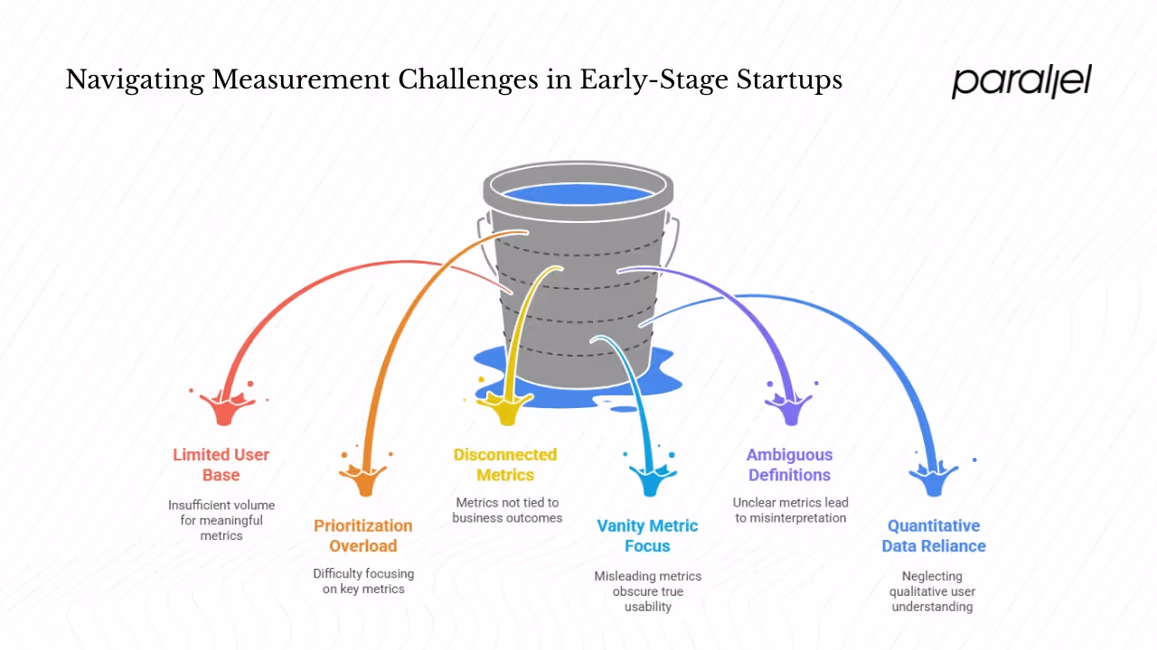
Constraints: limited data and users
Young companies often serve a small user base. This means many metrics won’t have enough volume to be meaningful. Instead of dashboard analytics, start with qualitative methods—prototype testing and moderated sessions. Even five participants can uncover most usability issues. For small samples, track task success, error counts and completion times rather than relying on engagement metrics.
Prioritisation and lean measurement
Keep your measurement lean. Identify the top one or two flows that drive business value and track just a few metrics on those flows. The Pareto principle reminds us that most value will come from a small set of tasks. For example, if sign‑up and first file upload are critical, track completion rates and errors on those steps.
Choose metrics tied to business outcomes
Investors and stakeholders care about retention, growth and conversion. Pick metrics that relate directly to these outcomes. For instance, if your goal is to improve trial‑to‑paid conversion, measure the percentage of users who finish onboarding and engage with the core feature within the first week. If your goal is retention, track churn rate and frequency of core feature use.
Avoid common traps
- Vanity metrics – big numbers like total visits may look good but don’t tell you anything about usability.
- Ambiguous definitions – define metrics clearly. If “task success” is not defined, team members will interpret it differently.
- Over‑reliance on quantitative data – numbers show what but not why. Always pair metrics with interviews or usability tests.
- Measuring what’s easy – it’s tempting to track what your analytics tool exposes by default (page views, session duration) instead of what matters. Be intentional.
A Practical UX Metrics Framework Template
Below is a template you can use to build your own ux metrics framework:
- Define product goals – e.g., improve sign‑up completion, increase retention, or drive feature adoption.
- Map UX goals – e.g., reduce friction in onboarding, increase satisfaction, improve efficiency.
- Select metrics – choose behavioural and attitudinal metrics (task success rate, error rate, time on task, NPS, CSAT, etc.) that connect to your goals.
- Define signals for each metric – identify user actions or survey questions that indicate progress.
- Set baselines and targets – use current performance or industry benchmarks. For example, Maze reports that a 0.05‑second first impression shapes whether users stay, and 88% of users won’t return after a poor experience. Use such data to set realistic targets.
- Instrumentation plan – determine where and how you will capture data (analytics events, test scripts, survey triggers).
- Reporting cadence and dashboard – decide how often you’ll review metrics (weekly, monthly) and build a simple dashboard for the team.
- Feedback loop and iteration – schedule regular reviews to interpret data, run tests, and adjust your framework as needed. Don’t be afraid to drop metrics that are no longer useful.
Example framework
Let’s say you run a task management SaaS product. Your business goal is to reduce churn in the first month. Your UX goal is to ensure new users understand how to create and share tasks. You pick metrics such as:
- Task success rate – % of new users who create their first task within one day.
- Time on task – median time to create the first task.
- Error rate – number of error messages during task creation per 100 sessions.
- CSAT – post‑onboarding survey asking “How satisfied are you with the task creation process?”
You define signals: event logs for task creation; survey responses; number of validation errors. You set a baseline (e.g., 50% completion rate) and a target (80%). You instrument the product to capture those events. You review data weekly, run A/B tests on interface changes, and adjust metrics as the product evolves.
Measuring Impact and Evolving the Framework
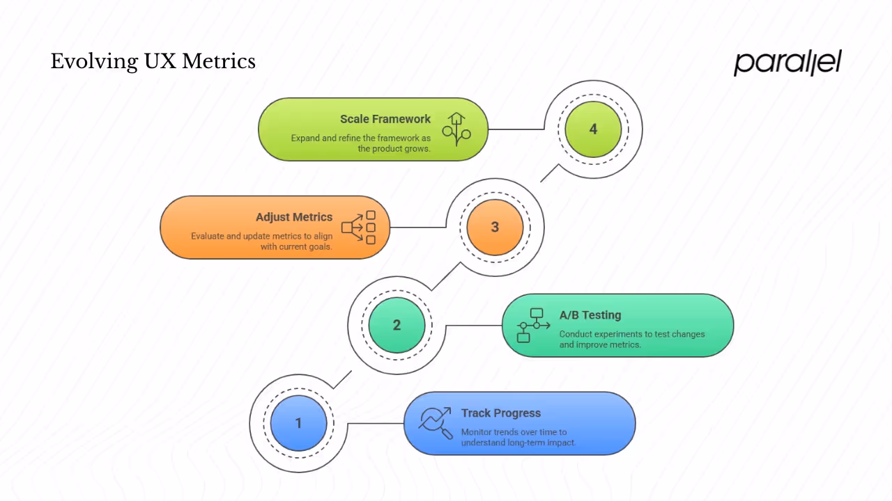
1) Tracking progress over time
Long‑term trends matter more than one‑off spikes. Use dashboards to track metrics weekly or monthly. Compare your numbers with industry benchmarks. Maze’s research found that companies with mature research practices are 1.9× more likely to improve customer satisfaction. DesignRush reports that good UX can boost conversion rates by up to 200%, and a comprehensive strategy can raise that to 400%. Such data can inspire targets and show what’s possible.
2) A/B testing and experimentation
Use controlled experiments to see if a change improves a metric. For example, test a simplified sign‑up form against your current one. Track task success rate, time on task and error rate. Statsig suggests combining experimentation with the HEART framework to make data‑driven decisions.
3) When to adjust or drop metrics
Metrics have a life cycle. Drop a metric when:
- It no longer aligns with current goals (e.g., adoption when your product is mature).
- Data collection becomes unreliable (e.g., a third‑party service changes how it counts sessions).
- The metric does not change over time, suggesting it is not sensitive to design changes.
At the same time, add metrics when new goals emerge, such as measuring cognitive load for a complex internal tool.
4) Scaling as you grow
As your product and team expand, your ux metrics framework should evolve. Start with a few core metrics. Over time, introduce more nuanced measures, but keep the focus on outcomes. Consider segmenting metrics by user cohorts (new vs. returning) and adding advanced metrics such as true positive rate for machine‑learning‑driven features. Always pair metrics with qualitative research so you understand not just what users do, but why.
Conclusion
User experience metrics are not vanity numbers for presentation decks; they are tools to learn how people use your product and to improve it. A solid ux metrics framework links those metrics to your goals, keeps you focused on what matters, and avoids drowning in data. Whether you use HEART, CASTLE or a custom mix, start by defining clear goals, pick a small set of meaningful metrics, and gather both quantitative and qualitative data. For startups, lean measurement is crucial: track a few critical flows and use feedback to refine. Invest in measuring user experience early; the payoff is higher retention, happier customers and better products. When you treat measurement as a conversation with your users, you don’t just make features—you build trust.
FAQ
1) What are UX metrics?
UX metrics are quantifiable indicators of how people interact with your product. They include behavioural measures such as task success rate, time on task and error rate, and attitudinal measures such as satisfaction and loyalty scores. They help teams understand whether a design is working and where to improve.
2) What is the 80/20 rule in UI/UX design?
The 80/20 rule, or Pareto principle, observes that a small portion of causes accounts for a large portion of results. In UX, this means that focusing on the most important 20% of tasks or features can deliver 80% of the impact. Use this principle to choose which flows to optimise first and which metrics to track.
3) What are the 7 factors of UX?
Peter Morville’s UX honeycomb identifies seven facets of a good user experience: useful, usable, findable, credible, desirable, accessible and valuable. A product must provide value, be easy to use, be easy to find, be trustworthy, be pleasant, be accessible to people with disabilities, and be worthwhile to justify the effort.
4) What are KPIs in UX design?
KPIs (key performance indicators) are metrics tied to business goals. In UX design, KPIs might include conversion rate, churn rate, task success rate, error rate or NPS. A good ux metrics framework ensures that these KPIs relate to both the user experience and the company’s objectives. Choose KPIs that change when the user experience improves and that the team can influence.

check out these related blogs