Most early‑stage founders obsess over screens and animations yet overlook the tiny phrases that actually drive behaviour. At Parallel we learned this the hard way: our beautiful dashboards still confused people because buttons simply said “Next” or error messages blamed the user.
Those short lines are more than adornments. They direct attention, build trust and prevent abandonment. In fact, 79% of web visitors skim rather than read every word, so ux writing best practices are essential for clarity and conversion.
This guide explains why microcopy matters, shares research‑backed principles and offers ten actionable ux writing best practices for founders and product teams.
What are UX writing best practices?
UX writing best practices focus on clarity, brevity, and usefulness: write in plain language, keep copy concise, and prioritize user goals over brand voice. Be specific and action-oriented in buttons and labels, maintain consistency in terminology and tone, and design for accessibility and inclusivity. Anticipate user questions, reduce cognitive load with scannable structure, and provide helpful error and success messages. Test and iterate based on real user feedback, and ensure every word supports usability, not just aesthetics.
Microcopy vs. UX writing
UX writing covers all the words that shape a digital experience, from onboarding screens to support articles. Microcopy is a subset: the brief text that guides users through an interface—button labels, form hints, error messages and tooltips. Without it, users get lost. Content strategist Bobbie Wood reminds us that microcopy is only the confetti sprinkled on a larger narrative; the bulk of a UX writer’s work happens earlier—understanding mental models and defining tone. Distinguishing the two helps teams give language the same priority as layout.

Why words matter
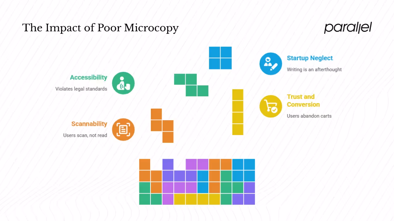
1) Scannability and usability
People seldom read digital content line by line. Nielsen Norman Group’s classic study found that users overwhelmingly scan, not read. When researchers compared different copy treatments, pages written concisely and formatted for scanning improved usability by 58%. When those improvements were combined with neutral language, the site’s usability jumped by 124%. In practice that means front‑loading the main idea, using bullet lists and removing filler words. Microcopy turns a labyrinth into a clear path.
2) Trust, conversion and abandonment
Copy directly affects business metrics. The Baymard Institute’s 2024 checkout benchmark reports that 70 % of users abandon their carts after adding items. Many of those drop‑offs stem from confusing forms or vague error messages. Among 130 + sites studied, 65% had a “mediocre” or worse checkout experience, and Baymard estimates that improving the flow could lift conversion by 35%. They highlight how generic error messages (“Something went wrong”) force customers to guess the problem, often leading to frustration and abandonment. Precise, adaptive feedback cuts errors and keeps users moving.
3) Accessibility and legal standards
Clear microcopy is also an accessibility requirement. The United States Department of Justice’s 2024 rule compels state and local government websites and apps to follow WCAG 2.1 Level AA. This standard emphasises perceivable, operable and understandable content. While startups might not fall under this law, designing for screen‑reader support, descriptive button names and alt text enlarges your audience and signals respect for all users.
4) Why startups should care
Early teams seldom have dedicated writers. Product managers, designers or engineers often cobble together text. In our experience, investing in disciplined UX writing early reduces support tickets, speeds onboarding and instils confidence. Words aren’t a final polish; they are part of the design. As we began auditing copy with the same rigour as UI components, sign‑up abandonment fell and positive feedback rose.
10 UX writing best practices
The following principles draw from research and lessons we’ve learned while working with AI and SaaS startups. Use them as guardrails rather than rigid rules. Interface copy should always be tested with real users.

1. Say just enough
Be ruthless about brevity. Users scan, so keep sentences short and avoid redundancy. Nielsen Norman Group demonstrated that concise text improves task success. We replaced a verbose heading—“Create your account to start exploring our powerful analytics platform”—with “Create your account” and saw a 12 % increase in sign‑ups. When editing, remove words until the meaning changes. Use verbs instead of noun phrases (“Log in to comment” rather than “You must log in before you can write a comment”).
2. Speak your users’ language
Avoid jargon, acronyms and internal labels. Confusing terms increase cognitive load and error rates. Baymard’s research found participants misinterpreted shipping cut‑off times due to unclear phrasing. Test key messages with people outside your company; if they stumble, rewrite. Use present tense and active voice (“Message sent” beats “Message has been sent”), and watch out for double negatives.
3. Be consistent
Uniform terminology reduces mental effort and signals professionalism. If one screen says “Log in” and another says “Sign in,” users may wonder if there is a difference. Create a vocabulary list for common actions and stick to it. Align capitalization and punctuation. Consistency extends to tone: decide if you use contractions, how you refer to customers, and whether you speak in first or second person.
4. Use specific, action‑oriented calls to action
Buttons should tell users exactly what happens when clicked. Generic CTAs like “Next” or “Continue” cause hesitation. The UX Writing Hub emphasises that microcopy drives action. In a B2B tool we built, changing a button from “Submit” to “Send invoice” increased click-through by 18 %. Write CTAs as verb + object: “Download report,” “Add to cart,” “Continue to payment.” Where possible, include secondary text clarifying what follows (“We’ll email your client a copy”).
5. Lead with the important info
Put the objective before the action. People decide whether to continue within seconds, so front‑load goals. Instead of “Tap the item to see its properties,” say “To see item properties, tap its name.” Use headings and subheadings to guide scanning. Show details progressively: provide only essential context upfront, then offer “Learn more” links or tooltips for deeper explanations. Progressive disclosure prevents cognitive overload while keeping help accessible.
6. Set the right tone
Tone communicates personality and influences trust. Nielsen Norman Group identifies four tone dimensions—humor, formality, respectfulness and enthusiasm. Determine a baseline voice (e.g., confident, approachable) and adapt it to context. Playful language may delight in onboarding but frustrate during an outage. We saw support requests double after a client used a quirky “Oopsie!” error message. Respect your users’ emotions; be empathetic in error states and celebratory after success. Avoid slang, idioms or cultural references that could alienate readers.
7. Write helpful error messages
Errors will occur, but how you handle them determines whether users recover or leave. Baymard found that 99 % of sites don’t adapt error messages to the specific problem. The result is frustration and abandonment. A good error message identifies what went wrong, explains why (if needed) and offers a clear fix. Avoid technical jargon and blame (“Your card is invalid”). Use plain language (“Your card number is incomplete. Please re‑enter all digits”), highlight fields with issues and provide links to support when appropriate. For accessibility, ensure error text is associated with form fields and isn’t conveyed only by color.
8. Design for accessibility and scanning
Accessible copy helps everyone. The DOJ’s rule sets WCAG 2.1 AA as the standard for government digital services; following similar guidelines benefits all users. Use high contrast and legible fonts. Label fields clearly rather than relying on placeholder text. Break long explanations into short paragraphs or bullet lists. Use numerals to speed reading. Refer to interface elements by their labels (“Click Save”) instead of relative positions (“click the button above”). Provide alt text for icons and meaningful images. Even if you’re not legally required to meet WCAG, these steps reduce friction and show respect for diverse abilities.
9. Test and iterate
Copy is a hypothesis until it meets users. In Nielsen’s study, combining concise, scannable and objective language improved usability by 124%. You can discover similar insights by experimenting. A/B test headlines, button labels and error phrasing. Measure completion rates, time on task, drop‑off points and support tickets. Ask participants to paraphrase messages during usability tests. Track copy changes and outcomes so you can roll back if a variant underperforms. Data should guide decisions; your team’s intuition is rarely enough.
10. Build governance and integrate writing into design
Sustainable writing requires process. Without governance, copy drifts as new screens are added or localised. At mature companies, content strategists manage repositories and style guides. Even small teams should create a lightweight style guide covering voice, tone, terminology and examples. Maintain a centralized copy library (in your design system or CMS) to avoid duplication. Assign ownership: a PM, designer or engineer can champion copy until you hire a writer. Include copy reviews in your definition of done and treat microcopy as a first‑class design element. These habits ensure that ux writing best practices survive growth and team turnover.
Mini case study
While building a fintech onboarding flow, we noticed users abandoned the final step because the button said “Next.” Renaming it “Create account” and adding a brief hint about the terms increased completion by 14 %. This small change, rooted in ux writing best practices, shows how specific labels and transparent messaging can lift conversion.
Challenges and trade‑offs
Writing a microcopy isn’t just about following checklists. Teams often juggle brevity versus nuance, a uniform voice versus context, text length versus design constraints and English phrasing versus translation needs. Recognising these tensions helps you make deliberate trade‑offs instead of defaulting to the quickest solution.
How to get started
You don’t need a large team to apply ux writing best practices. Begin with these steps:
- Assign ownership.
- Audit every screen and message.
- Create a style guide.
- Write alongside design.
- Iterate and measure.
These habits integrate writing into your process and ensure that these practices aren’t an afterthought.
Conclusion
Interface copy is an invisible design. It guides, reassures and builds confidence. Research shows that concise, scannable and objective writing can double usability, while generic messages drive abandonment. By following ux writing best practices—speaking the user’s language, being consistent, writing specific CTAs, prioritising information, tuning tone, crafting helpful errors, designing for accessibility, testing and governing your copy—startups can reduce friction, increase trust and accelerate adoption. Words deserve a seat at the design table from day 0. Investing in them is one of the highest‑leverage improvements you can make to your product.
FAQ
1) What is the “rule” of UX writing?
There is no single rule, but the guiding principle is to write concise, clear, user‑centred and contextually relevant copy. Reduce unnecessary words, use plain language, stay consistent and consider users’ mental models, emotions and abilities. Test your copy and refine it based on real feedback.
2) What makes good UX writing?
Good UX writing is short yet meaningful; clear and unambiguous; consistent in terms and tone; actionable—telling users exactly what will happen; accessible and inclusive; helpful in error states; adapted to context; and iterated through testing. In other words, it embodies the ux writing best practices described above.
3) What are the seven principles of UX and how do they connect to writing?
Many UX frameworks highlight: user‑centricity; usability; feedback and responsiveness; accessibility; consistency; hierarchy; and simplicity. Good microcopy supports each principle: clear labels reflect user empathy, concise copy enhances usability, specific CTAs provide feedback and control, accessible text broadens reach, consistent terms reduce cognitive load, structured information guides scanning, and brevity embodies simplicity.
4) What are the four C’s of UX design?
One model describes clarity, consistency, control and confidence. Clear copy avoids jargon; consistent terminology builds familiarity; specific CTAs and error messages give users a sense of control; and transparent, adaptive feedback fosters confidence. Applying these C’s is another way of describing ux writing best practices.

check out these related blogs


.webp)


.avif)

