What Is Accessibility in Design? Guide (2026)
Learn about accessibility in design, why inclusive design matters, and how to make digital products usable for all.
Most new products inadvertently shut out a chunk of their potential users. Roughly one in six people worldwide experience significant disability, and many more face temporary or situational challenges like bright sunlight. When basic design choices make it hard to read, tap or understand, these users give up. Asking what is accessibility in design is not about ticking compliance boxes; it’s about making your product usable and understandable for everyone from day one. In this article I’ll explain what accessibility means, why it matters to start‑ups, the core principles and practical advice, then answer some common questions.
What is accessibility in design?
Accessibility in design means building products so that all people — regardless of ability, device or situation — can perceive, understand and interact with them. The Web Accessibility Initiative explains that accessibility focuses on people with disabilities and aims to ensure that they can equally perceive, understand, move through and interact with websites and tools. While usability is about general effectiveness and satisfaction, accessibility is about removing barriers so that no one is excluded. When you think about ease of use, fair access and a barrier‑free experience, you are getting closer to understanding what is accessibility in design.
Why the term matters more than usability
It’s easy to confuse usability and accessibility. Usability is about how efficiently a person can complete a task. Accessibility concentrates on people who face discrimination or barriers because of impairments. Yet many accessibility requirements help everyone: high contrast makes it easier to read on a sunny afternoon, captions help when you’re in a noisy café and large targets help those with shaky hands and those trying to use a phone while walking. Designing for everyone, including temporary or situational limitations, ensures older adults and other people with age‑related vision or mobility decline are not shut out.
Where accessibility sits in the product lifecycle
Accessibility weaves through the entire product lifecycle. In research, involve people with disabilities; in design, plan for contrast, alt text and clear structure; during development, use semantic markup that works with screen readers; and in testing, try using only a keyboard and zoomed layouts. After launch, gather feedback from users who rely on assistive tools and refine your backlog.
Why accessibility matters for start‑ups?
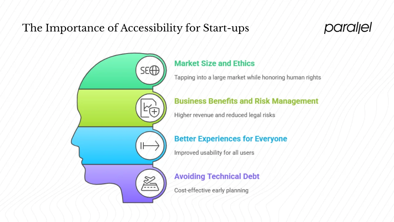
1) Market size and ethics
Before diving deeper into what is accessibility in design, consider the numbers. The World Health Organization reports that about 1.3 billion people worldwide live with significant disability. Accenture estimates that people with disabilities control roughly US$8 trillion in disposable income, and 20 million Americans alone control US$490 billion. Globally, 191 nations have ratified the United Nations Convention on the Rights of Persons with Disabilities, recognising access to information and communication technologies as a basic human right. Building universally accessible products is a simple way for a young company to honour those rights while tapping into a large market.
2) Business benefits and risk management
Making your product usable for all is good business. Leaders in disability inclusion report higher revenue and profit margins and often outperform peers. Accessibility also broadens your hiring pool and reduces legal risk because lawsuits over inaccessible products are increasing.
3) Better experiences for everyone
Accessibility patterns improve the experience for everyone. High contrast, captions and keyboard shortcuts assist people in bright light or noisy places and those with mobility impairments. Clear messages and large targets also benefit older adults and people with learning difficulties.
4) Avoiding technical debt
Retro‑fitting accessibility after launch is expensive. The W3C emphasises that addressing accessibility early makes it easier and less costly, and a 2024 Applause survey found that 79 % of teams plan for accessibility from the start. Starting early reduces technical debt and avoids having to halt feature development to fix inaccessible components later.
Core principles and types of accessibility
Different types of barriers
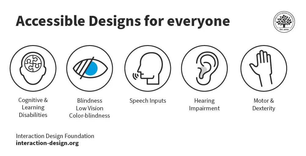
Accessibility covers sensory, motor, cognitive and situational barriers. Thinking about these four groups helps clarify what is accessibility in design and ensures your team considers a full spectrum of needs.
Guiding principles
The Web Content Accessibility Guidelines summarise accessibility into four central principles: perceivable (provide text alternatives and strong contrast), operable (make everything keyboard accessible), understandable (use plain language and predictable layouts) and resilient (use semantic markup and follow standards). WCAG 2.2, published in October 2023, is the current baseline for these principles.
Related concepts
You may encounter a few other terms when exploring accessibility:
- Design for everyone – A methodology that goes outside disability to consider the full diversity of users. The Interaction Design Foundation describes this approach as creating experiences usable and understandable by as many people as possible.
- Universal access – Designing environments and products so everyone can use them without adaptation.
- Assistive technology – Tools such as screen readers, magnifiers, speech input and alternative keyboards that help people use web‑based products.
- Fair access – The idea that all users should have equal access to information and services.
- Barrier‑free experience – A goal of removing physical, sensory or cognitive obstacles.
These related ideas support the overall understanding of accessibility in design.
Putting accessibility into practice
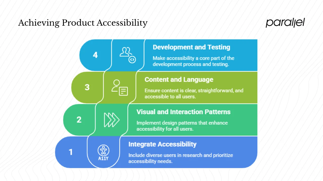
1) Integrating into your workflow
Start research by including people with disabilities and older adults in interviews and testing. Write user stories that include accessibility needs and prioritise high‑impact items like contrast, keyboard access and descriptive alt text. Surveys show that many teams plan for accessibility from the beginning.
2) Visual and interaction patterns
Certain patterns make your product more accessible:
- Visual design – Use strong contrast between text and background; avoid relying solely on colour to indicate meaning; ensure text on images remains legible. Let users scale text and avoid fixed pixel sizes.
- Interaction and structure – Organise pages with headings and landmarks; provide a clear focus indicator for keyboard users; avoid complex gestures like pinch‑to‑zoom; make buttons and links large enough to tap easily.
- Responsive layouts – Allow the interface to adapt to different screens. Think about environmental conditions like glare or one‑handed use.
- Assistive technology support – Use semantic HTML elements (such as proper headings and labels) so screen readers can interpret content correctly. Provide captions, transcripts and audio descriptions for multimedia.
3) Content and language
Accessible products are about more than visuals. Write in clear, straightforward language. Break text into short paragraphs and use headings and lists. Provide alt text that describes the purpose of images. Offer transcripts for podcasts and captions for videos. Use semantic markup — headings, navigation and footers — so assistive technologies can parse your site structure. Avoid idioms that may confuse non‑native speakers.
4) Development, testing and iteration
Make accessibility part of your definition of done. Use automated tools to catch missing labels and contrast issues, then manually test with only a keyboard, a screen reader and high zoom settings. Track issues and fixes alongside other work and celebrate improvements to motivate the team. Adopt component libraries that already meet accessibility guidelines, create short checklists and talk about accessibility in planning meetings so it becomes a shared responsibility.
Common myths and pitfalls
Misunderstanding what is accessibility in design can lead to poor decisions. Here are a few myths:
- “It’s only for people with permanent impairments.” Situational challenges like carrying a baby or reading in bright light also create barriers. Age‑related changes in vision, dexterity and cognition affect many people.
- “It’s just about meeting regulations.” Standards are a starting point. Real users need to test your product and provide feedback.
- “It slows us down.” Addressing accessibility early speeds development by avoiding costly rework and reduces support requests.
- “We can add it later.” Postponing this work creates technical debt and legal risk. Starting from the beginning is less costly and builds a better product.
- “Only developers need to worry about it.” Everyone has a role, from writers and designers to managers and executives.
Future‑looking products and accessibility
Technology and user expectations are changing. Personalisation lets people adjust font size, colours and interaction methods. Interfaces can adapt to context, switching to high contrast when light is bright or enlarging touch targets when only one hand is available. Voice and gesture inputs provide alternatives to typing or tapping; designing them carefully helps people with motor impairments as well as those cooking dinner or carrying groceries. The EU Accessibility Act, taking effect in June 2025, requires many web‑based products to meet stricter standards. Yet only about 32 % of organisations are on track. W3C is working on WCAG 3.0 to simplify guidelines and make them more flexible. Teams that understand what is accessibility in design today will be ready to adapt to tomorrow’s standards, access broader markets and show social responsibility.
Real‑world insights and data from 2024–2025
Working with early‑stage start‑ups, we often see teams focus on shipping features and leave accessibility for later. In one engagement a small collaboration tool was losing sign‑ups because new users with low vision struggled to read the onboarding fields. By increasing text contrast and adding descriptive labels, the team reduced the time it took new users to complete onboarding by 30 %. This quick change gave them confidence to expand accessible practices throughout the product.
Recent research backs up our experience. A 2024 survey by Applause found that 44 % of respondents said accessibility has become a higher priority than it was the previous year. Seventy‑nine per cent now build accessibility into their design plans from the start, and 87 % adopt design‑for‑everyone principles, yet only 19 % feel they have sufficient resources. Just 42 % are meeting WCAG 2.2 guidelines and only 32 % are on track for the upcoming EU Accessibility Act. These numbers show that awareness is growing, but execution still lags.
Understanding what is accessibility in design means recognising that it isn’t an optional extra. For founders and product managers, paying attention to accessibility early builds resilience and reduces rework. It also signals to investors that you care about long‑term viability and market reach. When your team has limited bandwidth, prioritise changes that have the highest impact — contrast, keyboard support, alt text and clear language — and iterate from there. This measured, data‑driven approach helps you scale gracefully while welcoming everyone.
Conclusion
Asking what is accessibility in design early in your company’s life is a strategic move. Over one billion people worldwide have a disability, and countless others experience temporary or situational barriers. Building accessibility into your processes from research through development and iteration helps you reach these users, avoid legal risk and create products that stand the test of time. Products designed for everyone also serve older adults and people in challenging situations, improving satisfaction across the board. As you prepare your next release, pick one tangible step: audit contrast, ensure keyboard access or add accessibility personas to your research. Small consistent actions build momentum, and the sooner you start, the easier it becomes.
Including all users builds trust and lasting loyalty, both within your team and with your audience.
FAQs
Q1. What does accessibility mean in design?
Accessibility in design means building interfaces, content and interactions so that all people — regardless of ability, device, context or situation — can use the product fully. It ensures that people with disabilities can perceive, understand and move through your product without barriers.
Q2. What are the four types of accessibility?
The four categories are sensory (vision and hearing), motor/mobility, cognitive/learning and situational or temporary constraints. Patterns like strong contrast, keyboard access, clear language and responsive layouts help cover these needs.
Q3. What is a simple definition of accessibility?
At its core, accessible design means enabling everyone to use a product confidently and independently. It involves designing for a wide range of abilities and situations, from blindness or mobility impairments to environmental challenges like bright light or limited bandwidth.
Q4. What is a central principle of accessibility in design?
One central principle is to make content perceivable: information and interface elements must be presented in ways users can sense. This includes providing text alternatives for images, captions for multimedia and strong colour contrast so content can be seen and heard by all.


.avif)


