How to Design an Accordion for Website UI: 2026 Guide
Master website accordion design in 2026. Learn the best practices for mobile usability, accessibility, and clear UI patterns to improve your product's UX.
If you’ve ever asked yourself what an accordion is on a website, the short answer is that it’s a simple interactive list of headings that reveal hidden details. In my work with early‑stage teams I’ve seen well‑built accordions lighten long pages and reduce fatigue on small screens; misuse can bury critical details or frustrate people. This guide breaks down the anatomy of the component, why it matters for lean product teams, common use cases, design and implementation tips and how to measure whether an accordion is helping your business. Good design always requires empathy, discipline and continuous learning throughout your product journey.
What Is an Accordion on a Website?
An accordion is a user interface pattern made up of stacked sections. Each section includes a heading and an icon (often a caret or arrow) that signals its expandable state. When you click the heading, the section expands to reveal the content panel; clicking again collapses it. Nielsen Norman Group describes accordions as headers that can be clicked to reveal or hide associated content. In their breakdown, each accordion item has three parts: a title, an indicator icon and a panel with the hidden information.

The term itself is a metaphor. Just as the bellows of the musical instrument expand and contract, web accordions expand or collapse to manage space. Unlike drop‑down menus that navigate to new pages or tabs that share the same horizontal area, accordions stack content vertically and may allow multiple panels to be open at once. Understanding what is an accordion on a website clarifies why it’s considered a form of progressive disclosure—users decide when to reveal details.
Why the metaphor matters
The word “accordion” signals how the interface behaves. When you press a key on an instrument, the bellows expand and compress to produce sound. On a website, clicking a heading expands or collapses content. This metaphor helps users predict the outcome of their actions. It also distinguishes accordions from similar patterns like tabs or drop‑downs, which either load new content or link to new pages. Knowing what is an accordion on a website—and what it isn’t—helps teams choose the right pattern.
Where accordions live in the information hierarchy
Accordions belong within a page’s body, not in the primary navigation. They group related topics in a single location while leaving control with the reader. A common pattern is to present several headings that summarise the content, letting visitors scan and then open the ones they care about. For example, you might add an accordion to an FAQ page so people can pick the question they want to read, or to a feature list so prospects can explore details selectively. In our work with AI and SaaS startups, we’ve used accordions to avoid pushing users to separate pages and to maintain a sense of continuity.
Why use an accordion (benefits and strategic value)

- Space‑saving on mobile and desktop: Long pages can exhaust readers, especially on phones. Accordions hide secondary information until needed. Rocketspark recommends them for breaking long content into digestible chunks. Mailchimp notes that the pattern minimises clutter and helps create pages that are easily accessible and readable. For early‑stage startups with evolving messages, this ability to keep pages concise while preserving rich details is invaluable.
- Improved scanning and reduced cognitive load: Most people scan before reading. Accordions present a set of headings that act like a table of contents. Nielsen Norman Group highlights that accordions reduce cognitive load by hiding irrelevant content. LogRocket’s research emphasises that their primary purpose is to make navigation easier and lighten mental effort. When your product page lists many benefits or features, the accordion lets visitors choose what to explore.
- Navigation aid: Accordions can double as mini navigation, especially when you have numerous related sections but expect different users to need different bits. CareerFoundry notes that accordions allow designers to include large amounts of information in a limited space and help users navigate quickly. We often use them for FAQs, pricing tiers or feature comparisons when a full sub‑page would be overkill.
- Responsiveness and mobile usability: On small screens, scrolling through every detail is tedious. Mailchimp points out that accordions let the visitor decide what to click and reduce vertical scrolling. OuterBox adds that accordions can improve mobile experience by condensing content. If your target audience browses on mobile (common for consumer apps), an accordion can keep pages manageable.
- Modularity and iteration: For startups iterating on their product or marketing site, accordions offer flexibility. You can add, remove or reorder panels without redesigning the page. This modularity supports rapid experiments, such as A/B testing different headings or default open states. It also aligns with progressive disclosure: reveal more detail only when the user requests it.
Strategic considerations for founders and product teams
When I’m advising founders, I emphasise that an accordion is a tool, not a silver bullet. It works best when the majority of visitors only need specific pieces of information. If every panel contains crucial content, hiding it behind clicks is counter‑productive. Nielsen Norman Group warns that accordions diminish content visibility and increase interaction cost. LogRocket cautions against having too many panels—if you have more than seven, scrolling might be simpler.
For early‑stage products, the choice hinges on priority. If a page serves multiple audiences—developers, business buyers or procurement—an accordion can surface targeted messages while keeping the rest tucked away. But always test behaviour: if most visitors ignore the panels, surface the information instead. Knowing what an accordion is on a website helps you weigh these trade‑offs.
Common use cases
Accordions work well when you want to keep a page tidy while still giving people quick access to details. Here are the most frequent situations where they help.

1. FAQ Sections
- Let visitors open only the questions they care about
- Keep long help pages compact
- Reduce scrolling on mobile
2. Long Feature Lists
- Break technical details into small, readable chunks
- Keep feature pages from feeling crowded
- Help readers compare points without losing their place
3. Step-by-Step Onboarding
- Show one stage at a time
- Keep beginners from feeling overwhelmed
- Offer optional guidance without cluttering the screen
4. Pricing and Tier Comparisons
- Reveal add-ons or advanced features inside expandable rows
- Keep key prices visible while keeping extras tucked away
- Help visitors scan through tiers quickly
5. Reports and Resource-Heavy Pages
- Condense long explanations, charts, or references
- Organise updates into expandable parts
- Make large documents feel easier to move through
6. Mobile Navigation
- Group related links under collapsible headers
- Save space on small screens
- Keep navigation clean without hiding important items
7. Settings in SaaS Products
- Group preferences into clear sections
- Help users adjust one category at a time
- Reduce visual clutter in account or system settings
8. Patterns Cited by Industry Guides
Rocketspark points to similar patterns, such as:
- Breaking long content into smaller blocks
- Keeping FAQs tidy
- Splitting policies and service options
- Presenting course details in manageable parts
- Structuring tutorials so readers can open each lesson when they need it
How to design and implement an accordion
UI and interaction design best practices
- Use clear headings: The heading should convey the gist of the hidden content. LogRocket recommends that the revealed material be closely related to the header. In our projects, we keep titles short and descriptive, such as “Pricing details,” “Technical requirements,” or “User stories.”
- Choose a consistent icon: A caret or arrow is the most effective symbol for indicating that a section is expandable. Avoid split buttons where the text and icon trigger different actions—Nielsen Norman Group found that split targets confuse users. Rotate or flip the icon to signal open or closed states.
- Provide clear feedback: When a panel opens or closes, the change should be obvious. Use a small animation or rotate the icon so users know something happened. On mobile, enlarge touch targets and show focus states to aid accessibility.
- Avoid nesting: Don’t place accordions inside accordions. The UK government’s design guidelines advise against nested accordions because they add complexity and hamper discoverability. If you find yourself considering this pattern, break the content into separate pages or sections.
Technical basics
- Use semantic HTML: a <button> for each heading and a corresponding panel with a unique ID. Mark the state with aria-expanded and link the button to the panel with aria-controls. Support keyboard users by enabling Enter or Space to toggle panels and Tab to move focus. Provide large touch targets and visible focus outlines.
- Follow progressive enhancement: if JavaScript fails, all content should still be visible. Lazy load heavy assets and use lightweight transitions. Avoid nesting accordions and limit the number of panels to reduce interaction cost. For SEO, keep critical text visible; research shows that sites often perform better when important content isn’t hidden.
Pros and cons

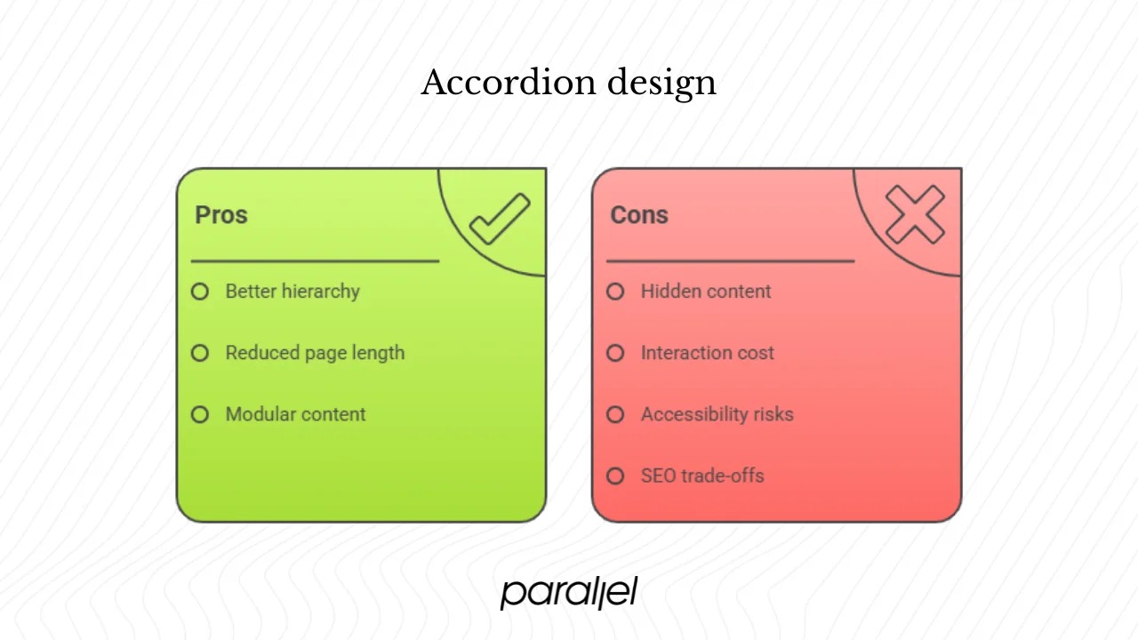
Pros
- Better hierarchy. Accordions let you present the “what” as a heading and the “how” or “why” in a hidden panel, aligning with progressive disclosure.
- Reduced page length. Collapsing secondary details shortens pages, improving perceived performance and saving screen space, especially on mobile.
- Modular content management. You can add or remove panels easily as your product evolves, supporting continuous iteration.
Cons
- Hidden content. Key details might be missed if users don’t expand the panel. Nielsen Norman Group points out that accordions reduce content visibility and increase the cost of access.
- Interaction cost. Visitors must click to reveal content. If they need information from multiple panels, the extra clicks can become annoying. LogRocket notes that too many clickable options can overwhelm people.
- Accessibility risks. Without proper markup, screen reader users might not know the content is there. Failing to support keyboard navigation can make the component unusable.
- SEO trade‑offs. Important text hidden behind toggles may have less prominence in search results. OuterBox’s testing saw improved traffic after making content visible.
Mitigation strategies
- Keep crucial information outside the accordion or open the first panel by default.
- Use clear headings, limit the number of sections and avoid nesting.
- Offer a show‑all/hide‑all control and ensure keyboard and screen reader support.
- Test with real users and track analytics; if few people open a panel, surface its content.
Measuring success
Once you’ve built what is an accordion on a website for your page, you need to evaluate whether it improves your site. Monitor:
- Expansion behaviour. Track the percentage of visitors who open at least one panel, the average number of panels opened per session and which headings draw attention.
- Engagement and scroll depth. Measure dwell time within panels and compare scroll depth on pages with and without accordions to see if they reduce clutter.
- Impact on key metrics. Compare bounce, exit and conversion rates between pages using accordions and those that don’t; some studies show better organic performance when important content is visible.
- Qualitative feedback. Talk to users and run quick tests to see if they notice the component and find it helpful or frustrating.
Quick checklist for startups
Before implementing an accordion, ask:
- Do users need only a subset of the content, or does everyone need to see everything?
- Are headings clear and descriptive, and do they match the content?
- Have we built accessibility and a JavaScript fallback in from the start?
- Are analytics set up to track usage and impact on key metrics?
- Will hiding this information hurt SEO or user comprehension?
- Is the accordion part of our design system for consistency across pages?
Conclusion
If you’ve been wondering what an accordion is on a website, the answer is straightforward: it’s a stacked set of headings that reveal hidden content. When used judiciously, an accordion can help you structure information, reduce clutter and improve mobile usability. Research from Nielsen Norman Group shows that accordions reduce cognitive load, while LogRocket’s work suggests they simplify navigation. Mailchimp and Rocketspark highlight their value in breaking long content into digestible pieces.
But the component isn’t a cure‑all. Accordions hide content, which can lower visibility and increase interaction cost. Accessibility and SEO require careful consideration. For early‑stage founders and product teams, the best approach is to treat an accordion as one tool in your kit. Use it to support scanning and modularity when appropriate, but always validate with real users. Measure whether panels are opened, whether conversion improves and whether the pattern genuinely serves your audience. That way you’ll know not just what is an accordion on a website, but when and how to deploy it effectively.


.avif)


