A founder recently showed me a comparison between their first dashboard and a refined version. The first felt like a jumble—graphs, numbers and buttons competed for attention. In the second, the most important metric was obvious and the eye moved naturally through the layout. The difference lay in applying some time‑tested guidelines. That moment led me to ask what are the 8 principles of design, and why should people building products care?
Knowing these principles isn’t about making pretty screens; it’s about creating trust, reducing clutter and communicating priorities. They give founders, product managers and engineers a shared vocabulary for critiquing work. In this guide we explain what are the 8 principles of design we apply at Parallel—balance, contrast, emphasis, movement, pattern, repetition, proportion and unity. For each we provide simple definitions, explain why it matters, share examples and pitfalls, and give you questions to use in your reviews. This is a hands-on resource rooted in experience with early‑stage machine‑learning and SaaS teams. If you’ve ever wondered what are the 8 principles of design, consider this your answer.
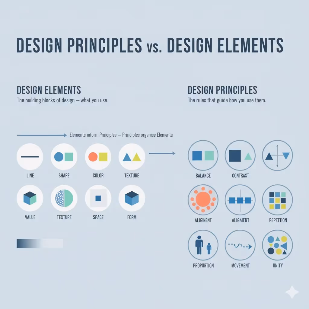
Design principles versus elements
Design elements are ingredients such as line, shape, colour, type, texture and space. Principles describe how these ingredients interact. The Oklahoma State University fact sheet explains that principles “can be used alone or combined to create objects that are visually pleasing” and that visual heft—the attention drawn by size, colour or contrast—underpins these principles.
Why do principles matter? They bring order to complexity. Without them, layouts feel random and confusing. Toptal’s Cameron Chapman observes that there is no strict consensus on how many principles exist, with sources citing anywhere from five to over a dozen, yet most practitioners rely on a core set because they solve common problems like unclear hierarchy, clutter and inconsistency.
How the principles interact
These guidelines overlap. Contrast enhances emphasis, repetition builds unity, and movement often depends on proportion. Toptal’s article states that contrast refers to how different elements are in a design, noting its role in hierarchy and accessibility, while balance results from arranging heavy and light elements effectively. Adjusting one principle often affects another. For example, increasing the size of a headline (proportion) strengthens emphasis and may change the movement through a page.
You can also break rules on purpose. A deliberately asymmetrical layout can signal energy, and an unexpected pattern can draw attention to a special feature.
Eight design principles
Before diving into each principle, let’s repeat what are the 8 principles of design: balance, contrast, emphasis, movement, pattern, repetition, proportion and unity. Each plays a part in making information clear and pleasing.
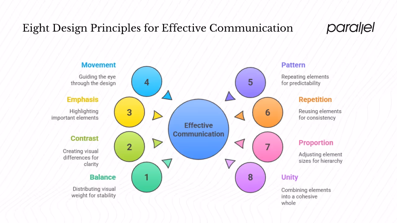
1) Balance
Definition. Balance is the distribution of visual heft across a composition. Dominant and subtle elements are arranged to create stability. There are two main types: symmetrical balance (equal heft on both sides of a centre line) and asymmetrical balance (different elements arranged to feel stable).
Why does it matters. People trust balanced layouts because our eyes seek equilibrium. Oklahoma State University points out that the eye desires equal visual balance horizontally or vertically. An unbalanced page can make users uneasy.
Application. Use a grid to arrange elements and distribute visual heft. On a dashboard, ensure charts and widgets are sized and positioned so no area feels heavier than the rest. In a hero section, balance a large image with grouped text rather than isolating everything on one side.
Pitfalls. Ignoring invisible heft—such as the heaviness of saturated colours—can lead to awkward compositions. Don’t overload one corner with dense content while leaving another empty.
2) Contrast
Definition. Contrast is the difference between elements—light/dark, big/small, rough/smooth. Toptal explains that it helps adjacent elements stand out and is critical for legibility. Ramotion calls contrast one of the most critical tools in any designer’s toolkit.
Why does it matter? Without contrast, everything blends together. Clear differences help users separate text from background and recognise what’s primary or secondary. Ramotion cites data that companies prioritising good design—including strong contrast—see up to 32% higher revenue growth.
Application. Use contrast to create hierarchy: primary buttons should differ noticeably from secondary ones. Check colour contrast ratios for accessibility. Bear in mind that contrast isn’t just colour; font thickness, size and texture also contribute.
Pitfalls. Too many contrasting elements create chaos. Don’t mix multiple bright colours, sizes and textures without a clear hierarchy. Also avoid low contrast combinations that make text hard to read.
3) Emphasis
Definition. Emphasis gives certain elements more presence so they stand out. Turing’s guide points out that emphasis defines a design’s focal point and clarifies what’s most important.
Why does it matter? Screens often contain lots of information; emphasis guides the viewer to the right starting point. If everything is loud, nothing feels important.
Application. Identify the primary action or message and make it bigger, bolder or more colourful. Use surrounding space to isolate it. Combine emphasis with hierarchy so secondary and tertiary elements are clearly subordinate.
Pitfalls. Emphasising too many things dilutes attention. Under‑emphasising crucial actions can leave users unsure of what to do. Avoid decorating secondary elements at the expense of the main action.
4) Movement
Definition. Movement refers to how the eye travels across a design. It’s influenced by positioning, directional cues and sequencing. Turing explains that movement involves leading the eye from one element to the next.
Why does it matter? Clear movement makes information easier to follow and prevents users from getting lost. In screen‑based experiences, movement also includes scroll patterns and micro‑interactions that guide tasks.
Application. Arrange elements in a logical order—headline, subhead, call‑to‑action—so the eye flows naturally. Use arrows, progressive disclosure or numbering to signal direction in onboarding flows. Subtle animations can aid movement but shouldn’t distract.
Pitfalls. Ambiguous or overly flashy movement confuses users. Avoid gratuitous animations and unclear directional cues. Movement should support the story, not steal attention.
5) Pattern
Definition. Pattern is a structured repetition of motifs, shapes or textures. Oklahoma State University distinguishes pattern from rhythm, noting that pattern focuses on similarities in spacing or the elements themselves.
Why does it matter? Patterns create predictability and tie different parts of a product together. They’re common in design systems—think repeated card layouts or consistent icons.
Application. Use subtle background patterns to add depth without distracting from content. Define patterns in your design system so they scale across pages. When repeating shapes or motifs, ensure they adapt to various screen sizes.
Pitfalls. Busy patterns compete with content. Avoid high‑contrast or dense motifs behind text. Also beware of patterns that don’t scale on mobile, causing awkward breaks.
6) Repetition
Definition. Repetition means reusing visual elements—colours, shapes, type styles—throughout a design. Toptal mentions that repetition reinforces an idea and unifies elements.
Why does it matter? Consistency reduces cognitive load. When buttons, icons and typography follow a repeated style, users learn patterns quickly. Repetition also creates rhythm and ties sections together.
Application. Build component libraries to enforce consistent spacing, typography and colours. Repeat visual motifs like icons or border styles across pages. Use repetition in marketing to create a consistent brand experience across channels.
Pitfalls. Blind repetition can make designs feel monotonous or ignore context. A dark button may not work on every background. Introduce variation where needed and ensure repeated elements fit their surroundings.
7) Proportion
Definition. Proportion refers to the relative sizes of elements. The Oklahoma State University guide says it’s the relation of one part to another or to the whole based on size or colour and observes that it often draws from the golden ratio.
Why does it matter? Proportion signals importance. Larger elements are perceived as more important, while smaller elements recede. Proper proportion also contributes to balance and guides the eye.
Application. Use modular scales when defining type sizes and spacing. Group related information together to maintain hierarchy. Adjust proportions across breakpoints so layouts remain clear on different devices.
Pitfalls. Out‑of‑proportion elements make designs feel awkward. A huge logo next to tiny text looks careless. Ensure proportions adapt to various screen sizes.
8) Unity
Definition. Unity is the sense that all parts belong together. Toptal points out that unity is about how well elements work together and that clear connections create cohesive communication.
Why does it matter? Unified designs feel intentional and trustworthy. Without unity, interfaces seem like a collection of unrelated parts, undermining credibility.
Application. Define a core palette, typography system and component styles and use them consistently. In cross‑functional teams, refer to the design system rather than improvising. Occasionally breaking unity (for example, a contrasting call‑to‑action) can draw attention where needed.
Pitfalls. Too little unity makes designs incoherent; too much makes them dull. Avoid mixing conflicting styles or fonts, and ensure that deviations have a purpose.
Using the principles in practice
After learning what are the 8 principles of design, integrate them into your process rather than treating them as theory.
Make a review checklist
Summarise each principle with a few questions: Is the layout balanced? Does the main action stand out? Are colours and type thicknesses contrasting enough? Do repeated elements remain consistent? Use this checklist during design reviews. Ground feedback in principle instead of subjective taste: “Could we improve contrast to make the call‑to‑action clearer?” is more helpful than “Make it pop.”
Apply principles throughout the process
Embed the principles at every stage: rough sketches can map balance, proportion and movement with simple boxes; mockups should check contrast, repetition and emphasis; final handoff should confirm unity across breakpoints. Frame feedback using principles so everyone speaks the same language.
When teams consciously apply these ideas the results are measurable. One project balanced charts on a grid and improved contrast; users completed tasks faster and engagement rose. A design system codifies such practices by defining spacing, colours and component sizes so unity is maintained.
Misconceptions and variations
You may encounter other lists that add arrangement, hierarchy or white space. Toptal observes that there is no definitive list. We prefer eight core principles because they solve most product‑design problems. Hierarchy is inherent in emphasis and proportion. Pattern is a specific sort of repetition and unity often arises from consistent rhythm.
Rules can be broken deliberately. Turing’s guide points out that some memorable designs skip or subvert principles. Use judgement and test with your users to know when to deviate. Cultural context matters; colours and contrasts that delight one audience may jar another. If you hear references to Elinor Ostrom’s design principles, be aware they refer to governance, not visual design.
Conclusion
If you’re wondering what the 8 principles of design are, this guide names them and explains how they work together. Balance creates stability, contrast clarifies hierarchy, emphasis guides attention, movement leads the eye, pattern and repetition build familiarity, proportion signals importance and unity ties everything together. Use these ideas deliberately, and don’t be afraid to bend them when it helps your story. Even one small change guided by a principle can improve clarity and trust.
FAQ
1) What are the 8 basic elements of design?
Elements are the raw ingredients—line, shape, colour, type, texture, space, value and sometimes three‑dimensional shape. They carry visual heft, which principles manipulate.
2) What are the 8 principles of design and layout?
When it comes to layout, people often ask what are the 8 principles of design. The answer remains balance, contrast, emphasis, movement, pattern, repetition, proportion and unity. Balanced grids rely on proportion; contrast and emphasis direct attention; pattern and repetition create familiarity; and unity pulls it together.
3) What are the principles used in creative fields?
Theories in painting and sculpture often mention the same eight principles. Creators tend to prioritise expression, while product design emphasises usability.
4) What are Elinor Ostrom’s design principles?
Elinor Ostrom wrote about managing shared resources. Her eight principles—clear boundaries, context‑appropriate rules, collective choice, monitoring, graduated sanctions, conflict resolution, recognition of organising rights and nested governance—have nothing to do with visual design and should not be confused with what are the 8 principles of design.

check out these related blogs


.avif)


.webp)