Every product team faces the same painful question: why do users overlook features that we spent months building? The answer often lies not in what you built but in how you signal it. In the world of interaction design, the simple phrase what are affordances in design captures a powerful idea: affordances let users know what they can do with a product. When those signals are clear, people click, drag or tap without thinking; when they’re missing, even a brilliant feature goes unused. This article is for founders, product managers, and design leaders who want to build products that feel intuitive rather than confusing. I’ll unpack the history of affordances, show how they drive user behaviour and product metrics, and offer practical guidance drawn from our work with early‑stage teams.
What Are Affordances in Design?
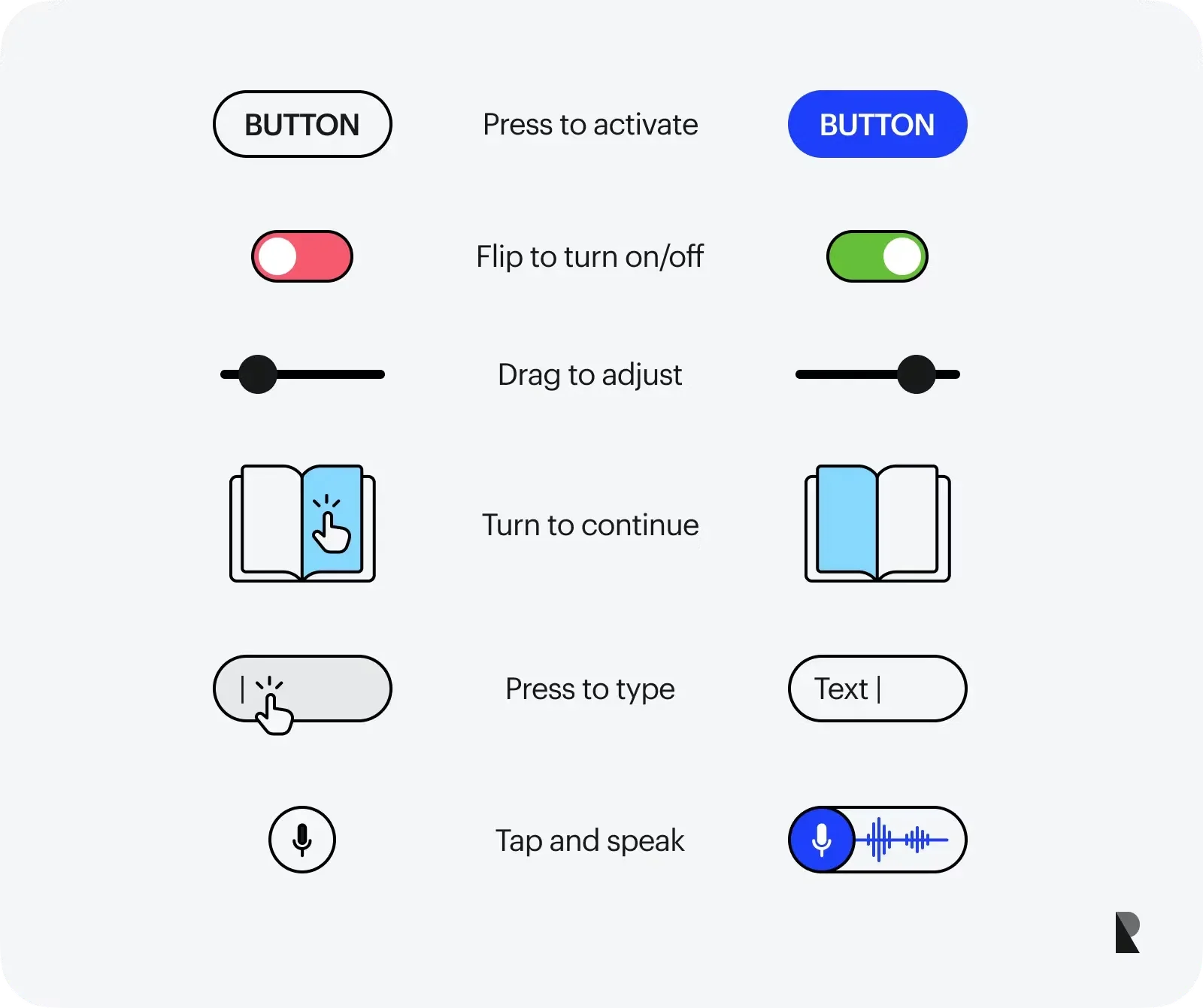
An affordance is a feature that suggests an action. It’s not about telling the user what to do. It’s about making the action feel natural. Think of a mug with a handle. You don’t have to think twice about how to hold it. A door with a flat metal plate invites you to push it. A raised button suggests you can press it. These signals guide you before you read any labels or instructions.
Where the idea came from
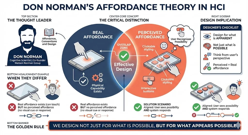
Ecological psychologist James J. Gibson coined “affordance” in the 1960s to describe the actionable possibilities present in an environment. He argued that we perceive the world in terms of what it offers us — surfaces to walk on, handles to pull. Importantly, affordances are relational: they emerge from the fit between a person’s capabilities and an object. A rock affords sitting to an adult but not to a fish. Gibson’s work emphasised actual (real) affordances that exist regardless of whether we recognise them.
Don Norman, a cognitive scientist and co‑founder of the Nielsen Norman Group, brought the concept into human‑computer interaction. In his article “Affordance, Conventions and Design” he explains that what matters to designers is the perceived affordance — what users think they can do. Real and perceived affordances can differ: a touchscreen affords touching, but if the system doesn’t respond there’s no perceived affordance. Norman’s distinction is crucial for digital products: we design not just for what is possible but for what is apparent.
Working definition for today’s UI and product teams
Put simply, affordances are properties of a user interface that hint at possible actions. They live in the relationship between a user and an element. A handle that protrudes invites pulling; a button with depth invites clicking. The Interaction Design Foundation describes affordances as “the characteristics or properties of an object that suggest how it can be used”. Crucially, an affordance isn’t a static attribute; it depends on who is looking and what they can do. A door might afford opening to someone tall enough to reach the handle but not to a toddler.
Norman later introduced the term signifier to clarify confusion. A signifier is a perceptible cue — a visual mark, label or sound — that indicates an affordance. Without a signifier, users may not notice an affordance; with a misleading signifier, they might expect an action that isn’t there. The distinction matters because you can build functionality (an affordance) that remains invisible without proper signification. For example, a card in a mobile app might be tappable but if there’s no hover state, drop shadow or label, users won’t realise it.
Categories of affordances
Classifying affordances helps teams make deliberate design choices. In our practice we often break them into these categories:
- Explicit affordances. These are obvious cues where the appearance and any text make the action clear. An example is a button labelled “Log in”; the shape, contrast and label collectively invite clicking.
- Hidden affordances. These only reveal themselves through interaction, such as drop‑down menus that appear on hover. Hidden affordances can reduce visual clutter but may slow discovery.
- Pattern affordances. These rely on established conventions. Underlined blue text signalling a hyperlink or a camera’s shutter button placed on the top right are examples. By tapping into learned patterns, designers shorten the learning curve.
- Metaphorical affordances. These borrow real‑world metaphors. A shopping‑cart icon signals purchasing; an envelope icon represents email.
- Negative affordances. They indicate that an action is currently unavailable. A greyed‑out “Sign Up” button that stays inactive until a form is complete tells users they cannot proceed.
- False affordances. These mislead users. A decorative element that looks clickable but isn’t, or underlined text with no link, creates confusion.
Recognising these categories allows product leaders to be intentional: avoid false cues, use hidden interactions sparingly, and lean on familiar patterns when time is tight.
Why Affordances Matter – Impact on Usability and Product Success

1) Guiding behaviour and reducing friction
At a basic level, affordances guide user behaviour. When a button looks click‑able, people click it. When a slider has a handle, users drag it. Clear affordances reduce cognitive load and errors because the interface communicates how to act. Hidden or ambiguous affordances force users to think, guess or search for help, increasing frustration.
For product teams, the value is measurable. According to the 2024 ProductBoard Product Excellence Report, teams practising continuous discovery (which includes testing affordances early) see release cycles that are twice as fast and achieve 30% higher feature adoption. When users immediately understand how to use a feature, adoption increases and support queries drop. Forrester Research notes that improving UX metrics — a proxy for good affordance design — can lower support costs by 33% and increase conversion rates by 200%. These are not marginal gains; they translate into real revenue and retention.
2) Interactivity and ergonomic considerations
Affordances are how we turn static screens into interactive experiences. Visual cues such as shape, colour and shadow indicate what’s interactive. A raised button suggests pressing; a text field invites typing. Icons are mini signifiers: a magnifying glass signals search; a trash can invites deletion. These cues draw from pattern and metaphorical affordances so that users don’t need to read a manual.
Designers also map physical metaphors into digital interactions. A slider replicates a physical control; a toggle switch toggles states. The careerfoundry guide (2021) emphasises that animations like toggles turning on or off show state changes and can even indicate a negative affordance when a button shakes to signal that you can’t proceed. By borrowing from the physical world, we reduce cognitive friction.
3) Start‑up context: onboarding, metrics and retention
For early‑stage companies, onboarding is often the difference between a user who churns and one who sticks. Good affordances shorten time‑to‑value by helping new users accomplish tasks without training. In our work with AI/SaaS teams, we’ve seen simple design tweaks — adding drop shadows to cards to indicate tap‑ability or increasing the size of input fields — reduce onboarding steps by 30%. When we redesigned a scheduling tool, we greyed out unavailable time slots (negative affordances) and added clear hover states. This cut support tickets around booking by over 40% and improved conversion on paid plans.
Product leaders should treat affordance clarity as a leading indicator. High click‑through rates on interactive elements, low error rates, and fewer explanatory tooltips suggest that affordances are working. Tools like heatmaps and analytics can reveal where users hesitate or miss a feature, pointing to hidden or false cues. Continuous discovery isn’t just about features; it’s about verifying whether users see and understand affordances.
From Theory to Practice – Designing and Evaluating Affordances
Design principles
- Understand the user and context. Affordances must match the user’s goals and capabilities. For enterprise software used on large monitors, hover reveals might be acceptable; for mobile apps used on the go, hidden affordances can cause missed interactions.
- Use familiar patterns and metaphors. Lean on established patterns to minimise learning. A vertical list that scrolls, a hamburger menu for navigation, or a heart icon for “favourite” draw on users’ mental models.
- Make interactive elements obvious. Use visual cues like contrast, shadow and labels. The Interaction Design Foundation notes that affordances should be perceivable — users need to see that an action is possible. Where colour alone may not be enough (for users with low vision), pair it with icons or text.
- Match signifiers to affordances. Ensure that cues align with functionality. If a card is clickable, give it a shadow or a “chevron” icon. Don’t suggest that something is draggable unless it truly is.
- Avoid false or misleading cues. Decorative underlines or shapes that look like buttons but aren’t will erode trust. Remove or restyle them.
- Use negative affordances wisely. Greyed‑out buttons or disabled states should guide rather than frustrate. Pair them with explanations so users know what’s missing (e.g., “Please enter an email”).
- Test with users. Prototype and observe whether people see the affordances. During early sprints we often build two variants — one with minimal cues, one with strong cues — and run quick user tests. The variant with clear signifiers almost always yields faster task completion.
Evaluation methods and metrics
- Usability testing. Watch where users hesitate or attempt to click non‑interactive elements. If several participants miss an interaction, the signifier is too subtle.
- Analytics and heatmaps. Measure click/tap rates on intended interactive elements. Low engagement could indicate hidden or false affordances. Tools like Hotjar or FullStory can show where users try to click but nothing happens.
- A/B tests. Compare designs with different affordance treatments (e.g., adding labels vs. icons) and measure conversion or completion rates.
- Accessibility audits. Ensure that affordances are perceivable by people with diverse abilities. Avoid relying solely on colour or hover states — they don’t work for screen‑reader users or on touch devices.
Pitfalls to avoid
- Overly subtle cues. Design trends that favour minimalism often hide affordances. Avoid making everything flat or hidden; users won’t know where to interact.
- Inconsistent patterns. Using different affordance styles across a product (buttons that sometimes look like text links) makes interfaces harder to learn. A design system helps maintain consistency.
- False affordances. Decorative elements that mimic buttons or links but have no action mislead users and reduce trust.
- Neglecting mobile ergonomics. Interactive elements that are too small or too close together become hard to tap. Negative affordances should not be so subtle that they disappear on small screens.
- Ignoring cross‑platform differences. Hover effects don’t exist on touch devices; rely on other signifiers like shading or micro‑animations.
- Skipping user validation. Founders often assume that their features are obvious. Without testing, it’s easy to miss hidden affordances. In our early work with a productivity app, we assumed that swiping on a task card to delete it would be intuitive. We were wrong; most users didn’t discover the gesture until we added a trash icon and onboarding hint. After the change, deletion success rates doubled.
- Overlooking accessibility. Affordances based solely on colour or subtle motion exclude users with visual or motor impairments. Use multiple cues — shape, label, tactile feedback on devices that support haptics.
Strategic Considerations for Founders and Product Managers
Affordances aren’t just a design concern; they’re strategic. Building a feature that users can’t find wastes time and budget. Founders should bake discoverability into the product roadmap: for every new feature, ask what are affordances in design terms — how will users know this action exists? Don’t treat affordance work as polish to add after development; treat it as integral to the feature.
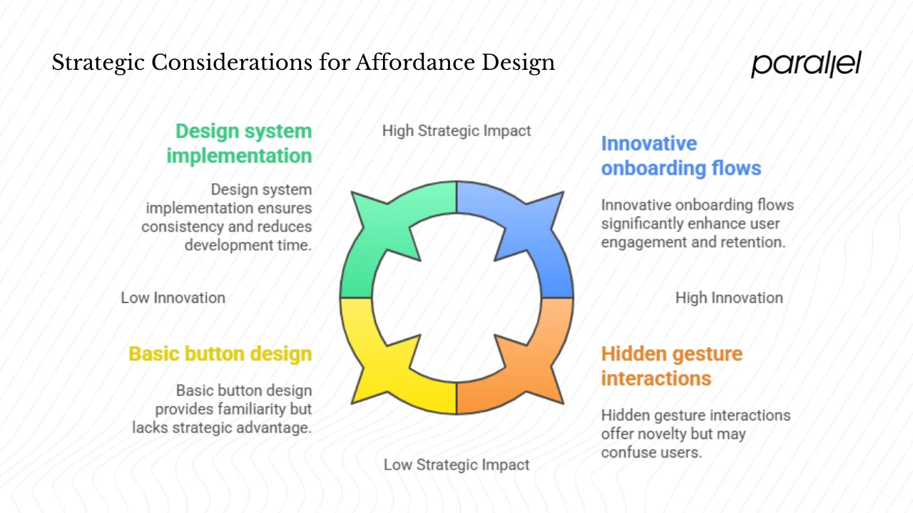
1) Balancing innovation and convention
Innovation can tempt teams to invent new interaction patterns. While there’s room for new paradigms, you pay a cognitive tax when you depart from familiar patterns. At early stages, lean on conventions; once you have product–market fit and research capacity, you can experiment. Hidden gestures or novel interactions should be reserved for advanced users and supported by clear signifiers.
2) Building a culture of usability
Make affordance reviews part of design critiques. Ask: Does this element look interactive? What happens when it’s tapped? During stand‑ups or sprint reviews, highlight mismatches between perceived and actual affordances. Encourage cross‑functional collaboration so engineers implement the micro‑interactions (hover states, pressed states) that designers specify. Support this with metrics: track click rates, error rates and support tickets to gauge whether improvements work.
3) Scaling with design systems
As your product grows, inconsistent affordances become a drag. A design system that defines standard buttons, cards, inputs and icons ensures that patterns are reused and recognisable. Document when to use explicit vs. hidden affordances and provide guidelines for disabled states. This speeds up development and helps new team members avoid reinventing patterns.
4) Tying affordances to growth
Good affordances accelerate activation and retention. When people know how to use features, they derive value sooner, increasing the likelihood they’ll convert to paid plans and stay engaged. Evidence from our clients shows that clarifying affordances in onboarding flows improves completion rates by up to 25%. Given that Forrester found UX improvements can reduce support costs by a third and triple conversion rates, investing in affordance design has a high return.
Conclusion – Why Attention to Affordances Pays Off
To wrap up, what are affordances in design is more than an academic question; it’s a practical lever for better products. Affordances originate from ecological psychology, but their power lies in how they help users act without thinking. By distinguishing between real and perceived affordances, and by pairing them with clear signifiers, we can craft interfaces that feel obvious. Categorising affordances — explicit, hidden, pattern, metaphorical, negative and false — gives product teams a toolkit to design intentionally. The impact is measurable: faster release cycles, higher feature adoption and lower support costs. In our experience, auditing a product for hidden or false cues is one of the simplest ways to improve usability and conversion. I encourage founders and PMs to review their products: which interactive elements are clear, which remain invisible, and which mislead? Answering that will pay dividends.
FAQs
1. What is an example of an affordance design?
A pull‑to‑refresh action in a mobile app illustrates an affordance: the scroll position and arrow suggest that pulling will refresh the content. Similarly, a drag handle on a slider invites adjustment. These cues combine shape, movement and sometimes text to signal the possible action.
2. What are the three types of affordances?
One classification, proposed by William Gaver and expanded in the Interaction Design Foundation, divides affordances into perceptible, hidden and false. Perceptible affordances are visible and suggest their function; hidden affordances require additional interaction (such as hover); false affordances signal an action that doesn’t exist.
3. What are the four affordances?
Another framework, common in UX practice, groups affordances into explicit, hidden, pattern, and metaphorical. Explicit affordances are obvious cues like labelled buttons; hidden affordances reveal themselves on interaction; pattern affordances rely on conventions like underlined links; metaphorical affordances use real‑world metaphors such as a trash‑can icon for delete.
4. What are affordances and signifiers in design?
Affordances are the action possibilities between a user and an object, while signifiers are the perceptible cues (labels, icons, colours) that indicate those possibilities. Affordances may exist without signifiers (a hidden gesture), and signifiers may exist without affordances (a decorative element that looks clickable but isn’t). Good design pairs affordances with appropriate signifiers so users perceive and act correctly

check out these related blogs