We’ve all felt it: the frustration of launching a feature you know can help people, only to watch users click away. The content is solid, the logic is sound, yet the experience feels flat. More often than not, the problem is visual hierarchy.
Visual hierarchy is simply the ordering of visual elements so people see what matters first — and it’s the difference between an interface that converts and one that confuses. Research shows that when hierarchy is missing, cognitive load rises and drop‑off increases. As a founder and product designer, I’ve learned that the question isn’t whether hierarchy matters but what can be used to improve visual hierarchy.
In this article I’ll explore how human perception shapes attention, the core techniques for creating hierarchy, a process to iterate on it, and common pitfalls. My goal is to share practical insights from early‑stage AI/SaaS projects so you can guide the eye with intention rather than guesswork.
How to Improve Visual Hierarchy in 2026: TL;DR
To improve visual hierarchy, use size and scale to signal what matters most, contrast and colour to draw focus, and white space to reduce cognitive load. Support these with typographic structure, consistent alignment, proximity-based grouping, and intentional positioning. Layer in depth cues like shadows and accent colours sparingly. Test with real users, measure engagement, and codify what works into your design system.
How Human Perception Shapes Visual Hierarchy?
The psychology of scanning
Users don’t read interfaces, they scan them. Eye‑tracking studies show that people reading left‑to‑right languages follow an F‑shaped pattern: they scan across the top of the page, then down the left side, occasionally reading short horizontal lines before continuing downward. This pattern explains why headlines and navigation belong at the top and left edges — that’s where attention naturally lands. For simpler, more visual layouts, a Z‑pattern provides a different anchor.
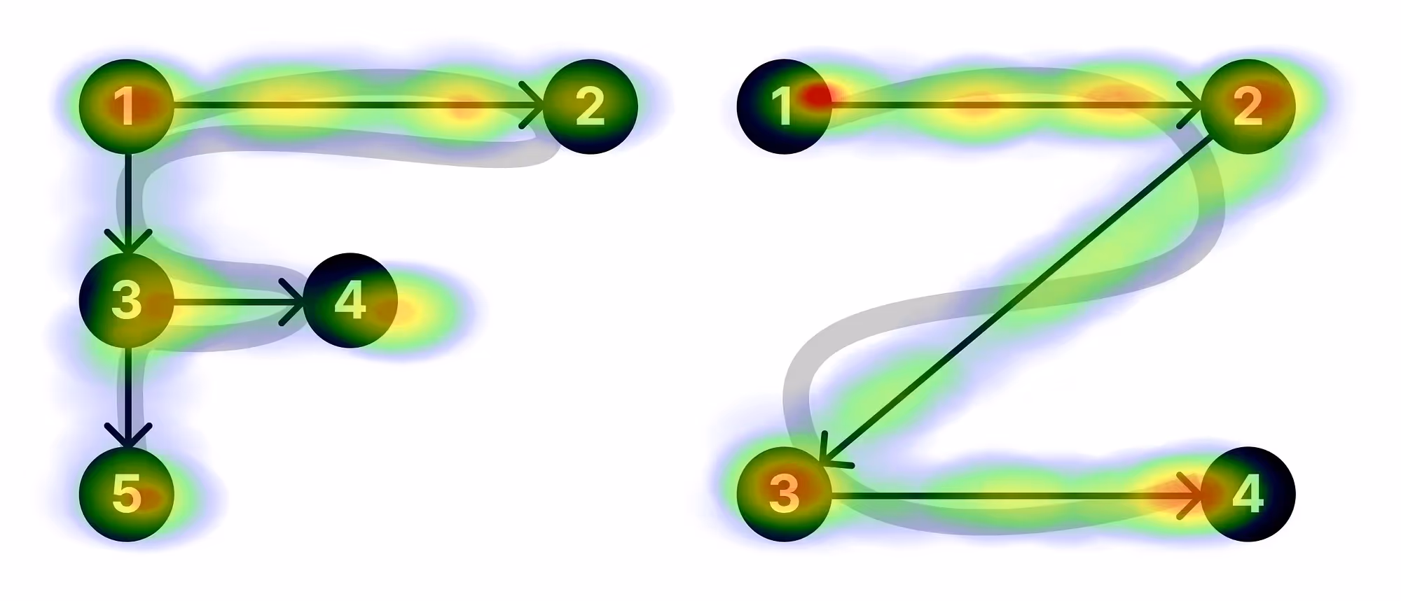
A July 2025 article on layout psychology describes the Z‑pattern as the path the eye takes on a page: left‑to‑right along the top, diagonally down, then left‑to‑right along the bottom. Designers leverage that path by placing the main call‑to‑action in the bottom‑right corner where the eye comes to rest. Understanding these scanning patterns allows product teams to build layouts that follow human tendencies rather than fight them.
Limiting levels of emphasis

Hierarchy isn’t about making everything bold; it’s about signalling what is primary, secondary and tertiary. When every element shouts, nothing stands out. A simple “squint test” — stepping back and squinting at a page to see what draws the eye — helps reveal whether you’ve assigned too much emphasis. In practice, limiting emphasis to three to five levels makes complex interfaces scannable. For example, in a dashboard we built for an AI analytics tool, we used large headings for KPIs, medium text for sub‑metrics and light grey labels for metadata. Too many levels would have overwhelmed the user; too few would have flattened important distinctions. Remember that hierarchy guides priority rather than ranking all information equally.
Gestalt principles and unconscious grouping
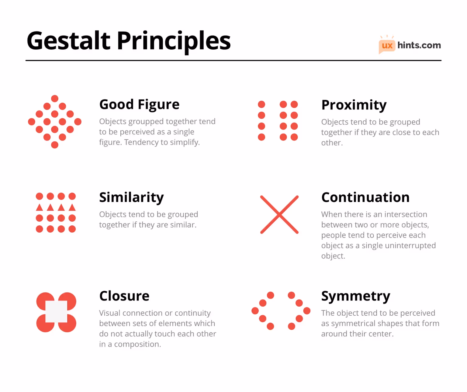
Our brains automatically group visual elements before we’re even aware of it. Gestalt principles — proximity, similarity, continuity and closure — explain this pre‑cognitive grouping. The similarity principle states that elements that resemble each other in colour or shape are grouped in our minds. Proximity is equally powerful: objects that are close together are perceived as related, while those far apart are seen as unrelated. By positioning related items near each other, designers create a sense of depth and organize information more effectively. Continuity shows that our eyes naturally follow lines or curves, making smooth visual paths essential for navigating interfaces. Closure describes our tendency to fill in gaps — we perceive incomplete shapes as whole. These principles underpin many of the techniques we’ll explore next.
10 Proven Techniques to Improve Visual Hierarchy in 2026
1) Size, scale and proportion

Make what matters bigger. Larger elements demand attention and create a visual entry point. When we recently redesigned a data‑intensive dashboard, we increased the size of the main performance metric by 40%. Users immediately gravitated to that number, spending more time exploring underlying trends. But bigger isn’t always better — oversized elements can dwarf secondary content and break balance. Use size deliberately: enlarge one or two key items to signal importance and ensure supporting details are smaller and lighter.
Tips:
- Establish a baseline type scale for headings, subheadings and body text; adjust in 2–4 pt increments to create clear steps.
- Use oversizing sparingly — enlarge the primary call‑to‑action or headline but keep other elements proportional.
- Test readability on mobile; what feels large on desktop may dominate on a phone.
Pitfalls:
- Over‑scaling can flatten the hierarchy; multiple giant elements compete for attention.
- Failing to size interactive elements (buttons, form fields) adequately can hurt usability, especially on touch screens.
2) Contrast and colour
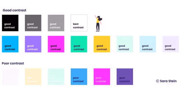
Our visual system is wired to notice differences. High contrast between foreground and background makes text readable and draws focus. Conversely, low contrast can recede secondary details into the background. A 2025 guide notes that vibrant colours and high contrast catch attention immediately and that accessibility research backs strong contrast for readability. In our work with AI‑driven finance tools, switching from muted grey buttons to a high‑contrast accent colour increased click‑through rates by 15 %. However, over‑using bright colours creates noise and fatigue. Reserve bold hues for primary actions and use neutral tones for supporting elements.
Tips:
- Check colour contrast ratios (e.g., WCAG guidelines) to ensure text remains readable; aim for at least 4.5:1 for body text.
- Use a limited palette: one primary brand colour, a secondary accent and neutral greys. This provides rhythm without overwhelming users.
- Leverage colour to categorize information or signal status (e.g., green for success, red for errors).
Pitfalls:
- Too many saturated colours compete for attention and reduce coherence.
- Relying solely on colour to convey information excludes users with colour‑vision deficiencies; pair colour with icons or labels.
3) Typographic hierarchy
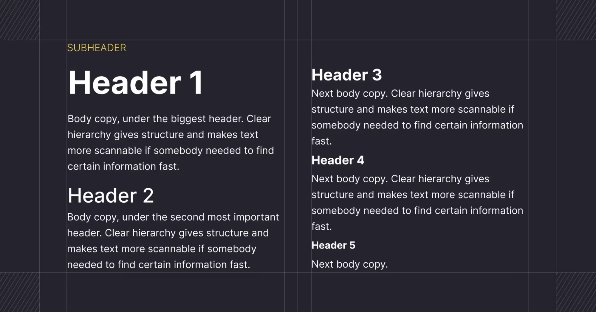
Typography communicates order as much as words do. People scan before they read, so text structure must guide them. Use variations in size, weight and style to create layers: display styles for hero headlines, large titles for section headings, smaller headers for subsections and body text for detail. In our experience, three levels are usually enough; more layers confuse readers. Consistency matters: choose fonts from the same family or with harmonious proportions, and avoid mixing too many typefaces. Maintain generous line spacing and avoid long line lengths to improve legibility.
Tips:
- Define typographic scales in your design system; base sizes on multiples (e.g., 12 pt base with 1.333 ratio).
- Use bold or semi‑bold weights for emphasis rather than all caps, which can slow reading.
- Pair contrasting typefaces (e.g., a serif for headings and sans‑serif for body) cautiously; ensure they complement rather than clash.
Pitfalls:
- Mixing more than two fonts dilutes hierarchy and looks inconsistent.
- Setting body text too small or too light leads to strain; test on devices.
4) White space and negative space

Space is a design element. It isn’t empty; it directs attention. A study from Wichita State University found that participants preferred layouts with margins and generous spacing and that these designs improved comprehension. Giving elements room to breathe allows the eye to pause and reduces cognitive load. For example, when we simplified the onboarding flow for a B2B SaaS product, we introduced generous padding around each step. Sign‑ups increased by 20% and support tickets dropped. Too little white space creates clutter; too much can feel sparse or disconnected. The key is balance.
Tips:
- Use consistent spacing increments (e.g., 8‑point spacing scale) to create rhythm across screens.
- Increase margins around key messages or images to isolate them from noise.
- Don’t be afraid of “empty” sections; they can provide relief after dense information.
Pitfalls:
- Over‑spacing on mobile can push important content below the fold, making it harder to find.
- Ignoring white space in dense dashboards can lead to visual overload and user fatigue.
5) Alignment

Alignment creates invisible lines that guide the eye. Grid‑based alignment reduces cognitive load by organizing information predictably. Studies show that when layouts follow consistent spatial patterns, users process information more efficiently and rate experiences as more usable. Use columns and rows to align text, buttons and images; align related items along a common edge to signal their connection. Occasionally breaking alignment can draw attention to a special element — but do so sparingly.
Tips:
- Set up a grid with fixed gutters; align elements to gridlines for consistency.
- Align labels and inputs vertically to improve form completion speed.
- Use left alignment for languages read left‑to‑right and right alignment for right‑to‑left languages.
Pitfalls:
- Over‑aligning every element can make the interface feel rigid; allow for intentional offsets to create interest.
- Inconsistent alignment (sloppy margins) undermines credibility.
6) Proximity and grouping

Proximity is one of the strongest signals for grouping. The proximity principle states that objects close together are perceived as related. Placing related controls, labels and supporting text near each other helps users understand relationships. Conversely, adding space between groups distinguishes unrelated content. Dovetail’s guide notes that applying proximity creates a sense of depth and organizes compositions. In our design work, grouping payment information (card number, expiration date, CVV) into a single module dramatically reduced errors during checkout.
Tips:
- Group labels directly above or beside their inputs to reinforce connection.
- Use cards or panels to encapsulate related content; leave consistent spacing between cards.
- Combine proximity with visual separators (lines or subtle backgrounds) to clarify complex groupings.
Pitfalls:
- Over‑grouping can merge distinct items; maintain enough space to separate unrelated groups.
- Uneven spacing between similar groups confuses users about what belongs together.
7) Positioning and layout patterns
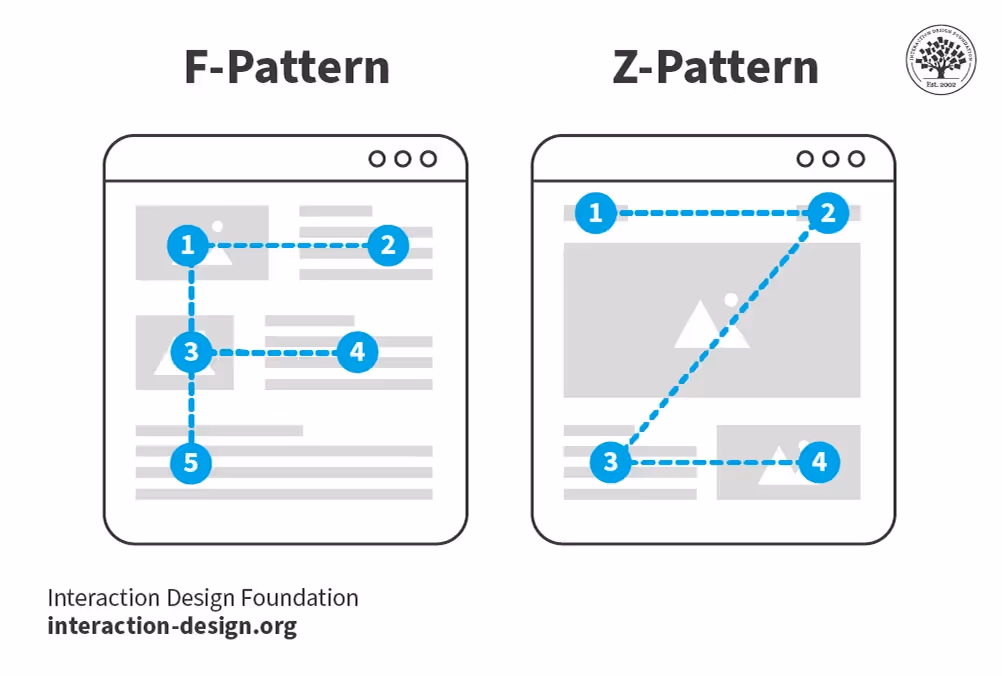
Where you place an element matters as much as how it looks. In Western cultures, the top and left areas receive the most attention. Heatmaps from Hotjar show that users engage most with content placed in the top left and centre of a webpage. For linear information flows (e.g., pricing pages), follow the F‑pattern: headline and value proposition at the top, secondary information down the left, with horizontal glances to key details. For highly visual or landing pages, employ the Z‑pattern: top bar for branding, a diagonal sweep to a hero image, and a final sweep to the call‑to‑action in the bottom‑right corner. Use positioning intentionally to frame the path users should take.
Tips:
- Place primary CTAs above the fold and again at natural stopping points.
- Respect cultural reading directions; flip layouts for right‑to‑left languages.
- Consider “hot zones” on mobile (bottom centre for thumb reach) when positioning actions.
Pitfalls:
- Ignoring lower‑visibility zones leads to important information being missed.
- Placing key content below the fold reduces engagement and conversions.
8) Depth, shadows and elevation

Adding depth helps separate elements and indicate interactivity. Soft shadows, blur and elevation cues make buttons and cards appear clickable. Material Design and iOS guidelines use subtle drop shadows to suggest layering. In our own prototypes, introducing a slight elevation on the active step in a multi‑step form helped users understand where they were in the process. Use depth sparingly: heavy shadows or multiple overlapping layers can create clutter and impact performance on lower‑end devices.
Tips:
- Use a 4–8 dp elevation for primary cards and buttons; less for secondary items.
- Combine elevation with hover or pressed states to provide feedback.
- Consider performance: CSS shadows can slow down animations on low‑powered devices.
Pitfalls:
- Over‑using shadows creates a dated, skeuomorphic look.
- Too much elevation can compete with other hierarchy signals like size and colour.
9) Colour palettes and accents

Beyond contrast, colour creates hierarchy by grouping related elements and drawing focus. Use accent colours sparingly to highlight primary actions; keep the majority of the palette muted to allow the accents to shine. For example, an AI productivity tool we worked on uses a calm blue for the interface, with a vivid coral accent reserved only for the “Start trial” button. This restraint makes the call‑to‑action unmistakable. Always consider accessibility: ensure sufficient contrast and be mindful that red/green cues may not be perceivable by all users.
Tips:
- Define brand colours and assign functional roles (primary action, secondary, destructive, success).
- Use neutral backgrounds to let content and images stand out.
- For complex dashboards, use colour to categorize data sets (e.g., sales vs. marketing) but provide legends.
Pitfalls:
- Relying solely on colour to convey state; always pair with icons or text.
- Overly saturated interfaces can fatigue users over long sessions.
10) Combining techniques
The most powerful hierarchies emerge when techniques are layered. For instance, a large, coloured button positioned at the bottom‑right and elevated with a subtle shadow draws the eye through size, colour, position and depth simultaneously. Combining white space with proximity clarifies grouping, while consistent typography and alignment keep information structured. Resist the urge to use every technique at once; choose a few that serve your goals and test them in context. The interplay of size, colour, spacing and positioning is what can be used to improve visual hierarchy most effectively.
An 8-Step Process to Continuously Improve Visual Hierarchy

1 – Audit existing screens
Start by measuring where attention currently goes. Tools like heatmaps or eye‑tracking — if available — reveal hotspots and blind zones. For early‑stage teams without advanced tools, conduct heuristic reviews: ask team members or users to narrate where they look first and what confuses them. Note misalignments, cluttered areas and neglected CTAs.
2 – Identify principal elements
Clarify what must be seen first, second and third. Tie hierarchy decisions to business goals and messaging. For example, on a pricing page the value proposition, price points and sign‑up button are primary; testimonials are secondary. Limit top‑level items to three to five; more than that dilutes focus.
3 – Sketch and wireframe variants
Before jumping into high‑fidelity design, sketch rough layouts. Experiment with swapping size, colour and position: what happens if the CTA moves to the top? Does increasing the hero headline size draw the right attention? Use low‑fidelity prototypes to iterate quickly; at Parallel we often generate three variants and discuss them internally before testing with users.
4 – Apply techniques thoughtfully
Once you have a direction, layer in the techniques outlined above. Boost primary elements through size and contrast; create breathing room with white space; group related items with proximity and align them cleanly. Use depth and accent colours to draw focus to interactive elements. Always cross‑check across devices: what works on desktop may need adjustment on mobile.
5 – Test with users
Release prototypes or A/B test variations. Use click‑tracking or analytics to see whether people notice and interact with prioritized elements. If you have eye‑tracking tools, verify that attention flows as intended. Hotjar heatmaps often reveal whether users are following the F or Z patterns you designed for. Gather qualitative feedback: ask users what drew their eye first and what they struggled with.
6 – Measure success and refine
Tie hierarchy adjustments to metrics: click‑through rates, engagement time, task completion speed, or error rates. For example, after simplifying a complex onboarding flow with clearer hierarchy and spacing, we saw a 30 % reduction in time‑to‑value. Review these metrics regularly and refine your design as product goals evolve.
7 – Embed guardrails
Once you’ve found effective hierarchy patterns, codify them in a design system. Document type scales, spacing units, colour palettes, and elevation levels. Provide examples of proper hierarchy and anti‑patterns. This ensures that future experiments don’t inadvertently break established flows. Encourage designers and engineers to question whether proposed changes support or disrupt the hierarchy.
8 – Learn from examples
Before‑and‑after comparisons are powerful. On a marketing landing page we redesigned, moving the sign‑up CTA from the bottom to a prominent position in the hero section and increasing its size and doubling conversion. In another case, cleaning up a dashboard by grouping controls and adding white space reduced support tickets. Collecting these case studies builds institutional knowledge and helps new team members learn how hierarchy drives outcomes.
Challenges, pitfalls and trade‑offs
Creating hierarchy isn’t free of challenges. Over‑emphasis everywhere makes nothing stand out. Accessibility constraints require careful colour choices and sufficient contrast; our accent hues must pass WCAG guidelines to accommodate colour‑blind users. Device constraints mean what can be used to improve visual hierarchy on desktop (e.g., multi‑column layouts) may not translate to mobile. Balancing consistency with occasional exceptions is tricky; breaking patterns intentionally can draw attention, but overuse erodes trust. Cultural factors also matter: right‑to‑left languages require mirrored layouts, and internationalization can lengthen text strings, affecting spacing. Finally, performance must be considered — heavy shadows or numerous layered components can slow rendering on low‑powered devices. Good hierarchy respects both human cognition and technical realities.
Advanced Strategies to Improve Visual Hierarchy Across Devices and Cultures
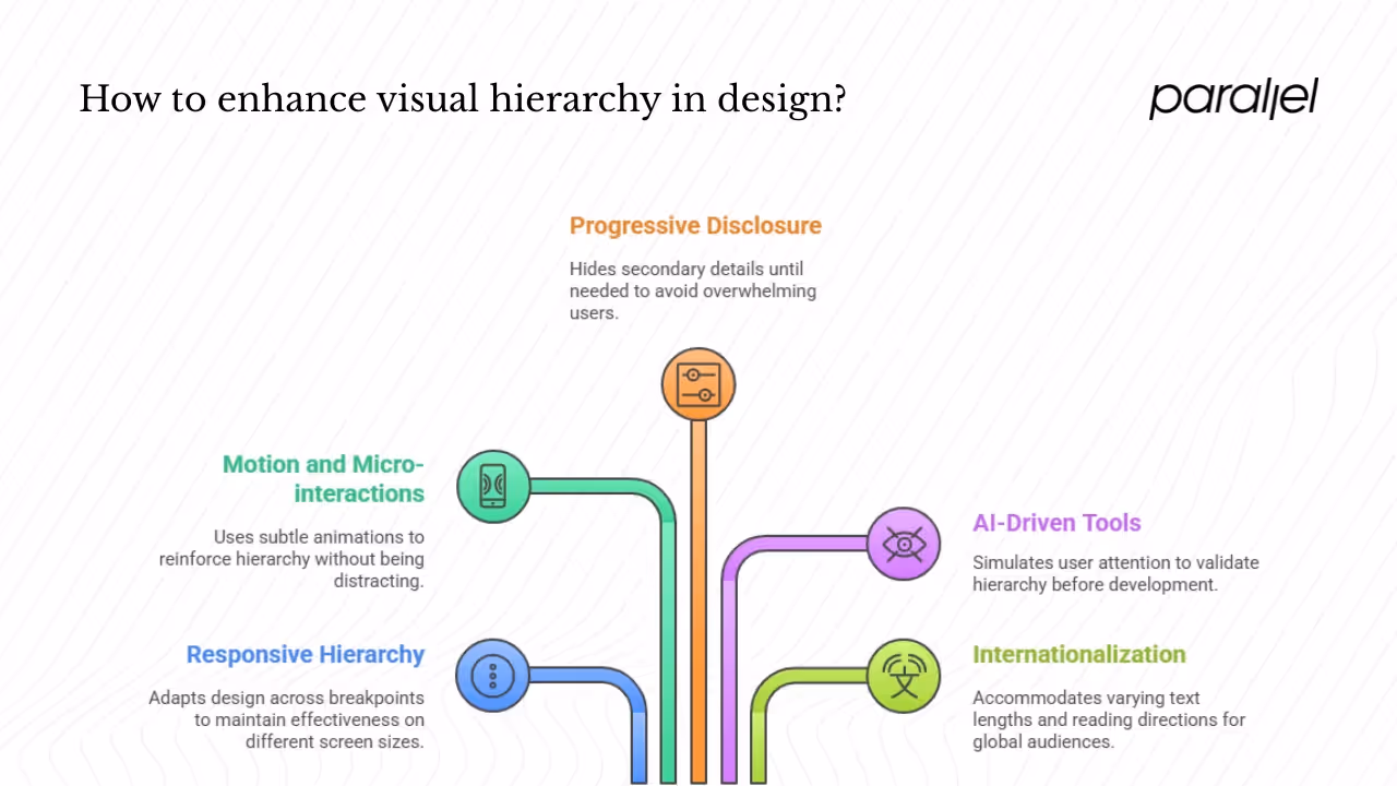
1) Responsive hierarchy
Design hierarchy should adapt across breakpoints. On small screens, stacking elements vertically and reordering content ensures that what can be used to improve visual hierarchy remains effective. For example, a three‑column pricing table becomes a stacked accordion on mobile, preserving the emphasis on the selected plan. Use CSS breakpoints and flexible grids to adjust typography sizes and spacing.
2) Motion and micro‑interactions
Subtle animations can reinforce hierarchy. Entrance animations (e.g., fading in a hero headline) draw attention to primary elements. Micro‑interactions, like a button shake when left unclicked, can nudge users gently. Use motion judiciously: it should enhance comprehension, not distract. Avoid long or flashy animations that may feel gimmicky.
3) Progressive disclosure
Complex products often overwhelm users with information. Progressive disclosure hides secondary details until they’re needed. For example, a settings panel may initially show only high‑level preferences; clicking “advanced” reveals additional options. This technique maintains a clean hierarchy while still offering depth.
4) AI‑driven tools
Attention‑predictive tools based on eye‑tracking models, such as Dragonfly, can simulate where users will look. They help validate hierarchy before development. In practice, we treat them as guidance rather than gospel — real user tests are still essential.
5) Internationalization
Designs must accommodate varying text lengths and reading directions. When localizing into languages like German or Hindi, text expansion may require re‑sizing elements or adjusting spacing. Right‑to‑left languages invert the F and Z patterns, requiring mirrored layouts. Consider these factors early in your hierarchy planning.
Conclusion
A strong visual hierarchy guides the eye, reduces cognitive load and drives engagement. Throughout this article we explored what can be used to improve visual hierarchy: size and scale, contrast and colour, typographic hierarchy, white space, alignment, proximity, positioning, depth and layering. We grounded these techniques in human perception, from F‑patterns and Z‑patterns to Gestalt principles. Evidence shows that clear hierarchy reduces cognitive load and improves comprehension, while grid alignment makes interfaces more usable. For early‑stage startups, investing in hierarchy pays off in faster onboarding, higher conversions and clearer messaging. Combine techniques thoughtfully, test them rigorously and embed them in your design system.
Design isn’t just decoration; it’s guidance. When you intentionally craft hierarchy, you respect your users’ time and cognitive bandwidth. You acknowledge how people see, think and decide. In the end, the most effective answer to the question of what can be used to improve visual hierarchy is a mindset: a commitment to clarity, iteration and empathy.
FAQ
1) Which technique is used to create visual hierarchy?
There is no silver bullet. The most perceptible cue is size — larger elements signal priority. Complement size with contrast and colour, typographic hierarchy, spacing, alignment and positioning. Layering these cues creates a robust hierarchy.
2) How to practice visual hierarchy?
Start with wireframes and label each element as primary, secondary or tertiary. Create variations that adjust one technique at a time (only size, only colour) and observe how attention shifts. Reverse‑engineer existing apps to understand how they guide the eye. Test prototypes with users — even informal internal tests reveal misalignments. Iterate based on data and feedback, and document patterns in a design system.
3) What are the three main elements of a visual hierarchy?
Many sources highlight size/scale/proportion, contrast/colour and position/alignment as the core trio. Others argue that typography and spacing deserve equal billing. Either way, combining these elements yields a powerful hierarchy.
4) What can a designer do to emphasize visual hierarchy?
Designers can increase the relative size or weight of priority items, apply high‑contrast or accent colours, isolate key elements with white space, place focal items in hot zones (top or bottom‑right), add subtle depth with shadows, use typographic variation and group related items through proximity and alignment. Prototype different versions and measure how attention flows. Above all, align hierarchy decisions with product goals and user needs — it’s not decoration but strategy.

check out these related blogs


.webp)


.avif)