If you run a young company, you’ve probably faced a common challenge: your menus feel disordered, labels confuse people and important sections end up buried. In workshops with founders and product leads I’m often asked what is card sorting and why it matters. Messy content slows growth because people can’t find what they came for and teams waste time arguing about terminology. Card sorting is a simple research method that helps you match your site structure with your customers’ mental models and make it easier for them to move around. In this guide I explain what card sorting is, when to use it, how to run a study and practical tips drawn from both research and our own practice.
What is card sorting?
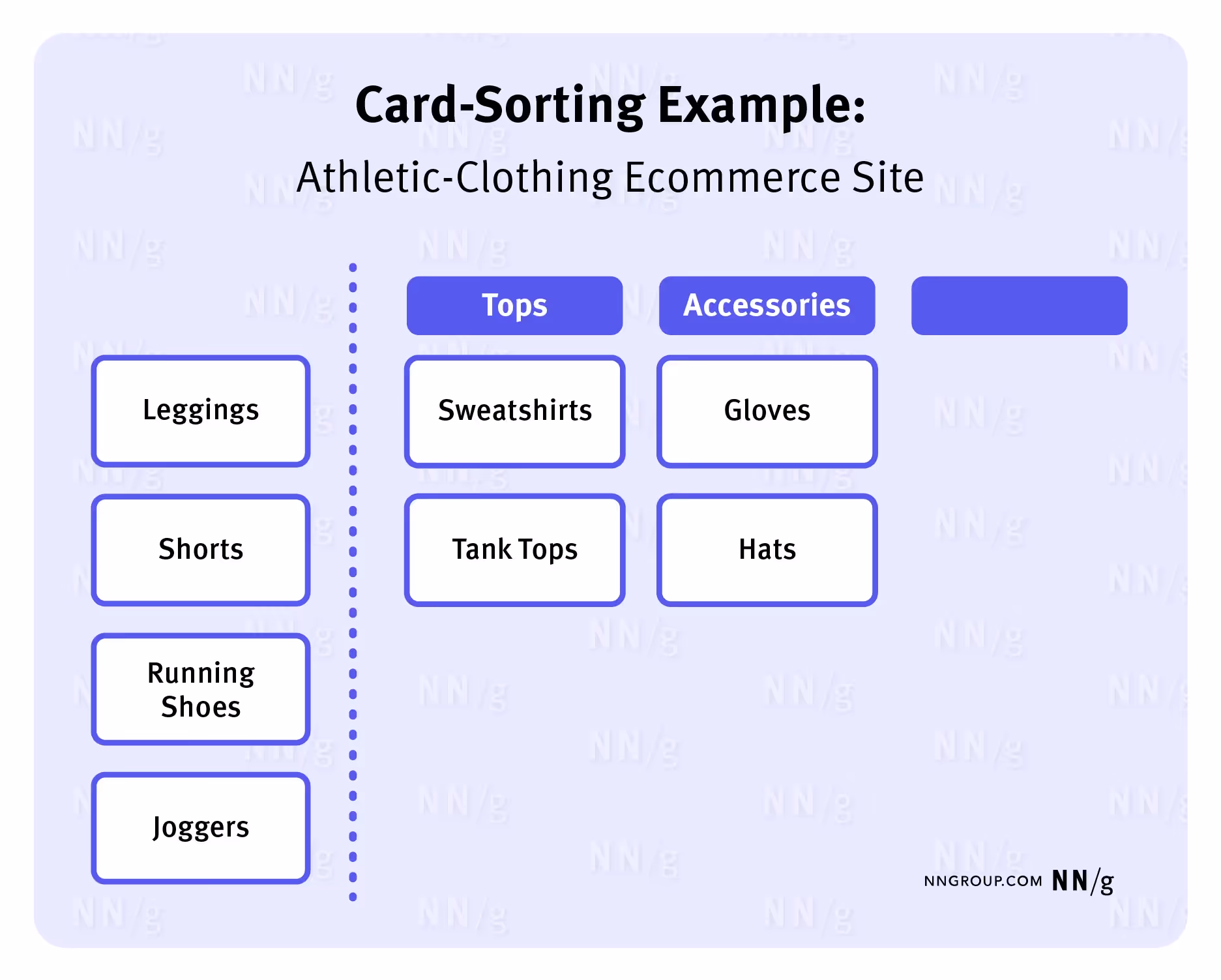
Card sorting is a user research method where people organise a set of cards into groups that make sense to them. Each card represents a page, feature or concept, and participants group them and, in an open study, choose names for each group. Designers use the results to build an information architecture (IA) that reflects how people think rather than how the organisation is structured. The goals are to understand your audience’s mental models, identify natural groupings and create labels that feel familiar. In practice card sorting helps you organise content in a way that reduces cognitive load and improves the find‑ability of features.
Before running a sort it’s useful to clarify a few terms. Information architecture refers to the way content and features are organised on a site or app. A mental model is the internal picture people have of how something works; it shapes how they expect to find information. Content organisation describes the process of grouping and labelling items, while menu structure refers to the arrangement of links, tabs or buttons that let people move through a site. Card sorting sits at the intersection of these concepts and provides evidence about how to structure them. In other words, when someone asks what is card sorting, think of it as a way to hear how your audience expects to find things.
Why it matters for startups, product managers and design leaders
Early‑stage teams move fast and often bolt on features without thinking about organisation. Fixing a broken menu later is much harder than getting it right at the start. Running a card sort gives everyone a shared picture of how real people categorise your content, so you save time and avoid costly rework. Clear menu structures also affect retention and conversion: poor organisation is a main reason people leave websites. When your menu reflects how your audience thinks, they find what they need faster and are more likely to complete tasks.
Card sorting complements usability tests and heuristic reviews. A sort tells you how users group concepts; usability tests tell you how well they can use a proposed structure. In our projects with machine‑learning and software‑as‑a‑service teams, combining card sorting with quick usability tests has cut onboarding time by up to 30%. The process also brings cross‑functional teams into agreement; engineers, marketers and designers see the same data and agree on labels and categories. That shared understanding reduces subjective debates and sets a solid foundation for future work.
Types and variations of card sorting
There are several ways to run a card sort, and the right choice depends on your goal.
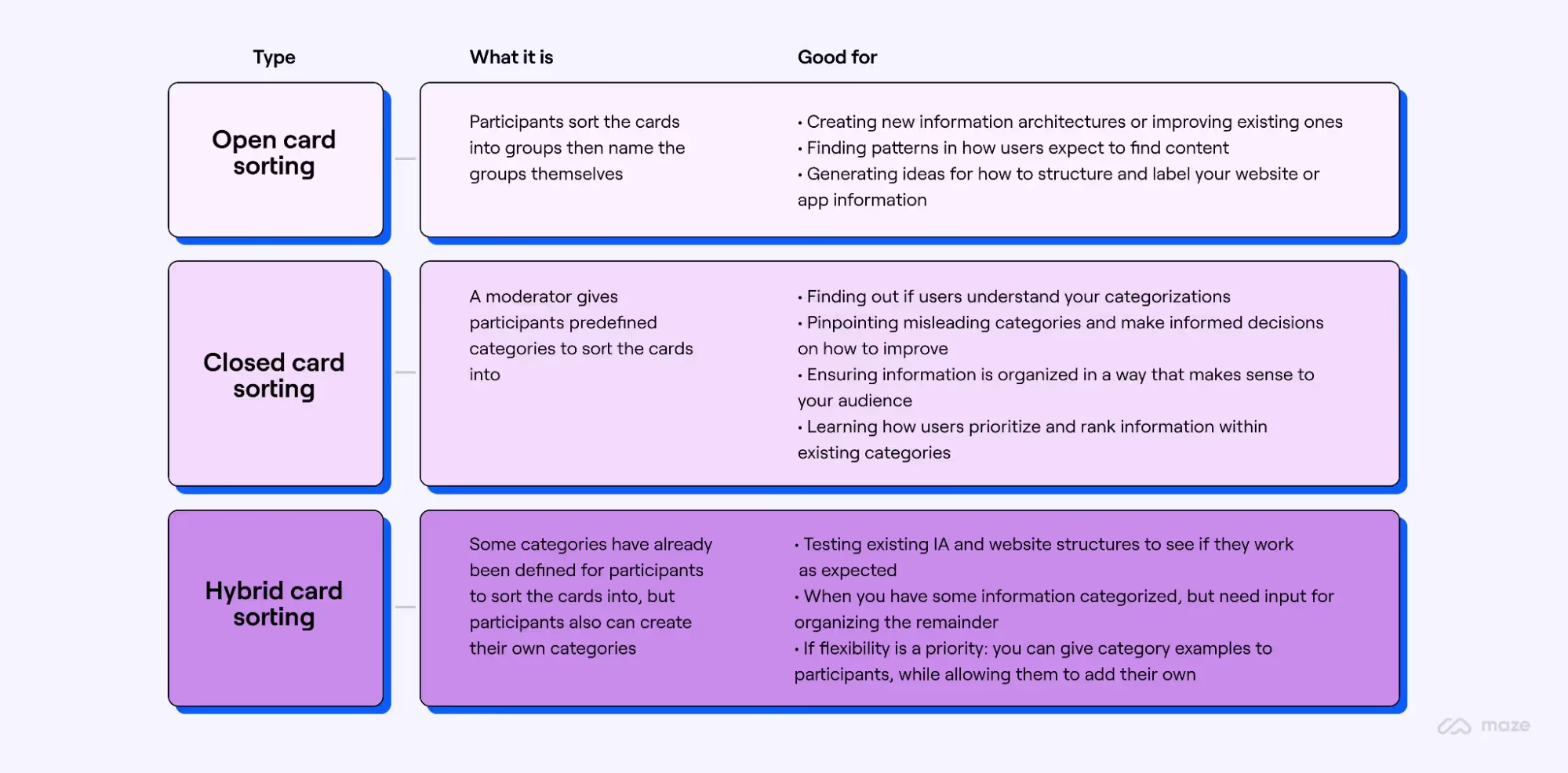
- Open sort: participants create their own groups and names. This is useful when you don’t know how people think about your content or you’re designing a new structure. It produces rich insights but results can be varied, so you need to interpret patterns carefully.
- Closed sort: you provide predefined categories and ask people to place cards into them. This is helpful when you have an existing structure and want to test how well it works. It gives clear patterns but doesn’t reveal new labels.
- Hybrid sort: a mix of open and closed. Participants start with provided categories but can create new ones if something doesn’t fit. This approach balances control with flexibility.
Beyond these core types, there are different modes. Moderated sorts involve a facilitator who can probe participants’ reasoning and encourage them to think aloud; they yield deeper qualitative insights but require scheduling and skilled moderation. Unmoderated sorts are self‑guided studies, often run remotely, that let you reach more participants quickly. Remote (virtual) sorts use tools that record results automatically, while in‑person sorts use paper or index cards and allow you to observe body language. Each combination has trade‑offs; for a new product, a moderated open sort can uncover mental models, whereas a remote closed sort is good for validation at scale.
When to use card sorting in your design process
Timing matters. Use card sorting at the start of a project when you’re creating a new section or app, so you can design a structure that matches your users’ expectations. It’s also useful when reorganising an existing site; if analytics show high page‑drop or people can’t find important features, a sort helps you identify why. Run a sort before or alongside other research methods such as usability testing, heuristic evaluation or tree testing. Card sorting reveals mental models; tree testing verifies whether people can find items in a proposed structure. If your labels are confusing or content is hidden under multiple clicks, a sort can point you toward better names. Finally, use it when drop‑off rates are high or when internal teams disagree on how to group content — the evidence from participants can break ties.
How to run a card sorting study
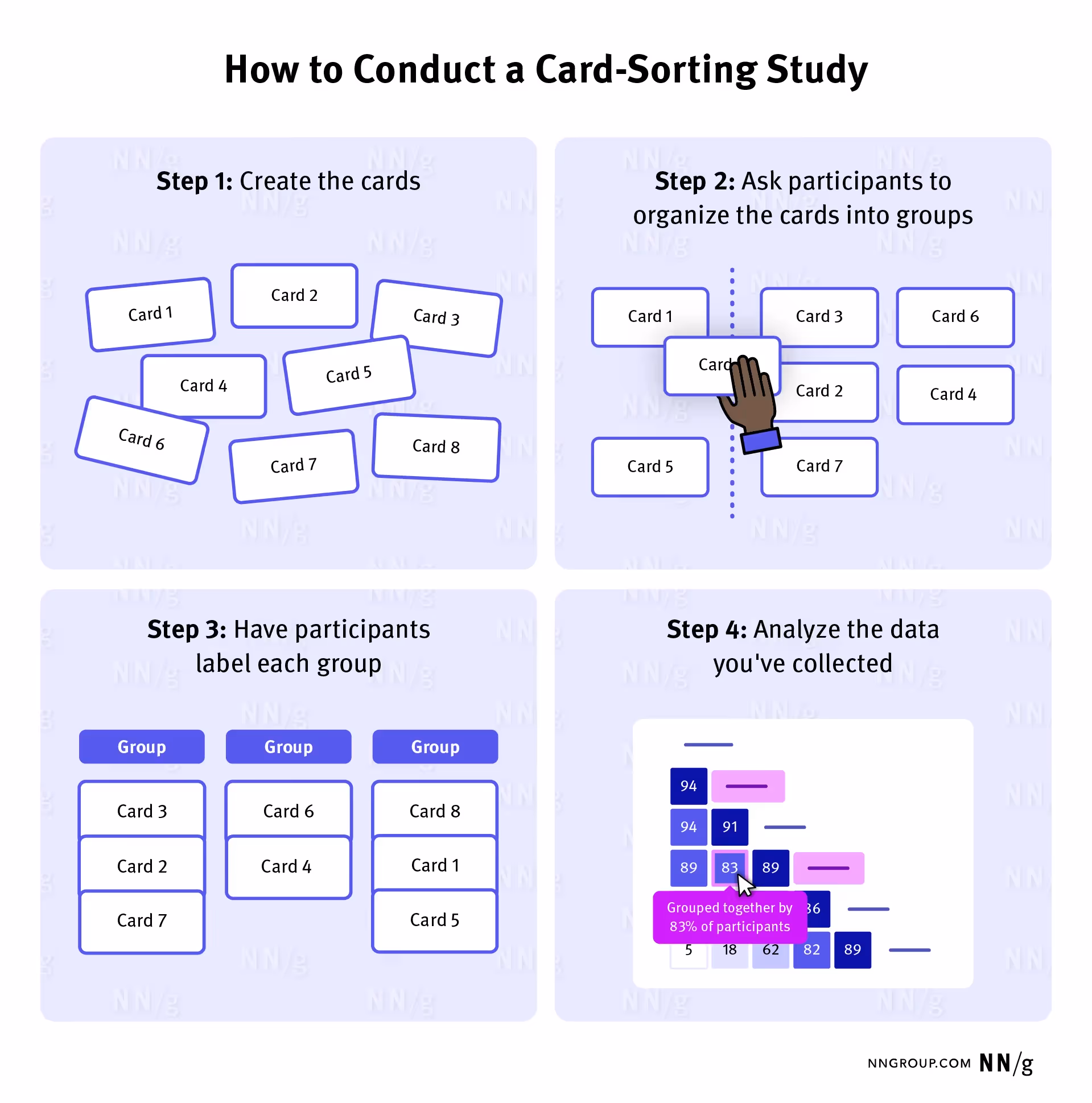
Running a card sort isn’t complicated, but a little preparation goes a long way. Here’s a step‑by‑step approach drawn from research and our projects:
- Set your goals and pick your items. Decide whether you’re trying to discover mental models, test an existing menu or validate new labels. Then choose a representative set of 30‑50 cards; too many cards can overwhelm participants. Avoid jargon and combine similar items to reduce repetition.
- Choose the type and mode. Decide whether an open, closed or hybrid sort fits your goals. Think about whether moderation is necessary and whether a remote tool or in‑person session suits your audience.
- Recruit participants. For qualitative insights 15‑30 participants usually produce sufficient patterns. For a wider sample, aim for 30 or more. Make sure participants reflect your target customers.
- Prepare instructions. Write clear guidance explaining the goal and how to sort the cards. For remote sessions, include a short tutorial within the tool. For in‑person sessions, randomise card order to minimise order effects.
- Run the session. In moderated sessions ask participants to think aloud so you can capture their reasoning. Avoid leading questions; let them move cards freely. Keep sessions short: roughly 20 minutes for 30 items, 30 minutes for 50 items and about an hour for 100 items.
- Analyse and discuss. Look for patterns in how cards were grouped and named. Use similarity matrices or cluster analysis to see which items frequently appear together. A dendrogram can visualise the structure, but treat it as guidance rather than absolute truth. Combine quantitative patterns with qualitative notes from moderated sessions and discuss findings with your team.
Always keep in mind what is card sorting at its core: listening to how your users organise information. That perspective should guide every decision, from card selection to analysis.
Best practices and pitfalls
From experience and research, certain practices help you get reliable results:
- Keep the number of cards manageable: Between 30 and 50 cards works well for most studies; too many leads to fatigue and messy results.
- Avoid ambiguous or overlapping items: If two cards sound similar, participants will struggle to place them. Combine or rephrase unclear items.
- Don’t mix tiers of hierarchy: Stick to one layer of detail per sort; if you need to test both top‑tier categories and subcategories, run separate sessions.
- Randomise card order: Present cards in a different sequence to each participant to minimise order effects.
- Represent your user base: Recruit participants who reflect your actual customers so that the mental models you capture are relevant.
- Use multiple methods: Card sorting is just one tool; follow up with tree tests or usability studies to check whether the structure you derived truly works for real tasks.
- Beware of analysis bias: Cluster analysis can suggest groupings even when agreement is low; treat the dendrogram as a guide rather than a rule.
Common pitfalls include using too many cards, mixing tasks with categories, ignoring participants’ explanations or drawing conclusions from a single session. Avoid these by planning carefully and validating your findings through other research.
How card sorting improves design and usability
A well‑run card sort has tangible benefits. It improves your information architecture by grouping content in ways people expect. A thoughtful menu structure reduces friction and helps people find what they need faster, which translates into happier users and better retention. By matching labels to your audience’s language, you lower cognitive load and make features easier to discover. These gains cascade into other interactive decisions: clear groupings inform menu items, page templates and movement across pages.
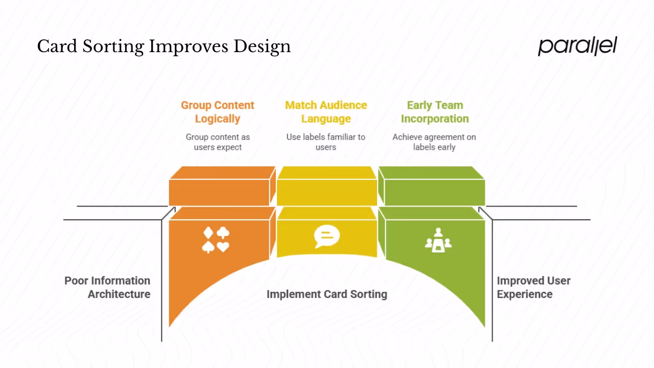
Teams that incorporate card sorting early also achieve better agreement; decisions on labels and categories become evidence‑based rather than opinion‑driven. Over time, the clarity gained from card sorting reduces support tickets and increases conversion because visitors spend less time searching and more time engaging with the product.
Limitations and when card sorting isn’t enough
Card sorting has its limits. It captures how people group items in isolation, but it doesn’t test how they behave when completing tasks. For example, a participant may group “Payment Options” under “Account”, yet in a real checkout flow they might look for it elsewhere. Card sorting also focuses on the first tier of hierarchy; deeper tiers may require other methods such as tree testing. In open sorts, participants may create many different labels, and reconciling them can be time‑consuming. When cards are poorly defined or too numerous, results become chaotic. Finally, card sorting alone doesn’t tell you whether the resulting structure works in practice. Use it as an input to design, then run usability tests to check whether people can accomplish tasks quickly.
Tools and resources
A number of tools make remote card sorting easy. Maze offers unmoderated open, closed and hybrid sorts with automatic cluster analysis. UXtweak provides similar features and is free for small studies; their August 2024 guide notes that card sorting is fast and accessible. OptimalSort (part of Optimal Workshop) remains a long‑standing option recommended in research. For face‑to‑face sessions, plain index cards or sticky notes are all you need.
For further reading, check out the Interaction Design Foundation’s deep dives into card sorting, Maze’s guide to uncovering mental models and Uxtweak’s practical guide. Each source offers examples and templates you can adapt to your own projects.
Conclusion
Startups move quickly, and the temptation is to add features and content without stepping back to think about structure. What is card sorting? It’s a straightforward method for listening to your audience and organising your site around their mental models. By running sorts early and often, you avoid the costly mess of reorganising later, improve clarity and boost retention. In our experience, card sorting works best when combined with usability testing and when the whole team participates in interpreting the results. It won’t solve every structural issue, but it gives you a solid base for building menu structures that feel natural.
When people ask me what is card sorting, my answer is always the same: it’s a way to let your users teach you how to organise your product. Card sorting may take a few hours to set up and analyse, but the insight you gain will serve you long after launch. Used alongside other methods, it is a cornerstone of user‑centred design.
FAQ
1) What is the meaning of card sorting?
To answer what is card sorting: it is a research technique where people group a set of labelled cards into categories that make sense to them. The patterns reveal how your audience organises information and what labels they use. Designers then use that evidence to build structures that match those mental models.
2) What is card sorting in gambling?
In gambling, the term “card sorting” can refer to manipulating physical cards to gain an unfair advantage, such as arranging them in a certain order or marking them. This is unrelated to the user research method described here, which involves asking participants to group concepts to improve a website’s structure.
3) How long does card sorting take?
Session length depends on the number of cards. William Hudson suggests about 20 minutes for 30 items, 30 minutes for 50 items and about an hour for 100 items. Keep sessions short to reduce fatigue and plan extra time for analysis.
4) When should card sorting be used?
Use card sorting when you’re designing a new section or product, reorganising an existing site, or noticing that people can’t find important features. It’s most effective early in a project but can also validate proposed structures before launch. Combine it with tree testing and usability sessions for a full picture of how your audience interacts with your content.

check out these related blogs


.avif)


