Imagine spending months building your product only to see most visitors disappear before they experience its value. That scenario isn’t rare. Ninety percent of users churn if they don’t understand a product’s value within the first week, and 38% of sign‑up flows lose users between the first and second screens.
Fixing the underlying issues after launch is expensive – usability experts estimate that correcting problems during development costs ten times as much as fixing them in design, and one‑hundred times as much after release. Founders and product leaders need a way to spot and solve learnability problems early. That’s where people ask, what is a cognitive walkthrough? It’s a structured method to evaluate an interface’s learnability before you ship.
This article defines the technique, explains when and why to use it, offers a step‑by‑step guide, compares it with other usability methods, and shares practical insights from our work with early‑stage SaaS teams.
A cognitive walkthrough is a structured usability inspection method in which evaluators step through a task flow from the perspective of a first‑time user to check whether the interface supports them in achieving their goal.
What is a cognitive walkthrough?
A cognitive walkthrough is a usability inspection method in which evaluators work through a series of tasks and ask a set of questions from the perspective of a first‑time or infrequent user. Its primary focus is learnability – whether someone who has never used the interface can figure out how to achieve their goal. Unlike heuristic evaluations, which compare designs against general principles, or usability tests, which observe real users, a cognitive walkthrough simulates the mental model and decision‑making process of a novice user.
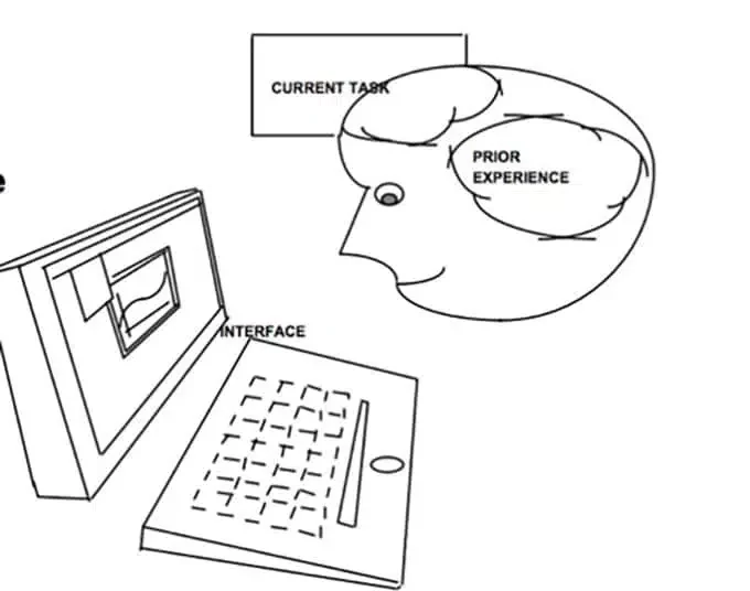
Evaluators identify the user’s goal, walk through each step of the task, and question whether the interface provides the right cues. Because it concentrates on specific task flows, it surfaces issues like poor affordances, missing feedback, or confusing labels that can cause first‑time users to give up. Researchers originally designed the method for “walk‑up‑and‑use” systems like kiosks, but it has since been applied to complex software to understand the initial experience. In other words, what is a cognitive walkthrough? It’s a focused way to evaluate whether your interface aligns with the mental model of a new user.
Why and when to use a cognitive walkthrough
Early‑stage startups often operate with limited resources and can’t afford the time or cost of large‑scale user research. A cognitive walkthrough offers a lean alternative. It requires no direct users, yet it provides concrete feedback on usability and accessibility. The method is fast and inexpensive, making it suitable for rapid iteration, and it focuses on the crucial first‑time user experience. The Swedish Employment Agency notes that poor usability is costly because of inefficient use, training and support costs and that it isn’t cost‑effective to correct issues once the service has been launched. The cost–benefit ratio for usability is estimated at $1:$10–$100, meaning each dollar spent on usability during design can save up to $100 later. For startups working with prototypes or wireframes, a cognitive walkthrough helps you validate assumptions before investing in full development. It’s particularly useful when:
- Prototyping new flows: Evaluate wireframes or mock‑ups to ensure first‑time users can complete critical tasks.
- Before major releases: Catch learnability issues early when redesigning onboarding or introducing significant features.
- When there’s a knowledge gap: If your product introduces unfamiliar tasks, a cognitive walkthrough exposes mismatches between your users’ mental models and your interface.
By integrating this method into your design process, you can reduce costly rework and increase user activation – a necessity when users who don’t engage within the first three days have a 90% chance of churning.
How it works: core components and flow
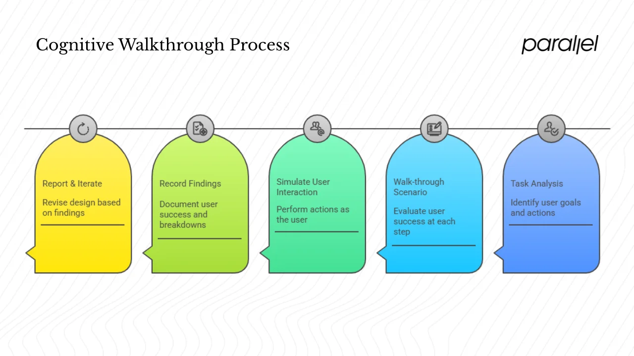
A cognitive walkthrough consists of preparation, simulation and analysis. Here’s how the flow works:
- Task analysis: Identify the target user, their goal, and the sequence of actions required. Break the task into discrete steps, noting what the user sees and does at each point.
- Walk‑through scenario: For each step, evaluators ask a set of questions (described in the next section) to determine whether the user is likely to succeed or struggle. They imagine themselves in the user’s shoes, considering what they know, notice and decide.
- Simulate user interaction: Evaluators perform each action as if they were the user, paying attention to visibility of actions, feedback, and whether the interface matches the user’s mental model. This simulation reveals decision points where users might choose the wrong path or fail to recognise available actions.
- Record findings: For each step, evaluators capture whether the user would achieve the intended effect, notice the correct action, associate it with their goal, and receive feedback indicating progress. They note breakdowns such as ambiguous labels, hidden controls, or lack of confirmation.
- Report & iterate: After the walkthrough, the team consolidates the issues, prioritises them by severity and impact on learnability, and feeds them into design revisions. Once the design is updated, the walkthrough can be repeated or followed by usability testing with real users to validate improvements.
The method’s strength lies in forcing evaluators to step through the user’s decision‑making process. Each action is treated as a decision point: Will the user know what to do? Will they see that their action made progress? Answering these questions ensures your interface aligns with users’ expectations and supports their mental models.
The four questions that drive a cognitive walkthrough
The classic cognitive walkthrough uses four questions at each step:
- Will the user try to achieve the right effect? Are they likely to pursue the goal that leads to the desired action?
- Will the user notice that the correct action is available? Is the control visible and does it stand out from other options?
- Will the user associate the correct action with the effect they’re trying to achieve? Does the label or design clearly map to the outcome?
- If the correct action is performed, will the user see that progress is being made toward the solution? Does the system provide feedback that confirms they’re on the right path?
Spencer’s streamlined cognitive walkthrough simplifies the process to two questions: “Will the user know what to do?” and “Will the user know they did the right thing and made progress?”. Some practitioners use three questions by combining the first two. Regardless of the variant, the intent is the same: to evaluate visibility, mapping and feedback.
| Question | Focus | What it surfaces |
|---|---|---|
| Will the user try to achieve the right effect? | User’s goal & intent | Whether the system encourages the right goal and discourages wrong paths |
| Will the user notice that the correct action is available? | Visibility of action | Hidden or non-obvious controls, poor affordances |
| Will the user associate the correct action with the effect? | Mapping between control and outcome | Misleading labels, unclear icons, mismatched mental models |
| Will the user see that progress is being made? | Feedback & status | Lack of confirmation, ambiguous success indicators |
Using these questions, evaluators can tell a credible story about the user’s thought process. If any question is answered with “no,” that step is a failure and the underlying reason is documented for redesign.
Step‑by‑step guide for running a cognitive walkthrough
Having run dozens of cognitive walkthroughs for early‑stage SaaS products, I’ve refined a process that founders and product managers can adopt. Below is a practical checklist to make your sessions effective.
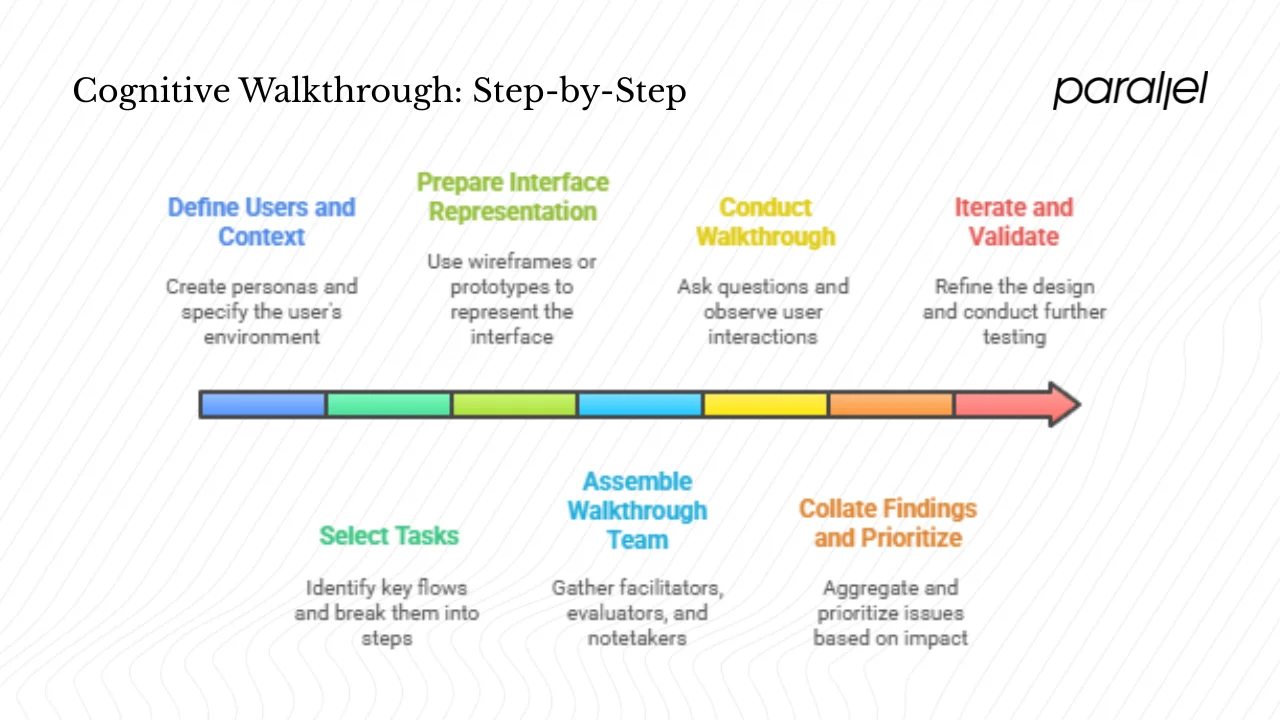
1. Define users and context
- Create personas: Focus on novices with minimal domain knowledge. Understand their goals, motivations, and potential pain points.
- Define context: Specify the device, environment and circumstances in which the user will perform the task. Consider factors like mobile vs desktop, distractions and time pressure.
2. Select tasks
- Identify key flows: Choose critical paths such as sign‑up, onboarding, first content creation, or payment. These are the moments where drop‑off has the biggest impact on growth.
- Break tasks down: Use task analysis to map each task into atomic steps. For example, “enter email,” “click verification link,” “create first project,” etc.
- Limit scope: Prioritise one to four tasks per session to maintain depth and focus.
3. Prepare the interface representation
- Use wireframes, mock‑ups, or an interactive prototype. The representation must reflect the current design; outdated prototypes will lead to irrelevant feedback.
- Provide the team with task flows and the set of questions ahead of time so that they come prepared.
4. Assemble the walkthrough team
- Facilitator: Guides the session, keeps time, and ensures ground rules are followed.
- Evaluators: Mix designers, product managers and engineers who have not been deeply involved in building the feature (to reduce bias).
- Notetaker: Captures observations verbatim. In more complex domains, include a domain expert to clarify details without leading the evaluators.
5. Conduct the walkthrough
- For each step in the task, ask the four questions. Use yes/no answers with explanatory notes.
- Stay in the user’s mindset. Evaluators should not redesign the interface mid‑session; discussion of solutions comes later.
6. Collate findings and prioritise
- Aggregate issues: Identify where evaluators answered “no” to any question. Consolidate similar issues and remove duplicates.
- Prioritise: Sort issues by severity, impact on the user’s ability to achieve core value, and frequency. In early‑stage products, problems that block onboarding or first purchase/activation deserve top priority.
7. Iterate and validate
- Refine the design based on the findings.
- Run another cognitive walkthrough or a usability test with real users to confirm that learnability has improved. Iterative testing is essential to measure progress over time.
For convenience, you can create a simple matrix to track tasks, steps, questions and notes:
| Task | Step | Issues & severity |
|---|---|---|
| Sign-up | Enter email → Click verification link | Didn’t notice “verify email” call-to-action (High) |
| Onboarding | Create first project | Button label ambiguous, user looked for “New project” not “Add workspace” (Medium) |
| Payment | Select plan → Confirm | Confused by pricing tiers and lacked confirmation message (High) |
Such a table keeps the team aligned on what was tested and which issues need immediate attention.
How it compares to other methods
Usability professionals often use three types of evaluations: heuristic evaluation, cognitive walkthrough, and user testing. Understanding their differences helps you choose the right tool for the job.
Heuristic evaluation
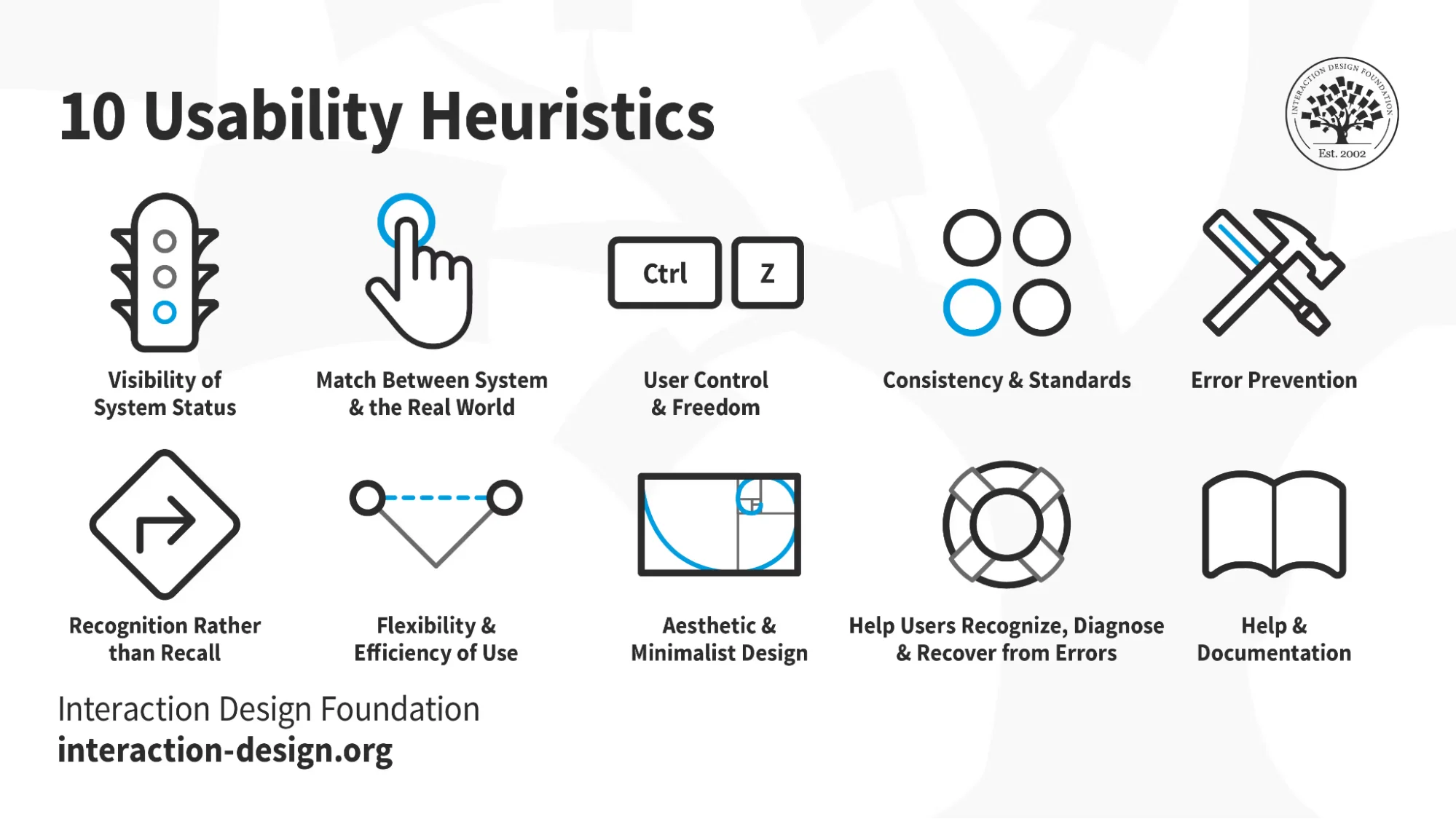
Heuristic evaluation involves experts reviewing an interface against a set of predefined usability principles, such as Nielsen’s heuristics. Evaluators judge whether the design follows guidelines like visibility of system status, match between system and real world, and error prevention. It’s broad in scope and can reveal general usability issues quickly. However, it may generate false positives and often requires multiple experts to get reliable results.
Cognitive walkthrough

Cognitive walkthroughs also rely on expert evaluators, but the focus is on task learnability. Evaluators step through realistic tasks to determine whether a new user can successfully complete them. The method is more structured and examines user goals and decision points. It’s particularly good at catching issues that hinder onboarding or activation. Unlike heuristic evaluation, it doesn’t rely on a generic list of principles but on the specifics of the task flow. In my experience, cognitive walkthroughs surface issues related to visibility, mapping and feedback that heuristic evaluations might miss.
User testing

User testing involves observing real users performing tasks in realistic scenarios. It provides empirical evidence about how users behave but can be time‑consuming and resource‑intensive. Cognitive walkthroughs and heuristic evaluations are complementary: they allow you to catch many problems early, often at a fraction of the cost. Both methods should not replace user testing but serve as precursors. In our practice, we run an expert inspection first, fix obvious issues, and then validate with actual users. This hybrid approach balances efficiency with realism.
A simplified comparison is shown below:
| Method | When to use | Strength | Limitation |
|---|---|---|---|
| Heuristic evaluation | Early and throughout; when you need a quick, broad assessment | Fast; covers general usability principles | May generate false positives; requires expert evaluators |
| Cognitive walkthrough | Early design; focusing on onboarding or new features | Uncovers learnability issues in specific tasks; inexpensive; no users needed | Can be time-consuming if tasks are complex; depends on evaluator skill |
| User testing | After prototypes are stable; before major releases | Provides real user behaviour and quantitative data | More costly; limited to tested tasks |
Practical tips and common pitfalls
Having facilitated numerous sessions with startup teams, I’ve noticed patterns that make or break a cognitive walkthrough:
Tips for success
- Keep tasks realistic: Align them with how users think. Use language your users would use and avoid internal jargon.
- Focus on first‑time user flows: Evaluate sign‑up, onboarding and the first action that delivers value. These are the moments where churn is highest.
- Use a fresh perspective: Include evaluators who didn’t design the interface to avoid blind spots. People who built the feature often unconsciously skip over issues because they know the workflow too well.
- Document clearly: Record the step, the question that failed, and a brief description of the issue. Include screenshots when possible. Avoid turning the session into a design debate; capture ideas separately and discuss solutions later.
- Prioritise high‑impact issues: Fix problems that block users from reaching value quickly. For SaaS products, activation and first revenue moments (first invoice, first integration) matter most.
Common pitfalls
- Choosing expert tasks: Don’t evaluate tasks that require domain expertise if your target users are novices. For example, testing advanced analytics before users finish onboarding leads to irrelevant feedback.
- Biased evaluators: Evaluators familiar with the product may fill gaps with their knowledge. They might not notice missing cues because they already know where to click.
- Design debates during walkthrough: Resist the urge to brainstorm solutions mid‑session. It distracts from identifying issues and slows down progress. Use separate sessions for ideation.
- Focusing on cosmetic issues: Don’t over‑index on colours or visual polish. The goal is to assess whether users can accomplish tasks, not to rate aesthetics.
- Outdated prototypes: Make sure your representation matches the current design; otherwise, you risk fixing problems that no longer exist.
A handy startup quick‑check list:
- Are tasks focused on first‑time user journeys?
- Do evaluators include at least one person outside the design team?
- Are we recording issues by step, question, and severity?
- Are we prioritising issues that block activation or revenue?
- Have we scheduled a follow‑up walkthrough or user test after changes?
Answering yes to all of these increases the chances that your cognitive walkthrough will lead to actionable improvements.
Use‑cases and examples in startups
To illustrate how this method works in practice, consider a hypothetical SaaS product that helps teams manage projects. Early user research shows that sign‑up is straightforward, but many users drop off before creating their first project. Here’s how a cognitive walkthrough surfaces the problems:
Scenario: A new user signs up, lands on the dashboard and is expected to create a new project and invite teammates.
- Task: Create a new project.
- Observation: The primary call‑to‑action says “Add workspace.” Evaluators ask, will the user try to achieve the right effect? Since most new users think in terms of “projects,” they may not realise that “workspace” means the same thing. The answer is no – the label doesn’t match the user’s mental model. The team notes this mismatch.
- Question: Will the user notice that the correct action is available? The “Add workspace” button is below the fold on larger screens. Evaluators answer no, noting a visibility issue.
- Feedback: When a user finally clicks the button, the interface creates the project instantly without confirmation. Evaluators ask, will the user see that progress is being made? Some testers answer no; there’s no feedback that the project was created. They suggest adding a success message or redirecting to the new project.
Through this exercise, the team identifies misaligned terminology, poor visibility and missing feedback—exactly the kind of issues that cause new users to abandon a product. After redesigning the call‑to‑action to “Create project,” placing it prominently, and adding a progress indicator, they re‑ran the walkthrough and later tested it with actual users. Activation increases, and support tickets drop because first‑time users can complete the core flow without assistance. This realignment with users’ mental models highlights the strength of cognitive walkthroughs.
Metrics and evaluating success
Because cognitive walkthroughs don’t involve end users, they don’t yield quantitative metrics like completion rates. However, you can track indicators that signal improved learnability:
- Number of failed decision points per task: Fewer failures across sessions indicate improvements in visibility, mapping and feedback.
- Time to complete the walkthrough: Shorter sessions suggest simpler task flows and fewer stumbling blocks.
- Number and severity of issues: As designs mature, you should see a decline in high‑severity issues and more low‑severity observations.
- Comparison with user testing: After applying fixes, run a usability test with actual users. Compare the issues they encounter with those predicted by the walkthrough. In some studies, inspection methods like cognitive walkthroughs identify 30–90% of the problems found in user testing, demonstrating their effectiveness.
You can also link walkthrough findings to business metrics. For example, if the walkthrough surfaces a confusing onboarding step, and you change it, monitor activation rates before and after. Evidence shows that interactive product tours increase feature adoption by 42% and one‑click social login boosts onboarding completion by 60%. While these numbers come from user behaviour rather than inspections, they underscore the impact of reducing friction in early flows. Tracking activation, time‑to‑first value, and churn after walkthrough‑driven changes helps you justify the investment and refine the process.
Conclusion
People often ask what is a cognitive walkthrough and whether it’s relevant for small teams. The answer: it’s a structured, low‑cost way to evaluate the learnability of your interface by stepping through tasks from a new user’s perspective. For early‑stage startups, the method’s benefits are clear: it helps you catch onboarding issues before they become costly, validates design decisions quickly, and complements heuristic evaluation and user testing. As the ROI of usability suggests, fixing problems during design is vastly cheaper than fixing them post‑launch. In my experience, teams that build cognitive walkthroughs into their process deliver products that feel intuitive from day one and experience higher activation.
Don’t wait for churn metrics to tell you there’s a problem. Pick a critical user task, assemble a small team, and run your first cognitive walkthrough this week. You’ll gain insight into your users’ thought processes and set the foundation for a product that welcomes new users rather than turning them away.
FAQ
1) What are the three questions asked during a cognitive walkthrough?
The classic technique uses four questions: will the user try to achieve the right effect; will they notice the correct action; will they associate the action with the desired effect; and will they see progress. Some streamlined versions collapse them into three or two questions, combining the first two (“Will the user know what to do?”) and simplifying feedback (“Will they know they did it right?”).
2) Who performs a cognitive walkthrough?
A cross‑functional team: a facilitator, a few evaluators (designers, product managers, engineers) and a notetaker typically conducts it. Sometimes a domain expert is present to answer questions. The method doesn’t require real end‑users, but evaluators must adopt the perspective of a novice user.
3) How do you write a cognitive walkthrough report?
A good report lists each task, breaks it into steps, and records the answers to the four questions for each step. It documents failures with context, severity and proposed fixes. A structured template or spreadsheet ensures consistency and makes it easier to prioritise issues and track them through your backlog.
4) What is the primary goal of a cognitive walkthrough?
The goal is to assess the learnability of an interface – to determine whether new or infrequent users can accomplish tasks by exploring the system without training. It provides actionable insights into how the design supports or hinders the user’s mental model and decision‑making process, helping teams improve onboarding, reduce churn and increase product adoption.

check out these related blogs


.webp)