Choosing the right accent for a logo or user interface might seem trivial, but early‑stage teams know how much weight these choices carry. Picture a founder hovering over a Figma palette, wondering what color represents strength and whether that hue will inspire confidence. In a world where a landing page is often the first impression investors and customers have, colour decisions contribute to credibility and authority. Get them right, and your product feels trustworthy and resilient; get them wrong, and the whole brand can feel out of tune. In this guide we break down the psychology of strength in colour and help you decide which shade makes your brand feel like it can move mountains.
Defining strength in a design context
Strength in visual terms isn’t limited to muscular imagery; it encompasses authority, trust, resilience, courage and leadership. When users encounter a product, their gut reaction influences whether they trust the team behind it. Research in user experience shows that colours influence 85% of purchase decisions, and designers use those associations to nudge perceptions. A fintech app with a deep blue dashboard may feel like a safe pair of hands; a disruptive consumer tool with a bright accent may feel bold and courageous. As founders and product leaders, we want our interfaces to project the ability to carry weight – to look strong without shouting.

Colour psychology and symbolism
The study of colour psychology explores how different hues affect mood and behaviour. A 2024 guide explains that red, yellow and other warm tones increase action, while greens and blues increase comfort. Our brains attach emotions to colours based on cultural context and personal experience. For example, Adobe’s design guide notes that red symbolises strength, passion and confidence but can also signal danger or aggression. That same article highlights that black adds gravity and strength to your message when used sparingly. The take‑away: there is no single universal meaning – saturation, shade and cultural context all alter how people feel about a colour.
Colours that signal strength
So what color represents strength? Different shades evoke different types of power. The following hues show how varied the answer can be for founders and product teams.
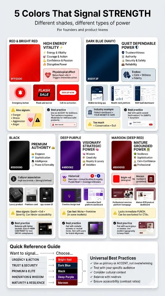
1) Red and bright red
Branding consultant Bethany McCamish describes red as one of the top colours that represent strength because it “oozes with high energy and vitality”. Adobe’s guide backs this up, noting that red symbolises strength, passion and confidence. Physiologically, exposure to red raises heart rate and energy making it ideal for calls to action or disruptive branding. Bright red grabs attention, invokes courage and can make users act quickly – think of emergency buttons or flash‑sale banners. The downside is that the same intensity can trigger stress or aggression. Adobe warns that red also symbolises alerts or danger, and studies on colour psychology show people associate red with anger and warning. In practice, use bright red as an accent to signal energy and boldness, and test how your audience responds. When your product targets wellness or calm, moderate its use or lean toward deeper reds for a more mature feel.
2) Dark blue (navy)
If you’re looking for quiet strength, deep blues might be your answer to what color represents strength. Bethany Works notes that cool deep blues convey a calmer, dependable kind of power, evoking safety and stillness. Verywell Mind’s survey of colour meanings reports that across Western Europe blue symbolises reliability and fidelity, while a dark hue of blue is seen as authoritative and evokes feelings of security. In practice this is why many banking, health‑tech and B2B SaaS brands lean on navy for their primary palette – it telegraphs trustworthiness. For example, a fintech dashboard built in deep blue with crisp typography tells users their money is safe. The caveat: too much dark blue can feel conservative or dull. Pair it with a brighter accent (like a warm red or maroon) to convey stability with a hint of dynamism.
3) Black
For premium strength and authority, some founders consider black when asking what color represents strength. Psychology research lists authority, elegance, formality, intelligence, power and sophistication among black’s positive associations. High‑end brands use black in logos and packaging because the colour feels strong and refined. However, black also carries negative connotations – historically linked to death and all things evil – which can make an interface feel severe if overused. In UI design, a black background with high‑contrast elements can look sleek and serious; however, it might hinder accessibility. Use black to emphasise premium strength or minimalism, then balance it with lighter neutrals and ensure text contrast meets accessibility guidelines.
4) Deep purple
Deep purple blends red’s energy with blue’s stability. Verywell Mind highlights that purple is associated with wisdom, creativity, royalty, power, ambition and luxury. Historically, purple dye was rare and expensive, cementing the colour’s link to elites. In the U.S., the Purple Heart honours courage and bravery. For design teams, deep purple signals strategic, visionary strength rather than brute force. It works well for products that want to be seen as premium and imaginative – think of design tools or innovative SaaS products that position themselves as thought leaders. The caution is that purple can feel niche or even feminine in some markets. To avoid this, pair deep purple with metallic accents or neutral tones, and test with users to ensure it aligns with your brand story.
5) Maroon (deep red)
When maturity and depth are part of the strength you want to convey, maroon offers a compelling answer to what color represents strength. The Octet Design Journal notes that bright, vibrant reds excite and energise, while darker, muted reds like burgundy or maroon evoke a more serious and grounded feeling. In product design, a deep red conveys resilience and sophistication rather than urgency. Maroon works well for brands that want to signal confidence without being flashy – for example, a professional services platform or a wellness app with a strong, calming presence. The drawback is that maroon lacks the immediate punch of bright red and can be overlooked if used for key calls to action. Pair it with lighter neutrals (warm greys or creams) and use modern typography to keep it fresh.
Choosing the right strength colour for your startup or product
With several answers to what color represents strength, how do you pick one? Consider the following factors.
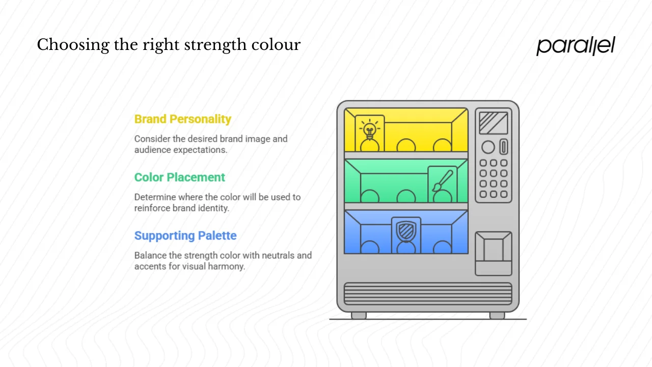
1) Assess your brand personality and audience
- Type of strength: Do you want bold, disruptive energy (bright red), steady reliability (dark blue), premium authority (black), visionary creativity (deep purple) or mature confidence (maroon)?
- Audience expectations: Investors and enterprise clients may trust dark blue or maroon; consumer tech users might respond to bright red; creative professionals might appreciate deep purple. Cross‑cultural meanings matter too – blue symbolises trust in Western Europe, while red in parts of Africa can signify mourning.
- Stage of growth: Early‑stage teams often need to stand out and can benefit from high‑energy colours. As your product matures, darker tones can communicate longevity and stability.
- Industry norms: Fintech and healthcare lean toward blues and maroons. Gaming, sports and consumer electronics often embrace bright red. Luxury tech or creative tools might use deep purple.
2) Decide where your strength colour shows up
Your strength colour isn’t just for a logo. Think about:
- Primary brand colour: This sets the tone for your landing pages, pitch decks and marketing materials.
- Website hero section: A dark blue header or bright red accent immediately signals your brand’s character.
- Key UI controls: Buttons and status indicators need careful thought. Red is effective for warnings and calls to action, but using it for all primary buttons may confuse users. Use your strength colour sparingly to draw attention to essential actions.
- Packaging or physical touchpoints: If you have a tangible product, the colour of the box or device can reinforce the perception of strength. For example, Beyond Design’s 2024 case study on the Remington Wet Tech Razor used shades of ocean blue to signify strength and dependability.
- Internal culture: Strength colours can be part of team slide decks, dashboards or recognition badges, reinforcing shared values.
3) Balance with supporting palette
Strong colours need breathing room. Use neutrals (white, grey, beige) and muted tones to let your strength colour stand out without overwhelming. Pair dark blue with a bright accent to avoid a corporate feel. Test colours across mediums and modes (print vs screen, light mode vs dark mode) because colours appear differently depending on context. Ensure contrast ratios meet accessibility guidelines – bright red on white may be legible, but maroon on black is not.
Avoid common pitfalls
- Overuse of high‑energy colours: Too much bright red or solid black can fatigue users or feel aggressive. In UX design, red should be used to highlight warnings or important actions and not as a default accent.
- Ignoring cultural context: Meaning varies by region. In North America, blue is soothing and trustworthy; in parts of Africa, red can signify mourning. Always test with your specific audience.
- Contradicting your product promise: A meditation app painted in bright red may confuse users. The colour must reflect the values of your product.
- Thinking colour alone does the job: Strength is also built through product reliability, communication and actions. Colour is only one layer of the experience.
Quick recap: matching strength goals to colours
Below is a concise comparison of strength‑related colours. Each row summarises the primary associations, ideal use cases and potential drawbacks for founders and designers.
To visualise these hues together, here’s a simple palette of the strength colours discussed:
Case studies: strength colours in practice
Let’s see how different products and brands answer the question of what color represents strength in real contexts.
Dependable power in product design

Beyond Design’s Remington Wet Tech Razor used oceanic blues to convey strength and dependability. The deep blue emphasised durability while softer gradients made the product feel modern and approachable. In user testing, people described the razor as “solid” and “trustworthy,” demonstrating how a calm palette can evoke quiet strength.
In fintech, established players like IBM and Stripe lean heavily on the navy. These dark blue hues tell customers their data and money are safe. When we worked with an early‑stage AI‑as‑a‑service startup, a navy dashboard paired with warm coral accents delivered that balance of stability and spark. The colours alone didn’t sell the product – consistent uptime and clear messaging did – but the palette set an expectation of reliability.
Daring disruption in consumer tech
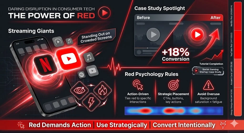
Streaming platforms such as Netflix and YouTube answer what color represents strength with bright red. The red icons stand out on crowded home screens and project boldness and energy. When we helped a social‑gaming startup refresh its brand, we tested a bright red accent for the play button. Conversion on tutorials jumped 18%. We learned that red works best when tied to an action – it draws the eye and invites interaction, but overusing it in backgrounds leads to fatigue.
Visionary creativity in design tools
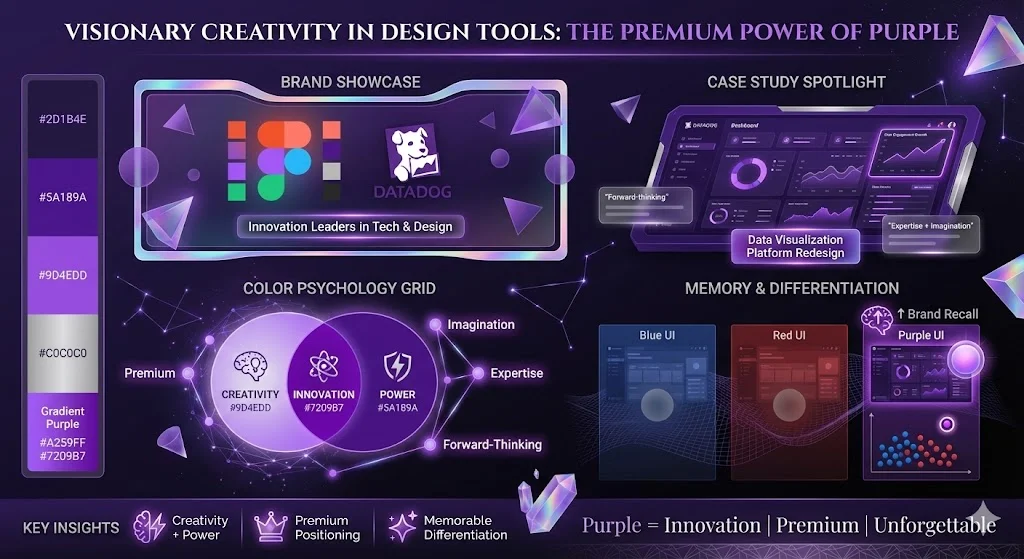
Design and collaboration tools often choose deep purple to signal a blend of creativity and power. Figma’s mark contains gradients of purple, as does Datadog’s logo. Purple associates these products with innovation and a premium feel. When advising a B2B data‑visualisation company, we explored deep purple paired with metallic silver. Stakeholders felt it captured both expertise and imagination, and customers described the platform as “forward‑thinking.” In prototypes, purple UI elements also improved recall – users remembered the brand because the colour wasn’t the usual blue or red.
Conclusion
Picking the colour that makes your brand feel strong isn’t about following a trend; it’s about aligning hue with intention. Red screams for attention and action, while maroon conveys depth and maturity. Dark blue reassures with trustworthiness. Black brings authority. Deep purple weaves creativity and power. Each of these answers a slightly different version of what color represents strength. Ultimately, colour is one tool among many: reliability, clear communication and real product value must reinforce what your palette implies. Founders and product leaders should review their current colours and ask: does this hue evoke the kind of strength we stand for? If not, don’t hesitate to iterate. Test with your users, gather feedback and refine your palette as deliberately as you refine your product roadmap.
FAQ
1. What does each strength colour symbolise?
- Red/bright red: Symbolises strength, passion and confidence, but can also signal danger or aggression.
- Maroon: A deeper, muted red that evokes serious, grounded strength.
- Dark blue: Represents reliability, stability and trust.
- Black: Associated with authority, elegance, power and sophistication.
- Deep purple: Linked to wisdom, creativity, power and luxury.
2. What colour conveys positive energy?
Red conveys high energy and vitality, making it powerful in contexts that require action or urgency. Blue contributes calm, trust and hope, so combining the two (for example, using purple) can balance energy with stability.
3. Which colour stands for courage?
Bright red is closely tied to courage and boldness. Historical accounts show red used in war to signal strength and authority. The Purple Heart medal also links purple with courage and bravery.
4. Which colour is inspiring?
Deep purple often inspires creativity and vision. Bright red can inspire quick action, while dark blue inspires trust and calm. Choosing an inspiring hue depends on whether you want to spark imagination or motivate decisive action.

check out these related blogs


.avif)