Early‑stage products often start scrappy: button styles change from screen to screen, colours vary and there’s no single place to see the latest designs. These small inconsistencies compound, slowing shipping and eroding trust. A design system tackles that pain by giving teams a shared set of patterns and rules.
In this article we’ll explore what a design system is, why it matters for founders and product leaders, how to build one and when not to. We’ll also answer common questions and share recent insights from design‑system research.
What is a design system?
A design system is a framework of reusable components, standards and documentation that helps teams build consistent digital experiences. Figma explains that a design system is “a set of building blocks and standards that help keep the look and feel of products and experiences consistent”. Nielsen Norman Group defines it as a complete set of standards intended to manage design at scale using reusable components and patterns. The Interaction Design Foundation adds that a design system includes reusable components, design principles and guidelines to achieve consistency and efficiency across digital products.
These definitions highlight three ideas:
- Consistency: A common palette of colours, typography and interaction rules keeps UIs uniform and reduces cognitive load.
- Reusability: Components such as buttons, form fields and navigation bars are designed once and used across products.
- Scalability: Standards and tokens make it possible to manage design work as the product portfolio and team grow.
Key terms
- Digital design: Creating interfaces for web and mobile apps.
- Modular design: Building complex layouts from small, reusable pieces.
- Product development: The process of conceiving, building and refining a product.
- UI (User interface): The visual elements a user interacts with.
- UX (User experience): How users feel and behave when they interact with a product.
- Design standards: Guidelines that codify how elements look and behave.
A design system goes beyond styling. It’s a strategic framework that bridges design, development and product teams so they can ship cohesive, accessible products faster.
Why startups and product leaders should care
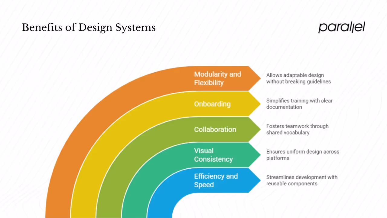
1) Efficiency and speed
Reusable components eliminate duplication. Instead of coding buttons or forms from scratch, teams pull them from a library. The Design Systems Report 2025 notes that 84% of teams now use design tokens to codify colours and spacing, illustrating how systems speed up implementation.
2) Visual consistency and brand integrity
A system ensures that colours, fonts and layouts match across screens. Nielsen Norman Group emphasises the role of reusable patterns in maintaining visual consistency. A cohesive interface strengthens brand recognition and reduces user confusion.
3) Collaboration between design, product and development
Systems create a shared vocabulary. Designers define components with states; developers reference the same definitions. Product managers understand what’s available. This common ground cuts down on handoffs and misinterpretations.
4) Easier onboarding and scaling
New hires need clear guidance. A well‑documented design system acts as a training tool, showing how components work and why certain choices were made. Onboarding times drop when there’s a single source of truth.
5) Modularity and flexibility
Components can be combined in new ways without breaking guidelines. Lean startups benefit from this reuse because they can pivot quickly while maintaining coherence. The Zeroheight report also warns that resource shortages and communication gaps still hinder adoption, reminding us that a system needs commitment.
Core components of a design system
#1: Style foundations and brand identity
A design system starts with foundational elements such as colours, typography and iconography. Define a colour palette using design tokens like primary-color, specify approved fonts and sizes, and curate standard icons and logos. Document tone of voice so messaging stays coherent across channels.
#2: Component library
Components are the building blocks of the interface. Common elements include:
- Buttons: Primary, secondary and icon-only variations with states (hover, disabled, error).
- Form elements: Input fields, dropdowns, radio buttons and sliders.
- Cards, modals, navigation bars and tooltips.
Each component should have design specifications, usage rules and code snippets. Documenting accessibility considerations—such as focus behaviour and contrast ratios—ensures components are usable for all.
#3: Pattern library
Patterns are collections of components solving recurring design problems:
- Layouts: Standard page structures and grid systems.
- Navigation flows: Sidebars, tabbed menus and breadcrumbs.
- Forms and wizards: Multi-step flows with clear progress indicators.
#4: Design tokens
Design tokens abstract styling attributes into variables. Instead of hard‑coding colours or spacing values, tokens like spacing-small or font-size-xl drive the UI. Tokens make theming and updates straightforward and are now widely adopted.
#5: Guidelines and principles
- Design principles: High‑level statements guiding decisions (e.g., “reduce complexity,” “design for clarity”).
- Accessibility: Rules to meet WCAG standards—colour contrast, keyboard navigation and screen reader support.
- Inclusive design: Consider diverse users and avoid language or imagery that excludes.
#6: Documentation and distinction from style guides
A style guide focuses on the visual identity—logos, colours and typography. Penpot notes that it covers visual and written elements and may include templates for print or digital assets. A design system contains the style guide plus the component library, pattern library, tokens, accessibility guidelines and code. Documentation ties everything together. It explains why a pattern exists, how to implement it and when to use it.
#7: Governance and maintenance
Systems need upkeep. Governance defines how changes are proposed and approved. Roles typically include designers, developers, UX researchers, product managers and leaders who sponsor the work. Maintenance involves auditing components, updating tokens and retiring outdated patterns. Without dedicated time and resources, a system can quickly become stale.
Design system vs. style guide
The terms are sometimes confused. A style guide is an approved library of design assets—logos, colours, fonts and voice guidelines. It may not include code or interactive elements. A design system goes further. It contains the style guide but also the component library, pattern library, tokens, accessibility standards and governance. For startups, a style guide might suffice in early marketing materials, but when products grow, a full design system becomes essential to maintain consistency and speed.

When to build a design system—and when not to
When it makes sense
- Growing product footprint: Multiple products or platforms require consistent UI.
- UI inconsistency: Visual differences appear across screens or teams.
- Team scaling: More designers and developers join, creating communication overhead.
- Theme or brand variations: Products need to support multiple brands or themes.
When to wait
- Early exploration: If you’re still seeking product–market fit, invest lightly in structure and iterate later.
- Limited resources: Building and maintaining a system takes time. When cash or staff are scarce, start with a simple style guide.
- High volatility: If your product direction shifts regularly, locking into a system too soon can slow experimentation.
Finding the right moment matters. Aim for a lightweight system that evolves with your product rather than a rigid rulebook.
How to build and adopt a design system
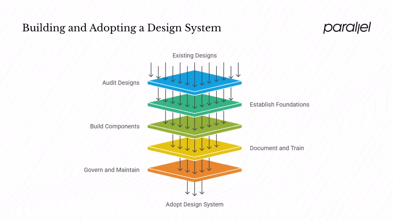
1. Audit existing designs
Begin with an inventory of your product’s current components and styles. UXPin recommends creating a patterns inventory—collecting screenshots or design files to identify existing UI elements and their variations. Categorise items by type (buttons, forms, icons, etc.) and note inconsistencies. Conduct separate audits for colour, typography and spacing.
2. Establish the foundations
From the audit, define a core colour palette, typography scale, icon set and spacing units. Convert these into design tokens so they can be referenced consistently in code and design tools. Document brand tone and accessibility requirements.
3. Build components and patterns
Create modular components that align with your standards. Each component should include visual specifications, usage guidelines, code snippets and accessibility notes. Then assemble components into patterns—navigation, forms, cards and layout templates. Document the user flows each pattern supports.
4. Document and train
Centralise documentation where everyone can find it. Include component guidelines, pattern examples, code references and principles. Host workshops or share recorded demos to teach team members how to use and contribute to the system. Encourage feedback and iterate.
5. Govern and maintain
Define roles and processes for proposing new components, reviewing changes and managing releases. Regularly audit the system to identify gaps or obsolete items. Provide versioning so teams can adopt updates gradually. Dedicated leadership support ensures the system continues to evolve rather than becoming a forgotten initiative.
6. Choose your strategy
You don’t always need to start from scratch. Evaluate three approaches:
- Adopt: Use an existing design system (e.g., Material Design) if you need speed and are comfortable with an established aesthetic.
- Adapt: Start with a public system and customise it to match your brand.
- Create: Build a bespoke system when brand differentiation and unique patterns are critical.
Pick the path that matches your stage, resources and brand ambitions. Many startups begin by adopting or adapting and later evolve into creating their own.
Benefits recap
Design systems deliver several advantages for early-stage startups:
- Faster development: Reusable components cut down on repetitive work.
- Consistency: Uniform UI reinforces brand trust and improves usability.
- Reduced decision fatigue: Clear guidelines let teams focus on user problems instead of styling choices.
- Scalability: Standards support new features and products without losing quality.
- Easier onboarding: New team members ramp up quickly with a single source of truth.
Conclusion
A design system is more than a style guide—it’s a strategic tool that helps lean teams ship cohesive products faster. It standardises colours, typography and interactions; turns components into reusable building blocks; and provides a shared vocabulary for design, product and engineering. However, timing is crucial. Building a full system too early can waste resources, while delaying it too long can lead to chaos.
The 2025 design systems report shows widespread adoption of tokens and more dedicated teams, but also notes that communication and resources remain bottlenecks. Approach your own system as a living, evolving guide—start small, involve the whole team and adapt as your product grows. When done thoughtfully, a design system becomes a competitive advantage rather than a decorative artefact.
Frequently asked questions
1) What is the meaning of design system?
A design system is a set of standards, reusable components and patterns that ensures consistent digital experiences. Figma describes it as building blocks and standards for maintaining consistent look and feel. Nielsen Norman Group defines it as a complete set of standards used to manage design at scale with reusable components. The Interaction Design Foundation notes that it includes reusable components, design principles and guidelines for consistency and efficiency.
2) What are the five principles of a design system?
A synthesised set of principles might include:
- Consistency: Ensure the same visual language across products.
- Reusability: Create modular components for repeated use.
- Scalability: Design for growth across products and teams.
- Collaboration: Build a shared language for designers, developers and product managers.
- Documentation and governance: Record decisions and establish processes for maintaining the system.
3) What is a design system Brad Frost?
Brad Frost introduced Atomic Design, a methodology for organising UI elements by size and complexity. It breaks interfaces down into atoms (small elements like buttons), molecules (combinations like input fields with labels), organisms (complex components like headers), templates (page-level structures) and pages (instances of templates with real content). While Atomic Design is not a design system itself, many teams use its hierarchy as a conceptual framework for their systems.
4) What is the meaning of system design in simple words?
System design refers to planning the high‑level architecture of software systems—defining components, data flows and interactions to meet functional requirements. It’s often used when designing back‑end services or technical infrastructure. A design system, on the other hand, focuses on the visual and interactive aspects of a product—colours, typography, components and patterns—to ensure a consistent user interface. Although they share the word “system,” they solve different problems: system design addresses engineering architecture, whereas a design system addresses UI consistency and usability.

check out these related blogs


.webp)