Missed signals = missed shots. How many early‑stage products suffer because a team builds from the inside out instead of looking outward? In my work with AI/SaaS startups, I’ve seen passionate teams stumble because they didn’t capture what their users really feel, think, or struggle with. That’s where empathy mapping comes in. An empathy map is, in Nielsen Norman Group’s words, “a collaborative visualization” that externalizes what a team knows about a user to create a shared understanding and support decision‑making. In other words, it’s a simple matrix that forces you to articulate what customers say, think, do, and feel so that your team’s strategy is grounded in reality.

In this article you’ll learn what is an empathy map, how it works, why it matters, and how to build one that drives product clarity. Drawing on research from the Nielsen Norman Group (NN/G), the Interaction Design Foundation (IxDF), Lucidspark, the UX Design Institute and other industry leaders, I’ll walk you through an anatomy deep dive, a step‑by‑step workshop plan, and guidance on using empathy maps alongside personas and journey maps. We’ll also cover best practices, pitfalls, and real‑world use cases for founders and product leaders. Empathy isn’t a buzzword – it’s a practical instrument for aligning teams and designing products that resonate with real humans. Let’s dive in.
What Is an Empathy Map?
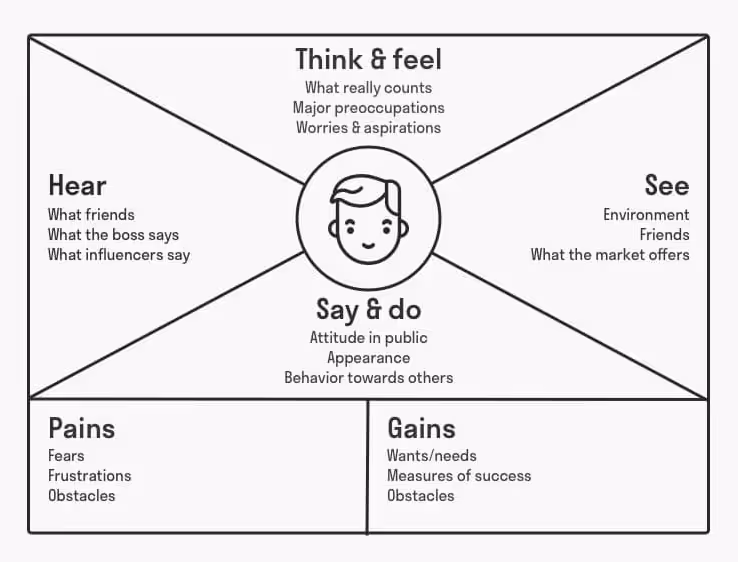
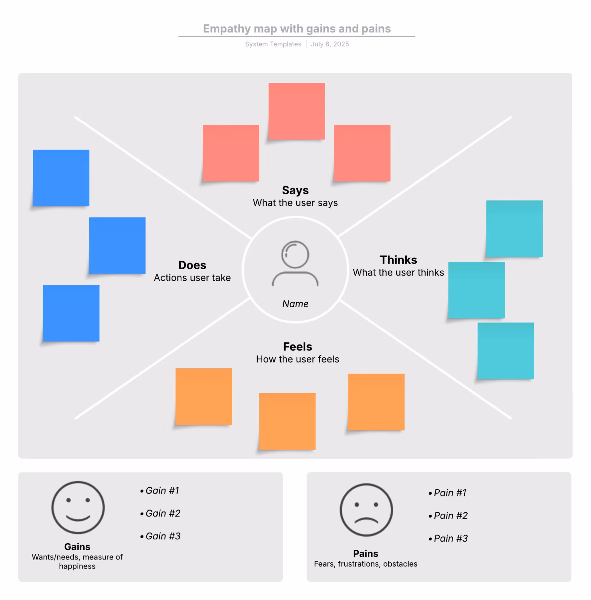
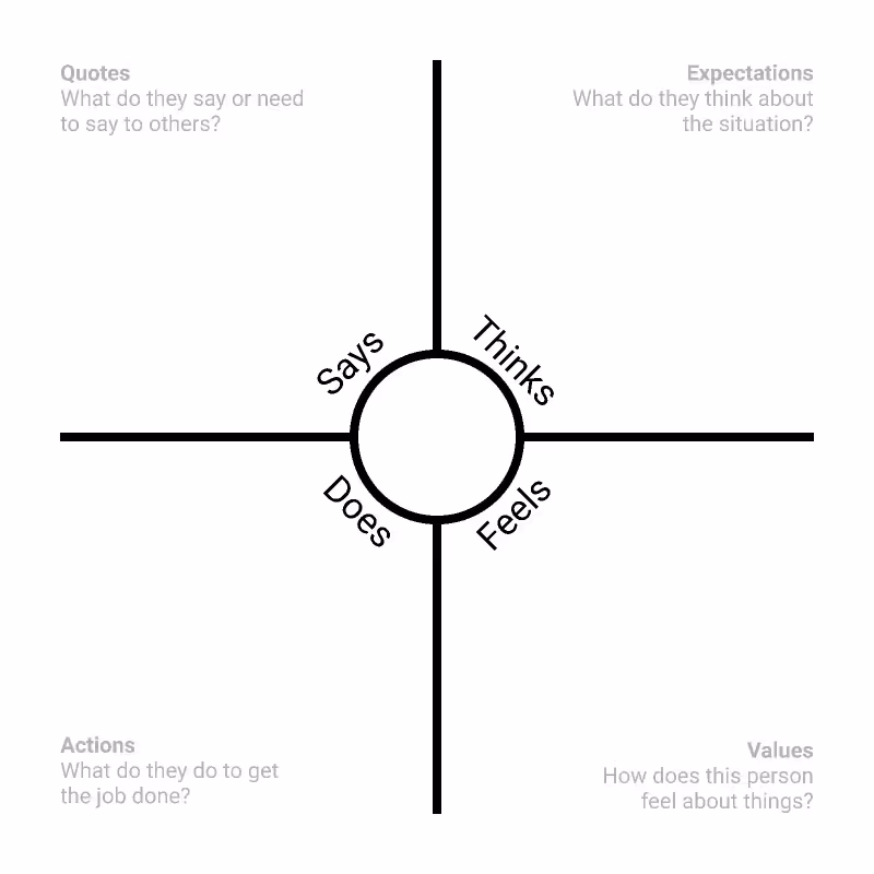
At its core, an empathy map is a collaborative visualization that externalizes user knowledge to create shared understanding and aid decision‑making. The Interaction Design Foundation defines empathy mapping as the visual representation of users’ thoughts, feelings and actions, noting that it organizes research data so teams can gain deeper, shared understanding of user needs and make better decisions. The canvas looks deceptively simple: a square divided into quadrants labelled “Says,” “Thinks,” “Does” and “Feels,” sometimes expanded with “Sees,” “Hears,” “Gains” and “Pains”. In the middle sits the persona or user segment you’re exploring.
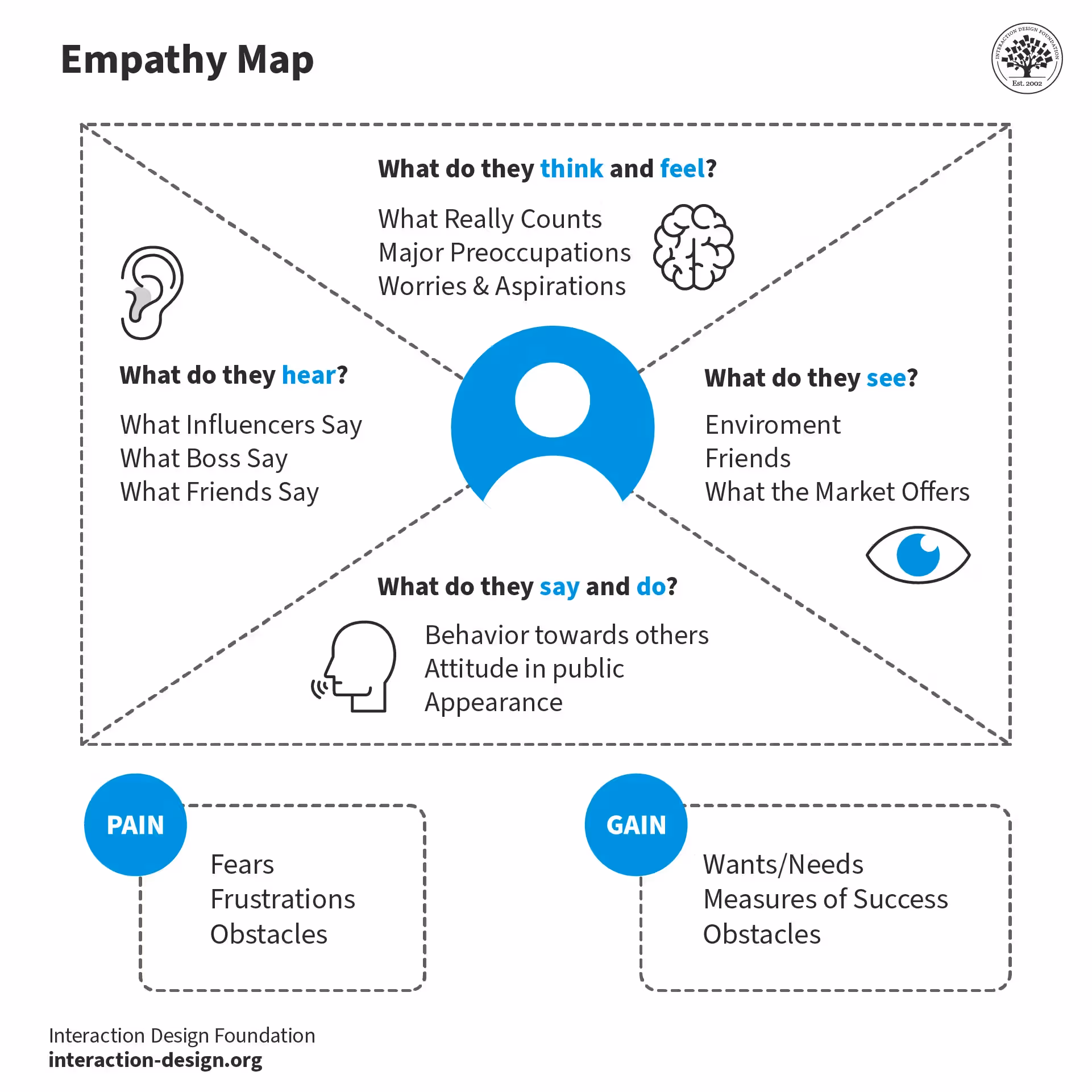
The idea is to capture not just what users explicitly say but also their unspoken thoughts, behaviours, and emotional states. UX designers at the UX Design Institute describe placing the user’s photo or name in the centre and surrounding them with four quadrants that relate to what they say, do, think and feel. The “Says” and “Does” quadrants record observable quotes and actions, while “Thinks” and “Feels” require interpreting underlying motivations or emotions. Many teams also add “See” and “Hear” to capture the user’s context and influences, and “Pains”/“Gains” to articulate obstacles and aspirations. By externalizing this knowledge, an empathy map surfaces what the team knows and (just as importantly) where data is missing.
So what is an empathy map used for? NN/G emphasizes that empathy maps “externalize knowledge about users” to create shared understanding and aid decision‑making. IxDF explains that empathy maps organize research so teams can understand users’ needs and spark creative problem‑solving. Lucidspark notes that an empathy map has four quadrants that outline what you know about your users’ attitudes and behaviours and helps visualize them to understand their needs and desires, adding that it’s a powerful addition to the empathize stage of design thinking. Amoeboids succinctly states that an empathy map is a simple, collaborative tool used to visualize user attitudes and behaviours, consolidating what is truly known about the user into a single shared reference.
Why Use an Empathy Map?
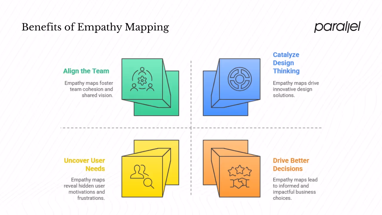
1) Align the Team & Build Emotional Connection
One of the biggest benefits of empathy maps is team alignment. NN/G explains that empathy maps help distil and categorize qualitative research, reveal gaps in existing knowledge, and act as a quick, digestible way to illustrate user attitudes and behaviours. When a cross‑functional team fills out a map together, it surfaces assumptions and provides a shared, unbiased picture of the user. IxDF highlights that empathy maps foster deeper understanding, better communication and can reveal opportunities for innovation. Lucidspark adds that empathy maps help develop a coherent user journey, keep design pragmatic (i.e., avoid building features no one wants) and map unmet user needs. Empathy mapping literally puts the user at the centre of the conversation.
2) Uncover Needs, Pain Points & Motivations
An empathy map forces the team to capture quotes, actions, thoughts and feelings – revealing underlying motives and frustrations that standard metrics often miss. NN/G notes that the process helps categorize research notes, discover gaps in knowledge, and create personas by aligning multiple empathy maps. By filling out the “Thinks” and “Feels” quadrants, teams surface user motivations, emotional states and anxieties that might never be spoken aloud. IxDF emphasizes that the exercise reveals gaps in research and helps identify user needs. Lucidspark’s guidelines call empathy maps a powerful way to locate deep, unmet user needs and transform them into actionable plans.
3) Drive Better Decisions & Design Impact
Empathy maps aren’t just about warm fuzzies; they drive tangible business outcomes. Lucidspark cites Forrester research showing that frictionless, empathetic user experiences can raise conversion rates by up to 400 %. Amoeboids reports that teams prioritizing empathy and user‑centric thinking are 60 % more likely to outperform their competitors financially. For early‑stage startups, aligning product decisions with real user emotions can mean the difference between a flop and a killer feature. Empathy maps act as an insurance policy: they help avoid building the wrong thing, saving months of development and marketing spend.
4) Catalyze Design Thinking
Empathy mapping sits squarely in the “empathize” stage of the design thinking process. Lucidspark notes that these maps are a great addition to the empathize stage and help teams transition into defining the problem and ideating solutions. IxDF points out that empathy maps help organize research data at the beginning of a project and spot opportunities for innovation. UX Design Institute reminds us that empathy mapping should take place right at the beginning of the design process and that you should continue to adjust maps as new research arrives. When empathy is woven into the process, teams are more likely to deliver solutions that feel human.
What’s Inside an Empathy Map? (Anatomy Deep Dive)
An empathy map looks like a simple quadrant grid, but each section plays a specific role. Here’s a deeper look at the traditional quadrants and newer sections, with examples pulled from NN/G, IxDF, Lucid and others.
1) Says
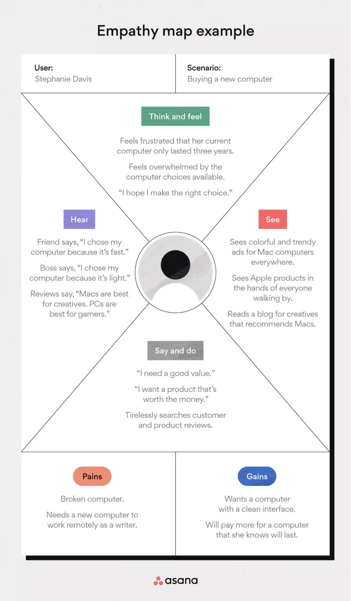
This quadrant captures verbatim quotes from users. NN/G’s empathy map guide places direct quotes here, such as “I am allegiant to Delta because I never have a bad experience” or “I want something reliable”. IxDF advises using this section for what you hear users say out loud, noting that these quotes reveal expectations, concerns and preferences. UX Design Institute suggests capturing statements like “Entering all the tasks’ due dates this way is stressing me out” or “Is my profile public?”. For your startup, this quadrant should contain authentic user language from interviews, support chats or research transcripts.
2) Does
“Does” records observable behaviours. NN/G includes actions such as refreshing a page, shopping around to compare prices or repeatedly trying a feature. IxDF notes that this section helps you understand how users interact with your product, and you can analyse actions to identify pain points and opportunities. UX Design Institute suggests capturing behaviours like customising an app or sharing content on social media. Observing actions often reveals contradictions between what users say and what they actually do.
3) Thinks
Here you capture the user’s thoughts, beliefs and assumptions, even if they’re not explicitly voiced. NN/G encourages paying attention to what occupies the user’s thoughts and why they might be reluctant to share. IxDF frames this section as uncovering underlying motivations that drive behaviour and aligning the product with users’ mental models. UX Design Institute suggests capturing thoughts like “The signup process is confusing” or “I hope this app has a free option”. These insights often highlight contradictory feelings or unspoken anxieties.
4) Feels
The “Feels” quadrant documents the user’s emotional state. NN/G illustrates this with feelings like being impatient because pages load too slowly, confused by conflicting prices or worried about doing something wrong. IxDF notes that this section articulates the users’ fears, frustrations and desires. UX Design Institute provides examples such as “nervous: not sure of what they’re doing” or “triumphant: successfully got to the right page”. Emotions are often the strongest drivers of user behaviour and brand loyalty.
5) Sees and Hears
Modern canvases expand to include sensory context. IxDF points out that additional sections for “Sees” and “Hears” explore what the user observes in their environment and what influences their thinking. UX Design Institute explains that the “See” quadrant captures what the user sees in their daily experience and digital environment, while the “Hear” quadrant captures influences from family, friends, co‑workers or the media. Lucid’s template suggests examples like seeing competitors’ ads, working from a desk or hearing recommendations from peers. These sections remind us that users don’t interact with products in a vacuum.
6) Pains and Gains
Some empathy maps add “Pains” and “Gains” at the bottom. “Pains” list obstacles, frustrations and risks, while “Gains” capture goals, aspirations and success indicators. IxDF notes that these sections allow teams to organize users’ problems and desires. UX Design Institute describes “Gains” as what users aspire to and “Pains” as obstacles that stand in their way. These categories pair well with needs assessment and motivate ideation.
How They Fit
Empathy maps provide a structured way to perform:
- User insights by gathering verbatim quotes and behaviours (“Says,” “Does”).
- Emotional connection through the “Feels” quadrant, capturing feelings like frustration or delight.
- Behaviour analysis by observing “Does” and comparing it to “Says.”
- Emotional states via the “Feels” quadrant and underlying motivations (“Thinks”).
- Pain points & motivations through “Pains,” “Gains” and the “Thinks”/“Feels” quadrants.
- Needs assessment by clustering verbs, traits and contradictions across quadrants.
- Customer understanding & persona development by aggregating empathy maps to inform personas.
- Journey mapping by linking insights across touchpoints to build end‑to‑end journeys.
By mapping these dimensions, your team moves from assumptions to grounded empathy and actionable insights.
How to Create an Empathy Map (Step by Step)
A polished empathy map isn’t a one‑off drawing; it’s the output of a structured workshop. Here’s a process drawn from IxDF, NN/G, Lucid and UX Design Institute.
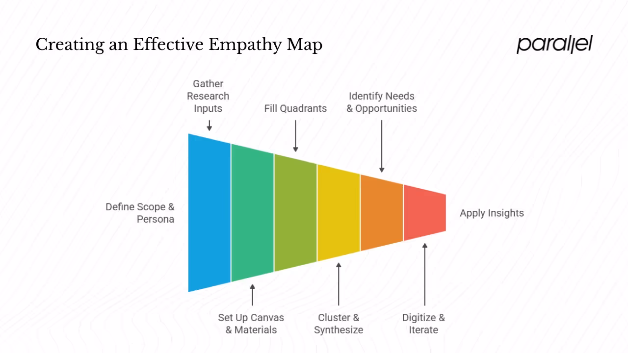
- Define scope & persona. Start by deciding which user or segment you’ll map. IxDF advises clearly defining the scope, purpose and target audience. Are you mapping an individual interviewee or an aggregated segment? UX Design Institute suggests defining whether the map will represent an individual or an aggregate.
- Gather research inputs. Collect as much qualitative data as possible from interviews, surveys, field observations or social media. IxDF recommends gathering surveys, interviews, observations and social media data. Lucid cautions that every addition to your empathy map should be backed by research, not conjecture. More data = a more reliable map.
- Set up the canvas & materials. Choose a collaborative space. IxDF suggests using sticky notes and a whiteboard or digital canvas divided into quadrants. UX Design Institute reminds us to gather materials like a whiteboard and sticky notes or create a digital system.
- Fill the quadrants. Have each participant write one insight per sticky note and place it in the relevant quadrant. Start with “Says” (direct quotes) and “Does” (observable actions), then move to “Thinks” and “Feels”. Encourage brainstorming and avoid filtering out contradictory or surprising data.
- Cluster & synthesize insights. Once the quadrants are populated, step back and identify patterns, gaps and contradictions. IxDF recommends identifying patterns and trends, pain points with the greatest impact, user segments and how insights align with business goals. UX Design Institute suggests clustering similar notes and then evaluating the map for themes, inconsistencies and gaps.
- Identify needs & opportunities. Use the map to identify verbs (activities and desires), traits, contradictions and Maslow‑level needs. These insights highlight opportunities to improve the user experience and differentiate your product.
- Digitize & iterate. Transfer your notes to a digital tool like Figma, Lucidspark or Asana’s empathy map templates to make sharing and versioning easier. Lucid encourages refining and adding sections, color‑coding or illustrations to improve design. NN/G reminds us to keep empathy maps “alive” by revising them as new research comes in.
- Apply insights. Finally, link the empathy map to personas, journey mapping and product decisions. IxDF notes that aggregated empathy maps can be a first step in creating personas and should inform product development, marketing and user‑experience initiatives. UX Design Institute points out that empathy maps help reduce bias, align teams and guide UX designers toward solutions users will love. In practice, once you’ve identified key pain points and motivations, you can prioritise features, craft messaging and design onboarding flows that speak directly to those emotions.
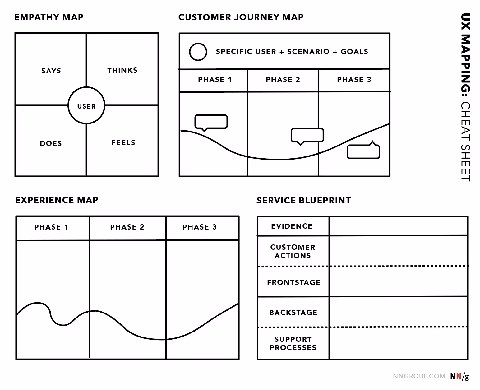
Empathy Maps vs Other Tools
Empathy maps share the user‑centred design stage with personas and journey maps, but they serve different purposes.
Empathy Map vs Journey Map
Journey maps illustrate the end‑to‑end user experience across multiple touchpoints. IxDF notes that empathy maps offer depth about a specific moment (what the user thinks and feels at a particular stage), whereas journey maps offer breadth across the entire experience. The UX Design Institute adds that empathy maps focus on a user’s thoughts and actions during a specific scenario, while journey maps represent the broader experience with multiple touchpoints. Use journey maps to understand macro‑level flow and empathy maps to drill into emotional drivers in a particular context.
Empathy Map vs Persona
Personas represent archetypal users, combining demographics, goals and behaviours into semi‑fictional characters. NN/G stresses that empathy maps are not a replacement for personas, but can be one way to visualize what you know about a persona and identify research gaps. IxDF explains that personas provide a holistic understanding of the target user, including demographic information and behaviours, whereas empathy maps focus on users’ emotions, thoughts and actions in a specific context. Empathy maps often precede personas when you need quick insights; aggregated empathy maps across multiple users can then be synthesized into personas. Personas and empathy maps are thus complementary: personas create a durable representation of your segments, and empathy maps inject emotional clarity.
Best Practices & Pitfalls
Best Practices
- Engage diverse stakeholders. IxDF recommends including stakeholders from different disciplines when creating empathy maps. Diverse perspectives surface hidden biases and improve buy‑in.
- Ground everything in research. Lucid stresses that every entry on the empathy map should be backed by research, not conjecture. Ensure you have quotes, observations or evidence for each sticky note.
- Use visual aids & digital templates. Sticky notes and whiteboards work well in person; tools like Lucidspark, Asana, Miro or Figma make remote collaboration easier and allow for color‑coding and version control. Lucid encourages adding illustrations or color‑coding to refine your map.
- Iterate & keep it alive. NN/G warns that empathy maps can become static and lose relevance. Treat them as living documents that you update whenever new research arrives. Set a cadence (e.g., monthly) to revisit and refine.
- Link to personas & journeys. Use insights from empathy maps to enrich personas and inform journey mapping. This ensures emotional clarity flows into other artefacts.
- Analyse & prioritise. After clustering, use the map to prioritise pain points and opportunities. IxDF suggests identifying patterns, segments and alignment with business goals.
Pitfalls
- Limited perspective. Empathy maps reflect the research you have. IxDF warns that a sparse map signals missing research and can lead to narrow perspectives. Always gather enough data before drawing conclusions.
- Lack of context. Without “Sees,” “Hears” or “Pains/Gains,” empathy maps can miss environmental influences. Include these sections or supplement with journey maps.
- Treating it as a one‑off. Empathy maps can quickly become outdated if not maintained. NN/G emphasizes the importance of revising empathy maps as new data emerges.
- Over‑interpretation. While “Thinks” and “Feels” involve some inference, avoid unfounded assumptions. Lucid cautions that every addition must be evidence‑based.
Real‑World Use Cases for Startups & Product Teams
Empathy maps can be a powerful tool across your startup lifecycle:
- Early‑stage alignment. For founders and product managers, empathy maps help align early hypotheses with user reality. Start by interviewing a handful of potential users and mapping what they say, think, do and feel. This can reveal surprising friction points (e.g., sign‑up anxiety, confusion about pricing) and highlight opportunities for differentiation.
- Product strategy & roadmap. Product leaders can use empathy maps to prioritise the roadmap. If your map uncovers that users feel overwhelmed during onboarding and fear losing data, that might drive investments in progressive onboarding, auto‑save features or reassurance messaging. Empathy maps also inform what features to delay or drop if they don’t address core pain points.
- UX design & content. Designers and researchers can use empathy maps to craft microcopy, design flows and interactions that speak to users’ emotions. For example, if users express impatience with slow loading, you might design skeleton screens and micro‑animations to reduce perceived waiting time.
- Marketing & positioning. A marketer can translate the “Thinks” and “Feels” quadrants into messaging that resonates. If users think “I don’t trust this brand fully yet,” you might focus on trust signals (case studies, testimonials) in your campaigns. When users feel relief after completing a task, emphasise simplicity and empowerment.
- Cross‑functional onboarding. When new team members join, empathy maps act as a quick way to learn about the user base. Instead of reading through long research reports, they get a concise, visual summary of user attitudes and behaviours. This fosters a customer‑centric culture.
Tools & Templates
Various tools support empathy mapping:
- Lucid’s empathy map template: Lucidspark offers online templates with sticky notes, colour coding and AI‑powered summarization.
- Asana’s PDF template: Asana provides a printable empathy map with quadrants labeled “Think & Feel,” “Say & Do,” “See,” “Hear,” “Pains” and “Gains,” making it easy to involve non‑design stakeholders (we referenced the template lines earlier).
- Figma & Miro kits: Designers can leverage Figma and Miro resource kits to create collaborative empathy maps; these tools support remote workshops and integrate with design systems.
Empathy maps shine in early‑stage AI and SaaS environments because they keep teams laser‑focused on real human needs amidst technical complexity. In our client work, we’ve used empathy maps to help a small AI‑powered analytics startup realize that their users (busy product managers) weren’t asking for more dashboards – they were anxious about misinterpreting data. This insight led to a feature pivot toward automated insights and simplified explanations, driving a 30 % reduction in time‑to‑value and a leap in user satisfaction.
Conclusion
Empathy maps are deceptively simple. They’re square grids covered in sticky notes, but they act as a north star for user‑centered design. By externalizing what users say, think, do and feel, empathy maps create a shared understanding among teams and uncover motivations, pain points and emotional states that influence behaviour. They align cross‑functional teams, reveal research gaps, and translate qualitative data into actionable product decisions. For early‑stage startups, empathy maps are a secret weapon: they help you build not just products but relationships with your users.
So next time you’re tempted to skip research and dive straight into prototyping, pause. Gather your team, fill out those quadrants, and let the user’s voice guide your roadmap. The best products aren’t built on guesswork – they’re built on empathy.
FAQs
1) What is the empathy map?
It’s a collaborative visual tool that captures what users say, think, do and feel about a specific scenario. By externalizing this knowledge, teams can surface insights and align their understanding.
2) What is the purpose of an empathy map?
To build shared understanding of users, uncover needs, emotional states, behaviours, pain points and motivations, and drive better design decisions.
3) What is in an empathy map?
Typically four quadrants – “Says,” “Thinks,” “Does” and “Feels” – plus optional “See,” “Hear,” “Pains” and “Gains” sections for context and aspirations.
4) What does empathy mapping mean?
It’s the process of creating an empathy map: collecting user research, filling each quadrant with quotes, behaviours, thoughts and feelings, synthesizing insights, and using them to inform user‑centric design and decision making.

check out these related blogs