Product teams obsess over landing pages and sign‑up flows but overlook the strip at the bottom. That lower section can build trust and offer a final nudge to act. When a founder recently asked me, what is a footer on a website and why they should bother with it, it reminded me how often we miss the basics. A footer is the band that runs along the bottom of a web page. It appears on every page, yet many early‑stage startups leave it empty or cluttered. In this guide I’ll explain why footers matter, what belongs there, how to design them and common missteps to avoid. Throughout I’ll weave in recent research from 2024–2025 and lessons from our work at Parallel.
What exactly is a website footer?
A footer is the horizontal region at the bottom of a web page, below the main content. In HTML5 there is a <footer> tag that identifies this section semantically. It sits alongside the header and body as one of the three major structural elements of a page. Unlike sidebars or banners, the footer doesn’t appear in view until someone scrolls down.

Many assume few scroll to the bottom, but data says otherwise. Chartbeat’s analysis shows that the average reader only scrolls down about 27% of a page and that 58% of attention is spent above the fold. Yet the group of people who do scroll are motivated: roughly one fifth jump straight into the middle of a page. A 2024 report from conversion agency The Good notes that two‑thirds of user engagement happens below the fold. People intentionally reach the bottom to find contact details, legal information or a way forward when the top of the page didn’t solve their problem. Those visitors are your most interested prospects. When you understand what is a footer on a website and treat it as a helpful last stop, you serve them well.
Footers have evolved into full navigation and engagement zones. Today’s best footers include utility links, secondary navigation, calls to action, social icons and legal notices. They are consistent across pages and carry the same visual language as the rest of the site. For early‑stage teams, this consistency builds trust and signals attention to detail.
Why your startup should care
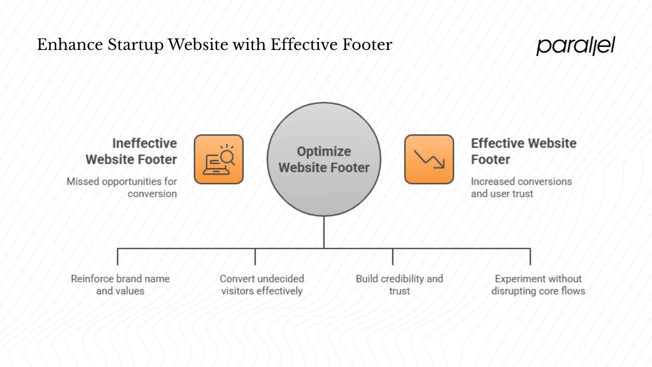
1) A consistent anchor
A footer appears on every page, reinforcing your name and values. The Nielsen Norman Group observes that modern footers have matured into reference points. Using the same layout and colour palette at the bottom of each page creates a familiar endpoint that can comfort a first‑time visitor. A short tagline and logo remind people who you are as they finish reading.
2) A final chance to act
Footers give you one last opportunity to convert. The Good highlights a test where simply redesigning the footer increased sales by 27% and revenue per visitor by 16%. Because 66% of user engagement occurs below the fold, the footer can be the place where an undecided visitor finally signs up, downloads or books a demo. In our own projects we have seen that a well‑placed “Start free trial” link at the bottom can bring in steady sign‑ups that weren’t captured higher up the page.
3) Essential information and trust
Visitors often scroll to the bottom deliberately to find contact information, addresses, careers or investor relations. When they’re looking for proof that you’re a real company, a physical address and telephone number build credibility. Links to privacy policies, terms of service and accessibility statements show you take compliance seriously. Without these items, some users may leave your site entirely.
4) Low‑risk improvement
A footer is easy to enhance because it doesn’t get in the way of visitors who already found what they need. You can experiment with CTAs or links here without disrupting core flows, and swap them out if they don’t perform.
What content goes into a footer
When someone asks what a footer is on a website, they might picture a copyright symbol and a few fine‑print terms. In reality a well‑composed footer contains a handful of deliberate sections. Here’s a concise guide to what belongs there.
- Branding and about – Start with a small logo and a one‑line mission. Include a link to your About page.
- Navigation and resources – Add a mini site map or duplicate your menu for long pages. Include secondary links for careers or documentation if you have multiple audiences. Group links by category for quick scanning.
- Contact information – Provide a clear email address, phone number and physical location. Entropik’s 2024 guide stresses that contact details build trust and credibility. If you have support hours or a live chat, mention them here. For start‑ups with a local presence, a link to a map or address can be helpful.
- Social and engagement – Place icons linking to your social accounts, but don’t let them distract you. Include a newsletter sign‑up or invitation to follow you on LinkedIn to keep the conversation going.
- Legal and policies – Display links to your privacy policy, terms of service, cookies policy and accessibility statement. A copyright notice that includes the current year and your company name signals that you keep your site up to date. Beetle Beetle emphasises that including legal documents in the footer is important for compliance.
- Call to action – A secondary CTA in the footer gives visitors another way to engage. Place it at the top of the footer as North Street Creative suggests.
Optional extras such as a site map or language selector can be added sparingly. Group related elements and avoid turning the footer into a dumping ground.
Designing and structuring your footer
Design decisions for footers depend on your stage and the complexity of your product. When you think about what is a footer on a website, consider whether a minimal strip or an expanded multi‑column layout suits your needs. A minimal footer with just a copyright and legal links suits a landing page or MVP. An expanded footer with two to four columns is common on SaaS and content‑rich sites. A contextual footer adapts its content to the page — for instance, a blog post footer might surface related articles while a pricing page footer promotes a demo. Whatever pattern you choose, follow a clear hierarchy: lead with a call to action, then navigation, and end with legal links. On larger screens you can split the content into columns; on small screens stack sections vertically. Keep fonts legible and contrast high, and avoid heavy widgets that slow down the page. Use heatmaps and scroll‑depth analytics to see how many people reach the footer and what they click. Adjust your links and calls to action based on these insights.
Nielsen Norman Group identifies three patterns: minimal footers with only legal links, expanded footers with multi‑column navigation and “fat footers” that act like site maps. Pick a pattern that matches your content and adjust it based on user feedback.
Common mistakes to avoid

- Too many links – Treating the footer as a dumping ground for every page makes it impossible to scan. Keep lists short and group related links.
- Poor legibility – Tiny fonts and low contrast colours render footers unreadable. Use accessible type and adequate contrast.
- Ignoring mobile – A multi‑column layout can become a long stack on phones. Collapse or hide non‑essential sections so mobile users don’t have to scroll past dozens of links.
- Missing legal and policy links – Users expect to find privacy and terms at the bottom. If they’re absent, visitors may lose trust or question your compliance.
- Clutter and keyword stuffing – Random promotions, outdated content or keyword‑heavy links make the footer look spammy and hurt your search ranking. Curate what goes into this space and write link labels for people.
- Neglecting analytics – Without tracking scroll depth and clicks you won’t know if your footer works. Review performance and revise accordingly.
How to make a footer: a startup checklist
Startups often realise they need a footer when they ask, what is a footer on a website? Here’s a condensed checklist to help you build one.
- Decide on sections – For an MVP you might only need branding, navigation, contact and legal. If you offer multiple products or audiences, add more categories and a CTA.
- Draft copy and layout – Sketch a simple structure (two or three columns) and write concise labels, a mission line and a clear CTA. Include the current year in the copyright line.
- Apply your style – Use your brand colours and fonts, ensuring good contrast and alignment. A tidy design aids scanning and keeps the footer from feeling neglected.
- Build and test – Implement the footer using the <footer> tag or your CMS template. Preview it on desktop and mobile to ensure links are tappable and the layout remains clear.
- Launch and refine – Once live, track scroll depth and clicks. Remove links that nobody uses, update content as your company changes and test different CTAs. Continuous tuning will keep the footer useful.
In our client work we often start with a simple footer and iterate based on usage data. For example, one SaaS team found that 40% of visitors who reached the footer clicked the careers link. Moving that link higher and simplifying other sections boosted job applications. Use your analytics to surface similar patterns and adapt your design.
A concise example
Imagine a B2B SaaS firm. Their footer could use four simple columns: logo and one‑line descriptor with a copyright; navigation links (About, Product, Pricing, Careers); contact info (email, phone, address); and social icons with a sign‑up prompt. A final row lists privacy, terms and accessibility. This compact structure mirrors the hierarchy suggested by North Street Creative and contains the elements highlighted by Nielsen Norman Group. If someone asks you what is a footer on a website, point them to a layout like this: a concise grouping of branding, navigation, contact, social and legal links at the bottom of each page.

Conclusion
The footer is the last thing visitors see. Modern research shows that a meaningful share of engagement happens below the fold. People who scroll to the bottom are typically looking for contact details, policies or a final call to action. By treating the footer as part of your product rather than an afterthought, you build trust, offer clarity and create one more opportunity to convert. A well‑designed footer doesn’t need to be complex. Start small, include the essentials and improve it as you learn more about your users. The next time you ask what is a footer on a website, remember that it’s your chance to leave a good final impression. Understanding what is a footer on a website—and treating it as a designed space rather than a dumping ground—will help your startup stand out.
FAQ
1. What is an example of a footer?
A good footer groups content into clear sections such as branding, navigation, contact, social engagement and legal links. The example above uses four columns to organise these elements, with a separate row for legal policies.
2. What is the purpose of a footer in a website?
It signals that a visitor has reached the end of a page and provides a last opportunity to guide them. It houses essential information such as contact details, legal policies and calls to action. Because many users engage below the fold, a thoughtful footer helps convert those who scroll.
3. How do I make a footer?
Identify the sections you need, sketch a layout, write clear copy, apply your brand style, implement with a <footer> tag or CMS template, test across devices and refine based on user behaviour. The checklist above covers these steps.
4. Where is the footer on a page?
It sits at the very bottom of each page, below the main content and above any closing scripts. HTML5 provides a <footer> element to identify it. Understanding what is a footer on a website starts with recognising this location and designing it deliberately.

check out these related blogs


.avif)