When you land on a new dashboard and everything just clicks, it’s because your brain is doing hidden work. It groups buttons, cards and text into meaningful clusters so you can focus on what matters. That intuitive feeling stems from Gestalt theory—the idea that we perceive organised patterns rather than isolated parts. In this article, we’ll explain what gestalt theory is, why understanding it matters for early‑stage product teams, and how you can apply it to build clearer user experiences.
We’ll cover its origins, outline the major principles of proximity, similarity, continuity, closure and figure–ground, and show how they apply to onboarding, navigation and dashboards. Whether you’re a founder, product manager or design lead, understanding how people see the whole will help you craft interfaces that feel obvious instead of confusing.
What is Gestalt theory?
Gestalt psychology arose in 1912 when Max Wertheimer observed the “phi phenomenon”—a series of flashing lights that appeared to move even though the lights were stationary. Along with Wolfgang Köhler and Kurt Koffka, he argued that perception is not just a collection of sensations but an organised whole. The word Gestalt roughly means “shape” or “pattern.” This theory posits that the attributes of a whole are not deducible from its parts. According to the Interaction Design Foundation, the mind “informs” what the eye sees by perceiving individual elements as unified patterns. When we ask what is gestalt theory, we’re asking why a circle made of dots appears as a circle rather than a series of points.
Why it matters for human perception
Human perception is inherently holistic. Verywell Mind emphasises that the whole is greater than the sum of its parts, and Simply Psychology points out that our brains seek order through grouping. This builtin pattern seeking reduces cognitive load and means that how you arrange elements influences what users see.
Important concepts: whole vs. parts, holistic processing and pattern recognition
Gestalt theory rests on the distinction between the whole and its parts. Holistic processing refers to our tendency to perceive a configuration before recognising its components. Pattern recognition is the brain’s way of simplifying complexity by using cues like closeness and resemblance to create meaningful units. When you design with these in mind, you help users see a structured interface rather than a random collection of buttons and text. These concepts set the stage for the principles that follow, which answer what is gestalt theory in practice.
The major Gestalt principles for visual design
Gestalt principles translate the theory into actionable heuristics. They describe how the brain groups elements based on proximity, similarity, continuity, closure and figure–ground distinctions. These principles are its practical expression, helping us create designs that feel organised and intuitive instead of chaotic. Here are the most relevant principles for product design.
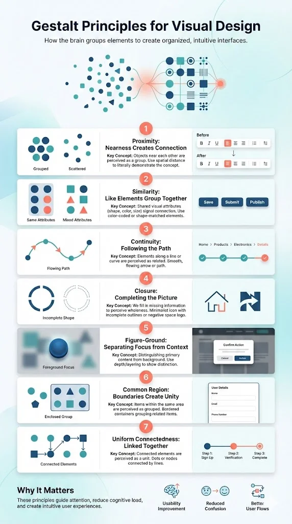
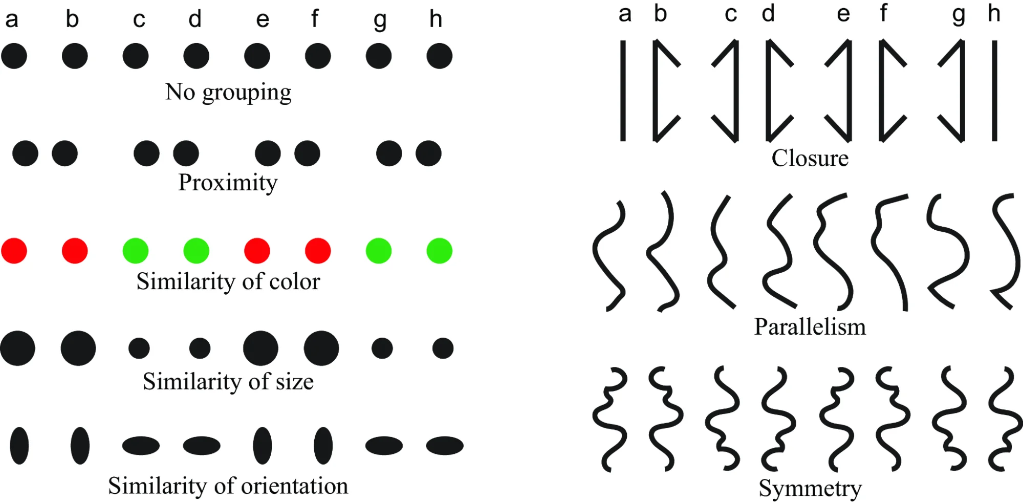
1) Proximity
Objects that are near each other tend to be seen as a group. Spatial closeness implies connection. In a UI, grouping related buttons, inputs or sections tells users they belong together. For example, placing text formatting tools next to each other in a rich‑text editor helps users understand they serve a common purpose. Conversely, scattering them across the page makes the interface feel disjointed.
2) Similarity
We group elements that share visual attributes such as shape, colour or size. Consistent typography, icon styles and colours signal functional similarity. Styling all primary action buttons with the same shape and visual emphasis across screens tells users they can expect similar behaviour. When unrelated elements look alike, users may infer a connection that doesn’t exist.
3) Continuity
The law of continuity states that we prefer smooth, continuous lines and paths. Elements arranged along a line or curve are perceived as related. Breadcrumbs, progress bars and step‑by‑step wizards use continuity to guide the eye along a logical path.
4) Closure
Closure refers to our tendency to complete incomplete shapes. We fill in missing information to perceive a whole even when parts are absent. Designers use closure in logos and icons—for example, the border of a QR code or an incomplete outline of a shape. Thoughtful use of negative space can create memorable visuals while reducing clutter.
5) Figure–ground
Figure–ground perception involves distinguishing an object (the figure) from its background (the ground). High contrast and clear boundaries help users identify primary content. Modal dialogs, cards and overlays apply this principle by placing important information on a distinct layer, making it easier to focus on what matters.
6) Common region and uniform connectedness
In addition to the classic laws, related cues like common regions and uniform connectedness also play a role. Elements enclosed in the same area are seen as a group. Using cards or panels to bound related content helps users understand its internal structure, and connecting steps in a process reinforces their connection.
7) Why these principles matter for product design
For early‑stage teams, applying Gestalt principles can dramatically improve usability. They guide user attention, reduce visual overload and create intuitive flows. When you design a navigation bar or dashboard using proximity and similarity, you help users find what they need without thinking. When you ignore these cues, you risk confusing them. In the end, these principles help answer what is gestalt theory by showing how human perception influences interface design.
Applying Gestalt theory in product strategy and design
The magic of Gestalt theory isn’t just theoretical; it has concrete implications for product strategy. At Parallel, we’ve seen that asking what is gestalt theory during planning helps teams think about perception rather than just pixels. Here’s how you can apply these insights.

1) Onboarding and first‑impression screens
New users decide quickly whether your product is worth their time. Research shows that 90 % of users churn if they don’t understand a product’s value within the first week. Good onboarding groups primary actions and messages clearly. Use proximity to keep the main call to action near its explanation and place secondary options at a distance. Similarity can differentiate primary buttons from secondary ones through shape and size. Interactive tours and progress indicators, which use continuity, increase feature adoption by around 42 %.
2) Feature grouping and navigation architecture
As products grow, feature sets expand and can clutter the interface. Applying proximity and similarity to navigation helps users recognise where to find things. Grouping related actions in a single menu and separating analytics into their own space reduces confusion. Research from Cloud Coach reveals that 75 % of users abandon a product within the first week if they struggle during onboarding, underscoring the importance of clear organisation from day one.
3) Visual hierarchy and dashboards
Dashboards often overwhelm users with data. Gestalt principles help establish hierarchy: users scan from larger elements to smaller ones, so size and placement matter. Group related metrics in cards to create distinct sections and arrange them consistently for easy comparison. Lining up charts along a common axis uses continuity. Clarity here shortens time‑to‑value and reduces cognitive load.
4) Branding, UI consistency and interaction flows
Consistency isn’t just aesthetic—it builds trust. Similarity ensures that actions that do similar things look similar across screens. Uniform connectedness can visually connect steps in a process, guiding users through flows. Unifying date and time pickers into a single visual cluster increased task completion. These patterns demonstrate how consistent onboarding elements support user success.
5) Testing and iteration with a perception lens
Designing with Gestalt principles is an iterative process. During usability testing, ask users how they group elements and which actions stand out. Their answers reveal whether your arrangement matches their perception and guide improvements. Since 55 % of customers abandon products they don’t understand, clear grouping directly impacts retention.
6) Startup‑specific considerations
Early‑stage teams often operate without dedicated design resources, but applying Gestalt principles doesn’t require a large budget. Focus on arrangement and consistency instead of adding more features. Improving perception and flow yields outsized returns; in practice, spending a sprint on grouping and hierarchy can have more impact than building new functionality.
Limitations and critiques of Gestalt theory
Gestalt theory offers powerful insights, but it isn’t a complete model of perception. Critics argue it’s descriptive rather than predictive; it explains how we group information but doesn’t always account for exceptions. Context, societal factors and domain knowledge can override simple cues. Experienced users may ignore proximity if they know where to look, and a brightly coloured button may draw more attention than closeness alone. Verywell Mind reminds us that perception is influenced by motivation and expectation. Designers should view Gestalt principles as guidelines to test rather than rules to blindly follow. Accessibility, societal influences and cognitive differences can influence how people perceive grouping.

Why founders, PMs and design leaders should care
Understanding Gestalt theory gives product teams a competitive edge. When designers think about perception rather than pixels, they create interfaces that feel natural. Positive onboarding experiences increase retention and activation, and clear grouping reduces support requests.
Studies confirm that perception‑driven design choices deliver measurable results. Cloud Coach found that 76 % of customers stay after a positive onboarding session, while 55 % will stop using a product they don’t understand. At Parallel, we’ve witnessed similar patterns: when teams grouped related features and simplified dashboards, support requests dropped and time‑to‑value improved. Conversely, when interfaces were cluttered or lacked clear grouping, users disengaged within days. For founders and product managers, this means investing in perceptual clarity yields returns across retention, activation and customer satisfaction. Instead of continuously adding features, consider how the ones you have are presented. Does the interface lead the eye naturally from introduction to action? Do related options look and feel consistent? These questions are just as strategic as roadmap planning because perception shapes behaviour.
Conclusion
Gestalt theory arose as a response to reductionist psychology. It reminds us that the mind assembles information into meaningful patterns and that the whole has properties that the parts lack. Learning what is gestalt theory equips founders and product leaders with practical tools for organising information, guiding attention and simplifying interfaces. These principles provide a framework for designing screens that fit how people naturally perceive. Reminding yourself what is gestalt theory can keep your design decisions focused on the whole.
For startups, the call to action is simple: recognise that design is about perception, not decoration. Audit your screens and ask where users might be forming unintended groupings. Pair related actions. Use consistent styles for similar functions. Build progress indicators to show continuity. Next time you review a mockup, ask yourself again: what is gestalt theory, and how can this layout respect how the brain makes sense of the whole?
FAQ
1. What is the meaning of Gestalt theory?
A: Gestalt theory is the idea that we perceive organised patterns rather than simply the sum of separate parts. It posits that the mind groups individual elements into unified wholes with properties not found in the parts alone.
2. What is the Gestalt principle in simple terms?
A: When you look at multiple visual elements, your brain groups them based on cues like proximity, similarity, continuity, closure and common region. You see a unified pattern, not isolated bits.
3. What is an example of the Gestalt theory?
A: In an interface, placing buttons for related actions close together and styling them similarly helps users see them as a group. Psychologically, when you see a circle formed by dots, you perceive a circle instead of many individual dots. The phi phenomenon also shows that flashing lights appear to move.
4. What is the best definition for Gestalt?
A: One clear definition comes from the Encyclopaedia Britannica: Gestalt psychology emphasises that the attributes of the whole are not deducible from analysis of the parts; the word “Gestalt” is often translated as “pattern” or “configuration”. In other words, the mind organises parts into patterns that have meaning that exceeds the sum.

check out these related blogs