Fast-moving startups cannot afford to ignore the basics of product usability. When teams are lean and every release has the potential to make or break customer trust, an inefficient interface will slow growth, frustrate early adopters and create costly rework.
Understanding what is a heuristic analysis can help founders and product leaders spot interface issues before they grow. Put simply, heuristic analysis is a structured usability review where experts judge a product against established guidelines to catch design flaws and improve the overall user experience.
This article explains the concept in plain language, shows when and how to apply it, discusses advantages and limitations, and offers practical steps and tools for teams. It is written for startup founders, product managers and design leaders who want to build products that feel right without burning through budgets.
What does “heuristic” mean in this context?
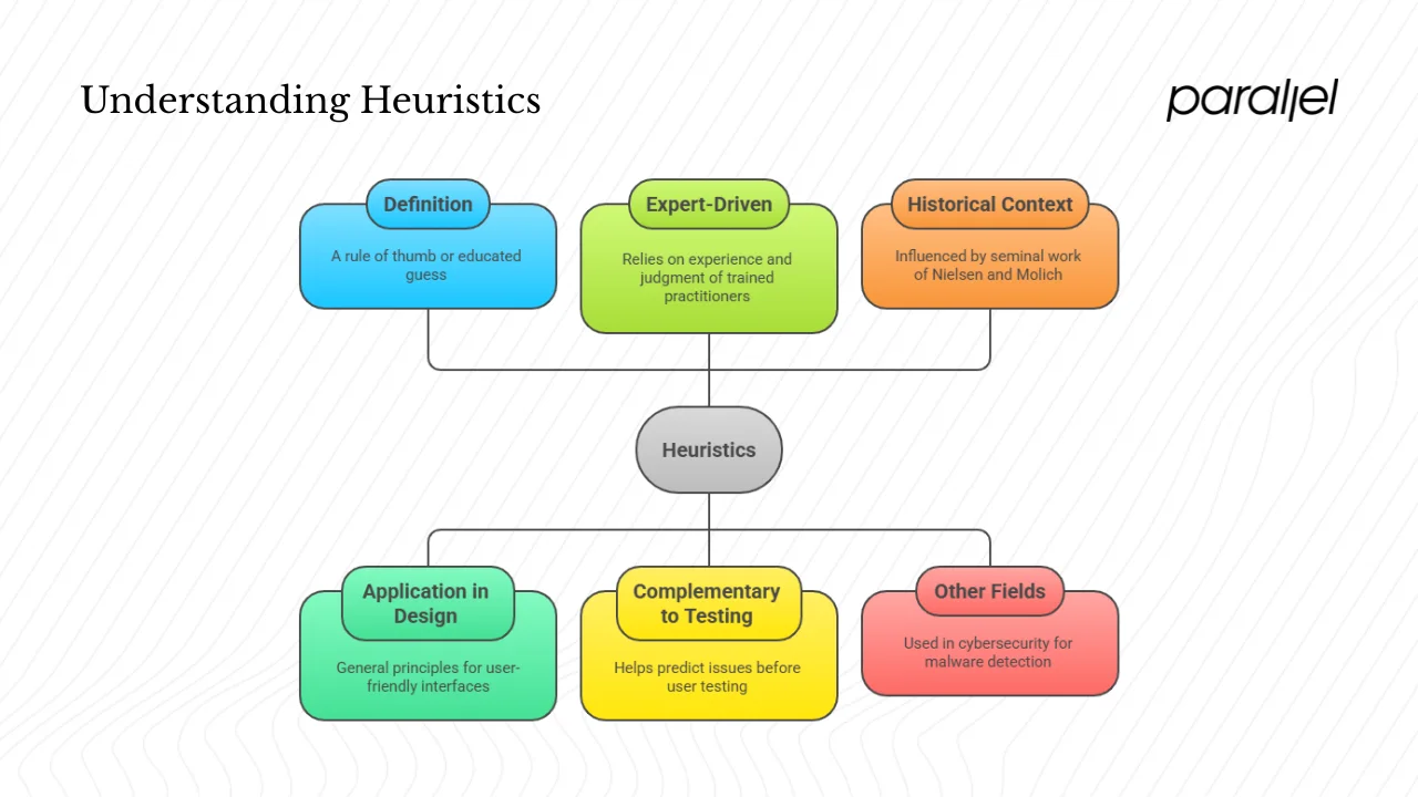
A heuristic is a rule of thumb or educated guess. In design, heuristics are not hard laws but general principles that suggest what tends to work for users. A heuristic for navigation, for example, might say that people understand familiar iconography better than novel metaphors. Instead of running a full quantitative study, you apply heuristics to judge whether your interface follows established patterns. This method is expert‑driven: you use the experience and judgement of trained practitioners rather than large datasets.
Quantitative testing and analytics answer different questions. Metrics and A/B tests tell you what users do, while heuristic reviews help you predict issues before you put a design in front of real users. In user interface design, heuristics often come from seminal work by Jakob Nielsen and Rolf Molich, who published ten usability principles in 1990. Those principles have since been adapted for different contexts but remain the backbone of many expert reviews.
The term “heuristic” appears in other fields as well. In cybersecurity, heuristic analysis refers to a technique where antivirus tools examine patterns and behaviours to detect unknown malware. Unlike UI heuristics, which are about human perception, security heuristics look for anomalies in code or network traffic. This article focuses on heuristics in the context of user experience and product design, but it is useful to be aware of the wider uses.
What is a heuristic analysis? Definition and scope
A heuristic analysis (often called a heuristic evaluation) is a method where one or more evaluators review an interface against a set of established heuristics and identify usability issues. The evaluators conduct independent walkthroughs, compare notes and consolidate findings. This process stems from the “discount usability engineering” method that Nielsen and Molich championed in the 1990s. Because it relies on expertise rather than large sample sizes, it can deliver actionable insights quickly and at low cost.
Heuristic analysis is most effective early in the product life cycle, such as during prototyping or before a redesign. It helps detect problem areas before investing in costly development or user recruitment. It is also valuable as a complement to user testing. While usability tests show how real people interact with the product, heuristic reviews provide structure and language for discussing design issues.
Evaluators look for violations of specific heuristics—such as poor visibility of system status or inconsistent terminology—and assign a severity rating. They focus on critical flows such as onboarding, checkout, dashboard interactions or settings. The findings feed into a usability report that guides product and design teams toward targeted fixes. Thus, heuristic analysis is a proactive way to assess user experience rather than waiting for support tickets or analytics to reveal friction.
Why founders and product managers should care
Early‑stage startups often have limited user data and a pressing need for fast feedback loops. Every change to the interface affects customer acquisition, retention and conversion. A rough onboarding flow may cause drop‑off, while a confusing dashboard can undermine trust. Heuristic analysis gives founders and product managers a practical tool for detecting and prioritising problems without waiting for a full usability study or large dataset.
This method aligns with user‑centred design by making sure the team’s assumptions are tested against widely accepted guidelines. According to a survey referenced by Clay Global, 73 percent of UX professionals use heuristic evaluations in their work. Evaluations draw attention to friction in navigation, unclear feedback, inconsistent language or unnecessary complexity. Fixes based on these insights often directly impact key metrics such as onboarding completion, daily active users and customer satisfaction.

From a business perspective, heuristic analysis is inexpensive compared with large‑scale research. It does not require running scripts or recruiting dozens of participants; a few experts can perform a review in a few days. In our experience working with early‑stage software‑as‑a‑service teams, an expert review often catches the bulk of glaring issues. That saves precious development time and allows founders to focus research budgets on more nuanced questions.
The heuristic principles you should know
Jakob Nielsen and Rolf Molich’s ten heuristics remain the most cited guidelines in usability evaluation. They are high‑level statements rather than rigid rules, and they guide evaluators in spotting common pitfalls. Here is a summary with examples relevant to startup products:
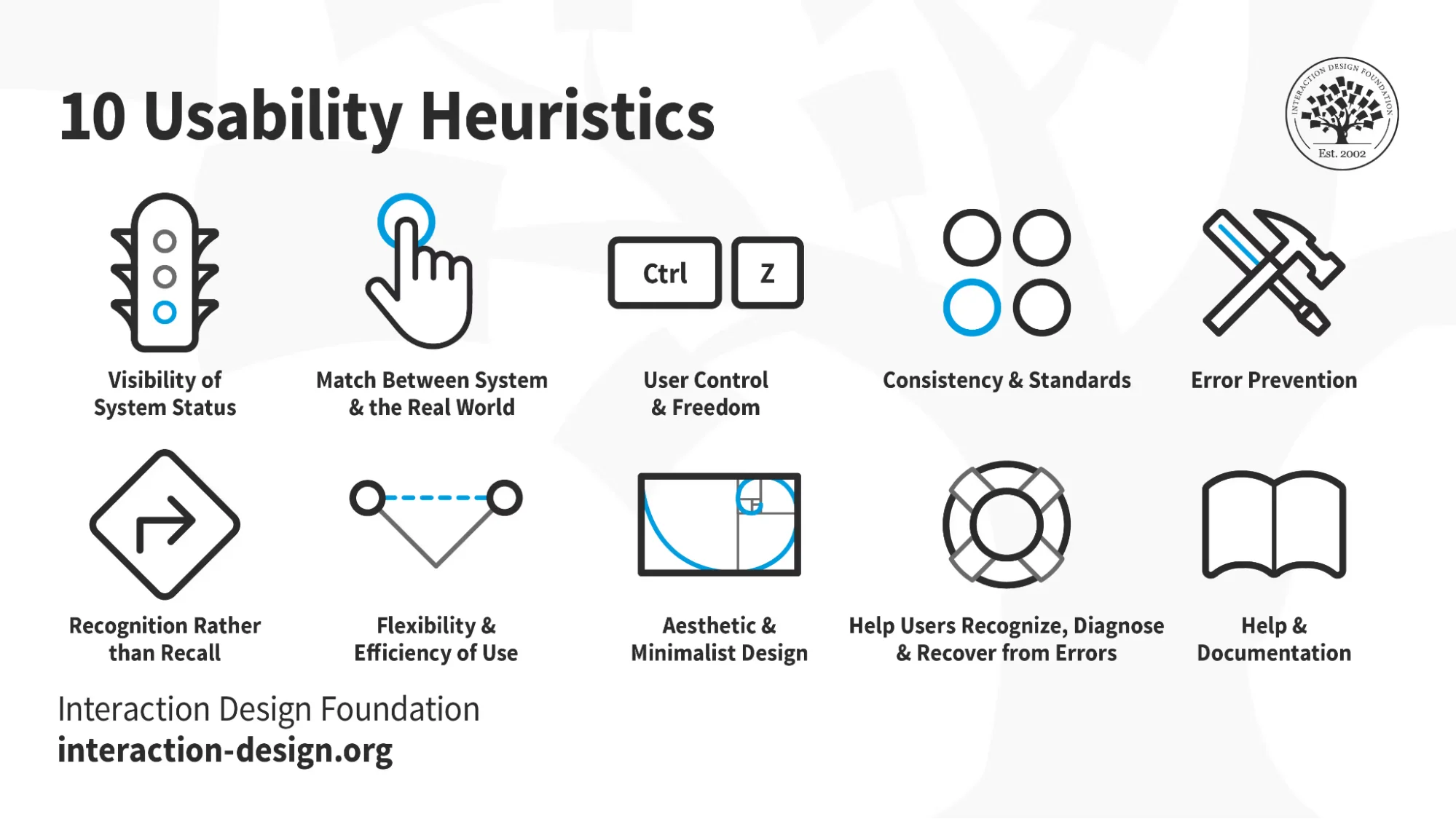
- Visibility of system status – The interface should keep users informed about what is happening through timely feedback. In a mobile app, a progress indicator during account setup reassures users that the system is working. If a dashboard refreshes data, a small spinner or message prevents confusion.
- Match between system and the real world – Use familiar terminology and follow real‑world conventions. For example, an invoice management tool should use plain financial terms instead of internal jargon. Icons should reflect their function—call the download button “Download,” not “Retrieve.”
- User control and freedom – Give users the ability to undo, redo or cancel actions. In a sign‑up flow, allow people to go back and edit their details without having to restart. Provide a clear exit for modals or wizards.
- Consistency and standards – Use consistent naming, icons and patterns across the interface. Startups often move quickly and inadvertently introduce multiple styles. A consistent design language reduces cognitive load.
- Error prevention – Design the interface to prevent errors before they occur. Confirm destructive actions, validate input, and disable irrelevant options. In an onboarding form, grey out the “Next” button until required fields are complete.
- Recognition rather than recall – Present options and information instead of forcing users to remember previous choices. Use autofill, drop‑downs and visible labels. For example, show password criteria while someone is typing rather than making them recall guidelines from a previous screen.
- Flexibility and efficiency of use – Provide shortcuts for experienced users and allow personalisation. Keyboard shortcuts or quick actions for power users can improve productivity without overwhelming newcomers.
- Aesthetic and minimalist design – Keep the interface free of unnecessary elements. Startup dashboards often accumulate features; remove clutter so that primary actions stand out.
- Help users recognise, diagnose and recover from errors – Offer clear error messages and guidance for recovery. Use plain language, avoid technical codes, and suggest solutions. For example, “We couldn’t process your payment because the card number seems incorrect. Please double‑check it or try another card.”
- Help and documentation – Provide easy access to assistance. Contextual tips, FAQs or a concise knowledge base reduce support tickets and empower users.
Designers often adapt these heuristics for specific contexts such as mobile, enterprise or accessibility. For instance, voice interfaces demand feedback through sound or light rather than text. Startups building complex products might add heuristics around trust, security or onboarding clarity. The key is to treat the principles as lenses for uncovering issues, not as rigid compliance checkpoints.
How to conduct a heuristic analysis
The process is straightforward, but discipline and preparation make it effective:
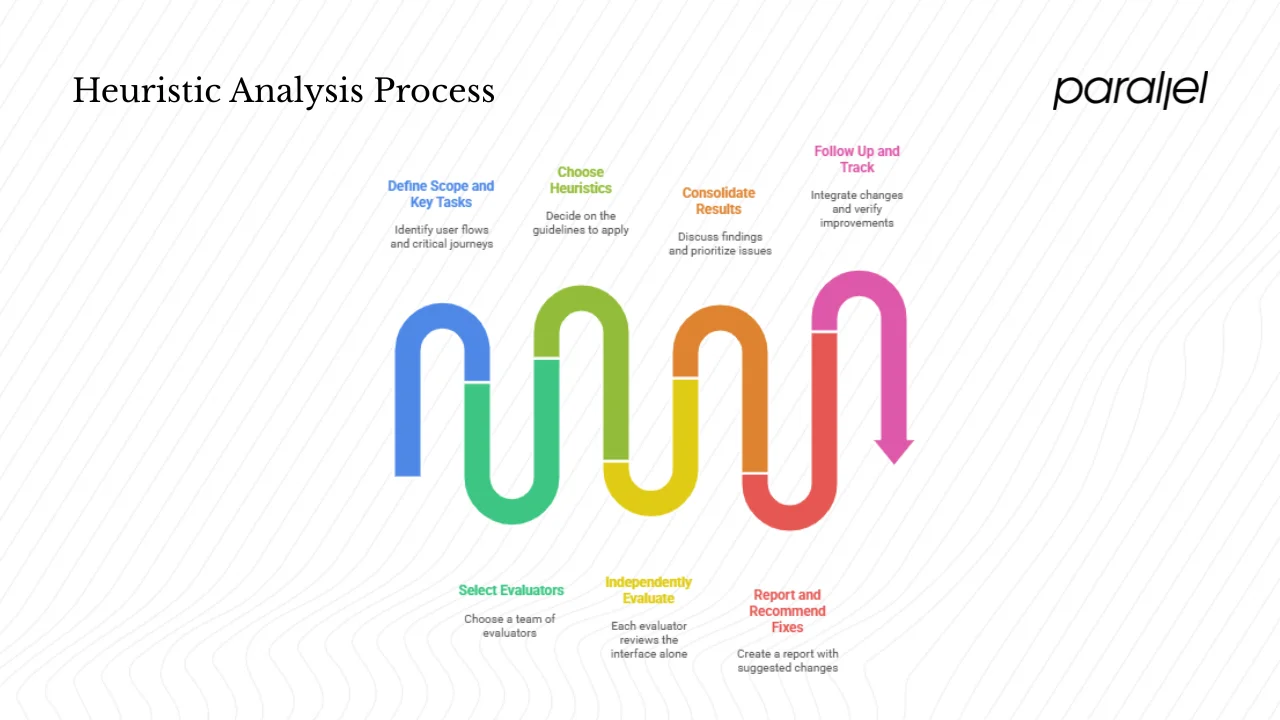
- Define the scope and key tasks. Identify the user flows or screens you will review. Focus on critical journeys such as account creation, onboarding, search, purchase or data entry. A clear scope helps evaluators concentrate on what matters.
- Select evaluators. Research shows that three to five evaluators provide the best balance between coverage and cost. Having multiple reviewers reduces bias and ensures more issues are discovered. In small startups, your evaluators might include a product designer, a PM and perhaps an external consultant.
- Choose your heuristics. Decide which guidelines you will apply. Nielsen and Molich’s ten heuristics are a solid starting point. You can combine them with Shneiderman’s eight golden rules or bespoke principles relevant to your domain.
- Independently evaluate. Each evaluator reviews the interface alone, taking notes on violations and assigning severity scores. Document issues with screenshots and context.
- Consolidate results. Bring the evaluators together to discuss findings, merge duplicates and prioritise issues. Severity should consider impact on user goals and effort required to fix.
- Report and recommend fixes. Create a structured report mapping each issue to the violated heuristic. Suggest practical changes, and indicate severity so stakeholders can focus on the most pressing problems. According to the Clay article, a good heuristic evaluation uncovers critical issues without extensive testing.
- Follow up and track. Integrate the recommended changes into your roadmap. After fixes, repeat the evaluation or combine it with usability testing to verify improvements.
Throughout this process, involve cross‑functional team members. Engineers can provide insight into feasibility, while marketing can weigh in on messaging. Scheduling evaluations early—before significant development—ensures that findings are actionable. Remember to plan time for the review in your sprint cycles; a rushed evaluation leads to surface‑level observations.
Where heuristic analysis fits in the overall design process
Heuristic analysis is not a replacement for other research methods; it is one component in a broader user‑experience strategy. A typical product development process starts with discovery, proceeds to prototyping, involves iterative design and testing, and culminates in launch and iteration. Insert heuristic evaluation after you have a tangible prototype but before you commit to full-scale development or large user tests.
Compared with usability testing, heuristic analysis is quicker and less expensive. Usability tests reveal real user behaviour, while heuristics provide expert judgement. Both are necessary: heuristics help you fine-tune the interface, and testing confirms that those changes work for real people. Analytics and A/B testing come later to validate performance at scale.
For startups with limited resources, heuristic analysis can be a valuable gatekeeper. By catching fundamental issues early, teams prevent rework and free up time for deeper research. This supports a user‑centred approach where design decisions are based on evidence rather than speculation.
Common mistakes and limitations
While heuristic analysis is powerful, it has pitfalls. Avoid these common mistakes:
- Relying solely on heuristics. Heuristic reviews are guidelines, not absolute truths. They cannot replace usability testing or analytics. Use them as an early check, then validate with users.
- Having only one evaluator. A single person will miss many issues. A group of three to five evaluators yields better coverage.
- Ignoring severity and prioritisation. Not all issues are equal. Some are minor irritants; others block users from completing tasks. Always assign severity and focus on what matters most.
- Using outdated or irrelevant heuristics. Adapt your heuristics to the context. Mobile, voice and enterprise systems may require additional or modified guidelines.
- Overconfidence. Evaluators often overestimate their ability to catch all problems. Recognise the limitations of expertise and cross‑check with other methods.
Limitations of heuristic analysis include the risk of false positives and missing real user behaviours. A study found that heuristic evaluations identified issues that did not impact actual users and missed many genuine problems. Because heuristics depend on expert judgement, they reflect the evaluators’ biases and may not capture nuances of your target audience. To address these limitations, combine heuristic analysis with user testing, analytics and feedback loops.
Finally, heuristics are guidelines, not strict rules. Design decisions must consider business goals, brand identity and user context. A principle like “minimalist design” may not fit a complex data analysis tool where users need dense information. Use your judgement and involve your team in interpreting the findings.
Heuristic analysis outside UI/UX—why it gets confusing
Outside of design, the term “heuristic analysis” appears in cybersecurity and data science. Antivirus software uses heuristic analysis to detect malicious code by examining patterns and behaviours instead of relying on signature databases. This type of heuristic analysis examines sequences of instructions or system calls to flag suspicious activity. In contrast, the UX application deals with human interaction and perception. When you read about heuristic analysis in a security context, bear in mind that it serves a very different purpose—protecting systems rather than improving user interfaces. This article uses the term strictly in the context of usability evaluation.
Real‑world examples and use cases from startups
To illustrate the impact of heuristic analysis, consider a few scenarios drawn from our work with early‑stage teams (names omitted for confidentiality):
- Onboarding flow for a B2B software platform: During an expert review, we noticed that the sign‑up page used vague labels and lacked progress indicators. This violated the “match between system and real world” and “visibility of system status” heuristics. Users were unsure if the account was created or what information was needed. By rewriting labels in plain language and adding a progress bar, the team reduced sign‑up abandonment by about 20%.
- Dashboard for a mobile app: A startup built a dashboard with multiple charts updating in real time. Evaluators identified that the refresh feedback was unclear and the colour scheme changed across screens, violating the “consistency and standards” heuristic. We suggested consistent colour usage and subtle loading indicators. The revised design improved user satisfaction scores and reduced support queries about data accuracy.
- Settings screen in a consumer app: During a heuristic analysis, we found that toggles for enabling notifications and privacy options were buried in nested menus. This violated “recognition rather than recall” and “user control and freedom.” By bringing the critical settings to a single page and allowing quick toggling, the team saw an uptick in user engagement and fewer complaints about hidden options.
These examples show that applying heuristic principles early helps surface issues that might otherwise slip into production. Even simple changes, like improving feedback or clarifying language, can have outsized effects on conversion and retention.
Checklist and template for startup teams
To make heuristic analysis easier to apply, here is a quick checklist:
- Define the goals and key tasks you will evaluate.
- Select the set of heuristics that best fit your product and context.
- Choose three to five evaluators with diverse perspectives.
- Walk through each flow independently, document issues and assign severity.
- Consolidate findings, prioritise issues and plan fixes.
- Track changes and schedule a follow‑up evaluation.
You can also use a simple table to capture findings. The columns below help organise the information without long sentences:
| UI screen/flow | Evaluator | Violated heuristic | Issue description | Severity | Suggested fix | Status |
|---|---|---|---|---|---|---|
| Onboarding step 1 | Designer | Match to real world | Label “username” unclear | High | Use “Email address” and explanatory hint | Pending |
| Dashboard | PM | Visibility of status | Data refresh has no indicator | Medium | Add spinner and time stamp | In progress |
| Settings | Engineer | User control & freedom | Unable to undo notification change | Low | Add “Undo” option | Done |
Adapt this table to your product and make it part of your documentation. Screenshots and direct quotes from evaluators help bring issues to life. Keep the descriptions concise and actionable. Severity ratings can follow a simple scale: high (blocks users), medium (slows users), low (cosmetic). Updating the “Status” column helps track progress over time.
Conclusion
Understanding what is a heuristic analysis equips founders and product leaders with a powerful yet accessible method for improving user experience. By reviewing your interface against established principles, you can catch problems early, save development time and deliver more polished products. Heuristic analysis is not a substitute for user testing but rather a complementary tool that guides discussions and prioritises fixes. As our examples show, small changes informed by expert review can lead to meaningful gains in conversion and satisfaction.
For teams building early‑stage products, consider incorporating heuristic evaluations into your design workflow. Allocate time and resources to conduct them thoughtfully. Use the checklist and template provided to structure your efforts. Combine expert insights with real user feedback and analytics to create a balanced approach to usability. Taking this disciplined approach helps ensure your product not only solves the right problem but also feels right to the people who use it.
FAQ
1) What does heuristic mean in simple terms?
A heuristic is a general guideline or educated guess that helps you make decisions when you don’t have complete information. In user experience, heuristics are principles that suggest what tends to work well for people, such as “provide feedback after an action.”
2) What is an example of a heuristic study?
Imagine a small mobile‑app team reviewing their sign‑up flow. Using Nielsen’s heuristics, they notice that the icons on the page do not match common real‑world symbols—a violation of the “match between system and the real world.” They replace the icons with familiar alternatives and see an increase in completion rates. This simple review is a heuristic study in action.
3) What is heuristic analysis in UX?
Heuristic analysis in user experience is a structured review where experts check a product’s interface against established heuristics to identify usability problems. Evaluators walk through key tasks, note where the design violates principles such as consistency or error prevention, and suggest fixes. It is a quick and cost‑effective way to improve interface usability.
4) What is heuristic analysis in antimalware programs?
In security software, heuristic analysis refers to methods for detecting malware by examining patterns and behaviours rather than relying on known signatures. The software analyses code or execution patterns to flag suspicious activity. This approach helps discover new or modified threats that do not match existing virus definitions. While the term is the same, it serves a very different purpose from usability evaluations.

check out these related blogs


.webp)


.avif)