In a rush to ship new features, early‑stage teams often release designs without pausing to look for obvious user‑experience problems. Confusing flows, inconsistent labels or hidden error messages can slip through the cracks when you’re racing against the calendar. A heuristic evaluation offers a fast, low‑cost way to find these issues before your customers do. If you’ve ever wondered what a heuristic evaluation is, think of it as a structured review against proven usability principles. In this guide I’ll explain how it works, why it matters for founders and product leaders, and how you can run one in a single afternoon.
What is a heuristic evaluation?
Heuristic evaluation may sound academic, but the idea is simple: a small group of people reviews a design using a set of usability heuristics—broad rules of thumb—to spot friction and confusion. The technique was introduced by Jakob Nielsen and Rolf Molich in 1990 as a “discount” method for finding obvious design flaws. The Nielsen Norman Group defines heuristic evaluation as a method where evaluators compare an interface against a set of guidelines to identify usability problems. These guidelines, such as “visibility of system status” or “error prevention,” are based on decades of research in human–computer interaction. They are suggestions rather than strict rules; evaluators are encouraged to adapt them to the product and ignore them when there’s a good reason. If you understand what a heuristic evaluation is, you see that it’s a tool, not a law book.

Nielsen derived his famous ten heuristics by analysing 249 usability problems and 101 underlying principles. Later he published them in 1994, emphasising that they were chosen because they explain the largest share of observed usability issues, not because they reflected his personal taste. The heuristics include visibility of system status, match between system and real world, user control and freedom, consistency and standards, error prevention, recognition rather than recall, flexibility and efficiency of use, aesthetic and minimalist design, helping users recover from errors, and help and documentation. Around the same time, Ben Shneiderman articulated eight “golden rules” stressing consistency, universal usability, informative feedback, closure, error prevention, easy reversal of actions, user control and reducing short‑term memory load. Both frameworks remain staples in design education and industry practice.
Nielsen has always made clear that heuristic evaluation does not replace usability testing. It’s a quick way to catch obvious problems, not a means to understand users’ goals or emotional reactions. Understanding what is a heuristic evaluation also means recognising its limits: it surfaces potential issues but doesn’t tell you how real users will feel. The value lies in catching low‑hanging fruit early so you can fix issues before they become costly.
Why and when to use heuristic evaluation
Early‑stage companies often operate with limited budgets and time. Recruiting participants for moderated tests or large surveys can feel out of reach when you’re iterating weekly. Learning what is a heuristic evaluation can help you find major issues quickly. A heuristic evaluation can uncover glaring problems at low cost; you can apply it to a prototype or live product, on your own schedule, without waiting for participants. Teams at the OpenSearch project found the method “significantly more cost effective” than research involving user samples. I’ve seen small SaaS teams catch navigational traps, inconsistent terminology and hidden errors with only a couple hours of work.
Heuristic evaluation is best used early in the product life cycle—during ideation, with high‑fidelity mockups, before major releases or after a big redesign. The Nielsen Norman Group notes that it’s particularly helpful for catching glaring problems when budgets are limited. It also serves as a teaching tool; junior designers learn to recognise patterns and avoid common missteps.
However, there are limits. Heuristics can flag issues that aren’t truly problematic and can miss subtle problems or emotional responses. A choice may violate a heuristic yet be the best compromise for your context—for example, hiding navigation behind a hamburger icon goes against the “recognition rather than recall” principle, but on small screens it may be necessary. Using this method doesn’t mean skipping interviews or analytics; it’s one piece of a broader research toolkit. At this stage, understanding what is a heuristic evaluation helps you decide whether to use it alone or pair it with other research.
When should you schedule a heuristic evaluation? My advice: run one whenever you’re about to invest heavily in development or marketing. For a new product, evaluate wireframes and prototypes to avoid building obviously flawed flows. Before a major launch, review the high‑impact paths (sign‑up, checkout, account settings) to ensure there are no glaring problems. After a redesign, evaluate again to see if improvements created new problems. In between, rely on analytics and user testing to validate the fixes.

Core heuristics and usability principles
Heuristics are broad principles that describe what makes an interface easy to use. The two most common sets are Nielsen’s ten heuristics and Shneiderman’s eight golden rules. Though the lists overlap, each brings a slightly different lens. Below is a condensed checklist; you can adapt it or extend it for your domain.
- Visibility of system status. Keep users informed with clear feedback.
- Match between system and real world. Use familiar words and concepts.
- User control and freedom. Allow undo, redo and easy exits.
- Consistency and standards. Reuse patterns and vocabulary.
- Error prevention and recovery. Prevent mistakes and help users fix them.
- Recognition rather than recall. Make important information visible.
- Flexibility and minimalist design. Support both novices and experts while keeping screens uncluttered.
- Help and documentation. Offer assistance when needed.
Shneiderman’s rules emphasise similar themes, adding points about universal usability, informative feedback and reducing short‑term memory load. The point isn’t to memorise every line; instead, use these lists as a checklist. For specialised products—like medical devices or trading platforms—you may need to add domain‑specific rules about safety or compliance. Knowing what a heuristic evaluation helps you decide which principles apply to your situation.
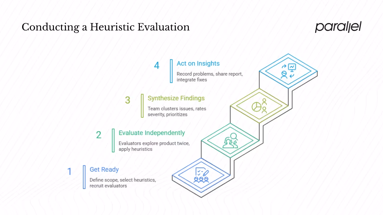
Process: how to conduct a heuristic evaluation
Running a heuristic evaluation doesn’t require fancy tools, but it does require planning. Before you start, outline the steps below.
1. Get ready. Define the scope (a task, device or user group), select or adapt a set of heuristics, recruit three to five evaluators and brief them.
2. Evaluate independently. Each evaluator explores the product twice—first to understand the flow, then to apply the heuristics—keeping the session to one or two hours.
3. Synthesize findings. After the independent reviews, bring the team together to cluster issues, discuss, rate severity and prioritise.
4. Act on the insights. Record each problem with context, violated heuristic, severity and a suggestion. Share the report and integrate fixes into your roadmap.
Before your first session, explain the method to your team and why it matters. Clarifying the purpose helps everyone focus on finding genuine issues rather than personal preferences. Taking a moment to explain what is a heuristic evaluation to your evaluators keeps everyone on the same page.
Real examples and best practices
What does this look like in practice? One engagement stands out. A marketing SaaS tool asked us to improve its onboarding. A quick heuristic evaluation by a designer, a PM and two engineers revealed that a “create workspace” screen was hidden behind an unclear icon and that error messages were confusing. Fixing those issues—violations of visibility of system status and error recovery—raised completion rates from about 55% to 78% in the next release.
Another example comes from the OpenSearch team. In 2025 they ran a heuristic evaluation on a dashboard called “Playground.” They found the method quick and cost effective compared to other research. Evaluators applied Nielsen’s heuristics and a “UI Tenets & Traps” framework. They discovered inconsistent terms, unnecessary steps for trial users and task‑oriented workflows. Their suggestions—focus on user goals, use consistent language and simplify the trial experience—guided subsequent design updates.
These stories reveal broader lessons: involve product and engineering early, make evaluations routine, keep a shared heuristics checklist, invest in user research and use data to prioritise. Heuristic evaluations are a complement to user research, not a replacement.
Challenges and tips
Heuristic evaluation has pitfalls:
- False alarms and missed issues. Some flagged problems aren’t real, and subtle ones may be overlooked. Discuss findings together and validate with data; heuristics are guidelines.
- Bias and blind spots. Mix insiders and outsiders to balance familiarity and fresh perspective.
- Wrong or generic heuristics. Adapt principles to your domain so you don’t miss important issues.
- Under‑resourcing and documentation. More reviewers find more issues up to about five, and clear documentation ensures findings are acted upon.
Understanding the method also means recognising these challenges. A thoughtful process will minimise them.
Conclusion
A well‑run heuristic evaluation saves early‑stage teams time and money. By reviewing your product against proven usability principles, you catch obvious issues before they cost you customers. It’s not a magic bullet—you still need user research to understand motivations and emotional reactions—but it’s a practical tool for shipping better products faster. If you’ve been wondering what a heuristic evaluation is, here’s your next step: pick one critical flow in your app, gather a few colleagues, spend an hour applying the heuristics and use the insights to guide your next release. You’ll be surprised by how much low‑hanging fruit you find.
Frequently asked questions
1) What is meant by heuristic evaluation?
It is a structured review method where evaluators compare a design to a set of usability principles and record any problems. Think of it as an expert inspection; it helps you find obvious issues without recruiting users. If you’re still asking what is a heuristic evaluation, it’s simply this quick, principled inspection.
2) What is a good example of a heuristic?
One of Nielsen’s heuristics is “recognition rather than recall.” The idea is that people shouldn’t have to hold information in memory from one screen to the next—important options should always be visible. For example, a website that keeps navigation visible across pages follows this principle.
3) What are the three elements of heuristic evaluation?
You need a set of heuristics (such as Nielsen’s ten or Shneiderman’s rules), one or more evaluators who understand them and the interface or prototype to inspect. Most teams also use a rating scale to decide which issues to fix first.
4) Who performs heuristic evaluation?
People who understand usability—product designers, researchers or trained PMs usually do it. Nielsen’s research suggests using three to five evaluators to catch most issues. Mixing internal team members and outside experts brings different perspectives.
5) When should you not use heuristic evaluation or what are its limits?
Don’t rely on heuristics to answer questions about user motivation, emotional appeal or complex domain details. Heuristic evaluation can miss subtle problems and can generate false positives. Pair it with user testing, analytics and interviews to build a complete picture.

check out these related blogs