Information architecture (IA) is the quiet force that makes digital experiences work. With over 2 billion websites online and only about 200 million actively maintained, users abandon anything that feels chaotic. Early‑stage startups don’t have the luxury of confusing their visitors; poor site structure leads to high bounce rates and wasted marketing spend.
In this guide I explore IA through the lens of my work at Parallel. I’ll unpack how structure shapes user experience, and why founders and design leaders should treat IA as a core capability—not an afterthought. We’ll cover the definition of IA, its impact on startups, the core elements and methods, practical examples, and how it differs from adjacent concepts like UX and content strategy.
Quick Answer: What Is Information Architecture?
Information architecture (IA) is the practice of organising, structuring and labelling content so users can find and understand it — in websites, apps or intranets. Think of it as the skeleton of your product’s information.
Scroll down for a full guide: why IA matters, how to build it, key methods, real-world examples, and advice tailored for startup founders and design leaders.
What is information architecture in simple terms?
Information architecture is the discipline of making information findable and understandable. It encompasses how we enable people to search, browse, categorize, and label information so they understand where they are and what’s available. Think of the experience of visiting a museum: fossils from the Jurassic period are grouped together so you intuitively know where to find them. The same principle applies to digital products, whether you’re structuring a SaaS dashboard, an e‑commerce site or a mobile app.
IA differs from technical architecture. Technical architecture addresses servers, databases and code. Information architecture, on the other hand, designs the presentation of data—content, navigation, labels, taxonomies and metadata—so that users can find and understand it. In other words, IA is the skeleton and information hierarchy that holds the content of a product together.
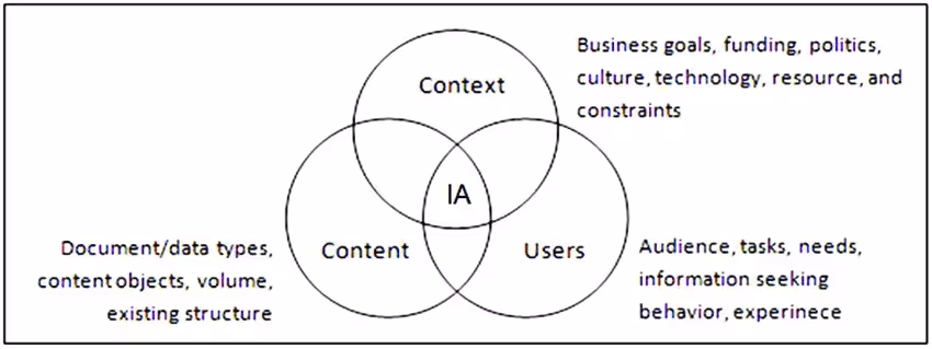
Louis Rosenfeld and Peter Morville describe IA as an information ecology made up of three interdependent elements: content, context and users. Content covers the information available and its relevance. Context reflects business goals, culture, technology and constraints. Users encompass the audience, their tasks, needs and prior expectations. When we design IA, we work at the intersection of these three circles, arranging information so it’s understandable and findable regardless of channel or device.
Why IA matters — the impact on UX & startup success
Startups live and die by user experience (UX). A well‑structured IA reduces cognitive load, enabling users to find information easily and focus on the job they came to do. Conversely, poor IA leads to information overload, decision paralysis and high bounce rates. Research shows that bounce rates across industries range from 26% to 70%, with mobile bounce rates peaking at 51%. Users abandon websites when they can’t locate what they need.
IA’s influence on the bottom line is significant. A well‑designed UI can boost conversion rates by up to 200%, and a comprehensive UX strategy can raise that to 400%. Another study found that 88% of users won’t return to a site with poor UX. In B2B, 80% of purchase decisions depend on customer experience rather than price. Even a one‑second increase in page load time increases bounce probability by 123%. These statistics confirm that investing in IA and UX yields measurable gains in conversion, retention and brand loyalty.
For early‑stage startups, good IA is a force multiplier. Limited budgets often mean there’s no second chance to impress users. A clear IA reduces the need for live support and expensive documentation because users can find answers themselves. It also improves search engine rankings; sites that load quickly and deliver coherent navigation perform better in search. By organizing information around user needs rather than internal department structures, startups can accelerate onboarding, shorten time‑to‑value and improve retention—essential outcomes when every customer counts.
Poor IA has hidden costs. If users can’t find the product page easily, they’ll leave, leading to lost revenue. Confusing navigation and high bounce rates correlate with lower conversion rates and decreased search engine rankings. As Matt Rae, Senior Product Manager at Adobe, observes, investing up front in IA avoids paying the price later—in the form of increased support volume, frustrated users and lost business.
Core elements of information architecture
Building effective IA requires understanding its component parts. The following elements form the backbone of a coherent information structure.

1) Navigation design and site structure
Navigation isn’t the same as IA. IA defines the structure of information—the hierarchy and relationships between pages—whereas navigation refers to the interface elements (menus, breadcrumbs, links) that allow users to traverse that structure. Good navigation starts with good IA. Without a clear content hierarchy, no amount of menu styling will save users from confusion.
Designing site structure involves mapping user flows through tasks and goals. This includes global navigation (primary menus), local navigation (sidebars or in‑page links), and context‑specific controls like filters or sort options. Deep hierarchies may require breadcrumbs or mega‑menus, while simpler experiences might adopt flat structures. The right choice depends on content volume, user needs and the resources available for maintenance.
2) Taxonomies and metadata
Taxonomies are classification systems—categories, subcategories, tags—that group similar content. Metadata provides descriptive labels (titles, descriptions, keywords) that enhance searchability. Good taxonomies reduce information overload by presenting fewer, meaningful choices. They also support scalability; as your product grows, new content can be slotted into an existing classification scheme without breaking the IA.
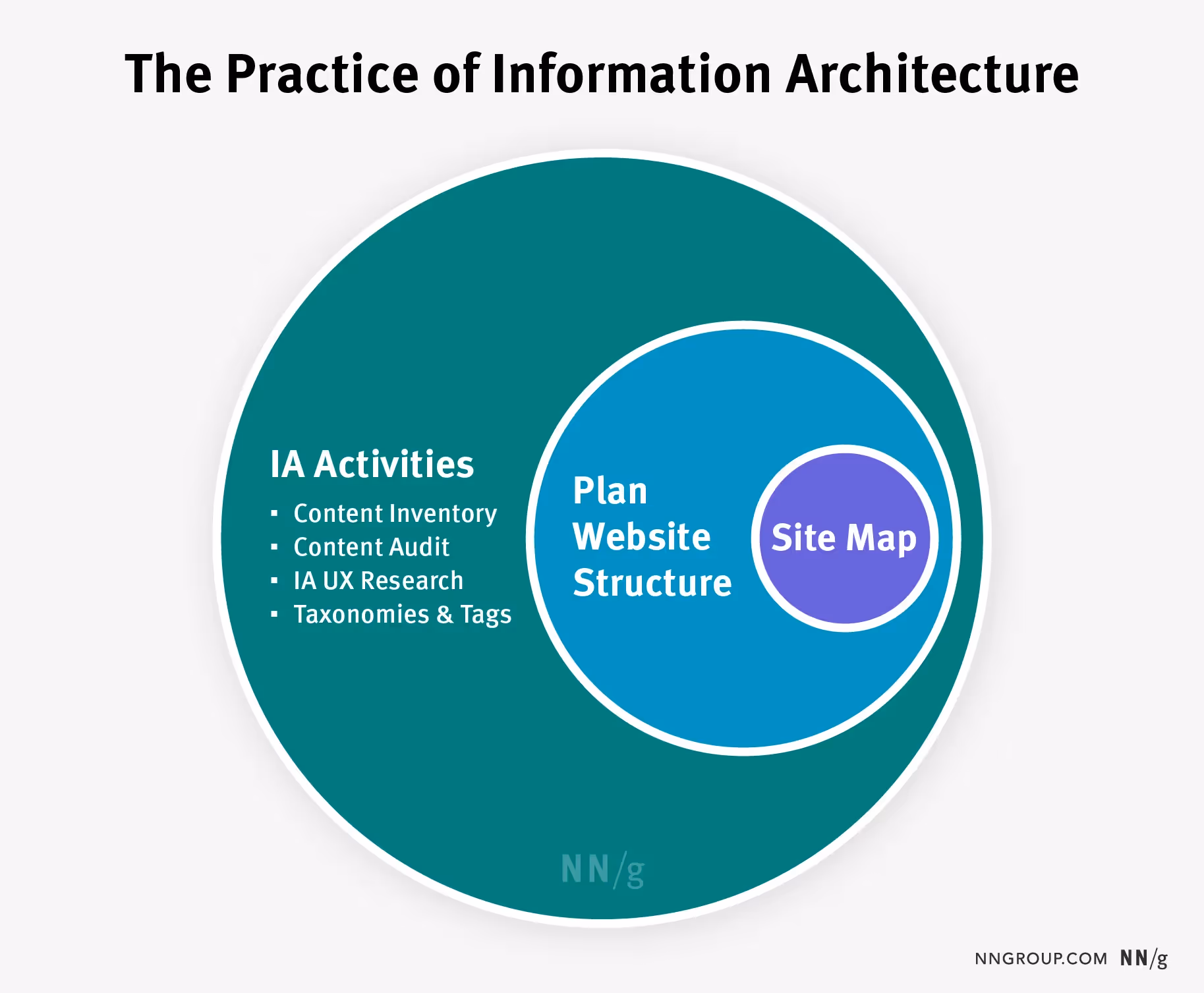
3) Sitemaps vs information architecture
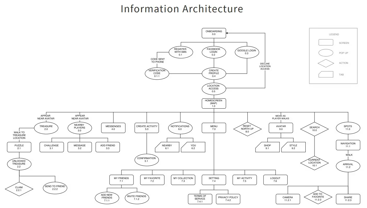
Many teams confuse sitemaps with IA. A sitemap is a visual diagram or spreadsheet that presents the structure of a website, while information architecture is the strategic practice of defining that structure. As the CareerFoundry guide explains, IA is the backbone; the sitemap is one deliverable that makes it visible. Navigation and wireframes are other deliverables built on IA. Treating a sitemap as a substitute for IA is risky because it focuses on outputs, not the underlying strategy.
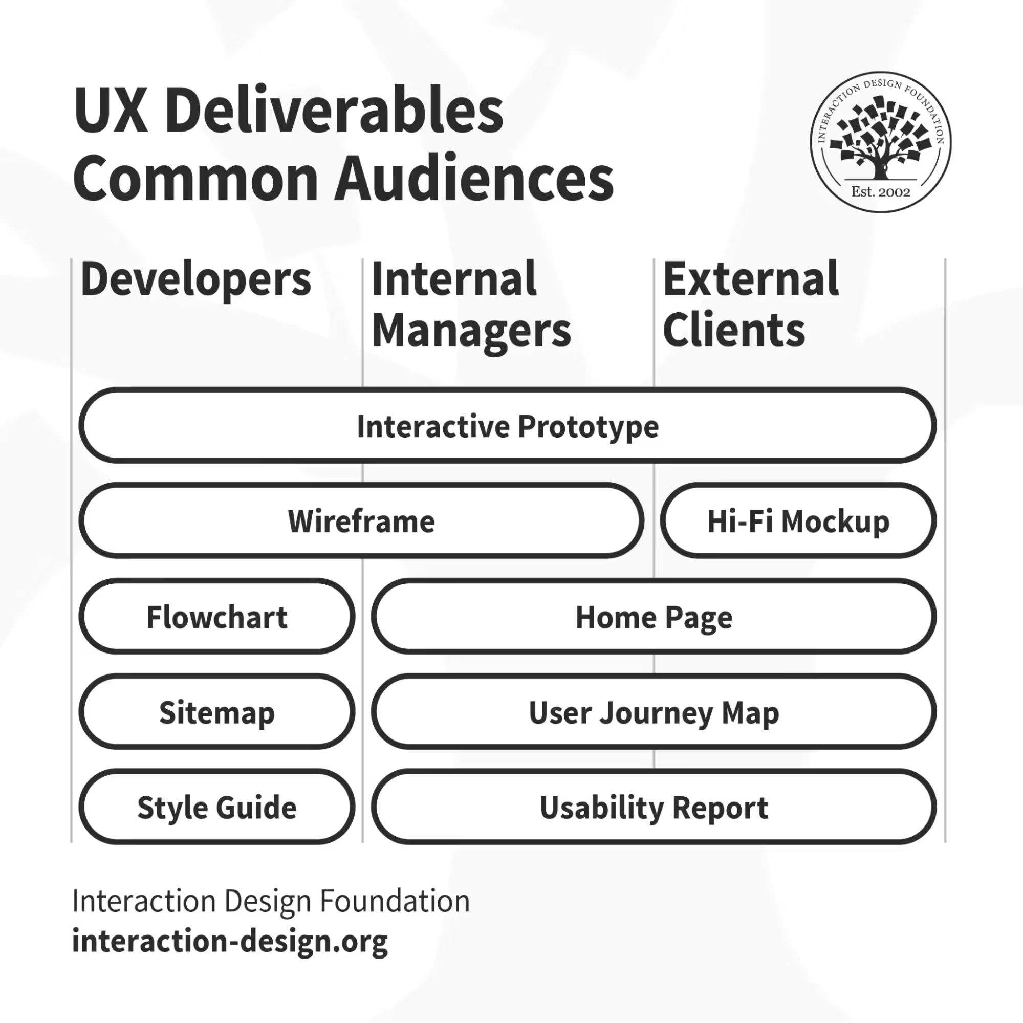
4) Wireframes, hierarchies and other deliverables
Information architects produce site maps, wireframes, hierarchies, navigation maps and metadata schemas. Wireframes visualize page layouts and show how navigation and content blocks will be presented. Hierarchy diagrams map parent‑child relationships between pages, features and content types. These deliverables serve as communication tools between designers, developers and stakeholders, ensuring that everyone understands the structure before visual design begins.
Approach & methods for building IA
Great IA doesn’t happen by chance. It emerges from a deliberate process grounded in user research, content analysis and iterative testing.
1) Understand content, context and users
As noted earlier, IA sits at the intersection of content, context and users. Start by inventorying your existing content—pages, media, documentation, knowledge base articles—to understand what you have and what’s missing. Clarify the business goals and constraints: Are you optimizing for conversion, trial sign‑ups or knowledge sharing? Then define the user goals: what tasks do users need to accomplish, what are their motivations, and what constraints do they face (device, language, accessibility)?
2) Card sorting & tree testing
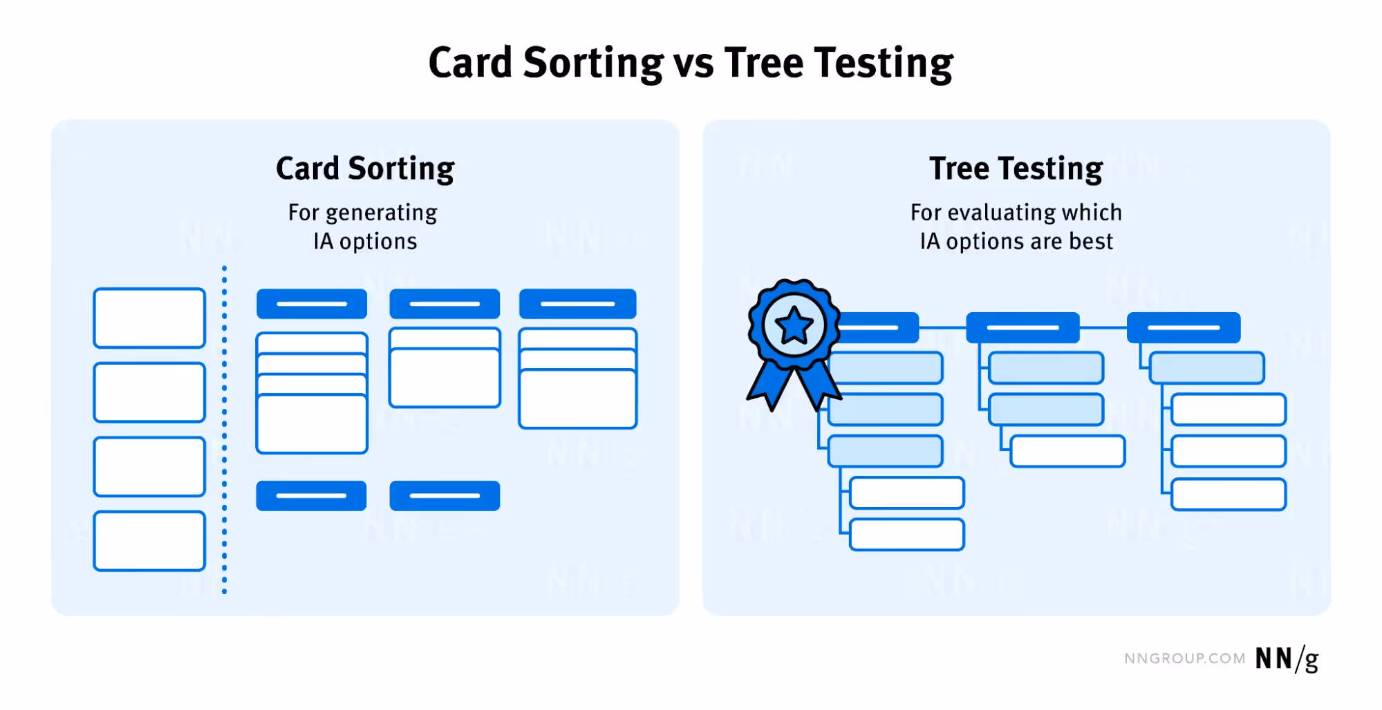
Card sorting is a participatory technique in which users group content cards into categories that make sense to them. The Smashing Magazine guide stresses that card sorting is cheap, reliable and helps diagnose poorly organized content. In an open card sort, participants create their own groups and labels. In a closed card sort, categories are predefined and users assign cards to them. Combining open and closed card sorts helps you validate both the overall taxonomy and specific labels.
Tree testing evaluates whether users can find information in your proposed hierarchy. Participants navigate the IA without a visual interface, using only link names. Tree testing reveals whether category names are clear and whether content is grouped in a user‑centered manner. Together, card sorting and tree testing reduce guesswork and ensure that your navigation aligns with user expectations.
3) Flat vs deep structures
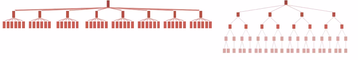
OneNine’s research highlights that mobile bounce rates are higher than desktop bounce rates (51% vs 26–70% overall). On small screens, deep hierarchies can be cumbersome. Shallow or flat structures reduce the number of taps required to reach information and are generally more mobile‑friendly. Deep structures can work for large information systems (e.g., intranets or knowledge bases) when supported by breadcrumbs, mega‑menus and robust search. The choice depends on the volume of content and how often users need to navigate across categories.
4) Iterate using analytics and feedback
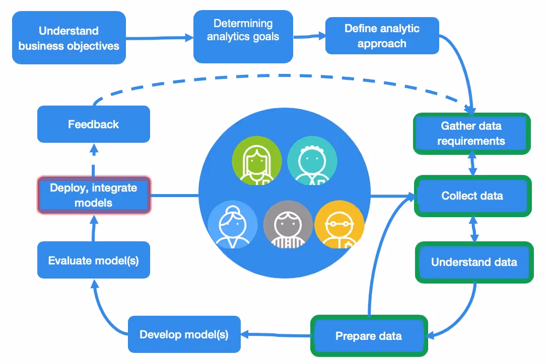
IA isn’t set in stone. After launching or updating your IA, collect analytics on page traffic, bounce rates and search queries. Run usability testing to observe how users navigate the structure and where they get lost. Combine qualitative feedback with quantitative metrics to refine your navigation and labeling. According to Userlytics’ 2025 report, 42% of organizations increased their UX research budgets by 10–30% in the last year, and 56% are using AI to analyze user insights. Investing in continuous research ensures that your IA evolves with user needs and business goals.
Examples of information architecture in practice
Digital product example: bookstore sitemap
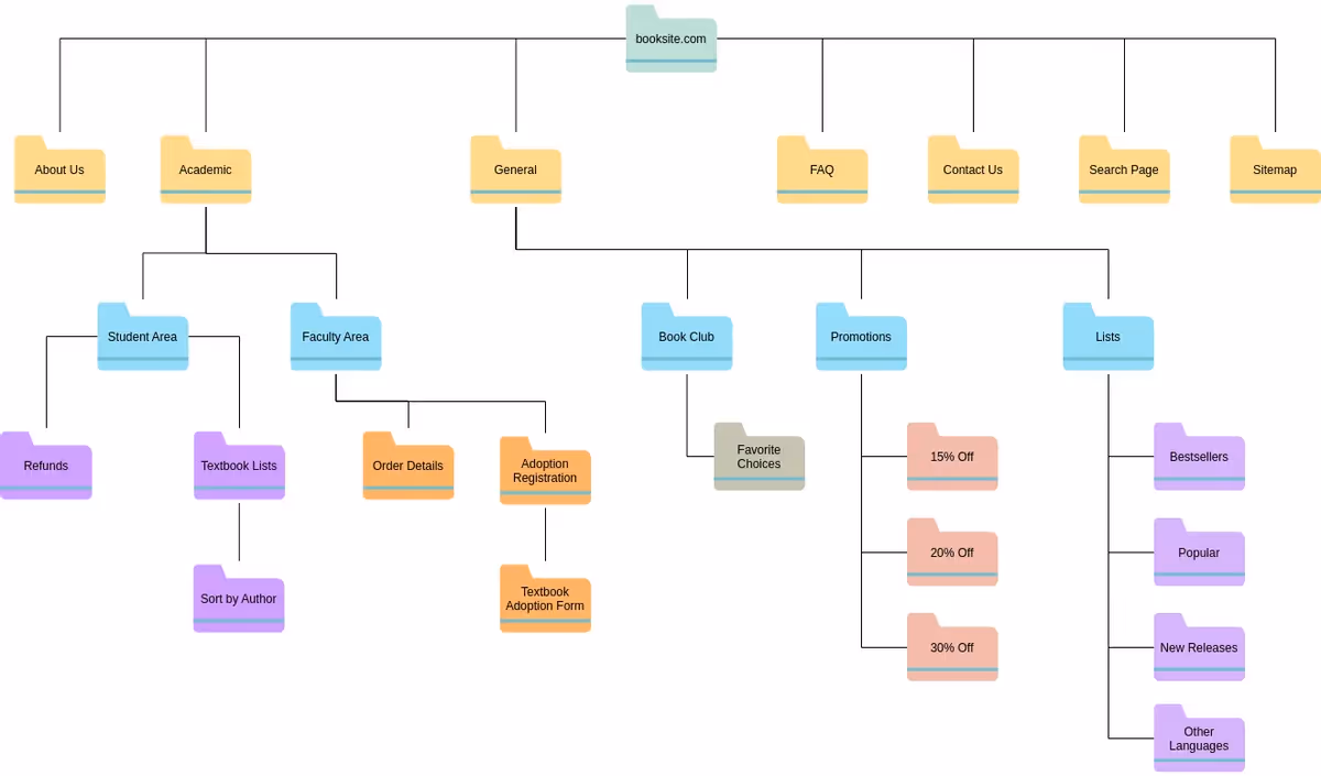
Interaction Design Foundation provides a bookstore sitemap illustrating how IA works. At the top level the site includes categories like New Releases, Genres, Authors and Help. Under Genres, subcategories might include Fiction, Non‑Fiction, Children’s Books and Science Fiction. Each category cascades into more specific subgenres. The hierarchy makes it easy to browse by category, while search supports users who know exactly what they want.
In my practice, I’ve applied similar patterns to SaaS product documentation. Grouping articles by task (e.g., “Integrations,” “Billing,” “API Usage”) instead of internal departments helps users find answers quickly. Cross‑linking related topics and adding contextual breadcrumbs reduce dead ends and improve self‑service support.
Intranet case study

A few years ago our team helped a fintech startup rework its internal knowledge base. The intranet had grown organically around departmental silos—HR, Engineering, Marketing—and employees struggled to find resources. We reorganized the site around common tasks such as “Onboarding,” “Security Policies,” and “Engineering Processes.” We introduced mega‑menus that displayed top tasks and links to relevant documentation on hover. Usage analytics showed a 32% reduction in search queries for common tasks and a 15% drop in support tickets within three months.
Startup scenarios
For MVP landing pages, clarity is paramount. In early projects we often limit top‑level navigation to three to five items—Product, Pricing, Docs, Support, plus a call‑to‑action like Get Started. This reduces choice paralysis and directs attention to the primary action. For feature documentation, organize content by user goal (how to accomplish a task) rather than by feature name. And for marketing content, group resources by audience or problem (e.g., “For Developers,” “For Product Teams,” “Scaling with AI”). These small, context‑aware IA decisions help prospects and customers find relevant information quickly, even with limited content volume.
IA vs related concepts: what’s the difference?
Information architecture vs user experience
Information architecture is foundational to user experience but not synonymous with it. IA focuses on organizing and labelling content so it’s findable and understandable. User experience (UX) encompasses the entire journey—including visual design, interaction design, accessibility, performance and emotional response. A beautiful interface cannot compensate for a confusing IA. Conversely, a clear IA enhances UX by reducing cognitive load and friction.

Information architecture vs content strategy
Content strategy determines what content to create, why it matters and how it will be produced and maintained. The Smashing Magazine article warns that large sites often suffer when there’s no clear content strategy. Content strategy answers questions such as: Who updates the website? How do we retire outdated content? What taxonomies and labels do we use? Information architecture then decides where that content lives and how it’s organized and labeled. The two disciplines are complementary; one determines the message and maintenance, the other structures and presents it.
Information architecture vs UX deliverables
UX deliverables include wireframes, prototypes, personas, journey maps, user flows and content plans. IA deliverables—site maps, hierarchies, wireframes and metadata schemas—feed into these artifacts. For example, a wireframe defines page layout and navigation based on the IA, while user flows map tasks across that structure. Recognizing the distinction ensures that teams allocate time to both the conceptual structure and the visual/interactive design.
Practical tips for startup founders & product leaders
- Start early: Begin shaping your IA before you write code or design high‑fidelity screens. IA work informs navigation, page templates and content creation. As Donna Spencer notes, if you can’t articulate why you’re creating IA or what you want to achieve, stop and clarify your goals.
- Align with business and user goals: Define what success looks like for both the company and users. This helps prioritize content and navigation. When the goal is revenue, IA should guide users toward conversion paths; when the goal is education, IA should emphasize learning resources.
- Conduct card sorts and tree tests: Involve team members or actual users in grouping and labeling content. Use open card sorts to discover natural groupings and closed sorts to validate existing categories. Follow up with tree testing to verify that people can find information using your proposed hierarchy.
- Prefer shallow structures for mobile: With mobile bounce rates around 51%, reduce the number of taps required to reach content. Where deeper hierarchies are unavoidable, support them with breadcrumbs and search.
- Name things clearly: Use labels that reflect how your users think about tasks. Avoid internal jargon or ambiguous terms. Clear labelling improves information scent and reduces cognitive load.
- Iterate based on analytics: Measure bounce rates, page exits and search queries to identify navigation problems. Adjust labels, groupings and hierarchy based on evidence. According to Userlytics, organizations are increasing UX research budgets—42% increased budgets by 10–30%—because continuous research delivers value.
- Collaborate across disciplines: Involve product managers, designers, content writers, engineers and support teams. Each brings a perspective on user needs and business priorities. Shared ownership prevents siloed thinking, one of the main causes of bad IA.
Conclusion
Information architecture isn’t glamorous, but it’s the foundation of effective UX. When we organize content around user goals and business context, we reduce cognitive load, improve findability and support seamless navigation. Strong IA reduces bounce rates and increases conversions; statistics show that well‑designed UI and UX can boost conversion by 200–400%. It keeps users focused, reduces support costs and improves retention. Poor IA, on the other hand, leads to lost revenue and reputational damage.
In my experience working with early‑stage startups, embedding IA at the start of product development is one of the wisest investments a team can make. It forces clarity about what you’re building, who it’s for and how information will grow as your product scales. Treat IA as a strategic discipline, not a deliverable. The time you spend up front pays dividends in usability, scalability and customer satisfaction.
FAQ
Q1. What is information architecture in simple terms?
It’s the practice of arranging information—through navigation, labels, taxonomies and metadata—so users can find and understand it. IA deals with search, browse, categorization and labelling, and it operates in both physical and digital environments.
Q2. What is an example of information architecture?
A bookstore website demonstrates IA with top‑level categories like Genres, New Releases and Authors, each containing subcategories. In practice, we’ve reorganized startup intranets around tasks (e.g., onboarding, security policies) instead of departments to improve findability.
Q3. Is information architecture the same as UX?
No. IA is a foundational part of UX focused on organizing and labelling information so it’s findable and understandable. UX covers the entire user journey—from visual and interaction design to performance, accessibility and emotional impact. Good UX requires good IA, but IA alone does not guarantee a great user experience.
Q4. What is the role of an information architect?
An information architect defines the structure, labels, taxonomies and navigation of a product. Deliverables may include site maps, wireframes, hierarchies, navigation maps and metadata schemas. The architect collaborates with designers, developers and content strategists to ensure information is organized around user needs and business goals.
Q5. Does every startup need information architecture?
Yes. Even simple landing pages benefit from thoughtful IA. Good IA reduces bounce rates, improves conversions and scales with your product. Skipping IA or relying on ad‑hoc structures may save time initially but leads to higher support costs and lost opportunities later.

check out these related blogs


.avif)