What Is Jacob’s Law? 2026 UX Guide & Design Examples
What is Jacob’s Law? Discover the 2026 UX rule: users spend most of their time on other sites. Learn how to use familiar UI patterns with real design examples.
When someone arrives at your service, they have an immediate picture of how things should work. They expect the logo in the top left, links to look like links and the shopping‑cart icon where it usually sits. That gut feeling forms the basis of what is Jacob's law: people spend most of their time on other sites, so they want yours to behave like the ones they already use. For founders and product leaders, meeting those expectations removes friction, speeds adoption and cuts support. This article explains the idea, why it matters and how to use it without losing your unique voice.
What Jakob’s law means
Jakob Nielsen’s principle – often spelled Jakob’s law – says that users bring expectations from other services. People transfer mental models from past experiences, so they want your interface to work like the ones they already know. When you place your logo in the top left and put a search bar where people look for it, you reduce the time they need to learn your interface. Nielsen coined the term in 2000 after observing that websites with standard layouts did better than those that tried to be too distinctive. This understanding is what is Jacob's law in practice.
The Laws of UX project summarises the idea: users transfer expectations, familiar patterns help them focus on tasks rather than the interface and when rolling out changes you should offer a bridge back to the old version. In essence, Jakob’s law tells us to match the mental models people already have.

Why familiarity fuels growth
First impressions happen fast: research shows that nearly 94% of the way people judge a site is based on its design. Bad experiences carry a high price; 88% of visitors won’t return after a frustrating visit. Good mobile experiences, on the other hand, keep 74% of visitors coming back, and smooth flows keep 90% of smartphone shoppers engaged. Early‑stage teams can’t afford to burn traffic, so respecting conventions is a growth lever. Recognising what is Jacob's law helps founders and PMs make smarter choices early on.
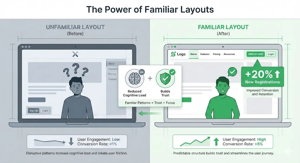
When your menu sits on the right or your sign‑up form behaves unpredictably, people hesitate. Teams that adopt standard patterns often see conversion rates double or triple. Familiar layouts also build trust; a 2024 article on the rule of familiarity notes that using common layouts and navigation patterns lowers cognitive load and helps visitors feel at ease. In our work, simplifying sign‑up flows and sticking to familiar patterns reduced time‑to‑value by 30% and cut support tickets in half. Respecting mental models isn’t about playing it safe; it’s about helping people get to the value you offer without unnecessary friction.
Where the principle came from
Nielsen introduced this law in his article “End of Web Design” in 2000. He observed that people spend most of their time on other sites and therefore expect yours to work the same. Standard design elements like the cart icon, blue links and predictable menu placement were already helping the biggest sites succeed. The law has since become a staple of UX education; the Laws of UX series lists it as one of its core heuristics. A 2024 update on mental models explains that users build their beliefs about a system from past experiences and bring them to every new interface. This psychological insight reinforces why the law remains relevant across web, mobile and other interfaces.
Putting the law to work
Understanding what is Jacob's law is only useful if you apply it. The steps that follow show how to recognise familiar patterns, decide when to innovate and measure whether your design meets expectations. They are rooted in research and our experience guiding early‑stage teams. To put what is Jacob's law into action, you need to translate these insights into everyday decisions.

1) Use conventions to your advantage
Start by noting the patterns your audience expects. In retail, shoppers look for a cart icon in the top right and an Add to cart button next to each product. The logo belongs in the upper left and global navigation runs across the top or down the left. Breaking these conventions without a clear reason raises friction. A Nielsen Norman study found that returning home is six times harder when the logo is centered rather than aligned left. Participants clicked the leftmost link thinking it was the home link.
Look at the successful products in your space and identify the layouts, labels and interactions that repeat. Follow those patterns where they support critical tasks. When in doubt, run quick tests with your audience and see where they expect things to be. Matching their expectations frees them to focus on their goal.
2) Know when to introduce something new
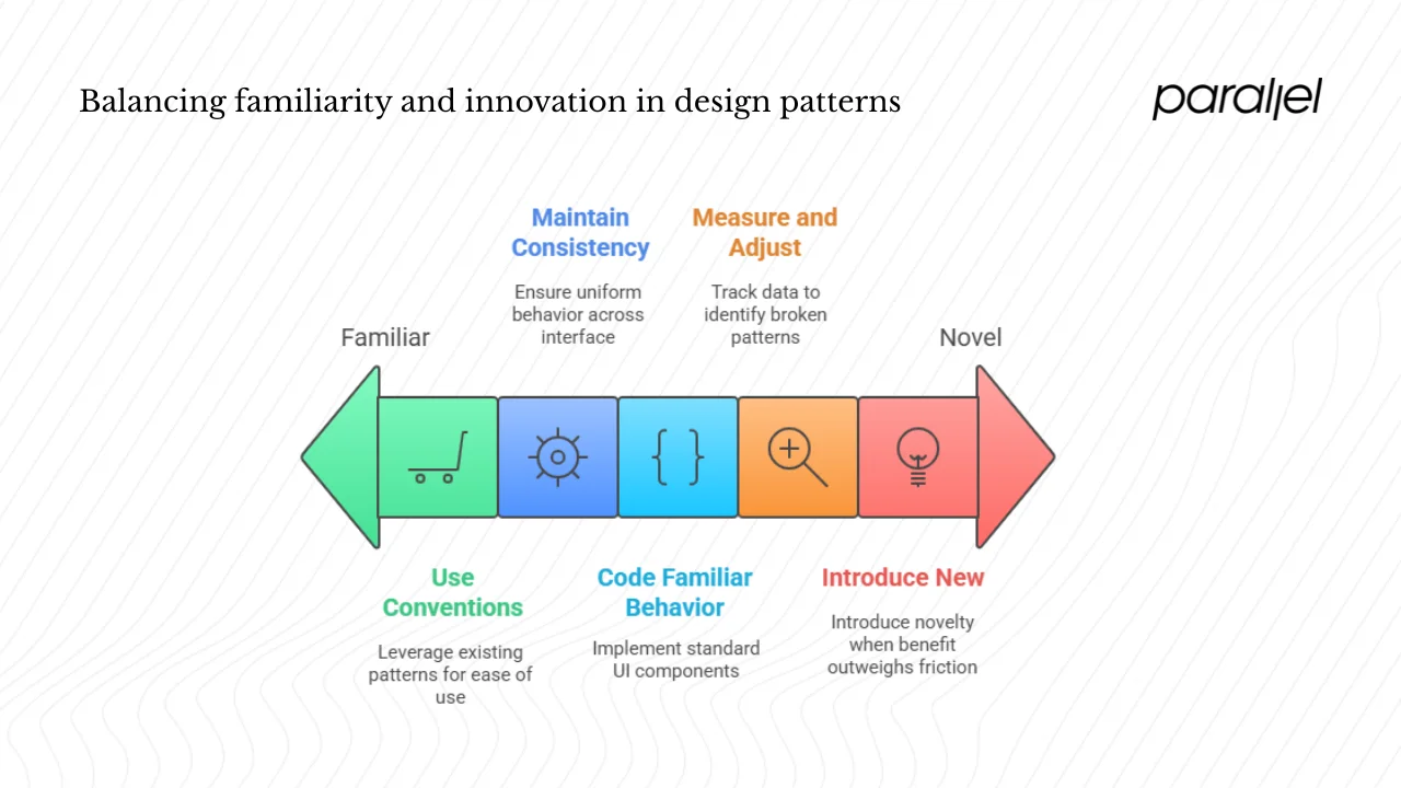
Jakob’s law doesn’t ban originality. The Familiar vs Novel essay notes that familiar designs transfer experience and reduce friction but that novelty can help a product stand out or support exploration. Use this checklist when considering a novel pattern:
- Does it map to existing mental models? If not, learning costs will be high.
- Is the new pattern necessary for differentiation or delight? Only introduce something unfamiliar when the benefit outweighs the friction.
- Can you provide a fallback? Offering the option to use the old interface or a clear tutorial reduces frustration.
For example, in an AI‑powered dashboard we introduced a radial menu. We knew it didn’t match common patterns, so we added a short animation and a tooltip explaining how to use it. Without that guidance, people missed it entirely. When novelty serves a purpose and is supported by cues, it can work. Otherwise, stick to the familiar.
3) Maintain consistency
Consistent patterns across your interface allow people to carry learning from one part of your product to another. The VERSIONS article stresses that using common layouts and navigation patterns lowers cognitive load and builds trust. Make sure that buttons, links and forms behave the same way everywhere. The mental models article adds that people expect the back button to act like an “undo” and not send them up a level. Breaking such expectations causes frustration.
For navigation, place menus where people look, label sections clearly and use a visible search bar. The left‑aligned logo pattern helps people return home quickly. Consistency extends to wording too: call things by the names your audience already knows. In our projects we’ve seen that a shared component library between designers and engineers helps keep patterns consistent without extra effort.
4) Code for familiar behaviour
Engineers can bake in familiarity by using standard UI components and avoiding custom behaviours that surprise people. A 2024 article on mental models notes that users bring knowledge from other sites; your terminology and behaviour should reflect that. Use accessible HTML patterns for links, forms and buttons, stick to grid layouts and test at different breakpoints to ensure elements stay where people expect them. A shared design system makes it easier for teams to implement patterns consistently.
5) Measure and adjust
Data will tell you whether your design meets people’s expectations. Track completion rates, time to complete tasks and drop‑off points. If people stall or leave at a certain step, ask whether you broke a familiar pattern. Studies show that 88% of visitors won’t return after a bad experience, whereas good experiences encourage return visits.
Pitfalls often stem from novelty for novelty’s sake. The mental models article notes that mismatched mental models are common when designs try something new. For instance, an ecommerce site that auto‑adds shipping insurance to a cart violates the expectation that the shopper controls what goes into it. Before shipping a change, test with real people. If you must break with convention, provide clear cues or onboarding to help them learn the new interaction.
Examples
A layout that works
A subscription software service we reviewed kept its logo on the left, placed navigation across the top and used familiar patterns for sign‑up and login. New registrations jumped by 20%. People knew where to find things and could focus on evaluating the product. This supports research showing that familiar patterns build trust and reduce cognitive load.

A design that caused friction
A fashion retailer moved its logo to the centre to appear unique. Nielsen Norman’s study found that visitors were six times more likely to fail to return home when the logo was centered. Many clicked the leftmost link thinking it was the home link, showing how small deviations can hurt usability.

Using the law during a redesign
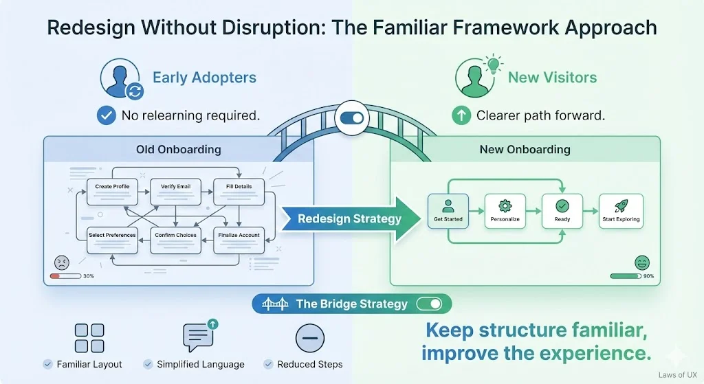
During an overhaul of our own onboarding flow, we kept the layout familiar but simplified language and removed steps. Early adopters didn’t need to relearn, while new visitors benefited from a clearer path. This aligns with the Laws of UX advice to offer a bridge back to the old version during big changes.

Clearing up misconceptions
Is it Jacob’s or Jakob’s? People often spell it with a c, but the principle is named after Jakob Nielsen. Searching for what is Jacob's law will still point you to the same concept, but using the correct spelling credits the right person.
Does it mean you should copy other sites? Respecting mental models isn’t cloning; it’s matching patterns that visitors already understand. You can still differentiate through content, tone and small touches. The challenge is to balance familiarity with originality.
Is it only for websites? The law applies to any interface – mobile, watch, voice or desktop. People carry mental models across platforms. For example, smartphone users expect the back gesture to undo the previous action, not to jump to a higher level.
Is it a legal rule? It’s a heuristic based on research. Use it as a guide, not a mandate; test when you choose to break from conventions.
Checklist for product leaders
- Place core elements where people expect them. Menus belong on the top or left; the logo sits on the left and links to home.
- Use familiar labels and patterns. Copy conventions on forms, buttons and notifications.
- Preserve key flows during redesigns. Offer a transition or a way to revert.
- Introduce novelty only when it serves a clear purpose. Use the checklist above to decide.
- Monitor your metrics. A spike in drop‑offs or support issues often signals a broken pattern.
- Share a design system. Consistency across features helps maintain familiarity.
Wrapping up
At its core, what is Jacob's law reminds us that visitors come with expectations formed elsewhere. Keeping what is Jacob's law in mind helps you design experiences people can pick up instantly. Meeting those expectations removes friction and builds trust, freeing people to focus on the value you provide. For early‑stage teams, embracing familiar patterns is a practical way to boost adoption and reduce support. The more your product works as people expect, the faster they can reach their goal.
Familiarity doesn’t equal dullness. When your interface fades into the background, your story and offering take centre stage. Ask yourself: which parts of our design require someone to relearn? If you’re forcing too much learning, return to the basics and respect what people already know.
FAQ
1. What is Jakob’s law?
Jakob’s law says people prefer sites that work like the ones they already use. When layouts, controls, and patterns feel familiar, visitors move faster and feel more in control. Designers follow this to cut confusion and help people focus on tasks instead of learning new ways to get around.
2. What is Jacob’s rule?
Jacob’s rule is a simple idea: if a feature makes someone think too long, it needs improvement. The rule pushes for clear choices, predictable actions, and layouts that support quick understanding. It encourages reducing friction so people feel confident while moving through a product or site.
3. What is an example of Jakob’s law?
A clear example of Jakob’s law is a shopping cart icon placed in the upper right corner of a store site. People expect that spot because they have seen it many times elsewhere. Using that pattern helps them find their cart instantly without learning anything new.
4. What is Jakob’s law of familiarity?
Jakob’s law of familiarity focuses on repeated patterns. When people encounter similar layouts across many sites, they grow comfortable with certain actions and placements. Designers rely on that shared comfort, using known structures so visitors understand what to do with almost no effort or instruction.


.avif)


