It’s common to see teams invest weeks polishing colors, icons and micro‑interactions only to realise later that they’re perfecting the wrong concept.
I still recall an early client who spent an entire sprint making a payment screen pixel‑perfect, only to find out in testing that their customers didn’t even want that step in the flow. That painful episode taught us an important lesson: start with simple, throwaway prototypes to test the core idea before adding detail.
In this article you’ll learn what a low fidelity prototype is, why it matters in the early design stage, and how to use it effectively. We’ll walk through definitions, types, examples and best practices so you can avoid expensive rework and make your product decisions with confidence.
Why low fidelity prototypes matter at the early design stage
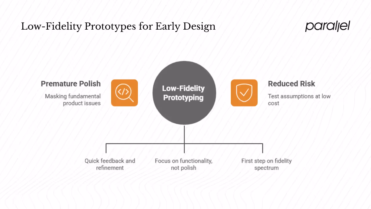
1) Avoiding premature polish
Jumping straight to refined interfaces might feel productive, but it often masks fundamental product issues. The Nielsen Norman Group reminds us that tearing up finished code is far more expensive than discarding a simple prototype. When teams focus on perfection too early, they become emotionally attached to their work and resist making necessary changes. Starting with crude sketches instead keeps attachments low and encourages honest feedback.
2) Rapid iteration and feedback
Low fidelity prototypes enable quick iteration. The 2025 F22 Labs article explains that teams can sketch multiple approaches to a checkout flow in the same time it takes to build a single high‑fidelity version. The rough look signals that nothing is set in stone, making it easier for stakeholders to suggest big changes. According to Dovetail’s 2024 guide to usability testing, early prototype testing uncovers confusing navigation and unclear interfaces before major resources are committed. These insights help product owners refine their concept without heavy investment.
3) Saving cost and time
Because they are quick to make and easy to change, low fidelity prototypes reduce cost. LogRocket’s 2024 article emphasises that such prototypes are quick to create and update. The same piece points out that simple sketches let designers focus on functionality and user flow rather than visual polish. This early focus prevents wasted engineering effort later. Outside of software, rapid prototyping in manufacturing shows similar efficiencies: a 2025 report on 3D printing notes that rapid prototyping can cut development time by up to 50% and reduce manufacturing costs by as much as 90%. While that statistic refers to physical products, it illustrates the broad cost‑saving impact of early prototyping.
4) Fitting into the design process
Low fidelity prototypes are the first rung on a spectrum. Teams typically move from low to mid to high fidelity as the concept solidifies and needs better validation. Starting lo‑fi allows wide exploration without commitment. As the design matures, increasing fidelity helps test finer interactions and presentation details. Keeping this progression in mind prevents rushing to build hi‑fi mock‑ups too soon.
If you’re still wondering what is a low fidelity prototype, think of it as that humble first experiment that lets you test assumptions at a low cost and pivot quickly. Starting with this rough tool reduces risk and sets the stage for more polished iterations.
What is a low fidelity prototype
A low fidelity prototype is a rough, early representation of a product. F22 Labs describes it as a simple version that focuses on how the product works rather than how it looks. LogRocket adds that it uses monochrome shapes and minimal text as building blocks instead of polished UI elements. In plain terms, it’s a sketch or basic wireframe that outlines layout and flow without delving into typography, colors or detailed interactions. When people ask what is a low fidelity prototype, think of paper sketches, napkin diagrams, or simple screens made in tools like Figma with grey boxes and arrows.
What it isn’t
Lo‑fi prototypes are not half‑finished products. They are intentionally incomplete and not meant to impress stakeholders. They are also different from polished mockups or final assets; there’s no point in perfecting every pixel’s position or choosing fonts at this stage. A proper low fidelity prototype should be quick to build and easy to change.
Differentiating from related terms
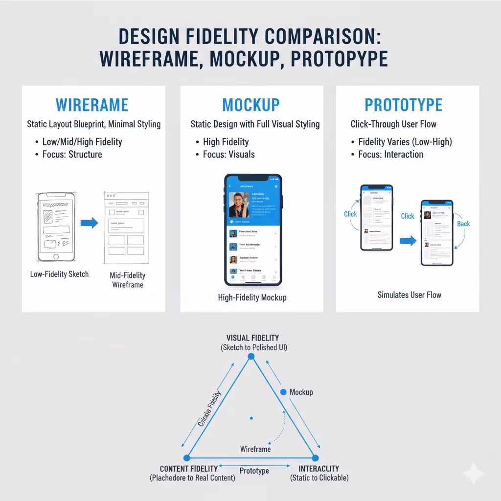
It’s easy to confuse low fidelity prototypes with wireframes or mockups. A wireframe is essentially a static layout blueprint; it may be low, mid or high fidelity depending on detail. A mockup often refers to a static representation with visual styling but no interactivity, usually higher on the fidelity scale. A click‑through prototype links multiple screens together to simulate how a user moves between pages; it can be low or high fidelity depending on detail. The important point is to understand that fidelity has three axes: visual, content and interactivity. The Nielsen Norman Group’s research explains that prototypes can range from hand‑sketched single pages to multipage realistic screens. Low fidelity prototypes score low on all three axes: minimal visuals, stand‑in content and limited interactivity.
Core characteristics and design principles
Low fidelity prototypes share several characteristics that make them valuable tools:
- Simplicity and abstraction – They strip away visual polish and complexity, using boxes and lines to represent elements. LogRocket points out that low fidelity prototypes often rely on monochrome shapes instead of full‑colour UI.
- Focus on flow – These prototypes prioritise user flow and task sequences over visual detail. They help teams understand how users will move through an app or site. The interactive parts are simple click targets or manual transitions, sometimes handled by a “wizard” in usability tests.
- Use of stand‑ins – Because the goal is to study structure, grey boxes and filler text stand in for images and copy. While stand‑in text can sometimes confuse test participants, Nielsen Norman Group’s 2024 article on promptframes observes that realistic stand‑in content can improve feedback by reducing confusion. Nevertheless, early sketches often use lorem ipsum to keep the focus on flow.
- Limited interactivity – Lo‑fi prototypes may be static or require a facilitator to act as the computer. The “Wizard of Oz” technique described by Nielsen Norman Group involves a designer manually switching screens in response to user actions. This low‑tech approach lets teams test concepts without building any real functionality.
- Iterative and disposable – They are meant to be changed or thrown away. F22 Labs emphasises the psychological safety created by rough sketches—stakeholders feel comfortable proposing major changes when the work looks provisional. This leads to rapid iteration and idea generation.
- Encouraging cross‑functional input – Because these prototypes are simple, non‑designers can sketch or modify them. This invites product managers, engineers and even customers to participate. The accessible nature of low fidelity prototypes democratizes early design discussions.
These principles fit the mindset shift required to design effectively: less detail, more learning. When you start by clarifying flows and important tasks, you reduce risk and set up a stronger foundation for later polish.
Put simply, all of these traits answer the question of what is a low fidelity prototype: it’s an accessible, learning‑oriented model that helps teams progress with confidence.
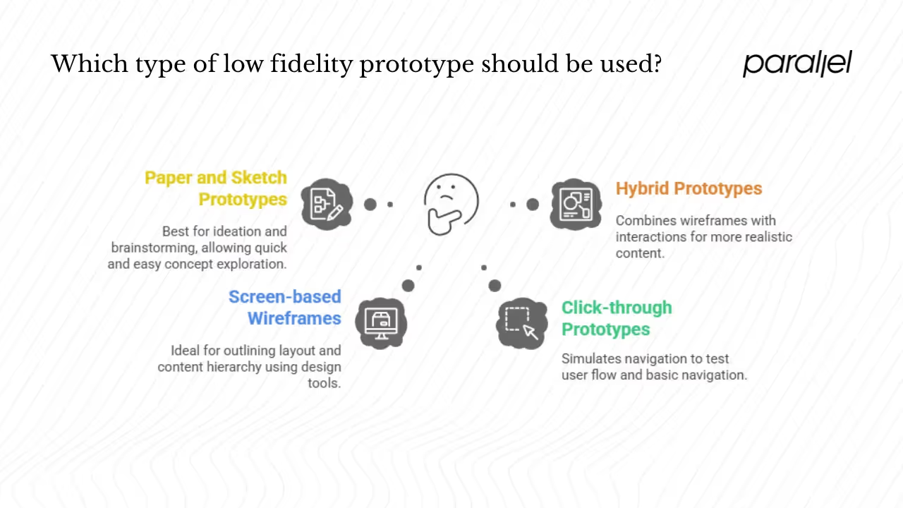
Types and formats of low fidelity prototypes
Low fidelity prototypes come in many formats. Each type has strengths and is suited to different stages of ideation and validation.
1) Paper and sketch prototypes
Best for ideation and brainstorming. Hand‑drawn sketches and paper cut‑outs are the simplest prototypes. Bricx Labs describes hand‑drawn wireframes as powerful tools for bridging abstract thinking and concrete visualization, allowing multiple concepts to be tried quickly. These sketches can be rearranged or discarded easily, making them ideal for early workshops.
2) Screen‑based wireframes
Layout blueprints made in design tools. F22 Labs lists wireframes as a structured format that uses simple shapes and lines to outline layout and content hierarchy. These static wireframes can be built in Figma, Sketch or Balsamiq. They give a clearer view of information hierarchy and screen organization without visual design.
3) Click‑through prototypes
Simulate navigation. Clickable prototypes link several lo‑fi screens together so that users can tap through a flow. Dovetail’s guide notes that clickable wireframes help test user flow and basic navigation. While they remain visually simple, they approximate the feel of using the product and reveal whether users understand where to go next.
4) Hybrid lo‑fi prototypes in screen‑based tools
Lo‑fi assets made with design software. Designers often combine simple wireframes with basic interactions in Figma or other prototyping tools. These prototypes might include simple transitions between screens or slightly higher content fidelity. The 2024 Nielsen Norman Group article on promptframes introduces the idea of adding prompt documentation for generative content to wireframes. While this is still considered lo‑fi, it enhances the usefulness of the prototype by making stand‑in content more realistic.
Format comparison
Here’s a quick comparison of different lo‑fi formats, their typical use cases and pros/cons:
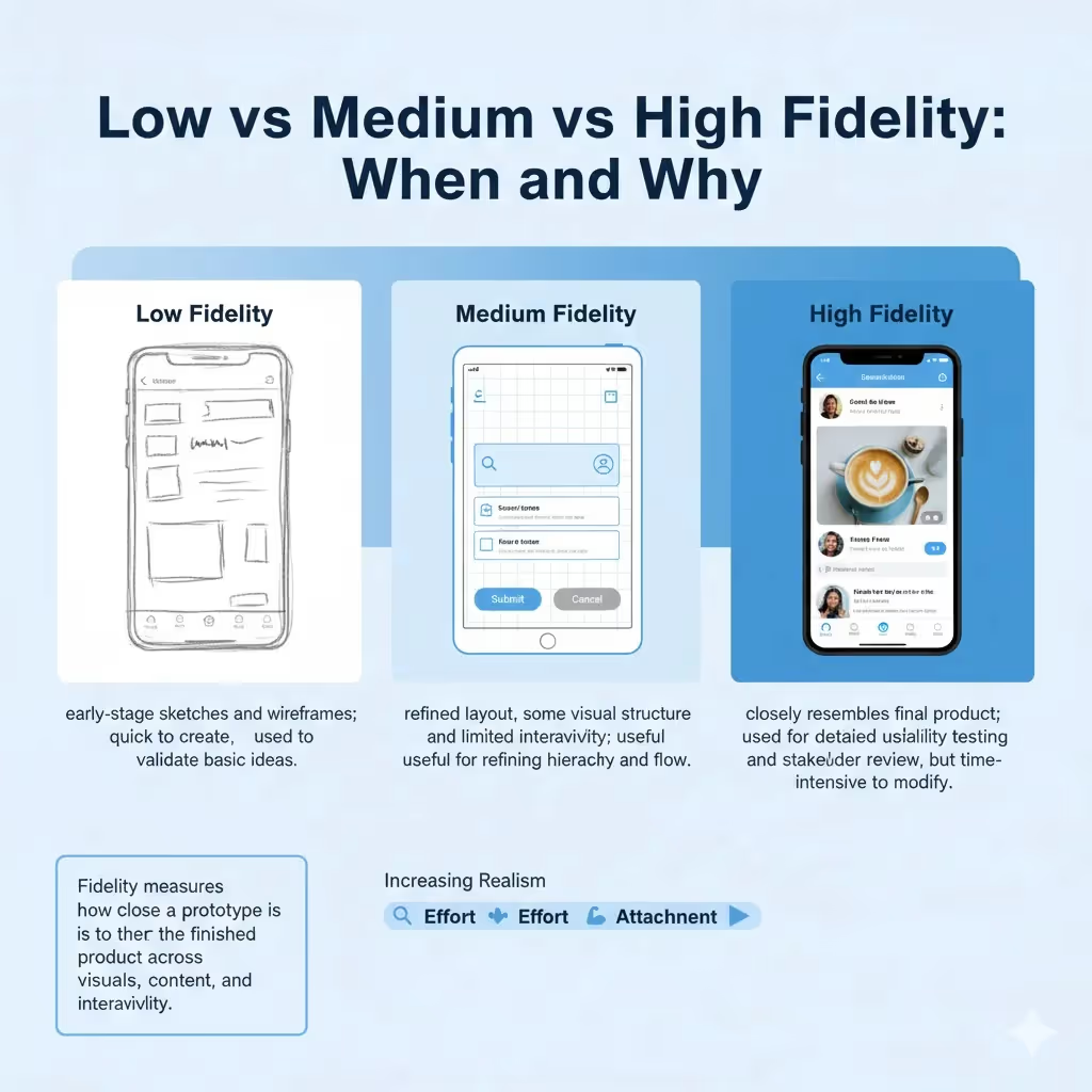
Low vs medium vs high fidelity: when and why
Understanding the fidelity spectrum
Fidelity describes how closely a prototype resembles the final product in terms of visuals, content and interactions. Innerview’s 2024 guide positions fidelity on a continuum: low fidelity prototypes are simple sketches or wireframes, medium fidelity adds more refined wireframes or basic mockups, and high fidelity prototypes look and behave like the finished product. Moving along this continuum increases detail and realism but also increases effort and attachment.
Medium fidelity
A medium fidelity prototype adds more structure and some visual details. You might refine proportions, specify labels and include basic icons or colors. It may also support simple interactions. This stage is useful when you have validated the basic concept and need to fine‑tune layout and content hierarchy.
High fidelity
High fidelity prototypes approach the appearance and behavior of the final product. They include real content, imagery, animations and polished visuals. They are valuable for user testing when the details matter—such as evaluating whether users can find a button or read text comfortably. However, building high fidelity prototypes takes significant effort and can make stakeholders think the design is finished. Innerview cautions that high fidelity prototypes are less flexible and more time‑consuming to modify.
Choosing the right fidelity
Use low fidelity prototypes when:
- You’re still validating the problem and solution.
- You need to try multiple concepts quickly.
- You want feedback on flow and structure without distraction.
Move to medium fidelity when:
- The core concept is validated and you need to refine information hierarchy.
- You want to clarify copy, component placement or basic visuals.
- You’re preparing for more formal usability studies.
Adopt high fidelity prototypes when:
- You need to test detailed interactions, animations or visual design.
- You’re seeking stakeholder buyin with a near‑realistic presentation.
- You’re ready to hand off to development and want to ensure accuracy.
Be cautious about jumping to high fidelity too soon. Doing so can waste time and make it harder to pivot when user feedback reveals a fundamental flaw. F22 Labs emphasises that early lo‑fi testing helps teams fail fast at a low cost.
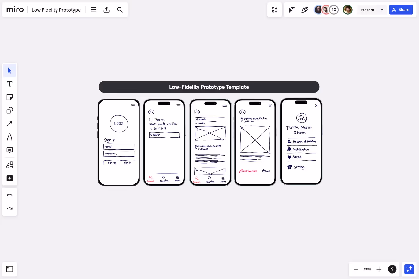
What does a low fidelity prototype look like? (examples & walkthrough)
Low fidelity prototypes come in various variations. Below is a simple sketch of a mobile onboarding flow created for this article. It shows two screens connected by arrows to indicate how users progress through an app. The rough style emphasises layout and flow rather than visual design.
This sort of sketch can be drawn on paper or on a tablet. It communicates the essential flow without getting stuck on icon design or typography. Contrast this with a high fidelity mockup where every pixel, color and animation is specified. At the lo‑fi stage, the goal is to answer questions like: Do users understand where to tap next? Is the sequence of steps clear? If the flow fails here, there is no point polishing the aesthetics.
For screen‑based examples, F22 Labs lists several variants such as sketches, wireframes, paper prototypes and storyboards—each with increasing structure. LogRocket’s article shows that low fidelity prototypes might be simple screen‑based layouts using grey tones and filler text. When comparing with medium or high fidelity prototypes, observe how details such as icons, colors and real data appear only in later stages.
Tools and templates
You don’t need fancy tools for lo‑fi prototyping. Paper, sticky notes and whiteboards work perfectly. When you need to share electronically, simple design tools like Figma or Sketch offer wireframe kits that include basic components. Many teams also use Balsamiq because its sketch‑style UI reinforces the idea that the design is provisional. The tool you pick matters less than your mindset: keep it quick and changeable.
Tips on what to include and omit
- Include only the screens and flows necessary to test your hypothesis.
- Use simple shapes for buttons and text blocks; label them clearly if needed.
- Annotate the flow so that observers understand how users would move through it.
- Omit colours, gradients, fonts and fine‑grained positioning.
- Avoid adding features you’re not testing; extra detail distracts from learning.
How to build a low fidelity prototype: step by step
Before diving into these steps, recall what is a low fidelity prototype: a simple tool to validate ideas quickly rather than a polished mock‑up. Keeping this definition in mind will help you avoid over‑investing in unnecessary details.
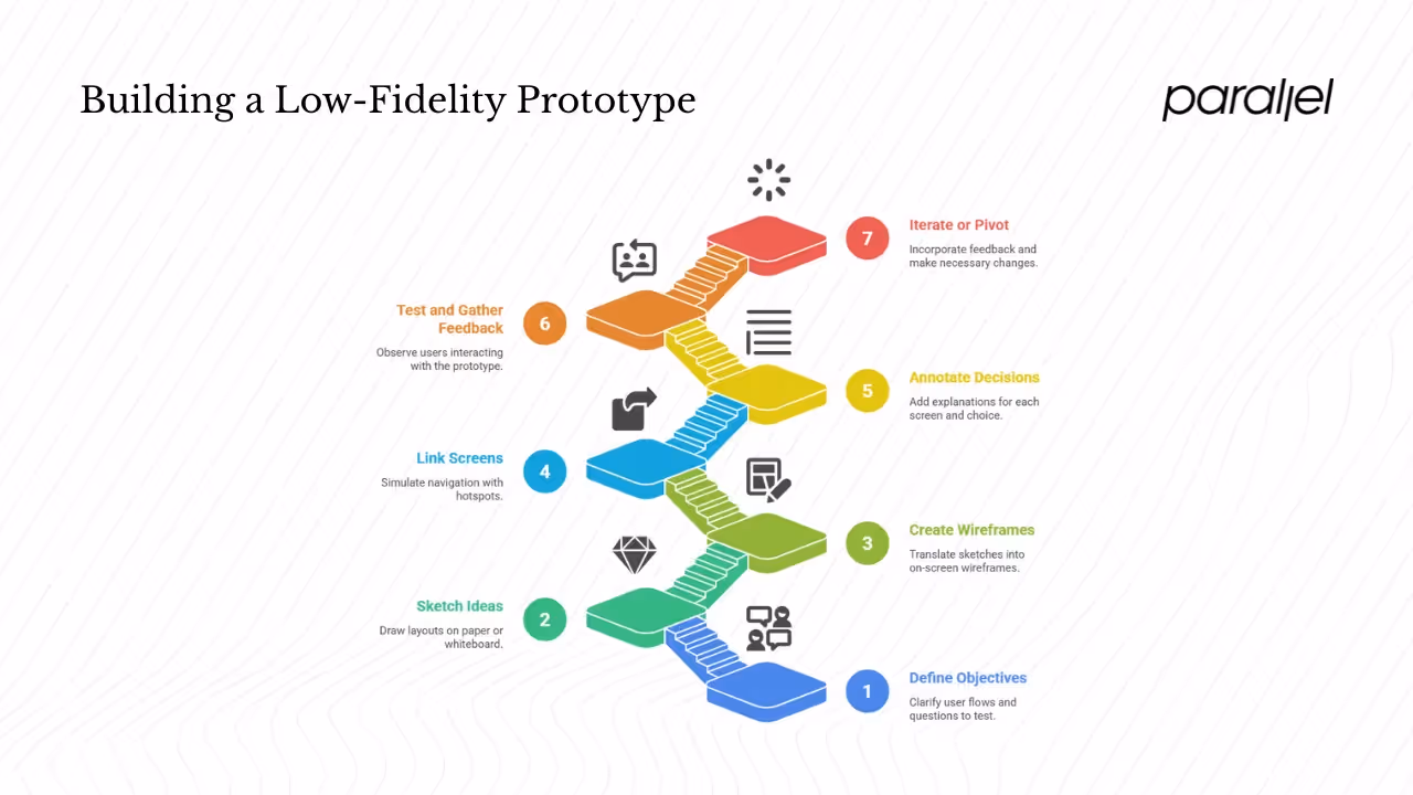
Here is a step‑by‑step approach we follow at Parallel when guiding founders and PMs through early prototyping:
- Define objectives and scope. Clarify which user flows and questions you want to test. Are you validating sign‑up and onboarding? Are you checking whether users understand your value proposition?
- Sketch rough ideas. Start with paper or a whiteboard. Draw different layouts for each screen. Don’t worry about neatness. The aim is to externalize ideas quickly. Encourage everyone—PMs, engineers, marketers—to add sketches. Bricx Labs notes that early sketches welcome all voices into the ideation process.
- Create screen‑based wireframes. Once you have a promising direction, translate sketches into simple on‑screen wireframes. Use rectangles for images, lines for text and arrows for navigation. Keep fonts and colours minimal. Tools like Figma or Sketch can help you organise screens into a flow.
- Link screens (optional). If you need to simulate navigation, connect wireframes with simple interactions. Many design tools allow you to create hotspots that link to other screens. Keep interactions straightforward; you’re not building full functionality.
- Annotate your decisions. Add short explanations of what each screen represents and why certain choices were made. Indicate where the user should tap or click. These annotations provide context when you share the prototype with others.
- Test early and gather feedback. Give the prototype to colleagues, customers or investors. Ask them to talk aloud as they try to accomplish the task. Observe where they hesitate or get confused. Dovetail notes that prototype testing reveals usability issues such as confusing navigation. Set expectations by explaining that the prototype is rough and you’re seeking feedback on flow, not visuals.
- Iterate, discard or pivot. Incorporate feedback quickly. Don’t hesitate to discard screens that don’t work; the low investment makes it painless to start over. Recall that multiple lo‑fi versions might be necessary. F22 Labs stresses the value of cultivating psychological safety so that teams feel comfortable making dramatic changes.
Quality checklist
Use this checklist to ensure your lo‑fi prototype is effective:
- Does it focus on the core flow or feature being tested?
- Is the navigation clear and easy to follow?
- Have you removed unnecessary visual details?
- Are annotations present to explain behavior?
- Did you involve cross‑functional team members in the creation process?
Common mistakes to avoid
Polishing too early – Resist the urge to add colours, icons or animations. They distract from the goal of testing the concept.
Testing everything at once – Limit the scope of each prototype. You might need multiple prototypes for different flows.
Not setting expectations – Make it clear to testers that this is a rough draft. Without this framing, people might focus on visual issues rather than the big questions.
Ignoring feedback – If people get lost or misinterpret the flow, address those issues before moving ahead. Failing to listen leads to costly rework later.
Pros, cons and limitations
Pros
- Speed and cost efficiency. Low fidelity prototypes can be created in minutes or hours, allowing teams to try multiple ideas quickly. They require little to no engineering effort.
- Encourage experimentation. The rough appearance creates psychological safety, encouraging stakeholders to suggest major changes.
- Better feedback. Because the prototype looks unfinished, users feel more comfortable giving honest input. This helps teams agree on the problem before investing further.
- Low commitment. It’s easy to pivot or throw away a sketch. You’re not bound by code or detailed design documents.
- Cross‑team involvement. Non‑designers can participate without needing to learn complex tools. This leads to better product thinking and reduces silos.
Cons and limitations
- Limited realism. Without real content or interactions, users may struggle to imagine the final experience. Nielsen Norman Group’s promptframes article warns that low content fidelity can derail usability sessions.
- Inadequate for testing complex interactions. Low fidelity prototypes can’t capture subtle animations or micro‑interactions. Those may require medium or high fidelity to evaluate properly.
- Risk of misinterpretation by stakeholders. Some executives might see the rough sketches and assume the design is immature. Others may become impatient with the lack of detail. Clear communication helps manage expectations.
- Not all usability issues surface. Certain problems only appear when realistic content, complex flows or visual design is involved. Lo‑fi prototypes are best at catching structural flaws; they may miss aesthetic or accessibility issues.
Best practices and tips for effective low fidelity prototyping
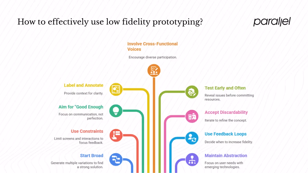
- Start broad. Sketch multiple variations instead of fixating on the first idea. The more alternatives you generate, the more likely you are to find a strong solution.
- Use constraints wisely. Limit the number of screens or interactions in each prototype. Too many variations at once can dilute feedback.
- Aim for “good enough.” Don’t worry about straight lines or perfect boxes. The goal is communication, not creating a beautiful drawing. F22 Labs reminds us that low fidelity prototypes are meant to spark discussion and change.
- Label and annotate. Provide context for each screen. Explain the intended behaviour and assumptions. This helps colleagues and test participants understand what they’re looking at.
- Involve cross‑functional voices. Invite product managers, engineers, marketers and potential users to co‑create or review the prototypes. The simplicity of lo‑fi makes it easy for anyone to participate.
- Test early and often. Show prototypes to users as soon as they’re coherent enough to communicate the idea. Dovetail emphasises that early testing reveals navigation and clarity issues before major resources are committed.
- Accept discardability. Expect that many lo‑fi versions will be thrown away. Each iteration brings you closer to a solid concept.
- Use feedback loops to decide when to raise fidelity. Once the core flow is validated and the questions shift to look and feel or micro‑interactions, move to medium or high fidelity prototypes. Innerview notes that this progressive approach balances flexibility and realism.
- When working with emerging technologies like generative tools, maintain abstraction in early prototypes. The promptframes concept suggests documenting content goals and context so that later content generated using artificial intelligence fits the design. Using plain sketches keeps the discussion on user needs instead of novelty.
When (and when not) to use low fidelity prototypes
Ideal scenarios
- Early concept validation. When you’re still questioning whether the idea addresses a real need, lo‑fi prototypes help you test assumptions quickly.
- Shared understanding. Use them in kickoff meetings, design sprints or product review sessions to ensure everyone gets on the same page.
- Rapid idea generation. During brainstorming, sketching multiple lo‑fi flows helps widen the solution space.
When not to rely solely on low fidelity
- Visual design debates. When stakeholders care about branding, visual hierarchy or spacing, you need higher fidelity. A low fidelity prototype won’t answer questions about typography or aesthetics.
- Complex interactions and animations. For products with sophisticated gestures, transitions or micro‑interactions, a low fidelity prototype can’t simulate the feel adequately.
- Stakeholder expectations for realism. Some investors or executives may struggle to imagine the finished product from rough sketches. In those cases, communicate clearly that this is a proof of concept and show hi‑fi prototypes later.
Transition points
Use low fidelity prototypes until you answer the question “does this concept solve a problem?” Once the answer is yes and you need to refine flows and content, move to medium fidelity. When finalising visual design or preparing for detailed usability testing, shift to high fidelity. Keeping these transition points in mind prevents wasteful over-designing at the wrong stage.
Real‑world examples and case studies
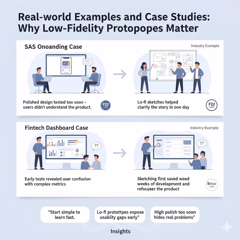
Although I can’t share client names due to confidentiality, I can share patterns we’ve seen at Parallel. One early‑stage artificial‑intelligence‑powered SaaS startup insisted on designing a beautiful onboarding sequence before validating whether users understood the product. After a week of work, we tested the polished screens with five potential users. Three of them couldn’t figure out the core value proposition, and one user asked if the product was just “another contact page.” We scrapped the design and started over with hand‑drawn sketches, focusing on the problem narrative. Within a day we had a new flow that testers found clear and engaging. The time wasted on the initial polished design could have been avoided if we had started with lo‑fi sketches.
In another project, a fintech founder wanted to build a complex dashboard with charts and filters. We convinced them to sketch the core flow first. During testing, we discovered that users didn’t care about half of the metrics presented. The founder realised that building a fully interactive dashboard would have wasted resources. By pivoting early, we saved weeks of development and improved the product’s focus. This is why we emphasise what is a low fidelity prototype—because understanding it prevents expensive mistakes.
Outside our work, industry examples echo similar lessons. F22 Labs describes how low fidelity prototypes reduce risk by revealing usability flaws before full development. Bricx Labs’ piece notes that hand‑drawn wireframes help teams try multiple interface possibilities and surface issues quickly. These experiences show that lo‑fi prototypes are not amateurish; they are a deliberate tool for smart product teams.
Quotes and community voices
On UX forums, experienced designers stress the importance of staying rough early. One commenter on a popular UX discussion board wrote, “Lo‑fi prototyping is not supposed to be pretty—it’s about clarity of thought. If you’re spending more than thirty minutes on your first wireframe, you’re overthinking it.” That sentiment rings true with our own practice. The Nielsen Norman Group’s promptframes article reminds designers that low content fidelity can derail sessions, reinforcing the need to focus on real flows and goals.
Conclusion
Building great products is not about showing how polished your design skills are; it’s about validating the right ideas. Low fidelity prototypes are your safety net. They let you answer what is a low fidelity prototype by practising it: sketching, testing and iterating quickly. When teams adopt simplicity first, they save time, reduce risk and create more meaningful products. The next time you’re tempted to perfect a pixel, grab a marker instead. Your future self—and your users—will thank you.
FAQ section
1) What is meant by a low fidelity prototype?
When someone asks what is a low fidelity prototype, the answer is simple: it’s a rough, early version of a product used to test ideas and flows without investing time in visual polish. Low fidelity prototypes use simple shapes, grey tones and minimal interactivity to help teams validate the concept. They act as early experiments rather than finished designs.
2) What is an example of a low‑fidelity prototype?
Examples include hand‑drawn sketches of an app’s signup flow, paper cut‑outs of web pages or screen‑based wireframes with grey boxes and minimal text. Our sketch of a mobile onboarding sequence above is another example. The common thread is simplicity and focus on flow.
3) What is a low vs medium vs high fidelity prototype?
Low fidelity prototypes are rough and quick, focusing on structure and flow. Medium fidelity prototypes add more detail, such as refined layout and some visual elements, and may include basic interactivity. High fidelity prototypes closely resemble the final product, with real content, visuals and interactions. Choosing the right fidelity depends on your project’s stage and goals.
4) What does a low fidelity prototype look like?
It looks unfinished and minimal—think of a wireframe with grey boxes instead of images and lines representing text. The purpose is to communicate the skeleton of the design without distraction. A low fidelity prototype might be drawn on paper or created using simple components in a design tool.
5) Can non‑designers create lo‑fi prototypes?
Yes. In fact, one of the main benefits of low fidelity prototyping is that it invites participation from anyone. The accessible nature of sketches and basic wireframes means product managers, engineers and even customers can sketch ideas and help shape the solution.
6) Which tools are best for lo‑fi prototyping?
Start with pen and paper or a whiteboard. When you need to document or share electronically, Figma, Sketch and Balsamiq offer wireframe kits with simple components. The choice of tool is less important than maintaining a light and changeable approach.

check out these related blogs