Launching a product without a solid web presence is like hosting a party with no address. In our work with early‑stage startups at Parallel, we’ve learned that what makes a good website isn’t mystery – it’s craft. A good website is one that helps visitors achieve their goal quickly and without friction. It’s purposeful, trustworthy and so aligned with your product that it becomes an extension of it. For founders, PMs and design leaders, the website is often the first touchpoint prospective customers, investors and recruits encounter. In this article I’ll unpack the core dimensions of a great site – from user experience and responsive design to performance, content strategy and security – and share a blueprint for building a website that grows alongside your product.
TL;DR: What Makes a Good Website?
A good website is one that helps users achieve their goals quickly, intuitively, and securely. It combines functionality, speed, and clear messaging with user-centered design. The essential traits include:
- User-focused experience with intuitive navigation and clear hierarchy
- Responsive design that works seamlessly across devices
- Fast loading speeds and optimized performance
- Strong visual design and consistent branding
- Clear, relevant, SEO-friendly content that meets user intent
- Robust security and privacy measures
- Accessible design for all users, including those with disabilities
- Action-driven structure with clear calls to action on every page
Use this framework as a foundation to build a website that not only looks good but drives real results.
What makes a good website?

1) User experience & clear navigation
Good websites begin with empathy. Your audience arrives with a job to do – find pricing, explore features or sign up – and every click that doesn’t get them closer is friction. Poor navigation is rampant: Baymard Institute’s 2024 study of more than 130 ecommerce sites found that 76 percent of leading e‑commerce homepages and category pages performed at a “mediocre” to “poor” level, with most failures tied to confusing navigation and information hierarchy. That’s unacceptable for a start‑up trying to build trust.
Design navigation with clear hierarchy and predictable patterns. Ideas On Purpose stresses creating obvious, logical navigation with clear hierarchy. Hotjar echoes that sentiment: keep menus simple, use descriptive labels and provide a search bar and breadcrumb trails so users can orient themselves. When navigation is intuitive, visitors stay focused on their goal rather than on the UI. In usability tests we run for clients, the most common comment is “I just want to find the thing.” Embrace standard patterns – a logo linking to the home page, sticky navigation, clear section labels – and resist the urge to get clever with core navigation.

The user experience also extends to how information is structured. On‑page hierarchy guides the eye toward the most important elements first. Hotjar recommends using position, color and size to prioritize key elements. For long pages, break content into digestible sections with bold headings and bullet points; your job is to make scanning effortless.
2) Responsive design & mobile compatibility

Responsive design is no longer optional. Mobile traffic accounts for more than half of all internet traffic, and Google’s mobile‑first indexing means that sites that don’t perform on phones will struggle to rank. Ideas On Purpose puts it bluntly: there are no excuses – your site must look great and work well on any platform. Mobile responsiveness isn’t just about shrinking a layout; it’s about reconsidering navigation, content density and interactions for smaller screens. Use simpler menus, generous touch targets and clear CTAs sized for thumbs.
From a product perspective, think mobile‑first. Evaluate flows on phones before scaling to tablets or desktops. In our projects we often prototype on small screens first, which forces the team to prioritise essential elements. When we work with AI‑driven SaaS tools, we’ve seen teams reduce time‑to‑value by simplifying mobile onboarding and deferring optional steps until after first value is delivered.
3) Fast loading & great performance
Speed affects trust and conversion. Akamai’s 2024 study cited by Hotjar found that a two‑second delay in page load time increases bounce rates by 103 percent, and 53 percent of mobile ecommerce users will abandon a page if it takes longer than three seconds to load. Performance isn’t just a technical vanity metric – it’s a business KPI. A fast site signals competence; a sluggish one suggests neglect.
To achieve speed, start with the basics: compress images, use modern image formats (WebP), lazy‑load below‑the‑fold assets and implement a content delivery network (CDN) for global audiences. Build lean: avoid heavy frameworks and unnecessary JavaScript. Ideas On Purpose emphasizes building to web standards and testing regularly for problems with speed or functionality. For our clients, we set performance budgets per page and monitor them throughout development. Tools like Lighthouse and WebPageTest can reveal regressions early. After launch, collect real‑user metrics to spot slow pages and fix them before they impact conversions.

4) Visual appeal & cohesive branding
A good website needs to feel like it belongs to your company. That means the visual language – color palette, typography, imagery and layout – must be intentional and consistent. Ideas On Purpose advises that sites should be visually appealing, polished and professional, using white space and uncluttered layouts with quality photographs and graphics. Quality visuals aren’t decoration; they communicate brand values and make complex concepts tangible.
Cohesive branding extends beyond the logo. Use a limited color palette anchored in your brand identity and apply it consistently across components. Choose two or three typefaces and assign roles: one for headings, one for body copy and perhaps a monospaced style for code snippets if you’re in tech. When we worked on a machine‑learning platform, unifying the UI’s color system across the marketing site and the product itself reduced cognitive load and improved brand recall.

Consistency also applies to tone of voice. Your headlines, taglines and microcopy should sound like they come from the same team – clear, straightforward and in the language of your users. According to Network Solutions, good content should be consistent in voice and tone across all touchpoints.
5) Quality content & SEO optimization
Content is often the most overlooked component of a website, yet it’s what visitors actually consume. A great website delivers content that is clear, relevant and actionable. Network Solutions lists several hallmarks of good content: it should be clear and easy to read, relevant to the audience, helpful and informative, action‑driven (with CTAs), SEO‑friendly, consistent in voice and tone, and visually engaging. They encourage writing for buyer personas, using short sentences and plain language.
For early‑stage startups, clarity beats cleverness. Explain your product in simple terms and avoid jargon. If clarity is a challenge, an AI-powered paraphraser can help simplify complex sentences, remove jargon, and refine tone without changing the original meaning, making content engaging and reader-friendly. Each page should serve a purpose: educate, persuade or convert. This is where SEO intersects with UX. Hotjar recommends structuring content around pillar pages and topic clusters. Pillar pages provide comprehensive coverage of broad topics (e.g., “AI‑driven customer support”), while cluster pages dive into subtopics and link back to the pillar. This structure helps search engines understand your content and helps readers explore related topics.
Practical advice: define your primary keyword for each page, align your headline and subheadings with that intent, and use internal links to connect related pages. Add meta titles, descriptions and alt text for images. Most importantly, write for humans first; search engines reward relevance and clarity over keyword stuffing.
6) Security features
Trust is non‑negotiable. Users will not engage with a site that feels unsafe. Hotjar notes that keeping users safe is a huge part of what makes a good website; great sites prioritise protecting user information through multi‑factor authentication, SSL certificates and secure hosting. Whether you’re handling payments or simply collecting emails, invest in a robust hosting environment with server‑side firewalls, encryption and anti‑malware. Use HTTPS everywhere; users notice the padlock icon and will abandon sites that trigger browser warnings.
Implement strong authentication for admin interfaces, enforce password complexity and enable two‑factor authentication. Limit login attempts to deter brute‑force attacks. If you’re using third‑party analytics or feedback tools, choose vendors that prioritise data privacy. For example, we choose services that anonymise IP addresses and are GDPR/CCPA compliant.
7) Consistent branding & clear calls to action
Brand consistency builds recognition and trust. Your logo, typography, imagery and messaging should reinforce each other across every page. Even small details, like button styles or iconography, contribute to a coherent identity. Inconsistent branding can make a startup look amateurish or untrustworthy. Ideas On Purpose advocates using clear calls to action on every page because sites that ask nothing of visitors will accomplish nothing.

Calls to action (CTAs) are the signposts that guide users toward conversion. Position them prominently, use action‑oriented language (“Start free trial,” “Book a demo”) and surround them with white space to draw attention. Make sure the same action uses the same CTA text across pages to avoid confusion. For complex flows, break tasks into steps and use progressive disclosure – ask only for essential information up front and collect the rest later.
Structural blueprint: what should a good website include?
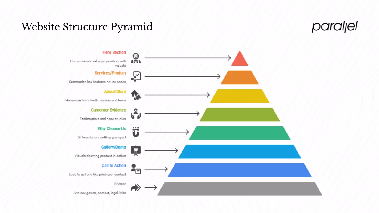
Behind every beautiful website is a simple structure. While each startup’s story is unique, most good websites share a backbone:
- Hero section – Immediately communicate your value proposition in a headline and a succinct subheading. Use a supporting visual or video to illustrate what your product does. Include a primary CTA.
- Services or product overview – Summarise key features or use cases in digestible chunks. Consider cards or icon‑driven lists for scanning.
- About or story – Humanize your brand. Explain your mission, values and team. Include a photo or video to build trust.
- Customer evidence – Testimonials, case studies or logos of companies using your product. Social proof is powerful and reduces perceived risk.
- Why choose us – Differentiators or principles that set you apart. Use concise copy and avoid cliché marketing language.
- Gallery or demo – Screenshots, GIFs or interactive demos showing the product in action. Visuals help visitors imagine using your solution.
- Call to action – Each section should naturally lead to an action: “See pricing,” “Try it free,” or “Contact sales.”
- Footer – Provide site navigation, contact information, social links and legal pages. Make it easy to find critical links without scrolling back to the top.
When building this structure, think like a product manager. Use analytics to see which sections visitors linger on and which they skip. Move important content higher if necessary. And don’t forget the boring but essential pages – privacy policy, terms of service and accessible contact forms.
SEO & content strategy for startups
Your content strategy should help users and search engines find and understand your product. Start with a clear information architecture that mirrors user goals: break topics into pillars and clusters, and map user journeys from awareness to conversion. Hotjar’s guidance on content structure – building topic clusters linked to pillar pages – is particularly useful. This approach tells search engines your site is an authority on a subject and gives readers an easy path to related information.
Focus on clarity and relevance. Network Solutions argues that clarity converts: write clear headlines and speak directly to your buyer personas. Offer value in every piece of content – how‑to guides, checklists or insights – because useful content earns trust and invites action. Use CTAs that align with the user’s readiness: a “Get Started” button for trial sign‑ups or a “Learn more” link for education.
SEO fundamentals still matter. Conduct keyword research around your users’ questions and incorporate those phrases naturally into headings and body copy. Use internal links to connect related articles and product pages. Add meta titles, descriptions and alt text for images. And remember: search algorithms are increasingly tuned to user satisfaction, so optimizing for readability, speed and mobile friendliness is itself an SEO tactic.
Technical best practices & performance optimization
Behind the scenes, technical excellence keeps your site running smoothly and securely.
- Clean code and standards – Follow semantic HTML and CSS best practices. Avoid unnecessary libraries and frameworks that bloat the page. Ideas On Purpose emphasises building to web standards and proof‑reading and testing rigorously.
- Performance monitoring – Set a baseline for page load times and core web vitals (Largest Contentful Paint, First Input Delay, Cumulative Layout Shift). Tools like Lighthouse, WebPageTest, SpeedCurve and Hotjar’s heatmaps let you track performance over time.
- Accessibility – Design for everyone. Hotjar reminds us that accessibility benefits both users and website owners, driving more traffic and engagement. Follow WCAG guidelines: provide sufficient color contrast, support screen readers with proper ARIA labels and descriptive link text, and ensure interactive elements can be operated via keyboard.
- Content Delivery Network (CDN) – Use a CDN to cache static assets closer to users. CDNs reduce latency and mitigate traffic spikes, ensuring consistent performance for global audiences.
- Image optimization – Compress images, use responsive sizes (srcset) and consider next‑gen formats (WebP, AVIF) to reduce payloads without sacrificing quality. Lazy‑load off‑screen images to prioritize above‑the‑fold content.
- Testing & maintenance – Launching a site is the beginning, not the end. Hotjar and Ideas On Purpose both stress continuous testing and improvement. Set up automated regression tests to catch broken links or UI glitches. Re‑audit your site after adding features or content.
Design & branding excellence for startups
Design excellence is about intention and restraint. Whether you’re a two‑person team or a scaling venture, invest in a cohesive design system. Ideas On Purpose advises using white space and uncluttered layouts with quality photography to let your message shine. Choose a color palette that reflects your brand personality and consider color psychology: blues often convey trust, while greens suggest growth.
Typography matters more than you might think. Use a limited number of typefaces and sizes to create hierarchy and guide the reader. Hotjar notes that readability requires balancing content, style and functionality, avoiding clutter and chunking text into short paragraphs.
Imagery should feel authentic and relevant. Avoid generic stock photos; instead, show real product screens, team members or customers. When we revamped an AI‑based workflow tool’s site, replacing generic background images with animated product gifs increased time‑on‑page by 27% in the first month.
Finally, maintain consistency between your marketing site and your product. The colors, buttons and icons on your site should echo your app’s interface; this reduces cognitive load for users transitioning between the two and strengthens your brand.
Prioritizing UX, accessibility & security
Accessibility isn’t an add‑on; it’s a foundation. A Reddit user once said, “If people can’t use a website, what’s the point?” Accessibility benefits everyone. Hotjar notes that accessible design helps website owners get more traffic, views and engagement. Plan for accessibility early by considering color contrast, avoiding color‑only instructions and using guidelines from the W3C Web Accessibility Initiative.
User experience and accessibility are intertwined. Simplify flows, minimise choices and remove friction. Provide feedback (e.g., form validation messages) and ensure interactive elements behave predictably. For instance, buttons should look clickable and change on hover or focus.
Security, similarly, must be part of the design. Use HTTPS by default, implement secure password policies, and enable two‑factor authentication for user accounts. Limit login attempts and monitor for unusual patterns. Being transparent about your security practices builds trust; consider a dedicated “Security” or “Trust” page that explains how you protect user data.
Checklist: qualities of a good website
Use this table as a quick audit. If a dimension is missing or weak on your site, prioritise it in your next iteration.
Conclusion
Building a website that works is both art and engineering. What makes a good website isn’t a secret formula; it’s a set of practices anchored in empathy, clarity and discipline. When you invest in user experience, mobile responsiveness, speed, strong visuals, compelling content, security and accessibility, you build an asset that grows with your product and your team.
Founders, PMs and design leaders should treat the website as an evolving product: regularly review it against this framework, gather data and feedback, and iterate. Your site isn’t just a digital brochure – it’s a strategic tool that shapes how people perceive and engage with your brand. Use it wisely, and let it be a catalyst for growth.
FAQs
1) What are the qualities of a good website?
A good website is one that serves users efficiently. It combines intuitive navigation, responsive design, fast loading, strong visual appeal, quality content, robust security and accessibility. Clear calls to action guide visitors toward their goal, while a cohesive brand experience builds trust.
2) What are the 7 C’s of a website?
The “7 C’s” framework isn’t universal, but it’s a helpful memory aid. They stand for Clear, Concise, Credible, Consistent, Correct, Compelling and Conversion‑oriented. In practice, this means your site’s messaging is straightforward, the information is accurate and trustworthy, the design and tone are consistent, the copy is engaging and there’s always a clear next step for visitors. I’d add an eighth “C”: Compliant – ensure your site meets accessibility and security standards.
3) What would make a good website?
In our experience, what makes a good website is an alignment of purpose and experience. Define a clear goal for each page, design a frictionless flow to achieve it and measure how users perform. Focus on speed, mobile‑friendliness, engaging visuals, useful content and trust signals (like SSL and transparent privacy practices). These factors work together to create a seamless journey that earns attention and drives action.
4) What are the 5 major components of a web page?
A typical web page has five structural components: header, hero/main content, supporting visuals/media, call to action and footer. The header contains navigation and branding. The hero or main content conveys the core message. Supporting visuals (images, video or diagrams) illustrate ideas. A call to action prompts the next step. The footer houses secondary navigation, contact details and legal links. This structure helps users orient themselves quickly and find what they need without friction.

check out these related blogs


.webp)