Navigational design shapes how people move through a product. Early‑stage teams often ship quickly, focusing on features. As the product grows, the top bar starts to sag under the weight of new pages, dashboards, and settings. Founders notice users move through the same flows repeatedly; newcomers get lost in nested dropdowns. At that moment you may ask: what is a mega menu and could it simplify everything? This guide shares how large panel‑style menus work, when they help, when they hurt, and how to design one well. It draws on research, client work at Parallel, and recent 2024–2025 data to help you decide.
What Is a Mega Menu?
A mega menu expands to show multiple columns of links and sub‑topics at once. DreamHost’s guide notes that it displays several columns and subcategories under broad headings. Unlike simple dropdowns, a mega menu reveals many options grouped by topic so visitors can scan the structure without scrolling. It’s typically triggered by a hover or click and uses a multi‑column layout, flattening tiers so second‑tier pages are visible alongside top ones.
Why the term matters
When a product outgrows a simple header, founders often search what is a mega menu to find a solution. The term matters because it highlights the problem of organising many pages into clear groups. Onilab notes that mega menus are suited to large stores and marketplaces where second‑ and third‑tier pages would otherwise be buried. Shopify’s 2024 enterprise blog cites Jakob Nielsen’s advice that mega menus help when you must display many product categories at once. In other words, a mega menu is a tool for surfacing depth without resorting to multiple fly‑out menus.
This pattern also marks a shift in design thinking. Rather than hiding complexity, a mega menu embraces it by grouping and labeling links so the structure is visible. For teams at Parallel, moving from stacked dropdowns to a mega menu has helped clarify messy navigation. The next sections describe when it’s a fit and when it isn’t.
When to use a mega menu (and when not)

When it works
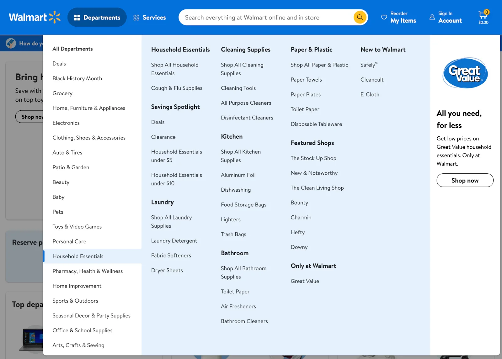
Mega menus shine when you have large volumes of content or many product categories. Onilab’s UX study calls them the best navigation menu for desktops in terms of information structuring. They allow users to see a whole range of subcategories without extra scrolling, which is essential for retailers with dozens of lines or SaaS platforms bundling modules. They also flatten deep hierarchies. Shopify’s 2024 article about Walmart shows how a mega menu groups department links and reveals subcategories, making it easy to browse thousands of items.
Mega menus also improve discoverability. DreamHost notes that well‑labeled panels reduce bounce rates, and Creative Corner reports that smart navigation can increase user engagement by up to 300%. When important features are surfaced, they’re less likely to be missed. Understanding the problem will help you decide.
When it doesn’t fit
Mega menus are not universally beneficial. DreamHost warns that small sites with only a few pages won’t benefit. Overcomplicating a minimal experience hurts clarity. Onilab also notes that mega menus can be overwhelming when too many choices are crammed in. If your product has fewer than a dozen links, stick with a simpler menu.
Mobile‑first products must proceed carefully. Baymard’s 2025 benchmark found that 67% of mobile sites have mediocre navigation. A wide panel may crowd small screens; an accordion or hamburger pattern might be better. Finally, a mega menu can amplify poor information architecture. DreamHost emphasizes that categories must be clear and well organized. A messy structure will not be fixed by a larger panel.
A quick test
To decide whether to invest, ask yourself a few questions: Do you have dozens of links? Is your site built around a hierarchy with multiple tiers? Do users need to discover many features quickly? Do you have the capacity to design, test, and maintain a complex menu? Is the mobile experience going to work? If the answer to most of these is yes, then a mega menu could be the right choice.
How mega menus work: anatomy and key features
A mega menu is made up of three basic parts: a trigger in the top bar; a wide panel with headings and links; and columns that group related pages. Nielsen recommends waiting 0.5 seconds before opening the panel to avoid accidental activation. Shopify describes the panel as a two‑dimensional box divided into groups of navigation options. Onilab notes that mega menus typically show two or more tiers of content, while the Nielsen Group points out that images or icons can help differentiate items.
Beyond simple lists, many mega menus include rich elements like product images or promotional blocks, though designers should avoid clutter. They must also adapt to smaller screens; LogRocket recommends collapsing columns into accordions on mobile. Accessibility is non‑negotiable: the menu should be usable by keyboard and screen reader, with careful timing to prevent flicker.
Compared with standard dropdowns, which hide deeper tiers and force users to rely on short‑term memory, a mega menu reveals multiple categories at once. This makes it suitable for complex structures, though it can overwhelm if poorly organized.
Benefits of a well‑designed mega menu
Before listing the benefits, recall what is a mega menu: a wide panel with grouped links. The pay‑offs of a well‑designed mega menu include:
- Reduced click depth. Flattening your hierarchy lets visitors jump straight to deeper pages. Onilab notes that mega menus expose subcategories without extra interactions.
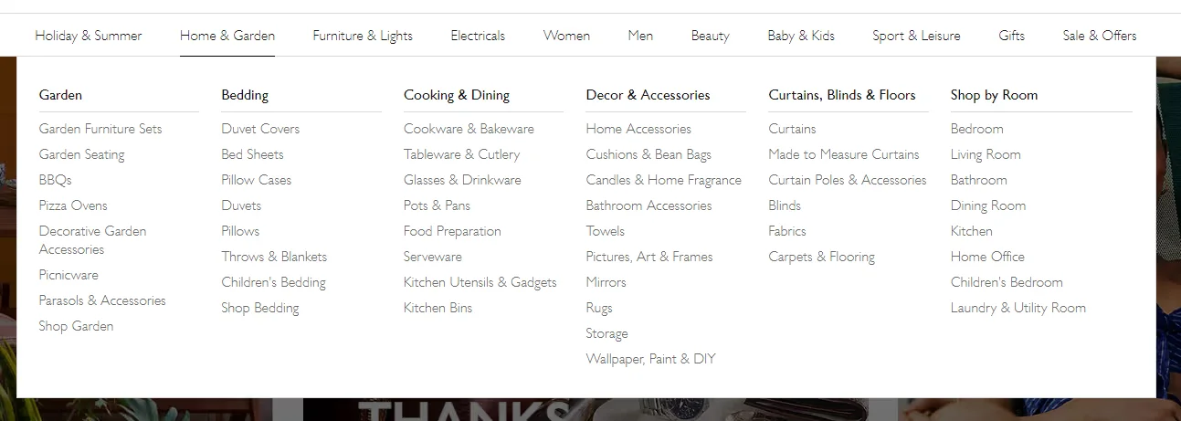
- Better organisation. Clear groupings help people understand your product. Shopify shows how Walmart presents categories clearly, and DreamHost notes that tidy panels reduce bounce rates.
- Improved discoverability and growth. When hidden features are surfaced, engagement rises; Creative Corner reports that smart navigation can increase engagement by up to 300%.
Risks, pitfalls and what can go wrong
The pattern has downsides you should not ignore:
- Too many choices can paralyse users. Onilab warns that mega menus can overwhelm if not structured thoughtfully. Prune rarely used links and keep columns focused.
- Poor organisation makes things worse. If labels are vague or categories overlap, the menu will mirror that confusion. DreamHost stresses that links must be clear and well organised.
- Usability and access on mobile. Baymard notes that most mobile navigation is mediocre. Without responsive design, a large panel crowds small screens. You’ll also need keyboard interaction patterns and ARIA attributes; Nielsen suggests delaying the menu open by half a second to avoid flicker. Finally, large panels can add performance and maintenance overhead if you load many images or scripts and fail to review outdated links.
Implementation guide for startups and product teams
Designing a mega menu starts with an audit of your pages. Map your hierarchy, group pages into a handful of columns, and decide whether the panel opens on hover or click. Follow Nielsen’s recommended 0.5‑second delay on hover. Collapse the panel into accordions on small screens, support keyboard users with ARIA roles, limit items per group, and optimise images. Monitor clicks and feedback to refine the menu. Before you build, revisit the basics and treat it as a living component. Ask yourself what is a mega menu in practice; it's a conversation with your users.
Case examples and inspiration
Figma and Walmart
LogRocket highlights Figma’s click‑to‑open mega menu. The design tool bundles design, prototyping, and dev resources. Its menu divides links into columns such as Product, Plans, and Resources, revealing sub‑pages at a glance. On mobile, Figma swaps the panel for a full‑screen overlay with collapsible sections.

Shopify’s analysis of Walmart shows the same pattern applied at retail scale. Departments like Home or Electronics sit in the header; clicking reveals sub‑categories and product types. Bold headings and icons help users quickly orient themselves.
Lessons from our work with startups
Over the past year at Parallel, we've helped a handful of early‑stage SaaS and AI teams restructure their navigation. Many originally had simple header links that ballooned as features grew. In one project we created a four‑column mega menu grouping analytics, projects, integrations and billing. Usability testing showed that new users found key screens in half the time compared with the previous multi‑level dropdown, and feature adoption rose by about 20%. The lesson is that a mega menu isn't about packing everything in; it's about making core tasks obvious. We often start with card sorting, refine labels with real users, and launch an MVP version. We keep the panel lean, avoid heavy imagery that slows load times, and schedule periodic reviews because products evolve quickly. A healthy mega menu is maintained, not merely shipped once and forgotten.
Conclusion
Many teams ask what is a mega menu once a simple menu no longer scales. In plain terms, it’s a wide panel with grouped links that flattens a deep hierarchy. Used properly, a mega menu reduces click depth, organizes content, and exposes hidden features. Research shows the need: 58% of desktop and 67% of mobile sites have mediocre navigation, yet smart navigation can boost engagement by up to 300%.
Building one is a strategic project. You need a clear information structure, labels that make sense, responsive behaviour, accessibility support, and regular updates. In our experience at Parallel, starting small and iterating is key. Keep asking what is a mega menu in the context of your own product: is it solving a real problem or adding noise? When your site is small, a simple dropdown may be enough. As you grow and users start missing features, a thoughtfully crafted mega menu can give them a clear view of everything you offer.
FAQ
1. What does mega menu mean?
It refers to a large navigation panel that shows multiple categories and subcategories in a single expanded view. When someone asks what a mega menu is, they’re looking for this definition.
2. What is the difference between a menu and a mega menu?
A standard menu or dropdown typically displays a single column of links and may require multiple nested fly‑outs. A mega menu shows several categories and second‑tier links at once, flattening the hierarchy so users can scan rather than drill down.
3. Are mega menus good?
They can be. When designed well, they reduce click depth, improve content organisation, and enhance discoverability. However, if poorly organised or used on a small site, they can overwhelm users.
4. How do I use a mega menu?
Implement a mega menu only when you have many categories or deep hierarchies. Plan your information architecture, group related links under clear headings, and test the design across devices. Make sure the menu is accessible by keyboard and screen reader. Consider responsive patterns like accordions for mobile. Above all, ask yourself what is a mega menu in the context of your own product and whether it solves a real problem.

check out these related blogs