The difference between a hit product and one that flops often isn’t the brilliance of the idea but how quickly teams spot issues. Time and money vanish when teams push straight into engineering without testing core assumptions. We’ve watched projects sink because they coded first and asked questions later. A simple sketch on paper can prevent months of wasted development – that’s the central idea behind what is a paper prototype and why we’re writing this guide.
As product leaders at Parallel we’ve seen the same pattern across startups: ambitious founders fund a build based on polished mock‑ups, only to discover that navigation flows confuse users or that the onboarding path feels like a maze. We’ll show you how a humble paper prototype helps you test concepts before investing in pixels and code. This piece will clarify when and how to use one, what you gain and where it falls short, and how to integrate the practice into your workflow. Expect actionable guidance, examples, and reflection from our own experience.
What is a paper prototype?
When we say “paper prototype,” we mean a hand‑drawn representation of interface screens arranged to simulate how a user will progress through a product. It’s not a polished wireframe; it’s a low‑fidelity model that emphasises structure and flow rather than graphics. The Nielsen Norman Group emphasises that these prototypes are throwaway tools for early tests; they allow designers to present pages in real time by acting as a “human computer”. The roughness of paper invites critique and signals that nothing is final. describes paper prototypes as low‑cost and easy to make, with the ability to slide bits of paper to mimic transitions. In what is a paper prototype we emphasise that these artefacts exist to answer questions about user flow and information hierarchy, not to showcase typefaces or colours.
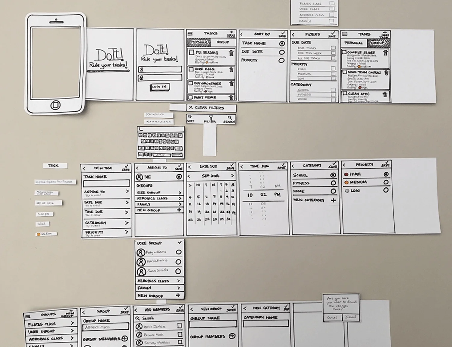
Though drawings can be made on index cards, sticky squares, or whiteboards, the essence is a collection of simple screens representing each step a user might take. Unlike wireframes (static structural layouts created in software), paper prototypes live in the physical world. A facilitator acts as the “computer,” switching pieces of paper when a participant taps or indicates a choice. This “Wizard of Oz” style approach keeps things flexible and fun.
Why bother with paper?
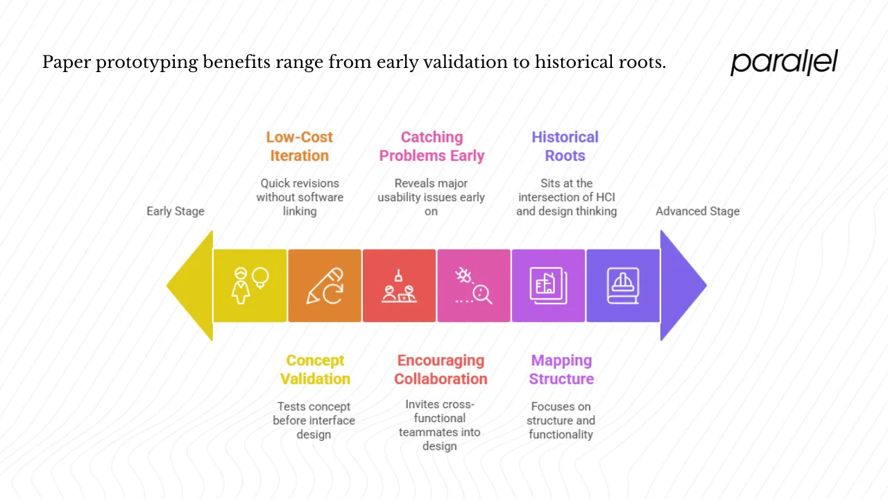
1) Early concept validation
Building a product without early feedback is like constructing a house without a blueprint. Paper prototyping lets you test your concept before spending on interface design or development. Susan Farrell of Nielsen Norman Group argues that paper prototyping allows you to test design ideas at extremely low cost. Her research shows that the biggest improvements in user experience come from gathering usability data as early as possible. She cites decades of software engineering experience which suggests that changes before code are around 100 times cheaper than changes after implementation. Early tests can improve measured usability tenfold because you’re still free to adjust your architecture, feature set, and information structure.
2) Fast and low‑cost iteration
Paper prototypes are inexpensive and quick to revise. In a comparison of low‑ and high‑fidelity prototypes, NN/g points out that low‑fidelity versions require less time to prepare, freeing designers to focus on designing more pages. They allow design changes between test sessions because you can sketch a quick response without linking new pages in a software tool. Interaction Design Foundation (IxDF) explains that these prototypes are obviously unfinished, which encourages candid feedback. Since they’re not polished, stakeholders won’t rush them into production, and designers don’t feel wedded to early ideas.
3) Encouraging collaboration
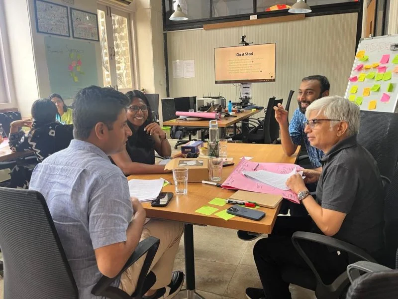
Because anyone can sketch, paper prototyping invites cross‑functional teammates – product managers, engineers, marketers – into the design process. Sketches remove the intimidation barrier of sophisticated tools. Team sketching sessions often surface more ideas and help teams reach consensus on user flows quickly. NN/g emphasises that rough prototypes put less pressure on users; they remind participants and stakeholders that the test is about the design, not about their performance.
4) Catching big usability problems early
Jakob Nielsen’s long‑standing usability research shows that simple prototypes can reveal major usability issues. IxDF’s article on low‑fidelity methods explains that paper prototypes allow you to test broad concepts rather than fine details. By testing flows and navigation early, you can discover whether users understand your design, where they get lost, and what features they need next. This helps you adjust content architecture before expensive screens or code exist.
5) Mapping structure and flows
As UXPin’s 2025 write‑up on low‑fidelity prototyping explains, low‑fidelity prototypes are best for brainstorming and user testing because they focus on structure and functionality rather than aesthetics. The article points out that tools like pen and paper or simple software let designers identify issues early and refine ideas without significant investment. Paper prototypes in particular help small teams quickly sketch multiple interface ideas, collect immediate feedback, and iterate without friction.
6) Historical roots and theory
Paper prototyping sits at the intersection of human–computer interaction and design thinking. In the 1990s, researchers popularised throwaway prototyping as part of rapid iterative design. The method shares DNA with the “Wizard of Oz” technique, where a human simulates system responses to test user reactions. In lean and agile product development, early experiments using paper help teams learn faster and reduce waste. IDEO’s prototyping principles emphasise building rough, rapid, and “right” prototypes to ask the right questions. They believe that the more you make, the faster you learn, and that early prototypes should stay modular so you can pivot easily.
These principles mesh well with the philosophy of paper prototyping: make something quickly, test it with users, and discard it once you’ve learned enough.
Paper prototype vs related concepts
Wireframes and screen‑based low‑fidelity prototypes
Wireframes are structural layouts drawn in software. They show page hierarchy, positioning of elements, and basic navigation but usually avoid colour or branding. Paper prototypes often precede wireframes. A team might sketch a set of flows with pen and paper to validate navigation and then “upgrade” to wireframes once confident about structure. Dovetail’s guide on low‑fidelity prototypes describes hand‑sketched screens and screen‑based wireframes as different expressions of the same idea. The difference is medium: paper is physical and involves a human acting as the computer; wireframes are created on a computer and can be linked for simple interactivity.
When should you switch? After your team has tested primary flows on paper and resolved major usability issues, you can move to screen‑based wireframes. These can be shared widely and allow you to test layout spacing and basic interactivity without yet worrying about fonts or colours. The moment you need to simulate linking between screens automatically, it’s time to “upgrade.”
Mock‑ups and higher‑fidelity prototypes
Mock‑ups show more visual detail, including typeface, colours, and imagery. Mid‑fidelity prototypes add some interactivity; high‑fidelity versions look and behave almost like the finished product. NN/g’s comparison guide explains that high‑fidelity prototypes have realistic visual hierarchy, spacing, and content. They respond to user actions automatically, freeing the facilitator to focus on observing. Low‑fidelity prototypes, in contrast, contain stand‑ins and simplified content. They trade realism for speed and flexibility.
The trade‑off is clear: higher fidelity offers better realism and more reliable behavioural feedback, but costs more time and might cause stakeholders to fixate on visual polish. Paper prototypes allow you to test flows quickly; high‑fidelity prototypes allow you to test visual details and micro‑interactions. Both paper prototypes and polished prototypes are valuable, each serving a distinct purpose in the development process. Teams should determine the appropriate level of fidelity based on their goals. Paper prototypes are best suited for early-stage testing, while more refined prototypes are necessary for final validation in later stages.
Usability testing and interface design

Paper prototypes are deeply connected to usability testing. They allow you to validate navigation, information hierarchy, and flows before any code is written. Because they can’t simulate animations or performance, they don’t replace later testing with high‑fidelity prototypes. However, they are invaluable for catching conceptual issues. IxDF warns that paper prototypes may not be suitable for commonly used patterns because users already know how those patterns work. In those cases you can skip paper and move directly to a higher‑fidelity prototype. But for novel features or flows with multiple possible paths, paper testing can reveal which design connects with users and where they struggle.
When and where to use paper prototypes
Ideal moments and triggers
Use paper prototypes at the very start of your product definition process. When you’re still deciding which features matter or how to organise content, sketches help you visualise flows without committing to details. They are particularly helpful when:
- You have multiple design directions and need quick feedback on which one makes sense.
- You’re brainstorming with a cross‑functional team and want to involve everyone, not just designers.
- You’re running discovery workshops and need to get stakeholders on the same page about user flows.
- You’re preparing a pitch or a consensus meeting and want to demonstrate concept value without building anything.
Where they shine and where they don’t
Paper prototypes excel in early stage features, flows, and simple interactions. They’re ideal for onboarding screens, navigation flows, or landing page layouts. They are less useful for complex animations or micro‑interactions; you can simulate basic transitions by sliding paper pieces, but you can’t mimic physics, drag‑and‑drop, or custom gestures. If your product depends on performance, transitions, or device sensors, you’ll need higher fidelity. For remote collaboration, you can mimic paper prototypes using tablets or shared whiteboards: take photos of sketches and present them through video calls. Just keep in mind that some of the tangibility is lost; participants might hesitate to criticise because they feel one step removed.
How to create a paper prototype (step by step)
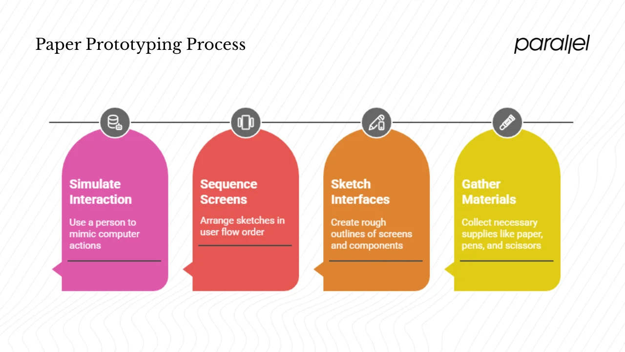
1) Preparation and materials
You don’t need fancy equipment. Gather printer paper or index cards, pens, markers, sticky squares, scissors, and tape. NN/g suggests creating a library of reusable interface blocks, such as buttons and input fields, so you can quickly assemble screens. Consider making cut‑out frames representing a phone or browser; this sets boundaries so you sketch within the right dimensions. Have blank cards for new screens and some “under construction” pieces to show that a screen isn’t ready yet.
2) Sketching interfaces and screens
- Draw one screen per sheet to keep things simple. Use minimal detail: outline major components like headers, navigation, buttons, and content areas. Use dummy text or generic labels such as “headline” or “body” rather than writing full content.
- Start with rough outlines. Resist the urge to polish; the goal is to test flow, not aesthetics. Use techniques like Crazy Eights (eight sketches in eight minutes) to generate multiple ideas quickly.
- Sketch according to device dimensions; draw an outline of a phone or browser window and keep your content within it.
3) Sequencing and mapping user flows
Arrange your sketches in the order the user would see them. Use arrows or numbering to indicate transitions. If your flow branches, prepare additional screens: for example, “if the user taps A, go to screen 2; if they tap B, go to screen 3.” Use overlays or folded pieces of paper to simulate modals or drop‑downs. Some teams attach small flaps to show expanded sections or additional details.
4) Simulating interaction – the “human computer” trick
During testing, assign one person to play the role of the computer. They will manage the stack of screens and place them in front of the participant when triggered. The “computer” should indicate when they’ve finished “working,” perhaps by folding hands or showing a printed hourglass icon. They should avoid overexplaining and let the participant interact naturally. Use cut‑outs to show loading states or transitions. For scrolling, use longer sheets or slide a paper strip behind a cut‑out frame. Keep “under construction” cards ready for sections you haven’t built yet.
Testing and feedback
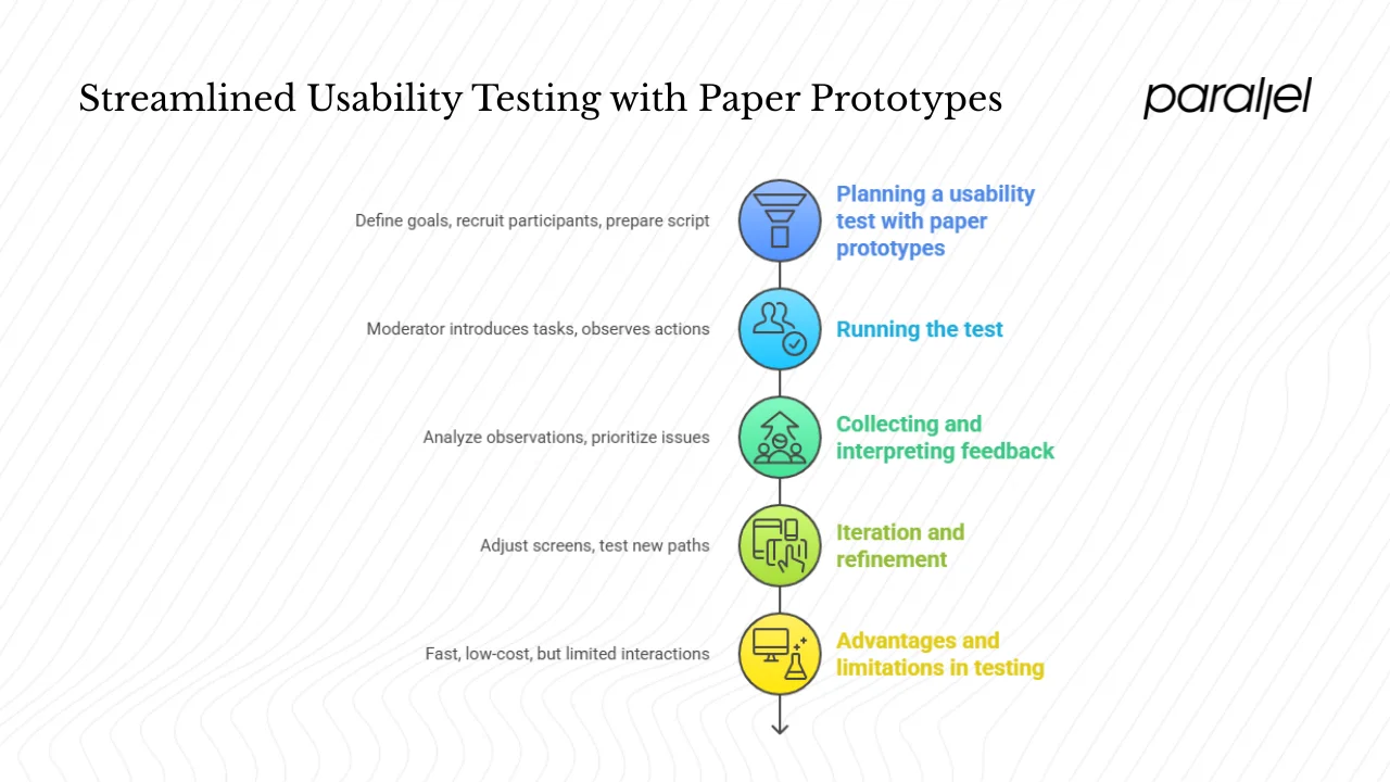
1) Planning a usability test with paper prototypes
Start by defining your goals: Are you testing whether users can find a feature? Do you want to validate the order of onboarding steps? Write down tasks and scenarios. Recruit participants representative of your target users; usability research suggests five participants often uncover most major issues. Prepare a script that sets context without leading participants. Explain that some parts of the prototype may not work; emphasise that you’re testing the design, not their abilities.
2) Running the test
A typical session requires a moderator and a “human computer.” The moderator introduces tasks and encourages the participant to think aloud. They observe actions, confusion, and hesitations. The “computer” handles screen changes quickly so the participant stays focused. If a participant taps something without a prepared screen, say “that isn’t working” and ask what they expected. If you show the wrong screen, remove it quickly and revert to the previous state. Keep conversation minimal and neutral; your job is to observe and learn.
3) Collecting and interpreting feedback
Take qualitative observations during sessions; capture photos of each sketch and the state it was used in. Look for patterns: repeated navigation errors, confusion about labels, or paths that participants never discover. Paper prototypes bring to light issues in content hierarchy and flow, so focus your analysis there. IxDF’s tips include doing a dry run with teammates first to discover how challenging it can be to moderate a paper test and how many questions users might ask. Prioritise issues based on impact and frequency; address the largest obstacles first.
4) Iteration and refinement
Because changes cost little, redraw or rearrange screens as soon as you spot problems. You can even adjust between sessions: sketch a new button or path and test it with the next participant. Continue the loop: test, adjust, test. Once flows feel solid and participants accomplish tasks easily, transition to screen‑based wireframes for more detailed testing.
5) Advantages and limitations in testing
Paper testing is fast, low‑cost, and ideal for catching conceptual issues. It invites broad participation and reduces pressure on users. However, participants must imagine the system working; some may struggle to visualise interactions. You can’t test micro‑interactions, performance, or visual polish. For commonly used patterns, like a typical login page, paper prototypes may be unnecessary. Recognise when to move to higher fidelity.
Best practices, tips and pitfalls
Best practices
- Keep fidelity consistent across screens to avoid drawing attention to differences that aren’t relevant. Don’t have one screen neatly drawn and another messy; users will focus on the polished one.
- Tell participants what is real and what isn’t. If a screen doesn’t work, say so; don’t let them think they failed.
- Use annotations on your sketches if needed; mark where modals appear or what each button does. This helps you later when translating into wireframes.
- Don’t over‑polish drawings; your aim is to validate flow and function, not decoration.
- Use clear labels and simple language; avoid jargon. Users shouldn’t guess what a button does.
- Time‑box your sketching and testing cycles; avoid endless doodling.
- Iterate often; early and frequent testing yields better designs.
Common mistakes and how to avoid them
- Too much detail too early: Resist shading, fonts, or colour. Focus on layout and flow. Detail invites attachment and slows change.
- Mixing fidelity levels: If some screens look polished and others rough, participants will focus on the polished ones and ignore the rest. Maintain consistency.
- Poor coordination between moderator and “computer”: rehearse the session so you know who is doing what. Slow responses break user flow and skew feedback.
- Ignoring interactions like scrolling or modals: Simulate these with paper strips or overlays. Without them, you may misjudge how a user experiences content.
- Not discarding your paper prototype after moving to screen‑based designs: Once you’ve learned from the sketch, let it go. Holding onto outdated flows can limit your thinking.
Tips from practitioners
From our own work with early‑stage startups, we’ve learned that teams skip paper prototyping because they underestimate its value. However, Susan Farrell has observed that even a simple paper test can reveal how users will interact with your service. In one machine‑learning‑enabled SaaS onboarding project, we sketched three versions of the sign‑up flow in an hour and put them in front of five users. The first version had a four‑step onboarding path; participants abandoned halfway. The second collapsed everything into one long page; users felt overwhelmed. The third used progressive disclosure: they entered email first, then saw more fields. Users breezed through. If we had built the first version, we would have wasted days of development.
Practitioners on forums and community threads share similar observations: paper prototypes help even in game design, where designers use cut‑out pieces to map open‑world mechanics. Others argue that while paper can seem quaint, it forces teams to think about structure and sequence. Some caution that remote collaboration requires screen‑based sketch tools; they suggest using tablets to draw and share screens in real time.
Integrating paper prototypes into your workflow
Suggested workflow
At Parallel we often follow this sequence:
- Discovery and ideation: gather requirements, write problem statements, and brainstorm. Sketch multiple solutions on paper.
- Paper prototyping: create simple screens and test flows with internal stakeholders and a handful of users. Identify what works and what doesn’t. Repeat until flows feel logical.
- Wireframes and mock‑ups: move your best paper flows into screen‑based wireframes. Add structure and basic interactivity. Validate again.
- High‑fidelity prototype: add visuals, typeface, and interactions. Conduct more formal usability tests.
- Development handoff: once design decisions are validated, create specifications and share them with engineers.
Transitioning from paper to screen‑based
When moving from paper sketches to screen‑based wireframes, view your paper as a blueprint. Translate each screen into a wireframe, ensuring you preserve flow and hierarchy. Include annotations to avoid ambiguity. Use your paper prototype as a conversation starter with developers; show them how users interacted and what issues you discovered.
When to skip or scale down
Not every feature requires a paper prototype. If you’re adding a standard login screen or a search bar, you can skip paper and go straight to a wireframe. If your team has strong design tools and an environment of rapid iteration, you might move directly into screen‑based prototypes. If your design relies heavily on complex animation or performance, you might start with higher‑fidelity prototypes. Use paper when the concept is novel, the stakes are high, or the team needs to get on the same page.
Examples & case studies
Web app example: onboarding flow

Imagine a SaaS product that requires users to set up a profile, integrate their data, and choose preferences. Rather than designing in Figma first, we sketched the onboarding screens on paper. We drew separate sheets for each step: welcome, profile creation, data integration, and dashboard tour. During tests, users repeatedly asked, “Why do I have to fill out these fields before I even see the product?” Their frustration led us to re‑order the flow: we allowed users into the dashboard after email verification and then nudged them to complete their profile later. The paper test saved us from engineering a multi‑step wizard that users would have hated.
Mobile app example: cut‑outs and overlays
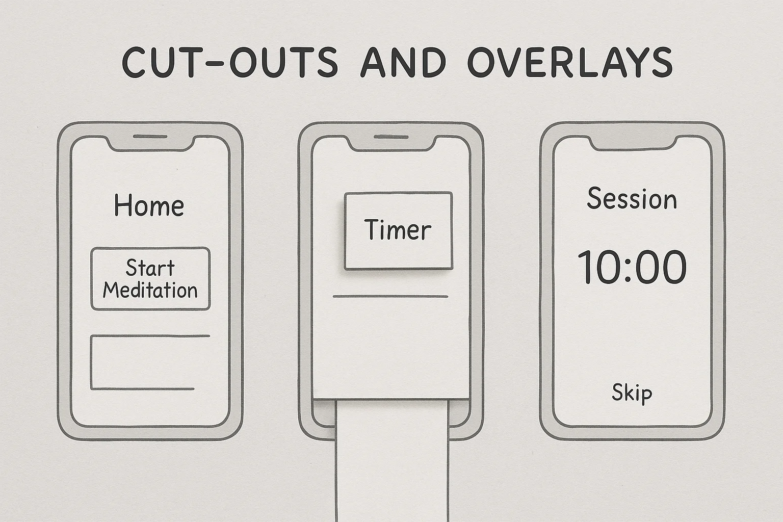
For a wellness app, we printed a phone frame and sketched different screens. We used small sticky squares as overlays for pop‑ups and modals. When users tapped the “start meditation” button, we placed a new sticky square over the screen showing the timer. To simulate scrolling, we slid a long paper strip behind the frame. This low‑tech simulation revealed that users missed the option to skip a session; we added a visible “skip” link in the next iteration. The entire experiment cost an afternoon and gave us actionable direction.
Game design example
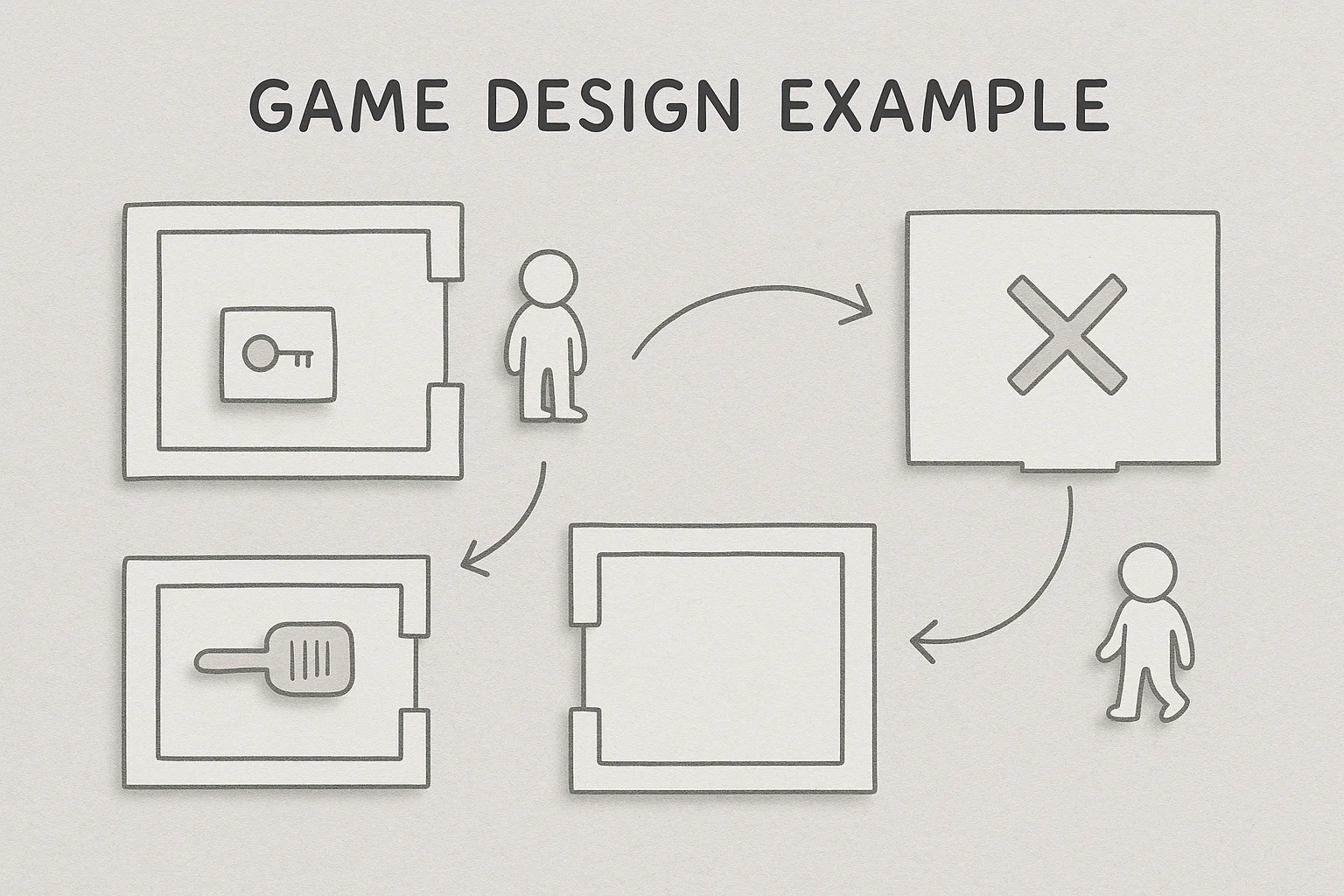
Even game designers use paper to test mechanics and story flows. For a puzzle game with branching paths, a team cut out room layouts and characters. They arranged them on a table, simulating how players would move through spaces and interact with objects. By acting out scenes and adjusting layouts, they discovered that certain puzzles were too easy and that some paths were dead ends. The insights came long before any code, saving weeks of development.
Startup story: catching a flaw early
One of our portfolio companies planned to launch a personalised finance app. The initial concept included a complex budgeting tool with multiple graphs and data inputs. We sketched the dashboard and asked five target users to interact with it using paper. Almost all of them ignored the budgeting feature and instead tapped straight into the expense tracker. When we asked why, they said the budgeting area looked intimidating. Based on this, we simplified the dashboard, moved the expense tracker to the top, and turned the budgeting feature into an optional deep‑dive. When the product launched, adoption rates were higher than our control group from earlier tests. A single afternoon with paper sketches prevented us from spending weeks building a feature nobody used.
Conclusion
In product development, speed and learning trump perfection. A paper prototype is a low‑fidelity, hand‑sketched representation of your product that allows you to test concepts early and at low cost. What is a paper prototype? It’s a simple set of drawn screens that simulate user flows. Prioritizing structure over style, paper prototypes foster collaboration and identify significant usability issues early on. Research indicates that initial paper-based testing leads to significantly greater improvements and cost savings compared to later-stage modifications, all before any code is written.
We’ve covered when and where to use paper prototypes, how to create and test them, and how to integrate them into your workflow. We compared them with wireframes and high‑fidelity prototypes, laid out best practices, and warned against common mistakes. We shared real examples showing how a few sketches can steer a product in a better direction. In the end, what is a paper prototype is not just about paper – it’s about learning fast. If you’re an early‑stage founder or a product leader, try sketching your next feature before you invest in design or code. You might save yourself months of rework and discover a better solution.
FAQ
1) What is the meaning of a paper prototype?
A paper prototype is a hand‑drawn representation of screens and interface elements arranged to simulate user flows. It is a low‑fidelity tool used to visualise ideas and test usability early. It allows teams to validate concepts at low cost before moving to computer‑based or coded versions.
2) What is an example of a prototype?
Examples include: (a) a series of hand‑sketched screens for a mobile app (paper prototype); (b) wireframes drawn in software that show layout structure; (c) a clickable mock‑up built in a prototyping tool; and (d) a near‑production simulation built with code. These span from low to high fidelity.
3) Can a paper prototype only be tested in person?
Not exclusively. While paper prototypes are traditionally tested face‑to‑face so you can swap screens manually, there are hybrid methods. Participants can draw on paper and share photos, or you can use a tablet to mimic paper sketches and flip images during screen sharing. However, remote testing may lose some of the tangible feel and immediacy.
4) What are the three types of prototypes?
One common classification divides prototypes by fidelity: low‑fidelity (simple sketches and wireframes), mid‑fidelity (more detailed mock‑ups with some interactivity), and high‑fidelity (polished, interactive models that look like the final product). Nielsen Norman Group also suggests considering the fidelity of interactivity, visuals, and content separately.

check out these related blogs