You click a button on a new service and nothing happens. You click again and again, still nothing. Frustrated, you hammer the same spot over and over. That moment captures the essence of what is a rage click. These rapid, repeated taps are not a tantrum but a cry for help. For product teams and founders, they expose the invisible friction that drives people away. In this article I explain what is a rage click, how to spot and interpret them, why they happen and how to fix the underlying problems.
What are rage clicks and why do they matter?
A rage click happens when someone rapidly clicks on the same spot of a webpage or app—usually out of frustration—because something isn’t working as they expect. It’s a behavioral signal that tells you the user is stuck, confused, or annoyed.

Microsoft’s Clarity platform defines a rage click as multiple taps clustered in the same area in rapid succession. Qualtrics puts it simply: a rage click is “a series of clicks or taps in very short succession that denotes extreme frustration”. These aren’t ordinary double‑clicks or exploratory taps. They occur when people expect a response from the interface and don’t get one. In my own work, I see them when a disabled button has no visual feedback or when a hidden overlay blocks a link.
In everyday use, a double‑click is deliberate, like opening a file. A rage click is impulsive, like mashing the lift button when it doesn’t arrive. The difference lies in frustration and reveals a mismatch between user expectations and the interface.
Normal clicking involves either a single action or a deliberate double‑click. Exploratory clicks might happen when someone doesn’t know which element is interactive. A rage click, by contrast, is a burst of taps born out of impatience or confusion. It’s the difference between testing and demanding.
Why this signal is useful
Rage clicks are a quantifiable signal of frustration because they expose the gap between expectation and response. Fullstory’s 2025 report found mobile error clicks surged 667% from 2024 to 2025, with similar spikes in rage clicks across sectors. Qualtrics reports that 90% of consumers abandon apps that perform poorly, and 43% won’t return to slow sites. Since 96% leave without complaining, rage clicks are one of the few behavioural cues we have. For early‑stage companies, this metric helps prioritise fixes and catches friction before it hurts conversion.
Related frustration signals
Rage clicks are one of several frustration signals. Dead clicks are single taps on non‑interactive elements that do nothing. Error clicks are taps that trigger an error or lead to a 404. Mouse thrashes show frantic cursor movements. These signals often accompany rage clicks, so filter out false positives — some visitors tap quickly out of habit.
Why rage clicks happen: common causes and patterns
Understanding what is a rage click is only half the work; you also need to know why they occur. In my experience working with early‑stage SaaS teams, the patterns fall into a few themes:

1) Ambiguous or misleading affordance
When something looks clickable but isn’t, frustration follows. Qualtrics warns that decorative elements are often mistaken for buttons. Transparent overlays or hidden layers can intercept taps, so users hammer the same spot.
2) Non‑responsive or broken elements
Buttons or links that do nothing — whether because they’re disabled, broken or lead to 404 pages — make people tap repeatedly.
3) Performance and latency issues
Poor page speed and delayed feedback make users think their tap didn’t register. If you hide spinners or prolong transitions, people assume the system ignored them and keep tapping.
4) Poor navigation or confusing layout
Hidden menus, unclear flows and misplaced calls to action make people tap the wrong area. If the primary action is hidden or looks inactive, they attack the wrong element.
5) JavaScript glitches and changing content
Race conditions or state mismatches can make buttons unresponsive or slow. Overlays (like cookie banners) may appear just as someone clicks, blocking input.
6) Habitual behaviour and false positives
Some visitors tap repeatedly out of impatience or habit. Pagination buttons or carousels can generate many taps as part of normal use, so filter these out.
7) Patterns in click behaviour
Rage clicks often cluster: a burst of taps in a small area within a second. If you see this pattern, investigate whether the element is broken, mislabelled or blocked.
Taken together, these root causes tell a story. Ambiguous affordance signals mislead users; broken elements and slow performance create invisible walls; confusing layouts hide the path forward; code glitches add hidden barriers; and habitual clicking muddies the water. Recognising which of these patterns is at play helps you prioritise where to dig deeper and fix the underlying issue. Once you understand what a rage clicks, you can decode these patterns.
Detecting and interpreting rage clicks
1) Manual methods and usability testing
You can spot rage clicks in usability tests. Ask participants to think aloud while using your product; if they tap the same spot repeatedly and voice frustration, you’ve seen the pattern. Session recordings from small tests reveal similar behaviour.
2) Behaviour analytics and session replay tools
To see rage clicks at scale, you need analytics. Heatmaps and click maps reveal clusters of taps; session replay tools like Fullstory and Qualtrics reconstruct sessions and let you filter by rage click events. You can also instrument your own code to log repeated taps — for example, flag three clicks within a second.
In practice, combining multiple methods yields the best insight. Heatmaps show where clusters occur; replays show why; and custom events let you customize detection to your product. Cross‑tool comparisons can uncover blind spots: one tool may surface dead clicks while another surfaces error clicks. When evaluating tools, consider privacy features, integration with your stack and the ability to segment by device and user cohort.
3) Tool‑specific features
Fullstory surfaces rage clicks and other signals and can break them down by sector and device. Hotjar lets you filter session recordings by rage click events. Qualtrics aggregates rage clicks with error clicks and mouse thrashes.
4) Heuristics and thresholds
To separate normal behaviour from frustration, set a simple threshold such as three taps within 500–1000 ms on the same element. Tune this to your product and confirm clusters by watching replays so you don’t act on false positives.
5) Prioritising what to investigate
Not every cluster deserves attention. Focus on sign‑up, onboarding and checkout, and segment by device and user type to uncover patterns.
6) Interpreting context and avoiding false positives
Rage clicks don’t tell the whole story. Check what users did before and after, and filter out legitimate rapid taps such as pagination or carousels. Combine rage click data with drop‑offs, conversions and qualitative insights.
Fixing and preventing rage clicks

1. Improve Feedback and Responsiveness
- Provide instant visual cues. When users click something, the interface should respond right away. Change button color or opacity on press.
- Use loaders wisely. If an action takes more than a second, show a spinner, progress bar, or skeleton screen so users know something’s happening.
- Boost real performance. Optimize both front-end and back-end speed. Reduce API latency, use caching, and prioritize content that needs to load first.
- Avoid “dead clicks.” Every interactive element should acknowledge user input, even if the result takes time.
2. Clarify Affordance and Consistency
- Make it clear what’s clickable. Use familiar visual cues—buttons that look like buttons, underlined links, and hover states.
- Differentiate static content. Avoid styling text or images in a way that suggests interaction if they’re not clickable.
- Stick to consistent patterns. Don’t surprise users with changes in design language or button behavior across pages or sections.
3. Handle Errors Gracefully
- Use clear, human error messages. Avoid technical jargon. Tell users what went wrong and how to fix it.
- Keep key actions functional. Design fallbacks so important buttons still work even if a script fails.
- Queue actions on weak networks. When connectivity drops, hold requests and retry automatically once the network recovers.
- Offer retry and recovery options. Let users refresh, resend, or cancel without losing progress.
4. Enhance Performance
- Compress and optimize assets. Reduce image and video file sizes to cut loading time.
- Lazy-load off-screen elements. Only load what’s visible first; bring in the rest as users scroll.
- Defer non-essential scripts. Run analytics or ads after the main content is interactive.
- Track and measure. Use tools like Lighthouse or Web Vitals to keep tabs on responsiveness and interaction delays.
5. Redesign Flows and Interactions
- Simplify user paths. Cut out unnecessary steps or hidden gestures that confuse users.
- Make important actions visible. Avoid burying them behind menus or icons that aren’t obvious.
- Use progressive disclosure. Show advanced options only when needed to reduce clutter and confusion.
6. Monitor and Set Safety Nets
- Track rage click patterns. Use analytics tools to identify which pages or elements trigger repeated clicking.
- Set alerts for spikes. A sudden increase often means a new bug or UX issue.
- Trigger help prompts. If users repeatedly click the same area, offer contextual guidance or chat assistance.
- Share findings across teams. Make data accessible to design, engineering, and support teams so fixes are aligned.
- A/B test solutions. Check if changes actually reduce rage clicks and improve satisfaction.
7. Validate Fixes and Keep Iterating
- Re-measure after changes. Compare rage click rates before and after the fix.
- Use session replays. Watch how users now interact—do they get feedback and complete their task?
- Track conversions. If engagement and completion rates improve, your fix worked.
- Keep monitoring. New features or UI tweaks can reintroduce friction.
- Pair data with user feedback. Quantitative drops in rage clicks mean little without qualitative confirmation from real users.
- Make this a habit. Treat rage click analysis as an ongoing process, not a one-off audit. Continuous refinement keeps the experience smooth and frustration-free.
Case studies and real‑world examples
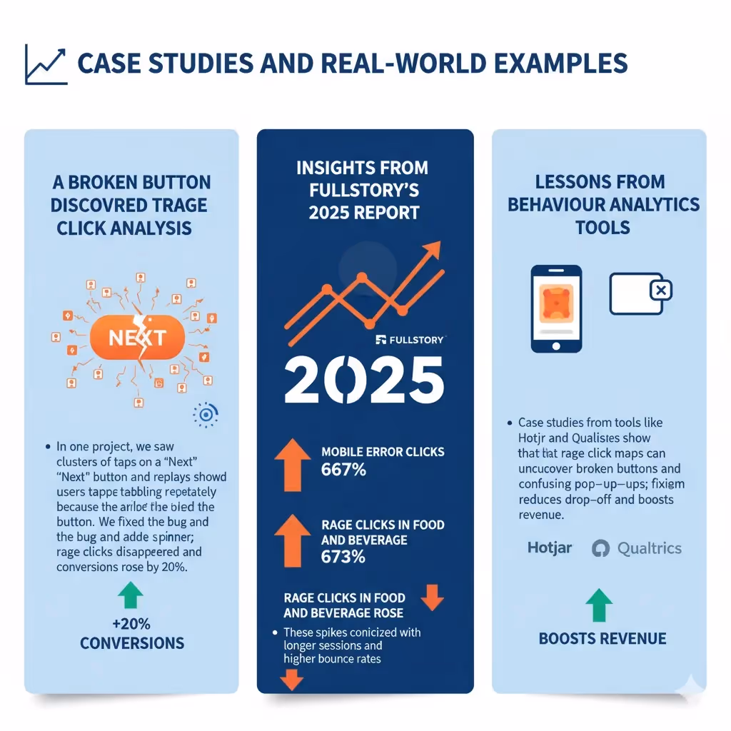
A broken button discovered through rage click analysis
In one project, we saw clusters of taps on a “Next” button and replays showed users tapping repeatedly because a logic error disabled the button. We fixed the bug and added a spinner; rage clicks disappeared and conversions rose by 20%.
Insights from Fullstory’s 2025 report
Fullstory’s 2025 report shows how serious the problem can be. Mobile error clicks jumped 667%, and rage clicks in food and beverage rose 673%. These spikes coincided with longer sessions and higher bounce rates.
Lessons from behaviour analytics tools
Case studies from tools like Hotjar and Qualtrics show that rage click maps can uncover broken buttons and confusing pop‑ups; fixing them reduces drop‑off and boosts revenue.
Best practices for founders, PMs and design leads
- Instrument early and use the signal wisely. Add rage click tracking early from day one; once you grasp what is a rage click, use it to understand frustration rather than just bugs.
- Focus on core flows. Fix rage click hotspots in sign‑up, onboarding and checkout.
- Combine data sources and share insights. Pair rage click data with interviews, surveys and support and make the findings visible across teams.
It isn’t about metrics. When people across design, engineering and product understand why users are frustrated, they make better decisions. Rage click signals can spark conversations across the team.
Limitations and misinterpretations
Rage clicks aren’t infallible: some are just impatience, tools misclassify events, and overreacting wastes effort. They tell you where frustration happens but not why, so always confirm with qualitative insights.
Conclusion
People rarely tell you when they’re irritated. What is a rage click then? It’s when that irritation surfaces as a burst of taps. By paying attention, you can fix broken experiences before they hurt conversion. As Fullstory’s 2025 data shows, frustration is on the rise. Yet teams who read these signals and act on them can turn anger into trust. If you learn what is a rage click and respond thoughtfully, you can transform irritation into loyalty. Audit your critical flows, instrument rage click tracking and keep improving. Stay curious; work never ends.
FAQ
1) What does “rage clicks” mean?
It means a user taps multiple times quickly on the same spot when the interface isn’t responding.
2) How do rage clicks differ from dead clicks?
Rage clicks involve multiple taps, whereas a dead click is a single tap on an element that produces no effect.
3) How can I detect them?
Use behaviour analytics tools like Hotjar or Fullstory to filter session recordings by clusters of rapid taps and mark them on heatmaps. You can also instrument your own code to flag three taps within a second and confirm via session replays.
4) How do I recognise what is a rage click in my own analytics?
Look for patterns of multiple rapid taps on the same spot. Tools like Hotjar, Qualtrics or Fullstory flag these events, and you can set your own threshold (for example, three taps within a second) to differentiate them from normal double‑clicking.

check out these related blogs


.avif)