Browser screens come in every shape imaginable. A founder showing a prototype to an investor might pull it up on a phone, a tablet or a gigantic monitor. Responsive design is the discipline that makes that page look and feel right on each device. In simple terms, it’s a design strategy that adapts to the device’s layout, adjusting fluidly to different screen sizes so that the interface remains usable, legible and attractive.
As someone who spends time building AI and SaaS products for early‑stage teams, I’ve seen how ignoring mobile users can derail adoption. By 2025, roughly 59.7% of global website traffic comes from mobile devices. Startups that overlook these users risk missing most of their audience.
This article will unpack what is responsive design, why it matters for founders and product leaders, and how to implement it. We’ll explore fluid layouts, flexible images, media queries, adaptive versus responsive approaches, mobile‑first practices and real‑world data.
Quick Answer: What Is Responsive Design?
Responsive design is a web design approach that ensures a website automatically adapts its layout, content, and functionality to fit any screen size—so it looks great and works well on phones, tablets, laptops, or large monitors.
What responsive design really means?
At its heart, responsive design is a design approach that adapts to various device sizes and contexts. Ethan Marcotte coined the term in 2010 to describe using fluid grids, fluid images and media queries to create layouts that respond gracefully across devices. Unlike rigid fixed‑width layouts, a responsive page expands and contracts like a liquid, ensuring that text remains readable and interface elements stay accessible.
How it works
- Fluid layout: Instead of defining widths in pixels, responsive layouts rely on relative units—percentages, em or rem—so that elements scale relative to the viewport. On a phone the main content might take 100% of the width; on a tablet it may become 50% to leave room for a sidebar. Fluid grids ensure each element occupies the same percentage of space, regardless of screen size, allowing components to scale up or down as users switch devices.
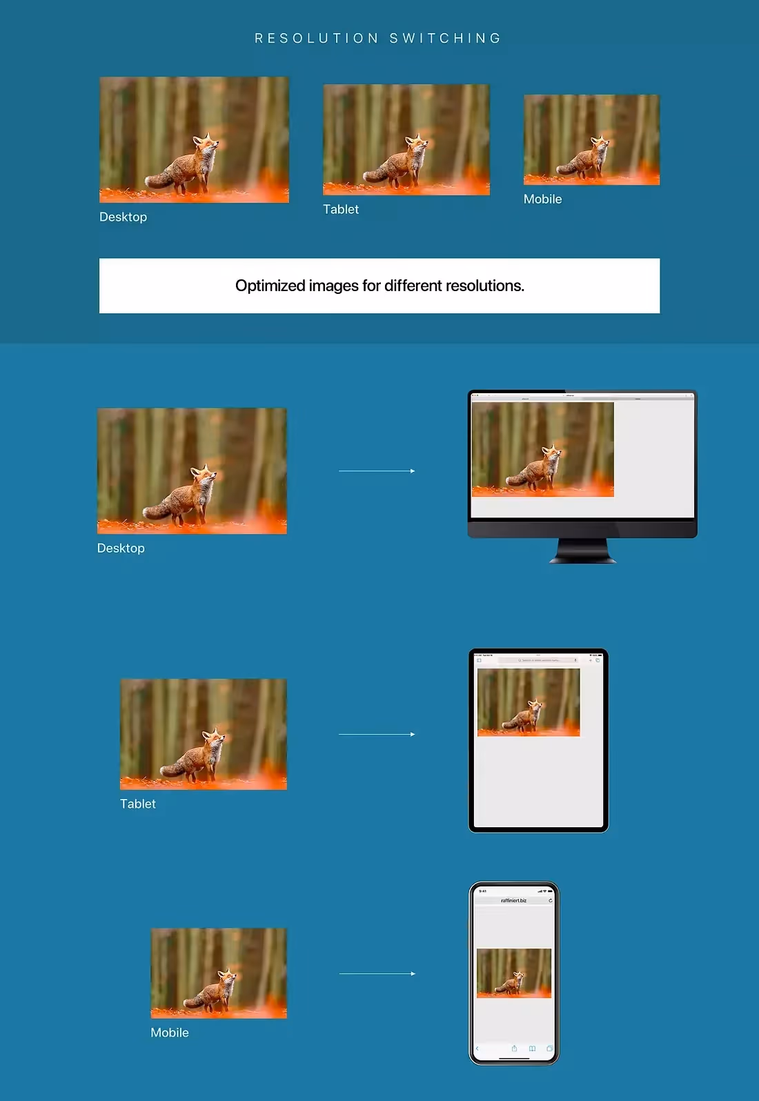
- Flexible images: Responsive images scale within their containers. Setting max-width:100% allows an image to shrink when the column narrows but never exceed its intrinsic width. Techniques like srcset and sizes attributes can serve different image resolutions based on screen size or bandwidth, and lazy loading delays downloading off‑screen images until needed—improving performance on slow connections.
- Media queries: CSS media queries detect characteristics such as screen width, orientation or resolution and apply style rules conditionally. Designers define breakpoints—thresholds where the layout shifts, such as from a single‑column mobile view to a two‑column tablet view. Modern tools like container queries complement viewport‑based media queries by responding to the size of a parent container instead of the viewport.
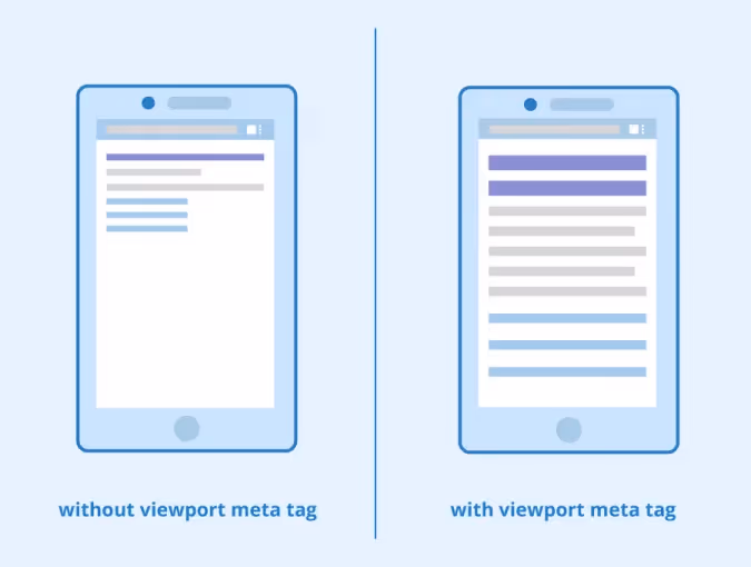
- Viewport meta tag: On mobile browsers, the viewport meta tag instructs the browser to set the viewport width to the device’s width and scale the document appropriately. Without it, mobile browsers may render pages at a default width (often 980 pixels), causing responsive layouts to fail. Always include <meta name="viewport" content="width=device-width,initial-scale=1"> to ensure breakpoints activate when expected.
Responsive design isn’t a single technology; it is an approach—a set of practices for building interfaces that respond to context. The rest of this article dives deeper into the core pillars and shows why adopting them early matters for startup teams.
What are the three core pillars of responsive design?
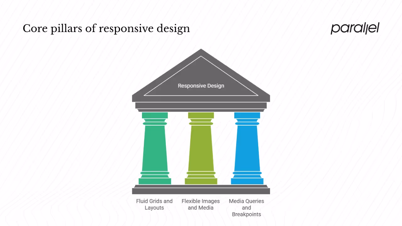
1) Fluid grids and layouts
Fluid layouts form the skeleton of responsive pages. Rather than anchoring elements to absolute pixel widths, designers use relative units like percentages, vh/vw (viewport height/width), em and rem. This allows content to stretch or compress with the viewport. Modern CSS provides powerful layout modules—Flexbox and Grid—that enable sophisticated fluid layouts without resorting to hacks. The Interaction Design Foundation notes that the principle of a grid is simple: every element occupies the same percentage of space, no matter how large or small the screen. By combining flexible units with responsive grid systems, we can build UIs that seamlessly adapt to any screen.
Why it matters:
- Consistent user experience: A fluid grid prevents horizontal scrolling and maintains visual hierarchy across devices. Users shouldn’t need to zoom or pan to read content.
- Ease of maintenance: One layout that scales reduces the need to maintain separate desktop and mobile codebases. Changes propagate across breakpoints automatically.
2) Flexible images and media
Images often break responsive layouts when they overflow their containers. To prevent this, set images to have a max-width of 100% and height set to auto so that they shrink gracefully. Scalable Vector Graphics (SVGs) are ideal for icons and simple illustrations because they scale without losing quality. Techniques like srcset allow browsers to choose appropriate image resolutions based on the device’s pixel density, and lazy loading defers loading images until they are about to enter the viewport, improving initial load times.
Why it matters:
- Performance: Large images slow down pages, especially on mobile networks. Responsive images deliver the right file size for each context.
- Visual consistency: Properly scaling images ensures they maintain aspect ratios and don’t appear pixelated or blurry on high‑resolution displays.
3) Media queries and breakpoints
Media queries are CSS rules that apply styles conditionally based on device characteristics. For example:
@media (min-width: 768px) {
/* styles for tablets and larger */
.sidebar {
display: block;
}
}
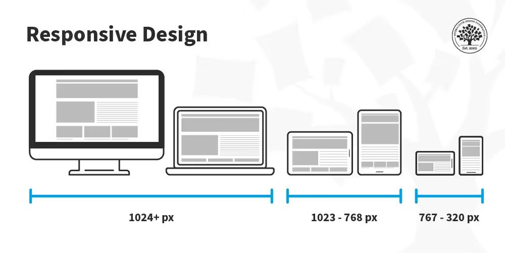
The IxDF explains that media queries detect the device’s dimensions and define breakpoints where the layout changes. Common breakpoints include 320 px (phones), 768 px (tablets) and 1024 px (desktops), but responsive designs should be flexible; it’s better to adjust at natural points where the content begins to feel cramped rather than targeting specific devices. Modern CSS also includes prefers‑reduced‑motion, color‑scheme and hover media features that allow you to tailor experiences based on user preferences and input methods, enhancing accessibility.
Why it matters:
- Tailored experiences: Media queries let you restructure the interface for each context—collapsing navigation, enlarging tap targets and adjusting typography.
- Progressive enhancement: They enable a mobile‑first approach: start with the smallest viewport and progressively enhance the layout as screen size increases.
How responsive design really works?
Fluid layouts in action
Modern CSS layout tools make building fluid grids straightforward:
- Flexbox: Use display:flex to create flexible row or column layouts. Child elements flex to fill available space. Setting flex-basis using percentages or auto allows items to grow or shrink naturally.
- Grid: With display:grid, you can define columns and rows using fractions (fr) or percentages. Media queries adjust the number of columns at breakpoints; for example, a two‑column layout becomes one column below 600 px.
- Relative units: Use em or rem to size typography so that it scales with the user’s settings. Viewport units (vw/vh) tie element sizes directly to the browser window.
I’ve worked with SaaS teams that initially set fixed widths for sign‑up forms. When users viewed the forms on small laptops, horizontal scrolling made fields disappear. Switching to a Flexbox‑based layout using percentages and min-width constraints fixed the issue and simplified maintenance.
Flexible images techniques
Responsive images require both CSS and HTML strategies:
- srcset and sizes: Provide multiple image resolutions. The browser chooses the most appropriate file based on the screen width and pixel density.
- CSS object-fit and aspect-ratio: Control how images crop or cover their containers. For example, object-fit:cover maintains aspect ratio while filling the container.
- Lazy loading: Use the loading="lazy" attribute or Intersection Observer to defer loading images until they’re needed. For large hero images, preloading at high priority can prevent content shifts.
Media query mechanics
Media queries listen for conditions such as width (min-width, max-width), orientation (orientation:portrait), resolution (min-resolution:2dppx) and even pointer capabilities (pointer:coarse for touch screens). Breakpoints are where you adjust the layout; choose them based on content rather than arbitrary device widths. MDN emphasizes that you should define breakpoints using relative units instead of hard‑coding specific device sizes. For example, @media (min-width: 48rem) scales naturally if the user adjusts the browser’s base font size.
Viewport meta tag essentials
Mobile browsers historically lied about their viewport width. When smartphones first appeared, they would set the viewport to 980 px to fit desktop pages and let users pinch‑zoom. The viewport meta tag overrides this behavior by instructing the browser to set the viewport width to the device’s width and scale the content to 100%, ensuring the layout responds correctly. Without it, your responsive breakpoints may never trigger. Always include initial-scale=1 to prevent automatic zoom.
Beyond the basics: adaptive vs. responsive
The early 2010s presented two approaches for designing across devices. Designers could either craft several fixed layouts optimized for specific devices—known as adaptive design—or create one flexible layout that stretches or shrinks to fit any screen (responsive design). In adaptive design, the server detects the user’s device and serves a tailored layout; for instance, delivering a simplified mobile site separate from the desktop site. This can offer highly optimized experiences but requires maintaining multiple codebases and anticipating new devices.
Responsive design, by contrast, uses relative units and media queries to let one design flow into any container. It scales gracefully from phone to desktop and, as new devices emerge, usually requires no structural changes. Most modern sites—including this one—adopt responsive design as the default because it is more future‑proof and efficient. However, hybrid approaches exist: some teams pair a responsive base with adaptive enhancements, such as loading smaller images or alternative navigation for specific devices. In my experience, an early‑stage SaaS team might start responsive and then add an adaptive landing experience for trade show kiosks or in‑app purchase flows. The key is to decide based on user needs and available resources.
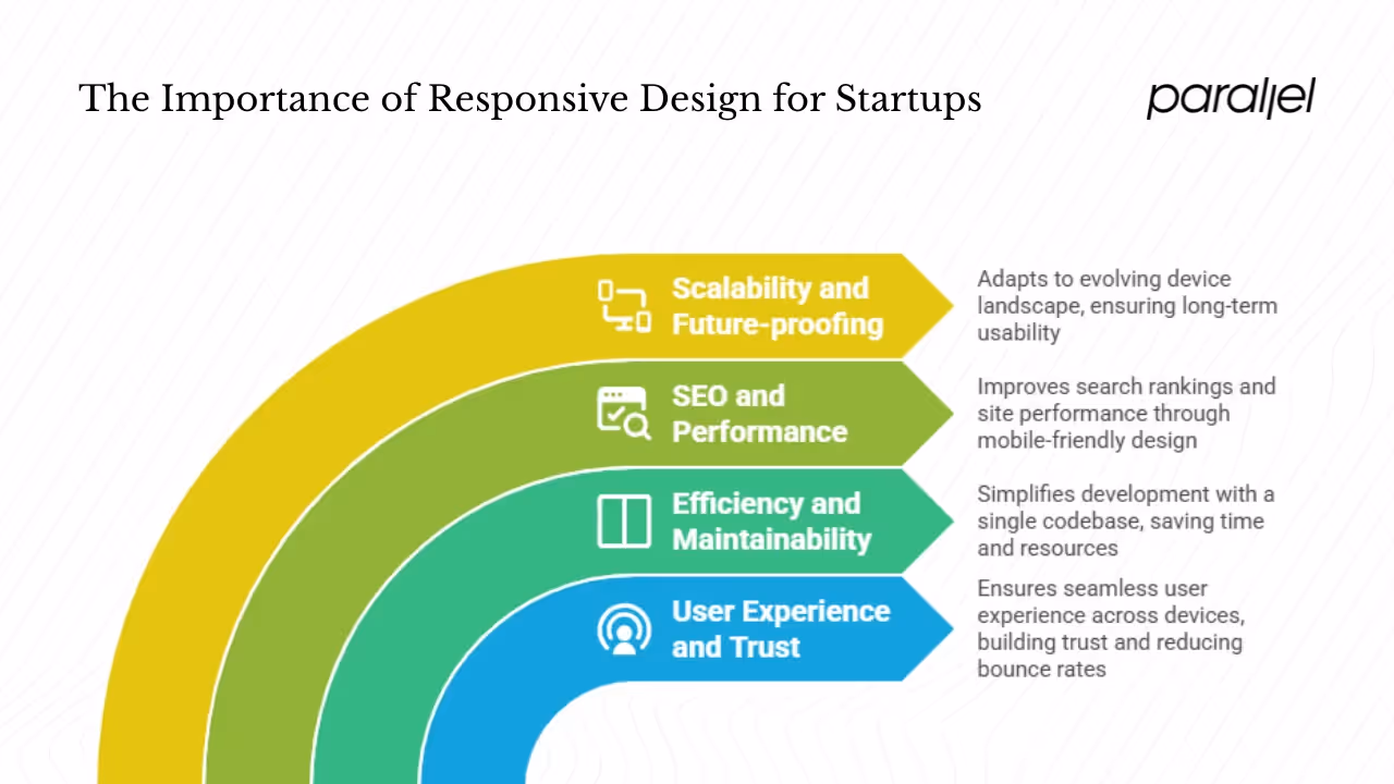
Why responsive design is critical for startups
1) User experience and trust
Users expect websites to work regardless of device. Studies compiled by VWO show that around 83% of mobile users feel websites should provide a seamless experience across all devicesvwo.com, and 8 out of 10 users will stop interacting with content that doesn’t display well on their device. In other words, a non‑responsive page erodes trust and drives users away. Moreover, research into viewing patterns suggests that 57% of users’ viewing time on a web page is spent above the fold. Responsive layouts help ensure that crucial content—headlines, value propositions, call‑to‑action buttons—appear in that first screen across devices, reducing bounce rates.
2) Efficiency and maintainability
From a development perspective, responsive design means one codebase instead of separate desktop and mobile sites. Maintaining multiple versions multiplies complexity: you must fix bugs, update features and ensure consistency across each version. By using fluid grids, flexible images and media queries, your team can ship improvements faster and focus on adding value rather than fighting layout issues. The Interaction Design Foundation points out that responsive design saves time because designers and developers focus on one design version.
3) SEO and performance
Google’s algorithms prioritize mobile‑friendly websites, and in July 2024 Google even stopped indexing sites that aren’t accessible on mobile. Responsive design improves search rankings because it provides a consistent URL structure and eliminates duplicate content issues that plague separate mobile sites. Performance also benefits: responsive techniques like lazy loading images and serving appropriately sized assets reduce load times, especially on slower mobile networks. The VWO statistics highlight that responsive websites register an 11% higher conversion rate and increase user engagement by 20%. Startups relying on organic growth should see these gains as competitive advantages.
4) Scalability and future‑proofing
The device landscape continues to evolve. Foldable phones, ultra‑wide monitors and wearables challenge designers to build flexible experiences. Responsive design inherently adapts to these variations. Tekrevol’s analysis of StatCounter data shows that mobile devices drove 59.7% of global website traffic in April 2025, up from 35% in 2015. That share is projected to reach 63.8% in 2025. Building responsively today ensures your product remains usable as new devices appear. For early‑stage startups, which often pivot and iterate quickly, investing in a scalable UI pays dividends later.
Real‑world patterns from startup work
Over the past year, our team at Parallel worked with several AI and SaaS startups that initially launched desktop‑centric interfaces. In user interviews, we noticed potential customers abandoning sign‑up flows when visiting on their phones; they simply pinched and scrolled until they gave up. After adopting a responsive approach—simplifying layouts, prioritizing key actions in the first viewport and using a mobile‑first design process—conversion rates improved significantly.

One client saw a 30% reduction in bounce rate on mobile and a 25% increase in completed trials within three months. Another gained organic search visibility after their new responsive site met Google’s mobile‑first indexing requirements, leading to a surge of inbound interest. These experiences reinforce that responsive design isn’t optional—it's a growth enabler.
Best practices for responsive design
Responsive design is more than just adding media queries. Below are practical guidelines drawn from research and hands‑on experience:
- Adopt a mobile‑first mindset: Start with the smallest screen and progressively enhance the layout for larger screens. This forces you to prioritize essential content and interactions.
- Prototype in the browser: Static mockups often fail to reveal responsive issues. Build early HTML/CSS prototypes and test them on real devices. Use tools like responsive inspectors or device emulators to check breakpoints.
- Optimize images and media: Implement srcset and sizes, compress images and enable lazy loading. Serve modern formats like WebP or AVIF for smaller file sizes.
- Tailor navigation to screen size: On mobile, a hamburger menu or bottom navigation can declutter the viewport. On larger screens, expose navigation items for quicker access. Ensure clickable areas are at least 44 × 44 px for touch targets.
- Prioritize content: Use clear hierarchy: headlines and calls to action should be visible in the first viewport. Nielsen Norman research shows that users spend most of their time above the fold, so craft those initial sections carefully.
- Use relative breakpoints: Define breakpoints based on content needs rather than specific device widths. For example, adjust the layout when a card becomes cramped, not because it’s a certain screen size. MDN recommends using rem units in media queries to remain consistent with the user’s font preferences.
- Consider touch and accessibility: Use pointer and hover media queries to adjust interfaces for touch devices. Ensure sufficient color contrast, scalable text and ARIA labels for assistive technologies.
- Test performance: Measure load times on a variety of devices and networks. Tools like Lighthouse and WebPageTest reveal bottlenecks. Aim for a Core Web Vitals score in the green zone; fast pages improve SEO and user satisfaction.
- Cultivate a responsive mindset: View the web as fluid, not fixed. Encourage your design and engineering teams to think in terms of components that resize and reflow. This mindset reduces friction when new devices emerge and fosters a culture of continuous improvement.
Implementing these practices ensures that responsive design delivers on its promise: an interface that serves users gracefully wherever they are.
Conclusion
Responsive design empowers startups to reach users across devices with one scalable interface. By leveraging fluid layouts, flexible images, media queries and the viewport meta tag, you build experiences that adapt to the user’s context. The approach originated as a practical solution to the proliferation of mobile devices and has since become the default way we build for the web. Data underscores its importance: mobile devices account for nearly two‑thirds of web traffic, and users expect seamless experiences. Responsive sites convert better, rank higher in search and future‑proof your product as new form factors emerge.
For startup founders and product leaders, adopting responsive design early is a strategic investment. It reduces technical debt, improves customer experience and aligns with search engine requirements. Most importantly, it demonstrates respect for users—meeting them wherever they are. In our work at Parallel, we’ve seen responsive design unlock growth and trust. Looking ahead, as devices continue to evolve and user expectations rise, the question isn’t whether to invest in responsive design but how to integrate it thoughtfully into your product strategy.
FAQ
1) What do you mean by responsive design?
Responsive design is a strategy where a website or app adapts its layout and content to the device’s screen size and context. It uses fluid grids, flexible images, media queries and the viewport meta tag to ensure the interface looks and works well on phones, tablets, laptops and future devices.
2) What best defines responsive design?
A responsive design uses fluid layouts, flexible images and media queries to deliver a single codebase that scales across devices. The goal is to provide a consistent, enjoyable experience whether a user visits on a 4‑inch phone or a 27‑inch desktop monitor.
3) What is an example of responsive design?
Imagine an e‑commerce product page. On a desktop it shows multiple columns: product images, description, price, reviews and related items. On mobile the layout reflows into a single column, images resize, text remains legible and navigation condenses into a hamburger menu. Users can tap images to zoom, swipe through galleries and add to cart without horizontal scrolling. This fluid experience illustrates what is responsive design in practice.
4) What are the three main elements of responsive design?
The three pillars are fluid grids, which use relative units to scale layouts; flexible images, which adapt to their containers and leverage techniques like srcset; and media queries, which apply styles conditionally based on screen size or capabilities. Together, they allow designers to build interfaces that respond gracefully to any viewing context.

check out these related blogs


.webp)


.avif)