That small rectangle with a magnifying‑glass icon is so familiar that we rarely stop to consider its role. Founders often ask me what a search bar is and why they should care about it. In plain terms a search bar is the interface element that lets people type words or phrases to find content inside a product. People often see it as an afterthought, but for early‑stage teams it can be a direct line to user intent. When done well it shortens the path to value, keeps users engaged and gives the team a direct feedback loop. This article answers the question of what a search bar is, explains how it works, shows why it matters for product and UX teams, shares design guidance and offers a practical checklist.
What Is a Search Bar?
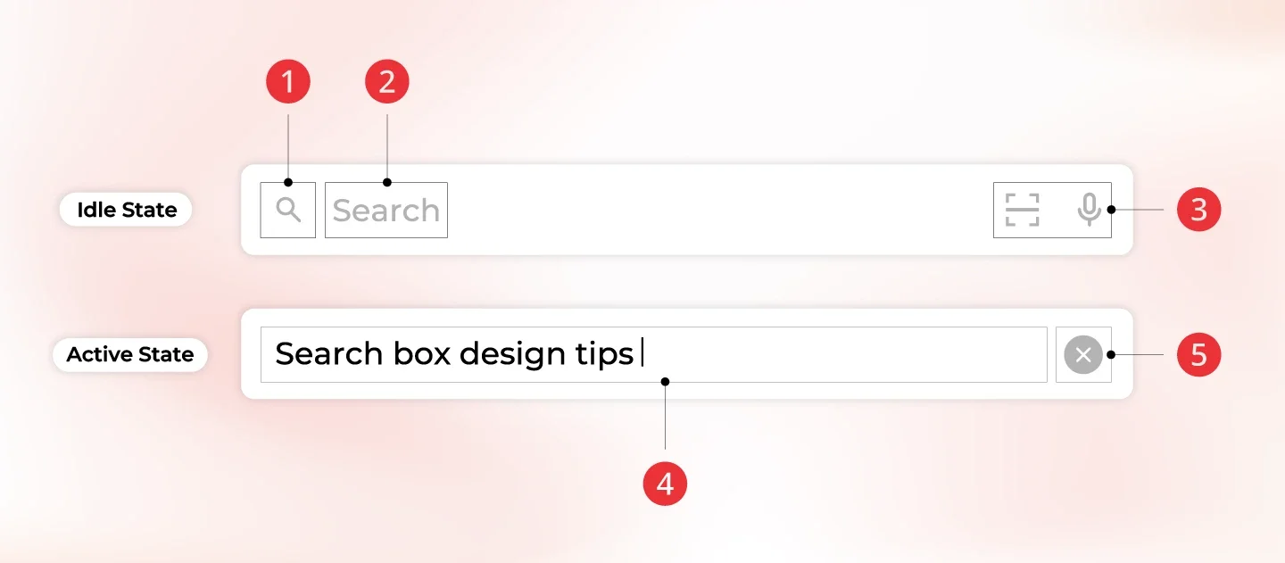
A search bar is a graphical component that provides a text input field and a trigger to submit a query. Users type a word or phrase and either press Enter or click the accompanying icon or button. This action sends the query to an internal search engine that returns matching content. The component is also called a search box, search field or query input. No matter the label, the purpose remains the same: letting people tell your product what they’re looking for. Asking what a search bar is reminds us that it’s not just a white box — it’s a promise that the system will respond.
Related terms
- User interface – The broader layout where the search bar sits; it must be visible and easy to access within the header, toolbar or navigation.
- Search field / query input – The area where the user types. Expanding the box to about 27 characters covers most queries.
- Internal search engine – The function that indexes and retrieves content within a site or app. It’s the unseen engine behind the search bar.
- Filters – Narrow down results by category or attribute alongside free‑text input.=
Why the definition matters for product teams
Founders and product managers often describe a search bar as a trivial widget. That’s a mistake. Knowing what a search bar is helps teams realise it’s a strategic feature. For product and design leads, it’s a lever to improve user experience and gather intent data. For early‑stage companies, learning from search queries can reveal gaps in onboarding, missing features or confusing labels.
How a search bar works

1) Input and submission
The basic workflow is simple: a user clicks into the search field, types a query and submits it. Good design supports both pressing Enter and clicking the magnifying‑glass icon. A hint inside the field can guide users about what they can search for. The bar should be wide enough to display most queries so users can review and edit them easily.
2) Indexing and retrieval
Once submitted, the query is handed to a search engine that has indexed your content. The engine matches the query against the index, applies ranking rules and returns results. Modern engines handle synonyms and misspellings so that “sofa” returns results for “couch”. They also allow filters to narrow results by category or other attributes.
3) Enhancements
Modern search bars do more than simple keyword matching. Auto‑complete suggestions help users finish queries quickly and roughly 9 % of people choose one. Spell correction and synonym support catch typos and alternative terms to avoid dead ends. Voice input is increasingly important on phones; in 2025 about one fifth of mobile searches were voice queries.
4) A fallback navigation tool
When menus fail, people turn to the search bar. A visible field acts as an escape hatch and reassures users that they can still find what they need even when the navigation doesn’t match their mental model. This is an essential insight when asking what a search bar is in the context of product design.
Why it matters for startups and product teams

1) Better user experience
Search reduces friction. When users can type what they need and get the right answer, they feel in control. Fewer than one in ten visitors use site search, yet those searches often account for more than a third of revenue. Making the search bar bigger and more obvious has been shown to lift conversions by over 30 %. On phones, where screens are small and menus awkward, a clear search bar is even more important. Mobile queries represent around two thirds of web searches.
2) Insight through analytics
Every query reveals what users want. Search analytics can tell you which terms are popular, which ones fail and where users leave. Despite this, very few companies act on search data. Only 7 % report learning from internal search and using it elsewhere in their business. As an early‑stage team, you can gain an advantage by monitoring search logs and addressing the gaps they reveal. For example, if many users search for “pricing” and bounce after seeing no results, you may need a dedicated pricing page or a link in your menu.
3) Conversion and retention
People who search are often ready to act. Customers using a site’s search bar are four to six times more likely to convert. Some case studies report that search users have 500 % higher conversion rates and spend 600 % more per user than non‑searchers. In our projects, enabling good search reduced churn because users found important features during their trial. When thinking about a search bar, these numbers show that it’s more than a convenience feature—it’s a revenue driver.
4) Scalability and accessibility
As your product grows, search scales better than static menus and handles long‑tail queries. Keyboard users or people with visual impairments often rely on search to bypass complex layouts. Considering a search bar from an accessibility perspective shows its role in accessible design.
Design and implementation guidance

1) Placement and visibility
Place the search bar where people expect to find it. Users look to the top left or top right of a page, and hiding it behind an icon increases effort. If search is central to your product, put the bar front and centre and keep it on every page, including error pages. On mobile, position it near the top and let it expand.
2) Sizing and icons
Make the input field wide enough to show typical queries. Aim for about 26–27 characters. Pair it with a simple magnifying‑glass icon; research shows people recognise this symbol. Make the icon clickable so users can submit with either a click or the keyboard.
3) Helpful hints and suggestions
Provide a short hint inside the field to guide users. Auto‑complete suggestions should appear after a few characters and the list should be short and easy to select. Don’t overwhelm users with too many options.
4) Handling errors and synonyms
Zero‑result queries frustrate users. Add spell correction and synonyms to handle misspellings and variations. When no results exist, offer related content or a prompt to contact support and review zero‑result logs regularly. This proactive approach is part of understanding what a search bar is in practice.
5) Results presentation and filtering
After submission, display the query at the top of the results page and show important details—title, snippet and any relevant metadata—so users can decide quickly. Provide filters to narrow results by type or category and, when relevant, allow sorting by relevance or recency. Keep performance fast: users expect near‑instant results and a slow response will hurt satisfaction.
6) Analytics and iteration
Track and measure how your search bar performs. Monitor how many sessions include a search, how often no results are returned, which queries lead to exits and how frequently search leads to purchases or important actions. Aim to keep zero‑result queries low. Iterate based on what you learn; very few companies dedicate resources to improving internal search. You can stand out by making search part of your product development routine.
7) Build versus buy
Decide whether to build search in‑house or integrate a third‑party service. For small data sets, a basic database query might suffice, but larger catalogues or advanced features require hosted search providers. Whatever you choose, make sure it scales with your growth and respects privacy.
8) Common pitfalls
Common problems include hiding the field behind an icon, using a short input that discourages longer queries, failing to handle typos and synonyms, ignoring search analytics and using search as a replacement for navigation.
Use cases and examples
Content‑heavy knowledge base
In a SaaS help centre with hundreds of articles, adding a clear search bar cut down support tickets. Logs showed many queries for “pricing” and “integrations”, prompting us to surface those pages and refine navigation. A well‑designed search bar connects users to content and gives the team insight.
E‑commerce marketplace
An e‑commerce site with thousands of items needs a strong search. Replacing a tiny icon with a full‑width input and adding suggestions boosted usage and conversion. By analysing zero‑result queries we learned that shoppers typed “sofa” while listings said “couch”, so we added synonyms and reduced bounce.
Mobile app with large catalogue
A mobile reading app placed a search bar at the top of every screen. “Search as you type” suggestions speed up discovery, and voice input lets users look for books while commuting.
Internal dashboard search
In a business analytics tool, we built a search field that understood natural language (“weekly active users”). It directed users to the correct chart and supported filters. This reduced time to find data and increased adoption. The case shows how this concept applies in B2B contexts.
Quick checklist for founders and PMs
- Do you have a visible search bar on all pages, and is it big enough to show typical queries?
- Does it support both pressing Enter and clicking the magnifying‑glass icon?
- Does the component offer auto‑complete and handle misspellings and synonyms?
- Are you tracking how often it’s used and how many queries return no results?
- Are you using search data to inform product and content decisions?
- Does it perform well on mobile, including voice input, and complement your navigation rather than replacing it?
Conclusion
The question “what is a search bar?” may seem trivial, yet the answer reveals its significance. A search bar is a small interface element that connects user intent with the right content. For early‑stage teams it has outsized impact: it delights users, surfaces insight and drives revenue. Invest in thoughtful design—proper placement, adequate size, helpful suggestions, spelling correction and analytics—and you turn a simple box into a strategic asset. Don’t see it as an afterthought. Knowing what a search bar is and handling it carefully will help your product scale and your customers succeed.
FAQ
1. How do I use the search bar?
Most websites or apps place the search bar near the top. Tap or click inside the field, type your query and press Enter or click the icon. On mobile, a magnifying‑glass icon may expand into a search field.
2. What does a search bar look like?
It’s usually a rectangular text field with a magnifying‑glass icon. Many include a hint such as “Search…” to prompt usage. The field should be large enough to show most of your query.
3. What’s the difference between a browser and a search bar?
A browser (like Firefox or Chrome) is software that lets you access sites. A search bar is a component within a site or app that helps you find content in that specific product. Modern browsers sometimes combine address and web search, but internal site search remains a separate feature.
4. What is another word for search bar?
People use terms such as search box, search field, query input or site search bar. They all describe the same element: a place where you type a query to find content.

check out these related blogs


.avif)