In young products, quick decisions are the norm. Visitors decide whether to sign up or buy with little patience, often while scrolling through long pages. When they lose sight of the menu or call‑to‑action, they hesitate or leave. To solve this, designers introduced sticky headers: a bar that stays anchored to the top of the screen as the page scrolls. In this article I explain what a sticky header is, when to use it, how it works and the trade‑offs. Drawing on research from 2024–2025 and our experience at Parallel, I’ll help founders and product leaders make informed decisions about persistent navigation.
What Is a Sticky Header?
A sticky header (sometimes called a persistent header or fixed navigation bar) is a design pattern in which the header remains visible as users scroll down a page. Unlike traditional headers that scroll away, the sticky variant keeps navigation, search or calls‑to‑action within reach. The Nielsen Norman Group notes that such headers improve the discoverability of important elements and reduce the need to scroll back to the top. Put simply, what is a sticky header? It’s a way to keep critical interface controls anchored to the viewport, even as content moves beneath them.

Sticky vs fixed – Sticky headers differ from fixed headers in implementation. A sticky header uses CSS position: sticky and behaves like a normal element until the page scroll reaches its top offset; at that point it sticks to the top. A fixed header uses position: fixed and is always detached from the document flow. This distinction matters for performance and user experience. When asking yourself what is a sticky header in technical terms, keep in mind that the sticky variant toggles between relative and fixed positioning depending on how far you scroll.

Why sticky headers matter
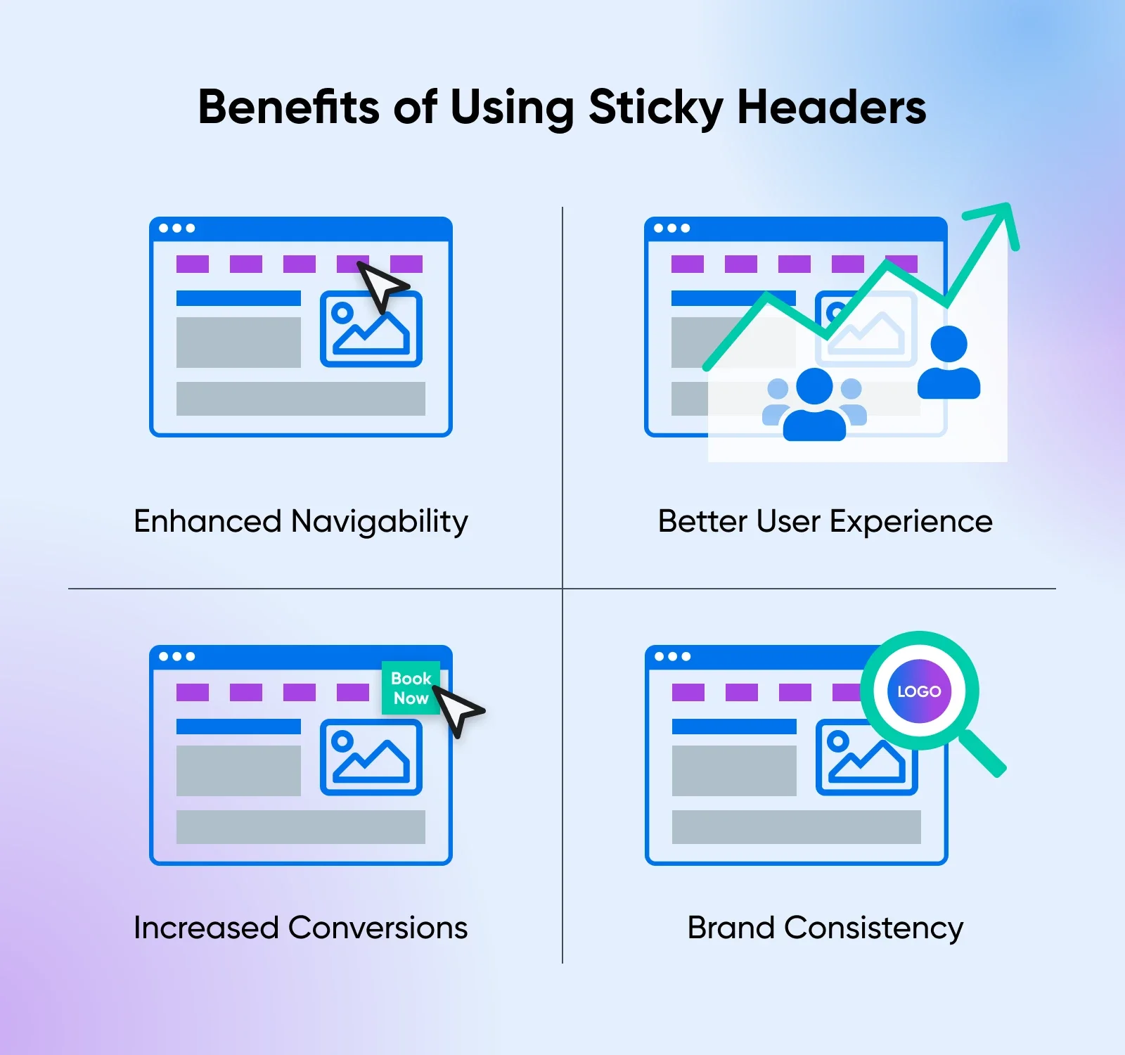
Benefits for users
Persistent navigation reduces friction on long or content‑heavy pages. Users don’t have to scroll back to the top to find the menu or search bar. Nielsen Norman Group reports that sticky headers increase the discoverability of navigation and utility elements. Our projects at Parallel have shown that keeping the sign‑up button visible on a long pricing page can shorten time‑to‑conversion. Wisdmlabs observed that adding sticky navigation to an e‑commerce site boosted conversion by roughly 3%. Sticky headers also support orientation: when reading documentation or infinite scroll feeds, people know where they are and how to move to other sections.
Business impact
Sticky headers can improve engagement, conversion and brand recognition. When the cart or call‑to‑action remains visible, users are more likely to complete purchases; A/B tests show up to a 25% conversion lift. For startups, quick access to sign‑up or search can translate into real revenue, and keeping your logo visible reinforces brand identity. In that sense, what is a sticky header? It acts as a constant reminder of your product’s value.
When they hurt?
The same qualities that help can also hinder. Sticky headers consume vertical space that could otherwise display content. Nielsen Norman Group warns that they inherently trade off content areas. On mobile the issue is worse: Slider Revolution notes that sticky headers can take up 30% or more of the viewport when users zoom. Persistent bars may trigger layout shifts, increasing Cumulative Layout Shift (CLS) and hurting Core Web Vitals. According to New Target, user satisfaction drops when more than 20–30% of the screen is occupied by the header. Poor implementation can slow pages; extra CSS and scripts can bloat the page and cause scroll jank. Accessibility is another concern: sticky headers can obscure focused elements and break skip links.
How sticky headers work
At the core of a sticky header is CSS positioning. A sticky element behaves normally until the scroll position reaches its offset, then it sticks to the viewport. To create one, set position: sticky; top: 0; on the header element and ensure that the parent doesn’t have overflow: hidden. This simple CSS pattern works across modern browsers (about 92% support). By contrast, position: fixed makes the header always attached to the viewport but removes it from the normal flow.
For more complex behaviour—such as shrinking the header or hiding it until you scroll up—you can add a small JavaScript helper. Use a scroll listener or Intersection Observer to toggle classes only when needed. Keep scripts lean to avoid performance issues.
Here is a basic example:
<header class="site-header">
…navigation…
</header>
<main>…content…</main>
/* CSS */
.site-header {
position: sticky;
top: 0;
z-index: 1000;
}
This code defines a header that sticks once you scroll past it. Always specify a top offset and a high z-index to avoid overlap. Test at various zoom levels; at high zoom, you may disable sticky behaviour with a media query.
Design and UX considerations
1) Size and content
Keep the bar as slim as possible: aim for a high content‑to‑chrome ratio and test at different zoom levels. Include only essential items—logo, primary navigation and one or two calls‑to‑action—and avoid cramming in secondary links or promotions.
2) Behaviour on scroll
Headers can behave differently as users move down the page. Some remain fully visible at the top; others slide off when you scroll down and reappear when scrolling up; still others shrink in height or transition from transparent to solid to maintain contrast. Keep any transitions smooth and responsive to natural scrolling, and avoid complex animations that distract users.
3) Mobile and accessibility
On small screens sticky headers can feel overwhelming, so you may disable them or use a compact icon‑based bar. Ensure keyboard focus isn’t hidden behind the bar and provide skip links or proper landmarks. Maintain good contrast between the header and underlying content to aid readability.
When to use a sticky header
Good cases

Sticky headers are helpful when pages are long or tasks require frequent navigation. Blogs, documentation, news sites and infinite scroll feeds benefit because users can jump to other sections without losing their place. Web applications that rely on persistent search or actions (such as dashboards) also gain from keeping controls visible. E‑commerce sites often keep the cart and search icon visible, increasing the chance that users will complete a purchase. Early‑stage products may use a sticky header to keep sign‑up or trial buttons accessible, reducing friction. When you evaluate whether to implement one, recall what is a sticky header intended for: providing constant access to important actions.
Poor cases

Not every site needs a sticky header. Single‑page sites with minimal scroll don’t benefit from persistent navigation; it just adds clutter. Pages with complex or heavy navigation can become cramped if all links remain visible. On mobile, large sticky headers can consume too much space and cause users to bounce. Performance‑critical pages (e.g., landing pages for ad campaigns) might avoid sticky elements to minimize layout shifts. If your content is short or your users rarely need to jump around, a static header is sufficient. Wisdmlabs points out that when there’s almost no scrolling, sticky navigation is unnecessary.
Decision criteria
Before building a sticky header, ask:
- Do users need constant access? Analyze scroll depth and navigation patterns. If people rarely scroll far or rarely use the menu mid‑page, skip it—ask yourself what is a sticky header supposed to achieve and whether another pattern would suffice.
- How long is the page? Persistent navigation makes sense on long pages; on short pages it’s overkill.
- What is the mobile experience? Test at various viewport sizes and zoom levels. If the header occupies too much space, disable or shrink it.
- Can you measure impact? Run A/B tests comparing sticky vs non‑sticky headers. Track bounce rate, task completion time and conversion. The Darwin Apps guide highlights conversion gains from header testing.
- Is the benefit worth the cost? Consider the development effort and potential performance impact. A simple CSS sticky header is low‑cost; complex behaviours may not justify the return.
Real‑world examples and variations
Many familiar products illustrate what a sticky header is in practice. News sites pin article titles and menus so readers can jump around. Shops keep the cart or search icon visible to encourage check‑out. Apple’s minimal header stays out of the way. In our data dashboards, a slim bar with a logo, search and account menu cuts down task time. These examples show that sticky headers work best when they are understated and purposeful.
Variations include shrinking headers that compress after a scroll, hide‑and‑reveal patterns and transparent bars that turn solid for contrast. Avoid oversized bars or too many links, which frustrate users, and keep animations minimal. Always test across devices and ensure that sticky elements don’t hide anchors or keyboard focus.
Implementation roadmap for startups
Building a sticky header doesn’t have to be complex. Our approach:
- Audit and define. Look at your site’s longest pages and identify tasks that require mid‑scroll navigation; decide what you need from the header (e.g., keeping a sign‑up or cart link in view).
- Pick essentials and design. Choose the logo, primary links and one or two calls‑to‑action that should stay visible, and wireframe a compact sticky state with clear behaviour.
- Implement with CSS. Start with position: sticky; top: 0; z-index: 1000 and add minimal JavaScript only if you need to hide‑and‑reveal or shrinking effects.
- Test broadly. Check the header on desktop and mobile, at different zoom levels and with assistive tools. Adjust if it hides content or anchors.
- Measure and iterate. Run experiments, monitor Core Web Vitals and adjust size or behaviour based on data; keep assets small (e.g., under 50 KB) and avoid unnecessary scripts.
This process helps you focus on value rather than fashion. As you refine your product, revisit the question of what is a sticky header and whether it still serves your goals.
Conclusion
Sticky headers are a powerful pattern, but they’re not a one‑size‑fits‑all solution. Understanding what is a sticky header and how it affects user experience, business metrics and technical performance allows you to make strategic choices. A slim, well‑designed sticky header can speed up tasks, improve conversion and reinforce your brand. Yet persistent bars can reduce content space, slow pages and create accessibility issues if implemented poorly. Use the decision criteria and roadmap above to determine if it makes sense for your product. Test, measure and iterate. Done well, a sticky header keeps navigation at your users’ fingertips without getting in the way.
Be clear about its purpose, seek feedback and iterate. Sometimes removing features is more effective than adding a sticky bar.
FAQ
1. Is a sticky header good or bad?
It’s good when pages are long and navigation or calls‑to‑action need to remain accessible. It can be bad on short pages or small screens, where it takes up too much space and hurts performance. Evaluate the context and test with users.
2. What is the difference between a sticky and fixed header?
A sticky header uses position: sticky and behaves like a normal element until you scroll past it, then it sticks. A fixed header uses position: fixed and is always detached from the document flow. The sticky pattern allows initial content to display before the header locks in place.
3. How do I create a sticky header?
Use CSS: set position: sticky; top: 0; on the header and give it a high z-index. Ensure the parent doesn’t hide overflow. For advanced behaviours (hide/reveal, shrink), add a small JavaScript script or use a framework with builtin options.
4. Does a sticky header hurt performance?
A simple CSS sticky header has little impact. Performance issues arise when heavy JavaScript or large assets are added. Layout shifts can affect Core Web Vitals. Keep the header lean and monitor CLS and LCP.
5. Should sticky headers be used on mobile?
Use caution. On small screens, a persistent bar can occupy a large portion of the viewport and frustrate users. Consider disabling sticky behaviour on narrow viewports or designing a compact version. Always test at different zoom levels and with assistive technologies.

check out these related blogs


.webp)