In the early days of a startup, chaos is almost a feature. Teams move quickly, priorities shift overnight and decisions are made with incomplete information. Amid that frenzy it can be tempting to treat writing rules, color palettes and logo sizes as an afterthought. Ever wondered what is a style guide and why it might matter? Yet the way you present yourself externally and internally shapes how customers, partners and employees perceive you.
In our experience working with AI and SaaS founders, teams that invest early in a style guide scale their voice and visual identity much more efficiently. A style guide (often called brand guidelines) is a single reference that documents how your brand looks, sounds and behaves. By codifying these choices early, you reduce the cognitive burden on team members, strengthen trust with users and avoid reinvention with every new asset.
In this article we define what is a style guide in practical terms, explain why it matters for small teams and startups, outline its core components, walk through a step‑by‑step creation process and share examples and best practices. The goal is to give founders, product managers and design leaders a roadmap for building a guide that delivers clarity, consistency and efficiency across all touchpoints.
What Is Meant by “Style Guide”?
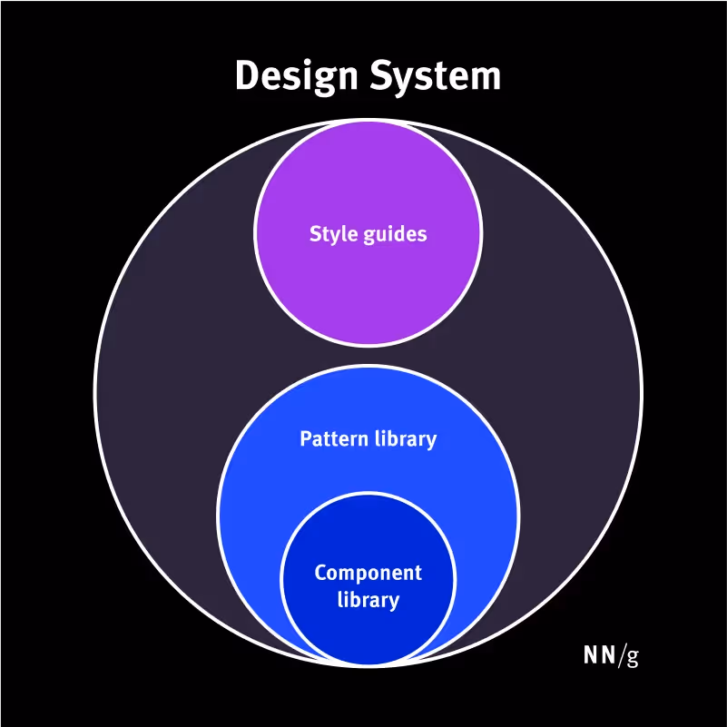
When people ask, “what is a style guide?”, the answer depends on context. In publishing it refers to grammar rules; in branding it evokes logos, colors and typography. For digital products and startups it is a living document that harmonizes writing conventions, visual standards and technical guidelines into a single source of truth. Bynder describes a style guide as a company‑produced guide that outlines how brand elements should be used in any print or digital representation. It covers colors, fonts, iconography, tone of voice, copywriting rules and illustration guidelines. Interaction Design Foundation adds that guidelines define how a brand represents itself in digital products and ensure consistency in the use of elements such as colors, typography and imagery. The purpose is to create a cohesive identity across touchpoints and to align designs with brand values.
A style guide is not just about grammar; it encompasses visual and brand norms. At a minimum it includes:
- Tone of voice: how the brand uses language, including preferred grammar, abbreviations and examples of phrasing.
- Typography: font families, sizes and spacing for headings, body text and captions.
- Logos: primary and secondary logos, file formats, spacing guidelines and examples of correct and incorrect usage.
- Color palette: primary and secondary colors with HEX, RGB, CMYK and Pantone codes. Studies have shown that using a signature colour can increase brand recognition by 80%.
- Imagery and iconography: guidance on photography styles, illustrations and data visualizations.
These pieces work together to ensure that anyone creating materials — from social posts to product UIs — can produce assets that look and sound like they came from the same organization. As Bynder notes, the best guides are concise, easy to read and digitally accessible so changes can be made in real time.
Put simply, what is a style guide? It is your brand’s rulebook that goes beyond grammar and into visuals and tone, giving every creator a single point of reference.
Why It Matters for Startups & Product Teams
Before exploring why it matters, it helps to consider what is a style guide doing for your team that loose conventions cannot. A shared reference turns preferences into decisions and frees mental space for product work.

1) Reducing cognitive load
When users encounter a uniform design they feel at ease. A consistent interface reduces cognitive load because people don’t need to adapt to varying styles or search for elements that should naturally be in place. Mobile Reality’s guide on software style guides notes that consistency in design significantly boosts user experience and enhances brand recognition. In product teams, a style guide performs a similar function internally: it reduces the cognitive load on designers, developers and writers by codifying decisions ahead of time. Instead of debating the capitalization of headings or the spacing around a logo, teams can focus on solving user problems.
2) Building trust and credibility
According to the Interaction Design Foundation, brand guidelines help build trust and credibility by presenting a cohesive visual and communicative style. When customers see the same colors, typography and tone across your website, app and emails, they perceive your organization as professional and reliable. Papirfly’s 2025 brand consistency guide reports that consistent brands enjoy over 20% more revenue growth compared to those that don’t take consistency seriously. The same research notes that consistent storytelling can grow brand value by up to 20%. When budgets are tight, this uplift can be a powerful competitive advantage for startups.
3) Supporting scalability
Scale is not just about acquiring users; it’s also about onboarding new team members and external partners. A style guide accelerates onboarding by providing clear references for how things are done. It also makes collaboration with contractors and agencies smoother because expectations are documented. In our work with early‑stage AI companies, we’ve seen how a shared guide reduces back‑and‑forth in design reviews and speeds up experimentation. The Exploding Topics report on branding statistics notes that 15% of companies don’t have brand guidelines and only 30% have guidelines that are well‑known and accessible to the entire organization. Almost half of brands publish off‑brand content at least a few times per year. Having a simple style guide accessible to everyone can mitigate these errors.
4) Ensuring brand consistency across channels
Consistency doesn’t happen by accident. Papirfly points out that over 75% of consumers use social media to decide what brands to engage with. If your social posts differ in tone and visual style from your website or product UI, you risk confusing your audience. A style guide keeps messaging aligned across channels — marketing sites, product interfaces, support docs and more. Lucidpress data (cited by Exploding Topics) indicates that staying on‑brand can increase revenue by 10–20%. A third of industry professionals in Lucidpress’s survey reported revenue increases of over 20% when messaging was consistent. That level of impact is hard to ignore for early‑stage ventures.
Core Components of a Style Guide
Your visual identity is how people recognize you. According to Bynder, a style guide should centralize the overall look and feel of your brand. Core elements include:
- Logo usage: Document acceptable versions of your logo (full logo, icon, wordmark) and specify clear space, minimum sizes and prohibited modifications. Provide examples of correct and incorrect use.
- Color palettes: List primary, secondary and accent colors with HEX, RGB, CMYK and Pantone codesbynder.com. Use diagrams showing how combinations should (and shouldn’t) be applied. Research shows that a signature color can boost recognition by 80%.
- Typography: Define font families, weights and sizes for headings, subheadings, body copy and captions. Specify line spacing, kerning and usage examples to ensure readability across platforms.
- Imagery: Provide guidelines for photography style (e.g., candid vs. staged, color grading), illustration aesthetics and icon sets. Include examples to illustrate tone and composition.
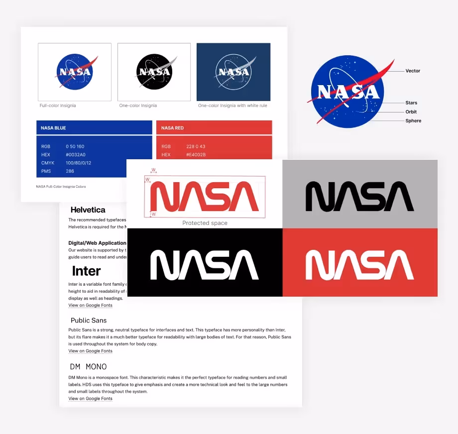
A clear visual rulebook lets any designer or marketer understand how to apply your identity in new contexts. NASA’s 1976 brand guidelines (60 pages long) are famous for meticulously outlining correct and incorrect logo usage. Modern guides don’t need to be that long, but they should convey the same level of clarity.
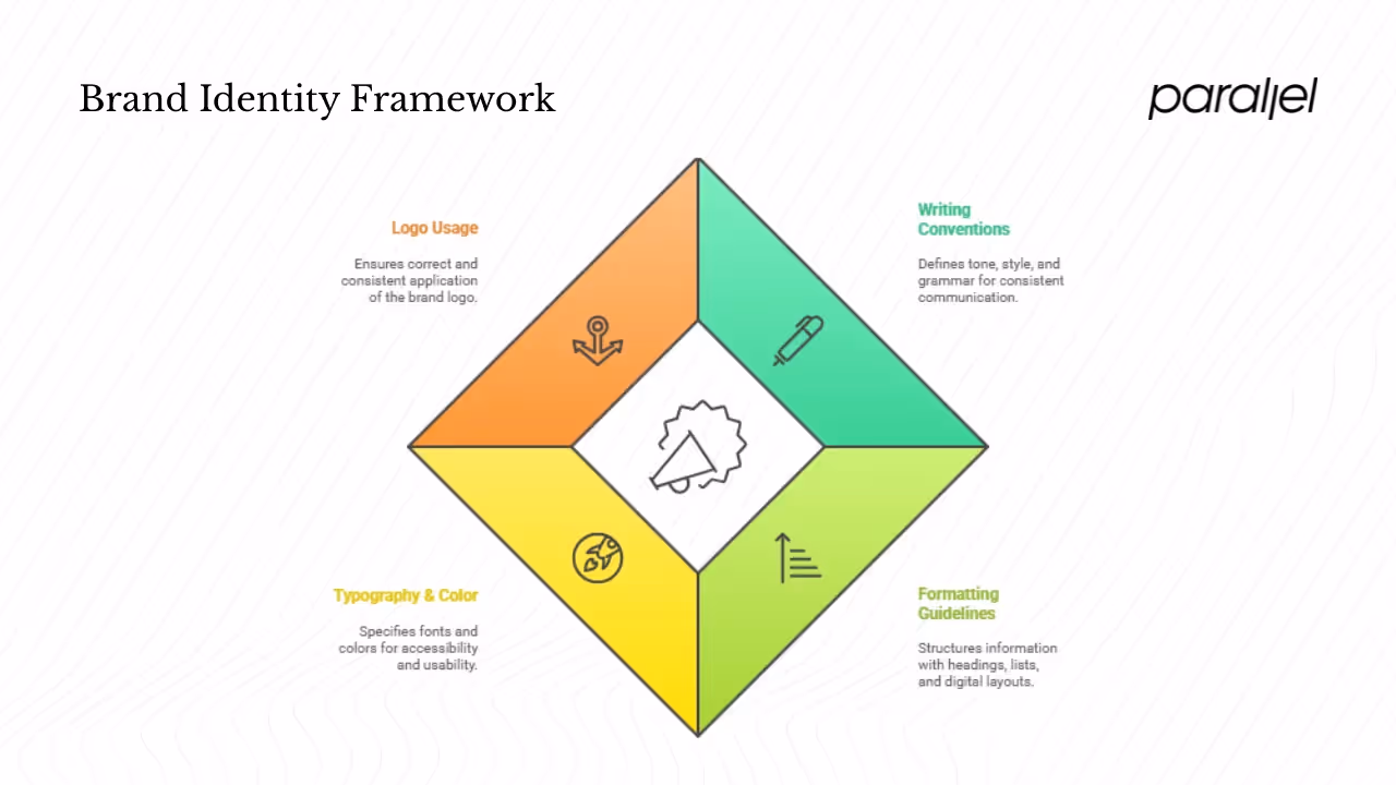
1) Writing conventions & editorial policies
Language is as important as visuals. Your guide should define tone, style and grammar conventions for all written communication. A brand’s tone may be formal and authoritative or casual and friendly. Document preferences for contractions, abbreviation usage and regional spellings (e.g., “colour” vs. “color”). In early‑stage teams, we often see friction arise from inconsistent capitalization of product names or varying definitions of industry terms. Setting these rules prevents confusion. Include examples of good and bad messaging, and note exceptions (for instance, product names may not follow normal capitalization rules).
2) Formatting guidelines & document formatting
Formatting covers how information is structured on the page — headings, lists, tables and numbering. Define rules for heading levels (H1, H2, H3), capitalization style (title case vs. sentence case) and how to number sections. Provide guidance on bullet points versus numbered lists, when to use tables and how to align content. Clarify how to format dates (e.g., “28 August 2025” vs. “8/28/25”) and times. For digital products, specify spacing, margins and grid systems to ensure alignment across screens. Formatting guidelines may sound trivial, but they build muscle memory that speeds up writing and eliminates inconsistent layouts.
3) Typography specifications & color palettes
Although typography and color were mentioned in the visual identity section, they warrant deeper attention because of their impact on accessibility and usability. For typography, specify fonts that support multiple languages if you operate globally. Document hierarchy: what font size and weight should be used for primary headings versus body text. Provide guidance on line length and paragraph spacing to improve readability. For color, include accessibility considerations such as minimum contrast ratios for text on backgrounds. List colors for links, buttons, alerts and backgrounds. Indicate how colors map to semantic meanings (e.g., green for success, red for errors) and note contexts where exceptions are allowed. By keeping color codes centralized, you reduce errors when building interfaces or marketing assets.
4) Logo usage & brand assets
Your logo is the most recognizable part of your brand. Document where the logo can appear, how to scale it and what background colors are acceptable. Provide downloadable assets in different file formats (SVG, PNG, JPG) and orientations. If your brand has sub‑brands or product marks, specify how they relate to the main logo. Include guidelines for co‑branding (e.g., partnerships) and for usage on merchandise. Bynder highlights that modern style guides often include examples of correct versus incorrect usage and that some companies, like Zendesk, go further by including copywriting guidance alongside visual rules. NASA’s historic guide even showed how not to treat the logotype. The key is to remove ambiguity so no one misuses your brand assets.
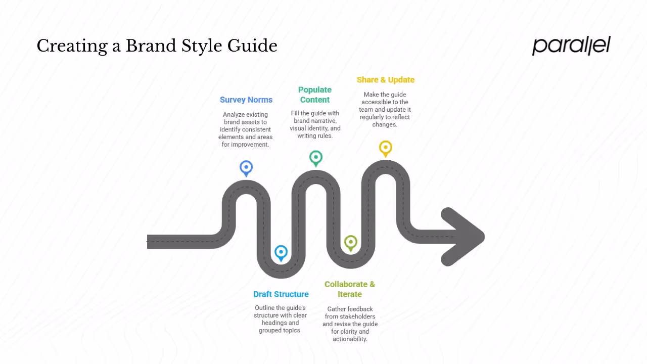
How to Create a Style Guide: Step‑By‑Step for Busy Founders & PMs
You don’t need to reinvent the wheel to create a style guide. Here’s a practical approach tailored for startups and product teams.
Step 1: Survey existing norms & pick a base
Start by looking at existing conventions within your organization. Gather marketing materials, presentations, product screens and docs. Note what seems consistent (colors, tone) and what varies widely. Choose a base to build on — perhaps the AP Stylebook for editorial rules or a recognized design system. Tools like the Chicago Manual of Style or Microsoft’s guidelines can serve as reference points. Don’t aim for perfection; the goal is to capture the current reality and intentionally refine it.
If you’re not sure what is a style guide supposed to look like, reviewing your own assets will highlight patterns you can formalize and areas where decisions are still ad hoc.
Step 2: Draft your guide’s structure
Outline a table of contents before you write a single rule. Group related topics, such as branding standards, writing style and formatting. Keep it short — no one reads a 200‑page manual. A simple document or wiki page with clear headings works. In our work with early‑stage SaaS teams, we’ve found that a two‑page PDF or a Figma file can be enough to start.
Step 3: Populate with brand story, visual identity and writing rules
Begin with your brand narrative: mission, vision and values. This context anchors the design decisions that follow. Document your logo guidelines, color codes, font specifications and imagery rules. For writing, define tone, grammar preferences and common terms. Use examples to show good and bad applications. Reference research where appropriate: the Reboot study found that signature colors increase recognition by 80%, and Papirfly’s research shows that consistent brands drive more revenue. Data points add weight to your guidelines and justify decisions.
Step 4: Collaborate with key stakeholders & iterate
Invite feedback from designers, writers, engineers, marketing leads and even customers. Your guide should serve all these groups, so capturing their needs early prevents later friction. Ask them to test the guidelines on real projects and note any confusion or gaps. Revise accordingly. At Parallel we’ve seen teams iterate through multiple drafts before landing on a version that resonates. The key is clarity; every rule should be actionable.
Step 5: Share & update regularly
Host the guide somewhere accessible — a shared drive, Notion page or Figma file. Educate your team on its existence and encourage them to reference it. Treat the guide as a living document: revisit it every six to twelve months to accommodate product changes, new platforms or evolving brand strategy. Exploding Topics warns that only 30% of brands have guidelines accessible to their whole organization. Make sure your team isn’t part of the majority without easy access.
Examples & Inspirations
Looking at existing style guides can spark ideas and reveal best practices. These documents demonstrate what is a style guide in practice, showing how teams package their identity and rules. Figma’s community and blog often share templates and case studies. Bynder’s glossary notes that NASA’s 1976 brand guidelines were 60 pages long and included examples of incorrect logo usage. The Bynder’s guide highlights Zendesk’s digital “Brandland,” which covers fonts, colors, layout and copywriting. Starbucks extends its guide to show how seasonality affects the look and feel of its brand. These examples illustrate different levels of depth: NASA’s manual is exhaustive, Twitter’s brand toolkit is under two hundred words. The lesson is that there is no single template; your guide should reflect your brand’s complexity and culture.
Figma’s design platform encourages teams to build component libraries and design tokens that integrate visual specifications directly into the design tool. For early‑stage startups, this might be overkill, but even a simple Figma page with color styles and text styles can serve as a living reference. When we worked with a machine‑learning SaaS company, we created a one‑page Figma style guide with their logo variants, color codes and type styles. This lightweight reference saved hours of back‑and‑forth during marketing campaigns and website updates.
Best Practices & Common Pitfalls
1) Keep it brief and focused
A style guide should answer questions where multiple correct options exist, not state the obvious. Don’t explain what a paragraph is; focus on choices like serial commas, heading capitalization or the exact green for your CTA buttons. Concise rules are more likely to be read and followed. Bynder emphasizes that the best guidelines are short, to the point and accessible.
2) Don’t mix process with standards
A style guide is about what decisions have been made, not how to request sign‑off or handle approvals. Mixing protocols with design rules makes the document harder to parse and invites bureaucratic bottlenecks. Keep operational workflows in a separate document or tool.
3) Involve contributors early
Engaging designers, writers and engineers in the creation process builds buy‑in and surfaces edge cases you might miss. It also prevents the guide from feeling like a top‑down mandate. Encourage team members to suggest revisions when something isn’t working; this fosters continuous improvement.
4) Format it as a quick reference, not a narrative
Use clear headings, bullets and tables for quick scanning. Keep paragraphs under four sentences. Include visual examples wherever possible. As Papirfly notes, consistent brands are more visible and enjoy higher revenue growth; to achieve that consistency, your guide must be easy to digest. A long narrative may feel authoritative but will be ignored when deadlines loom.
Conclusion
A style guide may not feel urgent when you’re scrambling to build product features and attract users, but it is a foundational investment. It reduces cognitive load for your team, builds trust with your audience and scales your brand without diluting its identity. Research shows that consistent brands enjoy greater revenue growth and brand value and that signature colors can boost recognition by 80%. A cohesive guide keeps your messaging aligned across all channels, from investor decks to support docs. If you’re a founder or product leader at an early‑stage startup, start small: survey your current materials, outline a simple guide, and iterate with your team. Over time, your style guide will become a north star that guides decisions and accelerates growth.
FAQ
1) What is meant by style guide?
If you’re asking what is a style guide, think of it as a consolidated set of standards outlining how your brand looks, sounds and behaves. It includes rules for tone of voice, typography, color palette, logo usage, imagery and formatting. The guide serves as a single reference so anyone creating content or designing interfaces can maintain consistency across channels and touchpoints.
2) What are the three major style guides?
Traditional publishing often references the AP Stylebook, the Chicago Manual of Style and the Oxford Style Manual. In branding and product design, many teams adapt these conventions to fit their tone and use a bespoke style guide to document visual standards, tone and technical specifications.
3) How do you create a style guide?
Start by reviewing existing materials to see what’s already consistent and what isn’t. Draft a simple structure (table of contents) that covers visual identity, writing rules and formatting. Populate it with your brand story, logo specifications, color codes, typography rules and tone guidelines. Collaborate with stakeholders, revise based on feedback and publish the guide in a central location. Treat it as a living document and update it regularly.
4) What is the main purpose of using a style guide?
The purpose is to ensure consistency in written and visual communication, reducing confusion and cognitive load for both creators and users. It protects your brand identity and makes collaboration easier across functions. By documenting decisions, a style guide helps your team work faster and avoid reinventing design and editorial choices.

check out these related blogs