You’ve built an early product and you’re debating whether to invest in the interface. You wonder what exactly a “user interface” is and why people keep telling you to care. In plain terms, UI (short for user interface) is the layer where people meet your software.
It’s the screens, buttons, fields, colours and interactions they see and touch. In a startup, a strong UI isn’t just cosmetic. It directly influences engagement, retention and customer trust. As someone who has led design and product teams at a young company built on machine‑learning, I’ve seen founders and product managers wrestle with this question many times.
This guide unpacks what UI means, how it fits into your product strategy and how to approach it with confidence. It’s written for founders, product managers, design leaders and talented designers or engineers who want to make smarter decisions about their product’s interface.
What does “UI” mean?
UI stands for user interface. When someone asks, what is UI, the simplest answer is that it’s the layer where your product meets its users. According to the Interaction Design Foundation, UI design is the process of building interfaces in software or devices, focusing on looks and style. A UI is the space where interactions between humans and machines occur. In other words, it’s the visual and interactive layer that allows someone to control a program and receive feedback.
The components of a UI include visual elements such as typography, colour and icons; interactive elements such as buttons, menus and input fields; and structural elements like layout and spacing. Good UI design makes the interface easy to use, efficient and pleasurable. This clarity matters because teams often conflate UI with the broader concept of UX (user experience). UX covers the entire path a person has with a product or service; UI focuses specifically on the look, feel and behaviour of the software interface. Coursera’s 2025 update explains that while UX can apply to non‑physical experiences, UI relates exclusively to screen‑based products and includes screens, buttons, toggles, icons and navigation menus.
Why stress this distinction? Because product decisions require precise language. Asking “what is UI” helps separate visual and interactive work from broader experience strategy. When founders ask designers to “improve the UX,” they may really mean “make the screens easier to scan” or “simplify the navigation.” Clarity helps the team allocate resources correctly. Calling UI work “visual polish” also underestimates its impact. Thoughtful UI shapes first impressions, reduces cognitive load and signals care; sloppy UI does the opposite.
UI in the context of a software product
In a software layout—be it a web app, mobile app or desktop tool—UI refers to the arrangement of elements that let users accomplish tasks. When you open a banking app, the login page, the “transfer” button, the icons for accounts and the spacing between them are all part of the UI. The Interaction Design Foundation notes that users judge designs quickly and care about usability and likeability. They don’t want to think about the interface; they just want to get their job done.
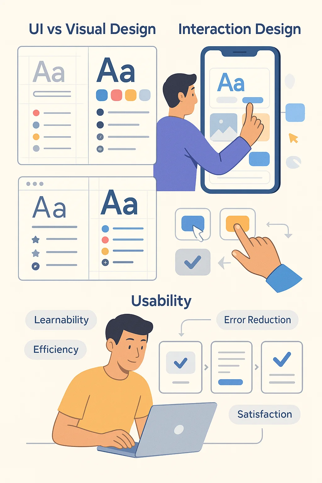
UI versus visual design, interaction design and usability
UI overlaps with graphic design. Graphic design covers typography, colour, iconography, grid and composition. In UI, these visual choices influence legibility, hierarchy and aesthetic appeal. Interactive design adds the behaviours that make elements respond to user actions—hover states, touch gestures, transitions and animations. Usability refers to how easy it is for users to accomplish their goals. Nielsen Norman Group defines usability as a quality attribute assessing how easy user interfaces are to use. It breaks down into learnability, efficiency, memorability, error prevention and satisfaction. A UI that looks good but is hard for users to move through or fails to provide feedback is unusable.
UI and UX: related but different
UI is part of the broader UX. As the Interaction Design Foundation puts it, UI is a craft where designers build an essential part of the user experience, while UX covers the entire spectrum. The UX designer defines the user path (like the architect of a hotel), and the UI designer shapes the interior—the visuals, controls and interactions. A product with good UX but poor UI can still frustrate users; a beautiful UI wrapped around a broken UX is equally problematic. In practice, small startups often combine these roles, but understanding the distinction ensures you’re not just decorating screens but solving user problems.
Why UI matters for metrics
For early‑stage products, UI has a strong effect on business and user metrics. Confusing interfaces increase error rates and onboarding drop‑off. Clear layout, legible text and intuitive controls make it easier for people to understand value quickly. With a heavy emphasis on mobile use—over 64% of website traffic in 2025 comes from mobile devices—responsive and adaptive design isn’t optional. In many regions, including India and Nigeria, mobile accounts for over 70% of web traffic. If your interface isn’t tuned for smaller screens, you’re effectively turning away most of your potential audience.
Main components of UI design
When designing a user interface, think in terms of components, visual elements, interactive behaviours and layout. Each of these plays a distinct role in how someone experiences your product. Whenever a founder wonders what UI is, pointing to these tangible building blocks makes the answer concrete.
1) Interface components
- Buttons and icons: Provide clear actions like “Save,” “Submit” or “Download.” They should look clickable and give visual feedback when pressed.
- Menus and navigation: Allow users to move between sections. They include tabs, sidebars, dropdowns and hamburger menus. For start‑ups, keeping navigation shallow (few clicks to reach core features) improves comprehension.
- Input screens and fields: Collect input from users. The design of these areas affects conversion. Label fields clearly, indicate required vs optional entries and show inline validation.
- Toolbars and panels: Provide quick access to tools or settings within complex software.
- Micro‑interactions: Tiny responses to user actions, such as a button ripple or a heart animation when liking a post. According to Lyssna’s 2025 trend report, teams that added subtle animations responding to users’ credit profiles lifted engagement by 35% and reduced bounce rates by 28%.
2) Visual elements
- Colour palettes: Colours signal hierarchy and mood. High contrast improves accessibility. If you choose a primary colour, ensure there are darker and lighter variants for states (normal, hover, disabled).
- Typography: Font choice and hierarchy drive readability. Limit the number of typefaces and use consistent sizes and line heights.
- Spacing and grids: White space guides the eye and gives breathing room. Grids position elements, ensuring balance and rhythm.
- Imagery and illustration: Photos and illustrations set the tone. Use them sparingly to support content rather than clutter interfaces.
- Micro‑interactions and motion: Subtle animations, transitions and feedback messages make interfaces feel alive. They confirm actions, smooth context changes and delight users.
3) Interactive design
This covers behaviours: what happens when you hover, click, press or swipe. It includes:
- Hover states for buttons and links on the desktop to indicate interactivity.
- Touch gestures for mobile, such as swiping, pinching and long‑pressing.
- Transitions for moving between screens or expanding/collapsing sections. Smooth transitions prevent disorientation.
- Feedback messages (loading spinners, success/failure notifications) to keep users informed.
4) Layout and structure
Information architecture (IA) dictates how content is grouped and ordered. Good IA surfaces the most important actions first. Layout concerns how elements are arranged on the screen—columns, rows, cards, lists or tables. Hierarchy helps users scan and prioritize. Use headings, subheadings, bullets and numbering to break complex information into digestible pieces.
UI must also be responsive (adjusts fluidly across screen sizes) and adaptive (adjusts layouts specifically for certain breakpoints). With mobile web traffic surpassing 64% globally, designing for smaller screens first and then scaling up is a wise strategy.
5) Graphic design’s role
Graphic design ensures aesthetic cohesion and brand alignment. It involves creating a consistent visual language across screens—colours, type, iconography—that reflects your brand’s character. A polished and cohesive UI builds trust; mismatched elements and inconsistent styles erode it. This is where a design system becomes invaluable.
6) Design systems
A design system is a collection of reusable UI elements that product teams use and build on to create a consistent user experience across software products. It includes UI components, code snippets, style guides, design guidelines and documentation. Design systems act as a single source of truth for designers and developers and help reduce design debt. Using a design system means you don’t have to recreate dropdown menus or buttons every time; you reuse well‑defined components. The Untitled UI guide notes that design systems allow teams to make changes in one place and cascade them across the product, reducing inconsistency and speeding up development. In a startup environment where speed is critical, a lightweight design system can help you ship faster without sacrificing quality.
Principles and best practices for effective UI
Over decades of human‑computer interaction research, experts have distilled a set of principles that make interfaces easier to use. Jakob Nielsen’s 10 usability heuristics remain a gold standard. Here are a few important ones, updated in 2024:
- Visibility of system status – Keep users informed about what’s happening through timely feedback.
- Match between the system and the real world – Use language and metaphors familiar to users; follow real‑world conventions.
- User control and freedom – Provide “undo” options and clearly labelled exits so users don’t feel trapped.
- Consistency and standards – Use consistent terminology and patterns; follow platform conventions.
- Error prevention – Design to prevent mistakes; confirm destructive actions and provide clear instructions.
- Recognition rather than recall – Make objects, actions and options visible; reduce memory load.
- Flexibility and efficiency – Provide shortcuts for power users while keeping the interface simple for newcomers.
- Aesthetic and minimalist design – Remove unnecessary elements; every extra button or graphic competes for attention.
- Help users recognize, diagnose and recover from errors – Use plain language to explain issues and suggest solutions.
- Help and documentation – Offer easily searchable help, but don’t rely on it; the interface should be self‑explanatory.
Additional guidelines from the Interaction Design Foundation encourage designers to predict users’ needs, design invisibly (so users focus on tasks, not the interface) and ensure visual consistency. Usability expert Jakob Nielsen notes that investing about 10% of a design budget on usability testing can more than double desired quality metrics. In other words, spending time on UI and usability isn’t a luxury—it’s a proven way to boost engagement and conversion.
Usability and accessibility
When designing a UI, you must consider everyone who might use the product, including people with disabilities. Accessibility involves ensuring colour contrast for low vision, keyboard navigation for people who can’t use a mouse, screen reader support for those with visual impairments, and easily resizable text. The Lyssna 2025 report stresses that accessibility is no longer a trend but a non‑negotiable; businesses now prioritise high‑contrast text, changeable font sizes and screen‑reader compatibility. Inclusive design broadens your user base and reduces legal risk. In my experience with SaaS teams, adding basic accessibility early is easier than retrofitting it later.
Startup‑specific considerations
For startups, UI must balance speed with quality. You often can’t build a full-scale design system or run extensive research. Instead:
- Start small: Create a lightweight design kit with the basic components you need. Develop it further as you learn.
- Iterate rapidly: Test prototypes with five users to uncover the most significant usability issues. Fix these before adding new features.
- Make sure UI goals support business goals: If your most important metric is activation, focus on the onboarding flows. If retention is an issue, look for points where users get lost.
- Balance speed and polish: It’s tempting to delay UI refinement until later. But early UI improvements can reduce support tickets and shorten sales cycles. In a machine‑learning product we worked on, tidying up the settings page cut down the number of onboarding support requests by 40%.
Examples of good and poor UI
Good UI: Clear, high‑contrast buttons; concise labels; consistent spacing; obvious focus states; fast interactions; accessible by keyboard. For instance, the Airbnb homepage (referenced by IxDF) uses a simple layout with large search fields and inviting graphics, allowing travellers to search quickly.
Poor UI: Overly busy screens; inconsistent icons; hidden navigation; insufficient feedback; crowded text; dark patterns that trick users. A product we audited had three different button styles for “Next,” confusing users about which to click. In user tests, participants hesitated and mis‑clicked multiple times. Cleaning up the button styles and repositioning them increased task completion rates by 25%.
UI vs UX: what’s the difference and why it matters
We’ve touched on this distinction, but it’s worth a deeper look because the confusion is pervasive. UX (user experience) refers to the overall experience a person has with a product or service—how it works, how it makes them feel, and whether it meets their needs. UI (user interface) is the visual and interactive layer—the screens and controls. Coursera’s 2025 article defines UI as the part of a website or device you interact with, including screens, buttons, toggles and icons.
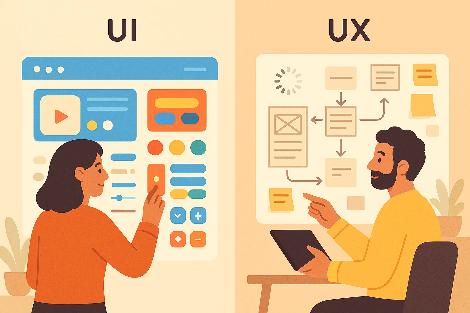
UX includes this but also covers factors like page load times and information structure. An analogy often used: the UX designer is like the architect of a hotel who decides how guests move through spaces, while the UI designer is like the interior designer who chooses furnishings and signage.
Startup teams often conflate the roles because of resource constraints. When a founder hires a “UI/UX designer,” they expect one person to do everything from research to visual polish. That’s possible, but only if the person understands which hat they’re wearing at any given moment. If you ask them to change the “UX” when you mean the “UI,” you may end up with misaligned expectations. Reminding yourself “what is UI vs UX” keeps conversations grounded.
A good collaboration between PM, design lead and tech lead looks like this: the PM defines business goals and core metrics; the design lead translates these into user flows, wireframes and then high‑fidelity screens; the tech lead assesses feasibility and helps implement the UI components in code. Together they iterate, test with users and refine. Recognizing the difference between UI and UX helps each party focus on their responsibilities.
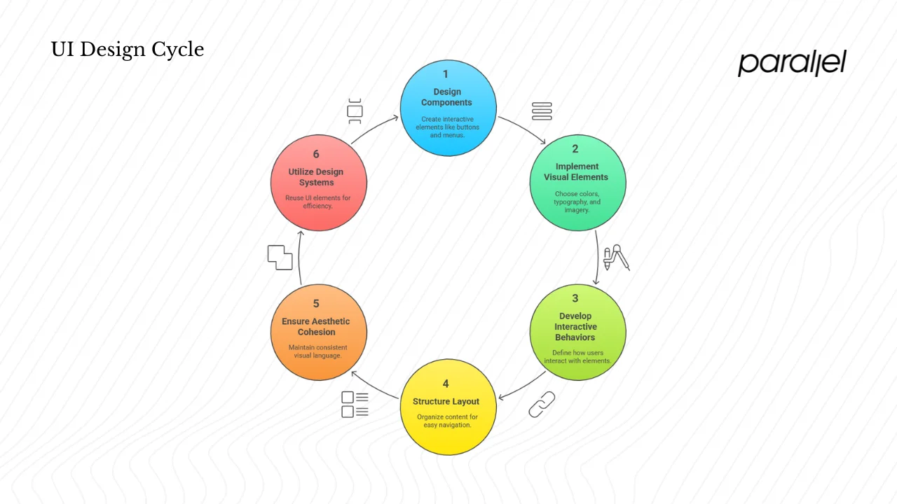
The UI design process in a startup context
While every team works differently, a typical UI design process for a startup might follow these steps:
- Research – Understand the target users, their goals and pain points. This may involve competitor analysis, analytics and quick interviews. Context informs the interface.
- Information architecture – Map out the content and actions. Decide what goes on each page and how pages connect. Keep navigation shallow.
- Wireframes/low‑fidelity UI – Sketch rough layouts to try out different structures. These are quick and low‑cost to change.
- High‑fidelity UI – Add visual details: colours, typography, iconography and spacing. Use your design system to ensure consistency.
- Prototyping – Build interactive prototypes to simulate the experience. Tools like Figma allow designers and developers to collaborate in real time.
- Testing – Conduct usability tests with at least five users to catch the most critical issues. Watch how they interact, where they struggle and what they don’t notice.
- Iteration – Refine designs based on feedback. This loop is repeated until the interface meets user needs and business goals.
Roles
- Founders/PMs set the product vision, define success metrics and prioritize features. They make sure UI goals support business and user goals.
- Design/product leads create style guides, define component libraries and keep the UI consistent across screens. They advocate for user‑centric decisions.
- Engineers translate UI specs into code, implement responsive layouts and handle performance considerations. They also surface technical constraints to the design team.
- Cross‑functional collaboration ensures trade‑offs are transparent. For example, a designer may propose a complex animation; engineers might push back due to performance impact. Together they find a solution that balances delight with speed.
Tools and collaboration
Modern UI design relies on collaborative tools. Figma allows multiple designers and developers to work on the same file in real time. It hosts design systems, prototypes and feedback loops in one place. For early‑stage teams, even a simple shared document with defined components and code snippets can serve as a lightweight system. Tools like UserTesting, Lyssna and Maze enable quick user testing and analytics. Use them to get feedback early.
Rapid iteration in startups
Startups must iterate quickly. Instead of perfecting every pixel before release, aim for “good enough” prototypes that you can test and refine. Welcome feedback. A flexible design system allows you to swap components without rewriting large parts of the code. In one project, we shifted button styles after user tests revealed that our call‑to‑action blended into the background. Because we used a shared design system, we updated the component once and automatically improved dozens of screens.
UI trends & emerging topics relevant for startups
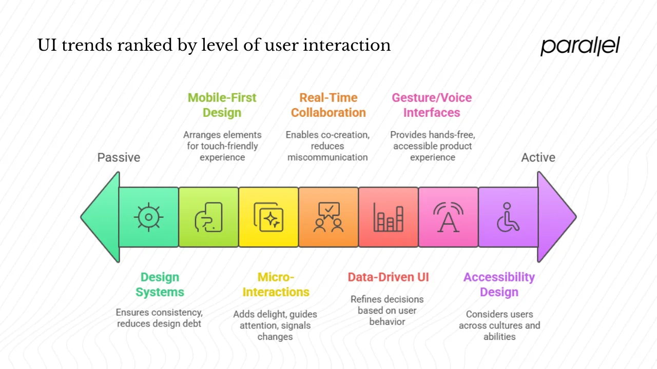
1) Mobile‑first and responsive design
Mobile traffic continues to dominate—over 64% of website traffic in 2025 comes from mobile devices. In many countries, such as India and Nigeria, this share exceeds 70%. Startups must therefore design mobile‑first, not as an afterthought. When people ask, what is UI in a mobile context, the answer is the arrangement of touch‑friendly elements that fit in a palm. Begin with the smallest screen, ensuring buttons are finger‑friendly, text is readable and navigation is reachable with one hand. Then scale up to tablets and desktops.
2) Gesture, voice and conversational interfaces
User interfaces are no longer limited to screens. The Interaction Design Foundation describes three formats: graphical user interfaces (GUIs), voice‑controlled interfaces (VUIs) and gesture‑based interfaces. Voice assistants such as Siri and Alexa continue to grow. The Lyssna trend report notes that almost half the US population will use voice assistants by 2026. Incorporating voice commands or conversational chatbots can make your product more accessible, especially for hands‑free scenarios. Gesture‑based controls (e.g., swiping in VR/AR) are also becoming common. Evaluate whether these modalities fit your users’ context.
3) Design systems and component libraries
As mentioned, design systems help teams scale UI work. In 2025, there’s a movement toward more flexible, component‑driven systems that integrate with code. Tools like Figma’s variables and tokens allow designers to link colour palettes directly to CSS variables. The Untitled UI guide emphasises that a design system acts as the visual language and philosophy of a product, ensuring consistency and reducing design debt. For startups, using an existing open‑source component library or UI kit can accelerate development while maintaining professionalism.
4) Micro‑interactions and motion
Tiny details like button ripples, hover effects and animated transitions add delight and clarity. Lyssna’s trend report highlights that micro‑interactions, powered by real‑time data, significantly improved engagement and reduced bounce rates. When used thoughtfully, motion can guide attention and signal state changes; overuse, however, can slow down your interface and annoy users.
5) Accessibility and inclusive design
Accessibility is now a baseline expectation. High‑contrast text, adjustable font sizes, keyboard navigation and screen‑reader support are common requirements. Inclusive design also considers users across cultures and abilities, such as providing multilingual interfaces and accommodating left‑handed navigation on mobile.
6) Real‑time collaboration and remote teams
Remote work has accelerated the adoption of collaborative design tools. Figma allows designers and developers to co‑create and comment in real time. Tools like Notion and Slack integrate design specs with product management. This encourages transparency and reduces miscommunication.
7) Data‑driven UI optimisation
Analytics and A/B testing help refine UI decisions. Rather than relying solely on opinion, measure metrics like click‑through rates, drop‑off points and time‑to‑task completion. Tools like Mixpanel or Amplitude can integrate event tracking into your app. Combine quantitative data with qualitative user feedback to make informed improvements.
Common UI mistakes and how to avoid them
- Over‑designing and ignoring usability – Shiny designs that sacrifice clarity confuse users. Use minimalism and test with real people.
- Inconsistent components – Mixing different button styles or navigation patterns creates cognitive load. Establish a design system or style guide.
- Poor performance – Heavy animations and large images slow down load times, especially on mobile. Optimize assets and test on slow networks.
- Broken hierarchy and navigation – If users can’t find what they need, they abandon your product. Keep navigation intuitive and limit the number of layers.
- Lack of feedback – Buttons that don’t show loading states or forms that fail silently leave users uncertain. Provide immediate and clear feedback.
- Neglecting mobile/touch contexts – Designing solely on a desktop monitor leads to small touch targets and cramped text on phones. Test on real devices.
- Not involving users – Designing in a vacuum leads to misaligned assumptions. Conduct quick prototype tests with representative users early and often.
Measuring UI success at a startup
To understand whether your UI decisions are working, track both quantitative and qualitative metrics:
- Task completion time – How long does it take for a user to complete an essential action? Reduced time usually indicates a more intuitive UI.
- Error rate – Track how often users make mistakes (wrong inputs, mis‑clicks). Good UI minimizes errors or helps users recover quickly.
- Engagement and retention – Monitor session length, daily/weekly active users and feature usage. UI improvements often correlate with higher engagement.
- Conversion rates – For e‑commerce or SaaS products, watch sign‑ups, purchases or upgrades. Clear calls‑to‑action and streamlined forms raise conversion.
- Qualitative feedback – Gather insights through usability tests, surveys and customer interviews. Ask open‑ended questions about what frustrated or delighted users.
- Design operations – For larger teams, measure design system adoption: how many screens reuse components, how many unique components exist, and how quickly new screens are produced. Track design debt issues and fix them proactively.
- Business alignment – Tie UI metrics back to business goals. If churn is high, investigate whether the interface contributes to confusion or drop‑off. If acquisition is slow, ensure landing pages communicate value clearly.
Conclusion
So, what is UI? It’s the space where your users interact with your software product—the buttons, menus, icons and layouts that enable them to complete tasks. A great UI isn’t superficial; it’s a strategic asset that guides users, builds trust and supports your product’s UX. As a founder or product leader, investing early in UI pays dividends. Clear, consistent and accessible interfaces reduce support overhead, speed up onboarding, and give your team a foundation to scale. Focus on the fundamentals: know your users, define a simple design system, test often and iterate. Consider UI as a core part of your product, not an afterthought. The payoff is not just prettier screens but more satisfied customers and a healthier business.
FAQ
1) What does a UI mean?
UI stands for user interface. It refers to the visual and interactive elements of a software product—the screens, buttons, text fields and icons—that allow people to interact with software and receive feedback.
2) What is the UI on my phone?
On your phone, the UI is everything you see and touch: home screens, app icons, notification bars, keyboards, menus and gestures. It’s designed to work with touch input and small screens, so buttons are finger‑friendly and information is organised for quick scanning.
3) What is an example of a UI?
A login page is a simple example. It has input fields for email and password, labels, a submit button and possibly an option to reveal your password. The arrangement of these elements, their spacing, colours and feedback when you tap “Log in” all constitute the UI.
4) What is UI medicine?
In a medical context, UI might refer to a user interface for healthcare software (such as electronic health record systems) or, in an entirely different field, urinary incontinence. In the context of design and software, UI always means the interface between humans and computers. Understanding the domain ensures you use the right definition.

check out these related blogs


.webp)