Imagine a founder watching sign‑ups flatten even though marketing spend keeps climbing. After tweaking ads and adjusting pricing, nothing moves. A closer look reveals that new users abandon the product mid‑onboarding. This common scenario prompts one big question: what is a UX audit and how can it help? A UX audit is a structured review of your website or app to find the points where people struggle. It does more than focus on surface details; it identifies the causes of drop‑offs, poor conversion and user frustration. For early‑stage teams, a UX audit is less a luxury and more a sanity check before investing further.
What is a UX audit?
People often ask “what is a UX audit?” At its core, a UX audit is a systematic evaluation of a web‑based product or app. Its purpose is to see how easily someone can use your product and where they get stuck. Dovetail calls it a “quality assurance process” that measures how easily users can interact with a product. Put differently, when you ask what is a UX audit, you’re asking about a process that combines expert review, data and sometimes user testing to uncover hidden friction. Unlike usability testing, which asks real users to perform tasks, a UX audit infers issues from expert analysis and metrics. It isn’t a redesign, and it isn’t a one‑off spot check—audits should be repeated as the product grows.

Why conduct one? Business and user benefits
Teams run UX audits for several reasons:
- Expose friction – VWO reports that people make up their mind about a site in just 0.05 seconds, and design influences 94 % of first impressions. If your interface confuses or irritates, visitors leave quickly.
- Guide decisions with evidence – Audits provide data rather than opinions, helping teams prioritise.
- Improve conversion – Forrester research cited by VWO suggests that every dollar invested in usability can return up to $100 and raise conversion rates by as much as 400%.
- Reduce rework costs – Fixing a problem during design costs about $1, while fixing it after release costs $100 or more. Early audits save money.
- Catch accessibility and performance issues – Many audits reveal poor contrast or slow load times, which hurt everyone, particularly people with disabilities.
In 2025, Dovetail compiled statistics showing that strong UX can lift ecommerce conversion by up to 400%, that 70% of shoppers leave carts because of friction and that poor design can drain 35% of revenue. When stakeholders wonder what a UX audit is, remind them it’s the process that surfaces such problems so you can fix them. The study also reports that bad UX drives people away while mobile‑friendly sites bring 74% of visitors back—another reason founders should understand what a UX audit is.
When to perform a UX audit
Run an audit when:
- You’re preparing to launch or redesign.
- Metrics such as bounce rate or conversion decline.
- New features might clash with existing flows.
- You perform periodic checks (quarterly or semi‑annual) for active products.
- Users or support teams report recurring problems.
Types and methods of UX audits
Different methods reveal different insights, so a solid audit combines several approaches without going overboard.
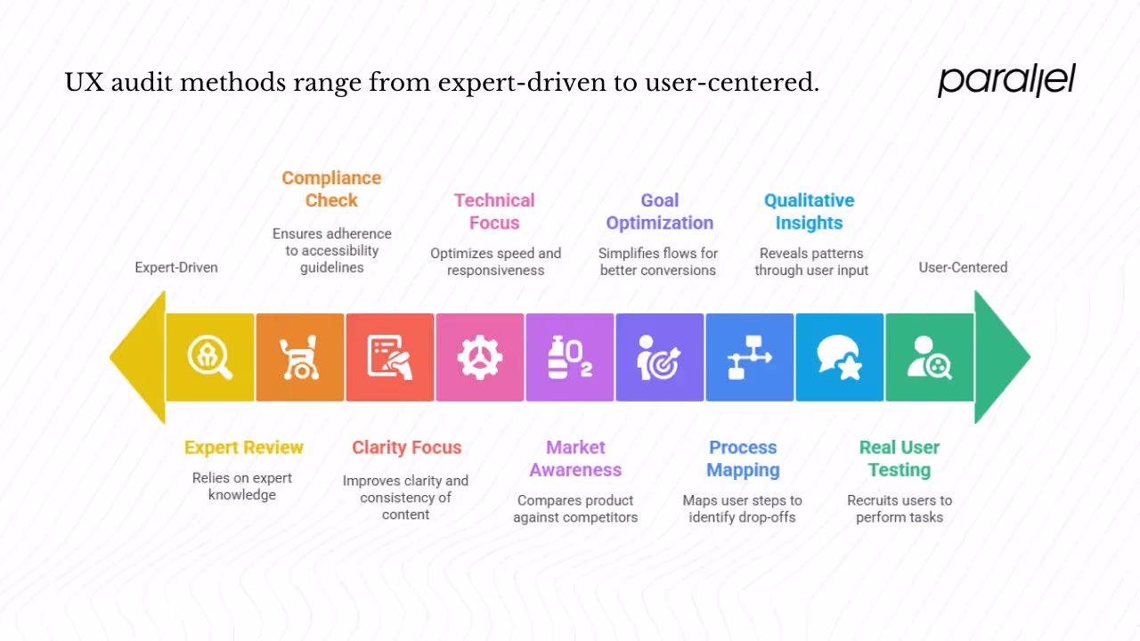
1) Heuristic or expert evaluation
Experts compare your interface against established usability heuristics. The Infragistics guide describes how reviewers walk through a product to spot bugs, confusing labels and poor flows. They often use Nielsen’s ten heuristics—visibility of status, match between system and real world, user control, consistency, error prevention, recognition rather than recall, flexibility, minimalism, error recovery and help. Heuristic evaluations are quick and inexpensive but depend on evaluator skill; they may miss issues only real users encounter.
2) Usability testing
Usability testing recruits real users to perform tasks while you observe. GeeksforGeeks explains that usability testing is conducted by non‑professionals and focuses on how easily they access features. It uncovers confusion that experts can’t anticipate. Include a few task‑based sessions in your audit to validate assumptions.
3) User flow and interaction analysis
Map the steps users take to complete tasks and pinpoint where they drop off. Simple flow diagrams reveal missing feedback, unclear calls‑to‑action or dead ends. Combine this with analytics to quantify abandonment.
4) Accessibility audit
An accessibility review looks at keyboard navigation, colour contrast, screen‑reader support and compliance with guidelines. Use tools like axe or WAVE as a first pass and follow up manually to catch subtler issues.
5) Content and UX content audit
Words matter. Review labels, instructions and messages for clarity and consistency, remove jargon and unify tone.
6) Performance and technical review
Slow pages create frustration. Measure load times and responsiveness; VWO notes that 88% of users are less likely to return after a bad experience. Optimize images, scripts and queries.
7) Customer feedback and qualitative data
Surveys, support tickets and user interviews reveal patterns that numbers alone miss. Tools like Hotjar or FullStory add heatmaps and recordings for context.
8) Conversion‑focused audit
For a conversion lens, simplify flows, clarify calls‑to‑action and minimize friction. Use A/B tests to confirm which changes actually help.
9) Benchmark and competitor review
Finally, compare your product with competitors. Look at their onboarding and help centres to understand conventions and prioritise fixes.
How to run a UX audit – step‑by‑step process
Here’s a lean process for small teams.
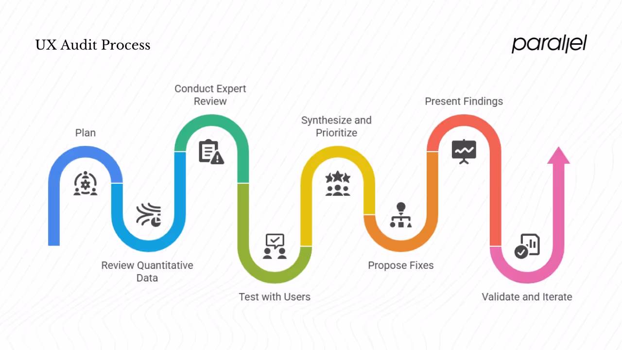
Step 0: Plan
Get on the same page with stakeholders about goals and scope. Decide which flows to review and collect existing metrics and feedback to use as a baseline.
Step 1: Review quantitative data
Analyze metrics such as bounce rate, funnel drop‑offs and error logs. Use heatmaps and recordings to see behaviour and identify abandonment points.
Step 2: Conduct expert review
Use heuristic checklists to walk through each flow. Record issues with screenshots and severity ratings. Check content, accessibility and performance.
Step 3: Test with users
Run short sessions with a handful of participants, asking them to complete tasks while thinking aloud. Observe where they struggle and use their feedback to validate your findings.
Step 4: Synthesise and prioritise
Group issues by theme, rate severity based on impact and effort, and link qualitative findings to metrics. Focus on changes that will move numbers.
Step 5: Propose fixes
For each issue, describe the problem, propose a solution and group fixes into quick wins and longer projects. Provide sketches where helpful.
Step 6: Present findings
Prepare a clear report with an overview, issue list, visuals and a prioritisation matrix. Explain why each problem matters and how fixes will affect metrics.
Step 7: Validate and iterate
After implementing fixes, measure the same metrics and run A/B tests to confirm improvements. Schedule follow‑up audits; Pendo’s data warns that 60 % of features are rarely used when teams skip user research.
Tools and templates
1) Data and behaviour tools
- Analytics: Google Analytics, Mixpanel, Amplitude.
- Heatmaps & recordings: Hotjar, FullStory, Crazy Egg.
- Input‑field and funnel analytics: Heap, Pendo.
2) Testing and feedback tools
- Moderated testing: Lookback, UserTesting.
- Unmoderated testing: Maze.
- Surveys: Typeform, Qualtrics.
3) Accessibility & performance
- Accessibility: axe, WAVE, contrast checkers.
- Performance: Lighthouse, WebPageTest.
4) Checklists
Use heuristic and audit checklists from Maze or Contentsquare to ensure you don’t miss major usability principles. VWO’s blog summarises common issues and provides sample heuristics.
5) Structuring reports
Include unique issue IDs, severity labels, annotated visuals and a phased roadmap. Break proposed changes into quick wins, medium‑term projects and long‑term refactors.
Common pitfalls and challenges
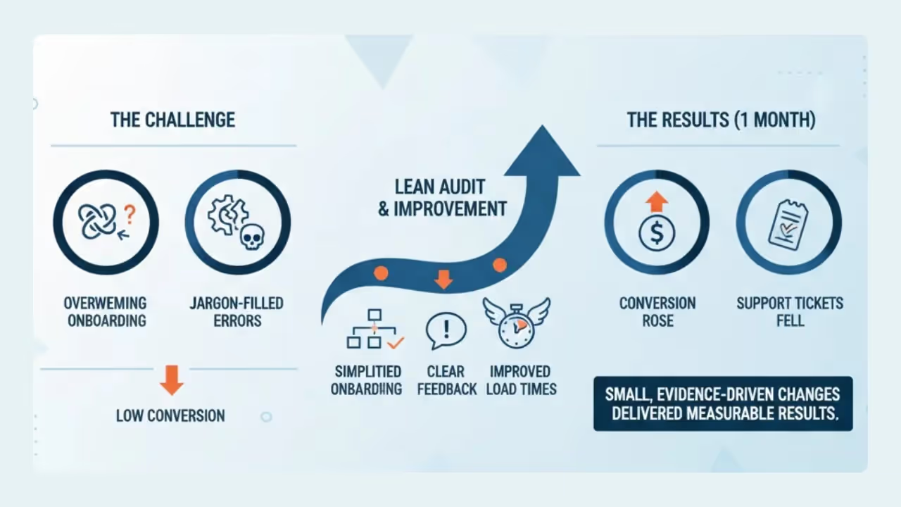
Real‑world case example
At a SaaS startup, trial users weren’t converting because onboarding was overwhelming and error messages were full of jargon. A lean audit led the team to simplify onboarding, add clear feedback and improve load times. Within a month conversion rose and support tickets fell—small evidence‑driven changes delivered measurable results.
Conclusion
The question of a UX audit has a straightforward answer: it’s a structured assessment that reveals where users struggle and why your metrics stall. A UX audit combines expert review, data analysis and user testing to produce actionable insights. Early‑stage startups stand to gain the most because small usability improvements often yield big returns. When you ask yourself again what is a UX audit, think of it as an investigative process that keeps your product honest about the experience it delivers. Research shows that users make judgments within a fraction of a second and that fixing issues during design is far cheaper than fixing them later. By investing in UX audits, teams improve conversions, retention and user satisfaction while avoiding expensive rework. Don’t wait—pick a critical flow this week, walk through it as a new user and identify friction points. The sooner you start, the faster you’ll build a product people love to use.
Audit your product and see the difference. Even a small audit will uncover issues you didn’t expect. Let evidence guide your design decisions. Start small. Your users will appreciate the improved experience.
Frequently asked questions (FAQ)
1) What are UX audits?
A UX audit is a structured review of a product or app that uncovers usability, accessibility, performance and content issues. It blends expert evaluation with data and sometimes user testing. Put another way, when someone asks what is a UX audit they want to know how to systematically spot and fix the issues that stop users from succeeding.
2) Why do teams use them?
Teams use UX audits to improve conversion and retention, guide design with evidence and avoid expensive fixes later.
3) How do you run a UX audit?
Plan the scope, gather data, conduct expert reviews and usability tests, prioritise findings, implement fixes and measure their impact.
4) What types of UX audits exist?
Audits can focus on heuristics, usability tests, accessibility, content, performance, conversion or competitor comparison. Mixing methods yields a fuller picture.
5) What is a UX content audit?
It reviews labels, buttons and messages for clarity and consistency, ensuring words support tasks rather than confuse users.
6) How long does a UX audit take?
Timing varies: a short audit can last a week while a deeper one spans several weeks, depending on scope and data.
7) Who should perform a UX audit?
Internal teams know the product but may be biased; external reviewers bring fresh eyes. Many companies use a combination of both.
8) What deliverables come from a UX audit?
Deliverables usually include an overview, a ranked issue list, annotated visuals and a prioritised action plan.
9) What’s the difference between a UX audit and a CRO audit?
A UX audit covers usability, accessibility, content and performance, whereas a conversion‑focused audit targets sign‑ups or purchases and relies on experiments. They complement each other.
10) How do you measure success after a UX audit?
Measure before and after metrics like conversion rate, task completion and drop‑off; run experiments to confirm improvements and gather user feedback.
11) Is a UX audit always necessary?
Very new products might not need a full audit, but once you have real users and data, even a lean review yields valuable insights. Start small and iterate.

check out these related blogs


.webp)


