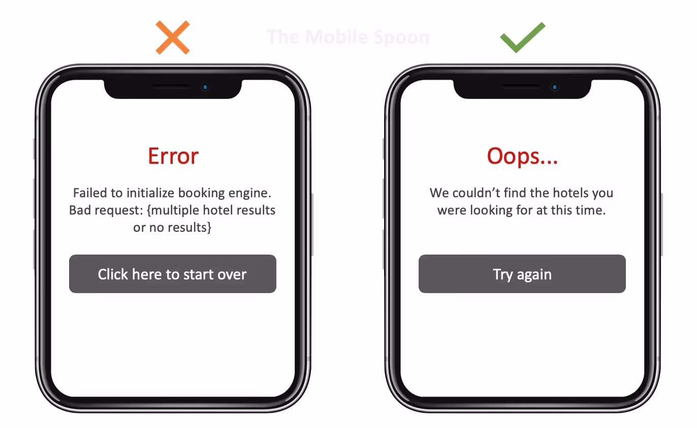
Picture a sign‑up screen that asks for your email. You type it in, press Sign up, and the form simply flashes red. No message. No clue. Compare that to a short line saying “We couldn’t recognise that email address – please double‑check it”. The first version leaves you stranded; the second one feels like a considerate host guiding you forward. Tiny sentences like that turn confusion into flow. They set the tone for the entire experience.
I’ve seen this in our client work. During the early days of Parallel, we helped a machine‑learning tool streamline its onboarding flow. When users tried to create an account, some would paste their company URL instead of an email. The error message simply said “Invalid” and blocked the process. We replaced it with a clear, friendly prompt: “Please enter a valid email address (like name@example.com).” Completion rates improved by 15 percent and support tickets dropped sharply. It seems small, yet it made a big difference.
That’s the heart of UX copywriting. If you’re wondering what UX copywriting is, it’s the practice of choosing and placing words inside software products – button labels, form hints, error messages, tooltips – that help people achieve their goals. It’s a discipline that sits between design and product management, and it can dramatically improve usability and conversion. In this article I’ll explain the core concepts, why it matters, how it differs from general copywriting and how to build it into an early‑stage team. I’ll draw on research from trusted organisations and share insights from our own projects at Parallel.
What is UX copywriting?
UX copywriting is the practice of writing the words people see and interact with inside a product, app, or website. Unlike marketing copy, which tries to persuade someone to buy or sign up, UX copy is about guiding people through a digital experience smoothly and clearly.
Think about the labels on buttons, the instructions in a form, the error messages when something goes wrong, or the welcome text when you open an app. All of those need to be written in a way that feels natural, helpful, and easy to understand.
Established organisations define this field in remarkably similar ways. Bynder’s glossary says that UX copywriting creates copy for apps and websites that tells the user how to do something. Its purpose isn’t to persuade but to help people move through tasks. The copy should be simple, easy to understand, helpful and precise. Toptal calls it composing words to provide people with decision‑making clarity when interacting with a product. This guiding voice serves as a digital ambassador and leads users through important interactions.
The craft relies on “microcopy” – the small, informative or instructional text on forms, pop‑ups, buttons, search prompts and tips. Microcopy is often fewer than three sentences. It helps people understand what to do next and prevents errors. Shopify’s microcopy guide describes it as small bits of text that guide users through an interface. Microcopy sits within the broader practice of UX writing, which covers everything from headings to help documentation. When done well, it reassures users, nudges them to take action and conveys brand personality.
Related terms and how they differ
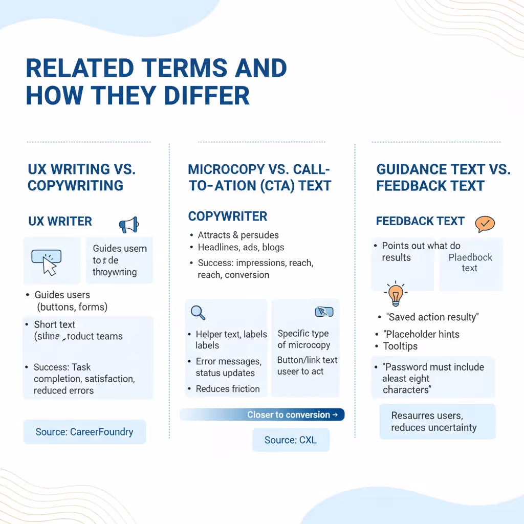
- UX writing vs. copywriting: Both involve words, but their aims diverge. UX writers guide users through tasks; copywriters create marketing messages to attract and persuade. CareerFoundry explains that UX writers focus on short text for elements like buttons, notifications and forms, working inside product teams. Copywriters, on the other hand, craft headlines, ads, blogs and emails to promote products and move customers down the sales funnel. Success for a UX writer is measured by task completion, satisfaction and reduced errors, whereas copywriters look at impressions, reach and conversion.
- Microcopy vs. call‑to‑action (CTA) text: A CTA is a specific type of microcopy, often on a button or link, that invites the user to act. Microcopy also includes helper text, labels, error messages and status updates. The smaller the text, the closer it sits to the point of conversion. CXL notes that microcopy can reduce friction and influence decisions more than a headline because it appears right where the action happens.
- Guidance text vs. feedback text: Guidance text points out what to do – such as placeholder hints or tooltips – while feedback text reports the result of an action. “Saved successfully” or “Password must include at least eight characters” reassure users and reduce uncertainty.
What UX copywriting is not
Some teams treat “UX copywriting” and “copywriting” as interchangeable. They are not. UX copywriting is not about catchy slogans or product stories; it’s about clarity and task completion. It’s also not an afterthought. If you wait until the end of a design sprint to drop words into a finished layout, you’re missing the point. Real UX copy emerges from understanding user context, mapping flows and iterating alongside design.
Why UX copywriting matters
Well‑chosen words can transform a product’s experience and bottom line. Here’s why.
1) Clear communication improves usability and reduces friction
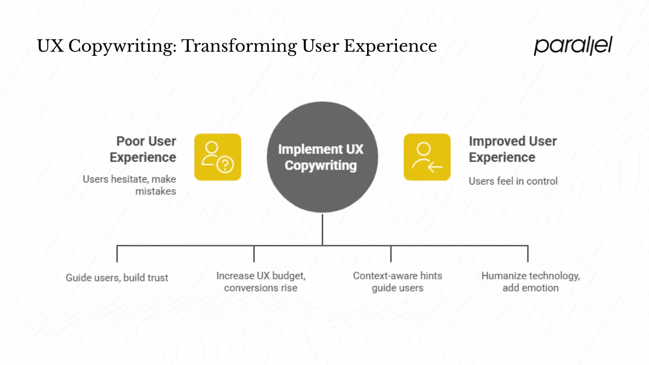
Tiny words remove roadblocks. Toptal’s microcopy article says microcopy serves as a guide when users take specific actions and can build trust and empathy with users. Effective microcopy is clear, concise, fits the visual style and fills a need. Without it, people hesitate, make mistakes or abandon tasks.
Research backs this up. Luke Wroblewski’s 2009 study on inline validation found that showing immediate feedback in forms led to 22 percent more successful submissions, 22 percent fewer errors and 31 percent higher satisfaction. This study, cited by CXL, shows that even microcopy attached to form fields and error states can substantially improve success rates.
2) Impact on conversion and business metrics
UXCam’s 2025 report aggregates industry data and finds that every dollar invested in UX yields a return of $100. Increasing the UX budget by ten percent can lead to an 83 percent increase in conversions. Companies that follow strong UX practices grow twice as fast as their peers. Those figures come from Forrester research and show that user experience, including thoughtful copy, isn’t just nice to have; it’s a major driver of growth.
Microcopy can directly influence sales. CXL documents a case where adding a “View Package” link above an Add to Basket button on an ecommerce site led to a 17.18 percent increase in conversions. The link simply clarified that customers could see what was in the bundle before purchasing. When you clarify, you build trust and reduce friction.
3) Supporting the customer path
UX copywriting helps map the user’s path through a product. By offering context-aware hints, it guides them step by step. Microcopy is easy to skim and helps users scan interfaces quickly. It also reduces anxiety by explaining why certain information is needed, such as why a credit card is required to start a trial. When people know what to expect, they feel in control – which fosters trust and lowers abandonment.
4) Engagement and trust
Words humanise technology. Toptal notes that microcopy can add emotion, helping users feel a connection and creating a stronger bond with the brand. Shopify’s guide points out that microcopy should anticipate the feelings and questions visitors have right before taking action. Answering those concerns – for example, telling someone they can change their store name later – diffuses anxiety. When we worked with a social media platform at Parallel, adding a small note under the username field saying “You can change this anytime” cut sign‑up abandonment by nearly 20 percent.
Elements and principles of UX copywriting
The elements inside a product interface
UX copywriting touches many parts of a web or mobile product:
- Labels and microcopy: Tooltips, placeholder hints, form labels and in‑field messages guide people and reduce errors. Examples include “Enter your name” or “Passwords must include a number.”
- Call‑to‑action text: Buttons and links tell users what happens next. Avoid generic words like “Submit”; use specific verbs such as “Create account” or “Add to cart.”
- Error and feedback messages: Clear messages acknowledge what went wrong and provide directions to fix it. Research shows inline validation reduces errors and completion time.
- Onboarding flows: Step‑by‑step copy introduces features and sets expectations. For example, Slack’s onboarding uses friendly microcopy to explain each field and reassure people that they’re on the right track.
- Notifications and alerts: Status updates like “Your file is uploading” or “Saved successfully” build confidence. Transparency around processes reduces confusion.
- Chatbots and assistants: Conversational copy humanises automated support. It should be succinct and feel like a helpful guide rather than a scripted robot.
- Navigation labels: Menu names and tabs must be intuitive and consistent. Avoid internal jargon; use words users would say.
- Modals and dialog copy: Pop‑ups should clearly state the purpose and what happens when you dismiss or confirm them.
Principles for writing effective UX copy
Here are core principles we follow at Parallel, aligned with research:
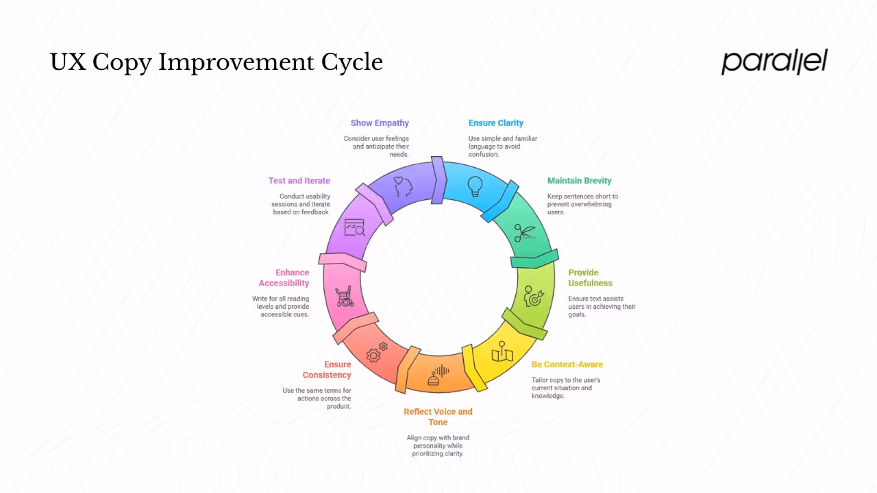
- Clarity: Use simple, familiar words and avoid jargon. Bynder stresses that UX copy should be simple, easy to understand, helpful and precise.
- Brevity: Keep sentences short. NNG points out that microcopy is fewer than three sentences. Long explanations overwhelm people.
- Usefulness: Each piece of text must assist the user’s goal. If it doesn’t help them act or understand, it shouldn’t be there.
- Context‑awareness: Good copy responds to where the user is and what they know. Microcopy should anticipate questions and provide answers just in time.
- Voice and tone: Reflect your brand’s personality but prioritise clarity. Tone can be friendly, but don’t sacrifice usefulness for jokes.
- Consistency: Use the same terms for the same actions across the product. Inconsistent terminology confuses users and undermines trust.
- Accessibility: Write for all reading levels; avoid idioms and complex metaphors. Provide meaningful error messages and include accessible cues like ARIA labels for screen readers.
- Testing and iteration: A/B test CTAs and microcopy. Conduct usability sessions and listen to how people read and interpret your words. In research shared by CXL, moderators noted the inflection in users’ voices when reading microcopy and followed up to ensure understanding. Iterate based on feedback.
- Empathy: Consider how users feel at each step. Shopify emphasises anticipating visitors’ thoughts and answering their worries. Empathy reduces anxiety and keeps people engaged.
Process and differentiation
A practical workflow for startups
For early‑stage teams, UX copywriting shouldn’t be an add‑on. Here’s a workflow we’ve found effective:
- Research and discovery: Start by understanding your users. Create personas, map out their tasks and note friction points. Review support tickets and analytics to see where people drop off or ask questions.
- Map existing copy: Conduct a content audit of your product. Document every label, tooltip, error message and CTA. Identify where microcopy is missing or confusing.
- Collaborate early: Bring writers into design discussions. At Parallel, we involve UX writers from the wireframe stage. Instead of placeholder text, we write “proto‑copy” – a draft copy that expresses the intent even if it’s not final.
- Draft and iterate: Write multiple options for CTAs and messages. Test them with design prototypes. Seek feedback from designers, product managers and developers to ensure feasibility and consistency.
- Review and align: Conduct copy crits where the team reviews language for clarity, tone and consistency. Use a style guide to keep terminology aligned across the product.
- Test with users: Run usability tests and A/B experiments. Pay attention to how users read and respond to microcopy. Use analytics tools to see which variants lead to higher completion rates.
- Refine and maintain: Integrate copy changes into your design system. Document decisions so future features use consistent language. Keep revisiting copy as the product evolves; words that worked at launch may lose relevance as you add features.
How UX copywriting differs from general copywriting
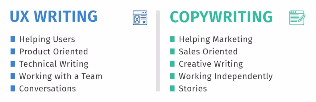
Product copy is about guidance; marketing copy is about persuasion. A UX writer’s work centres on the product interface – buttons, settings screens, onboarding flows. They aim to help people accomplish a task. A copywriter works with ads, landing pages and campaigns to attract and convince. Their language can be more colourful and brand‑driven. The CareerFoundry article puts it succinctly: UX writers guide users to complete tasks, writing concise microcopy for buttons, notifications and forms. Copywriters create advertising or publicity material, from headlines and blogs to social posts. The difference lies in purpose (guidance vs. persuasion), scope (product vs. marketing), tone (neutral and instructive vs. brand storytelling) and metrics (task completion vs. impressions or reach).
Challenges and common mistakes
From our work with SaaS teams, a few patterns recur:
- Treating copy as decoration: Many teams design screens first, then fill them with words. That leads to cramped buttons, unclear labels and mismatched tone. Start with a copy early.
- Using internal jargon: Developers often write system messages like “Authentication failure 003.” Users don’t speak that language. Instead, say “We couldn’t sign you in. Please check your password.”
- Overcomplicating or oversimplifying: Too much text overwhelms. Too little leaves users guessing. Strive for the sweet spot where every word serves a purpose.
- Misaligned tone: A playful error message might be charming in a chat app but inappropriate in a medical portal. Match tone to the context and emotional state of the user.
- No testing: Words are assumptions until you validate them. Without testing, you miss how people actually interpret your message.
- Inconsistency: Different screens may call the same action “Sign in,” “Log in” and “Enter.” This confuses people. Maintain a vocabulary list and use it consistently.
Building UX copywriting capability in a startup
- Decide when to hire or upskill: In tiny teams, a product manager or designer may write copy. As you scale, hiring a dedicated UX writer or content designer can pay dividends. Look for people who understand both writing and user experience.
- Introduce proto‑copy early: Avoid Lorem Ipsum. Write real words in wireframes. This surfaces problems with flow and space before you invest in high‑fidelity design.
- Integrate copy into sprints: Include copy reviews in design critiques. Don’t treat wording as a separate phase; treat it as part of product development.
- Use tools and guidelines: Maintain a style guide with preferred terms, tone guidelines and punctuation rules. Tools like Figma allow comments on copy, making collaboration smoother.
- Leverage analytics and feedback: Track where users hesitate or drop off. Use heat maps and form analytics to identify friction. Conduct surveys and interviews to hear the words users naturally use. Use that language in your copy.
In our own practice, we’ve seen that focusing on microcopy early can shorten time‑to‑value by about 30 percent in new product onboarding. Instead of pushing people through long tutorials, we surface just‑in‑time hints. That reduces frustration and support costs.
Limits of UX copy and concluding thoughts
Words cannot fix a broken interface. If your product structure is confusing, no amount of copy will rescue it. Microcopy also can’t compensate for unrealistic promises or poor performance. There are times when technical constraints, regulatory requirements or limited budgets force trade‑offs. In early stages, prioritising core functionality over perfect copy may be necessary. However, ignoring copy altogether often creates bigger problems later.
So, what is UX copywriting? It’s not just “writing text on screens.” It’s a strategic practice that combines research, design, psychology and language to help people accomplish tasks. Good UX copywriting creates clarity, reduces friction, builds trust and often boosts conversion. Founders and product leaders who invest in it early reap outsized returns. I’ve seen small teams climb from poor onboarding to smooth sign‑ups by paying attention to microcopy.
My suggestion to founders and product managers is simple: audit your current product copy. Look at your app or site and ask, “Do these words help someone understand what to do?” Start with high‑impact areas like sign‑up forms, checkout flows and error messages. Write new, clearer text, test it with users and watch the data. The returns will show you why this craft deserves a seat at the product table.
Frequently asked questions
1) What is the difference between copywriting and UX copywriting?
General copywriting aims to attract and persuade, often for marketing campaigns. UX copywriting guides users through tasks inside software products. UX writers craft short, clear text on buttons, forms and notifications to help people complete actions.
2) How can I learn UX copywriting?
Start by studying usability principles, reading resources from trusted organisations and practising on real interfaces. NN/g and Bynder offer guidance on microcopy. Practice rewriting forms and buttons in your own product. Conduct small tests to see what resonates. Courses and communities like the UX Writing Hub or Interaction Design Foundation offer structured learning.
3) Is copywriting part of UX?
Yes. UX copywriting is a subset of UX design. It ensures that every word in the interface serves the user’s needs. Without the right words, even well‑designed screens can confuse or frustrate.
4) What does UX mean in writing?
In this context, UX refers to the user experience – how a person feels when interacting with a product. Writing for UX means crafting language that helps people achieve their goals effortlessly and pleasantly.
5) How often should we test microcopy?
Regularly. Each time you launch a new feature or notice a drop in completion rates, review the words. Run A/B tests on CTAs and error messages. Use qualitative methods, like usability sessions, to hear how people interpret your copy.
6) Can one person handle both marketing copy and UX copy?
In very small teams, yes. But be mindful of switching mindsets. Marketing copy seeks to persuade; UX copy must be neutral and instructive. If you combine roles, use checklists or style guides to maintain clarity.
7) Do I need a style guide?
Absolutely. A style guide captures preferred terminology, tone and punctuation. It ensures consistency across teams and reduces debates. You can start small and evolve it as your product grows.
With clear microcopy and a systematic approach, early‑stage founders and product leaders can dramatically improve user satisfaction. The craft is not mysterious – it’s about listening, writing thoughtfully and putting users first. Start now and you’ll soon appreciate the power of words in your product.

check out these related blogs