Traffic alone doesn’t keep a company afloat. Many founders celebrate page‑view milestones only to wonder why revenue remains flat. In our projects at Parallel we see this pattern again and again: a marketing campaign drives visits, yet very few people take meaningful action.

This common frustration leads to a basic question — what is a website conversion? A conversion isn’t just a sale; it’s any behaviour that moves a visitor toward your goal, whether that’s starting a free trial, signing up to get product updates or downloading a guide. Conversions turn anonymous visits into connections.
For early‑stage companies every visitor counts, so squeezing value out of existing traffic is critical. This article explains what counts as a conversion, why many people don’t convert, and how you can design experiences that encourage the right actions.
What is website conversion?
At its core, a conversion happens when a visitor completes a desired action on your web presence. That action could be making a purchase, requesting a quote or subscribing to a newsletter. Invesp’s 2024 benchmark report reminds us that conversions cover many goals outside of purchases, including adding items to a cart or downloading content. When someone asks what is a website conversion in a meeting, the answer should reflect the outcome you care about, not an abstract metric.
Two broad categories exist.
- Macro conversions are the high‑value outcomes that directly support your business: transactions, paid subscriptions or demo bookings.
- Micro conversions are smaller steps that signal progress: clicking a main button, watching a demonstration video, creating an account or scrolling through most of a page.
Research from GetVero divides micro conversions into process milestones — moving through a pricing page or adding an item to a cart — and secondary actions such as reading a blog post. When founders consider which actions count for their product, they often overlook these small but critical steps. By mapping micro and macro events across your path you see where momentum builds and where it stalls.
Why conversions matter
Traffic without action is just a cost. TrustMary notes that improving conversion rates boosts return on investment by extracting more value from each visitor. For a lean team, lifting conversion means you can grow revenue without buying more ads. Ruler Analytics’ data shows that average conversion rates across industries hover around 3.3%. In practical terms, ninety‑seven out of a hundred visitors don’t act. Raising that number by a fraction can have a big effect on revenue. When setting targets, ask not only what is a website conversion rate but also what levels are realistic for your sector. Red Stag Fulfillment reports that the average e‑commerce conversion rate in 2025 is between 2.5% and 3%, with food brands exceeding 6% and luxury goods falling below 1%. Benchmarks provide context, not targets. Use them to frame conversations about what is a website conversion in your space.
Measuring conversion rates
A conversion rate is the percentage of visitors who complete your chosen action. The basic formula is:
Conversion rate = (number of conversions ÷ number of visitors) × 100
TrustMary advises dividing by the audience actually exposed to the offer. If you’re measuring sign‑ups from a pricing page, use visitors to that page rather than your entire site. Use bounce or click‑through rates to spot friction, and interpret numbers carefully. Small samples or seasonal swings can mislead. When colleagues ask what a website conversion rate is and why it changes, remind them to consider traffic quality and context, not just the percentage.
Why don't visitors convert?
Even a great product fails if people leave before acting. Through client work we’ve seen recurring barriers that explain why visitors don’t complete the step you’ve defined when thinking about your conversion goals.
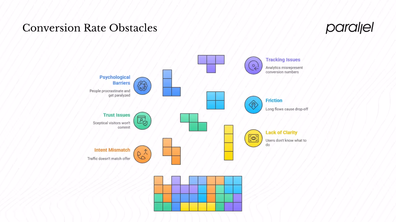
1) Intent mismatch: Traffic that doesn’t match your offer won’t convert. If an ad promises one thing but the page delivers something else, people bounce quickly. Match your message with what the page delivers.
2) Lack of clarity: When users don’t know what to do next, they leave. Confusing layouts and conflicting prompts obscure the main action. Make your primary button stand out, strip away clutter and put it where visitors expect to find it. The Young Urban Project notes that micro conversions such as clicking an important button signal early interest. Hiding these triggers wastes an opportunity.
3) Trust and perceived value: Sceptical visitors won’t share details or commit. Missing social proof, unclear pricing or absent security signals create doubt. Display testimonials, case studies and certifications. Offer free trials or guarantees to reduce perceived risk.
4) Friction: Long flows or unnecessary steps cause drop‑off. Ask only for essential information and keep each step short. Ensure pages load quickly and adapt to different screen sizes. Many of our early clients improved mobile conversions by enlarging tap targets and removing intrusive pop‑ups. Red Stag notes that both desktop and mobile conversions sit around 2.8%, so friction on either platform can halve your results.
5) Psychological barriers: People procrastinate. Too many choices can induce paralysis, while unclear value dampens motivation. Introduce urgency thoughtfully and emphasise clear benefits. Show progress so users know how far they have left in multi‑step flows.
6) Tracking issues: Misconfigured analytics misrepresent conversion numbers. Ensure events trigger correctly across browsers and devices, use server‑side tracking where possible and filter out spam submissions. When data is wrong you can’t answer what is a website conversion with confidence.
How to lift conversions
The good news is that conversion problems are solvable. The practices below draw on research, experiments and our first‑hand experience. They also illustrate how to define what is a website conversion in a way that drives action.
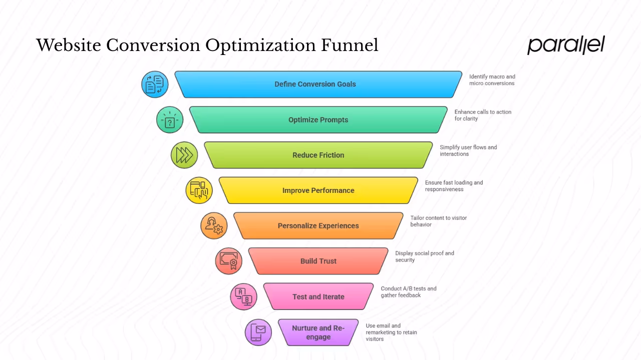
1) Map your goals and paths: List every macro and micro conversion relevant to your product and sketch the path a visitor follows. The Young Urban Project highlights that tracking micro events helps you see where people get stuck. Prioritise pages or steps with the biggest drop‑offs and the most traffic.
2) Optimise your prompts: Calls to action should be obvious and persuasive. Replace generic labels with benefit‑driven copy such as “Start your 30‑day trial.” Use contrast, whitespace and logical placement near related content. Test variations often. BloggingWizard’s 2025 statistics report notes that A/B testing can lift conversions by about twelve percent. Start with small changes like button text or placement and measure the impact.
3) Reduce friction: Simplify flows. Ask for only the information needed to continue, reveal optional fields only when necessary and provide inline feedback to catch errors. Offer guest checkout options for commerce sites. On mobile, make interactive elements large enough and ensure the keyboard doesn’t cover important fields.
4) Improve performance: Fast sites convert better. Compress images, defer unnecessary scripts and use caching. Slow pages cause frustration; people will leave before even seeing your offer. Test your site on slow connections and multiple devices to identify bottlenecks.
5) Personalise experiences: Adapt messages based on how people arrive and behave. Returning visitors may appreciate different content than first‑time guests. Use triggers — such as exit intent or scroll depth — to time your prompts. Segment email sign‑up incentives by audience.
6) Build trust: Display reviews, customer logos and ratings near your call‑to‑action. Offer transparent pricing and clear policies. Provide secure payment icons. Social proof reduces perceived risk and speeds up decisions.
7) Test and iterate: View each change as an experiment. Run A/B tests for different layouts, text or flow variations. Heatmaps and session replays show where people click or pause. Combine numbers with qualitative feedback from short surveys. Without iteration you’re guessing.
8) Nurture and re‑engage: Not every visitor will convert on the first visit. Capture email addresses and start a re‑engagement sequence. Remarketing ads can bring back visitors who left mid‑path. Provide helpful content and incentives to invite them back. Data from Red Stag shows referral traffic converts at over five percent, while social networks remain under one percent, so nurturing return visits can yield better outcomes.
Website conversion examples
E‑commerce store.
A consumer goods startup saw that only 1.5% of visitors purchased. Heatmaps revealed most users never scrolled far enough to see the “Add to cart” button. By moving the button higher, simplifying descriptions and adding customer quotes, conversion climbed to 2.3%. This aligns with Red Stag’s benchmark where top performers roughly double the median.

SaaS platform.
A B2B product tracked free trial starts and email sign‑ups. Analysis showed people clicked “Start Free Trial” but left on the second screen. Removing extra fields and adding a progress bar increased trial starts by eighteen percent. In both cases the teams clarified which actions defined success for them and adjusted their designs accordingly.

Common Mistakes in Conversion Optimization
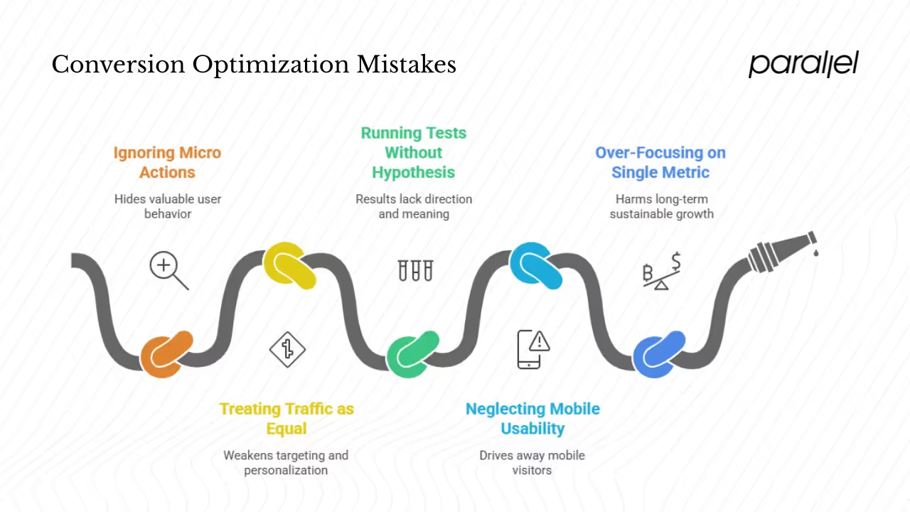
1. Ignoring Micro Actions
Small steps—like hovering over a product, starting a form but not finishing it, or pausing on a section—show where visitors hesitate or lose confidence. Overlooking these micro actions hides valuable signals that reveal friction points in the user flow. Tracking them helps you understand why users drop off, not just where they drop off.
2. Treating All Traffic as Equal
Not all visitors behave the same way. Referral traffic, for instance, often comes from trusted recommendations and converts at higher rates. Red Stag’s data shows referral visits convert above five percent, while social traffic struggles to reach one percent. Using a single strategy for all traffic sources blurs these differences and weakens targeting efforts.
3. Running Tests Without a Hypothesis
Testing for the sake of testing wastes time and data. Every experiment should start with a clear question or assumption—such as “shorter forms increase completion rates” or “free shipping improves average order value.” Without a hypothesis, results lack direction and are hard to interpret.
4. Neglecting Mobile Usability
Mobile users make up a major portion of visitors, yet many sites still feel clunky on smaller screens. Slow load times, difficult navigation, and oversized pop-ups can quickly drive people away. Optimizing layouts, buttons, and checkout flows for mobile is essential for keeping conversions consistent across devices.
5. Over-Focusing on a Single Metric
Chasing one metric—like conversion rate or average order value—can create blind spots. For example, increasing conversion rate by pushing aggressive discounts might boost short-term sales but harm retention later. A balanced view of metrics ensures growth that’s sustainable, not just impressive in a dashboard.
A simple roadmap for small teams

1. Establish a Baseline
- Set up event tracking: Use tools like Google Analytics, Mixpanel, or PostHog to log key actions (clicks, signups, purchases, form completions).
- Define conversions:
- Macro conversions – your primary goals (e.g., a sale, signup, or lead form submission).
- Micro conversions – smaller actions that show engagement (e.g., video plays, product page views, cart adds).
- Macro conversions – your primary goals (e.g., a sale, signup, or lead form submission).
- Create dashboards: Visualise these metrics so your team can review progress easily. Make sure everyone can access and interpret the data.
2. Fix Obvious Issues First
- Review UX basics: Look at your analytics and heatmaps to find friction points.
- Simplify actions: Move high-impact buttons (like “Buy now” or “Sign up”) to visible, logical spots.
- Shorten user flows: Cut unnecessary steps in checkout or signup processes.
- Improve speed: Optimize images, scripts, and hosting to reduce load times. Even a second faster can help conversions.
3. Focus on High-Traffic Pages
- Start small: Work on pages that get the most visitors or drive key actions.
- Tweak micro steps: Refine small details like button labels, image choices, or form fields.
- Monitor micro conversions: See whether these small changes improve completion rates.
4. Run Controlled Experiments
- Change one variable at a time: Test one thing (like a headline, color, or CTA text) to isolate what makes the difference.
- Use A/B testing: Compare performance between the original and the new version over enough traffic to get reliable results.
- Document learnings: Keep a simple log of what you tested, what changed, and what happened.
5. Advance to Smarter Techniques
Once your team is confident in basic tests:
- Try behaviour-based segmentation: Group users by intent, location, device, or actions to tailor content more precisely.
- Experiment with multivariate testing: Test combinations of changes at once (e.g., headline + image + CTA) when you have enough data.
- Layer insights: Combine qualitative feedback (like surveys or user sessions) with quantitative data for a fuller picture.
6. Build Continuous Conversion Reviews
- Make it routine: Discuss conversion metrics in your weekly or bi-weekly product reviews.
- Ask useful questions: In retrospectives, ask “What is a conversion for this page or feature?”
- Act on insights: Use the answer to guide your next round of tests or optimisations. Each review should end with a concrete next step.
7. Keep It Manageable
- Don’t chase every new optimization trend. Stick with clear goals and consistent tracking.
- Focus on learning, not just results. Even tests that “fail” can tell you what not to waste time on next time.
- Over time, you’ll build a reliable, repeatable process for improving conversions that fits your team’s size and resources.
Useful Tools for Measuring and Improving Performance
1. Analytics and Tag Managers
- Use Google Analytics or Matomo to track visitor behavior, page performance, and conversion paths.
- Set up a Tag Manager (like Google Tag Manager) to collect data on specific actions—button clicks, form submissions, video plays, etc.—without needing to constantly edit your site’s code.
- Combine both tools to build conversion funnels that show where visitors drop off, helping you pinpoint weak spots in your user journey.
2. Heatmaps and Session Replays
- Tools such as Hotjar, Crazy Egg, or Microsoft Clarity show visual representations of how users interact with your site.
- Heatmaps display click density, scroll depth, and mouse movement, helping you see which sections draw attention and which are ignored.
- Session replays let you watch real user interactions, offering valuable context about usability issues that numbers alone don’t reveal.
3. A/B Testing Platforms
- Platforms like Optimizely, VWO, and Google Optimize (legacy) allow you to test different versions of pages or elements—like headlines, layouts, or call-to-action buttons.
- Use these tools to see which variations drive better engagement or conversions.
- According to BloggingWizard, structured testing can increase conversions by roughly 12%, proving that small design or content tweaks can have measurable results.
4. Integrating Insights
- Use the data from analytics and heatmaps to design hypotheses for your next A/B test.
- Feed experiment results back into your analytics setup to measure the long-term effect on metrics like revenue, bounce rate, or lead quality.
- Over time, this cycle of measurement, testing, and refinement builds a data-driven optimization process.
Closing thoughts
A conversion is more than a click; it’s evidence that a visitor found enough value to take the next step. Early‑stage teams can’t afford to ignore this. By understanding the difference between macro and micro actions, measuring carefully, diagnosing friction and iterating often, you’ll turn more visitors into customers. The first step is to answer what is a website conversion for your product. Define it, instrument it properly and run a small experiment. Each improvement compounds, making your marketing spend go further and building a path that works for the people you’re trying to help. Keep learning and refining your approach always.
Frequently asked questions
1) What’s the difference between a conversion and a conversion rate?
A conversion is a specific action, while the conversion rate is the percentage of visitors who complete that action.
2) What is a good website conversion rate?
Benchmarks vary. Ruler Analytics’ 2025 report finds an average around 2.9%. Red Stag places commerce averages between 2.5% and 3%. Your target should reflect your sector and model.
3) How many goals should I track?
Track the main macro goal and the micro steps that lead to it. Start with a few high‑impact events so you don’t get overwhelmed.
4) Should I focus on macro or micro conversions?
You need both. Macro actions drive revenue, while micro actions show where to improve.
5) Can I have multiple goals on a page?
Yes, but emphasise one primary action and use design hierarchy to guide users.
6) How do I pick events?
Match events with your product maturity. A SaaS product may track free trials and feature use; commerce focuses on cart additions and checkouts; content sites watch email subscriptions and downloads.
7) How do I track users across devices?
Use tools that support user‑based tracking, such as first‑party identifiers or logins. Many visitors start on mobile and finish on a desktop, so design flows that support continuation.

check out these related blogs


.webp)


.avif)


