When you sketch a building, you start with a blueprint, not a glossy rendering. In product design, wireframes play the same role. They strip away color and polish to show what goes where and how people will move through the experience.
Early‑stage founders and product managers often jump straight into high‑fidelity mockups because that’s what looks impressive. In my own experience running Parallel, skipping this foundational step costs time and money because you end up “tearing down walls” later.
In this article I answer the question of what a wireframe is and share how we use wireframes with founders, product managers and design leaders to bring structure to an idea.
Quick Answer: What Is a Wireframe?
A wireframe is a blueprint-style, low-fidelity visual outline of a website, app, or interface that focuses on layout, structure, and user flow — before any colors, branding, or final design elements are applied. It helps teams plan content hierarchy and navigation early, saving time and reducing costly design rework.
What is a wireframe and why does it matter?
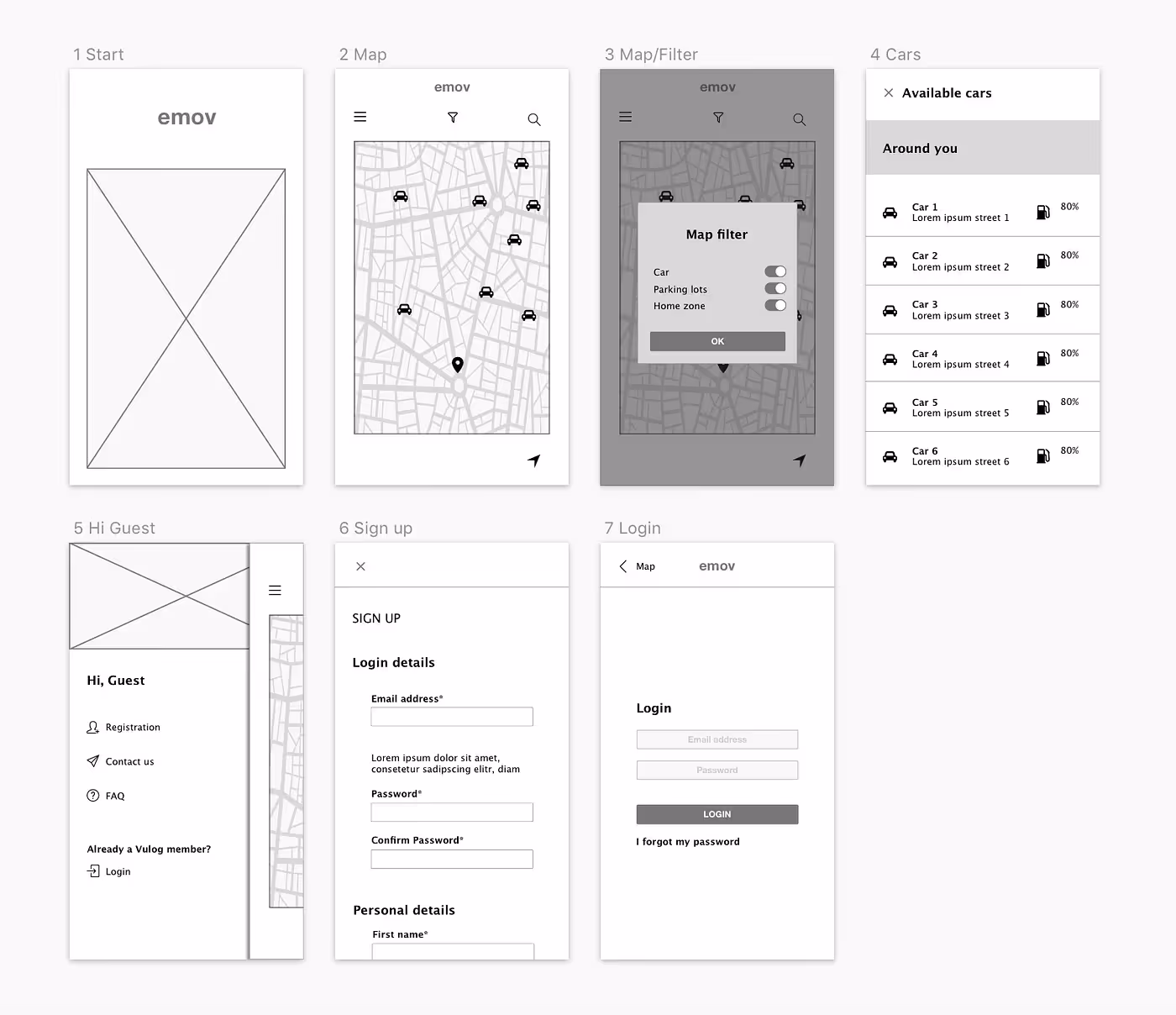
A wireframe is a simplified and schematic visual representation of a website, mobile app or software interface. Think of it as a black‑and‑white outline or skeletal drawing. The design studio Tubik describes wireframes as “simplified and schematic” layouts that are similar to architectural blueprints; they are usually monochromatic illustrations that give a clear view of the project’s structure and the connections between different parts. Wireframes intentionally omit styling—there are no colors, images or fancy fonts—because the goal is to focus on hierarchy, navigation and user flow. Designers use wireframes to outline visual and typographic hierarchy, set interactive zones and elements, plan transitions and interactions, and organize the general interface clearly for the target audience. In other words, wireframes answer what is a wireframe by showing the skeleton of your product before you flesh it out.

Wireframes matter because they help teams agree on structure and flow before investing in visual design or engineering. The Decision Lab explains that building a website or app without a wireframe can invite chaos and wasted resources; sketching the rudimentary elements of your design from the start provides direction and gives everyone on the team clarity thedecisionlab.com. In research cited by multiple design agencies, using wireframes can reduce design time by up to 50 percent requiment.com. A survey cited by Denovers found that 85 percent of designers use wireframes to plan the layout and structure of a website or application. Another study noted that 17 percent of startups fail because of a lack of wireframing requiment.com. These numbers confirm our own pattern: early sketches save time and prevent painful re‑work.
Why do wireframes save time and reduce risk?
Wireframes clarify layout and content placement. When we start a project at Parallel, we often hear from founders that their idea is “intuitive,” but when asked to put it on paper, they realize essential pages and flows are missing. Creating a wireframe forces you to decide what appears on each screen and how users move from one step to the next. The Decision Lab article notes that during wireframing designers concentrate on functionality rather than appearance, using wireframes to arrange buttons, text fields, images and menu items to determine the best layout for users and to optimize the user experience. Tubik adds that wireframing is a fast and inexpensive way to plan page structure; it gives designers, developers and clients a shared understanding and can be easily reshaped when changes are needed. In our projects, spending an hour on a wireframe often saves days of arguing about where a button should sit.
Wireframes also help teams communicate. UXPin’s book on wireframing states that wireframes keep everyone on the same page—product managers, designers and engineers—and can be changed quickly to support collaborative and iterative development. In other words, wireframes act as a shared language. Balsamiq emphasizes that low‑fidelity wireframes keep conversations centered on functionality, flow and the user experience, preventing premature debates over colors and pixels. When team members look at the same skeletal layout, they focus on user goals instead of visual details.
Wireframes save money by catching issues early. Research by the Requirement team reports that mobile wireframes with a clear call‑to‑action have 62 percent higher conversion and that 94 percent of first impressions originate in an app’s functionality and design requiment.com. Those numbers reinforce the idea that a solid structure is not just about aesthetics—it impacts business metrics. Tubik warns that skipping planning can lead to cracks: without careful wireframing, “the app looking amazing and stylish won’t bring you loyal users”. Investing time in wireframes helps avoid re‑design later, which is far more costly than drawing boxes early on.

What types of wireframes exist and how do you choose the right fidelity?
1) Low-fidelity wireframes

Low‑fidelity wireframes (lo‑fi) are quick sketches using simple shapes to represent text boxes, images and buttons. Denovers describes them as basic blueprints of a webpage or screen that ignore color and detail. Lo‑fi wireframes are often drawn with pen and paper or basic digital tools and may include notes explaining different sections. Their main job is to convey the product’s value proposition and organize content at a high level. Because they are cheap and disposable, they’re ideal at the beginning of a project or when exploring many options. I encourage founders to sketch lo‑fi screens themselves—even if you think you “can’t draw.” The point is to think aloud, not to make something pretty.
2) Mid-fidelity wireframes
Mid‑fidelity wireframes add more detail without being fully polished. They use a monochrome palette, proper headlines, buttons and highlighted visual hierarchy. This level is typically created using wireframing software to ensure accurate spacing and placement; some teams present mid‑fi wireframes in a wireflow—a diagram showing how pages connect. Because they illustrate actual content and more realistic layouts, mid‑fi wireframes invite constructive feedback from users and stakeholders while still being easy to adjust. For early‑stage startups we often use mid‑fi layouts to get buy‑in from investors or advisors who need more context than a napkin sketch.
3) High-fidelity wireframes

High‑fidelity wireframes (hi‑fi) resemble static mockups. Denovers notes that hi‑fi wireframes present the entire screen’s layout and architecture with intricate details—UI elements, colors, interactions, graphics, branding, copy and logos. Their purpose is to show how the final product will look, but they are still static; they do not behave like a prototype. A hi‑fi wireframe should come only after user research and content decisions are complete. At Parallel we rarely jump straight to hi‑fi; doing so locks you into specifics too soon. Use hi‑fi wireframes to prepare for visual design hand‑off or to clarify a complex feature.
Choosing fidelity is about risk and context. The Nielsen Norman Group suggests fidelity varies along three axes—interactivity, visuals and content. Early in a project, use lo‑fi to explore ideas; as complexity grows, add detail. Projects often blend fidelity levels: you might sketch a new feature in lo‑fi and overlay it on an existing hi‑fi screen. The goal is to support your design thinking, not to produce polished drawings.
Types of Wireframes: Summary Table
What goes into a wireframe: structure, flow and elements?
A good wireframe acts as a visual guide to your product’s layout. Based on Tubik’s description of wireframing, several elements matter:
- Information architecture: how content is prioritized and organized. Designers outline visual and typographic hierarchy, making sure important information stands out and that users can scan the page.
- Navigation and user flow: wireframes plan transitions and interactions, showing how people move from one screen to another. Arrows or numbered steps often illustrate the path.
- Interface elements: placement of buttons, input fields, headers and calls‑to‑action. Wireframes use boxes and lines to represent each component, ensuring spacing makes sense and there are no dead ends.

When we work with teams, we also encourage them to add simple annotations explaining interactions or business rules. This is not about writing a specification; a short note like “calendar appears when you tap” gives context. Annotations help developers and stakeholders interpret the sketch without endless meetings.
Who uses wireframes and how do they collaborate?
Wireframes are not just for designers. They are a shared tool across roles:
- Founders and product managers use wireframes to test ideas and prioritize features. A lo‑fi sketch of an onboarding flow exposes complexity before a single line of code is written. When we help founders, we ask them to draw the “happy path” and then to add edge cases. Wireframes make trade‑offs visible.
- UX and interaction designers use wireframes to plan user journeys and interactions, experiment with layouts and present alternatives. Tubik’s article notes that wireframing is the initial phase of actual design when the future product gets its first visual presentation.
- Developers and technical leads use wireframes to discuss feasibility. Early sketches allow engineers to raise questions about data models, APIs or constraints before the interface is fully designed. Seeing the structure helps them plan architecture.
- Stakeholders and clients use wireframes to give feedback at a strategic level. Because the sketches lack polish, discussions remain focused on user goals rather than personal preferences. As UXPin’s book notes, wireframes keep everyone on the same page and can be changed quickly.
Modern tool adoption reflects this cross‑functional use. The 2024 UX Tools Survey notes that Figma reigns as the leader across multiple categories, including wireframing, prototyping, design hand‑off and digital whiteboarding; it continues its dominance with high preference and satisfaction scores.

In our practice, Figma’s collaborative features allow founders, designers and developers to comment in real time, while Balsamiq supports rapid lo‑fi sketching and Miro lets teams create whiteboard flows. Selecting the right tool depends on your needs: speed for early sketches, collaboration for cross‑functional teams, or interactivity for testing.
What’s the difference between a wireframe, a mockup, and a prototype?
People often use these terms interchangeably, but they refer to distinct stages in product design:
- Wireframe: a black‑and‑white blueprint focusing on structure and flow. It answers what is a wireframe by showing the skeleton without stylistic details. The emphasis is on layout and user pathways.
- Mockup: a static, fully styled visual representation. It includes colors, typography, images and branding. A mockup shows what the interface will look like but doesn’t let you click through.
- Prototype: an interactive simulation. It may be built from mid‑ or hi‑fi wireframes and allows users to click from screen to screen, capturing feedback on interactions.

Think again of constructing a building: the wireframe is the blueprint, the mockup is the artist’s rendering, and the prototype is a walk-through model you can explore. Each stage serves a purpose. Starting with a blueprint prevents you from making expensive mistakes during construction.
How do you create a wireframe step by step?
You don’t need to be an artist to create a useful wireframe. Over years of working with startup teams, I’ve distilled the process into simple steps, inspired by Balsamiq’s guides and reinforced by industry research.

- Define the problem and goals: Do thorough research before you draw. Tubik advises outlining the goals, unique value proposition, target audience and the problem your product should solve before starting. Without a clear goal, a wireframe becomes a collection of features rather than a coherent experience.
- Sketch the layout quickly: Start with lo‑fi sketches—use a thick marker, sticky notes or simple boxes. The point is to explore ideas, not to make them perfect. Keep the structure simple and decide where major elements live before worrying about detail. Tubik recommends keeping wireframes simple and using a monochromatic palette.
- Map navigation and user flow: Draw arrows or numbers to show how users move from one screen to another. Identify decision points and error paths. This helps you catch missing steps early and ensures the flow supports the user’s mental model.
- Add interface elements: Once you’re comfortable with the layout, add buttons, input fields, menus and other controls. Don’t worry about color—use labels or icons to indicate function. Some designers put placeholder text (for example, “Sign up” inside a button) to remind themselves of the intended action.
- Annotate and gather feedback: Tubik suggests adding annotations to help others understand your ideas. Share the wireframe with colleagues or potential users and invite comments. Wireframes are easy to modify; adjust based on feedback. Gathering input early saves time later.
- Use grids and consistent spacing: A grid helps place components evenly and makes the interface easier to scan. Even in lo‑fi sketches, try to align elements (without using that banned word) to create visual harmony.
- Iterate: Wireframes are living documents. Start lo‑fi, then move to mid‑fi as your understanding deepens. Keep updating them as you learn from user testing or business changes. Don’t be afraid to throw away a sketch and start again—the cost is minimal.
What tools and resources are best for wireframing?
You can wireframe with pen and paper, but specialized tools make collaboration and iteration easier. Each has strengths:
- Balsamiq: Ideal for lo‑fi wireframes. It offers drag‑and‑drop UI components and intentionally keeps sketches plain so conversations stay focused on flow and function. Balsamiq points out that low‑fidelity wireframes keep teams talking about functionality rather than debating colors and pixels. It’s great for early ideation and for founders without design training.
- Figma: Dominant across wireframing, prototyping and design hand‑off according to the 2024 UX Tools Survey researchgate.net. Figma supports both lo‑fi and hi‑fi wireframes, real‑time collaboration and easy sharing. We often start lo‑fi in Balsamiq and move to Figma when we need comments, versioning and integrated prototyping.
- Miro: A web‑based whiteboard tool that lets teams draw flows, sticky notes and diagrams together. It’s handy for remote workshops and for capturing user journeys alongside wireframes.
- HTML or code‑based prototypes: For some projects, designers jump straight into code, using frameworks like Bootstrap or simple HTML/CSS to create interactive wireframes. This approach is helpful if your team wants to test responsive behaviour or if developers are more comfortable in code.
- Other tools: Axure and OmniGraffle support advanced interactions and conditional logic. Tools like UXPin also integrate design and prototyping, while not as widely adopted as Figma according to recent surveys.
Choose the tool that fits your fidelity needs and the working style of your team. The tool should empower you to answer what is a wireframe by making the underlying structure clear, not distract you with features.
How do startups and teams use wireframes in real life?
- Clarifying an idea before hiring designers: We worked with an early‑stage software startup that planned to build a social network for researchers. Before investing in design, the founder sketched lo‑fi wireframes of the profile page, feed and chat. The act of drawing forced her to realise she needed a moderation dashboard and onboarding. That early insight saved weeks of development.
- Getting consensus on layout and interactions: In a recent engagement with a SaaS platform (AI/ML tools for chemists), our design leader created mid‑fi wireframes using Figma to show how data tables, filters and chemical structures would appear. We presented these wireframes in a workshop with scientists, engineers and product managers. Because the sketches were mid‑fi, the team could focus on data hierarchy and workflow without being distracted by color or brand. The scientists suggested changing the filter location, and the engineers flagged a performance constraint. Making the change at the wireframe stage was painless.
- Acting as a shared shorthand between product and engineering: For a fintech app, the product manager created annotated wireframes for account opening, verification and transaction flows. Developers referenced these wireframes to write stories and plan backend APIs. Later, when the visual design evolved, the core flow remained intact because the structure had been agreed early. As the Tubik article explains, wireframes provide a first visual representation of an abstract idea, giving both developers and clients a clear understanding and making it easier to reshape if changes arise.
- Wireframing for growth experiments: Even established teams use wireframes for quick experiments. A design leader at a streaming service needed to test a new recommendation widget. Instead of investing in full visuals, the team sketched the widget and integrated it into an existing mid‑fi prototype. They ran a user test and discovered that placing the widget after the first episode summary improved click‑through. Because the wireframe made the layout simple, users could provide honest feedback about placement rather than colors.
These examples show that wireframes are not just academic exercises; they are practical tools for reducing risk, facilitating collaboration and making smarter product decisions.
Conclusion
Founders and product leaders often ask what is a wireframe with a hint of skepticism, as if sketching boxes might slow them down. In practice, wireframes accelerate progress by forcing clarity. They transform abstract ideas into tangible structures, help teams surface assumptions and enable quick adjustments before costly decisions are locked in. Wireframes guide layout and user flow, serve as a blueprint for collaboration and act as a design framework for interactive products. By starting simple and iterating early, you save time, reduce risk and create better experiences for your users. My advice: pick up a pen, open Balsamiq or Figma, and draw your next feature before you build it.
FAQ
1) What is a wireframe in design?
It’s a skeletal outline of a user interface focusing on structure and flow without styling. It uses boxes and lines to represent content, navigation and controls. Designers use wireframes to plan what goes where and how users will move through the product.
2) What is a wireframe example?
A common example is a sketched home page showing a header area, navigation links, hero image placeholder, feature sections and a footer. Another example is an app dashboard wireframe with charts, filters and action buttons. These examples deliberately lack color and typography so you can focus on content hierarchy.
3) Is Figma a wireframe?
Figma is not a wireframe itself; it’s a design tool. You can create wireframes in Figma at different fidelity levels, and the 2024 UX Tools Survey reports that Figma is the most popular tool for wireframing and prototyping researchgate.net. The wireframe is the output; Figma is just the tool.
4) Is UX a wireframe?
User experience (UX) is a broad discipline covering research, interaction design, visual design and evaluation. A wireframe is one of the tools within UX design, focused on laying out structure and flow. Wireframes help UX practitioners communicate early ideas and involve stakeholders before investing in full design.

check out these related blogs


.avif)


