Colour is often the first thing users notice. A 2025 survey by Adobe found that 16% of consumers notice a brand’s colour scheme and half have chosen one brand over another based solely on colour. With early stage products, those split‑second judgements are precious. The question at the heart of this piece is what are triadic colors and why should product and design leaders care? For founders and product managers, colour harmony is more than decoration—it affects trust, usability and brand recognition. This article explores triadic combinations in plain language and shows how to use them in real projects.
Colour theory foundations: a quick refresher
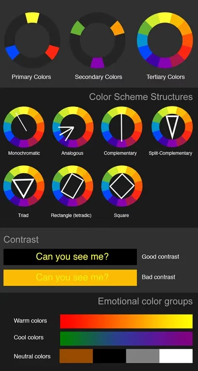
Sir Isaac Newton’s colour wheel arranges primary hues (red, blue, yellow), secondary hues (orange, purple, green) and tertiary blends into a circle. This simple diagram underpins colour theory. A colour scheme is a set of hues chosen for a painting or interface. Designers talk about harmony when hues work well together and contrast when they stand apart. In a user interface, harmony makes screens comfortable to read, while contrast lets important elements stand out. Basic schemes include analogous (neighbouring hues), complementary (opposites) and triadic (three equidistant hues). Limiting the palette helps establish hierarchy—research from the Nielsen Norman Group suggests keeping palettes to three colours.
For product teams, these foundations translate into practical choices. The dominant hue supports brand perception; secondary hues draw attention to buttons and feedback. Saturation and value adjustments ensure text remains legible. Knowing how hue, value and saturation interact, as explained by the Interaction Design Foundation, helps teams balance warmth or coolness and set the right mood.
Colour meanings also vary across regions and backgrounds. Red can suggest danger, passion or revolution in one place but happiness or good fortune in another. Blue can feel calming or conservative, while white can symbolize purity or even death. These differences underline the need for user research when selecting hues.
What are triadic colours?
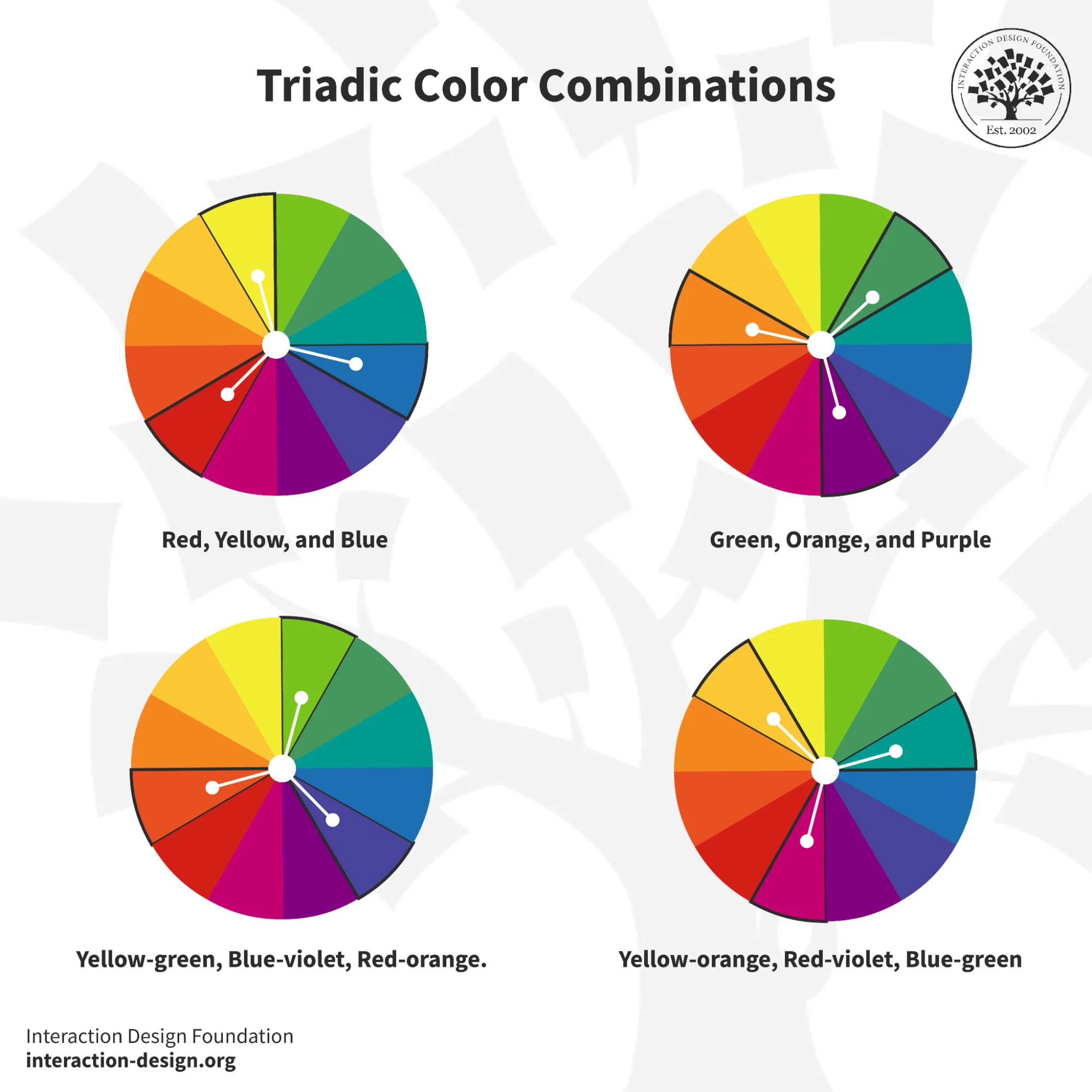
Triadic colours are three hues spaced evenly around the colour wheel, forming an equilateral triangle. In other words, what are triadic colors? They are a set of three hues at 120‑degree intervals on the wheel. Classic examples include red–yellow–blue (primary), orange–green–violet (secondary) and tertiary trios such as red‑orange, yellow‑green and blue‑violet. The resulting palette is lively yet balanced because each hue has equal distance from the others.
In practice, one hue takes centre stage while the others support. This hierarchy avoids visual noise. The Interaction Design Foundation notes that triadic schemes deliver both harmony and contrast. Figma’s resource library advises choosing a dominant hue that matches your brand, then selecting supporting hues to balance it. This hierarchy is key to applying triadic schemes effectively.
Why triadic colour schemes matter in design and startups
Colour shapes perception and behaviour. Statistics compiled by Colourlib show that around 60% of people accept or reject a new product based on colour and up to 90% of initial impressions are driven by colour alone. The same source notes that 80% of people think colour increases brand recognition and 84.7% cite colour as the main reason for buying a product. Adobe’s 2025 survey echoes these findings: blue is seen as the most trusted hue and the most likely to trigger impulse purchases, and 36% of consumers expect earthy or AI‑inspired tones to dominate branding in 2025. Consumer preferences are not random either; a study summarised by Colourlib found that 42% of people cite blue as their favourite colour, with green far behind at 14%, while orange is the least liked at 30%. For a founder or product manager, choosing the right palette can build trust, recognition and even influence buying behaviour.
A triadic palette offers a middle path between minimalism and chaos. It provides high contrast—helpful for calls to action—while maintaining harmony across screens. Compared to a simple complementary pair, a triad gives a richer set of tones without losing cohesion. This answers what are triadic colors for startups: a structured way to get variety without confusion. Three hues also provide anchor points for logos, dashboards and marketing assets.
However, the scheme comes with caveats. Using all three hues at equal strength can feel chaotic. Without clear hierarchy, the palette may overwhelm users. The 60‑30‑10 rule (for dominant–secondary–third hues) is a proven technique to maintain balance.
How to identify and generate a triadic palette
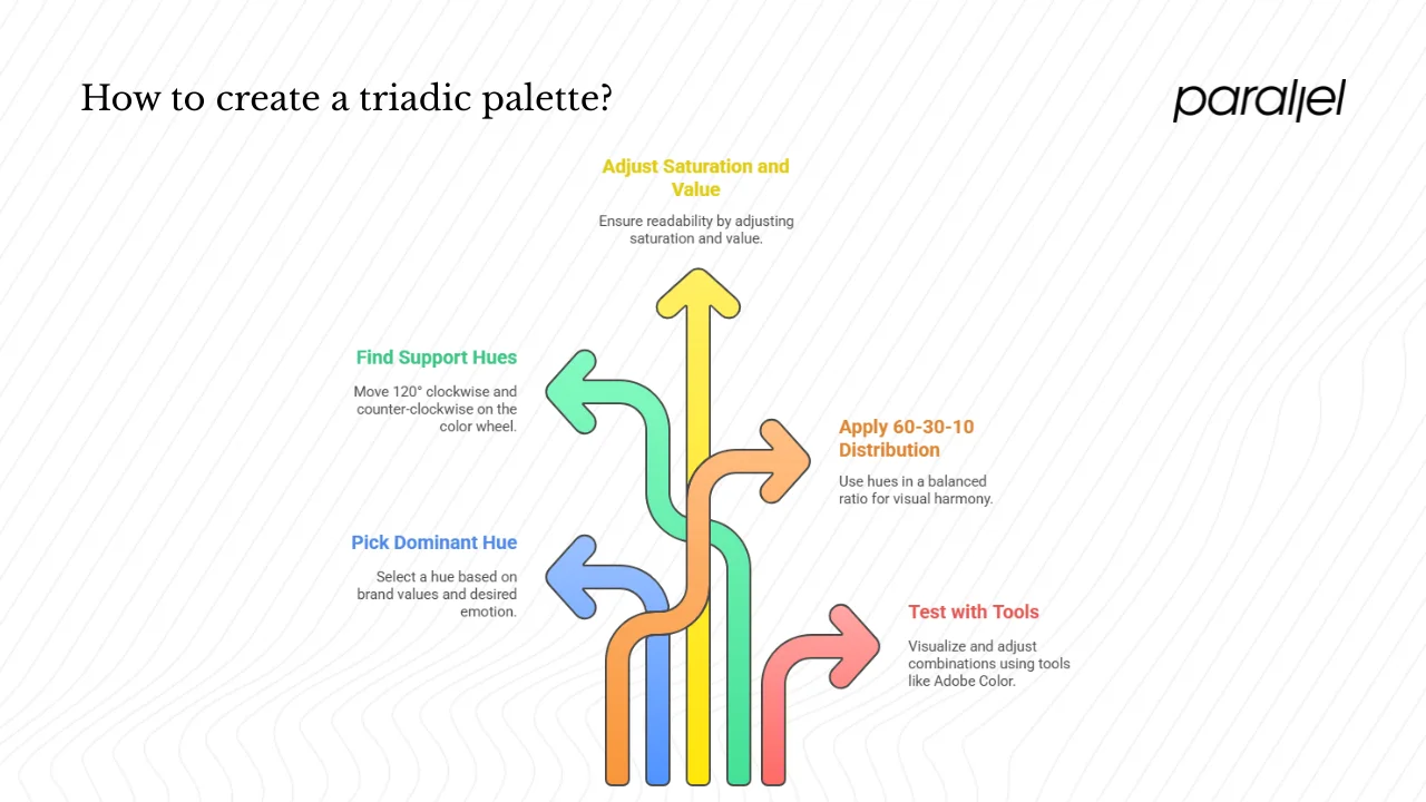
Creating a triadic palette starts with the colour wheel:
- Pick a dominant hue based on your brand’s values and desired emotion. For a fintech app, a shade of blue might signal trust; for an eco‑friendly service, green suggests growth.
- Find the two support hues by moving 120° clockwise and counter‑clockwise on the wheel.
- Adjust saturation and value to ensure readability. Lighten or darken hues for backgrounds and text. The Web Content Accessibility Guidelines recommend a contrast ratio of at least 4.5:1 for body text.
- Apply the 60‑30‑10 distribution: use the dominant hue for about 60% of the interface, the secondary hue for 30% and the third hue sparingly—around 10%.
- Test with tools and prototypes. Tools like Adobe Color, Coolors and Figma’s palette generator let you visualise and adjust combinations. Usability testing ensures your colours resonate.
This process clarifies what triadic colors are in a hands-on way. The pie chart below illustrates how the 60‑30‑10 ratio keeps balance:
Choosing actual hues doesn’t have to start with primaries. For example, a health‑tech startup might choose green as the dominant hue. Moving 120° in either direction yields blue‑violet and red‑orange as support hues. By muting the support hues and using them for icons or messages, the interface feels energetic without overwhelm.
Examples of triadic colour schemes in product and brand contexts
Triadic palettes vary widely depending on hue selection. Here are some archetypes and how a startup might use them:
- Primary triad (red, yellow, blue): Bold and youthful. Education apps or children’s products often lean on it. Red could drive call‑to‑action buttons, blue could anchor menus and yellow might indicate badges.
- Secondary triad (orange, green, violet): More subdued than the primary triad. A productivity tool might choose green as the main hue, with orange signalling progress and violet used sparingly for alerts.
- Tertiary triads (red‑orange, yellow‑green, blue‑violet or yellow‑orange, blue‑green, red‑violet): Subtle and sophisticated. A SaaS dashboard could set blue‑green as the dominant hue, use red‑violet for alert badges and yellow‑orange for progress indicators.
In each case, the dominant hue should cover large surfaces. Support hues can guide the eye to important actions or statuses. Keep support usage restrained to avoid distraction. High‑saturation support hues can be distracting; reducing saturation or choosing pastel variants works better. Testing in dark mode is essential.
The bar chart below illustrates the equal presence of three hues—useful when each module in a suite needs its own identity.
Triadic vs other colour schemes
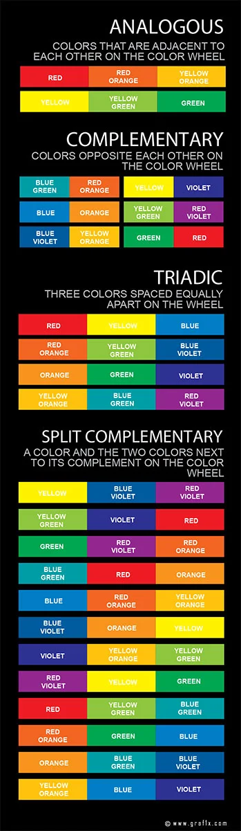
While triadic palettes offer balance, they are not always the right choice. Complementary schemes pair two hues opposite each other on the wheel and provide strong contrast but limited variety. Analogous schemes use adjacent hues, creating a calm atmosphere but little differentiation. Tetradic schemes use four hues forming two complementary pairs; they offer richness but can be hard to manage.
Ask yourself what are triadic colors relative to these options. Choose triadic when you need more variety than a pair provides but still want cohesion. Pick simpler schemes when minimalism or high contrast between two elements is paramount. Whatever you choose, enforce rules in your design system to prevent drift.
Triadic schemes may be unsuitable for brands that need a highly restrained or conservative look. A legal services platform, for instance, might lean on a monochromatic or complementary palette to project seriousness. Likewise, high‑contrast pairs often work better for warning messages or urgent notifications because the eye can quickly discern the difference. Always consider the context of your product, the expectations of your audience and the devices they use when selecting a colour scheme.
Best practices and startup‑specific tips
From our work with early‑stage teams, a few guidelines stand out:
- Connect your main hue to your message. Green suggests growth and health; blue implies trust and stability; orange signals energy and warmth.
- Use support hues sparingly. Keep them for buttons, icons and small states. Overuse makes screens busy.
- Maintain hierarchy. Follow a 60‑30‑10 or similar distribution and document these percentages.
- Check accessibility. Use contrast checkers and follow WCAG ratios.
- Plan for growth. As features grow, stick with the three hues and adjust saturation rather than adding new hues.
- Test with users. Colour perception varies across regions and backgrounds. User tests reveal whether your palette supports comprehension.
These tips only work if you know what triadic colors are and how to apply them.
Real‑world application: a mini case study
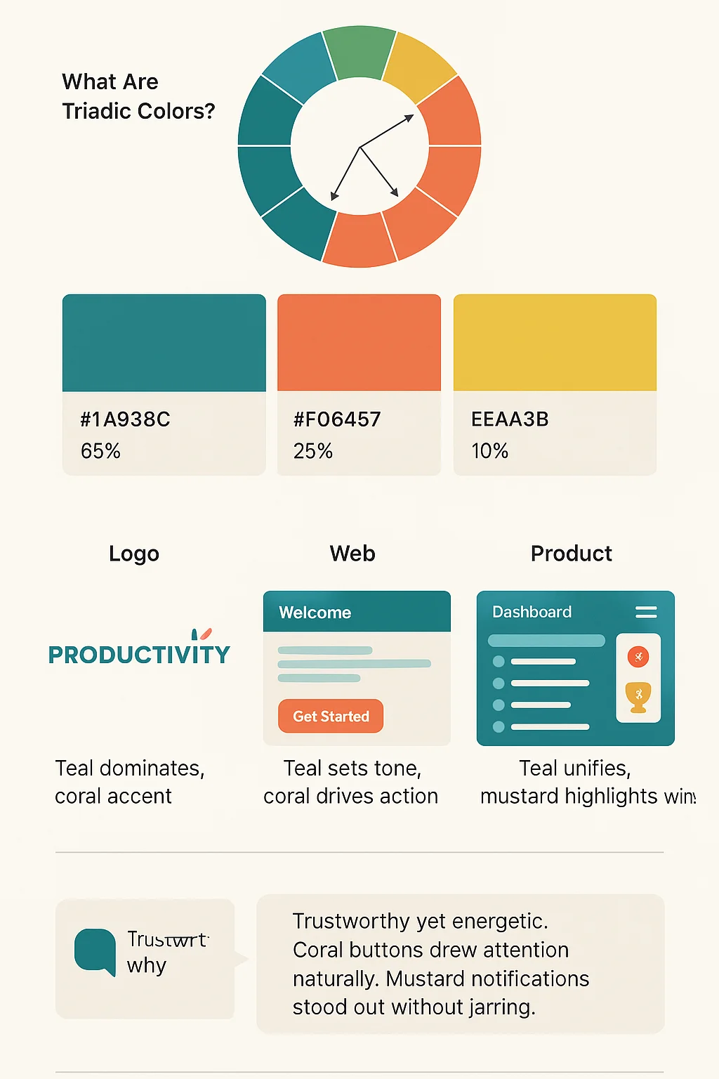
Consider a SaaS startup building a productivity platform for small teams. The founders want to signal trust, clarity and progress. They explore what are triadic colors by selecting teal as the dominant hue (around 180°), coral as the support hue (around 300°) and mustard as the third hue (around 60°).
In the brand mark, teal dominates the logotype while coral forms a small motif. On the website, teal backgrounds and typography set the tone. Coral buttons direct attention to calls to action; mustard appears only in badges or notifications. In the product dashboard, teal backgrounds unify the interface, coral signals interactive elements and mustard indicates achievements. Usage percentages are roughly 65% teal, 25% coral and 10% mustard.
User testing shows that this palette feels trustworthy yet energetic. Participants said the coral buttons drew their eyes naturally, while the mustard notifications stood out without being jarring. Because the palette uses three hues, new modules can map to one of them or a desaturated variation, supporting growth.
Wrap‑up & key takeaways
Triadic palettes answer the question what are triadic colors by framing three equidistant hues as a system for harmony and contrast. A simple definition—three hues spaced 120° apart—belies the power of this scheme to balance variety and cohesion. For startups, this balance translates into trustworthy, memorable interfaces that guide users and reinforce brand identity. Data from Adobe and Colourlib shows that users make rapid judgements based on colour, so thoughtful choices can have outsized effects.
Key insights include:
- Understand the colour wheel and the role of hue, value and saturation.
- Recognise three hues evenly spaced on the wheel—the essence of a triadic scheme.
- Use a dominant hue for most of the interface, with two support hues in a 60‑30‑10 ratio.
- Test palettes with users and accessibility tools; adjust tints and shades for readability.
- Document your palette in a design system so that it remains consistent over time.
By treating colour decisions as strategic rather than arbitrary, founders and product teams can build interfaces that feel deliberate and unified. When you hear others ask what triadic colors are, you’ll be ready to answer with confidence and apply the concept to your own products.
FAQ
1. What are examples of triadic colors?
Examples include the primary set (red, yellow, blue), the secondary set (orange, green, violet) and tertiary combinations like red‑orange, yellow‑green and blue‑violet.
2. What are tetradic colors?
A tetradic or double‑complementary scheme uses four hues—two pairs of opposites on the colour wheel—and one hue usually dominates.
3. How to find triadic colors?
Start with your chosen hue, then find the two hues 120° away on the colour wheel. Adjust saturation and value and apply a 60‑30‑10 distribution for dominant and support hues.
4. What are triad and tetrad colors?
A triad uses three equidistant hues; a tetrad uses four hues forming two complementary pairs. The choice depends on how much variety and contrast you need.

check out these related blogs